How to Isolate Linear Regression Equations in Tableau

Tableau has a decent variety of built-in statistical features. One of the easiest to use is the trend line. The trend line is a drag and drop feature in the Analytics pane that results in an equation that represents the overall trend of the data. You have the option to choose a Linear, Exponential, Logarithmic, Polynomial, or Power trend line. Recently, I had run into a request to isolate the linear regression equation that Tableau generates to use it in other calculations. The only solution currently is to do the math outright using calculated fields. In addition, I will also explain some of the metrics used to evaluate the performance of the line.
This is the third post in a series on statistical analysis in Tableau. For other applications, see How to Flag Rows of Interest in Tableau and How and Why to Make Box Plots in Tableau.
Earn the Advanced Analytics Practitioner Badge with Playfair+
How to extract Tableau trend line formulas
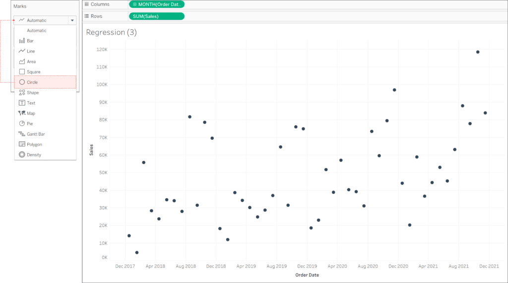
The trend line, or in this case the simple linear regression, shows the relationship between two numeric variables. In this example, I will be using the Sample-Superstore dataset and calculating the simple linear regression for Sales by Order Date. First, let’s assemble the view by dragging Month of Order Date to the Columns shelf and dragging Sum of Sales to the Rows shelf. In the Marks card, change the Mark type to Circle.
We will now start building the equation by using the least-squares method. The least-squares method minimizes the sum of the squares of the errors to get the best fit line. Essentially it is trying to minimize the differences from the actual values in the view to the fitted value on the line.
![]()
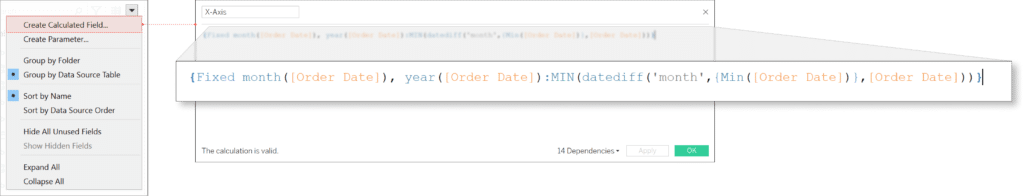
To create the regression formula, we need to convert the date into a numeric variable. We will just use the DATEDIFF function to do this. DATEDIFF calculates the difference between two dates based on either the Day, Month, or Year date parts. Since we are looking at sales by month we will want to use the Month date part in our calculation. We will also use the MIN(Order Date) as the start date and Order Date as the end date. I am also going to wrap it in a fixed LOD, fixing it on the month and year of the order date.
Next, we can start working on the calculated fields needed for the equation. There are two components we need to solve for in the classic linear equation: y=mx+b. We will first need to solve for the slope, “m”, as well as Y-intercept, “b”. To solve for these, we are going to create three calculated fields.
Continue reading with a free account, or login.
Unlock this tutorial and hundreds of other free visual analytics resources from our expert team.
Already have an account? Sign In
By continuing, you agree to our Terms of Use and Privacy Policy.
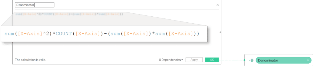
The first calculated field will be the denominator for both the slope and Y-intercept equations. The denominator in mathematical notation is this:

In layman’s terms, that equation multiplies the sum of the squared X-axis value that represents the months by the number of months and then subtracts the squared sum of months. In Tableau the equation will look like this:
SUM([X-Axis]^2)*COUNT([X-Axis])-(SUM([X-Axis])*SUM([X-Axis]))
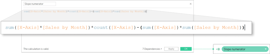
The numerator for the slope is:

The slope numerator calculation is taking each month’s sales and multiplying it by the X-axis values that represent the months. It is then summing up all those values and multiplying it by the total number of months. Then it is subtracting the sum of the X-axis values multiplied by the Sum of Sales.
SUM([X-Axis]*[Sales by Month])*COUNT([X-Axis])-(SUM([X-Axis])*SUM([Sales by Month]))
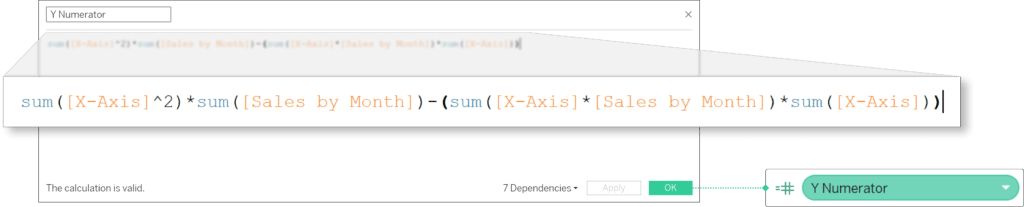
Next, the numerator for the Y-intercept is:
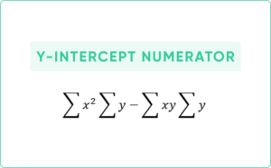
The equation is squaring each X-axis value, then summing up all those values and multiplying it by the total sum of sales. It is then subtracting from it the sum of the X-axis values multiplied by the sum of each month’s sales multiplied by its X-axis value.
SUM([X-Axis]^2)*SUM([Sales by Month])-(SUM([X-Axis]*[Sales by Month])*SUM([X-Axis]))
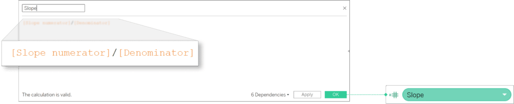
Now that we have all the components, we can start assembling the equation. To create the slope, divide your slope numerator by the denominator.
[Slope Numerator]/[Denominator]
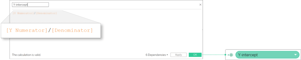
Now divide your Y-intercept numerator by the denominator to get the Y-intercept.
[Y Numerator]/[Denominator]
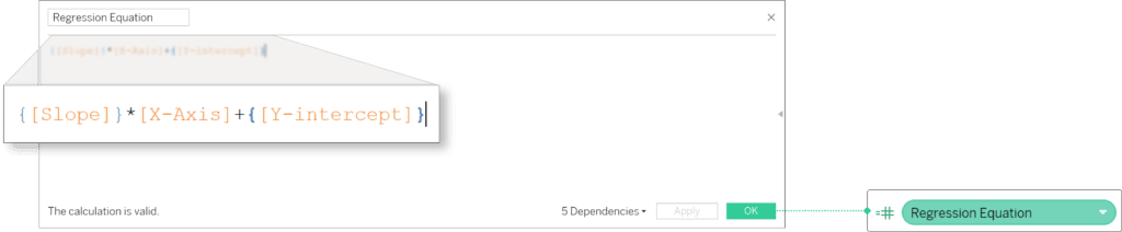
With the slope and Y-intercept already calculated, you can simply put it into “y=mx+b”. Let’s create another calculated field and plug in the slope for “m” and the Y-intercept for “b”. You will also need to wrap your slope and Y-intercept in “{}” Tableau will automatically apply the FIXED level of detail function to the calculated field since we want the slope and Y-intercept to remain constant for each month.
{[Slope]}*[X-Axis]+{[Y-intercept]}
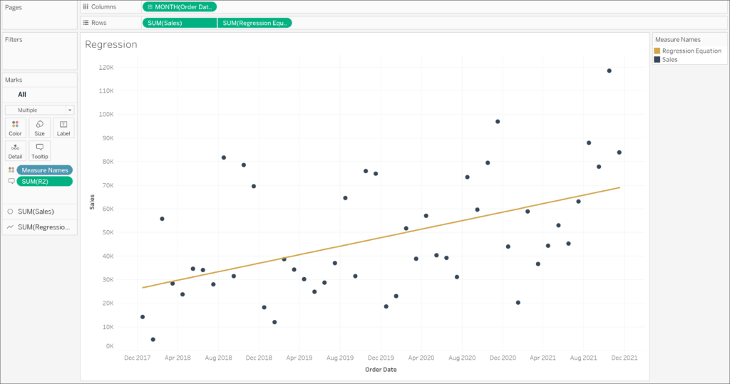
Now return to the original view you created. Add your regression equation to the Rows shelf. Create a dual-axis chart and make sure to synchronize your axis. Change the Mark type to Line and now you should have a linear line that cuts through the middle of your data points. If you want to check your results, you can also go to the Analytics pane and drag Trend Line to the view. When the pop-up appears, drop it under Linear for Sum(Sales).
How to use mean squared error and R-squared to evaluate model quality
Once we have the equation, we need to evaluate if it is a good interpretation of our data. Two values that can be used to do this are the mean squared error and the R-squared.
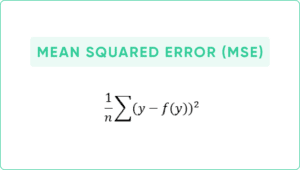
Mean squared error tells us the average squared error, which means the average of how far off the value of our regression is from the actual value. A perfect fit would result in a MSE of 0. Generally speaking, we want our MSE to be low. However, there is no set standard for what is considered a low MSE and it is highly dependent on the data. The formula is:
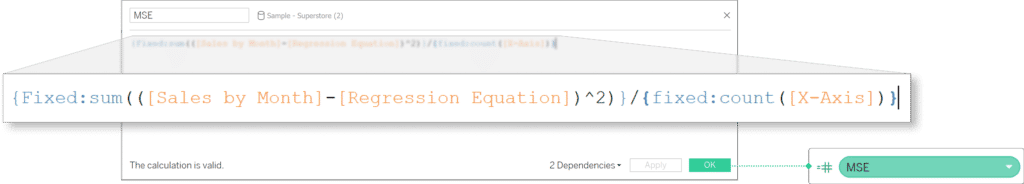
In Tableau the equation will look like this:
{Fixed: SUM(([Sales by Month]-[Regression Equation])^2)}/{Fixed: COUNT([X-Axis])}
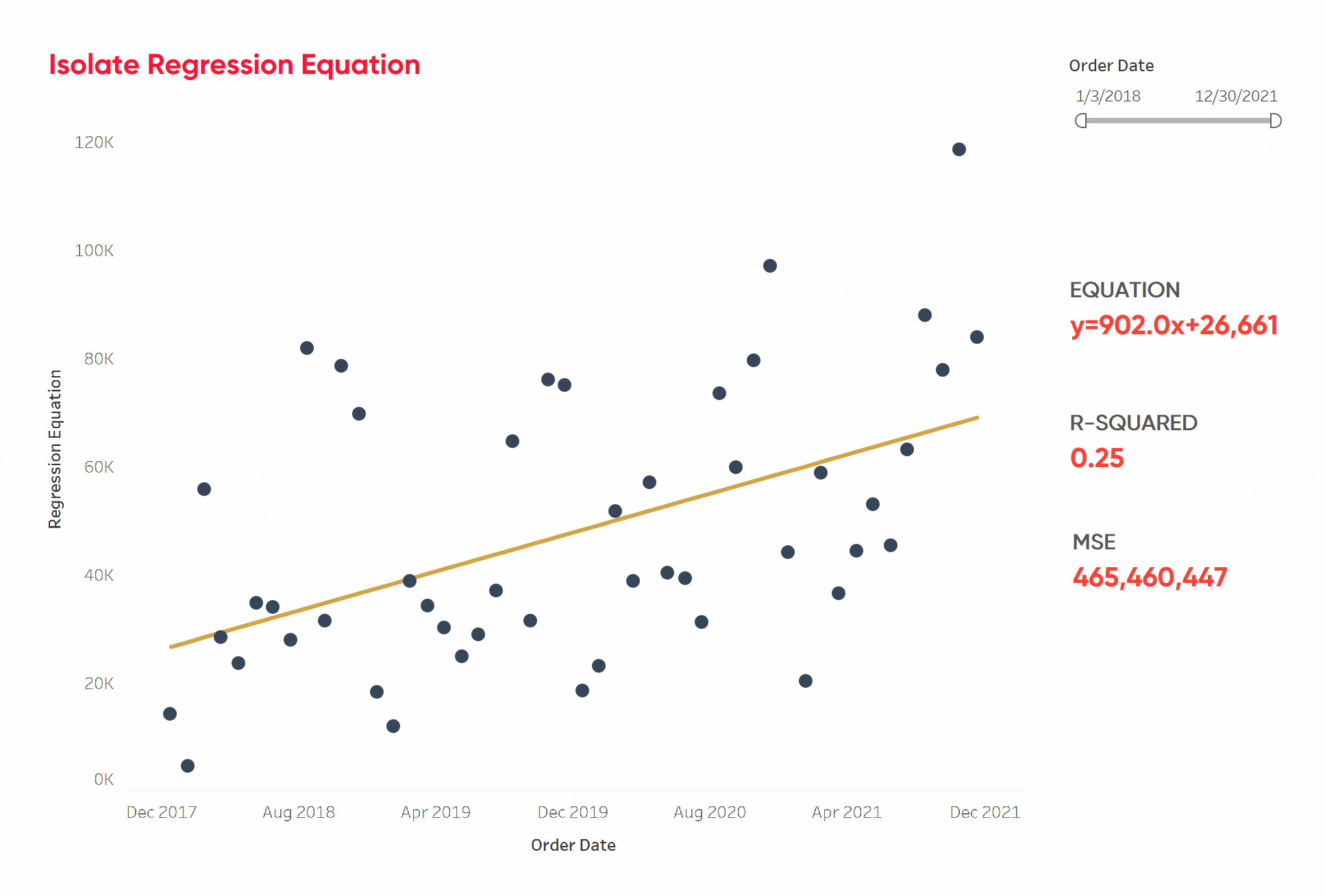
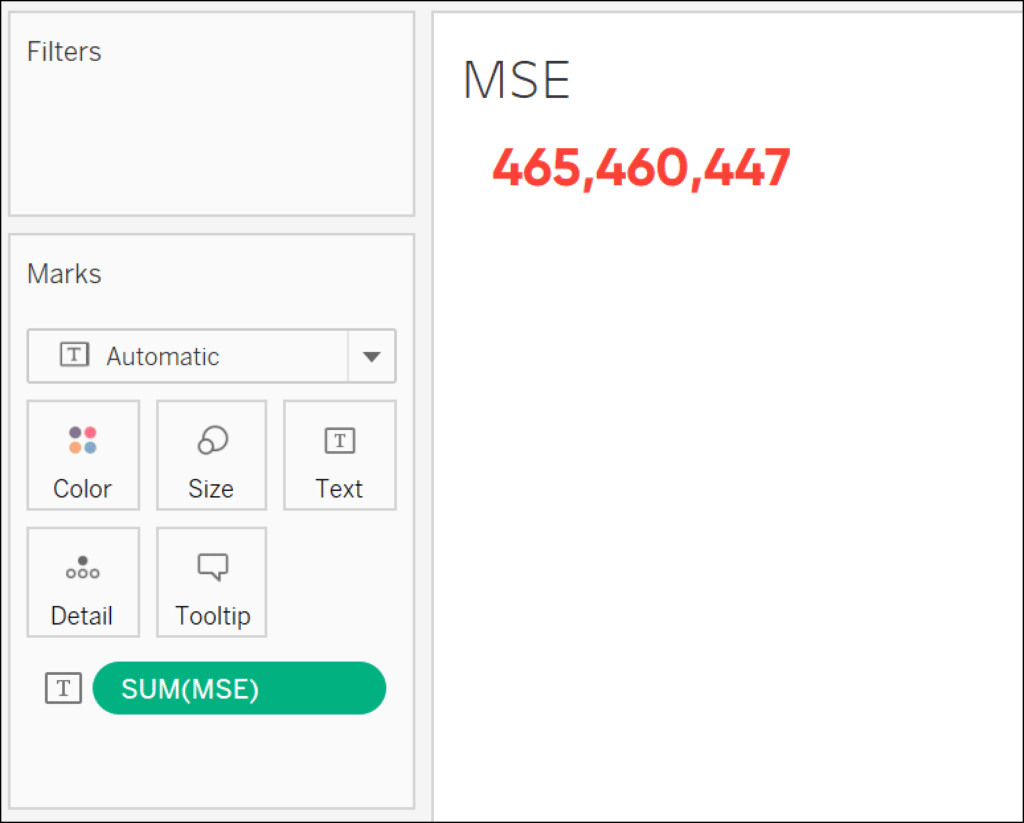
This results in a MSE of 465,460,447. While that value is high, I will go into more detail later on as to how we should interpret the value in this context.
Now we are going to create the R-squared metric. R-squared is a number between 0 and 1 that measures the variance of the dependent variable that can be explained by the independent variable. 0 indicates that none of the variance in our dependent variable can be explained by the independent variable and 1 indicates that all of the variance can be explained by the dependent variable.
In our case, how much of the variance in our sales can be explained by the month. It is also one of the metrics provided in the pre-built trend line feature. There are a lot of measures that can be used to explain the results of a regression model. While R-squared is accepted by statisticians as a good measure to use to explain a linear regression model, there may be other measures that would better fit your use case.
The R-squared equation is as follows:
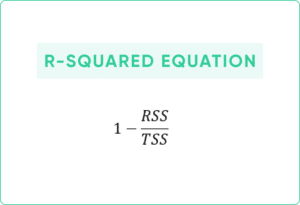
Where RSS and TSS are:
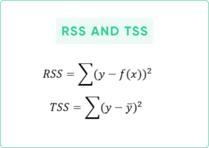
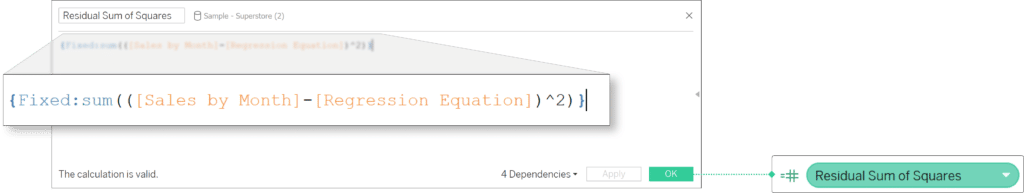
RSS is the Residual Sum of Squares. It is the sum of the squared difference of the actual Y value and the Y value on the regression for each value on the X-axis. If you want to include it in the Tooltip of your visual, you need to wrap it in a fixed LOD so that it is the same for each month. It can be calculated in Tableau like this:
{Fixed: SUM(([Sales by Month]-[Regression Equation])^2)}
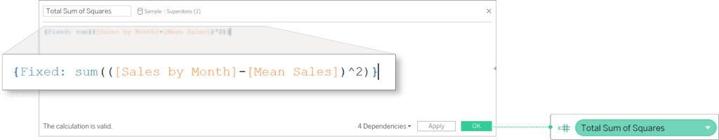
TSS is the Total Sum of Squares. It is the sum of the squared differences of the actual Y value and the mean Y value. Same as RSS, if you want to include it in your visual, you will need to wrap it in a Fixed LOD:
{Fixed: SUM(([Sales by Month]-[Mean Sales])^2)}
Now we get can use both the RSS and TSS calculations to get our R-squared value:
1-([Residual Sum of Squares]/[Total Sum of Squares])
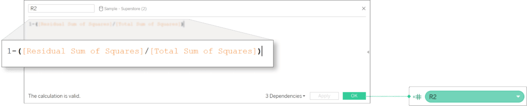
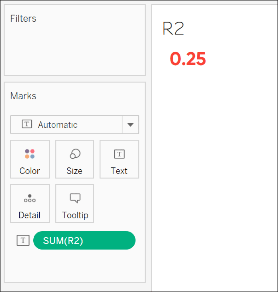
The final value of our R-squared is 0.25.
How to interpret the results of a linear regression model
Now that we have our MSE and R-Squared, what do we do with these results? There is no set standard for our MSE, meaning that interpretation is widely dependent on its use case. Our MSE is very high at 465,460,447. However, it is important to consider the data we are running the model on. We are looking at sales data in the thousands, so naturally, we will have a higher MSE. We can also see that we have an R-squared of 0.25. Generally speaking, a lower R-squared indicates that our regression does not accurately represent the data.
![]()
Since we have a high MSE and a low R-squared does that mean our regression line is useless? No! If we examine our data, we can see that there is a seasonality to our sales. September, November, and December tend to have higher sales while January and February are consistently low. While this may not be the best model for making high-impact predictions, it can be useful in filling in missing data points as well as conveying the general direction sales are moving without getting distracted by the peaks and dips.
Now that you have the ability to extract the trend line formula to make our own linear regression calculation, it is important to do additional research to make sure this method best fits your use case.
Stay after it,
Maddie

Written By
Maddie Dierkes
Related Content
How to Do Customer Segmentation with Dynamic Clustering in Tableau
Tableau has a few different built-in analytics features that allow you to both summarize and model your data in various…
Advanced Analytics in Tableau Series: One-Way ANOVA Tests
You may be wondering why we would want to perform an ANOVA test in Tableau, as you can do it…

Ethan Lang
Benchmarking, Modeling, Forecasting, and More In this live webinar on the Analytics pane in Tableau, join Ethan as he does…