How and Why to Make Box Plots in Tableau

Box plots, sometimes called box-and-whisker plots, can give your dashboard users an easy introduction into the world of statistical analysis whilst at the same time giving immediate context to the data and its outliers.
Box plots are a great way to process large amounts of data efficiently whilst not getting too deep into the weeds and allowing an entry-level summary of the distribution within your data. It allows analysts to view the symmetry of data and emphasizes significant outliers that can be double-checked for data issues or acted upon immediately.
Box plots may not be the “prettiest” visualization you have ever created in your life, but its value to the business is underrated. So let’s work on changing that!
This blog is going to be the first of a series that will give you an introduction to statistical visualizations and measures that will allow you to understand your data better and also draw conclusions from it.
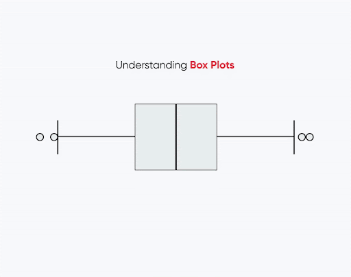
How to read a box plot
Let’s start with the basics, what does a box plot even show me? In principle, box plots are a standardized and widely-used illustration that statisticians use to show the distribution of data. The box plot uses five metrics: minimum, maximum, median, first quartile, and third quartile.
![]()
The space of the box plot between the first and third quartile is also called the Interquartile Range (IQR) and displays the range which 50% of your data fall under. In addition, whilst it would be easy to use, the minimum and maximum values are not simply as their name suggests, they usually represent 1.5 times the Interquartile range in both positive and negative directions. Data points outside this 1.5x IQR would be considered outliers.
I have heard from many people in my career that they like to exclude those outliers because they don’t want their data to be skewed. Please be careful doing that! Your outliers could bring the most valuable insights into your whole dataset!
Continue reading with a free account, or login.
Unlock this tutorial and hundreds of other free visual analytics resources from our expert team.
Already have an account? Sign In
By continuing, you agree to our Terms of Use and Privacy Policy.
Create a box plot in Tableau
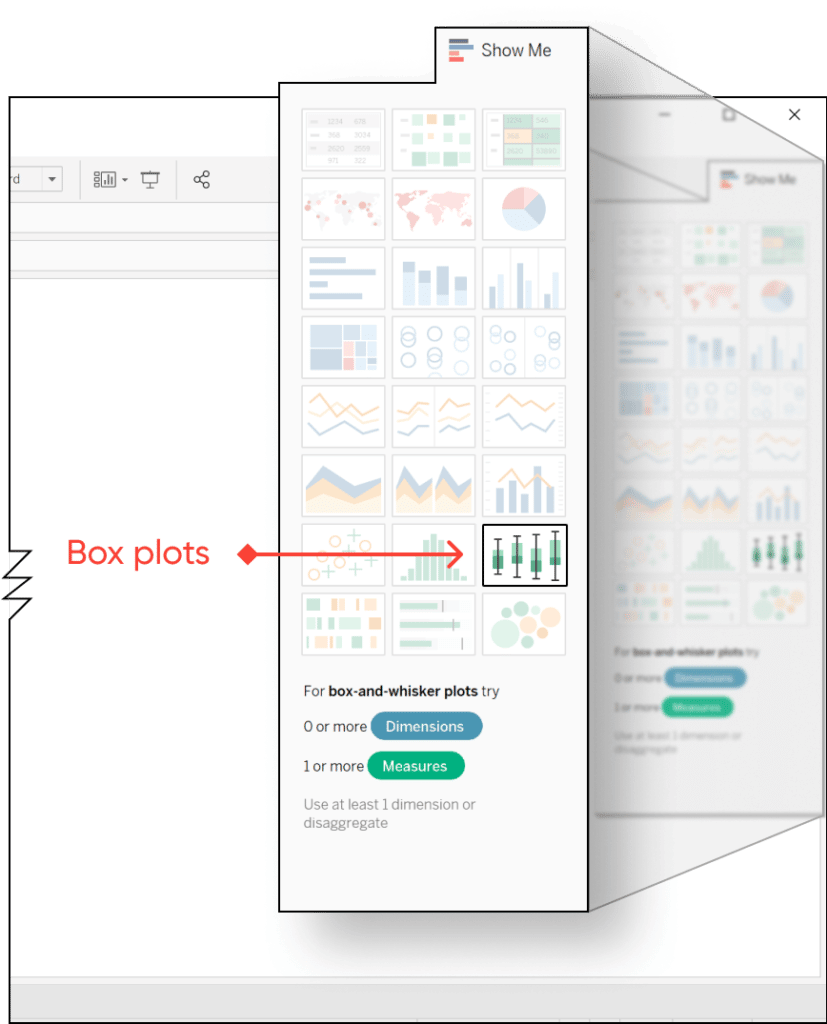
Tableau has two ways to create box plots, one of them is directly integrated into the “Show Me” feature. The other one is accessible through the Analytics pane, which also has Reference Lines.
Let’s start with the first one through the “Show Me” feature. For people who hardly ever use it, the “Show Me” feature can be found at the top right side of your Tableau window when you are located in any of your sheets. This is always a good place to start when you are thinking about the possible visualization for your data as Tableau will help you choose what you need. When you go down to within the “Show Me” list and highlight the box plot, it will tell you that you need at least one or more measures as well as one dimension. You can also disaggregate your values and can create your box plot without a dimension – more details on how to do that will be covered in the next section.
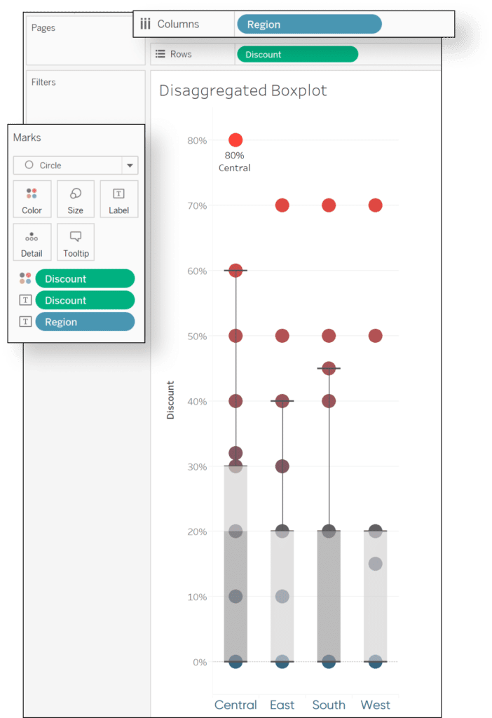
For the example we will be working on, I am using the measure “Discount” and the dimension “Region” from the Superstore data set. This will allow me to compare the different areas and potentially identify who is giving the most discounts. I then dragged Region onto the Color property of the Marks card to better visualize what the bubbles mean and dragged Region onto Detail so it will show up in the Tooltip.
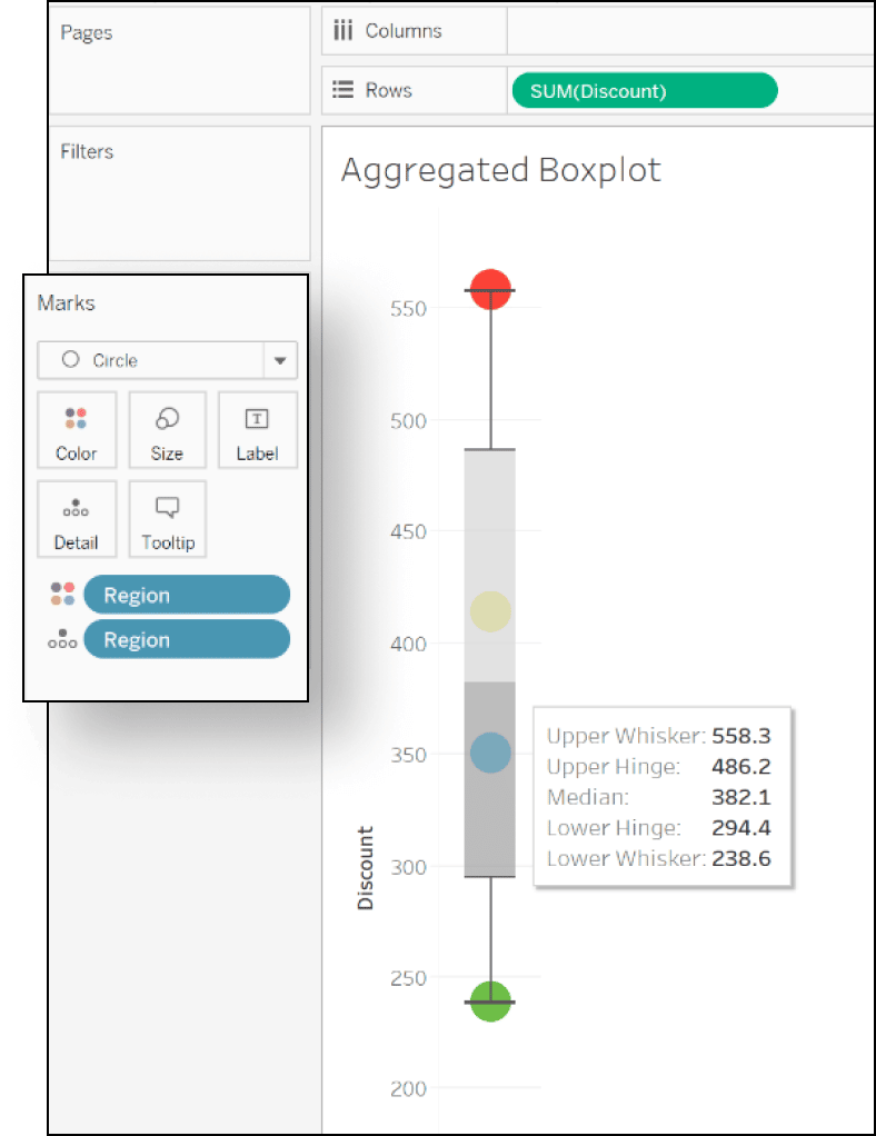
Yet, I am really not satisfied with how the regions are displayed in this view. It gives me the total Sum of Discounts for each of the regions and how they are placed on the box plot, but it adds little value as I am not able to see if that high discount from e.g. the red region is driven by a large number of sales or if it truly is driven by outliers in discounts.
In order to get these additional insights, we need to disaggregate the data. To disaggregate data in Tableau, you will need to go to the top of your screen into the “Analysis” section and deselect where it says “Aggregate Measures”.
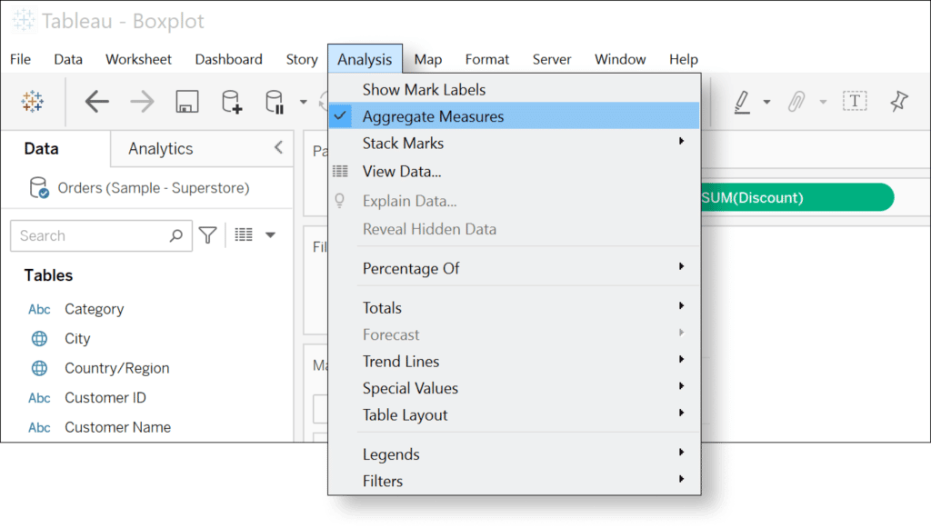
By doing so, and by dragging Region on Columns, you will now be able to see how much Discount was given by each region on average as well as it’s outliers. You are immediately able to see that the Central region is giving the highest discounts and has the largest interquartile range out of all the other regions. In addition, when you hover over your created box plots you can also identify that the median discount of the Central and South region is 20% whilst it is 0% for the East and West region. This means that East and West, in around 50% of the cases, do not give a discount at all. With just three clicks you can generate a box plot and immediately start digging into your business data.
To visualize everything a little bit better, I replaced Region on the Color property of the Marks card with Discount and added both to the Labels property of the Marks card. I then selected to only display the maximum value as the Label to not overcrowd my view.
The second way in Tableau to create a box plot is actually on an existing visualization such as a bar or line graph. To illustrate, I start with a line chart with Order Date on the Columns and Profit on the Rows shelf. I then added Region on the Detail property of the Marks card and to show some labels I added Region and Profit to the corresponding card as well which should give you a view something like the one below.
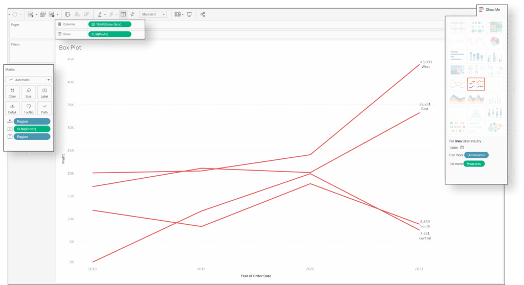
PS: Mind you, if you are creating box plots this way you will see aggregate values, so when you are putting the box plot on the view, it will only show one box including the data and not four for each region like we saw in the previous example.
To add the box plot you now have two options:
The first option is to go to the Analytics pane and drag Box Plot onto the view
The second option is to right click into the Y-axis and select “Add Reference Line” where the fourth option to the right shows the box plot. Here you can also select how far your minimum and maximum Whiskers should go. By default, it is 1.5x the interquartile range, but this can be changed to the “Maximum extent of data”.
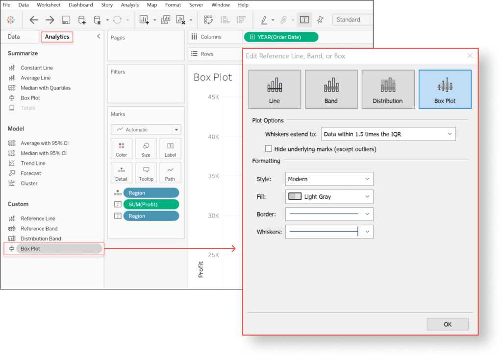
Personally, I would recommend keeping the default setting with the minimum and maximum Whiskers at 1.5x the IQR because this will later allow you to better identify outliers and analyze them.
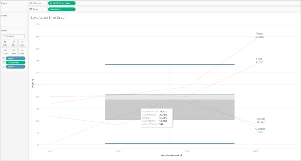
A useful additional feature, when you set up your box plot as a reference line, is the little checkbox that allows you to hide underlying marks with the exception of outliers. It will get rid of the lines on your underlying line chart and only highlight the values that are considered outliers outside the 1.5x Interquartile range.
I prefer to keep the underlying data in the view but making it less visible by reducing the opacity of the lines and the thickness of the lines to a minimum, which in the end, could look something like this:
How to make additional use of box plot information
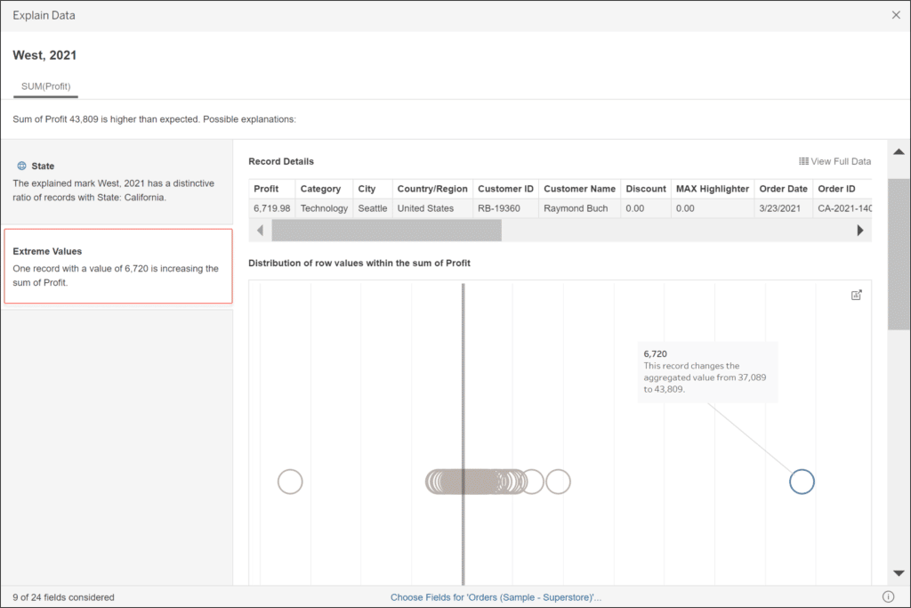
An additional, very helpful feature that I found while writing this blog, is “Explain Data” in combination with outliers identified through using box plots. I have to admit, I often do not make use of that feature, but in this case, it is extremely helpful and I definitely want to make sure to show you these.
When you identify an outlier that falls outside your minimum or maximum whisker, you can right-click on the data point and select “Explain data”. This will open up a separate view with all sorts of details, but the really important one falls under the section “Extreme Values”.
Hint: If the “Explain Data” section is greyed out, make sure you are clicking on one specific point of the data and nowhere else within the box plot.
For the example I did in the previous section with the line chart, the outlier would be the Western region as it was far outside the maximum whisker. To see what was causing the outlier, I clicked into the Explain Data feature and Tableau automatically showed me how the data is distributed, highlighted the outlier, and even indicated what the aggregated Sum of Profit would be without this outlier.
![]()
In addition, if you have a closer look on the top, above the visualization, it even gives you the record details of this specific outlier and details about the order, who the order was from and when it was made.
If you want to create a visualization yourself that shows the distribution of data the same way, I would recommend creating a jitter viz. The introduction to jitters and how to combine them even more creatively with box plots can be found in our post linked below.
Why and How to Make Jitter Plots in Tableau
I hope I was able to change your mind about box plots and make them appealing again!
As always – stay hungry,
Maggy


Written By
Maggy Muellner
Related Content
Statistical Tableau: How to Analyze Distribution with Histograms

There are many times when performing data analysis when we may want to view the distribution of our data. One…
3 Creative Ways to Visualize Outliers in Tableau
There are many ways to detect outliers in your data, but flagging them for your end users may present some…

Ryan Sleeper
Highlight insights by adding statistical context to your line graphs Do you ever experience unnecessary stakeholder panic or jubilation when…