3 Simple Ways to Improve the UX of Your Dashboards

At Playfair Data, we pride ourselves in improving the UX of dashboards to transform raw data into powerful insights. To do this, we use our in-house developed framework called the “Decision-Ready Data Framework.” When creating dashboards, it is important to keep basic user experience design principles in mind. Prioritizing this during the creative process will guarantee that your final product is usable, efficient, and enjoyable.
In this post, we will go over some easy ways to improve the user experience of your data analytics projects in just 3 simple steps.
Establish relationships through proximity
Behind every well-crafted dashboard, there is an understanding of human behavior. The Gestalt Principles of Perception mention seven ways our brains take mental shortcuts to make sense of the world around us. All seven of these principles are essential when making design decisions, but the two that we’re focusing on today are proximity and similarity.
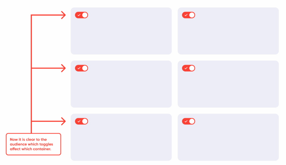
The principle of proximity states that people perceive the distance between two objects as proportional to their relationship. In other words, objects closer together are considered related and unrelated when farther apart.
Continue reading with a free account, or login.
Unlock this tutorial and hundreds of other free visual analytics resources from our expert team.
Already have an account? Sign In
By continuing, you agree to our Terms of Use and Privacy Policy.
Keeping this in mind, we can structure our design accordingly. We can convey relationships in our dashboards by making sure content related to one another is placed together. Using the space between containers, layout positioning, and UI elements, we can establish a visual grouping in our data to tell a story.
See this principle put into action as I move the toggle buttons closer to their corresponding content.
Establish relationships through similarity
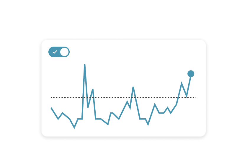
Another Gestalt principle – similarity – comes in handy when evaluating the user experience design of our dashboards. According to this theory, objects that appear similar to each other are naturally grouped. In the same way, those that look similar are also expected to have the same functionality.
To put it differently, if elements look like a button, users will expect them to act as buttons.

When possible, make sure that your clickable elements use different colors than your data visualizations. Doing this will promote intuitive navigation of your dashboards by associating a color with actions and controls. It can also avoid wrongfully associating actions with specific data points.
In the example below, different elements that share the same color must also share a purpose. In this scenario, all filter items share the same color, layout position, and formatting – while not strictly positioned close to one another. So, we are safe to assume they work in the same way because of their similarities.
Guide users through instructions
As creators, analysts, and designers, we spend countless hours looking at the same data. It becomes easy to lose sight of who our users are. We forget that our users come into our dashboards with only seconds of seeing the same data. These concepts that may come naturally to us may be perceived differently by our users and will take time for them to grasp. Our role as designers is to help users digest the same data in a shorter amount of time than it took us to put it together.
To help them, we can add instructions in various places to give them reminders and subtle hints about the data being visualized.
Everyone has different levels of data literacy. Some may spend all day reading reports and navigating complex topics and dynamic systems. Others may only come into contact with a dashboard visualization every so often. Whatever the case, decision-ready dashboard designs should be approachable and user-friendly to accommodate everyone.
Adequately documenting your dashboards – using a concise and universal language, making use of helper texts, and providing guides and instructions – we can contribute to reducing cognitive load and promoting usable interface designs.
See this final step implemented below.
Conclusion
At Playfair Data, we aim to ensure that our products are efficient, enjoyable, and reliable. When creating your next dashboard, keep these three UX tips in mind to foster seamless experiences for your audience.
To learn more about user experience, dashboard creation and design, and much more, join Playfair+, our Premier Visual Analytics eLearning platform.

Written By
Luke Lewis

Peer Review
Rafael Simancas
Sr. Manager, Brand Strategy
Related Content
3 Creative Ways to Add Instructions for Your Users in Tableau


When you publish a Tableau dashboard, you want to ensure that every user, regardless of their data literacy, can easily…
3 Innovative Ways to Use Figma in Your Visual Analytics Projects
What does design software have to do with visual analytics software like Tableau? At Playfair Data, we approach our visual…
How to Completely Customize Multi-Select Filters in Tableau

Filters play a crucial role in allowing users the flexibility to manipulate dashboards to their liking. Multi-select filters can be…