3 Innovative Ways to Use Figma in Your Visual Analytics Projects


What does design software have to do with visual analytics software like Tableau? At Playfair Data, we approach our visual analytics projects with our own process called the “Decision Ready Data Framework”. This framework makes sure that our end product produces insights that help a company turn their data into value. The framework diverges into four steps: discovery, data, dashboards, and distribution. While Tableau is our preferred choice for data visualization, we also use Figma, an interface design software tool, throughout our visual analytics process. Though traditionally used to prototype applications, it reinforces different roles throughout our process and allows for fluidity and innovation in our practices.
Learn more strategies with Playfair+
This post will focus on the first 3 steps of the decision-ready process to demonstrate a few interesting ways you can incorporate Figma into your visual analytics projects.
What is Figma
Figma is a UI/UX design application focused on interaction design, prototyping, and development tools. Widely used throughout the industry, it offers a way for teams to collaborate on every phase of the design process. Its adaptable features have supported the design of websites, mobile apps, presentations, and much more. It can run in a browser and offers a range of tools for creating screen-based designs and prototypes. Figma offers free and paid versions, so it is easy to get started and allows for upgrades as your needs change.
Check out figma.com for more information.
Integrating Figma during discovery
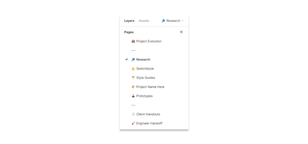
During the discovery phase the focus is on defining and understanding the audience who will be using the visual analytics tool and their objectives. Doing this requires interviewing stakeholders. Figma is a great collaborative tool for collecting notes and visuals across a team. Our teams create projects for each client and then a collection of pages within each project for notes, research, style guides, and mockups. By keeping a consistent project structure within Figma, we achieve improved communication and documentation transfer across team members as we each know where to find different types of information.
Collecting different types of information from the client is important, and keeping it close at hand and organized helps to answer questions as the concept evolves.
Continue reading with a free account, or login.
Unlock this tutorial and hundreds of other free visual analytics resources from our expert team.
Already have an account? Sign In
By continuing, you agree to our Terms of Use and Privacy Policy.
Using mood boards
As we collect information about the audience and the objectives, we also collect brand guidelines or style guides. We have found that integrating branding into the final product design generates a positive response, increasing user adoption. In other words, branding can influence the effectiveness of a product’s ability to fulfill user needs and deliver an enjoyable experience where users can better adapt to the new tool.
![]()
Creating mood boards is valuable in the early stages of development because it serves as inspiration for the final product’s appearance. There is a delicate balance between a tool that highlights insights, that is user-friendly, and that the expression of the brand is appropriate.
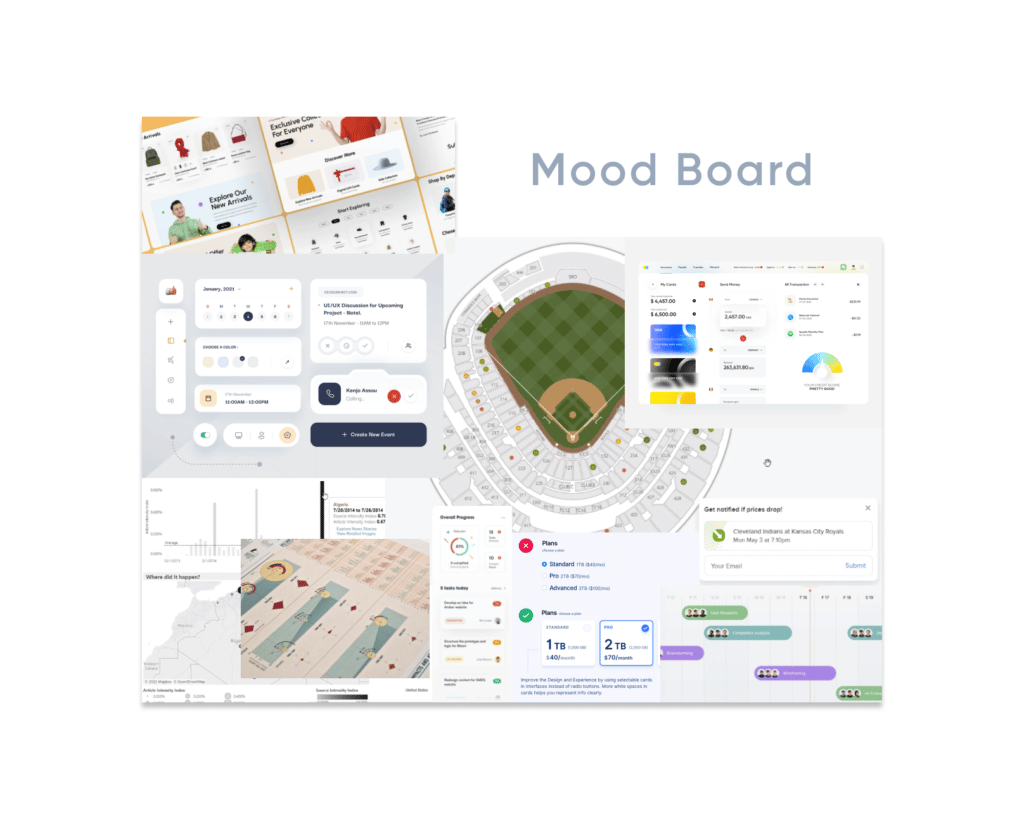
A mood board is a collection of existing designs that, when grouped, suggest a feeling or mood. We must understand that a mood board brings together many visual elements and should not be mistaken for a final visual solution. I look for inspiration at many websites; here are a few of my favorites:
I will also capture screenshots of the client’s web page to understand how they use color, layout, and even the voice of their copy.
You can use these resources and organize your visual findings in Figma for easy access, the flexibility of mood board creation, and the ability to share with your team or client for feedback.
Visualizing data schemas
Once we understand the audience and their objectives, the next step in our framework is to look at the information that needs visualizing. Our data engineers access, explore, and shape the client data to fit the proposed design solution. The measure of success at this stage is dependent on the team’s ability to understand the data at hand.
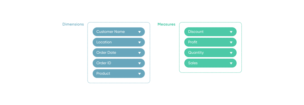
Generating a list of dimensions and measure names as a first step helps us conceptualize the layouts, interactions, and chart types.
Simultaneously, we typically compile a series of data-related questions during our exploration. These are on a case-by-case basis and are dependent on the state of the datasets provided to us.
Some questions we may ask include: Does the data contain many measures that will need to be combined into ratios? Do dimensions contain hierarchies? Is filtering important to get to the insights?
As we answer these and many more questions, possible solutions start taking shape.
To help us work through these questions, we use Figma. We build out our own version of Tableau “Pills” for dimensions and measures. Using the pill design language of Tableau helps us communicate eventual solutions to our dashboard engineers and is a fun way to collaborate.
Laying out dashboards
The third step in the Decision Ready Dashboard Framework is Dashboards. At this point we are using the information gathered about the audience combined with the mood boards and the data schema to lay out the final visual analytics tool.
![]()
There are many methods to lay out a dashboard in Tableau, but one of my favorites is what I call the Gray Box Technique. Nothing too fancy, just simple gray boxes with labels that simply show what type of functional interface item will live in a particular space.
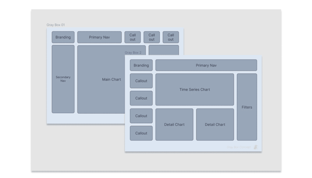
I like to start very simple with items like a navigation element, a chart, maybe a call out, or a filter. What this allows is iteration. In Figma it is easy to create a few of these elements and then use them repeatedly. This way, I can create 10 or 15 options very quickly and evaluate the flow of the dashboard. I might do a few rounds of this technique to land on a few options that hold promise.
Conclusion
Figma has become an integral part of our process here at Playfair Data. Its highly collaborative nature, intuitive interface, and ultimate flexibility are second to none.
Thanks for reading!
Jason & Rafael

Written By
Jason Penrod

Written By
Rafael Simancas
Related Content
3 Reasons to Learn Figma as a Data Analyst

Figma isn’t just for designers. If you’re a data engineer, analyst, Tableau / Power BI user who has been curious…
How to Create Better Dashboard Layout Designs with Figma
Being able to apply some basics of dashboard layout design to your visual analytics projects in Figma can bring a…
3 Ways to Wow Stakeholders with Figma
When it comes to demonstrations, it goes without saying that you want your stakeholders to walk away “wowed.” But what…