How to Create Better Dashboard Layout Designs with Figma


Being able to apply some basics of dashboard layout design to your visual analytics projects in Figma can bring a surprising amount of benefit. As we discuss this topic it is important to know how Playfair Data thinks about the roles and titles of individuals involved in the development process.
- Visual Analytics Architect: Usually has a background in design and uses design software, in our case Figma, to prototype and wireframe interface designs for visual analytics tools. They are also responsible for the user experience (UX) of the tool which is essentially understanding the needs of the end users and ensuring the deliverables meet these needs.
- Visual Analytics Engineer: Primarily works in Tableau to produce the various sheets and dashboards that become our final deliverables to the client. They usually have a background in data including data analysis, data engineering, data science or other related fields.
These two roles work very closely together to create the features and functionality that make up the front-end of our visual analytics tools. Using Tableau and Figma together can aid in preconceiving the design of a dashboard and help in communicating its purpose to the engineer.
Learn Design Tips and Tricks with Playfair+
Before getting started on Figma or Tableau, an architect can begin the exploration of layouts with a simple piece of paper. In UX, paper prototyping has been highly encouraged across many design fields and designers. Among its many benefits, we can save a lot of time and effort by first sketching our layout elements before fully fleshing them out in high-fidelity prototypes.
In this exploration phase, we are looking for the ins and outs of a system. We look to understand the information we will be working with, the UI elements in use, and the user flow. In the following blog, we’ll dive into the different elements and principles of layout design and where we can find them in Figma.
3 Ways to Add a Button to a Tableau Dashboard
What is layout design?
In short, layout design involves the precise arrangement of various design elements together in a single space to communicate information. The successful layout will be both visually appealing and easily readable. There are specific design elements and principles to follow to achieve a successful layout design. A dashboard that is visually appealing but not easy to understand will not produce a satisfactory user experience. Our job in designing data rich interfaces is to present the information in a way that expedites the user’s understanding of the data and provides enough interaction to reveal insights that can be acted upon. At the same time we should strive to create a visually pleasing interface that instills confidence in the information being presented.
![]()
Layout design elements
As you begin to sketch your dashboard, you’ll start brainstorming about the different elements you’ll need to achieve a layout design. These are the various bones of your skeleton: text, lines, shapes, images, and space. Strategically choosing them can impact your audience’s understanding of your product. We’ll also show you where these elements are typically found and used in Figma.
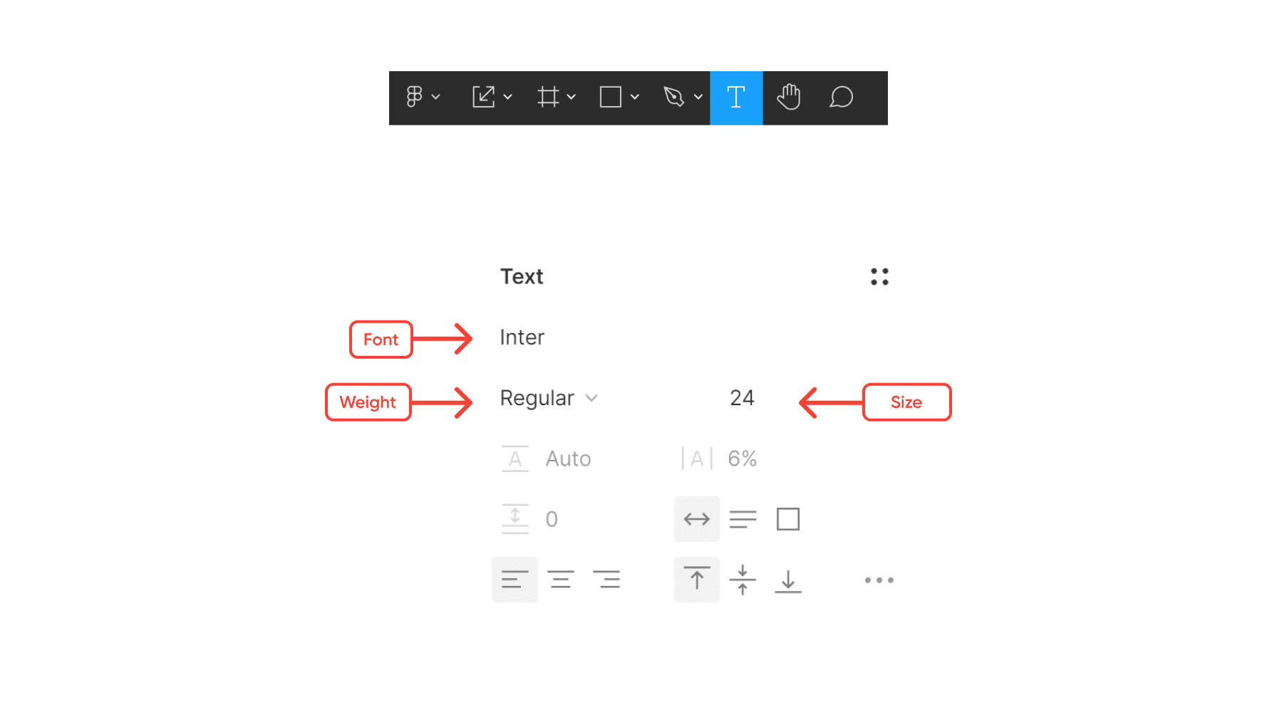
Text
Typography is among the, if not the most, important element you’ll have on your page. Text can evoke an array of tones and will most likely influence the first impression of the sort of content and message you are trying to communicate. Different typography can range from professional to playful looks. When choosing, consider matching the typography to the tone of your content. Also, consider your company’s brand and if it matches its language.
Another important aspect of typography is its part in creating a visual hierarchy. The weight, height, and size of your text can guide the audience and tell them exactly where to look and in which order to digest the information. Larger font sizes, such as headers, naturally catch the reader’s eye and indicate a point of convergence.
Continue reading with a free account, or login.
Unlock this tutorial and hundreds of other free visual analytics resources from our expert team.
Already have an account? Sign In
By continuing, you agree to our Terms of Use and Privacy Policy.
Lines
A line is when two areas, or points, in a space meet. They vary in width, length, direction, and color. They don’t even have to be straight and continuous – they can be rough, curved, and dotted. Lines guide the eyes to specific areas in the design as they create division and constraints among your visual elements.
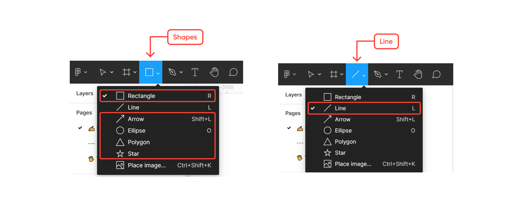
Shapes
Shapes are two-dimensional objects that emphasize areas in the architecture because their anatomy – lines – implies boundaries. Shapes help us set apart one content from another when necessary, through the use of containers, cards, or forms.
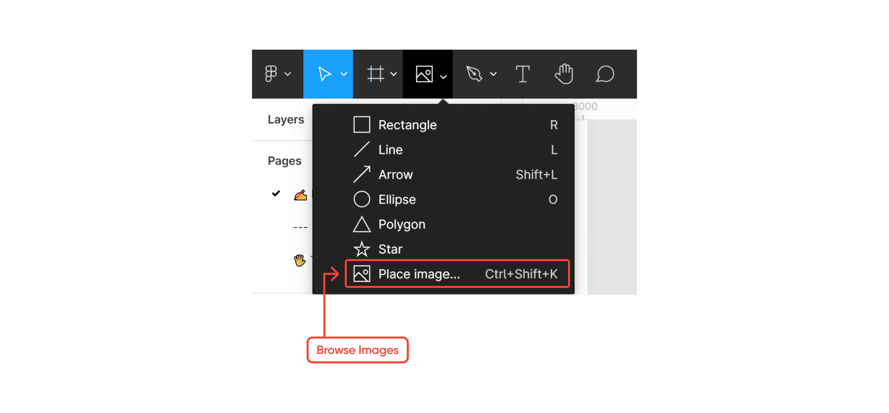
Images
Images are the use of shapes and colors to become a visual representation of something. These become the most engaging areas in your design, and you can use them to convey the message without words. In our world, images work the same way data visualizations do. They engage the audience with the content in a more creative and easily digestible way.
Space
Space is the deciding factor between a relaxed perception of information or an overwhelming one. This might be one of the elements designers and analysts forget most often about. When looking at a dashboard, and we see white space (“negative” space), we are tempted to fill that space with information or content (“positive” space). It is fair to believe the audience will assume empty space as a signifier of missing information or missing data. We quickly jump to the decision of filling that space with something – anything!
Kenophobia, the fear of empty spaces, could easily be suffered by designers, analysts, and stakeholders alike. Negative spaces are just as important as the content itself. When used correctly, it enhances the readability of your dashboard by ensuring there is sufficient space between objects (text, visualizations, shapes, etc.). It also helps to simplify the design, breaking content and areas of the architecture into smaller chunks, so the audience is not overwhelmed – creating breathing spaces. It can even achieve a sense of modern style – giving it a clean look where less is more. Furthermore, it helps to draw attention to specific areas of the page that may be of interest.
This is how you can explore spacing in Figma:
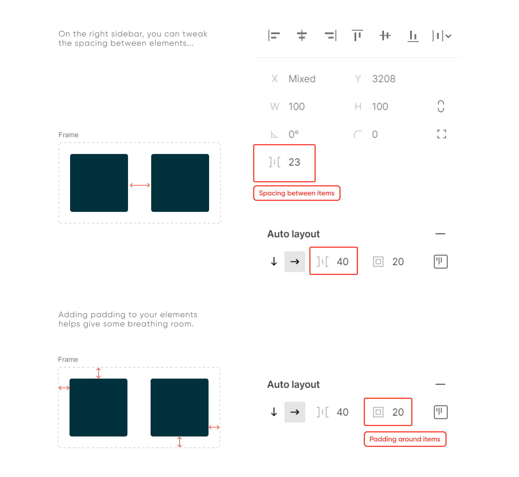
You can play around with how much whitespace you want to add to your UI elements and quickly explore the layout before taking your dashboard to the next level – development.
Dashboard layout design principles
Beyond the bits and pieces of the layout, there are certain principles or rules of thumb to consider for a successful design: hierarchy, balance, alignment, and proximity.
Hierarchy
We use hierarchy to arrange the shape of the visual information in a certain way to imply order and importance. There are three ways we can communicate this:
- Size: larger objects will naturally draw the user’s attention, whereas subsequent sizes will help create a direction.
- Contrast: elements with higher contrast will stand out most among lower contrast elements.
- Placement: positioning elements strategically can communicate hierarchy, where stand-alone objects tend to draw more attention to themselves.
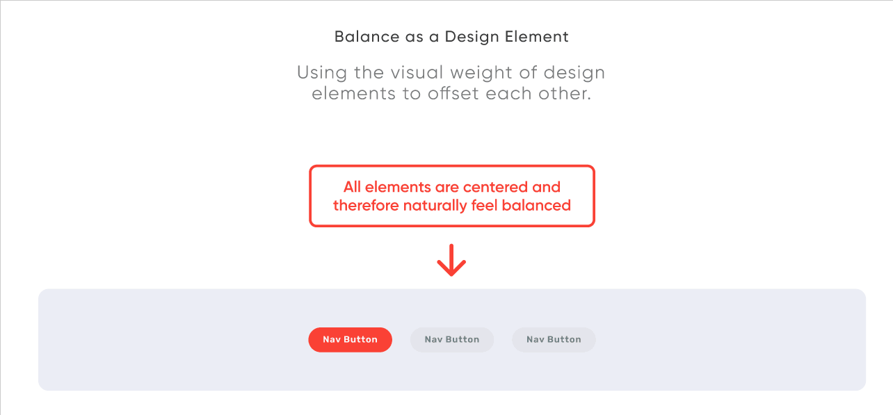
Balance
Funny enough, there are two ways to achieve an eye-catching design by making your layout balanced and also unbalanced.
![]()
A balanced design, where symmetrical or asymmetrical, is when the elements in your layout balance each other out. It makes your content appealing and clean. On the other hand, an unbalanced design, when done correctly, can draw attention to specific areas that may look out of place. When done incorrectly, it can look messy or unorganized.
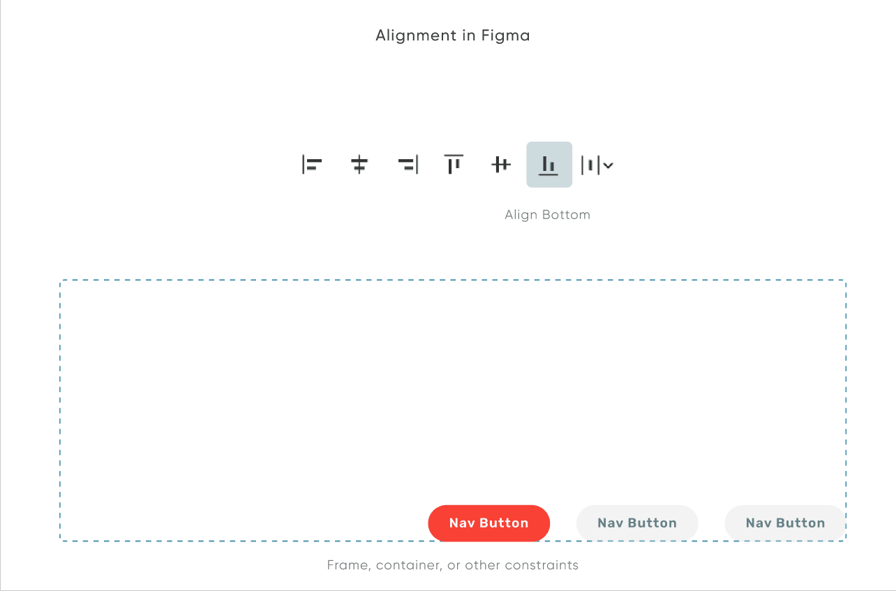
Alignment
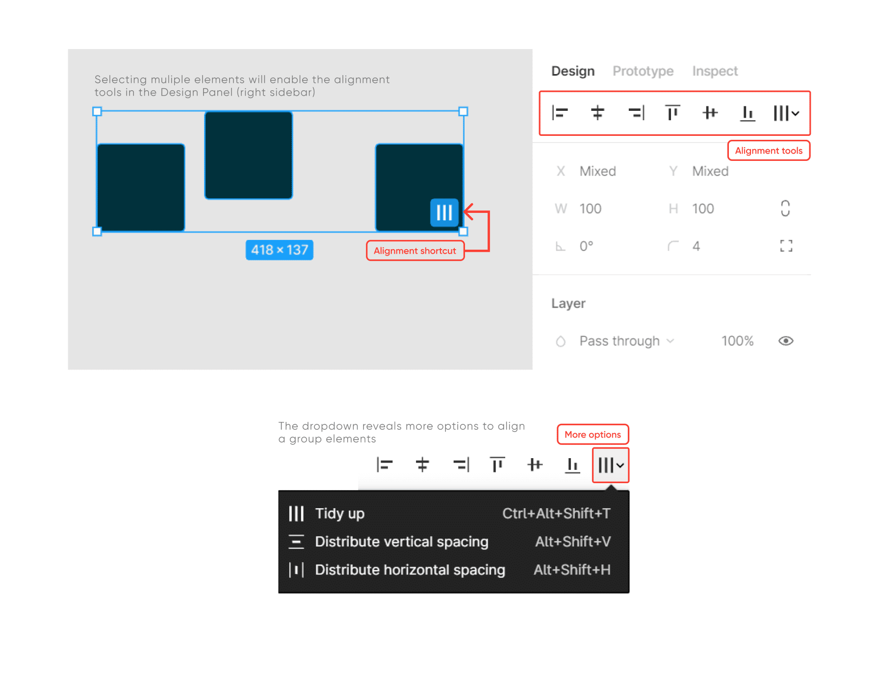
We use alignment to arrange the different elements of a design in relation to one another. When we do this, we choose between edged alignment – when elements are aligned to the top, bottom, left, or right edge of a layout – or center alignment – when elements are aligned to the centerline.
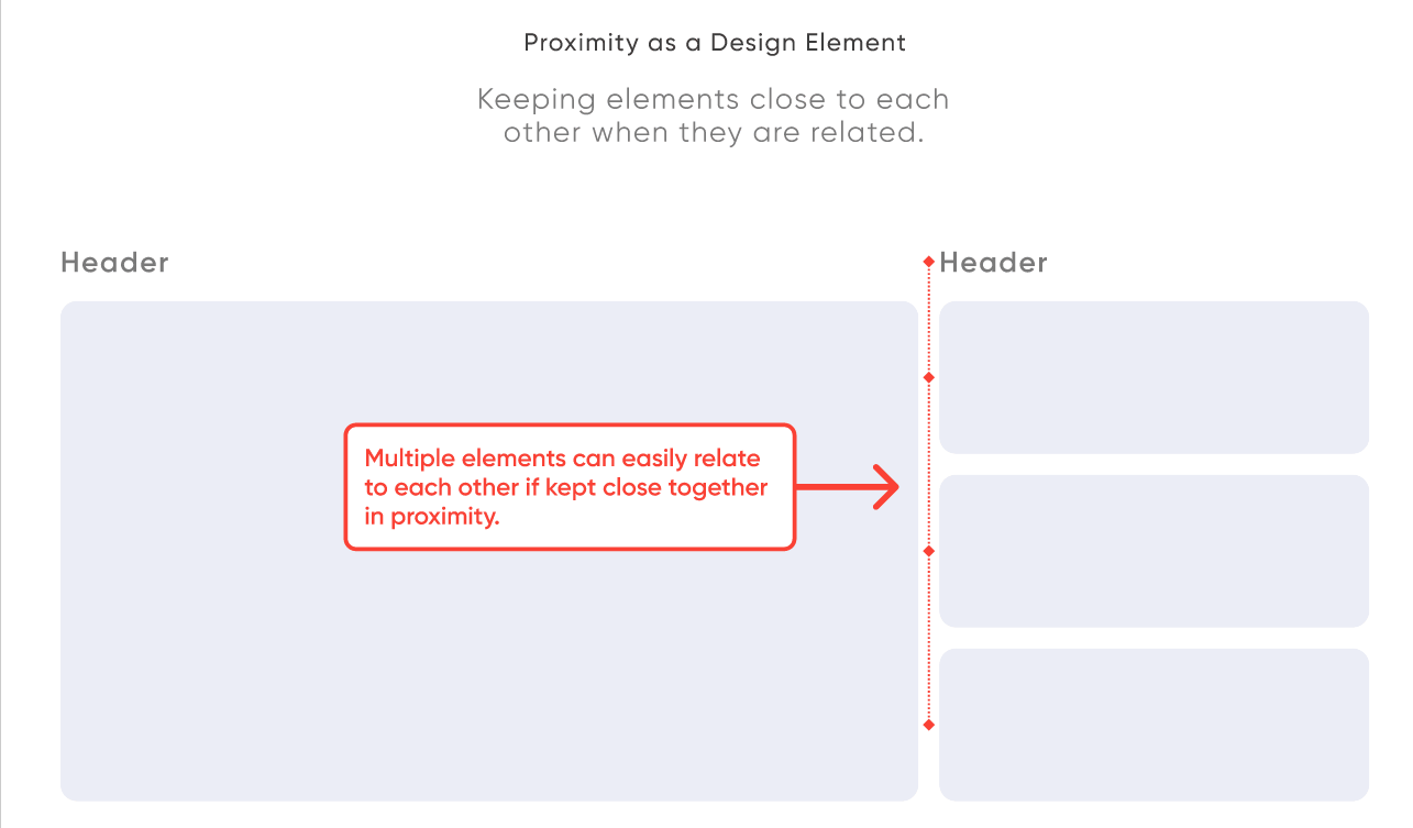
Proximity
Depending on how close or far some elements are to one another, we naturally assume a correlation. Being mindful of the distance we add or remove within our content can add to the legibility and understanding of the design.
The value of dashboard layout design for Tableau projects
Now that we explored the Figma environment and its different tools for better layout design, how does this translate to designing dashboards in Tableau? There are various reasons why sketching a dashboard before engineering is beneficial. Above all things, it will save you time and effort and can make planning and strategizing a lot more efficient.
At Playfair Data, we refer to our designers as Architects because they ideate, plan, and proof how the product will ultimately look and behave. Dealing with data and tableau engineering can become an overwhelming task. Architects help make data-related projects concise and manageable.
Some aspects where dashboard design can improve your work structure are as follows:
- Discovery & Brainstorming: sketching helps to brainstorm design solutions, evaluate the user experience, communicate with clients to translate the product’s needs and solutions, and assess the success rate of the overall project.
- Resource Planning: designers, engineers, and strategists will conceive the time and level of effort required and assess the engineering feasibilities.
- Development Shortcut: having a design will help guide engineers and save them time when creating the actions and visualizations in Tableau.
- Documentation: design iterations and sketches serve to document changes, client requests, project history and keep the end goal in mind for what the product should solve and achieve.
The takeaway
When designing dashboards, prototyping tools like Figma can serve as the creative space for your team to grasp the scope of a project. A layout plan can help guide everyone in the project towards the same end goal. A great layout design assures your dashboard is readable, enjoyable, and actionable. Keeping the design layout elements and principles in mind improves your workflow and enhances your user’s experience.
Until next time and have fun!
– Rafael

Written By
Rafael Simancas

Written By
Jason Penrod
Related Content
3 Innovative Ways to Use Figma in Your Visual Analytics Projects
What does design software have to do with visual analytics software like Tableau? At Playfair Data, we approach our visual…
3 Reasons to Learn Figma as a Data Analyst

Figma isn’t just for designers. If you’re a data engineer, analyst, Tableau / Power BI user who has been curious…
3 Ways to Wow Stakeholders with Figma
When it comes to demonstrations, it goes without saying that you want your stakeholders to walk away “wowed.” But what…