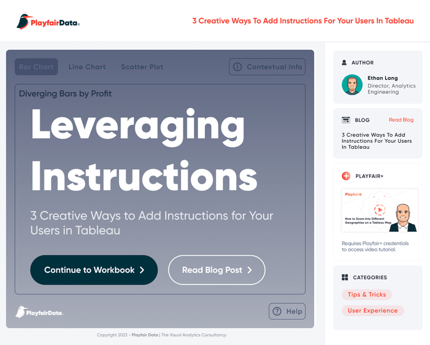
3 Creative Ways to Add Instructions for Your Users in Tableau


When you publish a Tableau dashboard, you want to ensure that every user, regardless of their data literacy, can easily interact with your dashboard. This can be challenging to achieve, especially when we are constructing tools that solve very complex problems. How do you ensure that every user will understand how to use the tool, what methodology is being used, and guide them through their analysis? Over the years, we have come up with several solutions to add instructions to a Tableau dashboard, which we have consolidated into this tutorial.
After reading this content, you will understand how to implement a landing page, tooltip instructions, and user guide overlays into your dashboards. These are useful touches that ensure each user knows the tool and trusts the methodology in the underlying calculations.
How to design a landing page in Figma
Have you ever landed on an analytics dashboard and felt a bit… lost? A dashboard, packed with data and visualizations, can sometimes overwhelm anyone. This is where a well-designed landing page can help guide the user through complex dashboards, adjust settings before using a tool, or help a user link to documentation. Think of a landing page as the front porch of a house, guiding you seamlessly inside. Let’s dive into the first of our three methods to enhance user experience: Designing a landing page in Figma.
Continue reading with a free account, or login.
Unlock this tutorial and hundreds of other free visual analytics resources from our expert team.
Already have an account? Sign In
By continuing, you agree to our Terms of Use and Privacy Policy.
Prerequisites: Setting the stage in Figma
First things first, open up Figma. If you haven’t already, create an account and get familiar with the basics. We have some other resources to help you get up to speed if needed.
3 Ways to Wow Stakeholders with Figma
3 Innovative Ways to Use Figma in Your Visual Analytics Projects
How to Create Better Dashboard Layout Designs with Figma
The Value in Low-Fidelity Wireframes for UX and Dashboard Designs
💡 Tip: If you are not familiar with Figma, it is a browser-based visual design tool that specializes in designing interfaces and graphics for applications, websites, and other screen-based output. Figma offers a free account which has some limitations but is more than sufficient for most new users.
Think about the last time you tried out a new online tool or application that greeted you with a concise, visually appealing introduction of what could be done and quickly directed you to the correct place to take action. That is our goal.
Sketching the layout
Typically, start with the same pixel dimensions you used or plan to use for your dashboard. The key to landing pages is presenting a few paths for the user to follow. It could be different types of users that need to accomplish different things or new users vs long-time users. The aim is to guide, not overwhelm.
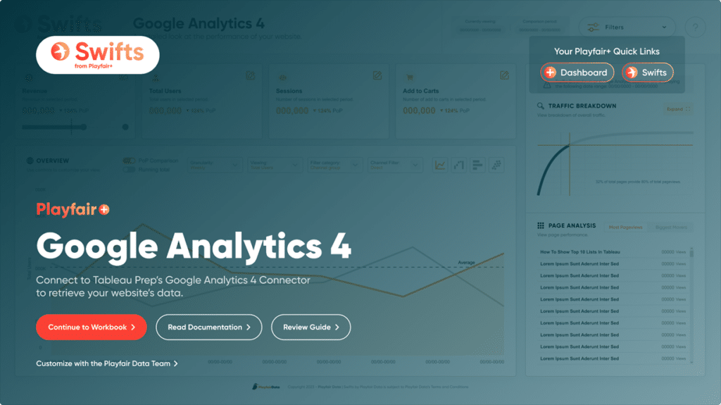
Example: for the Swifts from Playfair+, we designed the landing pages to lead the user to the following primary paths.
-
- The main workbook
- The documentation
- The Playfair+ Guide
We also added some secondary paths:
-
- Other Playfair+ Swifts
- The user’s Playfair+ Dashboard
- A link to a form to request help
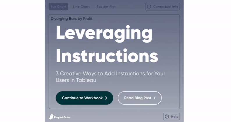
Notice how the design of the landing page uses a visual hierarchy to prioritize “Continue to Workbook”. Next, your eye will find the buttons that take you to the documentation and guide.
Finally, you see that you can link to other Playfair+ offerings and even request help from the Playfair Data team.
Incorporating the brand
To keep things consistent with your company or client’s branding, incorporate their color palette, fonts, and logos. This not only makes your design look professional but also instills a sense of familiarity and trust for the users.
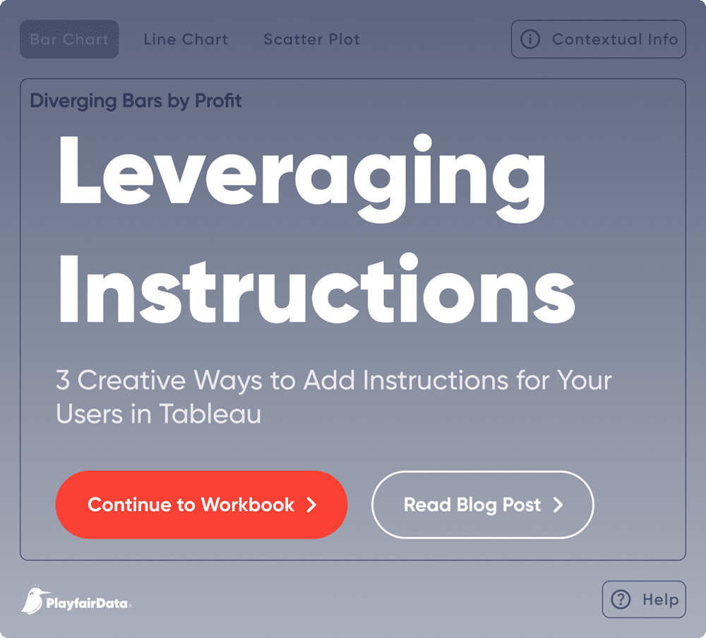
In this example dashboard, you can see the Playfair branding and hierarchy for the buttons’ importance.
Call to action (CTA)
Your CTA is the gateway from your landing page to the main dashboard. Make it prominent. Maybe a button that says “Dive into the Data” or “Start Analyzing”. Remember, it should be enticing enough for the user to click on it.
Secondary buttons and links should be less prominent and represent less mainstream paths. It’s important to not have multiple primary paths competing as this will add to confusion.
The Definitive Guide to Buttons in Tableau
Exporting your designs
Once you’re satisfied, it’s time to export your design. Figma makes this incredibly simple. Select your frame, click on ‘Export’, choose your preferred format (typically PNG for web use), and you’re good to go!
How to design informational element for tooltips in Figma
Starting small & simple
Tooltips are like the friendly guides in a museum. They provide additional information, offering insights without cluttering the main view. Designing a small informative element that provides a backdrop for our tooltip content.
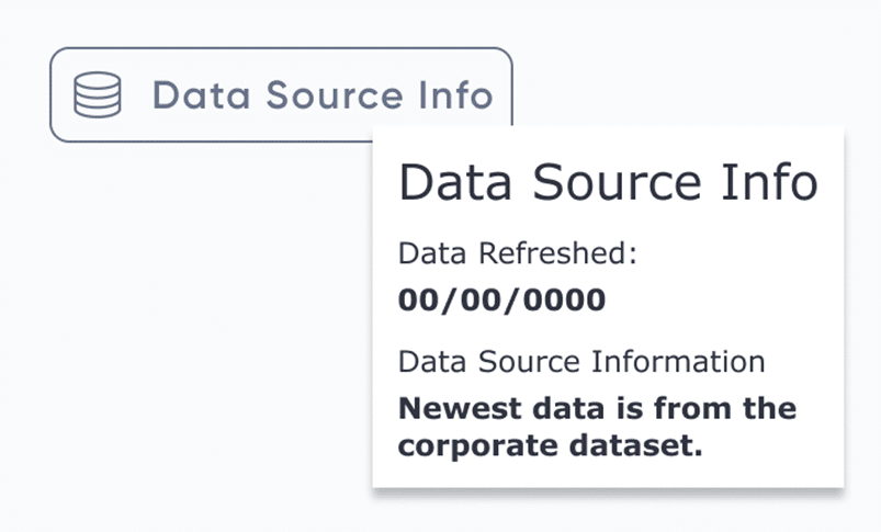
An informative element to add data source context, notice the subtle color, use of an icon, and providing a design for the tooltip.
Noticeable, not obtrusive
The design element should be noticeable, but not obstructive. The idea of this tactic is to only be noticed by the user when they naturally have a question or need more context within the overall design. If you are designing multiple dashboards it is a good idea to have such an element placed in a consistent spot so the user comes to know the element.
Add text
Keep your tooltip content concise. Add a text box, ensuring the font size is readable and the color contrasts against the element’s background. A few words can help prompt the user to explore the element and discover the tooltip’s content.
Some idea starters for creating contextual elements.
Tooltip formatting
Remember that the tooltip content can be edited both in it’s content and it’s formatting. I tend to design the look and feel of the tooltips in Figma where I can specify a typographic hierarchy. To learn more about typography we have a post that dives deeper into the topic:
How to Design a Typographic Hierarchy in Tableau
Export & share
Again, once you are satisfied with the element you can export it and integrate it into your Tableau workbook. When exporting small elements I tend to export them larger than 1:1. This helps small elements appear sharp and easy to read on high-dpi displays. For more tips on image resolution check this post out:
The Ultimate Guide to Getting High Resolutions In and Out of Tableau
How to design a user guide overlay in Figma
The final method in our trilogy is the User Guide Overlay. It’s like having a built-in manual, guiding users on how to navigate and use the dashboard effectively.
Frame your dashboard
Start by creating a frame in Figma that matches the dimensions of your dashboard. This technique requires using the “Fixed” dashboard sizing in Tableau. We are basically designing an image that will lay on top of your entire dashboard. You can fill this overlay with a solid color or a gradient. Typically a transparency is added to allow partial viewing of the dashboard below.
Design transparent highlights
Next we are creating “holes” or areas of 100% transparency where we will see the dashboard below. Think about the main features you want to guide your users towards. Design transparent shapes or highlights to draw attention to these areas.
Add instructional text
Beside each highlight, add a brief instruction. For example, “Click here to filter data” or “Hover over the graph for detailed insights.”
Finalize & export
Once you’ve covered all essential features, finalize your design and export it. Like before, consider exporting at a larger size and use the “Fit Image” and “Center Image” options in Tableau to make sure everything stays sharp on large monitors.
Remember, a well-informed user is an empowered user. Dive into these design methods, and watch as your analytics dashboards transform into user-friendly masterpieces.
Thank you for joining me on this design journey! This is Jason now passing things over to Ethan to explain how to integrate all of these design elements into Tableau dashboards.
How to incorporate a landing page in Tableau
From the technical side, implementing a landing page in Tableau is very useful. For instance, maybe you want to capture some input from the user, have them choose a starting point, or select certain filters to make the report more relevant.
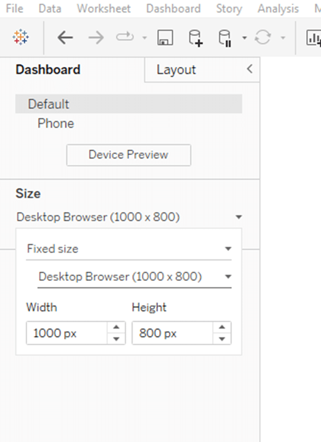
The first step is to create a new dashboard and size it the same as the dashboards within your workbook. In my example, the dashboard I have is sized to 1000 width and 800 height, which matches the default, “Desktop Browser” dimensions of a Tableau dashboard.
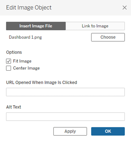
Next, I will drag an image object into the view and choose the image that Jason created for the landing page. After that I will click OK to close the menu.
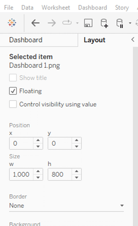
Now, I need to resize the image object to the same size as the dashboard so it covers the entire screen. To do this I will select the object and then toggle to the Layout pane in the top left corner. In the Layout pane, I will adjust the x and y coordinates to 0, change width to 1000, and height to 800, as shown in the screenshot below.
Once I have that image laid out on the canvas I just need to finish adding objects that would account for each call to action on the landing page. If I have a button that navigates to a different URL, I need to add an image object and set the URL. If I have a button that navigates to another dashboard within the workbook, I need to use a Navigation object. If you want the users to select parameters, you need to add a sheet then filters, set controls, or parameters that the user can interact with.
Making Your First Tableau Dashboard (Part 1)
For my example, I will add all the appropriate calls to action and call it done. My final landing page looks like this:
How to incorporate tooltip instructions in Tableau
This tactic has several use cases within a dashboard. It could be used to relay brief instructions on certain interactions, methodology you are using, or important information about the data. I use this tactic all the time on just about every interaction I can by just changing the tooltip text to say things like “Click here to see ABC happen”. This is just a subtle way to answer questions the users would have about the user experience directly in the tool. I also set up info buttons throughout the dashboard explaining the methodology I am using in certain complex calculations.
To implement this tactic I first need to load the image Jason created to My Tableau Repository. To do this open the folders on your computer, navigate to documents, double click on My Tableau Repository, then double click on Shapes.

From the shapes folder, I can create a new folder or load the image Jason provided to an existing folder.
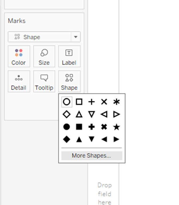
Jump back into Tableau and create a new sheet. In the sheet, change the mark type to Shape from the drop down, click on the Shape property and select More Shapes.
From the Edit Shape menu, click Reload Shapes and then navigate to the folder you saved the shape to in your repository. You should see it available from the list of available options
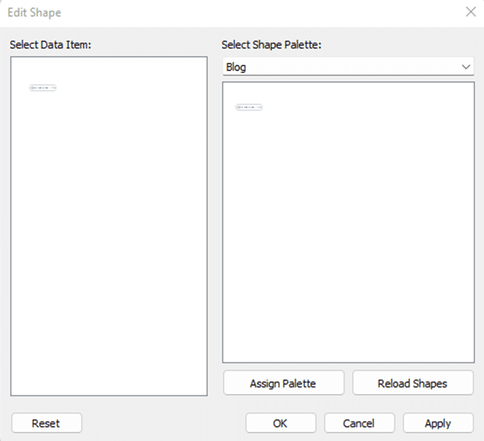
Now click OK to close the menu and set the shape. From the Authoring interface, double click into the empty space in the Marks card and create an empty text dimension by typing two quotes into the pill from the flow. Hit Enter on your keyboard and you should see the shape appear in the canvas as well as a new pill appear on the Marks card.
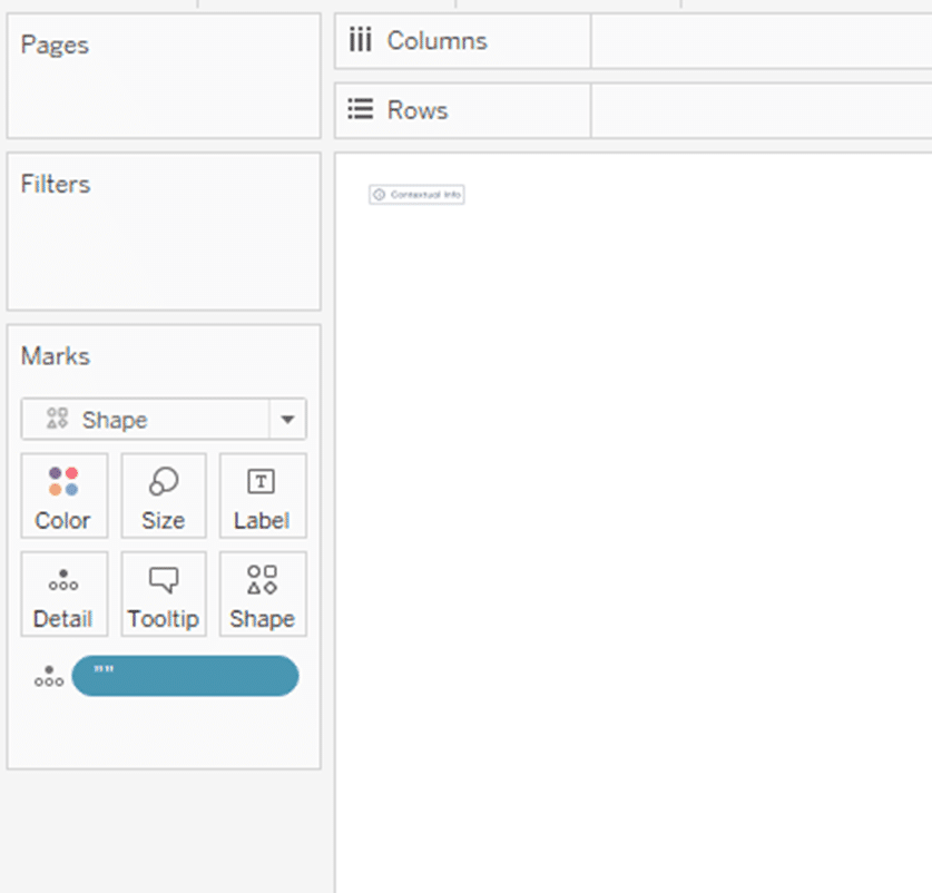
Now click the Tooltip property on the Marks card and enter the message you want displayed when the user hovers over the object on the dashboard.
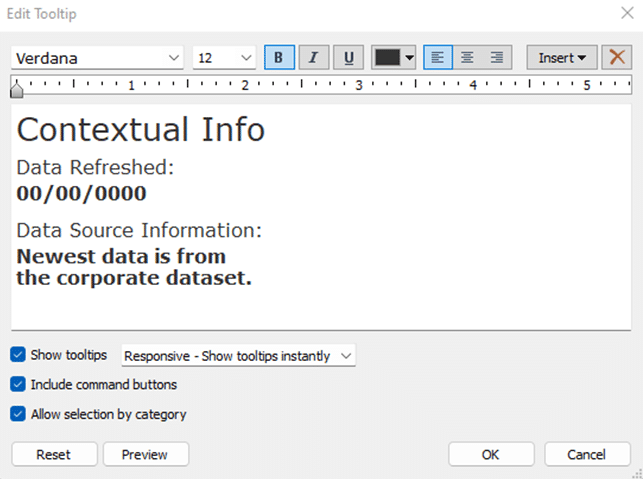
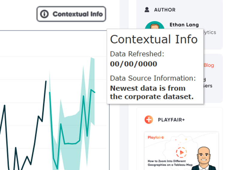
Last step is to add this sheet to your dashboard and hover over it to see if it produces the desired effect. Here is the final product.
How to incorporate a user guide overlay for instructions in Tableau
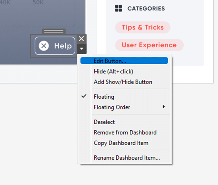
The easiest way to implement a user guide overlay in Tableau is using a Show / Hide button and an image object. First, drag an image object to your dashboard and then select the overlay image from your files.
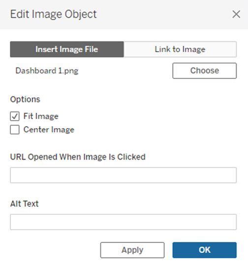
Click OK to close the menu and the image will be added to the dashboard. Next, click on the image, navigate to the top left of the Authoring interface, and toggle to the Layout pane. Set this object to cover your entire screen. This image should mirror the dashboard and give the users instructions to the UX throughout.
Next, you need to add the Show / Hide button. To do so, click the image object and select the carrot from the sheet menu, then click Add Show / Hide Button.
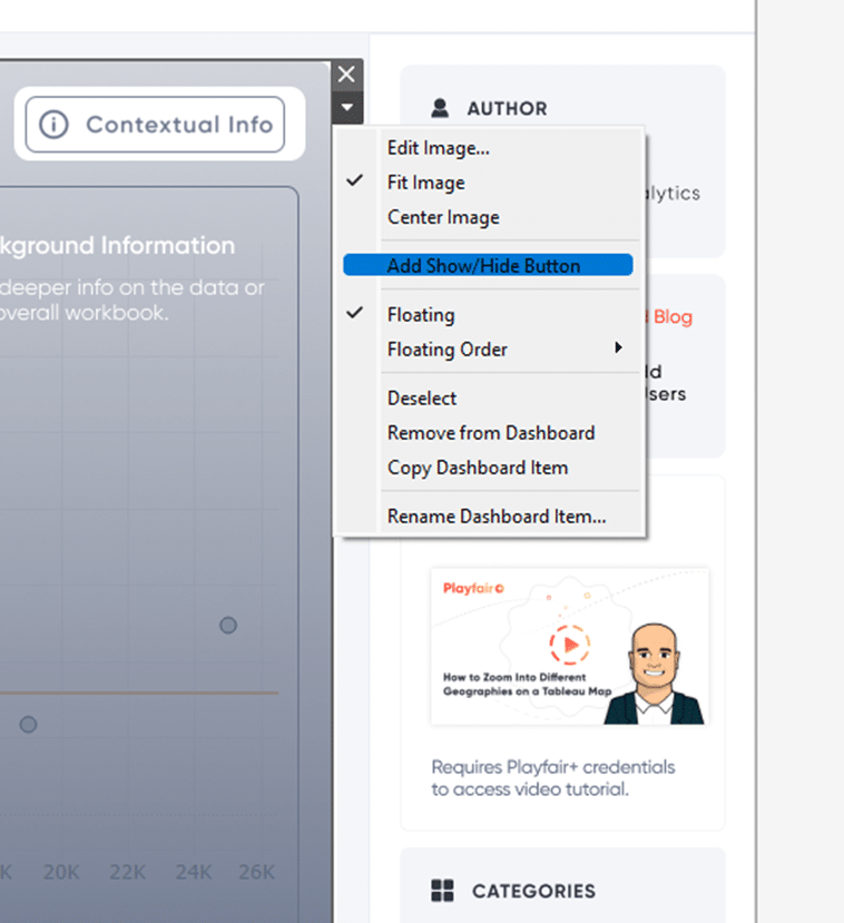
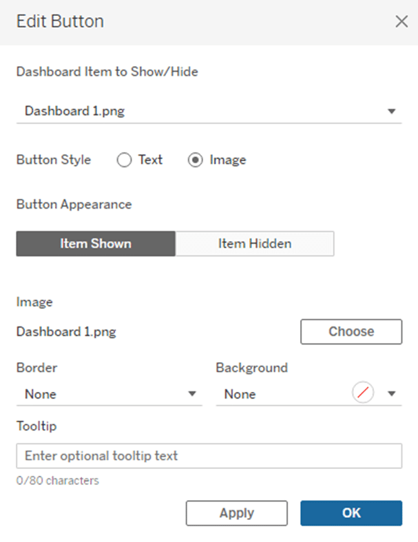
You will see a menu appear on the dashboard. Click on that new object and click Edit Button from the more options menu.
Now I will provision the button with the images that Jason gave me for the button itself. As you can see in the menu, you will need to assign an item shown and an item not shown image for the button.
Once you have pointed to the correct images, click OK and close the menu.
The last step is to align this button where you want to on the dashboard. Here is the final product with the instructions toggled on.
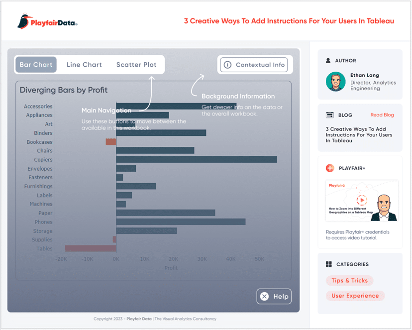
As you can see there is still visibility to the underlying view and clear callouts to important UX within the dashboard.
How to Add a Show/Hide Button to a Tableau Layout Container
Conclusion
In this tutorial, we showed you how to create the assets needed to implement three ways to incorporate instructions for your users. We showed you how to use those assets and implement them in Tableau effectively. Remember, when we build complex solutions for our users, we want to ensure they know how to use it. This will ultimately drive adoption of your tools and make the users feel more comfortable finding the answers they need.
Until Next Time & Stay Creative,
Ethan & Jason

Written By
Ethan Lang

Written By
Jason Penrod
Related Content
3 Simple Ways to Improve the UX of Your Dashboards

At Playfair Data, we pride ourselves in improving the UX of dashboards to transform raw data into powerful insights. To…

Ryan Sleeper
Allow your users to toggle between actual and normalized performance There can be value in viewing both actual data and…
Ten Tableau Text Tips in Ten Minutes
This is the fifth and final post in a series about getting the most out of text in Tableau. For…