The Definitive Guide to Buttons in Tableau

The Button. Seemingly simple — yet so powerful. As humans, we are well versed in buttons and have been trained to use buttons from a very early age. Look around your current space. I bet there are buttons you have used in the last few minutes, and there are likely buttons you have never used. We are surrounded by buttons and, for the most part, interact with them seamlessly. By the end of this post, you will have a reference to many of the Tableau button tactics we use every day at Playfair Data, and you will learn to create custom graphics for use in many of the tactics using Figma, an interface design software.
What are buttons?
Buttons exist for one reason: to allow users to interact with whatever we are designing. As a UX designer, interaction is a key ingredient in creating a user experience that enables a user to accomplish their goals efficiently and satisfactorily.
Tableau is slowly adopting button usage into its Desktop product. While buttons are still limited in Tableau, you can bring some UX polish to your Tableau projects by adhering to some general design guidelines.
3 Ways to Add a Button to a Tableau Dashboard
Part 1: A quick history of Tableau buttons
Interaction design
Tableau has always understood that interaction is a key differentiator that its analytics platform offers over others. Click a mark in a visualization, and you can filter multiple sheets and/or highlight the selection across multiple charts. I find it fun to show an Excel user this capability because I find it is the quickest way to show them what Tableau can offer over a spreadsheet.
While interaction based on selecting marks within a visualization is powerful, button interaction is different in that it is based on a button not being a mark on a chart. Buttons are stand-alone objects which are important for a couple of reasons.
Buttons being independent of marks and charts allow them to offer more abstract functionality outside of filtering and highlighting, for instance, navigation.
Buttons self-promote themselves as interactive; humans have been trained in both physical and digital contexts that buttons can be pressed or clicked on to manipulate the state of the object(s) to which they are attached. Even new users who have not seen a particular interface understand quickly that by pressing a button, some action will be performed. This principle relies on us following the guidelines we will talk about later so that our buttons appear to be buttons.
Navigation buttons
Until Tableau 2018.3, Tableau had not given much attention to buttons. If a user wanted to add a button to a dashboard, they would have to use a hack to transform a sheet into a button on their dashboard.
At Playfair Data, previous to 2018.3, we developed several tactics to accomplish button-like navigation before the capability was added.
How to Make a Navigation Bar with Buttons in Tableau
Tableau 2018.3 added “Button” objects, which were later renamed to “Navigation” objects in 2020.3. The Tableau projects developed at Playfair Data are vastly more complex than simple dashboards. Having these navigation features built into Tableau Desktop made implementing these complex tools much simpler.
Show/Hide buttons
Tableau 2019.2 added a Show/Hide option for Container objects. The functionality is simple on the surface: click a button and show a container and its contents; click the button again, and the container and its contents are hidden. This is a great way to hide less-used elements on dashboards, like long sections of filters and/or parameters.
One of the best parts of Tableau is the ability to take a simple feature like Show/Hide buttons and push its use beyond what it was first intended. At Playfair Data, we have pushed this technique to create many other types of button interactions, including:
● Zoom Feature: 3 Innovative Ways to Zoom in Tableau
● Boolean Toggle: The Easiest Way to Make a Toggle in Tableau
● Sheet Swapping: Tableau Tip: How to Do Better Sheet Swapping
Most recently, in Tableau 2021.2, the show/hide button can now be added to any object on the dashboard. Containers, Sheets, Text objects, Blank objects, and even the default Tiled container. It’s great to see Tableau understand that buttons are an important part of building a project. I am looking forward to seeing what is next for buttons in Tableau. Until then, there are cases where the built-in options are not enough.
Beyond the default button types
To date, this is where Tableau leaves off in its out-of-the-box solutions for buttons. Luckily though, this is not where the story of Tableau buttons has to end.
There are many tactics to make use of button interaction in Tableau using combinations of Tableau features like Sheets, Images, Calculations, and Actions. Below are a few previous posts that should give you some ideas of how to combine techniques to achieve results you may not have thought possible. Graphics can be used in many of these examples, so make sure you check out the next section, where I show you how to create your own custom graphics!
Formatting a sheet to look like a button
In this example, Ryan shows how to use a secondary data source to build a slick set of toggle buttons that, when linked to Dashboard Actions, allow the user to choose a specific measure value and date part independent of each other.
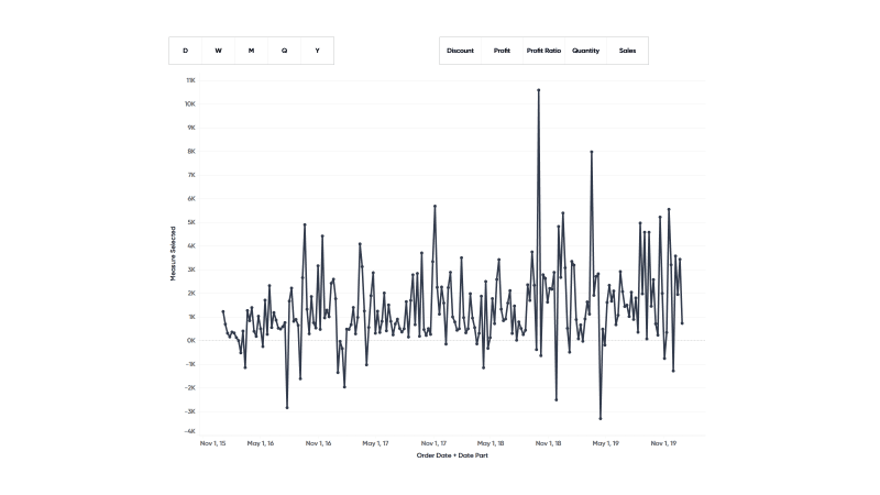
How to Use Control Sheets for Better Parameter Actions
Continue reading with a free account, or login.
Unlock this tutorial and hundreds of other free visual analytics resources from our expert team.
Already have an account? Sign In
By continuing, you agree to our Terms of Use and Privacy Policy.
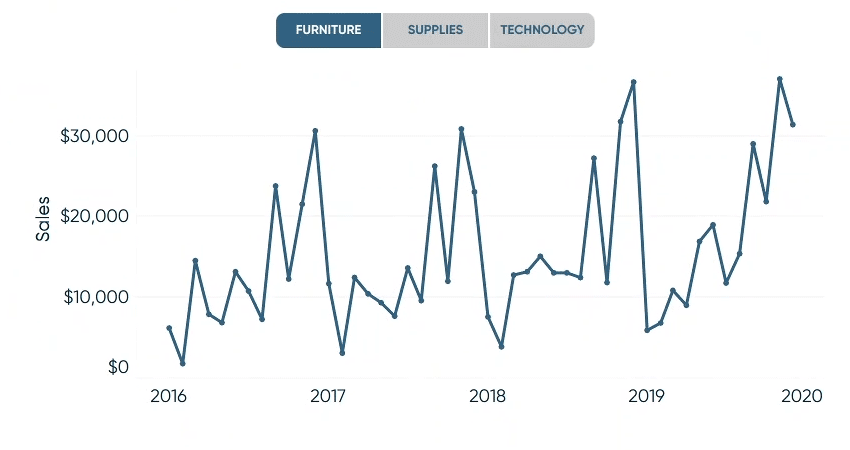
Custom shapes as buttons
Using custom graphic buttons is a great tactic for endless ways to deliver very professional results. This technique uses what we call “button swapping” to give each button a different “state”, like selected and not selected.
Custom shapes combined with formatted sheets
In my previous post about dropdown menus, I used an image swap and some tricky Boolean logic to create a dynamic dropdown button with a highlightable menu. That’s a mouthful but it looks great and allows for unlimited formatting options.
Part 2: Options for designing custom button graphics
Time to create some custom graphic buttons. I will demo the use of a graphic design application called Figma to create simple buttons and output the graphic files required to build any of the previous tactics I have referenced.
Alternative options for using figma
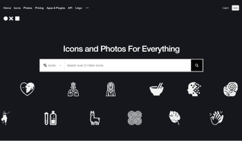
Not everyone is ready to jump in and learn a new application for a few buttons. If that is the case, I am going to point you to a couple of options. The first is a website called ‘The Noun Project’. There are free and nearly free versions of this service that give you access to endless simple images that can be used for anything, including buttons. This is by far the easiest way to get graphics for buttons.
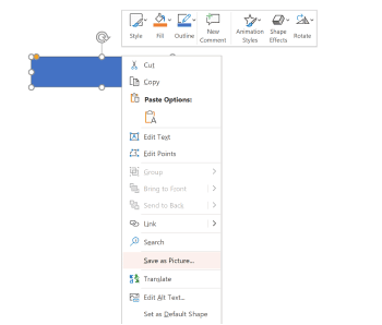
If you are interested in making your graphics but want to use a more familiar tool, PowerPoint may be an option. Just follow the simple guidelines from this post to build your buttons in PowerPoint. Exporting is as easy as right-clicking on the image you want to save and clicking “Save as Picture”. Once you do you can name the file, choose where to save it, and select the file type. Portable Network Graphic or PNG is the default, which is the perfect choice.
But if you are interested in exploring a new world that can be as deep as Tableau itself, then keep following along to jump right into Figma!
Figma
Figma is flexible graphic design software that has both paid and free versions. It can run right in your browser, so it does not require any special local permissions to install. Just go to https://figma.com, create a free account, and you will be up and running in just a few minutes.
Our team uses Figma to create all of our wireframes and mockups during the design phase of our process. All assets are then outputted and set up in a Tableau workbook for our engineers to use for the final deliverables to our clients.
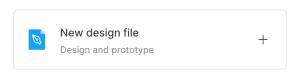
The first step in the process once you have the software running in your browser is to open a new design file. There are a couple of ways to do this, but clicking the button that says “New Design File” will do the trick.
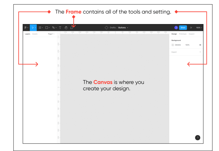
After creating a new file, you will then see the Figma interface. It is well laid out and divided into two main areas: (1) The Frame which includes the left, top, and right edges of the interface. (2) Inside The Frame is The Canvas, where you will create your designs.
Let’s start with the blank canvas. The canvas is infinite, both vertically and horizontally. The following basic key commands are critical for getting the most out of the software and will become second nature in no time.
Spacebar – Hold down the spacebar, and it activates the Hand Tool. While you have the spacebar pressed, click and drag around the canvas. It will be helpful to put something on the canvas for context, so choose the Type Tool in the top Frame, click on the canvas, and type something clever. Now, try out the hand tool again. As soon as you release the spacebar, the selection tool is enabled.
CTRL Key – Hold down the Control key and use the scroll wheel on your mouse to zoom in and out. Nice! Now, you can use the hand to pan around the canvas and zoom in and out using the Ctrl key and mouse wheel.
We are almost ready to start designing, but before we do, it’s good to remember what our goal is. Humans are naturally trained to interact with buttons throughout life, which means that they have already come in contact with buttons way before they come in contact with the button we are about to design. Therefore, it is advantageous to design our button using best practices and known design principles.
The following is a simplified set of design considerations to keep in mind when designing your buttons. There are way more complicated versions of these guidelines, but this gets us a long way to designing effective buttons.
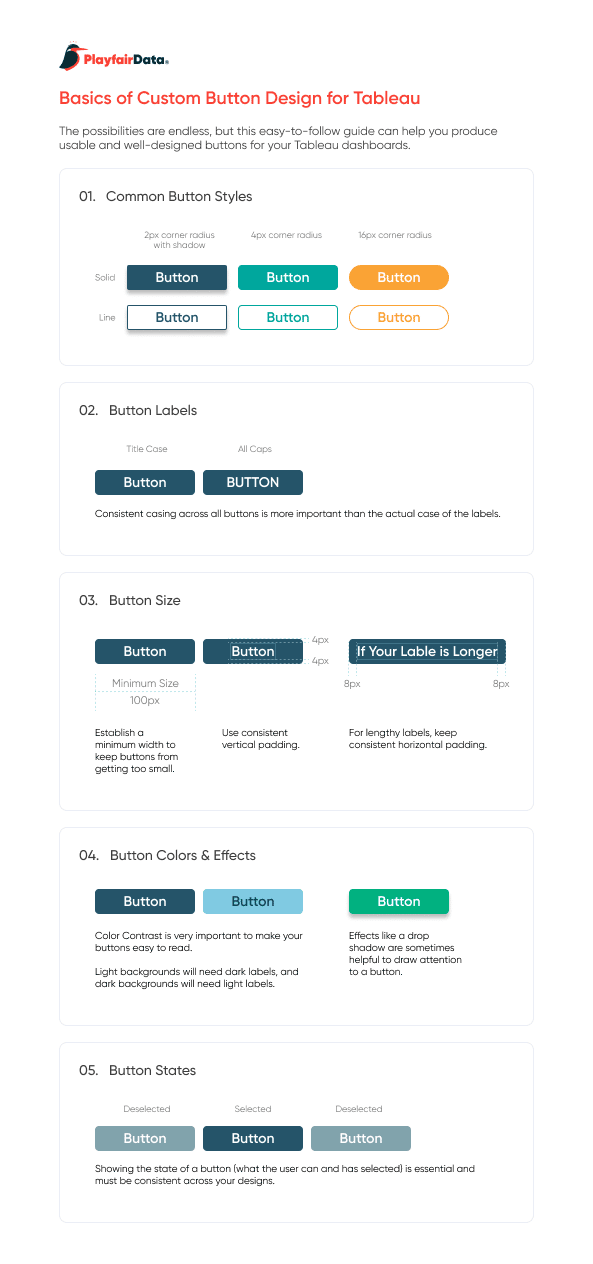
Remember, buttons can add professional polish and make our dashboard easier to use, but the opposite is true as well. I am sure you all have had the experience of using a non-optimal interface where you were confused by poorly designed buttons! Think about your users here; it’s less about fancy design tricks and way more about what is going to help them understand what happens if they click your button.
Figma is powerful but different
One more note on using Figma is if you have used graphics applications in the past, then you may have noticed that Figma goes about things slightly differently. For example, in other applications, you might start with a container and then add a word or two into the container to make a button. With Figma, it’s best to start with the words and then build the container based on the words. It’s a lengthy discussion as to why, but trust me, learning this early builds a good foundation as you progressively design more complex objects.
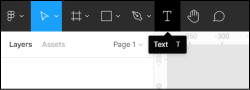
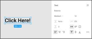
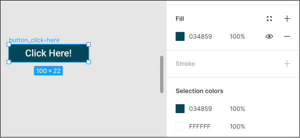
Start with the text your button will display. Keep it simple, and remember you want to make it clear as to what the action will be by clicking. Format the text by using the Text controls on the far right of the interface and choose a font that is easy to read.
Containers
By starting with the text, we can now wrap it with a container with specified padding around the text. This becomes handy in keeping multiple buttons feeling consistent across a dashboard. Click on the Figma menu and choose Object > Auto Layout.
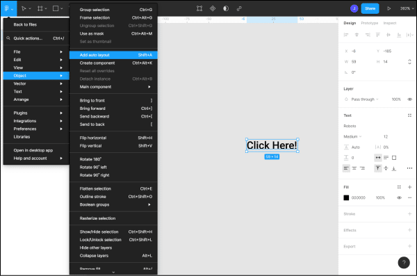
Now you will see a default Frame show up surrounding the text. It will be called Frame 1. I recommend renaming this to something you will use for naming all of your buttons and that clearly describes what this version of the button will be used for.
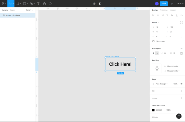
Next, let’s add a Fill to the Frame so we can start to see our button come to life. In the right-hand frame, look for a section called Fill. Click the plus symbol while having the frame selected. You will see the frame fill with white by default.
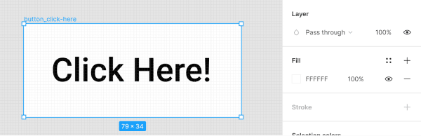
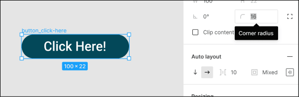
Before we change the color, let’s adjust the Auto Layout settings. On the right frame of the interface, you will see a section called “Auto Layout”. Currently, the padding around the text is set to the default of 10px on all sides.
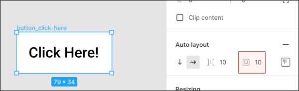
I recommend editing the padding so there is some difference between the top/bottom padding compared to the right/left padding. I usually stick to 4px for the top and bottom and 8px for the left and right. I will override the width if my button label is short, so I end up with a 100px minimum width. There are times when smaller buttons are appropriate, but that is for another post! To override the width of the frame, you will need to click on the right side of the frame and drag it out to something close to 100px. You will notice that when you do this, the text will by default be aligned to the left. When you are adjusting the padding, you can select the center alignment icon as Show.
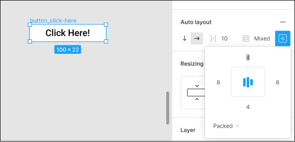
Using Auto Layout could take an entire post or two on its own, so just know that we are barely scratching the surface. You also need to understand that much of Figma’s power comes from this feature, so look for more Figma tutorials in the future here at Playfair Data.
Now, feel free to pick some colors for the fill and text color. Remember to keep the contrast great enough so the text is easy to read and that this button will sit on top of color in your dashboard.
Now, let’s make sure the button looks like a button. A common current trend in button design is to add a corner radius to the outer shape. Putting a radius on the frame is easy and adds a nice bit of polish to the overall design. Toward the top of the right-hand interface, you will find a radius adjustment. Adjust until you are satisfied with the result. I usually find 4, 8, or 16 does the trick.
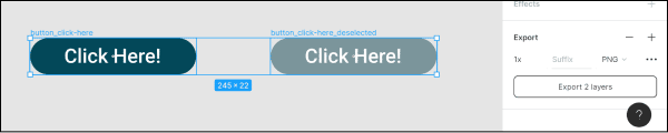
If you are feeling good about your button design, then it’s time to make a duplicate for the deselected state. ‘States’ is the way we refer to the state of interaction. A button can usually have many states, and each one communicates important information: am I able to click on this button, am I hovering over this button, have I already selected this button, etc. In Tableau, we tend to keep our states very simple: selected and deselected. There are cases for more complex states, but we will stick to two for now.
Make sure you have the frame selected and use the Figma menu Object > Duplicate to make a copy of the button. You won’t see anything change, but if you click and drag the selected button, you will see there are two identical buttons on top of each other. Drag the top one away so you can see both buttons with no overlap.
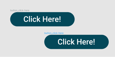
Now we want to rename the new button to something that represents the second state of the button; I suggest “deselected” or, if you are planning to use it for a show/hide button, add “show” or “hide” to the end of the file name so you can find it when you are back in Tableau.

Now, we need to change the color of the button so it looks like it is deselected. Many times, a lighter or more grey color helps get this point across. It should not be too faded, as that might indicate a non-clickable button. We are just wanting it to look like it’s not currently selected but could be. Once you are happy with your results, we need to export the images for use in Tableau.
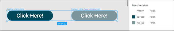
Select both buttons by dragging a window around both. Near the bottom of the right-hand interface, you will see a section called Export. Click the plus sign, and you will see some options show up. The default is PNG, and is perfect for what we need to accomplish.
Depending on what technique you are planning to use, you may want to adjust the Scale setting. Typically, I save button images out at 2X the design size, which gives a little extra resolution for high dpi displays and mobile screens. If you are using your button as a shape, I recommend 3X design size because Tableau does some of its own compression on shape images.
The Ultimate Guide to Getting High Resolutions In and Out of Tableau
Once your scale settings are set, you can click on the Export button and choose a location on your hard drive to save the files. Once they are saved, they are ready to be put to use in any of the aforementioned Playfair Data tutorials.
I hope this gives you some ideas on how to start using custom buttons in your designs and gives you the confidence to try out Figma for this and other graphic needs. Of course, any graphic design software can be used, but Figma is a great choice that can grow with you as your skills grow.
Thank you for following along! I will be posting more UX, interface design, and Figma tutorials in the near future.
Thank you,
Jason

Written By
Jason Penrod
Related Content
3 Innovative Ways to Use Figma in Your Visual Analytics Projects

What does design software have to do with visual analytics software like Tableau? At Playfair Data, we approach our visual…
3 Ways to Wow Stakeholders with Figma

When it comes to demonstrations, it goes without saying that you want your stakeholders to walk away “wowed.” But what…

Ryan Sleeper
Dynamically change images in a navigation to highlight choices Ryan shares an innovative technique for highlighting dashboard selections in Tableau.…