How to Design a Typographic Hierarchy in Tableau

For most Tableau authors, typography is not the first thing they think about when they develop a dashboard, let alone typographic hierarchy. Luckily, Tableau has spent considerable time and creativity to develop its own font family designed specifically for data visualization. Typography is an incredibly deep topic that can be overwhelming with unique terms and endless aesthetic guidelines – but it’s also central to most visual analytics projects. Typography, defined in its simplest terms, is the arrangement of letters and numbers to make them readable and appealing. Not many visualizations get away without using some form of arranging letters and numbers – so let’s get started! In this post, we will start to take some of the mystery out of typography and learn how to use 3 simple typographic elements to build a typographic hierarchy, which can serve as a guide through a visualization or complex dashboard. Our focus will be on size, weight, and the use of color.
Learn more design tips with Playfair+
Tableau + typography
By the end of this post, you will be able to make your own typographic hierarchy in Tableau like the following example.
Font vs Typeface
Today the word “font” is used interchangeably with the word “typeface”. I will use the terms interchangeably here as well. It is easy to confuse the many names and definitions involved in typography since type is an old craft that has been through a revolution or two, most recently the digital revolution.
Tableau the Typeface (font)
With the release of Tableau 10 back in 2016, the Tableau Font was released and remains the default font for Tableau today. Tableau spent considerable time and effort to develop the font with a legendary type foundry, Frere-Jones Type. If you are interested in all the details Tableau has a great post on it that is worth a read!
![]()
Related research: Tableau 10 includes a new typeface designed for data
In summary, the Tableau font is designed with the overall the goal of simplicity and readability in the visually dense data visualization environment.
Continue reading with a free account, or login.
Unlock this tutorial and hundreds of other free visual analytics resources from our expert team.
Already have an account? Sign In
By continuing, you agree to our Terms of Use and Privacy Policy.
Choosing a font
Knowing that Tableau has your back with its default font is great but there are times when you will want some options or need to adhere to a specific font or fonts for branding reasons. If you have brand guidelines or a style guide to follow – that’s great; someone has spent a decent amount of time putting these guides in place and they are definitely worth following. If you do not, then the task can be somewhat overwhelming with so many choices. I find that most Tableau authors at this point just go with the defaults, which thanks to Tableau is not a bad thing. If you are interested in choosing a font family to work with, make sure you keep things simple.
Here are a few tips:
* Look for a font that is simple and not too decorative or thematic. Dashboards tend to get visually busy; your font should help balance this fact and not add to it.
* Look for websites or other dashboards in your industry or field and study the characteristics being used. There are several web-based tools for figuring out what fonts are being used in both digital and physical designs. Check out Search fonts | Adobe Fonts and Identify Fonts – The Font Squirrel Matcherator for more.
* Look for a typeface that has a variety of font weights and widths as they will give more options in building hierarchy in your system, i.e., thin, medium, semi-bold, bold, and heavy.
Using fonts in Tableau
Understanding how Tableau handles custom fonts within Tableau products is beyond the scope of this article. Refer to a previous post at Playfair Data about using custom fonts in your dashboards.
Tips for Formatting Text Tables in Tableau
Typographic hierarchy
Typography has a lot in common with data visualization. Especially when we talk about preattentive attributes. In the post and video, Playfair Data Presents: Preattentive Attributes, we shared an animation that illustrates preattentive attributes. All the preattentive attributes can also be applied to type! Designing a typographic hierarchy can help guide users through the information being displayed. Once this hierarchy is established, it is important to use it consistently within a project. If the hierarchy is from a brand guideline, then constancy should extend to all branded projects.
The example below visualizes the difference using a typographic hierarchy can make in consuming information. I have used the classic Lorem Ipsum text to demonstrate.
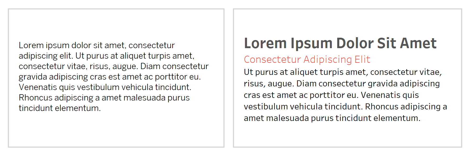
Both sides of this example use the same exact text, but in the right example I have applied specific sizes, weights and colors to enhance the viewers ability to visually organize the information.
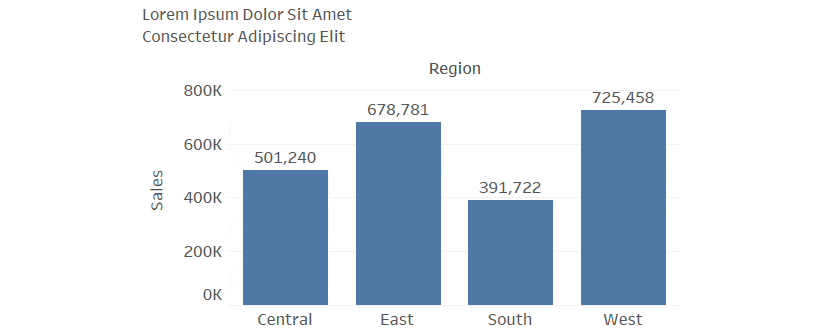
Look at the same principal applied to the chart below.
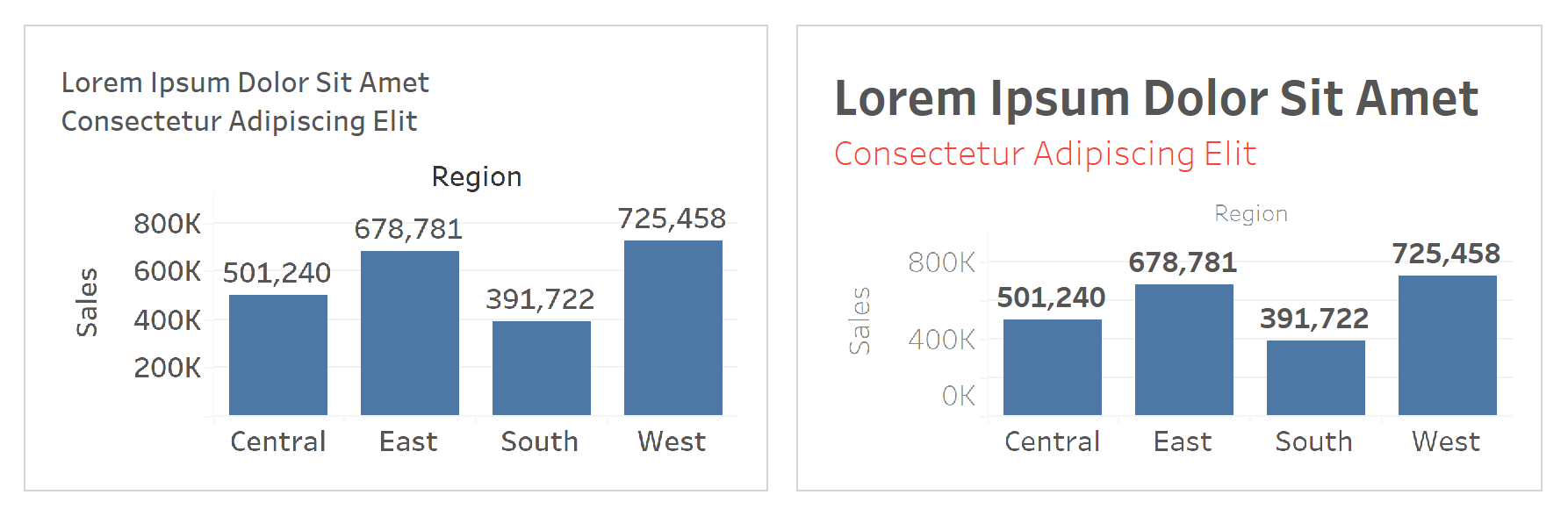
In this example, I have created a bar chart using the Sample Superstore dataset. SUM(Sales) in on the Rows shelf and Region is on the Columns shelf. On the Label property of the Marks card, I checked the “Show Labels” check box. In the example on the left, I formatted all text elements using the same size, weight, and color. Much like the first example, I feel it is difficult to know which information is more important from another.
For another example, I let Tableau use its defaults, seen below.
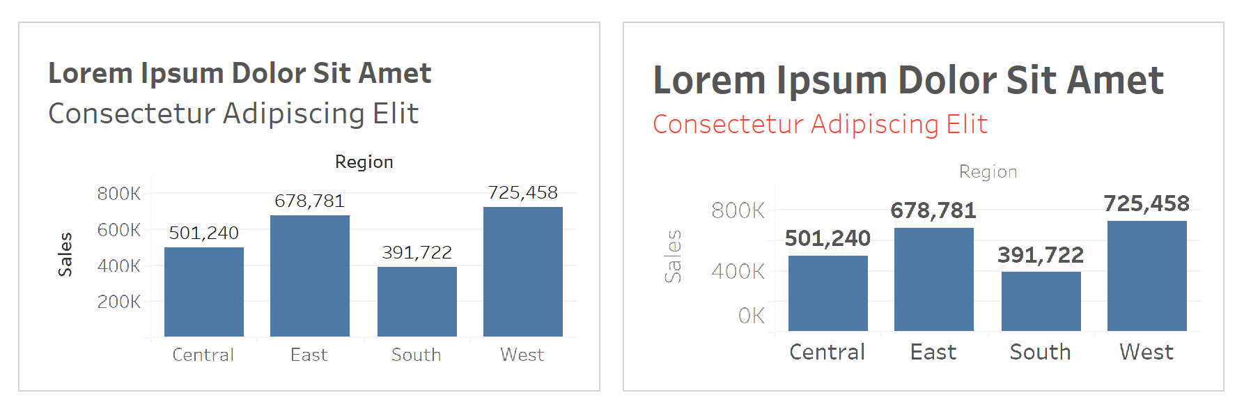
Not a bad start but pushing on size a bit and using color to help distinguish values in the chart really helps. Also note that when I use the Playfair Data Red I have paired it with a “light” weight to take away some of the power that color can have. My hope is that you see the title and subtitle first, then move to the values labeling the bars and finally land on the specific regions. I gave the Sales axis the least emphasis because it is technically not needed due to the bars being directly labeled but have left it to keep the two views equal outside of the text.
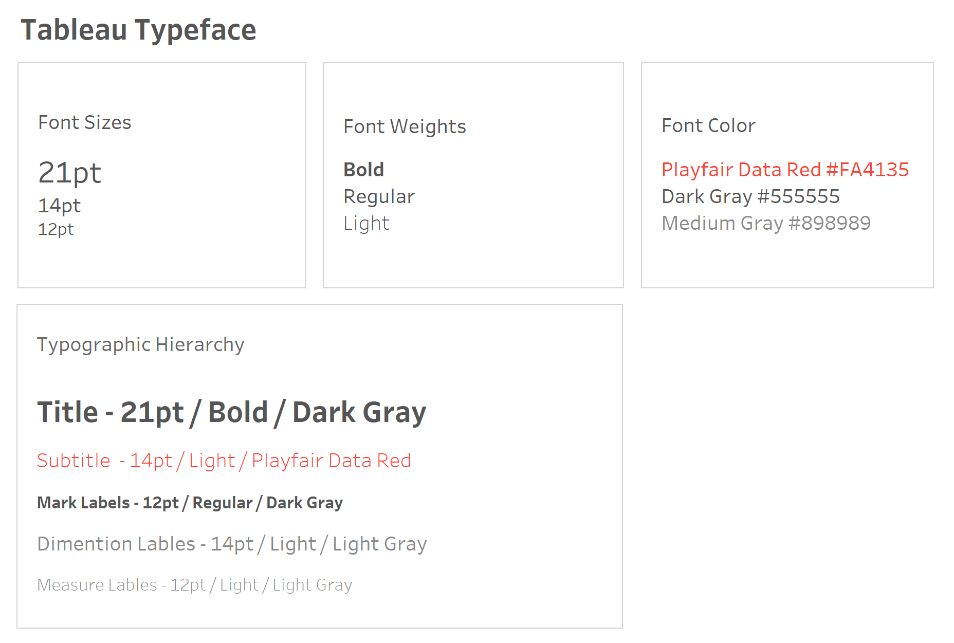
A simple typographic hierarchy in Tableau
Typeface
I have chosen to stick with the default Tableau Font to keep things simple.
Font Size
So how should we set up our size hierarchy? Keep it simple. Traditional guidance suggests keeping size options to three. I like to follow this when I can but there are times when working on a large project that more sizes are needed. Sticking to three for this post I chose 21pt, 14pt and 12pt.
Font Weight
The weight of a font describes the thickness of the stroke for each letter, digit, or symbol. I will be using the Tableau font for this example, but it is something to think about when choosing to use other fonts. Some font families will have many choices in weight, while some are more limited. The Tableau Font Family provides 6 weights: light, book, medium, regular, semi bold, and bold. I am choosing 3 that give some contrast: light, regular, and bold.
![]()
Font Color
Using color in your typographic hierarchy needs to be handled with care. Just like using color in visualizations the same causation needs to be observed with the use of color in type. If used carefully it can help balance other aspects of our hierarchy. Once again, I am choosing 3 colors: Playfair Data Red #FA4135, a dark gray #555555, and a medium gray #898989.
The final hierarchy
I hope this gives you confidence and inspiration to start using some more typography in your Tableau projects!
Thank You,
— Jason

Written By
Jason Penrod
Related Content
Ten Tableau Text Tips in Ten Minutes

This is the fifth and final post in a series about getting the most out of text in Tableau. For…
How to Create Better Dashboard Layout Designs with Figma

Being able to apply some basics of dashboard layout design to your visual analytics projects in Figma can bring a…
3 Creative Ways to Add Instructions for Your Users in Tableau

When you publish a Tableau dashboard, you want to ensure that every user, regardless of their data literacy, can easily…