The Value in Low-Fidelity Wireframes for UX and Dashboard Designs

Low fidelity (or Lo-Fi) designs are simple sketches that outline the key elements of a dashboard. In many ways, it stands as a blueprint and helps teams visualize and test early concepts at the start of the design process. In this blog, you will learn about the benefits of creating low fidelity wireframes and how it can enhance planning and delivery of dashboard designs.
What is a low fidelity wireframe?
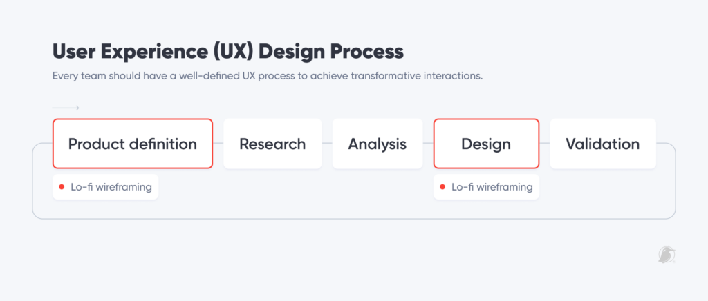
The User Experience (UX) design process has five key phases: product definition, research, analysis, design, and validation. Low-fidelity wireframing or sketching can take place in two of those phases: early in the product definition; and at the design stage. It is the way designers approach architecture and concept ideation.
Continue reading with a free account, or login.
Unlock this tutorial and hundreds of other free visual analytics resources from our expert team.
Already have an account? Sign In
By continuing, you agree to our Terms of Use and Privacy Policy.
When and how we use low-fidelity sketches will impact the overall project evolution.
Some common characteristics of wireframes at these stages include:
- Using software tools or paper to present designs.
- Using black and white color schemes.
- Using generic shapes and language to fill the dashboard.
- In theory, they take the least amount of time in the design process.
- And most importantly, they can look scrappy!
Sometimes, however, these characteristics can bring pain to your process. When presenting your solutions to a team or client who is unfamiliar with these concepts, it can incite unfavorable reactions, such as:
- “Where is the color? Is this the final look and feel?”
- “I don’t see my brand reflected in this.”
- “Is this what my data looks like?”
- “I think it looks ugly and too simple.”
These are all valid concerns. Our goal today is to change that perspective, emphasize the importance of prioritizing low-fidelity wireframing, and show the impact it will bring to your projects.
![]()
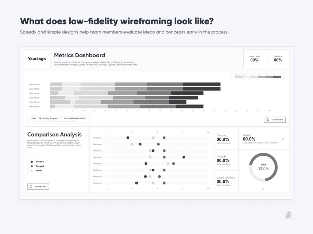
Your design drawings may look unattractive and unfinished – it’s in their DNA. Hence the name, low-fidelity.
The UX hierarchy of needs
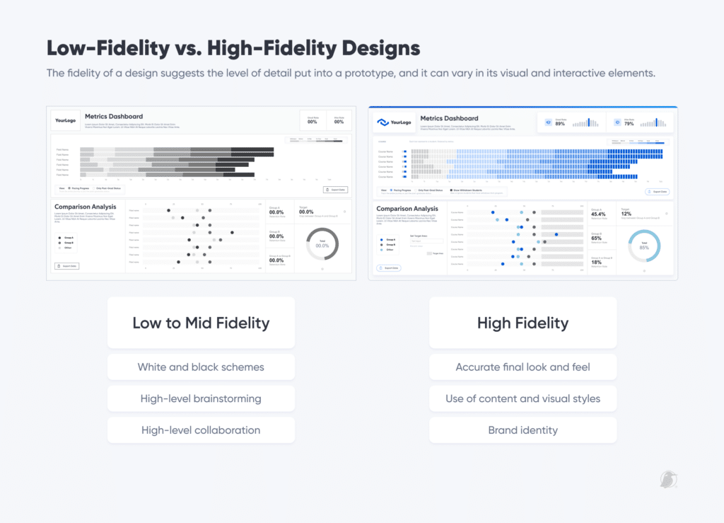
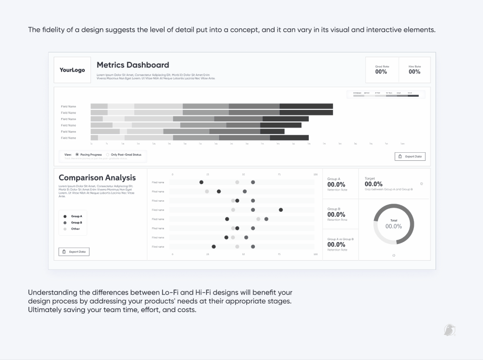
The fidelity of a design suggests the level of detail put into a prototype, and it can vary in its visual and interactive elements.
In psychology, Abraham Maslow created his theory Hierarchy of Needs. He suggested that, for a person to reach satisfaction, they must take care of their needs in a particular order. The most basic needs must be fulfilled before higher-level ones can be met successfully.
Borrowing from Maslow’s theory, the UX Hierarchy of Needs breaks down the basic requirements that a system should meet if it is going to satisfy the user. Here, you can see that the most fundamental elements lie at the bottom of the pyramid. At the peak, we achieve meaningful products, not only a functional system but a transformative one.
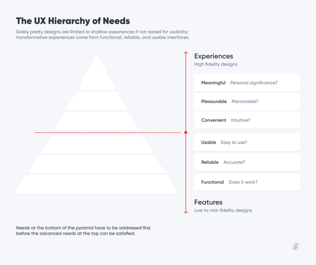
At the bottom of the pyramid, we find low-fidelity wireframing fits best. If your dashboard isn’t functional, it won’t be reliable, usable, pleasurable, or meaningful. In other words, poor functionality will ruin the product experience.
High-fidelity wireframes are best used in the advanced stages of the process (higher in the pyramid where we find Convenient, Pleasurable, and Meaningful). Here, we seek to capture the look and feel of the dashboard and closely resemble the final design. The problem with jumping headfirst into high-fidelity is that your team will invest more hours creating products that may not address the issues effectively, thereby wasting time and effort. Low-fidelity wireframes, on the other hand, are lower investments that accommodate future revisions ahead of time.
Low-Fi wireframing generates the most amount of possible solutions while also tackling several usability questions, including:
- Are we solving the problem?
- Is our product easy to use and navigate?
- Is our product feasible? I.e. Can it be engineered?
- Where can we make improvements?
The value of low fidelity wireframes
Now that we understand what, where, and when low-fidelity should take place, let’s explore the impact it can bring to your teams:
- It can help with rapid ideation. Disregarding the aesthetics and minute details of interfaces allows us to explore and create many possible solutions to be tested and evaluated for effort and impact.
- It can reduce the time and energy spent on design iterations. Catching issues and making revisions earlier in the process will take less time and effort than in the advanced stages of implementation. Design revisions in the later stage can delay the timeline, add to project hours, and increase costs.
- It can help identify process and data gaps. We make sure that the final product can effectively address our users’ needs, but can also pinpoint weak spots in our design architecture and data. It lets us know if our data can support the visualizations, and vice versa; designers can understand the constraints that may arise during the engineering stage.
![]()
- It can help with project management. Creating a blueprint of our dashboards can adequately assess the effort required to complete a project. Managers can foresee the cost, hours, and additional resources needed to present a realistic timeline and find areas to support the team.
- It can help gather resources and goals. We can better prioritize our action items and allocate resources accordingly while keeping up with the overall project goals.
- It can help with user experience. When looking at the skeleton of a dashboard, the team can focus on usability and efficiency and not spend too much time on appearances. Many times, we focus so much on making something pretty that we forget to make it usable.
These are just a few ways low-fidelity wireframing can impact your business performance and facilitate a higher satisfaction rate with your dashboards.
The basics of low-fidelity in Figma (A checklist to keep your low-fidelity just that: low effort!)
At Playfair Data, we have found that constraining ourselves to certain criteria via checklists guarantees that we do not skip steps in the design process. Whether you like using pen and paper, or a software tool to mock your dashboards, here are some ways that you can make sure that your designs stay low effort when they need to be:
- Stick to a neutral color palette. Using a grayscale color palette is the best way to make sure our focus on the functional aspects and save hours spent on color testing. If working on a software tool like Figma, you can create your own and add it as a color style to reuse across your projects. Tip: maintaining moderate to high grayscale contrast ensures that the palette is viewable across different monitors.
- Keep your user statements in sight. Whenever ideating solutions, we like to document the user statements or questions we are trying to solve. For example, “I want to see how many students are behind pace for a cohort.”, and use that to gauge the effectiveness of my design and revise or discard sketches.
- Restrain from applying design details and effects. Using drop shadows, line radius specifications, and in-brand typefaces won’t help gauge the dashboard’s functionality, so they should not be prioritized at this stage.
- Keep it short and simple – do it once, and then move on. If it is taking too long to build, chances are the wireframes are getting way more attention to detail than they require. At this stage, we only worry about brainstorming and establishing the general direction of a design. More is more, so focus on generating plenty of iterations and leave the embellishment for later.
The takeaway
Prioritizing low-fidelity wireframes helps set expectations early in the design process and allows for rapid ideation and product iterations. It is also important to note that beauty in design isn’t always translatable to efficiency. So, next time you start a new project, consider allocating time early in your process to sketch before jumping right into in-brand designs and Tableau implementation. This way, you will save your team energy, time, and costs in the long run.
Rafael

Written By
Rafael Simancas

Peer Review
Jason Penrod
Director, Information Design
Related Content
How to Create Better Dashboard Layout Designs with Figma
Being able to apply some basics of dashboard layout design to your visual analytics projects in Figma can bring a…
3 Ways to Wow Stakeholders with Figma

When it comes to demonstrations, it goes without saying that you want your stakeholders to walk away “wowed.” But what…
3 Ways to Optimize Tableau Workbook File Size


Are you running into file size issues when you attach Tableau workbooks to emails? Has IT asked your team to…