How to Make Ranged Dot Plots in Tableau
Ranged dot plots display not only a circle mark representing the current performance for a specific dimension member, but a full range of how that ‘dot’ has moved over time. You can also add even more context by coloring the dot and/or changing the mark type of the circle to up or down triangles, based on period over period performance.
Both of these additions to a traditional dot plot help provide comparisons that paint a clearer picture of whether changes in performance are notable. This post shows you how to add a performance range for each dimension member represented in a dot plot.
How to Make Dot Plots with Performance Ranges in Tableau
How to create a traditional dot plot
By the end of this post, you will be able to make a dot plot showing the period over period performance across dimension members with a performance range for each dimension member in the background.
Let’s knock out the traditional dot plot portion of this chart first. You can create this chart with any measures and dimensions, but I will look at current month’s sales by region in the Sample – Superstore dataset.
For ease of illustration, I have parameterized the current month selection so the user can choose any month between January and December as the “current” month. Also, the sample data has four years of data in it, but we will aggregate all four years into one (i.e. pretending there’s only one year of data).
![]()
Continue reading with a free account, or login.
Unlock this tutorial and hundreds of other free visual analytics resources from our expert team.
Already have an account? Sign In
By continuing, you agree to our Terms of Use and Privacy Policy.
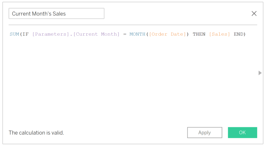
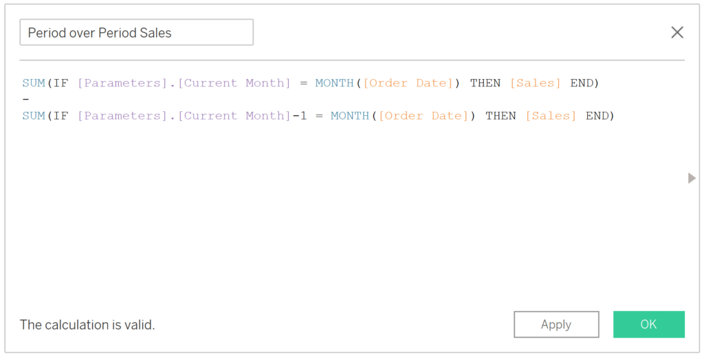
The first thing we need to do is isolate the performance for the current month. The formula for my fields is:
SUM(IF [Parameters].[Current Month] = MONTH([Order Date]) THEN [Sales] END)
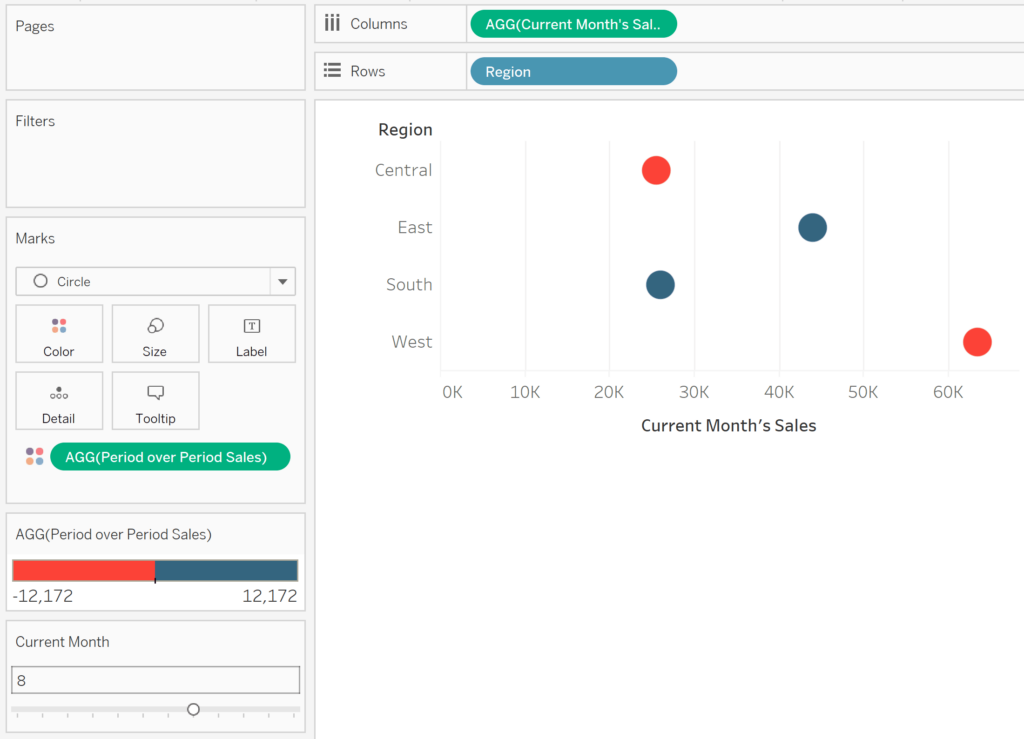
To analyze this measure by the Region dimension as a dot plot, place the newly created calculated field on the Columns Shelf, the Region dimension on the Rows Shelf, and change the mark type to Circle.
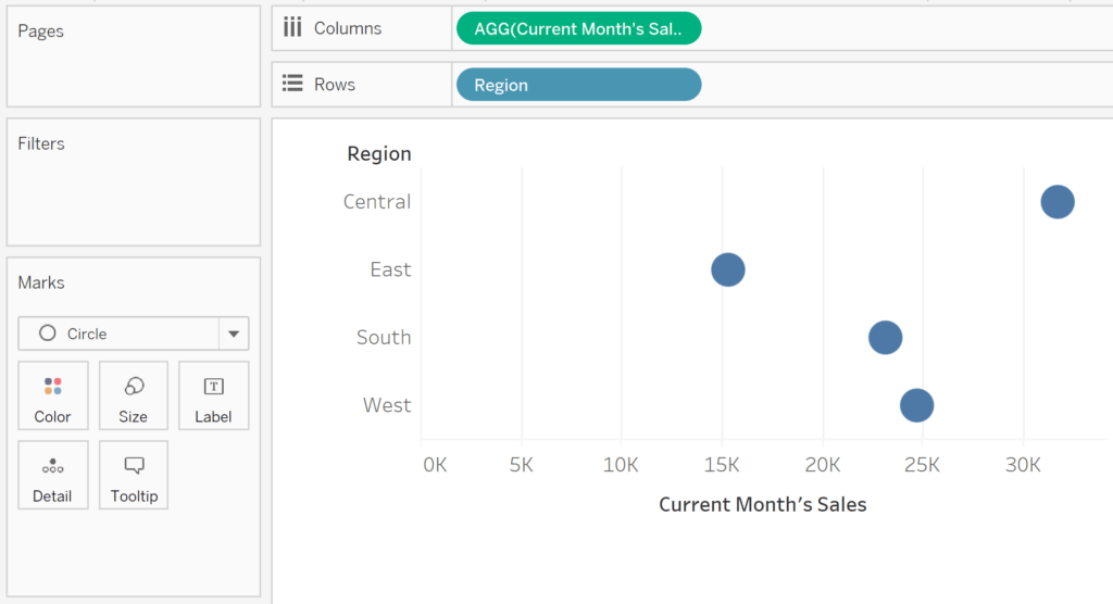
By default, the current value of a parameter is the first allowable value. Since the first allowable value in my case is 1, so far we are looking at January’s sales by region.
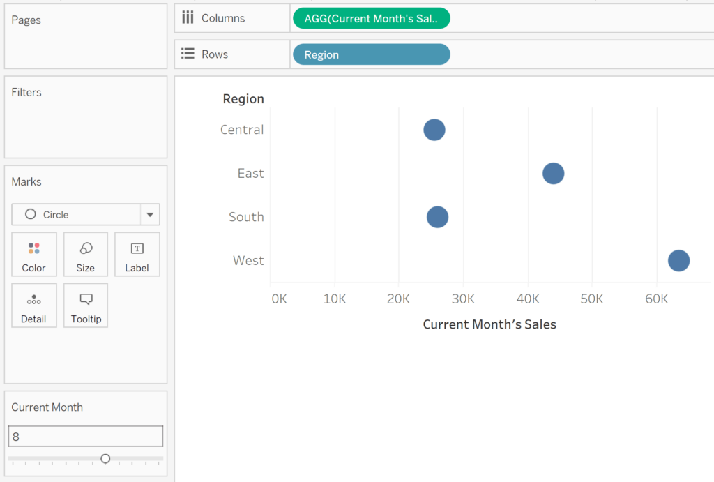
If I show the parameter control and change the value of the parameter to 8, the value of 8 will replace the value of 1 in my Current Month’s Sales calculated field, and we will be looking at August’s sales per region.
Calculating a comparison point
The dot plot is already providing one comparison: Region. The next step is optional, but I typically like to add at least one more comparison to a dot plot by coloring each circle based on the period over period performance of each dimension member. You could also change the mark type to Shape and map up triangles for positive changes and down triangles for negative changes. In either case, we need to make a calculated field that determines the month over month change. In my case, the formula is:
SUM(IF [Parameters].[Current Month] = MONTH([Order Date]) THEN [Sales] END)
–
SUM(IF [Parameters].[Current Month]-1 = MONTH([Order Date]) THEN [Sales] END)
Now, if I place this calculated field on the Color Marks Card, change the colors to a diverging palette, and map one color for positives and one color for negatives – I can quickly compare performance between dimension members and between months.
Creating a Gantt chart to display performance ranges
Now for the new stuff.
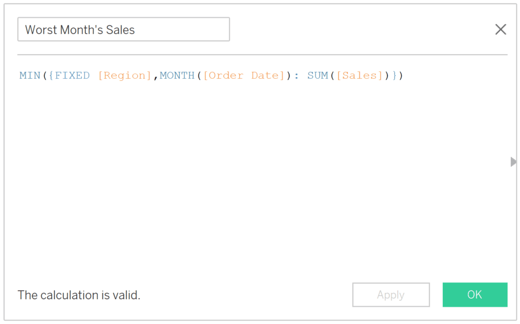
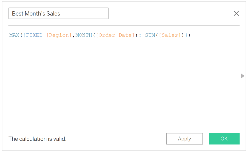
The trick to creating a ranged dot plot is to combine a traditional dot plot with a Gantt chart representing the performance range for each dot. The Gantt mark for each dimension member will start at the beginning of the range, so we need to isolate the value for the worst performing month per row. The formula in my case is:
MIN({FIXED [Region],MONTH([Order Date]): SUM([Sales])})
I’m using a level of detail expression, but don’t let this formula intimidate you!
Just think logically through what we’re trying to isolate: the lowest value, aggregated at the monthly level, for each region. When that’s the case, my brain first thinks of MIN([Sales]). Well, in our view, the level of detail is Region, so the Sales measure with this aggregation will take the lowest sales value per region.
This is isn’t quite what we want because several orders make up each month’s sales, and in this case, Tableau would display the lowest order value for each region (but not for each month). What the FIXED level of detail expression does is aggregates those multiple rows with all of our different orders at whatever level you address within the calculated field. In my case, I have rolled up all the SUM([Sales]) values at the Region and Monthly levels.
Level of detail calculations are unique in Tableau in that you can create an aggregate of an aggregate. So, after summing up sales per region and month, I’ve wrapped that value in an aggregation of MIN to derive the lowest monthly sales value per region.
An Introduction to Tableau Level of Detail Expressions
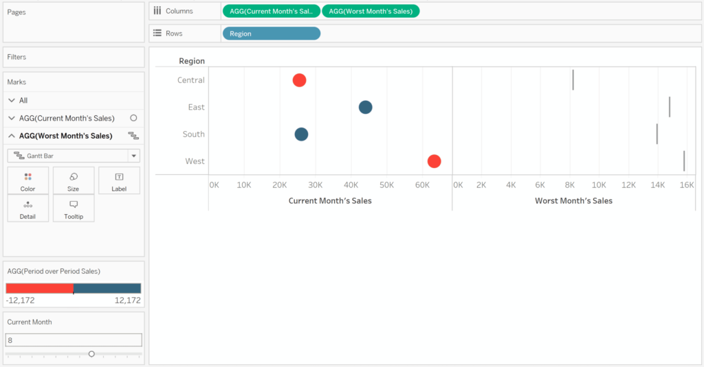
To get this value on the view as a Gantt mark, simply place the calculated measure on the Columns Shelf and change the mark type to Gantt Bar. I’ve also removed the field on the Color Marks Card for the right-side.
To size the Gantt marks so they represent the full performance range from the worst month’s sales to the best month’s sales, we need to size them by that range. To compute that range, we need to know the value for the best performing month for each row.
Computing the top of the range
We already created the calculated field isolating the worst performance, so we can simply duplicate that calculation and change the MIN aggregation at the beginning of the formula to MAX.
MAX({FIXED [Region],MONTH([Order Date]): SUM([Sales])})
The last calculated field we need takes the difference between the highest sales value and lowest sales value. For my measures, the formula is:
[Best Month’s Sales] – [Worst Month’s Sales]
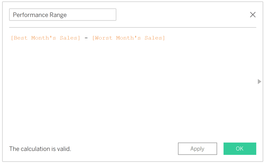
Note you could consolidate these last two calculated fields into one, but in the case you want to use Best Month’s Sales somewhere else in the future, there is value in keeping them separated.
Place the calculated field computing the difference between the highest month’s sales and lowest month’s sales on the Size Marks Card for the Gantt chart.
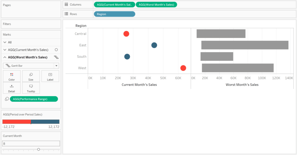
Tying the charts together
There are a few short steps to finalize the ranged dot plot:
- Convert these two separate charts into a dual-axis combination chart by clicking the second pill on the Columns Shelf and choosing “Dual Axis”.
- Synchronize the axes by right-clicking on either one and choosing “Synchronize Axis”.
- Move the circles in front of the Gantt bars by right-clicking on the axis for the current performance and choose “Move marks to front”.
- Reduce the height of the Gantt marks by navigating to the Marks Shelf for the Gantt chart, clicking on the Size Marks Card, and dragging the slider to the left.
How to Make Dual-Axis Combination Charts and Some Creative Applications
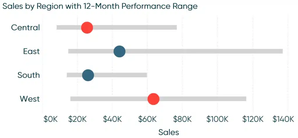
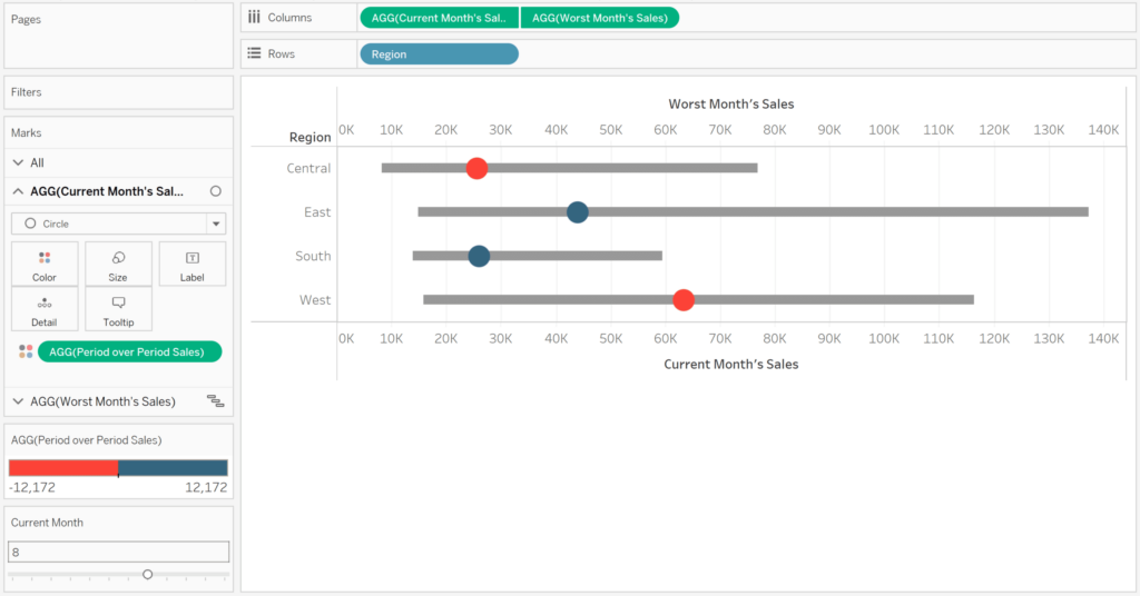
Here’s how my final ranged dot plot looks after formatting:
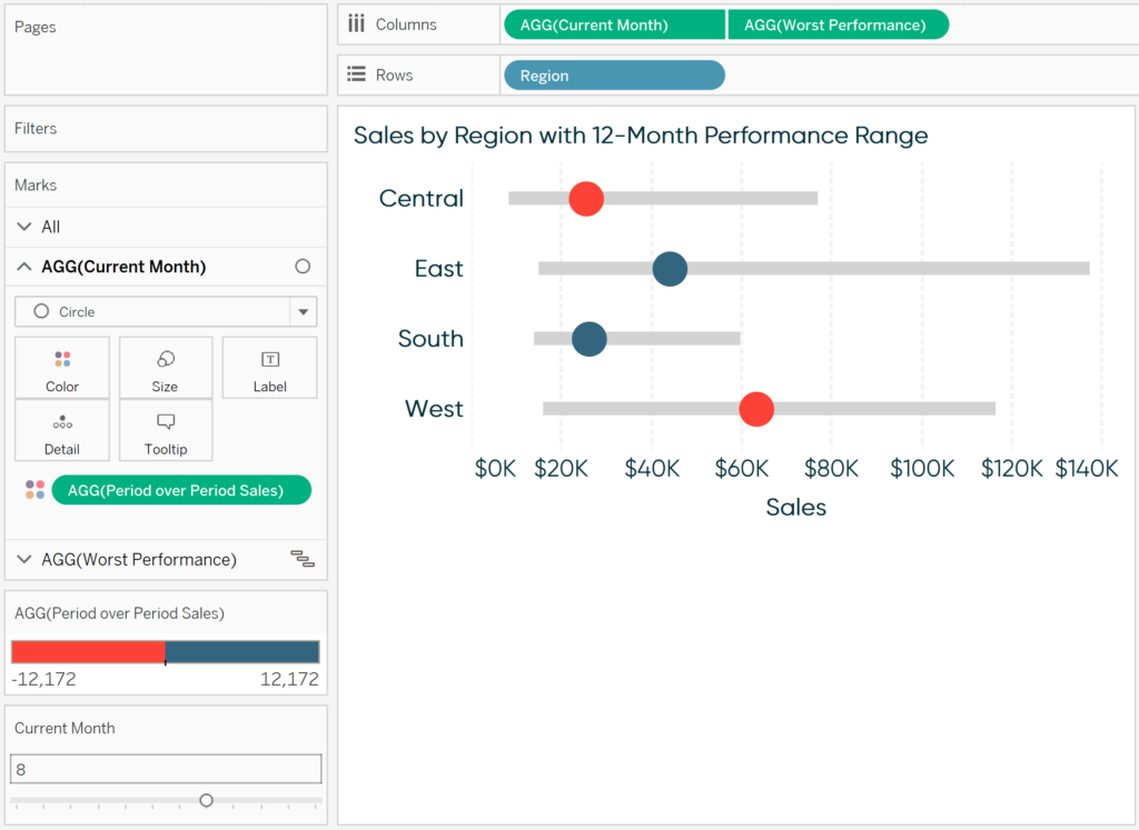
In this final view, the circle’s position on the x-axis represents its current month sales, the color represents month over month sales, and the gray bar represents the range of values the dimension member has achieved during the year.
![]()
If I were to change the current month from August to something else, the circle’s position and color would change, but the gray bar is always frozen in the same place (unless the data is refreshed and the range changes).
Thanks for reading,
– Ryan


Written By
Ryan Sleeper
Related Content
3 Ways to Make Gorgeous Gantt Charts in Tableau
Traditional Tableau Gantt charts display a mark at a start date and size the mark by duration, showing a visual…

Ryan Sleeper
An alternative solution for showing rank and performance Learn how to make ‘leapfrog’ charts, a dot plot variant that uses…
How to Highlight a Dimension Member on a Minimalist Dot Plot in Tableau
There is a chart type I’ve been gravitating toward a lot this year, but have struggled to find a documented…