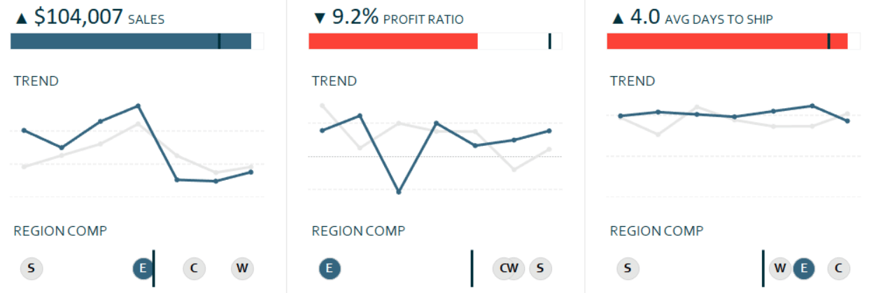
How to Highlight a Dimension Member on a Minimalist Dot Plot in Tableau
There is a chart type I’ve been gravitating toward a lot this year, but have struggled to find a documented name for it. The chart consists of dots (or the Circle mark type in Tableau) plotted on a shared axis. I’ve been calling this a dot plot for seemingly obvious reasons, but traditional dot plots in statistics are closer to unit charts, where the mark type would simply be changed from Bar to Circle. My examples are slightly different in that they share one axis, or row of dots, and I usually hide the axis header. Being that this is a plot of dots and only includes the minimum amount of data possible, for now I’m calling this a minimalist dot plot.
This chart type has some big benefits. First, it’s the closest I’ve seen to getting to a 100% data-to-ink ratio. It provides comparisons which help avoid the dreaded, “So what?”. Also, by hiding the axis header, the user is forced to focus on the insight of comparing dimension members in relation to each other, rather than the exact numbers. Of course, I provide the exact data points on demand via the tooltip when the user hovers over a circle.
The chart type is featured prominently in both my Super Sample Superstore and MLS Standings Reinvented dashboards. In the first, the user is able to choose which region they hypothetically manage, and in the latter, the user can choose their favorite team. In both cases, the dot plots then highlight the selection throughout the dashboard so the user can see where they stand in relation to the others.
This post will show you how to make a minimalist dot plot in Tableau and how to highlight a specific dimension member throughout multiple views.
This is the fourth in a series of five “you are here” Tableau tutorials. These tips will help improve the user experience of your Tableau dashboards by helping guide your end users. Subscribe here to receive new updates.
How to Highlight a Dimension Member in Tableau
Continue reading with a free account, or login.
Unlock this tutorial and hundreds of other free visual analytics resources from our expert team.
Already have an account? Sign In
By continuing, you agree to our Terms of Use and Privacy Policy.
How to make a minimalist dot plot in Tableau
This chart type is one of the easiest to create in Tableau and requires only a few simple steps. For the purposes of illustration, we’ll be rebuilding one of the dot plots from the Super Sample Superstore dashboard. Note the charts at the bottom of the view, which highlight based on the user selection.
To recreate the Sales dot plot from the Sample Superstore dataset, drag the Sales measure onto the Columns Shelf.
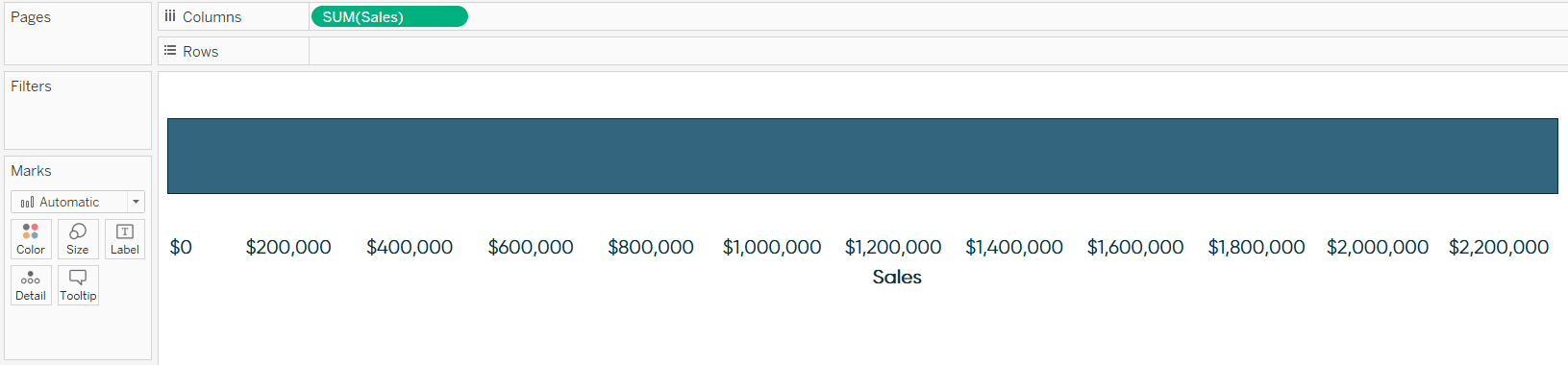
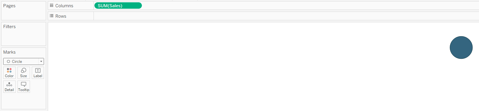
Change the mark type to Circle using the Marks Shelf and, optionally, hide the axis by right-clicking on it and deselecting “Show Header”.
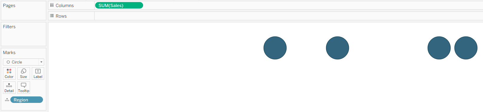
The most critical step is to place the dimension that you want to compare on the Detail Marks Card. In this case, I am comparing regions, so I will place the Region dimension on the Detail Marks Card. This changes the level of detail for the view, and draws one circle for each region.
Optionally, you can also add a reference line by navigating to the Analytics Pane and dragging “Reference Line” onto the view. Here’s how my final view looks after adding and formatting a reference line that shows the average sales for the four circles.
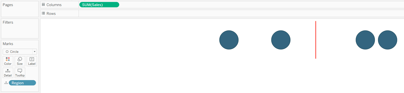
With this chart type, I care most about the marks’ relation to each other, so I usually don’t mind if the axis doesn’t start at zero. I’m sure you’ve heard the argument for including zero, so this choice is up to you and your stakeholders.
![]()
How to highlight a dimension member throughout dot plots
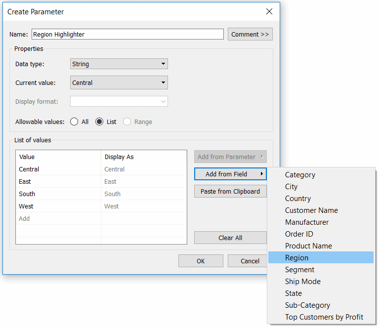
The trick to highlighting a specific dimension member on one or more of these dot plots involves parameters. To begin, create a parameter with a data type of String. For the list of allowable values, click the “Add from Field” button and choose the dimension you are comparing.
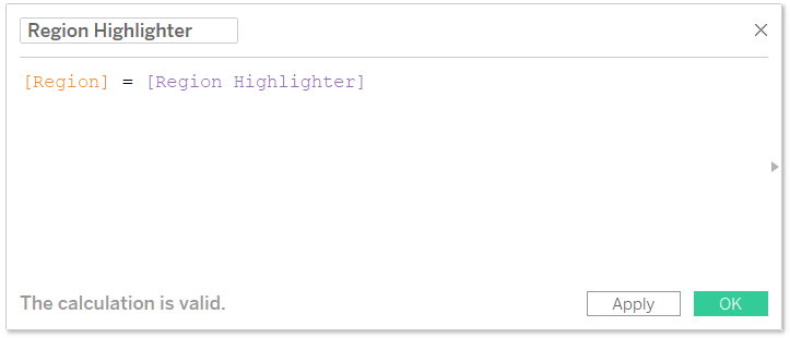
Next, create a calculated field with a Boolean formula. The calculation will be [The dimension you are comparing] = [The highlighter parameter]
Place this newly created calculated field on the Color Marks Card. If the dimension member matches the parameter selection, it will be colored a distinct color from the other dimension members.
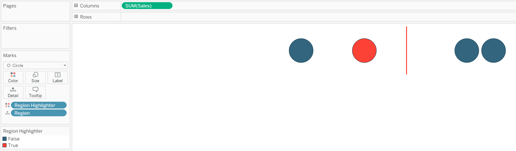
Don’t forget that if you want your end users to be able to choose the parameter selection, you must show the parameter control by right-clicking on the parameter and choosing “Show Parameter Control”. Now the highlighter calculated field can be used to color marks across multiple dot plots, and choosing the dimension member to highlight on the parameter control will highlight the specific dimension member across all of them!
![]()
Thanks for reading,
– Ryan


Written By
Ryan Sleeper
Related Content
3 Innovative Ways to Highlight Selections in Tableau

In this tutorial I will demonstrate three ways to use different mark types with transparent sheets to highlight a selection…

Ryan Sleeper
Dynamically change images in a navigation to highlight choices Ryan shares an innovative technique for highlighting dashboard selections in Tableau.…
Ryan Sleeper
Let your audience control a visualization through user-generated values This video will show you how to set up a parameter…