3 Lessons Learned from the APAC Tableau Zen Master Tour
Last week, I had the honor and privilege of participating in the Asia-Pacific (APAC) Tableau Zen Master Tour. The tour was a whirlwind of nine presentations to more than 1,400 Tableau customers over five days and two countries – beginning in Tokyo, Japan and culminating with the Data Day Out event in Singapore!
Along for the journey were Pooja Gandhi of Comcast and Andy Cotgreave of Tableau. We were also joined by David Murphy of Google, the only Tableau Zen Master in the region, for the Singapore leg of the trip. I would also be remiss if I didn’t mention Sarah Kurian of Tableau, who traveled with us and was instrumental in the planning of the event. She kept us on schedule and made sure we never forgot the hashtags #zentour and #datadayout ????
The trip was packed with highlights for me both personally and professionally. One of my favorite aspects of the tour was getting to know my travel companions better. It was fascinating to be along for the ride to see the masters at work. I also learned, or was reminded of, three powerful data visualization lessons that I want to share.
Simplicity is not a recommendation; it is a requirement
One of the data visualization tips that I share nearly every time I present is: Keep it simple. The idea is not new, nor complex to execute, yet I see many companies struggle to take the advice to heart. Well, this week I learned what it was like when I was required to simplify my explanations to communicate with my audience.
With the tour starting in Tokyo, the speakers were often paired up with translators. This was a first for me, and reminded me you can’t take communication for granted. I was instructed to speak slowly and stop every three or four sentences so the translator could take over. In this position, you have no choice but to choose your words wisely because your original estimated presentation time is essentially cut in half (half the slot to speak in English; the other half to translate it to Japanese). The big learning for me though, was that the message still got through. I believed I was already speaking concisely, but when I was forced to share the same message in half the time, I learned I can do better.
I couldn’t help equate this experience to data visualization. Simplicity is required to clearly communicate the story you are trying to share. Even if you think you’re doing an effective job, there’s likely opportunity to improve. I also plan to use the schemas that come with using shapes and symbols to simplify dashboards and reduce the language barrier.
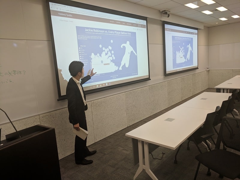
A Japanese translator discusses Jackie Robinson during the Tokyo Tableau Sports User Group meeting
Continue reading with a free account, or login.
Unlock this tutorial and hundreds of other free visual analytics resources from our expert team.
Already have an account? Sign In
By continuing, you agree to our Terms of Use and Privacy Policy.
It’s okay – dare I say better – to be a real person at work
I admit, the one part of the trip I had been dreading was ‘the turn’ from Tokyo to Singapore. We had not quite adjusted to the half-day time difference, we had just completed two full days of meetings and presentations, and now we were getting on a 7-hour red-eye flight with meetings starting at 10 AM the next morning. To put it simply: I was tired!
![]()
By the time the Singapore Tableau User Group rolled around late the afternoon of our arrival, I think we were all feeling and acting a little loopy. I believe I opened my talk with something like, “Are any of you attending Data Day Out on Friday? Well, this will be a bit of a preview, but the difference is that this is the version where I was on a red-eye from Tokyo last night and have had practically no sleep. This should be fun…”
It turns out it was a lot of fun. By admitting I was in rare form, the mood lightened up and I think it turned out to be one of the best user group meetings I have ever attended.
This is another lesson that I think is applicable in data visualization, and for that matter, your work in general. For example, though it can be challenging with our and our stakeholders’ biases, be open and honest with your analyses. Also, viz what you want to viz. I credit a lot of my learning in Tableau to using Tableau Public to visualize a topic that I am personally passionate about outside of work. Not everybody thinks there’s value in sports data visualizations, but I learned countless tactics that I eventually incorporated into my other consulting work.
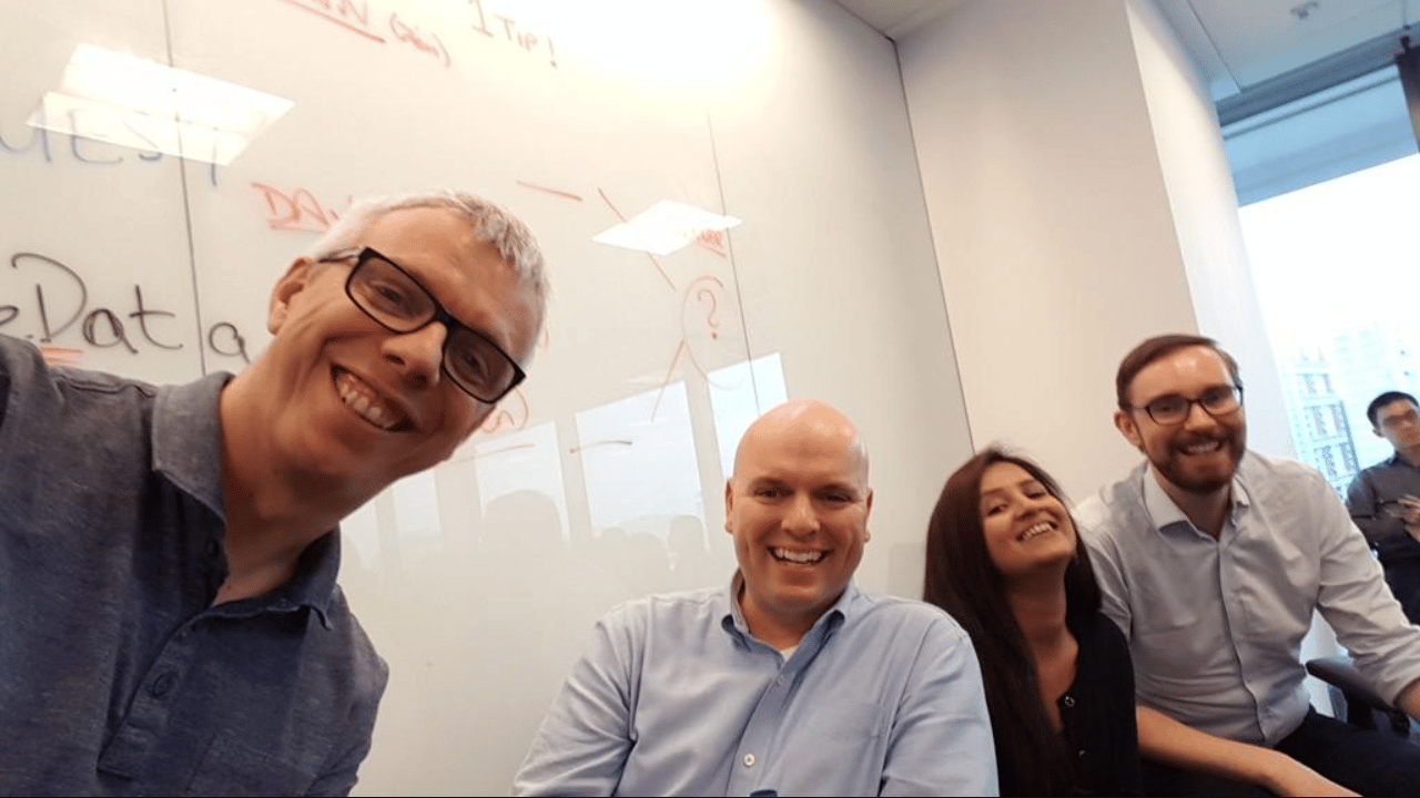
The APAC Tableau Zen Master Tour crew during the Singapore Tableau User Group meeting
There is still an enormous opportunity in data visualization
I like to joke that I used to get very frustrated with many companies’ culture of exclusively using spreadsheets to make critical business decisions. That is until I realized I had a very long career ahead of myself and can use the money I earn to buy lots of barbecue. On this trip, I learned that if I lived in Japan, I would use those earnings to purchase Kobe beef meals.
What I learned on this trip is that we share the same challenges in data visualization literally on the other side of the world.
I enjoyed seeing Andy Cotgreave present his take on preattentive attributes because sometimes I feel like I am being too elementary when I discuss the topic in my trainings or presentations. Even though the value of data visualization has been illustrated for more than two centuries, most companies around the world simply aren’t taking full advantage.
This means that we, as data visualization practitioners, still have an enormous opportunity to reduce the time to insights, improve the accuracy of insights, and improve engagement.
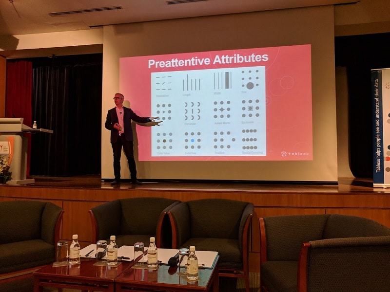
Andy Cotgreave presenting preattentive attributes at Civil Service College in Singapore
This was a life-changing tour with many personal and professional imprints. I’m excited to get back to work knowing this trip will have an influence on my future initiatives. And maybe, just maybe, next time I’ll learn how to properly use chopsticks!
Thanks for reading,
– Ryan

Written By
Ryan Sleeper
Related Content
5 Lessons Learned While Becoming a Tableau Zen Master
This month I received the news that I had finally reached a career-long goal of being named a Tableau Zen…
Playfair Data Presents: Preattentive Attributes
In the post and video, Why do you visualize data?, I share my exercise for educating stakeholders on the value…

Ryan Sleeper
Find and communicate actionable insights See for yourself how preattentive attributes like color help you instantly answer business questions. Ryan…