3 More Ways to Make Beautiful Bar Charts in Tableau
The humble Tableau bar chart still reigns supreme when it comes to visualizing differences between categorial, or discrete, data – but it seems many stakeholders have fallen out of love with them. Perhaps it’s because they’ve been around since the year 1786 or they are the default chart type created in Tableau when you double-click on a measure from the Data pane.
This post aims to help you make the best bar chart possible to breathe new life into this quintessential chart type. I provided some initial thoughts on this topic in our second-most popular post of 2017, but this post shares my three favorite tricks I’ve picked up since then. You’ll learn whether your bar charts should be vertical or horizontal, the easiest way possible to round the ends of bars, and how to make dynamic axes for direct labeling.
3 Ways to Make Beautiful Bar Charts in Tableau
FAQs answered in this post:
Should Tableau bar charts be horizontal or vertical?
Horizontal bar charts are often the better choice because they allow full dimension names to display without wrapping or cutting off, creating a more natural left-to-right reading experience. They’re also easier to consume on mobile devices where stakeholders access dashboards through Tableau Server, Tableau Online, or the Tableau Mobile app. Use the Swap button in the top ribbon to convert vertical bars to horizontal, then sort them to enable comparison by both length and rank order.
What is direct labeling and when should I use it in Tableau bar charts?
Direct labeling displays values directly on the marks themselves rather than requiring users to reference an axis. This technique is particularly valuable for mobile consumption and bar charts with relatively few dimension members, preventing users from scrolling to see axis ranges. Enable it by checking “Show mark labels” on the Label property of the Marks card, then hide the axis for a cleaner design.
How do I create rounded bar charts in Tableau?
Replace your measure with Measure Values, add MIN(0) as a placeholder to the Measure Values shelf, then change the mark type to Line and move Measure Names to the Path property. Remove markers by selecting the third option on the Color property of the Marks card, then increase line size to reveal rounded edges. This technique adds visual polish without requiring complex calculations or custom shapes.
What are dynamic axes and why do they improve bar chart labeling?
Dynamic axes use table calculations to extend axis ranges beyond your data, providing breathing room for labels that might otherwise overlap bars or display incorrectly. Create a calculated field using WINDOW_MAX(SUM([Measure])) * 1.2 to add 20% padding, place it on Detail, then add it as a hidden reference line. This ensures consistent right-aligned label formatting across all marks without manual axis adjustments.
Why does research suggest bar charts are so effective for data comparison?
Research from Stephen Few identifies length and 2-D position as the two preattentive attributes our brains process most efficiently and accurately. Bar charts leverage these attributes better than any other visualization type, which explains why they’ve remained the gold standard for comparing categorical data since William Playfair invented them in 1786. This cognitive efficiency makes bar charts particularly valuable for executive dashboards where quick insight recognition is critical.
How can Playfair Data help advance our Tableau bar chart design capabilities?
Playfair Data teaches advanced Tableau techniques like rounded bars, dynamic axes, and mobile-optimized layouts that transform standard bar charts into polished analytical tools. Our instructors include Tableau Visionaries and authors who bring practical enterprise experience to every workshop. Book a strategy call to learn how our training programs can help your team master sophisticated Tableau engineering techniques that improve dashboard adoption and stakeholder engagement.
Should bar charts be horizontal or vertical?
By the end of this post, you will be able to make a bar chart with rounded edges and dynamic axes:
I’ve recently had the honor of reviewing the new book, Communicating with Data; the latest from Tableau Prep Up & Running author, Carl Allchin. In it, I was introduced to some research from Stephen Few that says while you shouldn’t attempt to rank preattentive attributes, there are two notable attributes that are significantly easier for us to process: length and 2-D position. This is why bar charts are so effective and have withstood the test of time for more than two centuries. But should bar charts be in a horizontal or vertical orientation?
Related research: The Visual Perception of Variation in Data Displays by Stephen Few
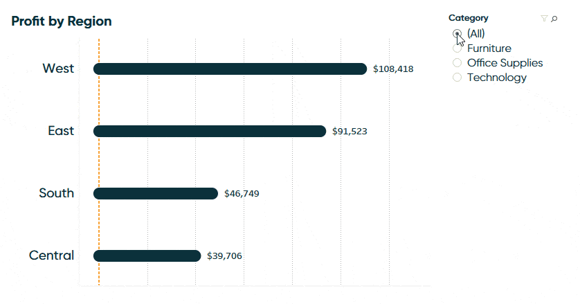
One notable feature of the bar chart pictured above is it’s in a horizontal orientation so that the bars are read from left to right. One obvious advantage of this is the full name of each header is visible, and the user doesn’t have to turn their head to read the dimension members, making this a more natural reading experience.
![]()
A less obvious advantage is that a horizontal bar chart is easier to consume on mobile devices that may require the user to scroll. This is an important consideration as stakeholders are increasingly accessing visualizations from the field via Tableau Server, Tableau Online, or the Tableau Mobile app.
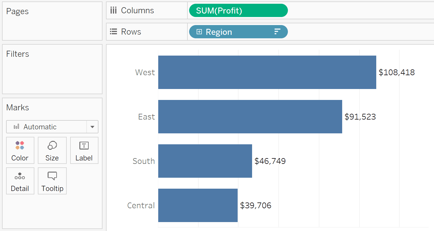
Though horizontal bar charts are often the better choice, note that by default, Tableau creates a vertical bar chart when you double-click a measure from the Data pane. Here’s the default bar chart after double-clicking the Profit measure, then double-clicking the Region dimension in the Sample – Superstore dataset.
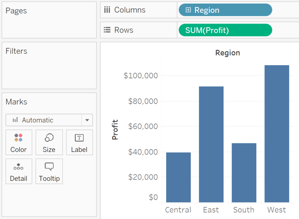
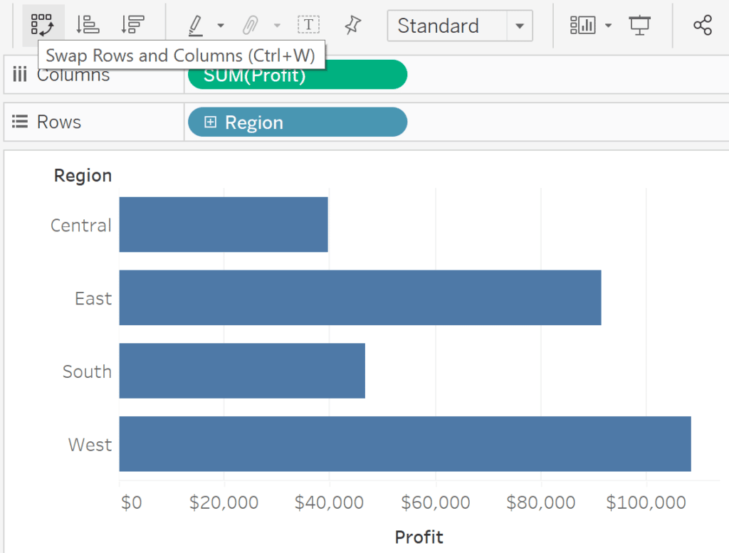
This is not a bad bar chart, but if the bar headers had longer names, they could be wrapped – or worse – cut off so they are not readable. You can easily convert the default, vertical bar chart, into a horizontal bar chart by clicking the Swap button in the top tool ribbon. This swaps whatever is on the Columns shelf with whatever is on the Rows shelf, flipping the orientation of the chart.
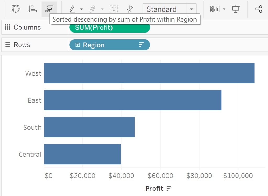
I also recommend you sort these bars by clicking either the Sort Ascending or Sort Descending button immediately following the Swap button in the tool ribbon. This allows you to compare not only the length of the bars, but their rank order from top to bottom.
Lastly, I’m a fan of direct labeling, particularly when creating a bar chart with a relatively small number of dimension members like we have here with four regions. When creating a bar chart that is likely to be consumed on a mobile device, this prevents your user from having to scroll to the bottom to see what the axis range is. To use direct labeling, click the Label property of the Marks card and check the box that says, “Show mark labels”. Now that you are displaying the labels on the marks themselves, I also recommend hiding the axis by right-clicking on it and deselecting, “Show Header”.
The easiest way possible to create rounded bar charts in Tableau
I’ve shown you before how to create rounded gauges in Tableau which shows rounded edges for both the portion of the gauge that is filled in and the portion of the gauge that is yet to be filled in. However, if you only need to round the edges of the bars themselves, there is a much easier way. I picked this trick up from Toan Hoang in his post, Tableau QT: Rounded Bar Charts.
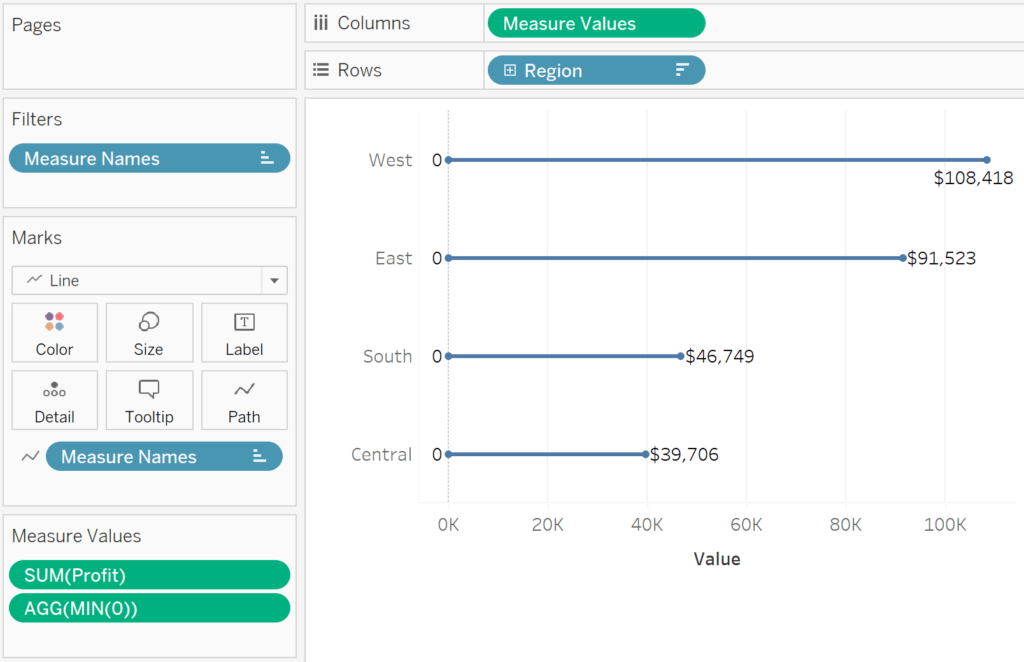
If you’ve been following along to this point, start your rounded bars by replacing the SUM(Profit) measure on the Columns shelf with the generated field, Measure Values. You can do this by dragging the Measure Values field from the Data pane and dropping it right on top of the Profit measure that is currently on the Columns shelf. If you are starting a new rounded bar chart from scratch, place the Measure Values field on the Columns shelf and the dimension you want to create the rows from onto the Rows shelf.
In both cases, a new Measure Values shelf will appear just below the Marks card containing all the measures in the dataset you are using. To create the base of the rounded bar charts, or the value of zero, we will use a “placeholder” measure. To do so, double-click in any blank space on the new Measure Values shelf, type MIN(0), and hit the Enter key.
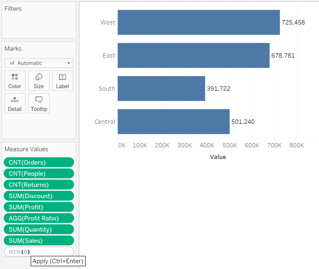
After adding the new placeholder value, you will see a Measure Names filter added to the Filters shelf. Next, we need to remove all measure values from the view except for the newly added placeholder value of zero and the measure we are actually wanting to plot. To do this, you can either edit the filter on the Filters shelf or simply drag any unwanted measures off of the Measure Values shelf.
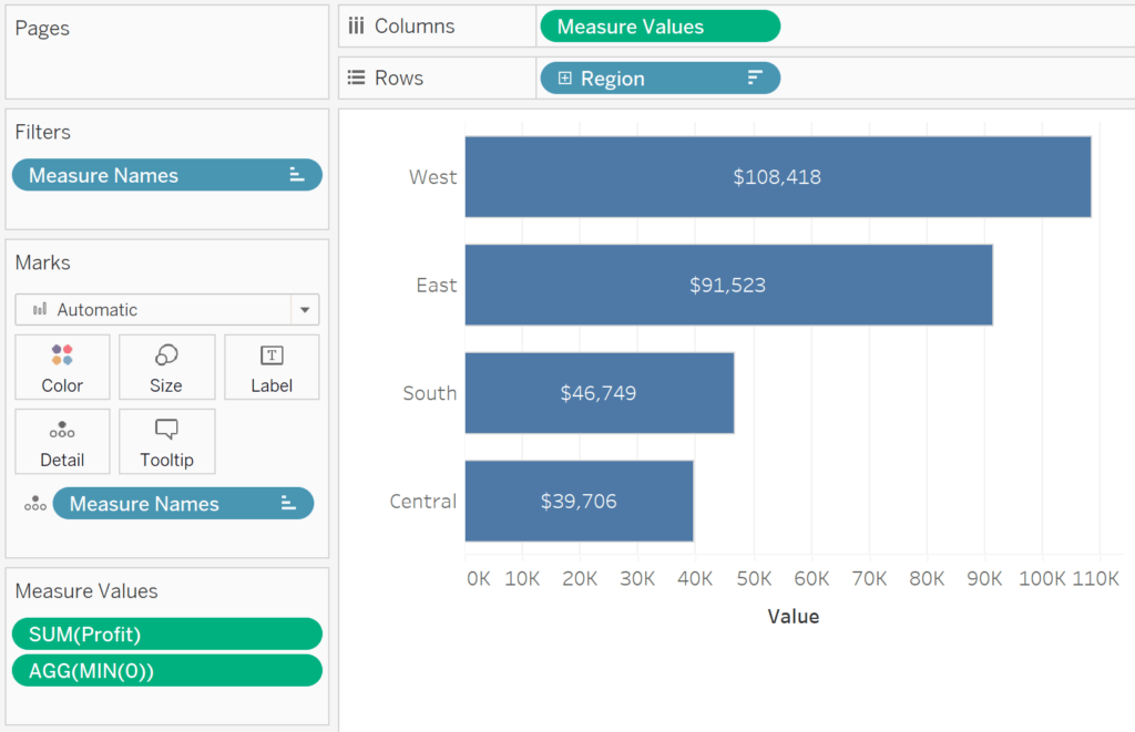
Next, change the mark type dropdown from Automatic (Bar) to Line.
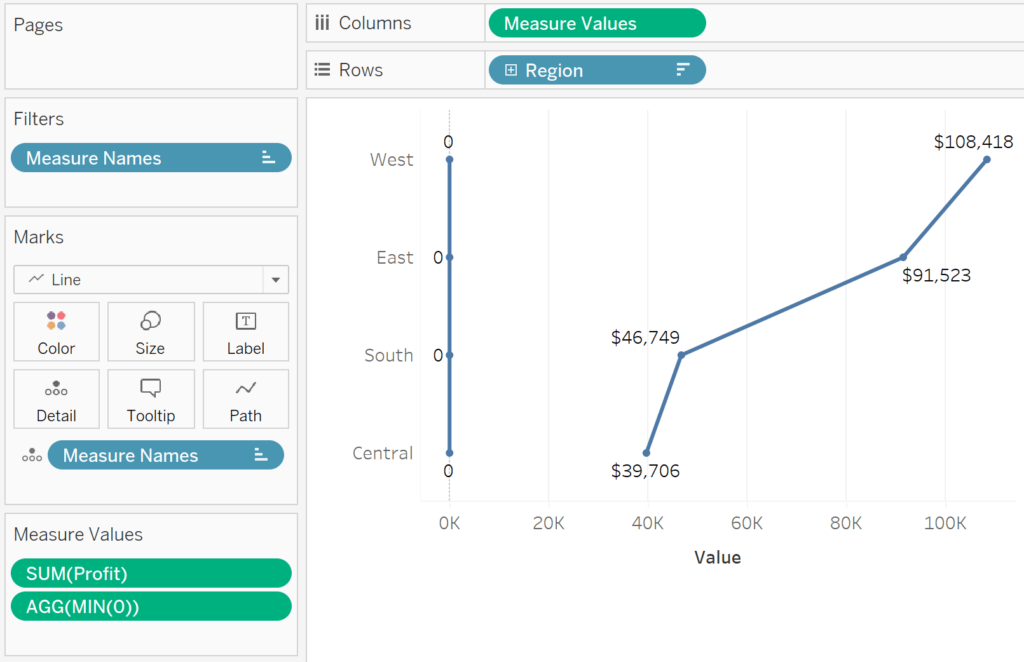
To change the way in which Tableau is connecting the dots, click the Measure Names pill, which is currently on the Detail property of the Marks card, and drag it to the Path property of the Marks card.
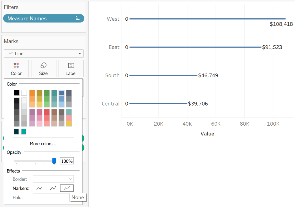
This is starting to take shape, but to reveal the rounded edges, we must turn off the markers that are currently being displayed on the line ends. You can do this by clicking the Color property of the Marks card and choosing the third option after the “Markers” effect.
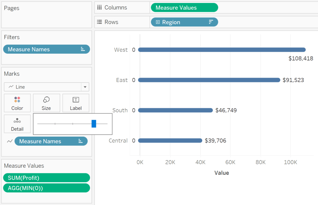
Now if I click the Size property of the Marks card and drag the slider to the right to make the line marks larger, you can see the rounded edges!
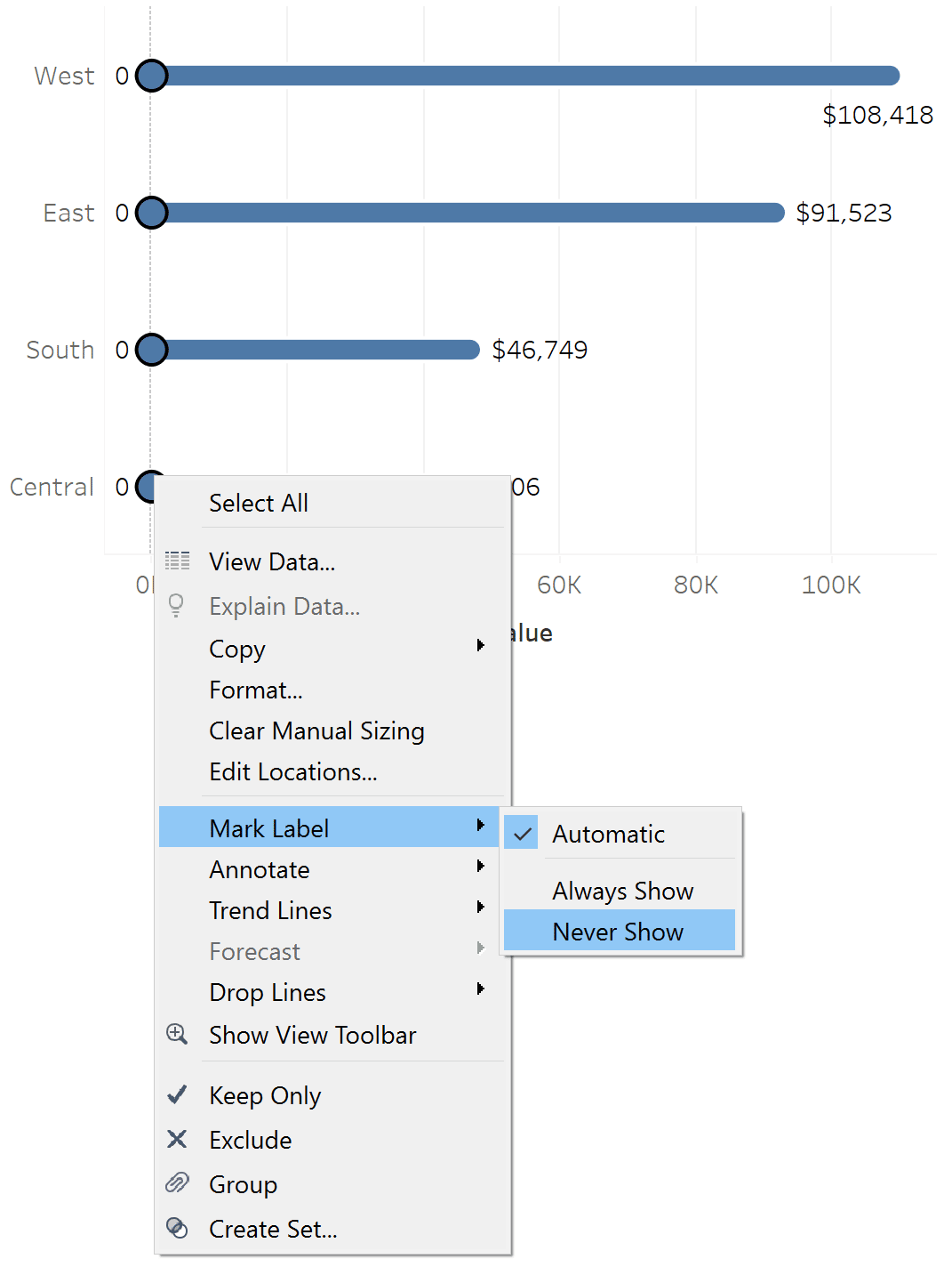
Lastly, we will never need to show the labels for our placeholder field of “0”, so I will turn these off by left-clicking on the view, drawing a box around the values of zero, right-clicking, hovering over “Mark Label”, and choosing “Never Show”.
How to improve direct labeling using dynamic axes
Did you notice on the rounded bar chart above that the first label is below the bar instead of right-aligned? This is because Tableau displays labels for the mark type of Line differently than the mark type of Bar – and it’s killing my bar chart buzz! Fortunately, there is yet another Tableau trick for this to improve this type of labeling.
Continue reading with a free account, or login.
Unlock this tutorial and hundreds of other free visual analytics resources from our expert team.
Already have an account? Sign In
By continuing, you agree to our Terms of Use and Privacy Policy.
Start by creating a calculated field with the formula: WINDOW_MAX([the aggregation and measure you are using]) *1.[the amount of padding you want on the axis]. If I wanted to pad the axis 20% from the end of the longest profit bar, the formula would be WINDOW_MAX(SUM([Profit])) * 1.2
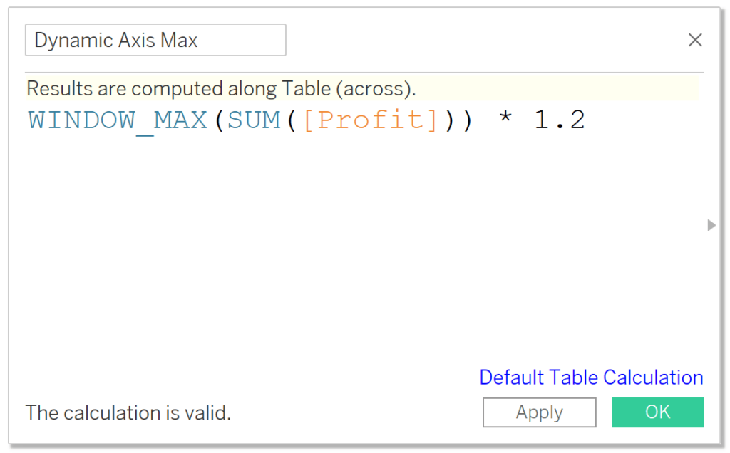
WINDOW_MAX is a table calculation that will return the highest value in the window, which is the entire bar chart, in this case. We are then multiplying that value times 1.2, which increases it by 20%. In my current bar chart, this would make the value of the Dynamic Axis Max calculation 108,418 x 1.2 = 130,102.
Now if I place this calculated field on the Detail property of the Marks card, I can use it as a reference line. Since axes extend to show values being used in reference lines, the axis should extend to the right by 20%, providing enough breathing room for Tableau to display the bar label as I intended!
![]()
To add a reference line, right-click on an axis and choose “Add Reference Line” or drag Reference Line from the Analytics pane onto the view. Then use the Value dropdown box to select the newly created Dynamic Axis Max calculated field; remember the calculation must be on Detail to be available as a selection.
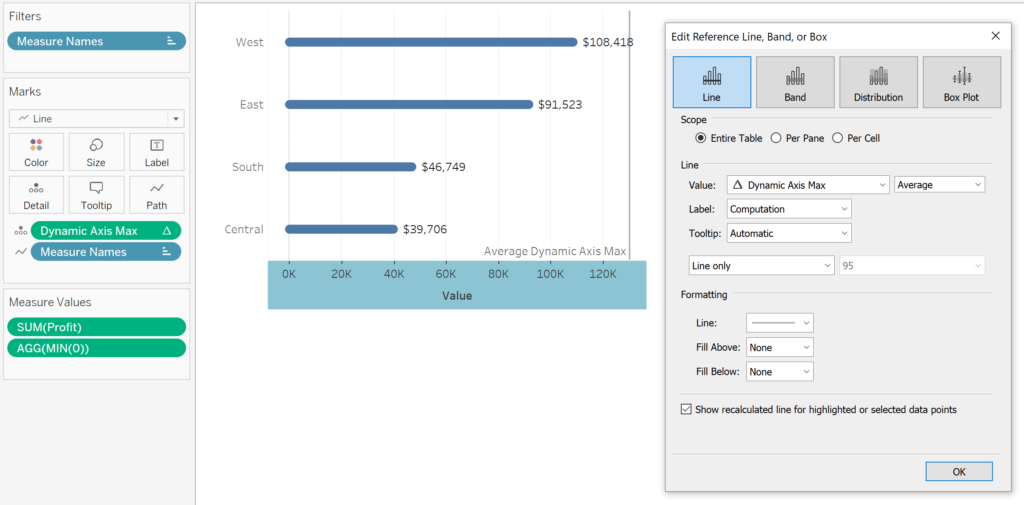
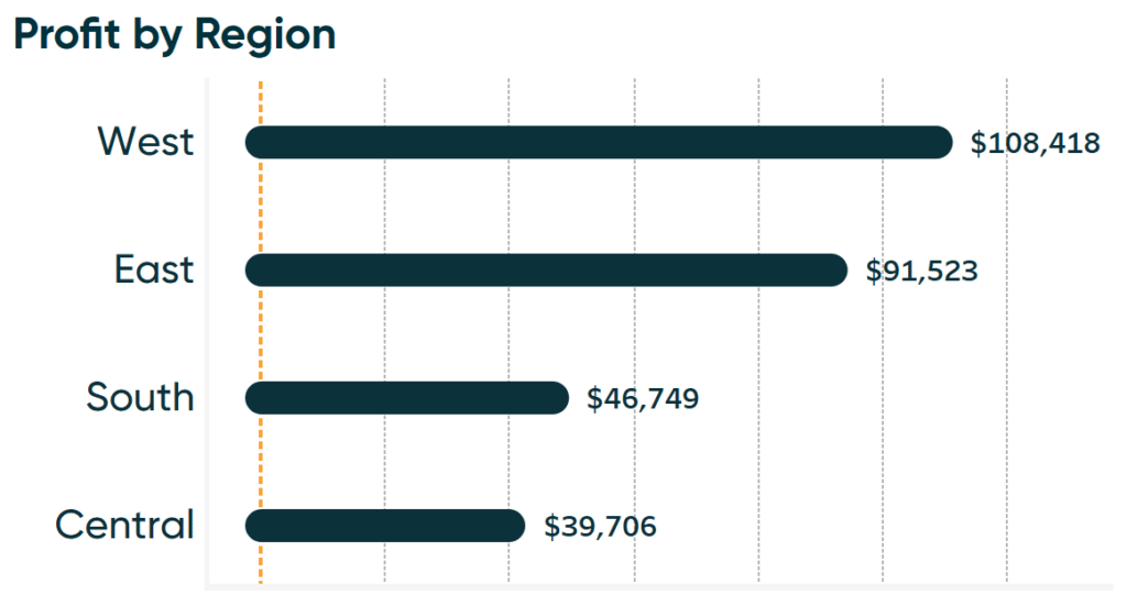
As you can see, the highest value is now right aligned to match the formatting of the following marks. This line itself and reference line label provides no other meaning, so I recommend changing both the Label and Line dropdowns to “None” which will remove any visual evidence of this trick from the view. Here is how my final rounded bar chart looks after hiding the axis header again and updating the formatting to be in brand.
This also works should you have both positive and negative values, which is possible with a measure such as Profit. To accommodate the label with the smallest negative value, simply follow the steps used to create the dynamic axis in this third tip, but change WINDOW_MAX to WINDOW_MIN and add the calculation as a second reference line.
Two Ways to Make a Diverging Bar Chart in Tableau
Thanks for reading,
– Ryan


Written By
Ryan Sleeper
Related Content
3 Ways to Make Beautiful Bar Charts in Tableau
When it comes to data visualization, Tableau bar charts are still king. With all due respect to my other favorite…

Ryan Sleeper
Create Stacked Bar Charts Formatted For a Positive User Experience Ryan demonstrates how to make stacked bar charts in Tableau,…
Ryan Sleeper
Create a More Polished Analysis with Rounded Bar Charts Ryan demonstrates why creating rounded bar charts will add professional polish,…