Dashboard Gauge 2: How to Make Rounded Bars and Scales in Tableau
While bullet graphs are the optimal type of rounded ‘gauge’ in Tableau because of their efficient use of space and their ability to show values past 100%, there are other engaging ways to display the progress toward a goal or prior period. If your primary objective is to communicate how much progress you’ve made toward hitting the 100% mark, and you don’t mind not seeing performance past the goal, you can stop the scale at 100%. This lends itself to some interesting design possibilities including the oft-maligned, donut chart.
Donut charts are criticized for inefficiently using dashboard real estate, stopping at 100%, and making it difficult for users to accurately assess progress to goal. This post will show you how to essentially flatten out a donut chart, which will solve two of these three deficiencies. Plus, I will show you a hack that allows you to round bars and the background scales. This is not an out-the-box design in Tableau, but I think it adds a touch of engagement to gauges.
This is the second in a five-part series on dashboard gauges in Tableau. For future updates, subscribe to our mailing list.
Watch the related video with Playfair+
Intro + use case
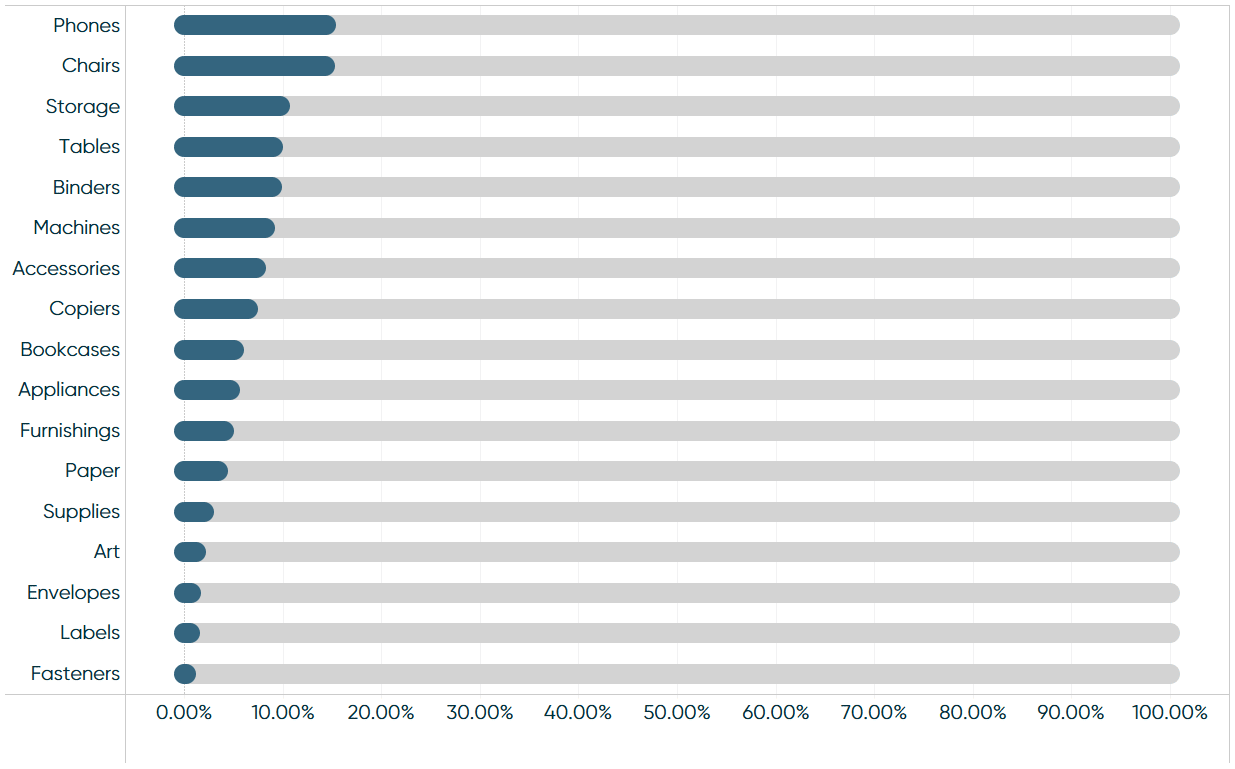
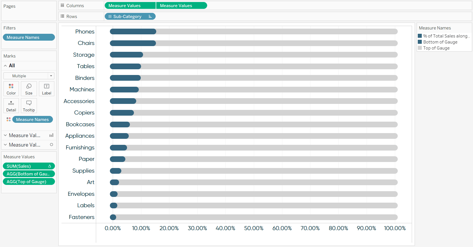
By the end of this post, you will be able to make rounded gauges in Tableau that look like this:
I’m using Percent of Sales by Sub-Category in the Sample – Superstore dataset, but you can use the following technique for any measures that you want to display on a 0 to 100% scale. Admittedly, Percent of Sales is not the best use case for this type of chart, but I wanted you to be able to follow along without having to provide a separate dataset. The reason Percent of Sales is not the best use case is because no dimension member will ever fill the gauge all the way to 100% and this would be just as effective as a basic bar chart. This type of gauge works best when you are wanting to track and communicate progress towards a goal or comparison up to, but not past, 100%.
Continue reading with a free account, or login.
Unlock this tutorial and hundreds of other free visual analytics resources from our expert team.
Already have an account? Sign In
By continuing, you agree to our Terms of Use and Privacy Policy.
To create rounded gauges in Tableau, you need three measures: (1) the measure you are analyzing, (2) a calculated field that creates the bottom of the gauge, and (3) a calculated field that creates the end of the gauge.
The measure I am analyzing in my example is a table calculation that computes the percent of sales across the 17 sub-categories in the Sample – Superstore dataset; this will always total to 100%.
Create the gauge end points
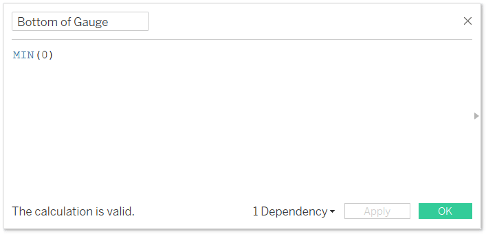
The calculation for the start of my gauge should equal zero, so the formula is:
MIN(0)
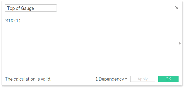
The calculation for the end of the gauge should equal one, so the formula is:
MIN(1)
Add measure values
Next, I need to get these three measures onto the view, and break them down by (in my case) Sub-Category. To do so, I’ll use the generated field Measure Values on the Columns Shelf and the Sub-Category dimension on the Rows Shelf.
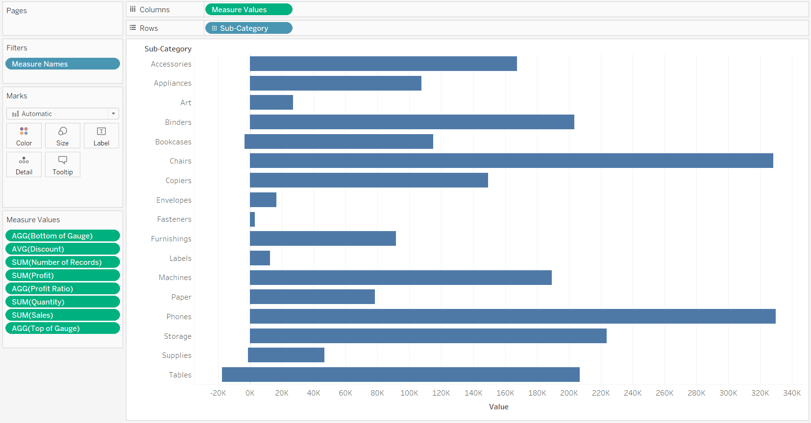
By default, this stacks every measure in my dataset in a bar chart, broken down by Sub-Category. For this visualization, I only need the Sales, Bottom of Gauge, and Top of Gauge measures, so I will drag the others away from the Measure Values Shelf to filter the measures being used.
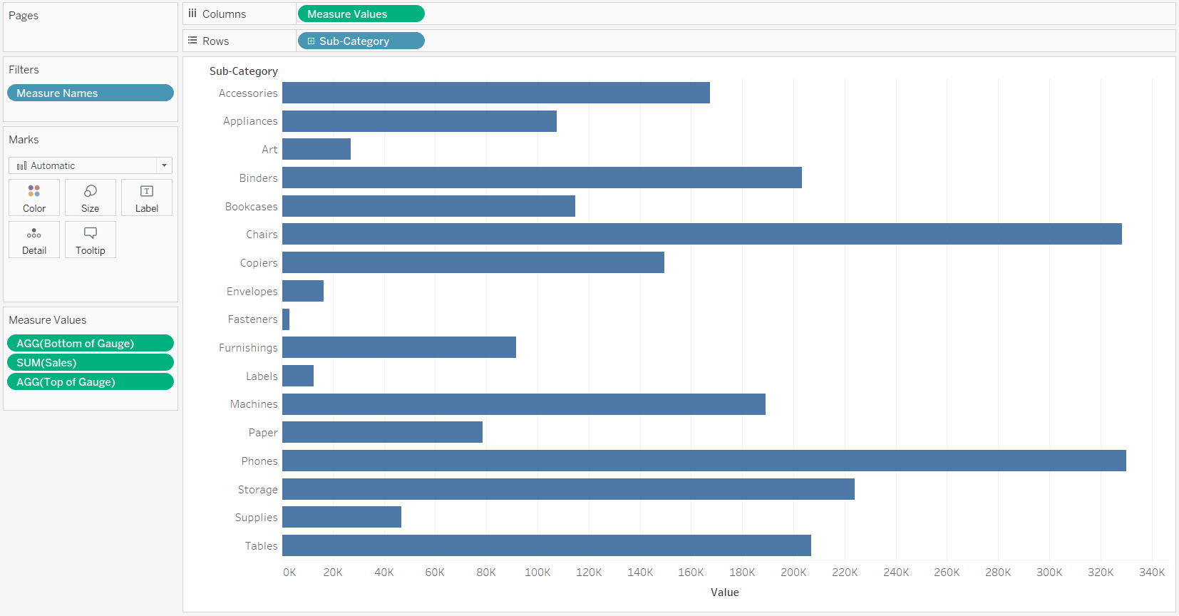
For my example, I need to add a table calculation to compute the percent of total sales for each sub-category. This can be accomplished by right-clicking on the Sales measure that is currently on the Measure Values Shelf, hovering over “Quick Table Calculation”, and choosing “Percent of Total”. Now all three measure are stacked on top of each other on a 100% scale.
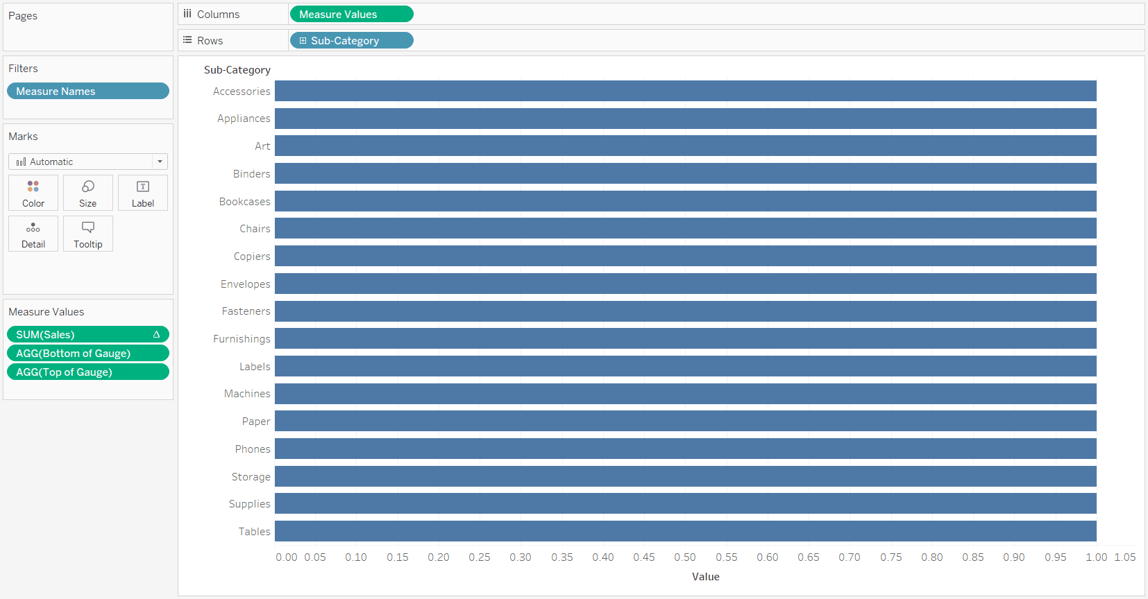
To see the three individual measures, drag the generated field, Measure Names, to the Color Marks Card. The bottom of the gauge and the measure you are analyzing should be colored the same, and the top of the gauge should be a different, more neutral color (this will eventually be the gauge background).
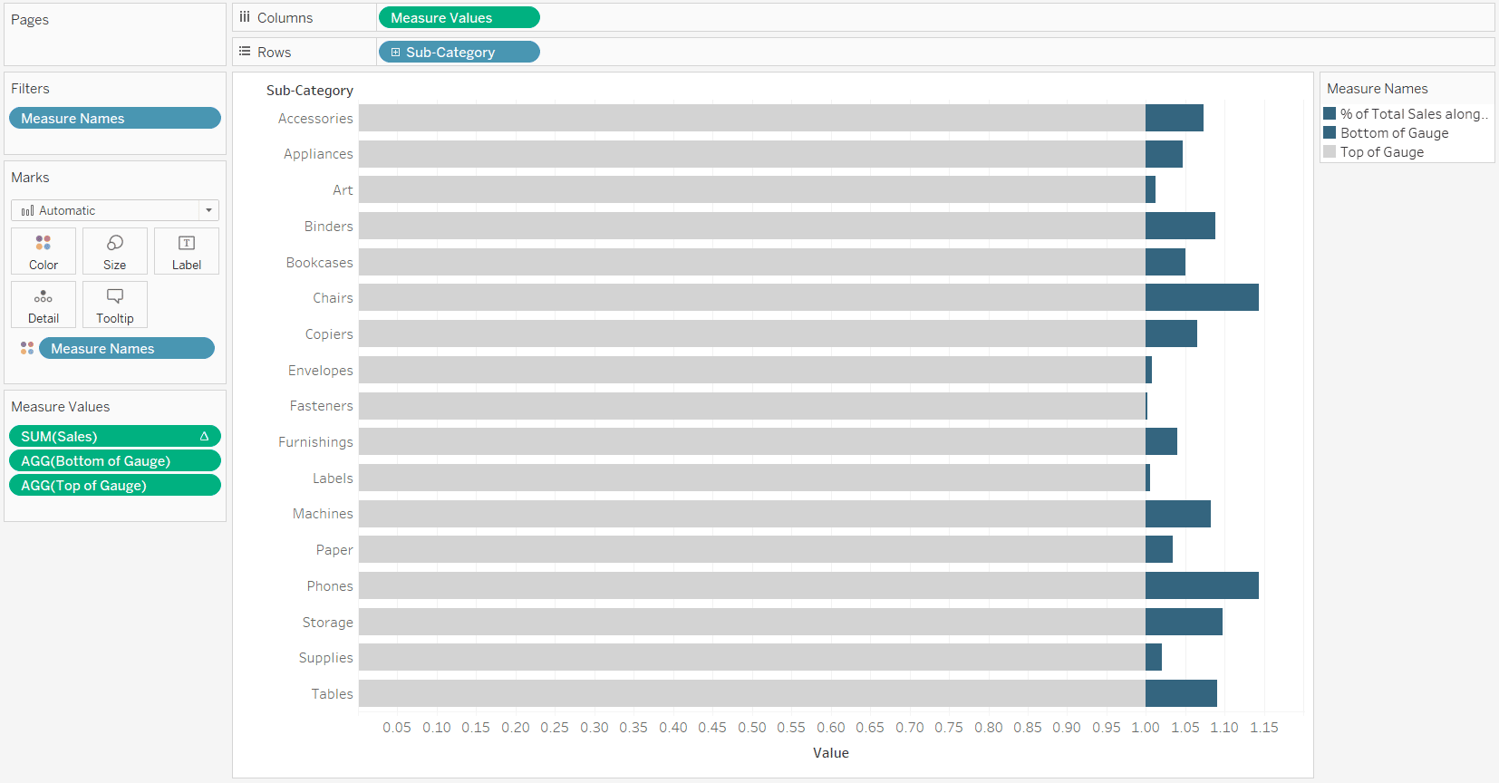
Now you can see the scale is going beyond 100%. To get the gauge back to representing zero to 100%, you must turn off stacked marks. This can be found under Analysis > Stack Marks in the top navigation. After choosing Off, my chart looks like this:
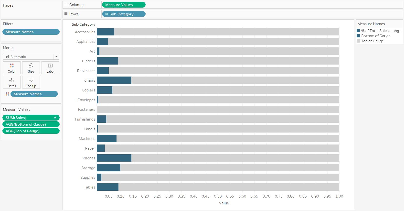
This is a decent chart at this point, but has at least one drawback that I can think of: the bars can be implied as stacked bars and confuse the user into thinking the gray shading means something other than blank space that is yet to be filled. Although it comes with its own limitations, most notably less precision, I believe rounded marks help imply that the chart is a gauge that is filling up.
Round the gauges in Tableau
To create the rounded design, duplicate the Measure Values pill on the Columns Shelf. I like to do this by holding down the Control key while I click on the pill and drag it next to itself.
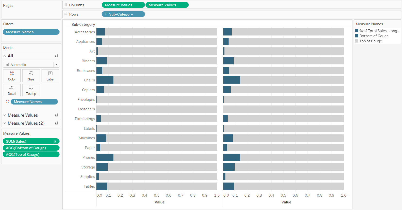
This puts the same gauges in two columns, but now that there are multiple measures on the Columns Shelf, they each get their own set of Marks Cards that can be edited independently of each other.
This means I can navigate to the Marks Shelf for the second column and change the mark type to Circle.
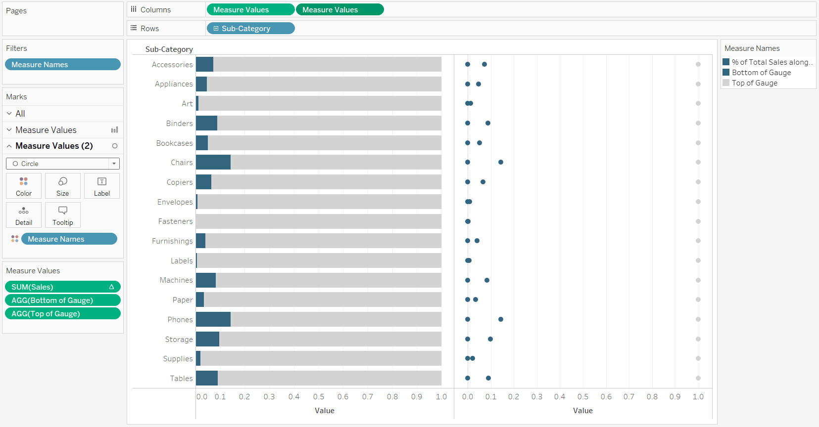
Next, convert these two columns in to a dual-axis combination chart by right-clicking on the second pill on the Columns Shelf and choosing “Dual Axis”. Tableau will try to help you out and change the mark type of the first column to Circle. Make sure you change the mark type of the first column back to Bar.
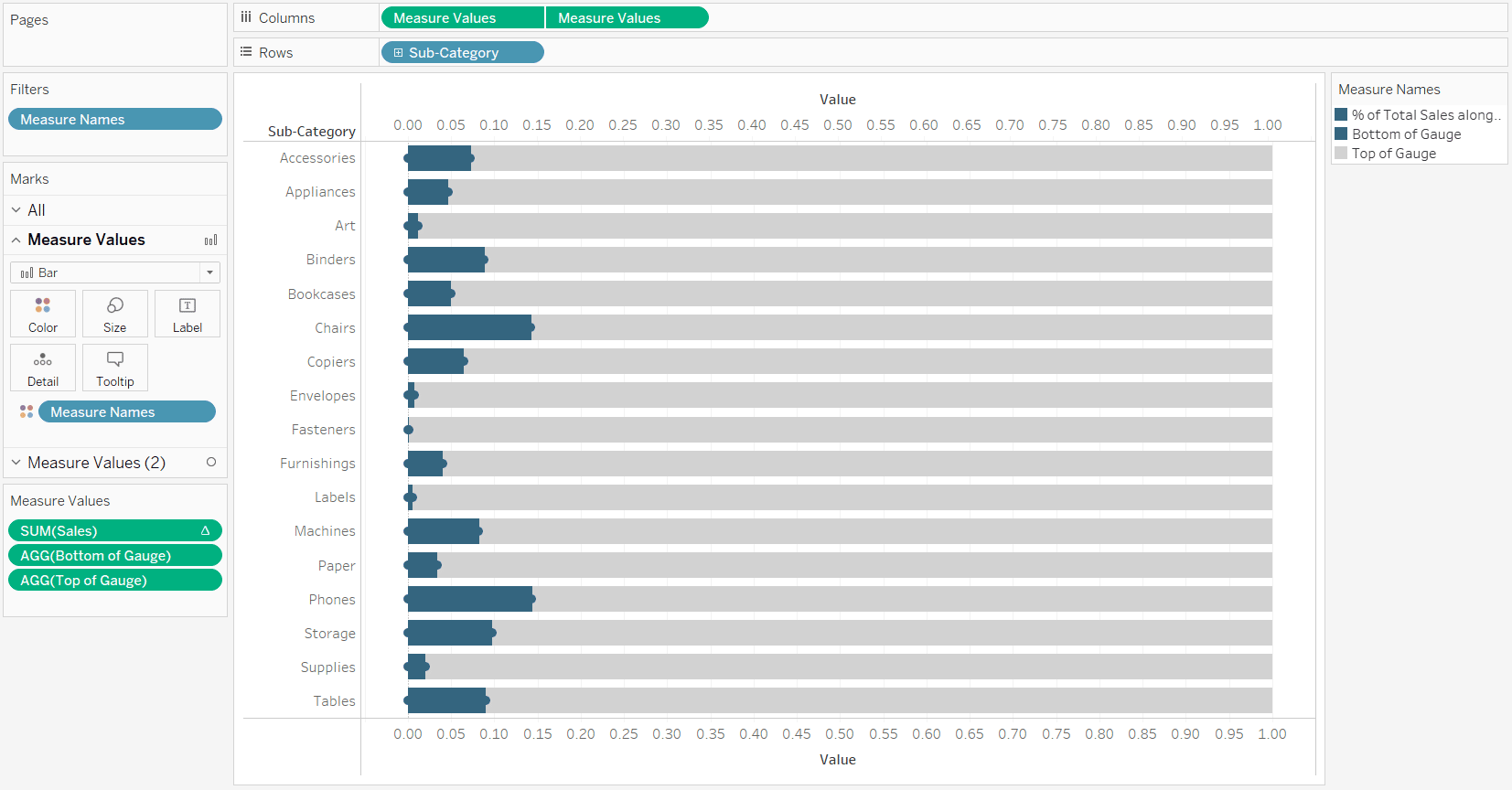
To finalize the view, use the Size Marks Card to get the circles to line up with the ends of the bars and ensure the axes are synchronized by clicking on either axis and choosing “Synchronize Axis”.
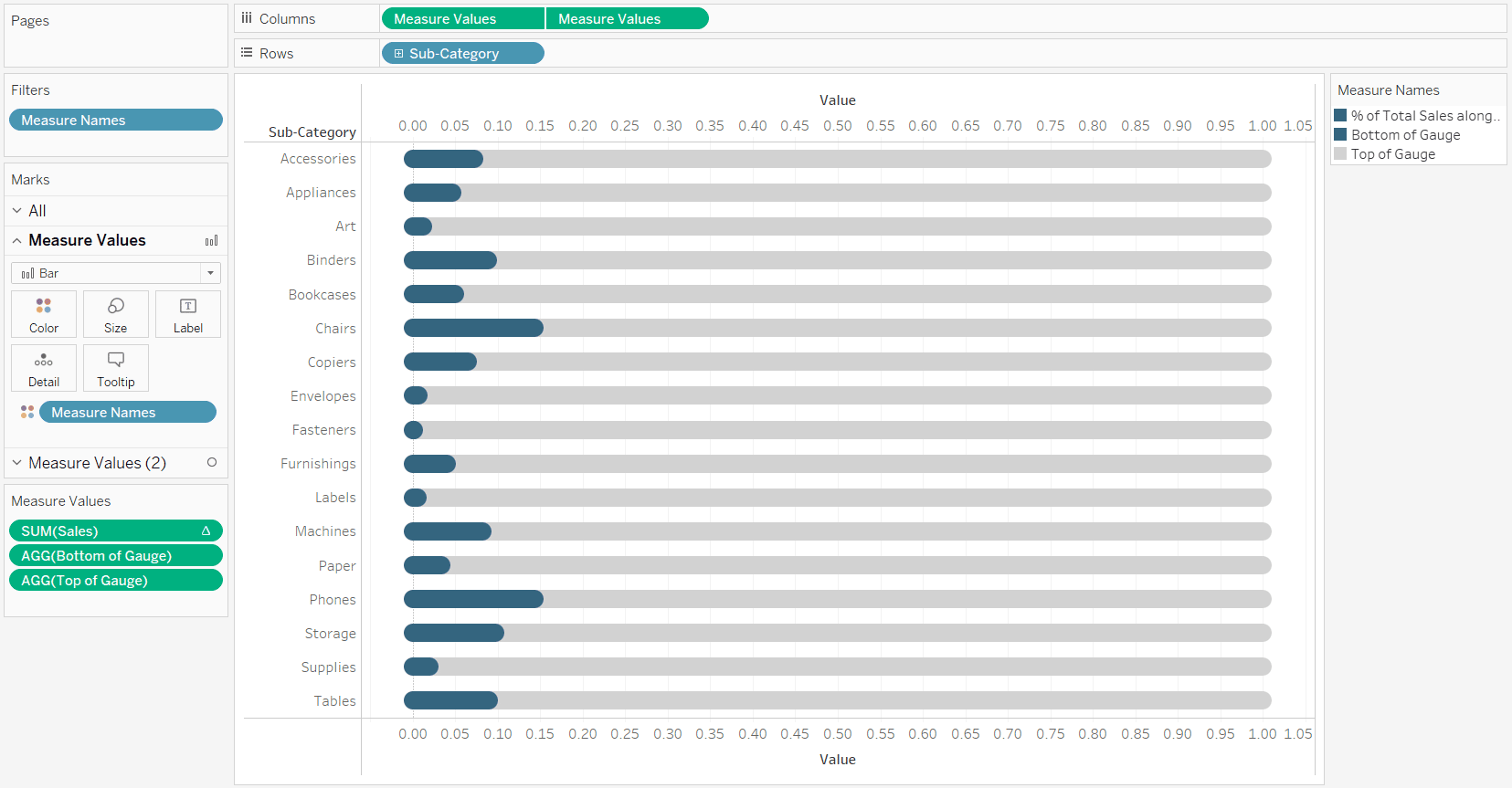
Here’s how my final view looks after hiding one of the axes, changing the number formatting to percentages, sorting, and cleaning up the formatting.
Thanks for reading,
– Ryan
Related Content
Ryan Sleeper
Create a More Polished Analysis with Rounded Bar Charts Ryan demonstrates why creating rounded bar charts will add professional polish,…
3 More Ways to Make Beautiful Bar Charts in Tableau
The humble Tableau bar chart still reigns supreme when it comes to visualizing differences between categorial, or discrete, data –…
3 Ways to Make Gorgeous Gantt Charts in Tableau
Traditional Tableau Gantt charts display a mark at a start date and size the mark by duration, showing a visual…
