3 Ways to Make Beautiful Bar Charts in Power BI
Despite many new challengers over the years in the world of data visualization, bar charts have remained one of the most effective and understandable chart types to showcase information. Don’t look past their simplicity–that’s a baked-in feature, not a bug! They take advantage of one of the most powerful preattentive attributes: length. Even a casual viewer can quickly glance at the various lengths on bar charts and process the visualization with efficiency and accuracy–exactly what you want a powerful data visualization to have in Power BI.
That being said, bad bar charts can be boring, uninteresting, or even worse–misleading. My hope is that the tips listed below will help you create “beautiful bar charts” for all your data visualization needs. By the end of this post, you will be able to use Power BI’s default formatting, some tips for cleaned up formatting, and create capped bars to create some visual interest.
FAQs answered in this post:
How do I adjust bar spacing in Power BI bar charts?
Navigate to Format visual and adjust spacing under the Columns section by increasing the Space between categories from 20% to 30%. This reduces bar thickness while maintaining readability, creating better visual balance in your chart. The right spacing ensures bars are substantial enough to compare but not so heavy they dominate the visualization.
Should I avoid double encoding in Power BI bar charts?
Yes, bars already separated by position don’t need unique colors added to the Legend, as this creates unnecessary and potentially confusing visual encoding. The exception is when colors link multiple dashboard visuals together for consistent data storytelling. Keep your bar charts simple with single color schemes unless coordinating across an entire dashboard layout.
How do I add a baseline to Power BI bar charts for direct labeling?
Hide the axis to maximize the data-ink ratio and add direct labels to bars, then navigate to the Analytics pane and add a Constant line at zero. Make the line solid, black, and 0% transparent to create a foundation that prevents bars from appearing to float. This technique provides visual grounding while eliminating unnecessary axis elements that detract from the data.
What are capped bar charts in Power BI and how do I create them?
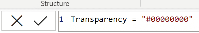
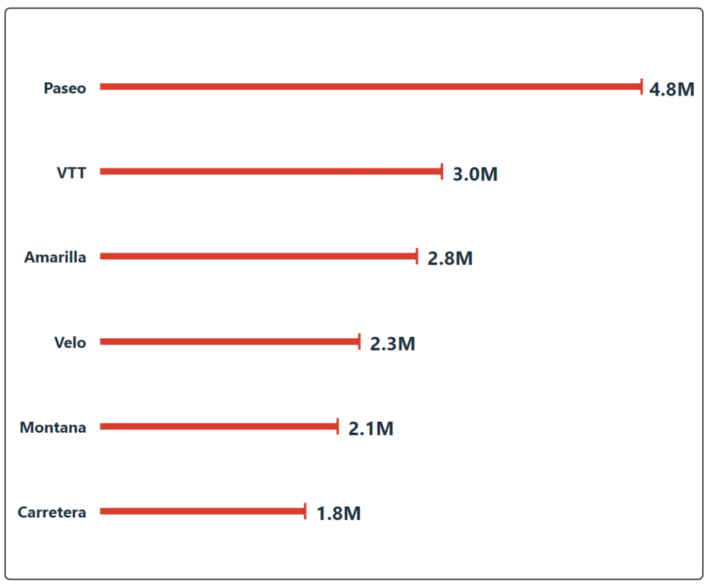
Capped bar charts use error bars to create visual interest by emphasizing bar endpoints while hiding the standard bars. Create a DAX measure that returns 100 for transparency, add it to bar color formatting as Field Type, then add an error bar with upper bound as your measure and lower bound as zero. This technique creates a clean, modern look that draws attention to values rather than bar masses.
When should I use formatted gridlines in Power BI bar charts?
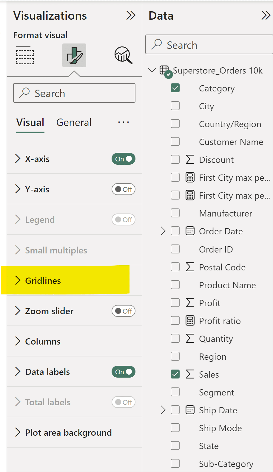
Formatted gridlines work well for wider bar charts with three or more columns where slight height differences need emphasis. Use dark gray, dotted lines at 3px to help stakeholders track raw values across the chart without overwhelming the visualization. Be cautious with gridline formatting to avoid negatively impacting the data-ink ratio when variance between bars is already obvious.
How can Playfair Data improve our Power BI bar chart design and dashboard strategy?
Playfair Data teaches Power BI engineering techniques including data-ink ratio optimization, DAX calculations for advanced formatting, and strategic color usage that transforms basic bar charts into decision-ready analytics. Our experts deliver practical training on Power BI Desktop features and enterprise dashboard design. Book a strategy call to learn how our Flagship Power BI workshops can help your team master advanced techniques that improve stakeholder engagement and ROI.
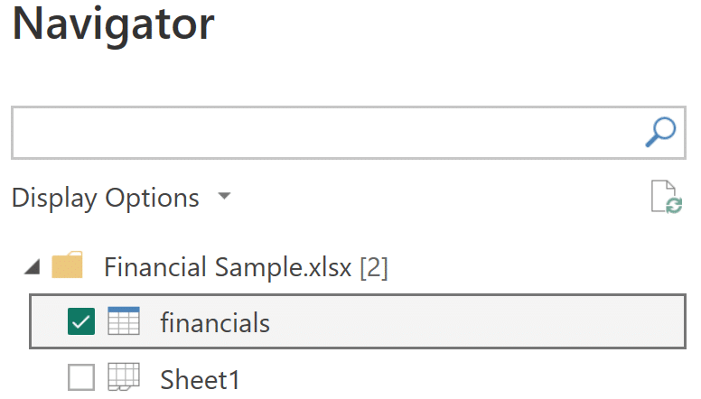
We’re going to use one of the sample data sets available to anyone using Power BI Desktop–when you open a new file, follow the instructions on how to load a sample data set and choose the “financials” sheet from Financial Sample.xlsx
Use available formatting for Power BI bar charts
My first tip for making beautiful bar charts in Power BI is to not overthink things–use the formatting options provided in the Power BI software.

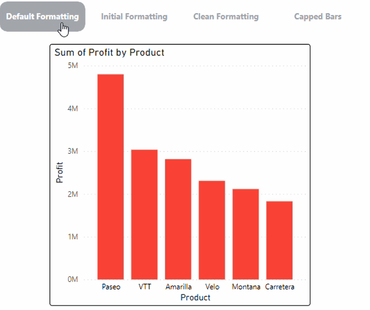
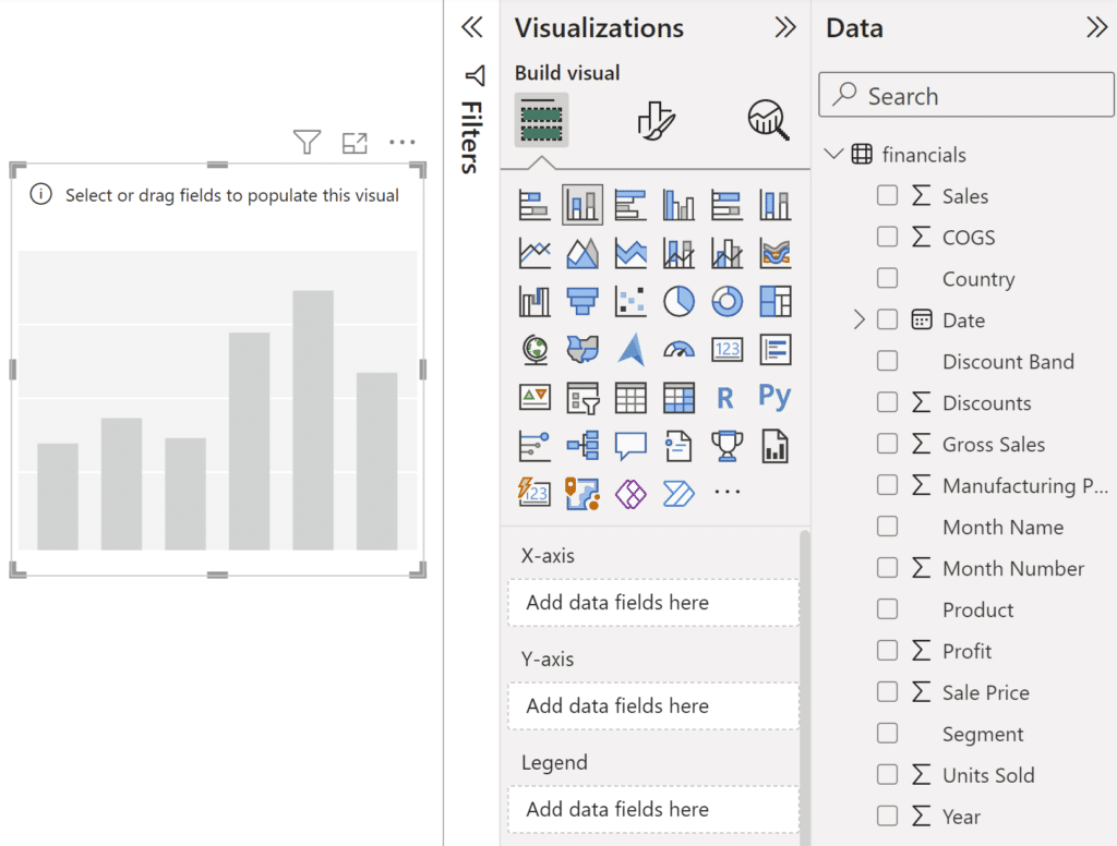
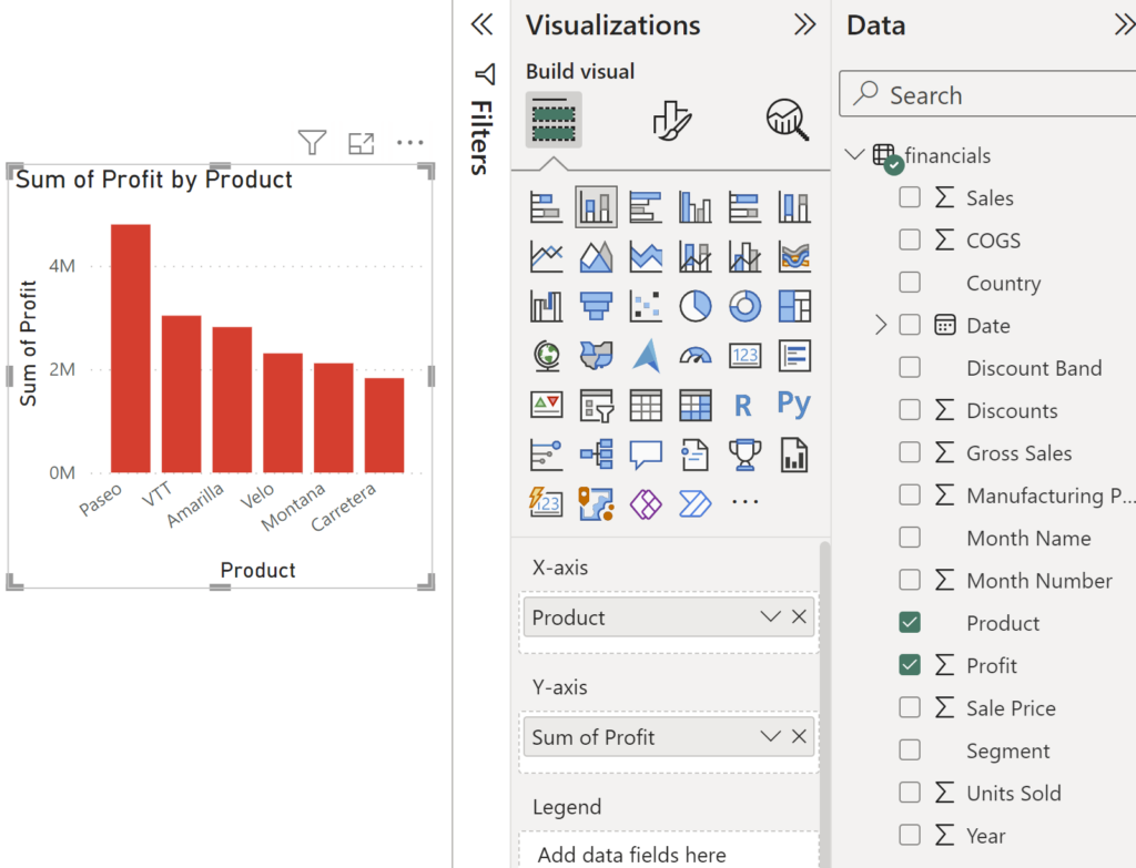
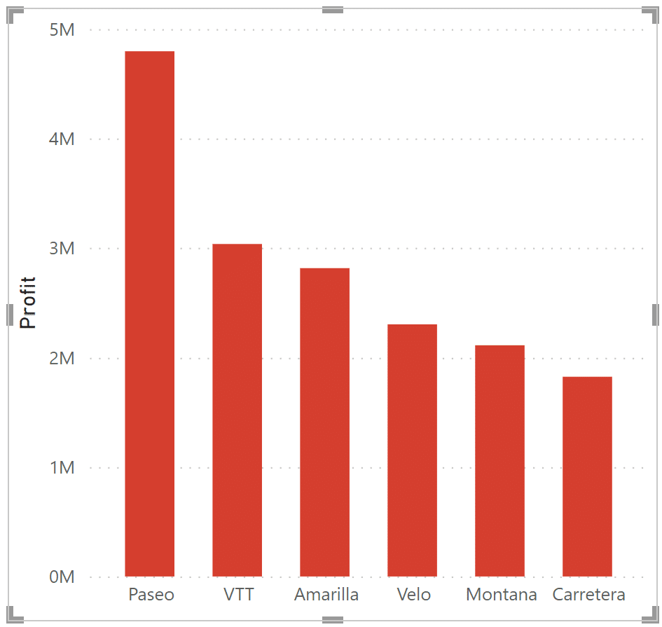
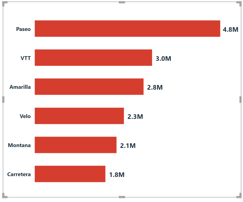
Let’s start with the following Profit by Product bar chart by clicking on the “Stacked column chart” visualization type. You’ll see a blank chart appear on your report page and several new fields available in the Visualization pane: X-axis, Y-axis, Legend, Small multiples, and Tooltips.
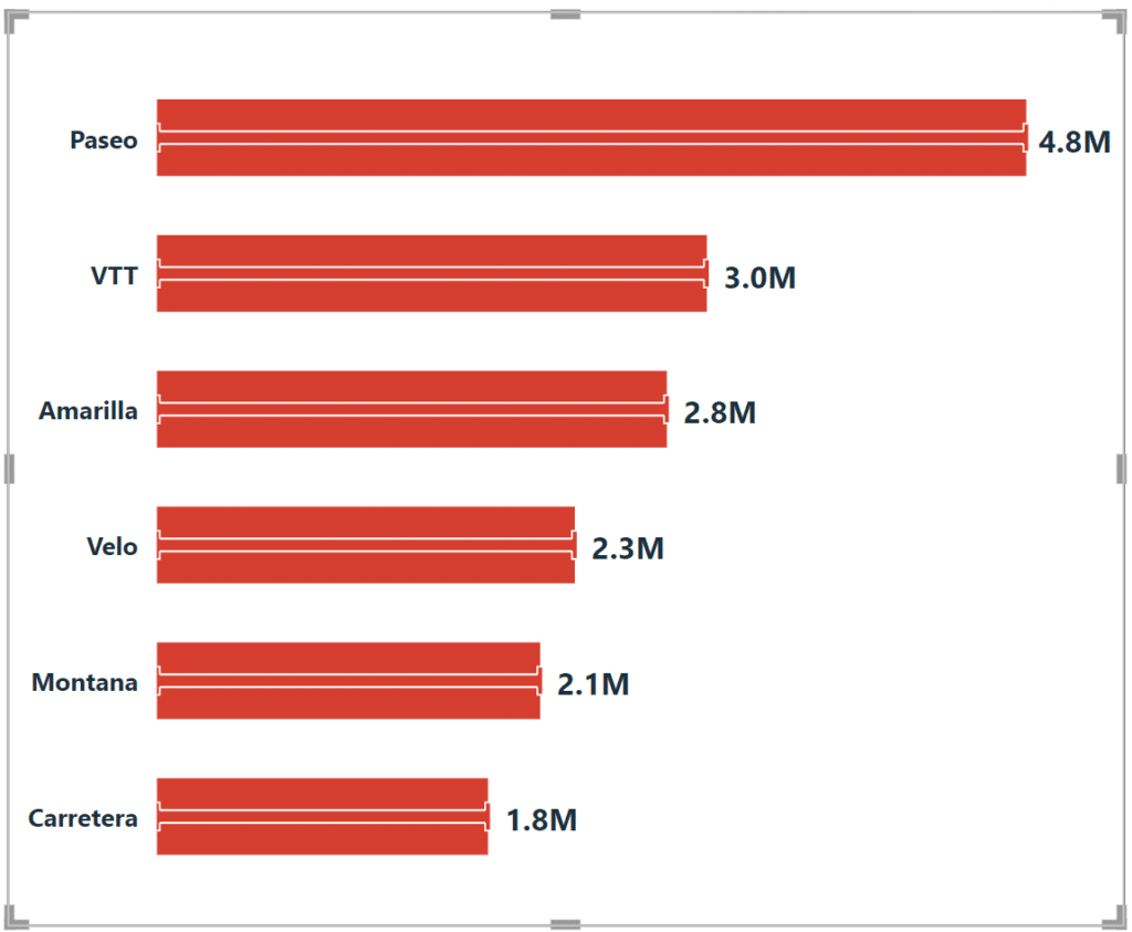
Go ahead and add “Product” to the X-axis and “Profit” to the Y-axis–you’ll see that Profit is automatically brought with an aggregation of SUM. This is the default view without any formatting. I might describe it as “aggressively fine” as it gets the point across that “Paseo” has the highest amount of profit, at around $4.5M, followed by VTT and then Amarilla.
However, there are several opportunities to make this bar chart more engaging and effective. The most obvious of which is to increase the column width so the categories can be more easily read, and to adjust the Y-axis to better gauge the bar heights. To adjust the column width, find the Layout section under X-axis and increase the Minimum category width from 20 px to your desired width.
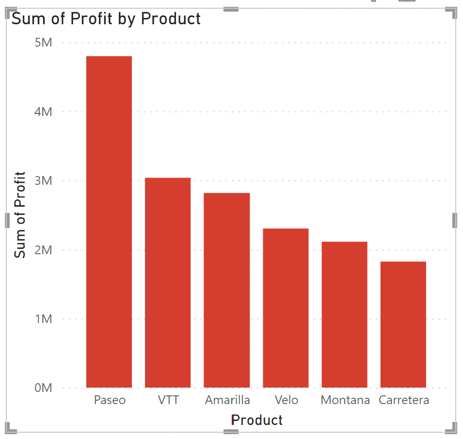
When you increase column width in PBI, the width of the bars also increase. In my opinion, these bars are now too heavy relative to the rest of the visual.
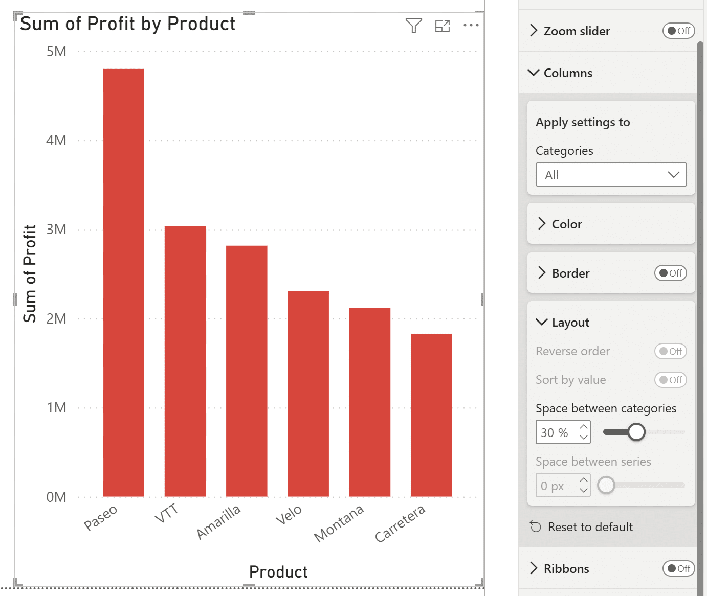
The next step I’ll take is to reduce the size of the bars by going into the Visualizations pane, selecting the Format your visual icon, scrolling down to Columns, and adjusting the spacing by increasing the Space between categories from 20% to 30%. Here’s the result:
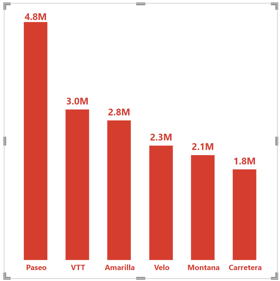
The next tip is arguable, but I’m going to defer to visual analytics expert (and Playfair Data founder), Ryan Sleeper, on this one and say we should clean up the visualization by hiding the X-axis header. In my experience, the context of the chart is often provided in surrounding text and/or dashboard titles, so I am going to hide the axis title by navigating to the “General” tab under Format Visual and turn the Title slider to “Off.” I am also going to do the same under the X-axis menu in the “Visual” tab and change the default Y-axis title to “Profit.” If this is a standalone visualization, I recommend keeping the title.
Take this next step on a case by case basis, but a potential side effect of having limited variance between the three bars is that there are too many “unused” gridlines and axis marks. This negatively impacts the data-ink ratio, and can be cleaned up if necessary. You can set the Minimum and Maximum values in the Range menu under Y-axis, and also change the display units to provide additional clarity for analysis.
Last, but not least: color. Playfair Data has written quite a few color tutorials including Leveraging Color to Improve Your Data Visualization and 3 Ways Psychological Schemas Can Improve Your Data Visualization. There is so much to be said about color, but for the purposes of this post, I will offer two highlights from my colleagues on coloring your bar charts and one addition of my own:
- Avoid double encoding. The bars in our chart are already separated by category. Adding category again to the Legend to color each bar with a unique color is unnecessary and potentially confusing. The one caveat to this is if the colors are being used to provide a link between multiple visuals on a dashboard.
- Keeping in mind the possibility of overwhelming your visuals with too much formatting, consider the effect that formatted gridlines can have on your bar chart. Effective gridlines can emphasize slight differences between similar bar heights and make it easier to track raw values across the chart. Play with the Gridlines formatting option for this–I enjoy a dark gray, dotted line at 3 px for wider bar charts with more than three columns.
- Use this as an easy opportunity to brand your data visualization. If you can’t decide on a color, consider using a primary or secondary color from you or your end users’ brand.
Use axis rulers to add a baseline to Power BI bar charts
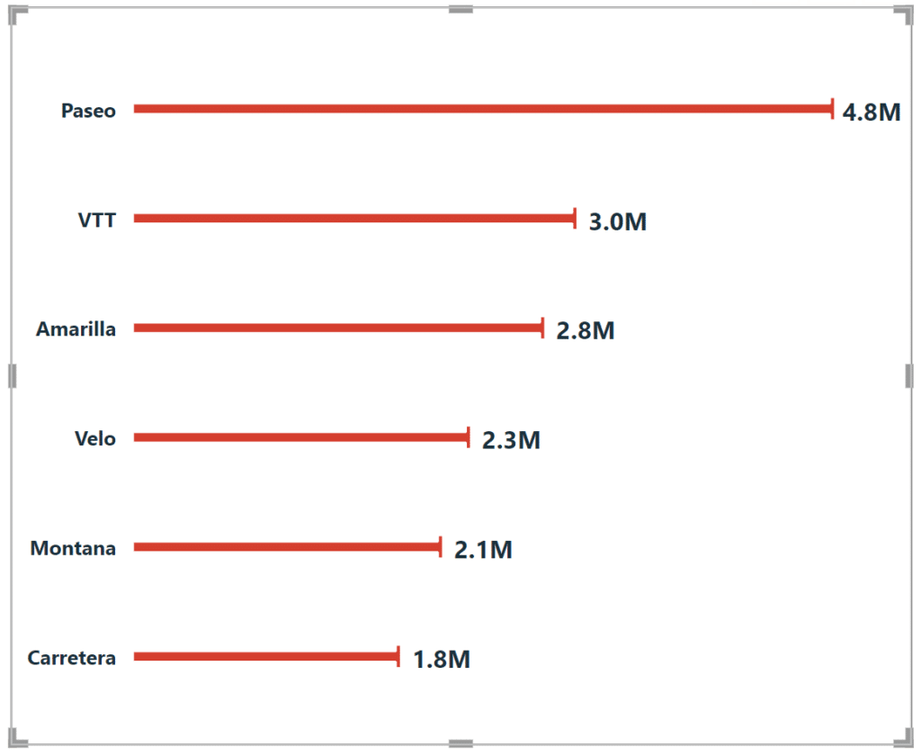
A big design emphasis in data visualization is the “data-ink ratio.” This concept introduced by Edward Tufte says that you should dedicate as much “ink” on a data visualization to the data as possible. One way I sometimes achieve this is by hiding the axis altogether and adding labels to the bars; a technique called “direct labeling”.
To highlight the numbers themselves, I’ve increased the font and also changed the colors to be the same as the bar, visually connecting them. However, this might be “too clean” of a look, floating freely and disconnected. Let’s add a foundation of sorts–a base for the bars to sit on. To do this, navigate to the Analysis icon in the Visualization pane–the chart inside a magnifying glass, and add a Constant line. We’ll make ours black and solid, with 0% transparency.
This will open the formatting pane on the left. Navigate to the “Format Lines” tab and modify the formatting for the Axis Rulers for Rows and Columns. To clean up the view, I’m going to set the Axis Rulers for Rows at None, which removes the thin gray vertical line on the left side of the bar chart. I’m then going to format the Axis Rulers for Columns to be a solid, thick line that matches the color of the bars’ borders.
Here’s how my final bar chart looks after removing all of the other lines except for the baseline. Compare this to the default Power BI bar chart in the first image above!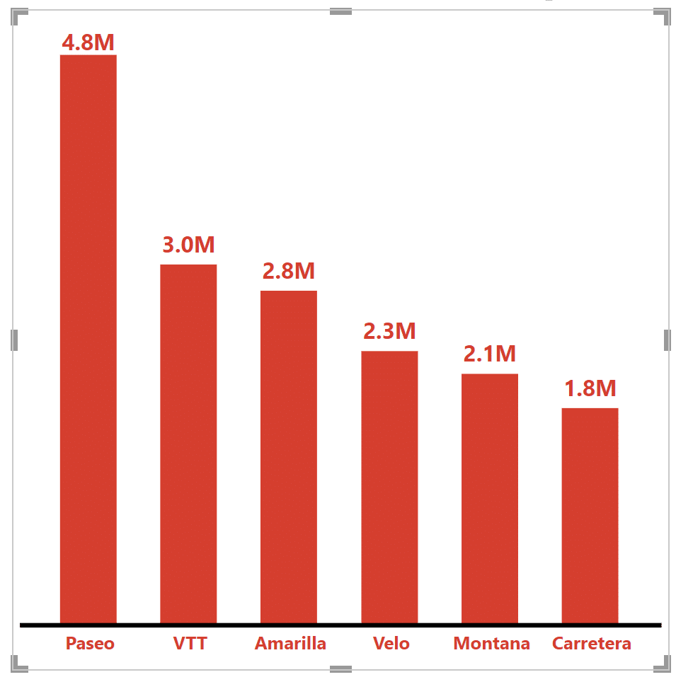
Use error bars to create visual interest in the bar chart
If you’d like to create a viz that carries a bit more interest than a traditional bar chart, there’s a neat trick that, while limited, can go above and beyond the basic blocky design. To emphasize the end of a chart, combine a Data Label with an Error Bar and one nifty bit of DAX to hide the standard bar. Your end result will look like this:
But how do we get there from here?
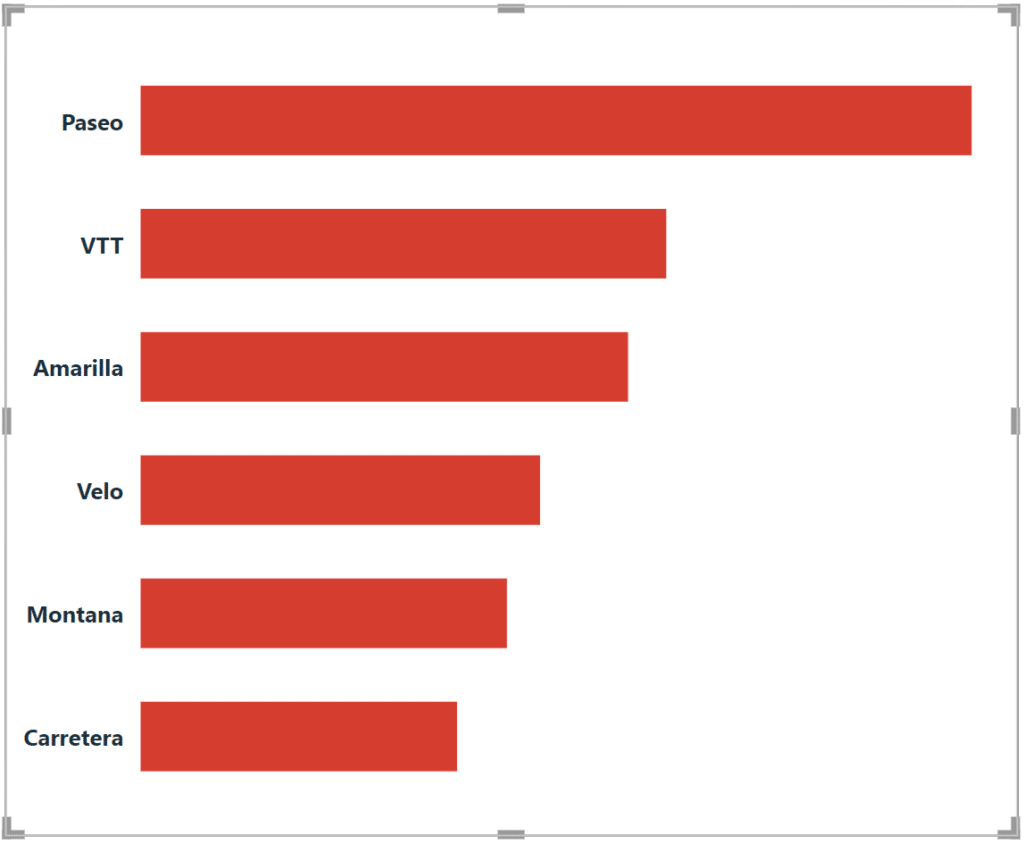
Let’s dive in. To start, you’ll choose the “Clustered bar chart” viz type and have “Product” on the Y-axis and “Sum of Profit” on the X-axis. Moving to the Format visual menu, you’ll want to turn on Data labels and match the color to your bars.
Continue reading with a free account, or login.
Unlock this tutorial and hundreds of other free visual analytics resources from our expert team.
Already have an account? Sign In
By continuing, you agree to our Terms of Use and Privacy Policy.
I’ve also made my text bold to draw the visual weight and interest to the right side of the visualization.
The next step is to navigate to the Analytics menu and add two items: a solid, 0% transparent Constant line at 0 in the same color as your background and an Error bar with the upper bound as the same as your X-axis (in this example, “sum of profit”) and a lower bound at Zero.
![]()
Wait, you don’t have a Zero measure in your dataset? Let’s fix that with a simple single-line DAX function. Create a new measure and use this formula:
While we’re creating this function, let’s also jump ahead a couple steps and create our real magic for this visual, which is the transparent bar chart measure. You need this because without it, you won’t be able to reveal your underlying error bar. Before you apply this measure to your color formatting, your visual should look like this:
Switching back to the Format visual menu, you can format your bar color using a function. You want the Format Style to be Field Type, and then from your available fields, select the “Transparency” field you just created. Your main bars should disappear, leaving only our full-length error bar behind!
Thanks for your time!
Matt Snively
Sr. Manager, Analytics Engineering


Written By
Matt Snively

Peer Review
Juan Carlos Guzman
Visual Analytics Associate

Graphic Design
Dan Bunker
Manager, Decision Engineering
Related Content
3 More Ways to Make Beautiful Bar Charts in Tableau

The humble Tableau bar chart still reigns supreme when it comes to visualizing differences between categorial, or discrete, data –…

Matt Snively
Create impactful bar and column charts in Power BI Desktop In this video, you’ll learn how to create and use…
3 Ways to Make Beautiful Bar Charts in Oracle Analytics Cloud
When it comes to comparing discrete categorical values, rarely is there a better choice than the bar chart. Invented by…