3 Ways to Make Brilliant Bullet Graphs in Tableau

Setting goals and measuring progress is a common activity for many people. Maybe someone wants to read 25 books, travel to 5 new places, or learn 10 more Tableau techniques. From a business perspective, this might mean setting sales quotas, app download totals, or ad click-through rate benchmarks. Since we’re talking about setting goals, it’s only appropriate to dive into the ways we can visualize progress throughout the month, year, or beyond. In a previous post, we walked through how to create Tableau bullet graphs to gauge or measure progress. Pioneered by Stephen Few, bullet graphs offer an easy-to-read way to make comparisons to prior periods or goals.
Watch the related video with Playfair+
This post will show you three ways to polish bullet graphs to really make them stand out in your dashboard or report. 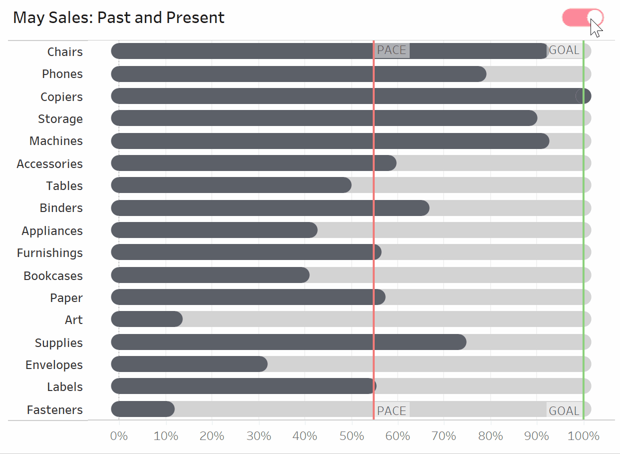
Taking Tableau bullet graphs beyond basic formatting
Traditional bullet graphs employ a comparison point in the form of a reference line plus shaded bars or bands that represent some percentage of that reference line (e.g. 60% and 80%). While in some contexts those percentage bands may be helpful, we always want to be mindful of ways we can reduce cognitive load for our end user. That is, we want to reduce our visualizations down to just their essential components so they are quick and easy to understand.
![]()
When the primary objective is to communicate whether the comparison was met, and the progress to the comparison is not as important, I recommend omitting the percentage bands. Below you can view a comparison:
Color choice is another way we can take bullet graphs from basic to brilliant. Since color is a preattentive attribute, meaning our brains process colors without the conscious decision to do so, color choice can make or break the success of your visual. Things to consider when selecting your color palette include:
- A color palette that fits with your brand color scheme, if applicable.
- Colors with established meanings make sense in the context of the visual (e.g., green for positive change, red for negative change).
- The number of distinct colors in your dashboard is reduced to just the essential, ideally five or fewer. More colors equal more cognitive load.
- Sufficient contrast between colors on the same visual so that they are readable.
Taking a few extra steps to move beyond the basic formatting can take your bullet graph from ho-hum to wow. Read on for more ways to take your bullet graphs to the next level, and to see the formatting and color scheme I chose.
Continue reading with a free account, or login.
Unlock this tutorial and hundreds of other free visual analytics resources from our expert team.
Already have an account? Sign In
By continuing, you agree to our Terms of Use and Privacy Policy.
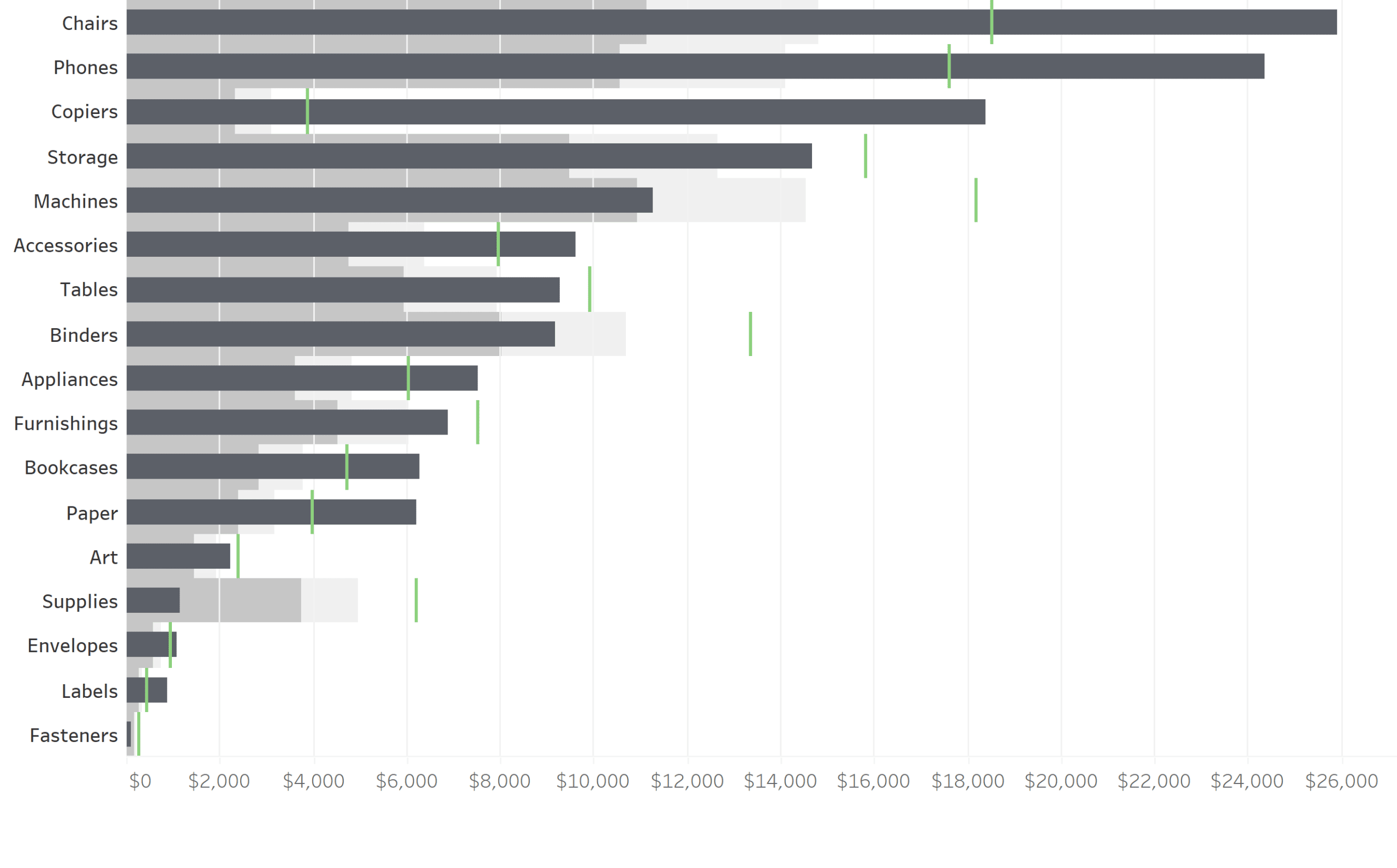
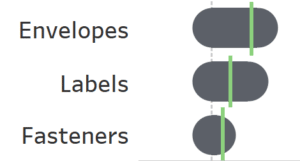
How to make a modern, rounded bullet graph in Tableau
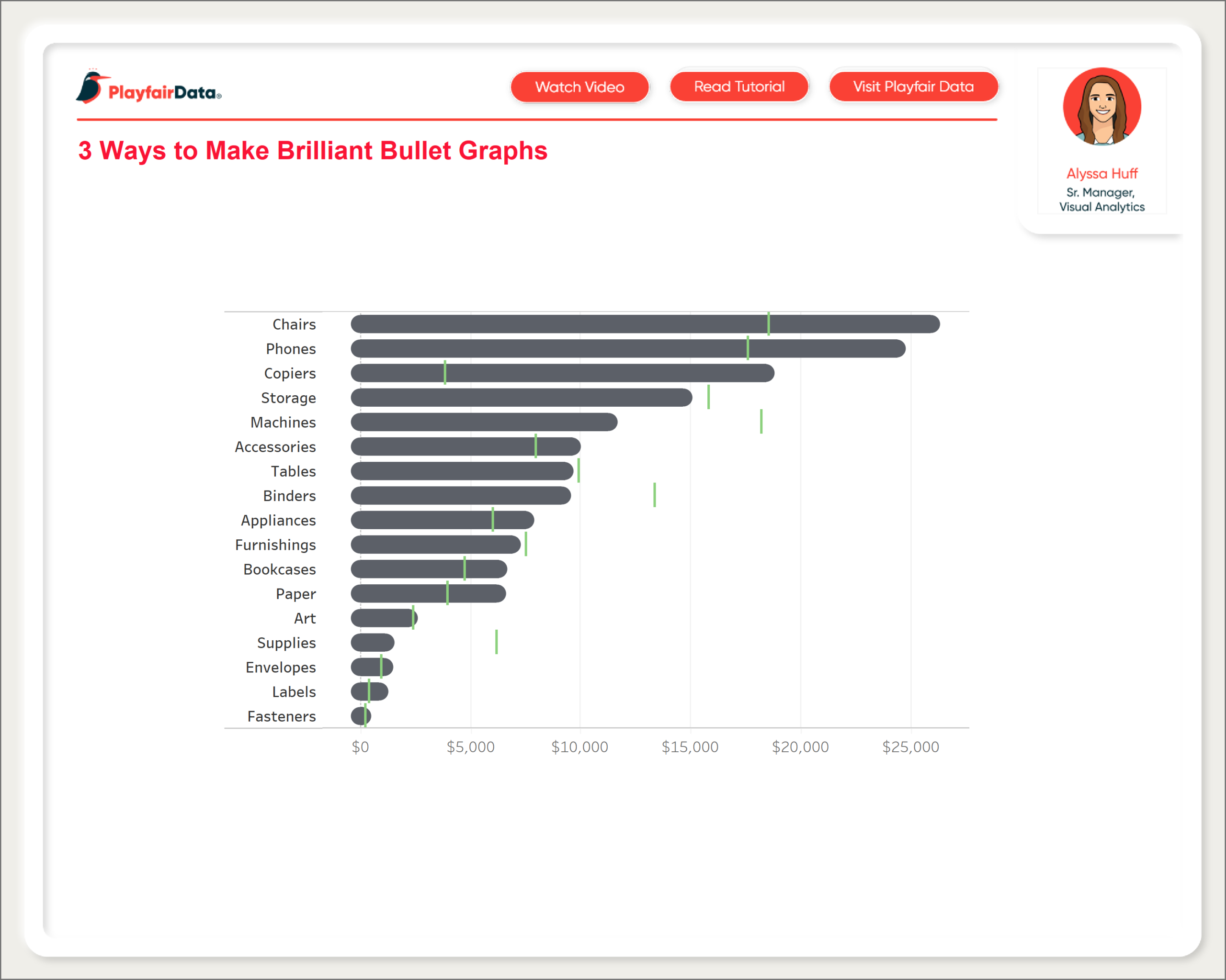
By the end of this post, you will be able to make a modern, rounded bullet graph that looks like this:

Out-of-the-box bullet graphs in Tableau look like this:
While this is perfectly useful as-is, what if we want to create a bullet graph with a cleaner, more modern look? To create our bullet graph, we’ll build upon the example from this previous blog post that compares month over month sales, and this post that shows how to create rounded gauges. Like the first post, we’ll use the Sample – Superstore dataset and pretend that there is only one year of sales data.
The Easy Way to Make Rounded Bar Charts in Tableau
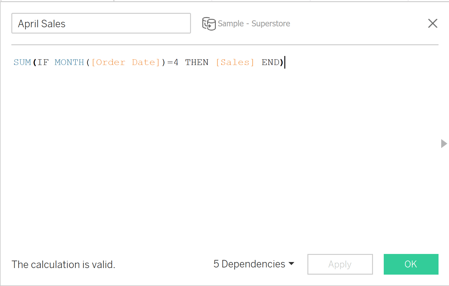
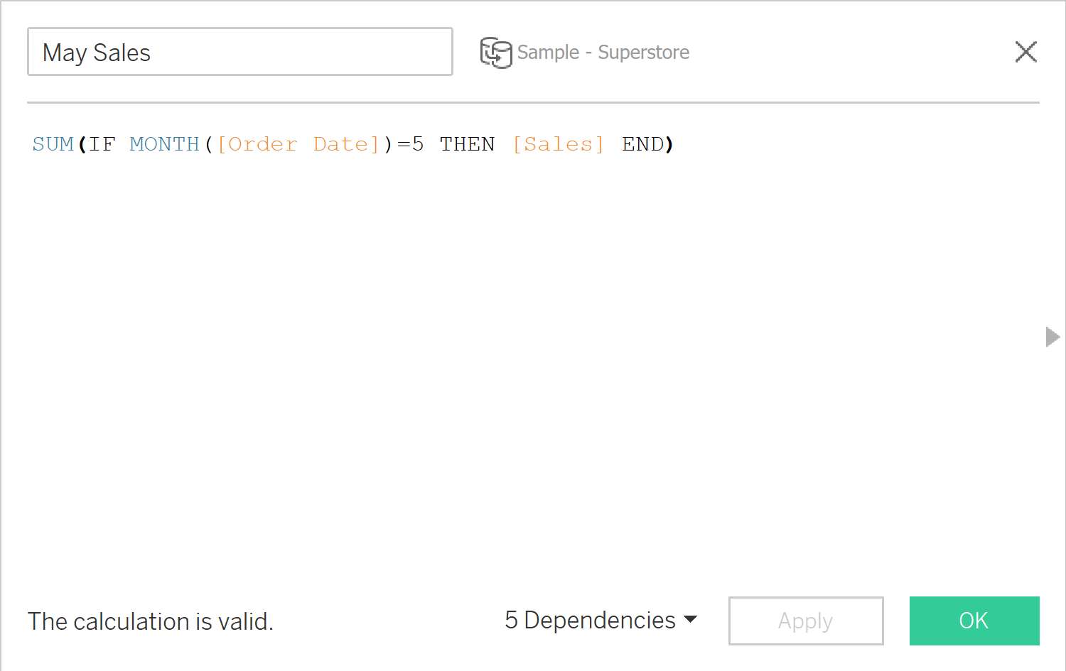
First we’ll create calculated fields to isolate April and May sales.
SUM(IF MONTH([Order Date]) = 4 THEN [Sales] END)
SUM(IF MONTH([Order Date]) = 5 THEN [Sales] END)
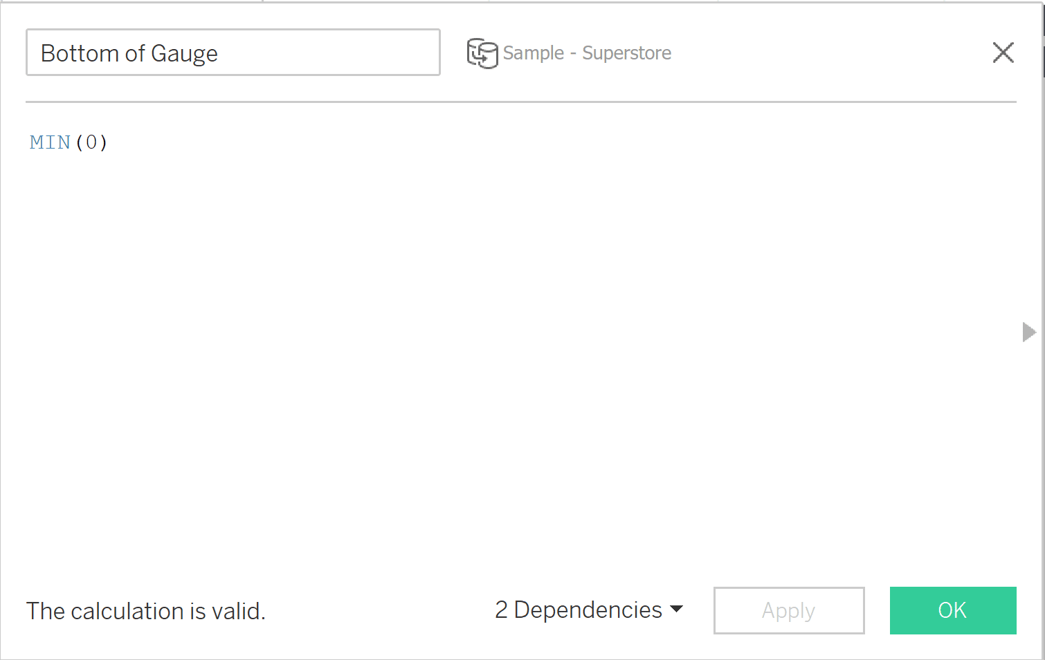
Next we need to create a calculated field to create the bottom of our rounded gauges. We’ll use our May Sales calculated field as the top of our rounded gauges, so no additional calculated field will be necessary. The formula for the bottom of our gauge looks like this:
MIN(0)
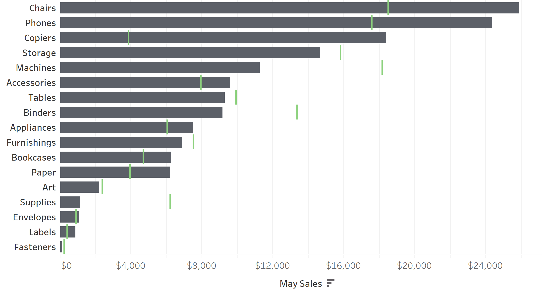
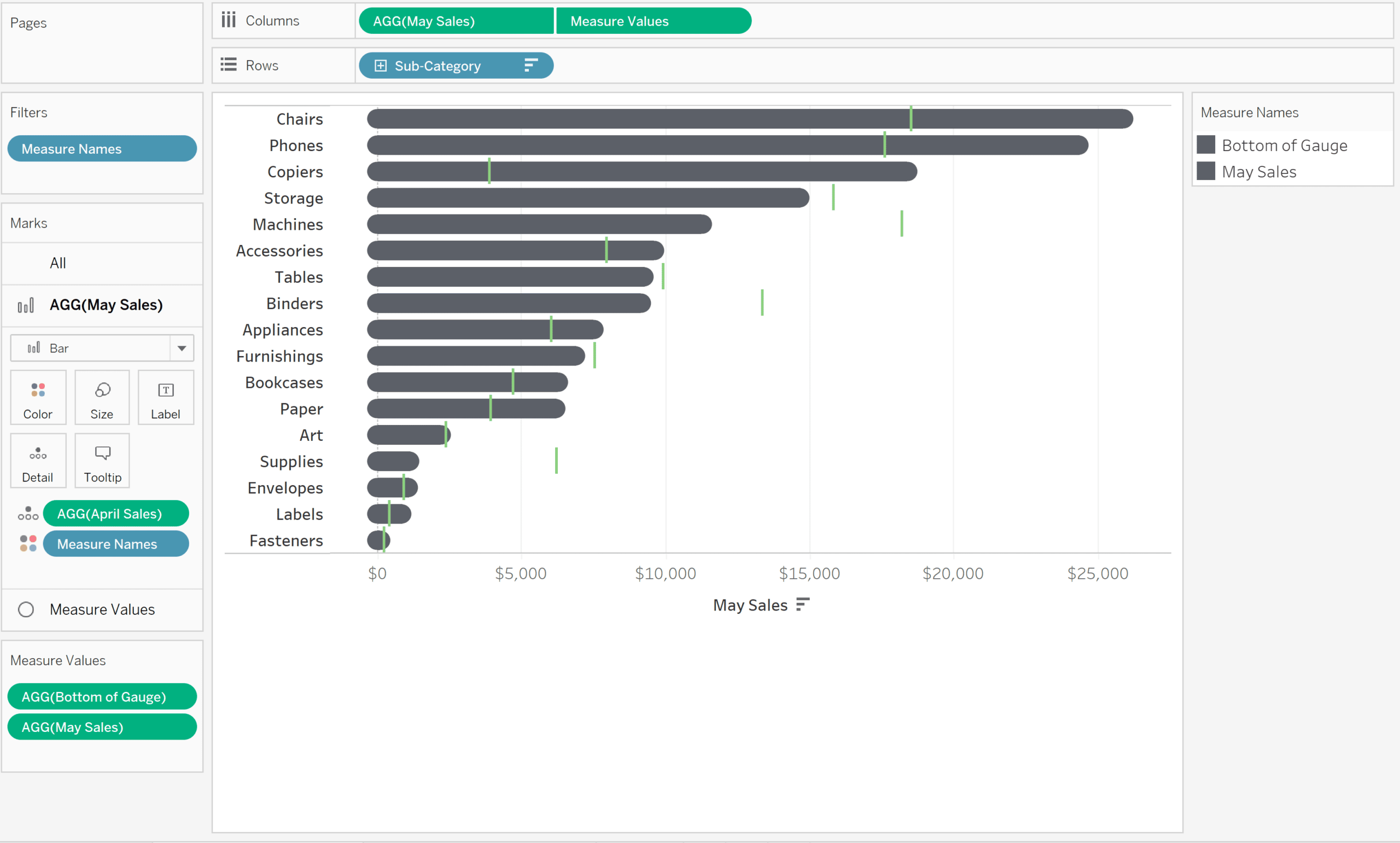
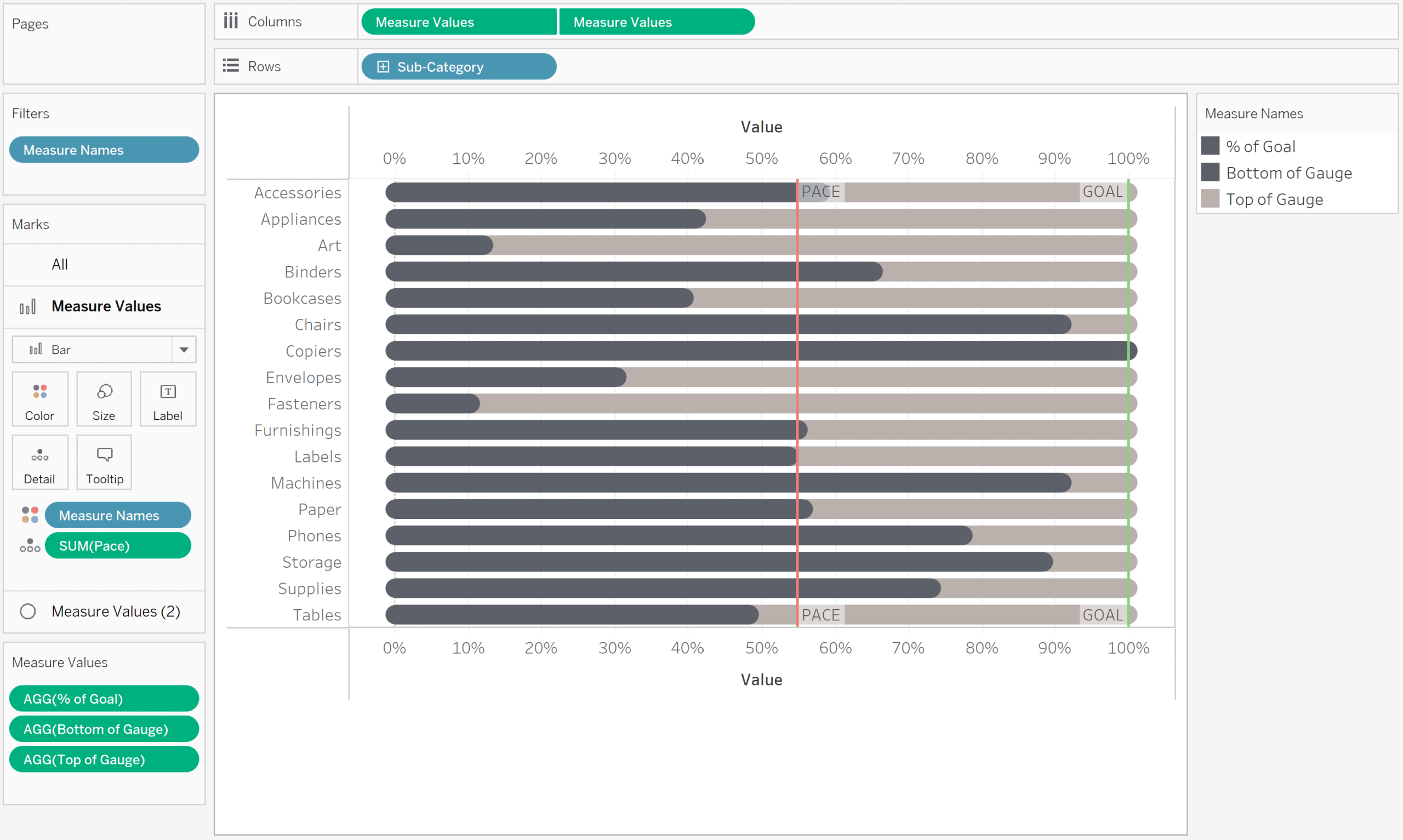
Now that our calculated fields are ready, we can build our view. Add Sub-Category to the Rows shelf and May Sales to the Columns shelf. Sort Sub-Category in descending order, and then add a reference line for April Sales numbers. For our purposes, we’re only going to add a single reference line to keep things simple. I set the bars representing May sales to a dark gray color and set the reference line for April sales as a bright green color so it stands out.
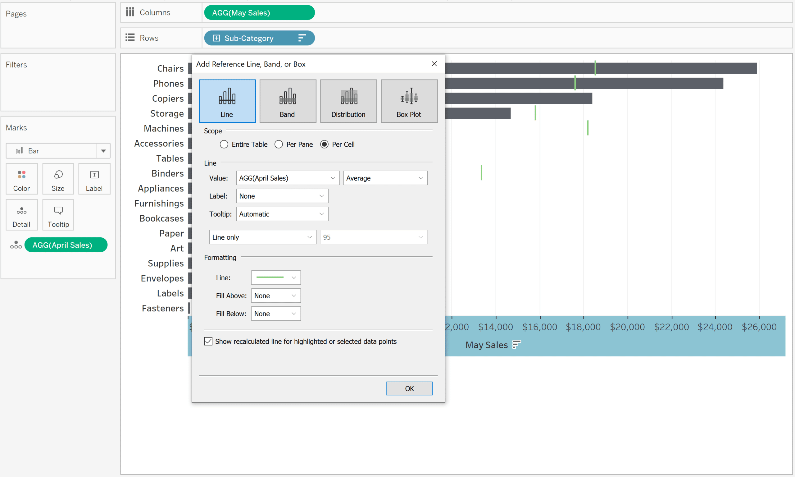
Now that we have our standard bullet graph complete, we’ll work on getting the rounded, modern look. First add Measure Values to the Columns shelf and filter to the Measure Values Bottom of Gauge and May Sales. This creates a second set of marks that can be edited independently of our original bar chart.
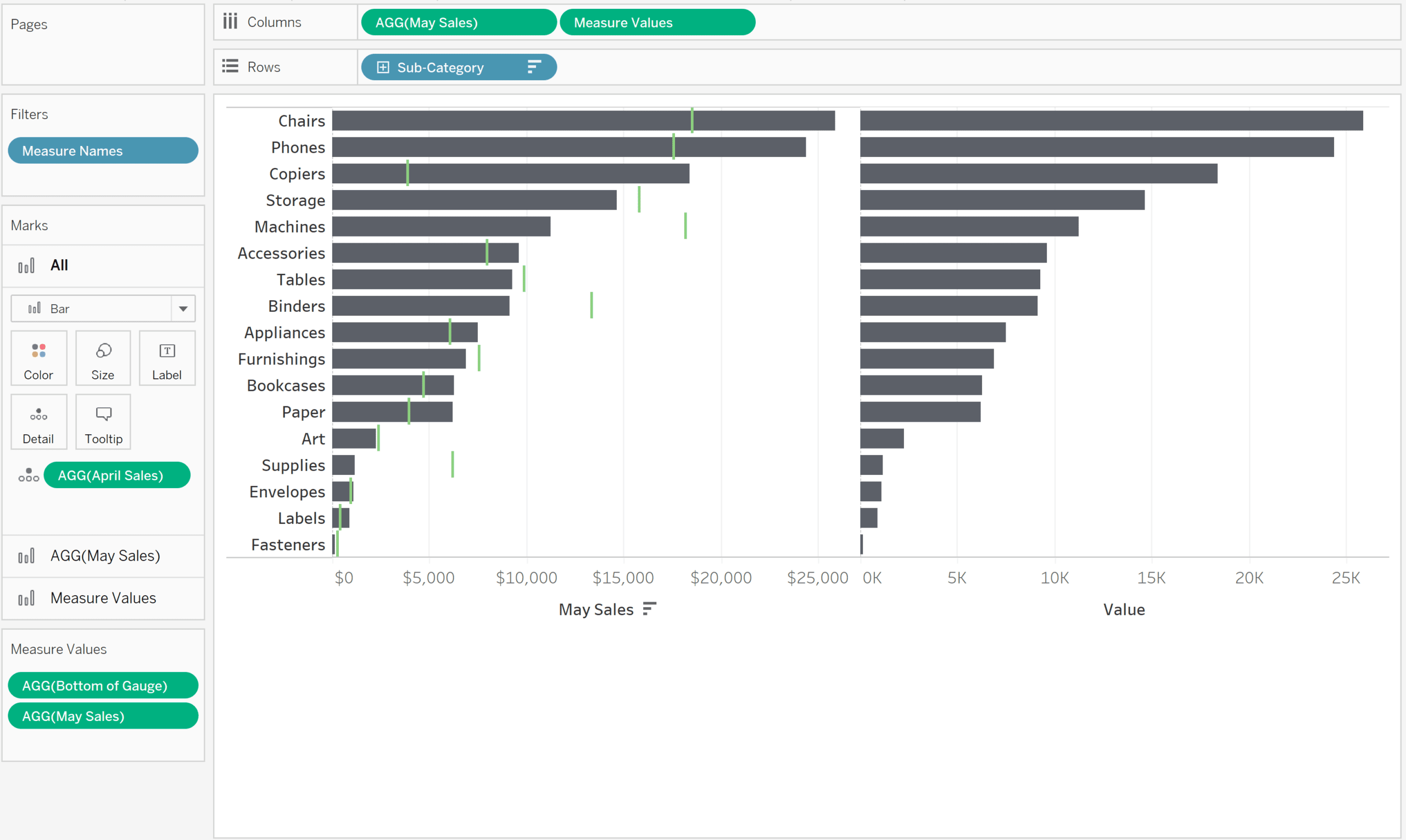
Next, change the mark type to Circle on the Marks shelf for the Measure Values. Make sure to change your May Sales mark type back to Bar.
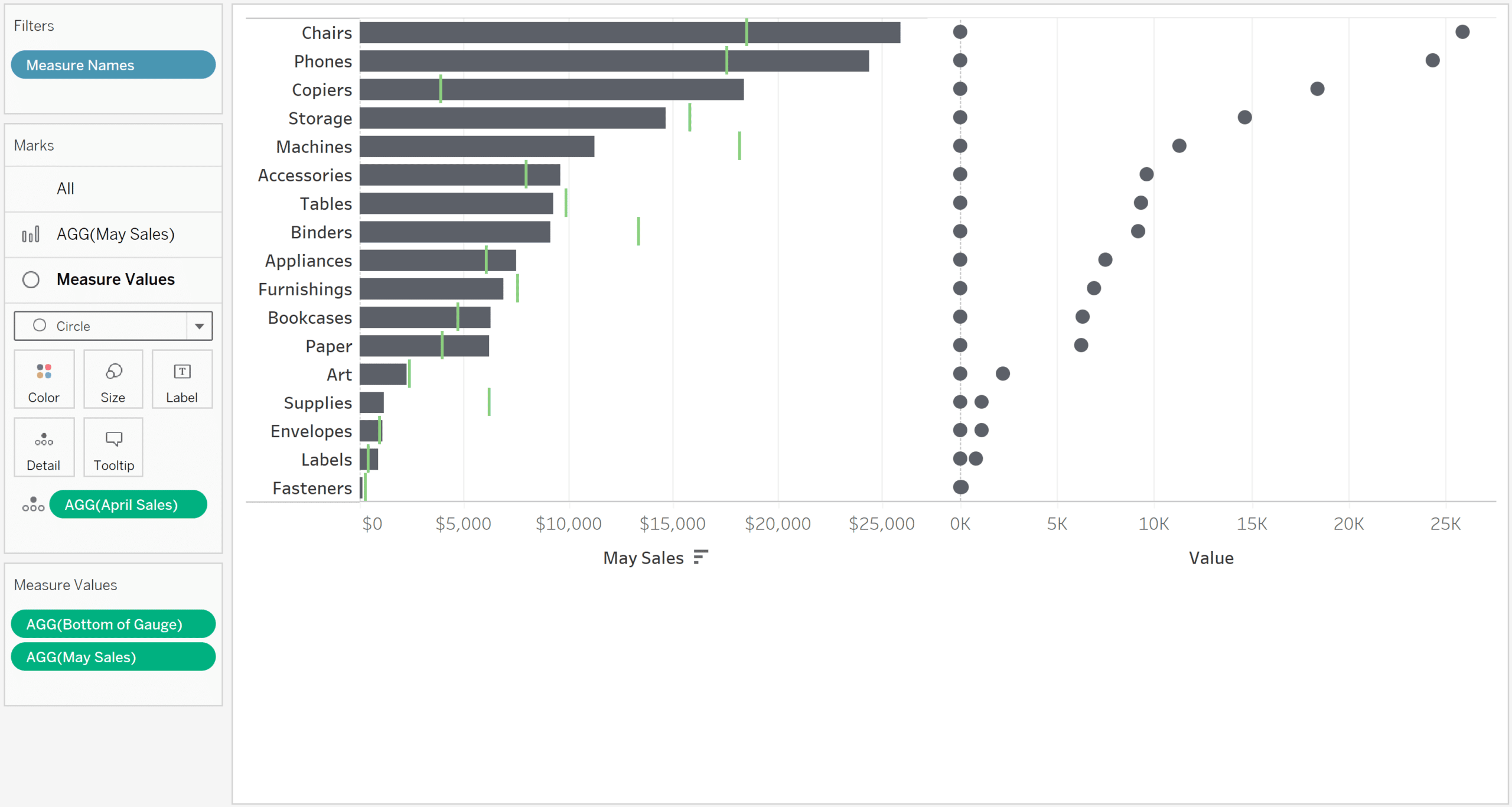
Create a dual-axis chart by right clicking on the Measure Values pill in the Columns shelf and choosing “Dual-Axis”. We’re almost there, but our view needs a few more tweaks to get it just right.
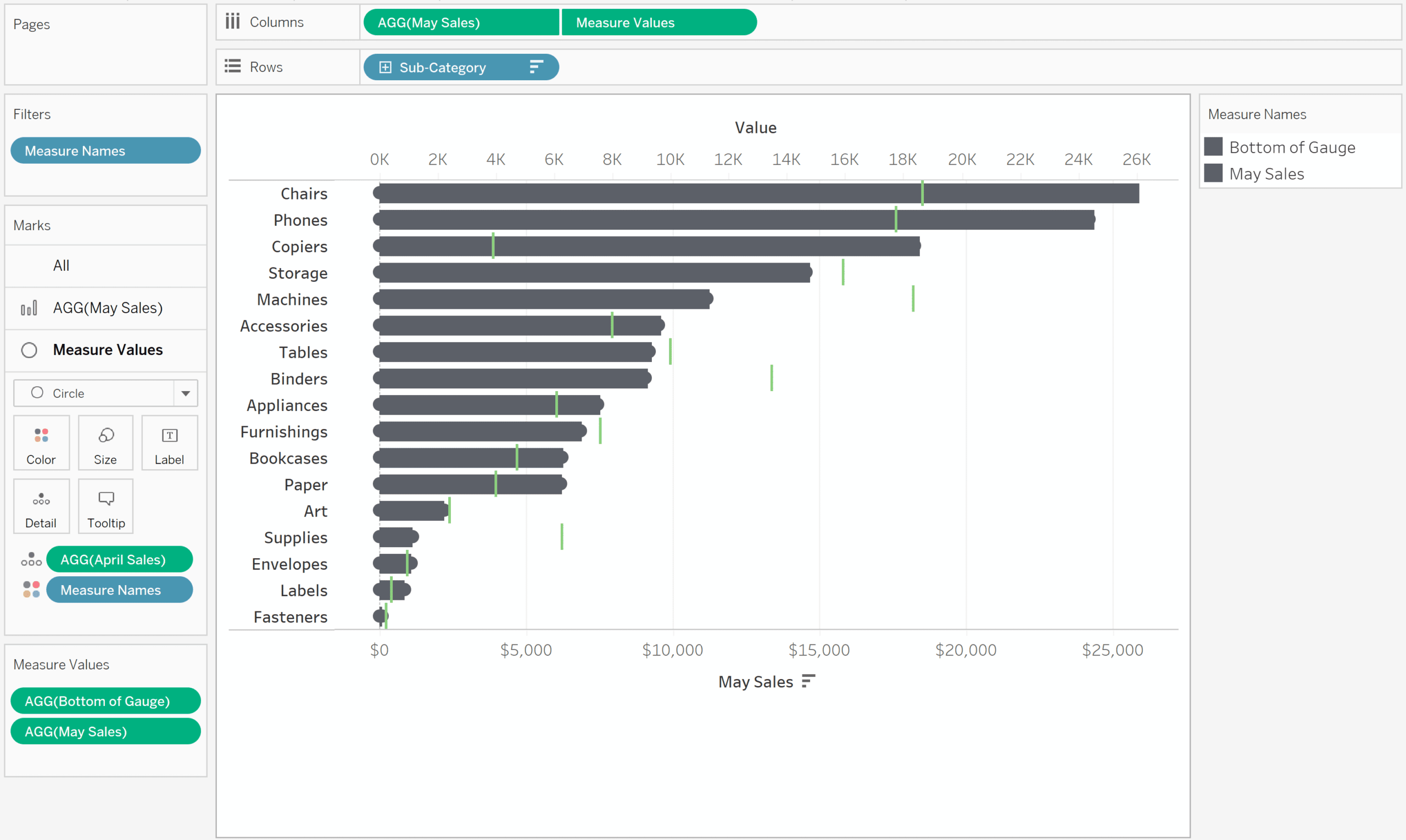
Right click on either axis and choose “Synchronize Axis”. This ensures that the bars and circles align. Adjust the size of the circles so that they line up with the edges of each bar by clicking on the Size property of the Marks Card and adjusting the slider. Finally, hide the axis for the Measure Values.
3 Ways to Use Dual-Axis Combination Charts in Tableau
Here’s what my version of the first technique looks like after cleaning up the formatting:
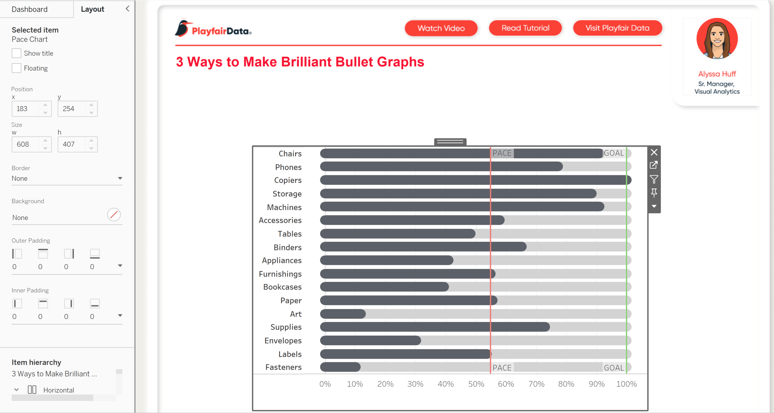
How to use a bullet graph as a “pace” chart
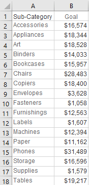
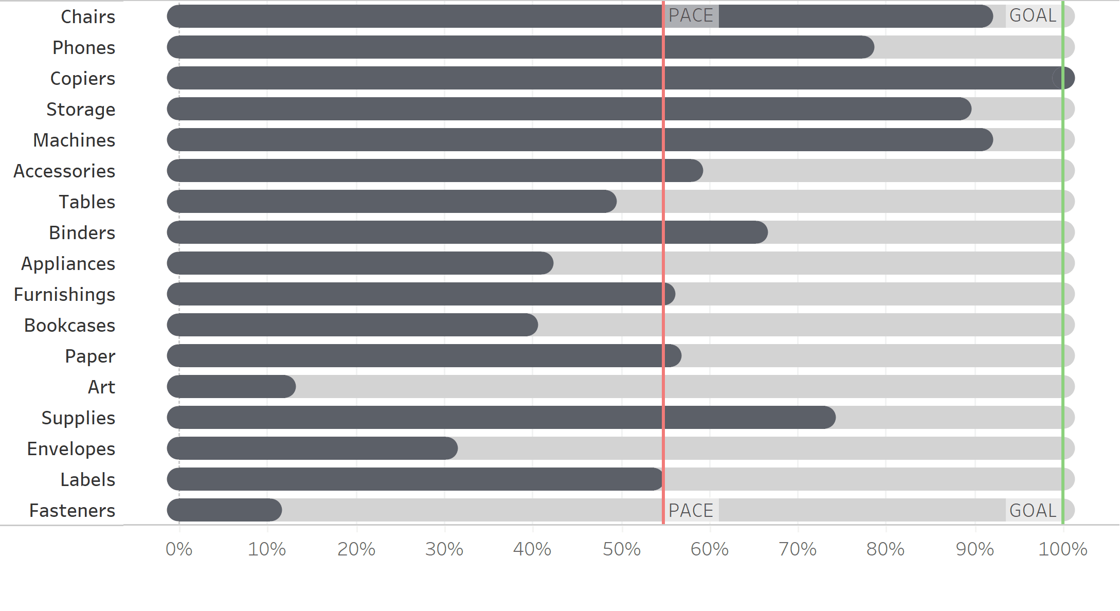
Our second method for polishing bullet graphs will be to convert the rounded, modern bullet graph we just made into a pace chart. A pace chart is another form of bullet graph and allows us to see if our KPIs or metrics are on track to meet our goals. Pace charts work across different scales or categories by normalizing the data. For the purposes of this chart, we’ll pretend that May is not yet complete, and we’ve been given a set of sales goals for each Sub-Category:
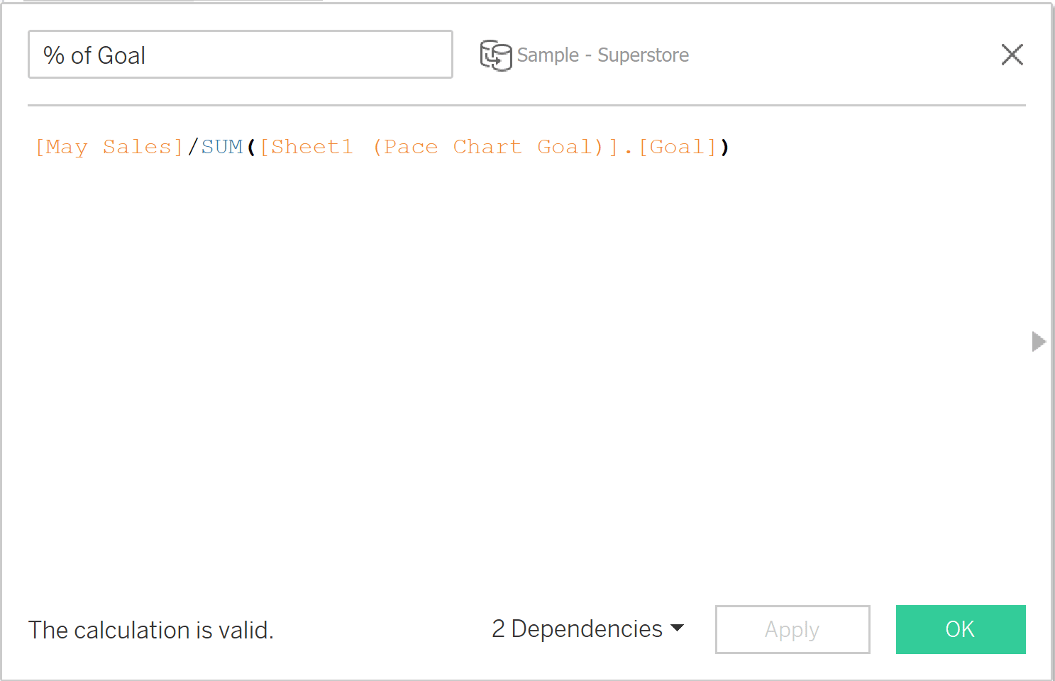
We’ll use the same Bottom of Gauge calculated field that we created for our rounded bullet graph. From there we need two additional calculated fields. The first one establishes the progress to our goal. The benefit of this formula is that it normalizes the data, which allows us to compare progress to goal for a wide range of values, and makes the comparison apples to apples. The formula looks like this:
[May Sales]/SUM([Sheet1 (Pace Chart Goal)].[Goal])
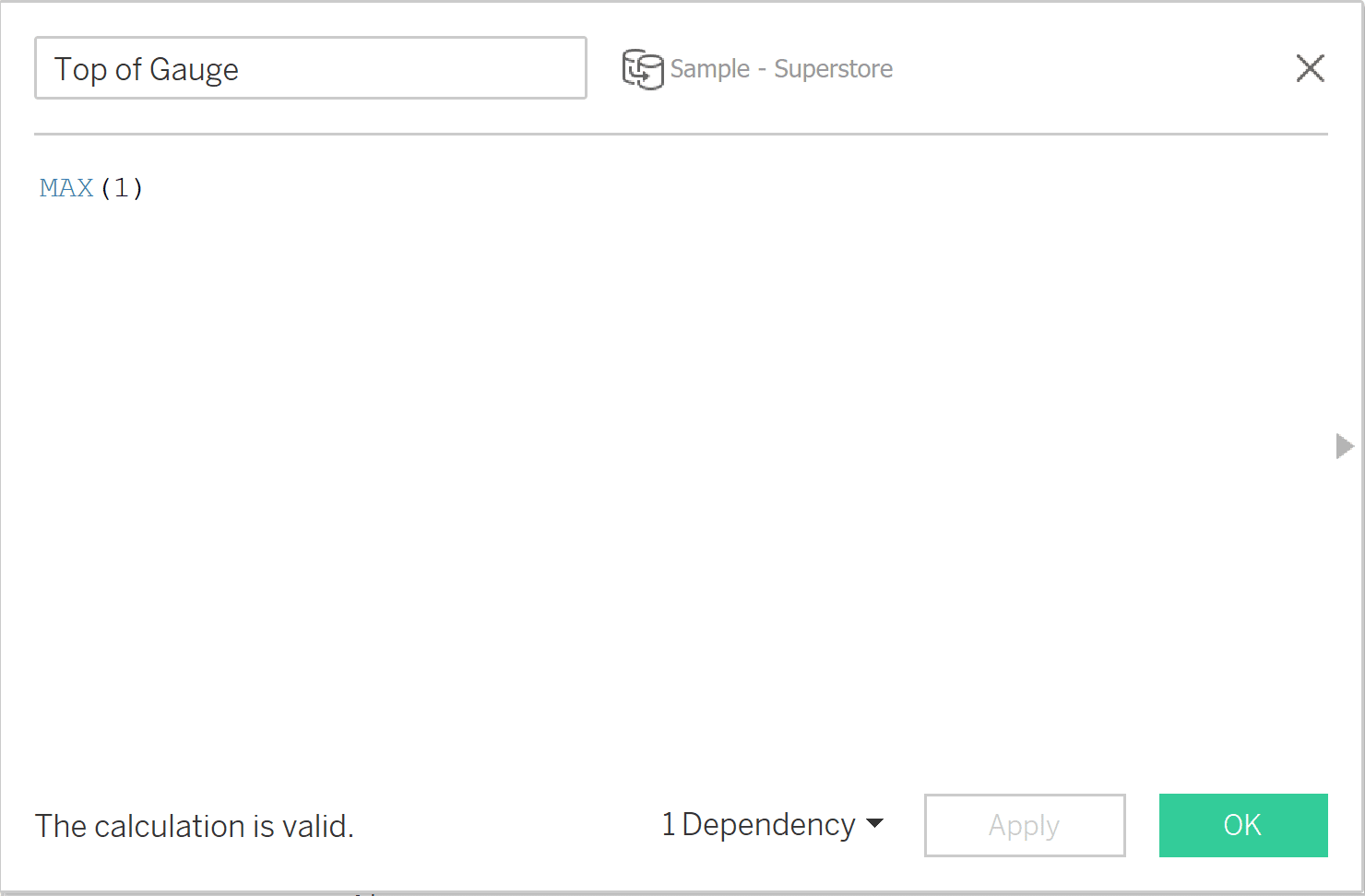
The second calculated field establishes the top of our gauge. Since the maximum value of our % to Goal calculation cannot exceed 100%, our formula looks like this:
MAX(1)
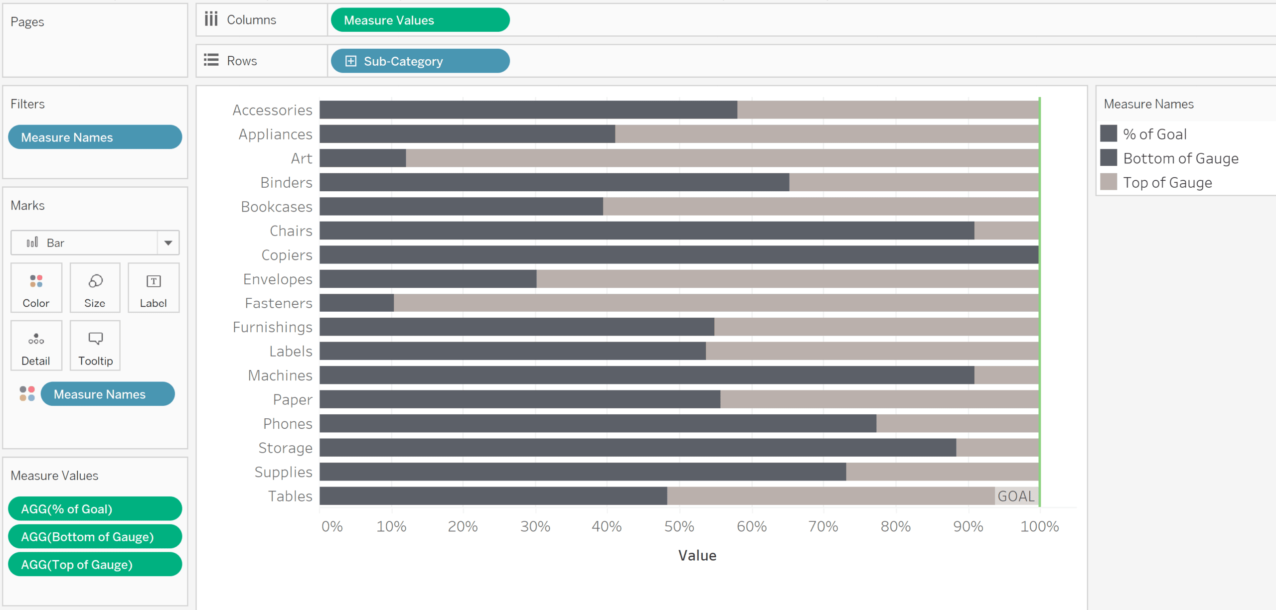
Now we’re ready to build our pace chart. Add Sub-Category to the Rows shelf and Measure Values to the Columns shelf. Filter to the % of Goal, Top of Gauge, and Bottom of Gauge metrics. This will help us create a rounded gauge look later. Since the goal for each Sub-Category is to reach 100%, we’ll add a reference line with a constant of 1.
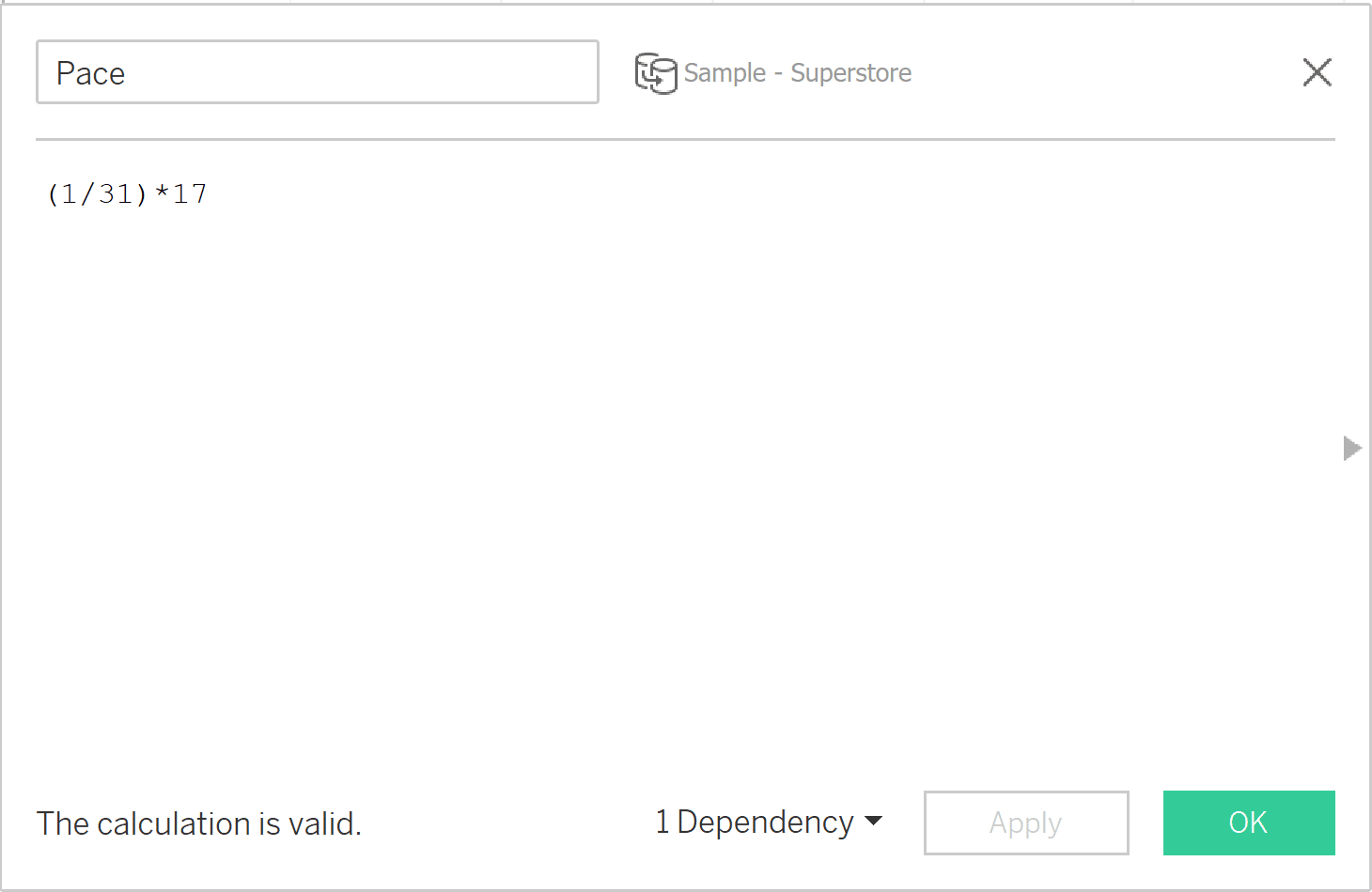
In order to demonstrate this pace chart we’ll use a simple static formula, but this can be accomplished dynamically. For example, this formula computes the number of days that have passed in the current month: DATEDIFF(‘day’,DATETRUNC(‘month’,TODAY()),TODAY())+1. Continuing with our static formula, we’ll add a reference line that shows how we’re pacing toward our May sales goal. Let’s pretend we’re 17 days into the month. Create a calculated field with the following formula:
(1/31)*17
This divides the month into equal parts (days) and multiplies it by the number of days that have already passed. If you like, you can make this dynamic by using a parameter.
Add the Pace calculated field to the Detail property of the Marks Card, then right click the axis and add Pace as a reference line:
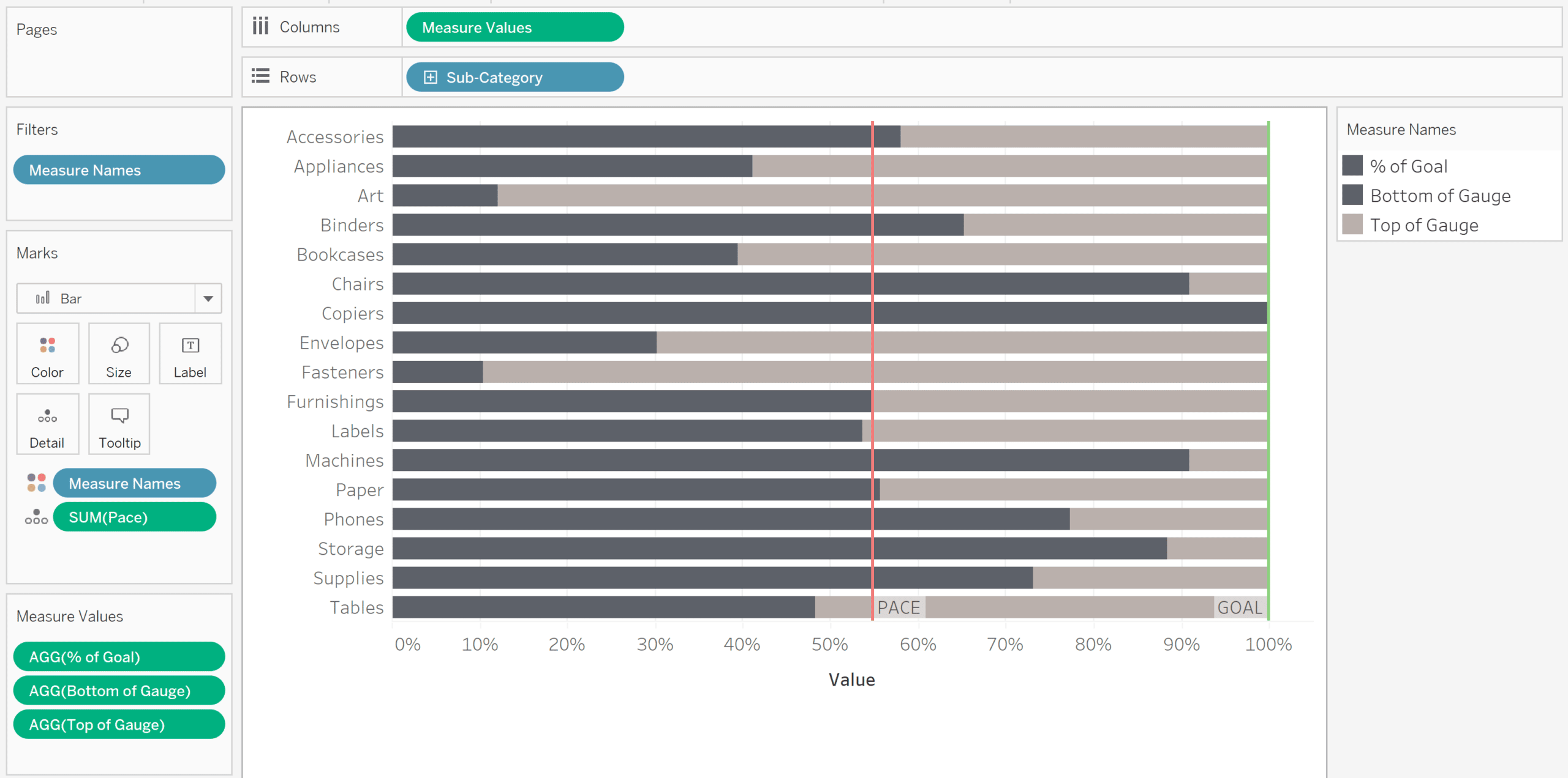
Next we’ll create the rounded ends for each bar to match the look we created with our first bullet graph. Duplicate Measure Values on the Columns shelf, and change the Mark type to Circle. Right click on one of the Measure Values pills and create a dual axis, then synchronize the axes to align the bars and circles.
It’s important to note that one tradeoff of this approach is that because color coding is reserved for the Measure Values field, we aren’t able to color by whether the goal is behind, on track, or has met the goal.
To finalize my view, I made a few formatting changes. I removed the axis title, adjusted the font and bar colors, and sorted Sub-Category by May Sales in descending order to match my first bullet graph. My final view looks like this:
How to toggle between Tableau bullet graphs and pace charts
The final part of this post isn’t a new bullet graph, but instead we’ll create a toggle that allows the user to flip back and forth between our actual May sales data and our normalized pace chart. Adding interactivity to a dashboard is a great way to engage an end user and get them exploring the data on their own. Plus, you’ll wow them with the seamless switch between your two brilliant bullet graphs.
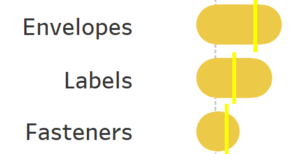
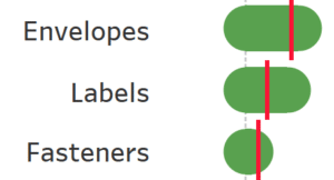
To achieve our toggle, we’ll use the layout container method and the two worksheets for our modern bullet graph and pace chart. First, select two images that will represent your toggle in the unselected and the selected state. Here are the images I’ve chosen:
How to Add a Show/Hide Button to a Tableau Layout Container


For our unselected state, we’ll use our modern, rounded bullet graph that shows actual May sales. Float this sheet on your dashboard so you can control its size and placement. Right click on the sheet title and choose “Hide Title”.
Next, float either a Horizontal or Vertical layout container over your first sheet. Place and size the container so it fits exactly on top of your sheet. I used the Layout pane to achieve this.
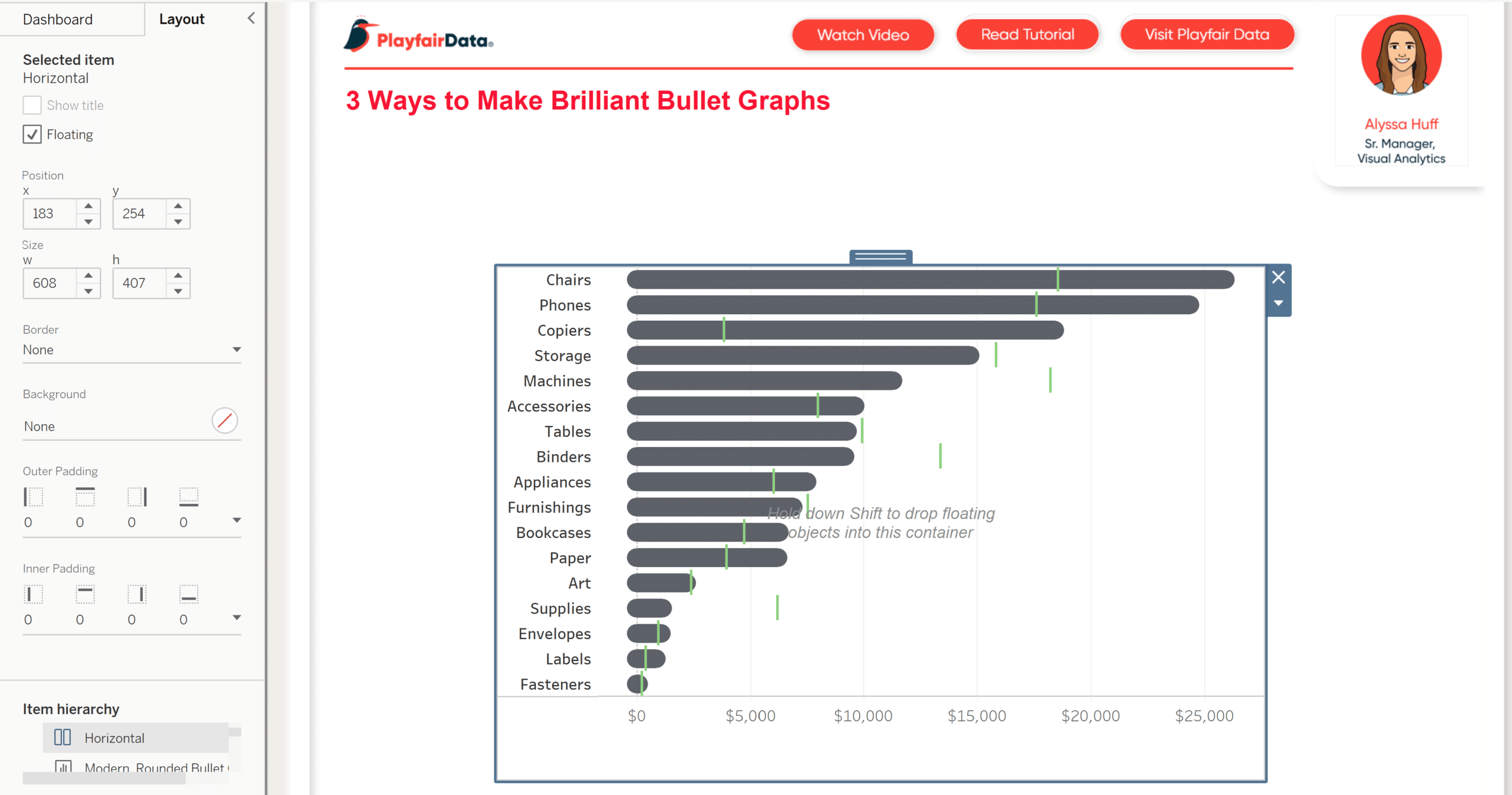
Now add your Pace Chart worksheet, which represents the selected state, to the container on your dashboard. Hide the title for this sheet. I also had to adjust the padding on my Bullet Graph sheet so that it matched the padding on the Pace Chart (zero inner and outer padding).
To complete the toggle functionality, we’ll use “Show/Hide Button” on our layout container that will allow us to toggle between the two sheets by clicking on an image. To access this option, select your layout container on your dashboard. Make sure the border is blue instead of gray, so you know your layout container is selected instead of one of your sheets. Click the dropdown arrow and then the “Show/Hide Button” option. An “X” will automatically appear as Tableau’s default button image for when the container is shown. A hamburger menu will appear when the container is hidden.
To customize the images for our toggle, click the down arrow on the button and choose “Edit Button”.
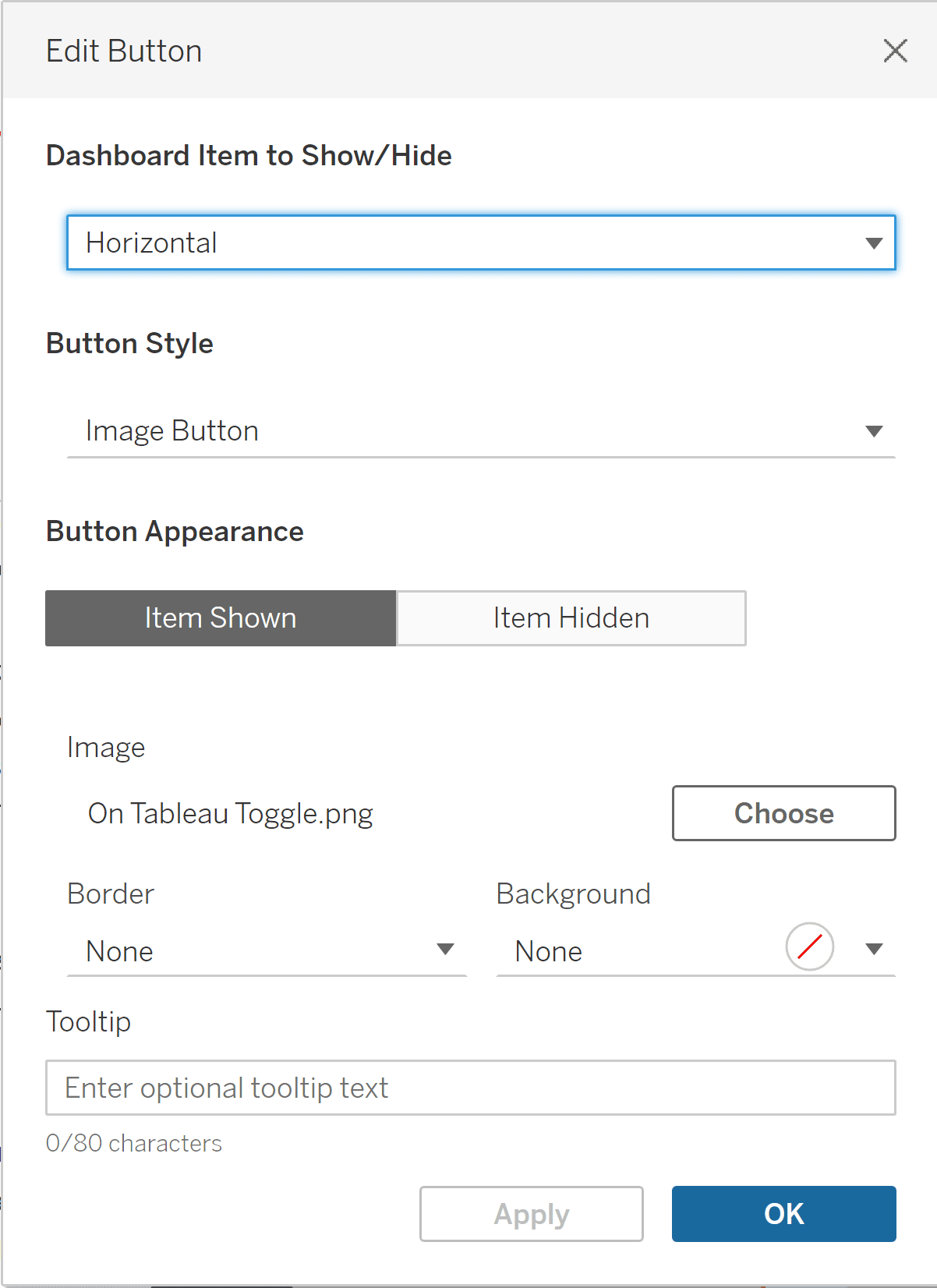
Under Button Appearance, choose the toggle images you’ve selected for both the “Item Shown” and “Item Hidden” options. I’ll use the images mentioned previously. Once your image selection is complete, you can move and resize your button on your dashboard just like any other dashboard object.
![]()
I made a few more updates to my dashboard to finalize it, such as adding a heading above my visuals. To see your toggle in action, view your dashboard in Presentation mode or hold down the Alt key when you click on your toggle.
Thanks for reading,
Alyssa


Written By
Alyssa Huff

Peer Review
Felicia Styer
Assoc. Director, Analytics Solutions

Graphic Design
Dan Bunker
Manager, Decision Engineering
Related Content
Dashboard Gauge 1: How to Make Bullet Graphs in Tableau
Speedometer-like dashboard gauges that show an arrow moving across a semi-circle consume an unnecessarily large amount of valuable real estate…
Introducing “Gap” Charts in Tableau
In Practical Tableau, we introduced the concept of a pace chart, an alternative bullet graph that normalizes progress to goal…

Ryan Sleeper
Create a More Polished Analysis with Rounded Bar Charts Ryan demonstrates why creating rounded bar charts will add professional polish,…