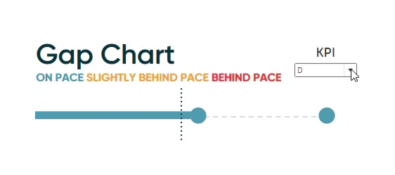
Introducing “Gap” Charts in Tableau
In Practical Tableau, we introduced the concept of a pace chart, an alternative bullet graph that normalizes progress to goal on a 100-point scale. These are a great choice if you want the benefits of a bullet graph, but need to visualize measures that have a large range of scales (i.e. Metric A has a goal of 4, and Metric B has a goal of 4 million). Inspired by our team’s recent innovations included in the Atlas tool – and further by the design of our new office building in Orlando – I wanted to take this chart type further. The result, which I’m tentatively calling a “gap” chart in Tableau, is a pace chart alternative that puts more emphasis on the gap between actual performance and goal – plus has a fun aesthetic element that “lights up” to indicate whether you are on pace, slightly behind pace, or behind pace.
By the end of this post, you will be able to make a gap chart in Tableau using two different approaches.
How to make a gap chart in Tableau with a single sheet
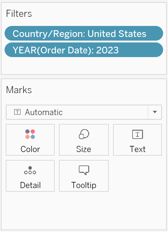
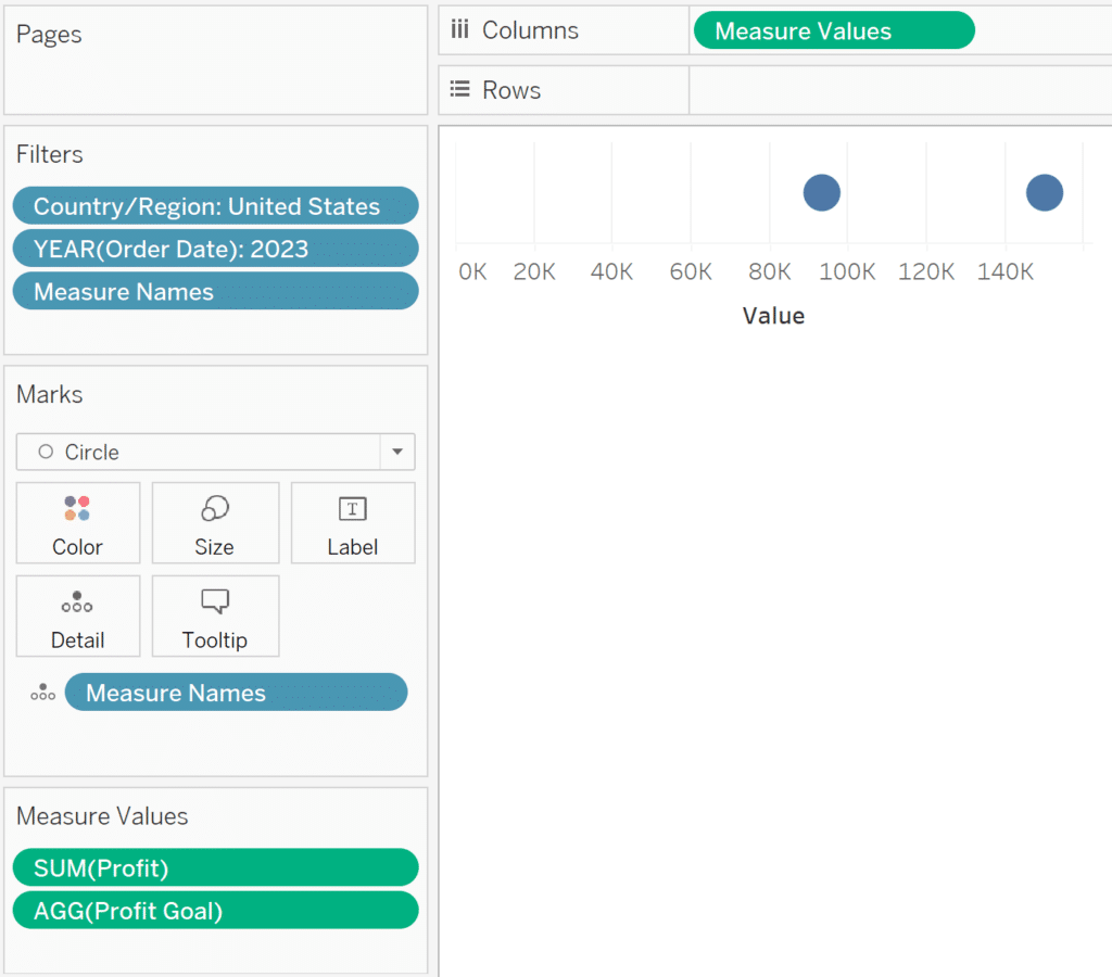
For this example, we’ll use the Sample – Superstore data and imagine we have a goal to hit $150,000 in profit from 1/1/2023 to 6/30/2024. To match this business use case, set up a sheet that contains a Country/Region filter for United States and YEAR(Order Date) filter for 2023.
Continue reading with a free account, or login.
Unlock this tutorial and hundreds of other free visual analytics resources from our expert team.
Already have an account? Sign In
By continuing, you agree to our Terms of Use and Privacy Policy.
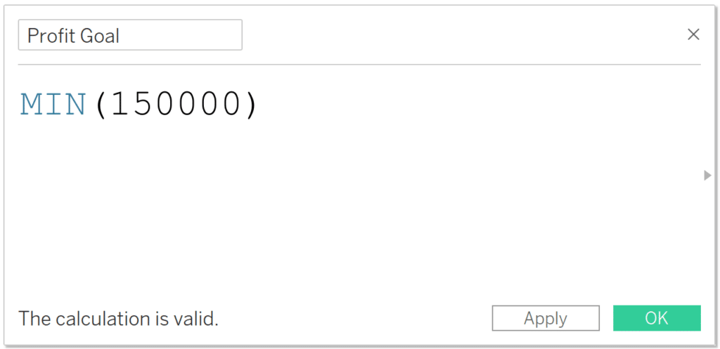
The first step is to create a calculated field containing your goal. This will give us a measure to work with in the next step. I will set up a calculated field for MIN(150000); the aggregation of MIN will ensure the goal is always stuck at $150,000 regardless of the visualization’s level of detail. Note you can also skip this step if your data contains a column for your goal measure.
Next, change the mark type to Circle, place the Measure Values field on the Columns shelf, and remove every measure from the Measure Values shelf except for Profit and Profit Goal (or whatever KPI and associated goal you are using).
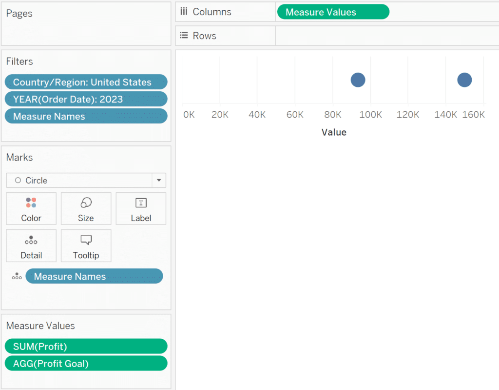
Next, place the KPI you are evaluating – Profit, in this case – onto the Columns shelf directly next to the Measure Values pill. Each measure gets its own Marks card, which means we can edit the marks independently. That means we can leave the left side of the chart as is, but change the mark type of right side to Bar.
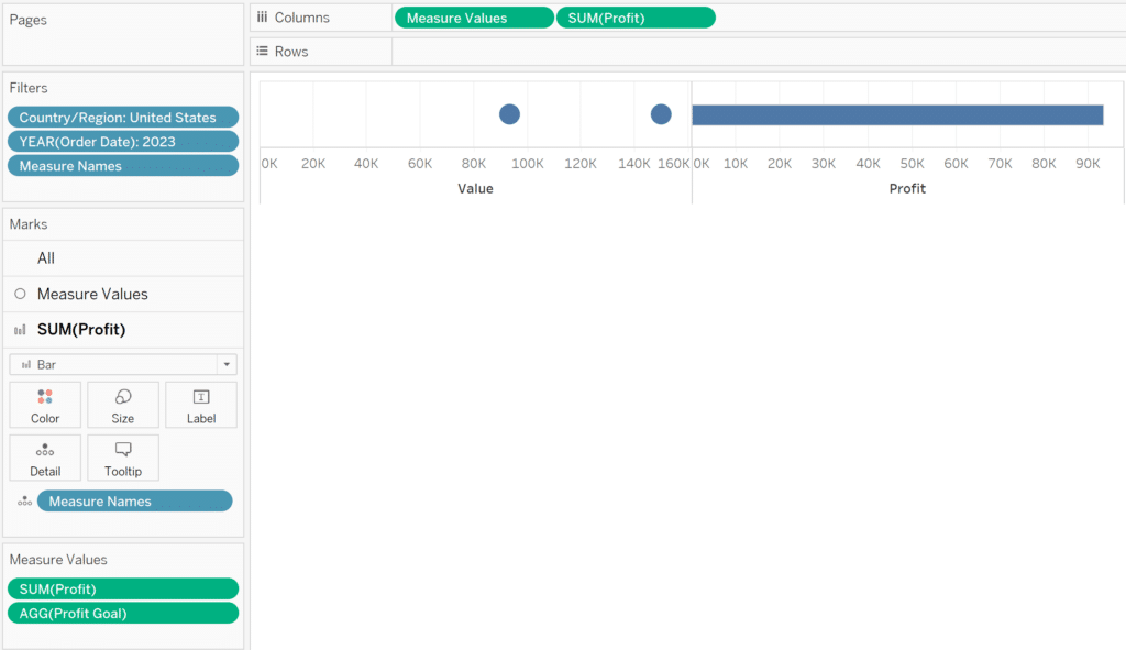
Now we can convert this visualization into a dual-axis combination chart so that the circle marks are on top of the bar mark. To do so, right-click on the second pill on the Columns shelf and select “Dual Axis”. At first, it will appear that only the bar mark remains, but that is because the axes are not yet synchronized. To get everything to show up properly, right-click on either axis and choose “Synchronize Axis”.
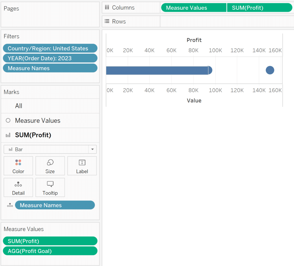
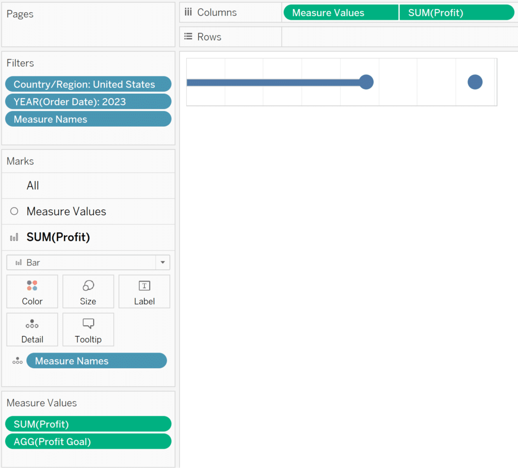
To finalize the foundation of our first Tableau gap chart, reorder the mark layers by right-clicking on the top axis and choosing “Move marks to back”. I also recommend hiding both axes at this point by right-clicking on the bottom axis and deselecting “Show Header”. Lastly, you can resize the bar mark by clicking on the Size property of the Profit Marks card and moving the slider to the left.
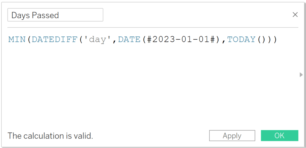
To add the context of whether or not we are on track to hit our goal, we will need to create some calculated fields. First, we’ll need to know how many days have passed during our allotted range. If we started tracking our goal on 1/1/2023, the formula is MIN(DATEDIFF(‘day’,DATE(#2023-01-01#),TODAY())). Based on your specific use case, you can dynamically create the starting point using the DATETRUNC function and/or use date parts other than day.
Second, we’ll need a calculated field that computes where we are supposed to be at this point in the allotted timeframe. If using days and a time range other than a year (i.e. 365 days), Google is a great resource to find how many days you have to hit your goal. For example, I asked Google, “how many days between 1/1/2023 and 6/30/2024”, and it returned the answer of 546.
With this number, I can calculate where I’m supposed to be today to hit my overall profit goal. The formula is: ([Profit Goal] / MIN(546)) * [Days Passed]
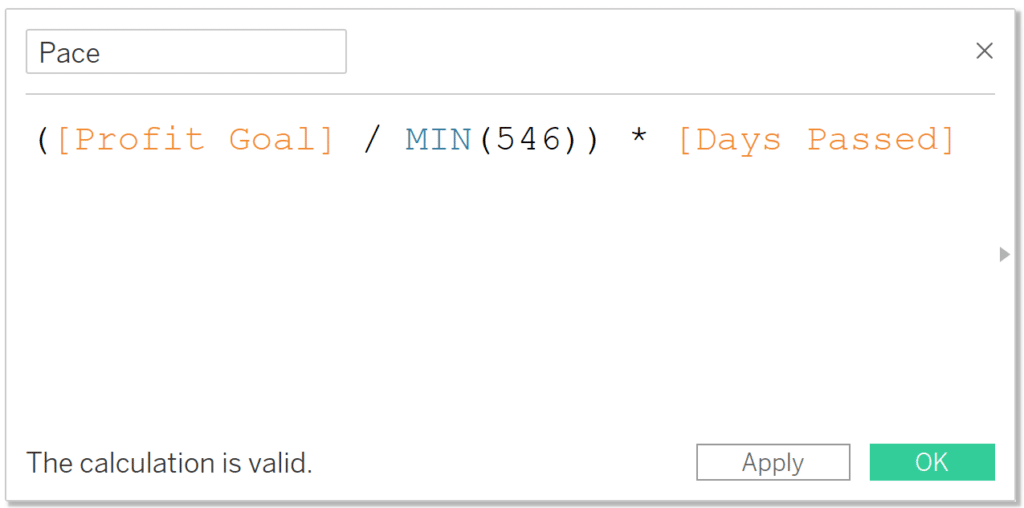
This calculation computes a linear pace as it takes the total profit goal of $150,000, divides it by the total number of days we have to achieve the goal, then multiplies it by the number of days that have actually passed to show us where we are supposed to be at this point within the allotted date range. If your business has seasonality, you could add a custom goal or seasonal pace to your dataset as its own column and use that instead.
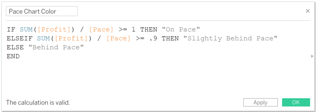
The third and final calculated field needed computes whether we are on / ahead of pace, slightly behind pace, or behind pace. You can use whatever thresholds you prefer, but for the purposes of this example, we’ll say that at or above pace is “On Pace”, 90 – 99.9% of pace is “Slightly Behind Pace”, and anything below 90% is “Behind Pace”.
With these thresholds, the calculation is:
IF SUM([Profit]) / [Pace] >= 1 THEN “On Pace”
ELSEIF SUM([Profit]) / [Pace] >= .9 THEN “Slightly Behind Pace”
ELSE “Behind Pace”
END
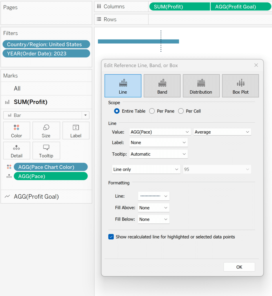
We’re now ready to add these contextual elements to the gap chart. To start, place the newly-created Pace calculated field onto the Detail property of the Profit measure Marks card. Then navigate to the Analytics pane and drag Reference Line from the Custom section onto the view. This will allow you to choose AGG(Pace) from the Value dropdown and customize the reference line to your liking.
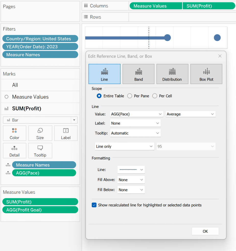
Next, place the newly-created Pace Chart Color calculated field onto the Color property of the All Marks Card. You will see one of the three outcomes appear on the color legend which you can now remap to the color of your preference.
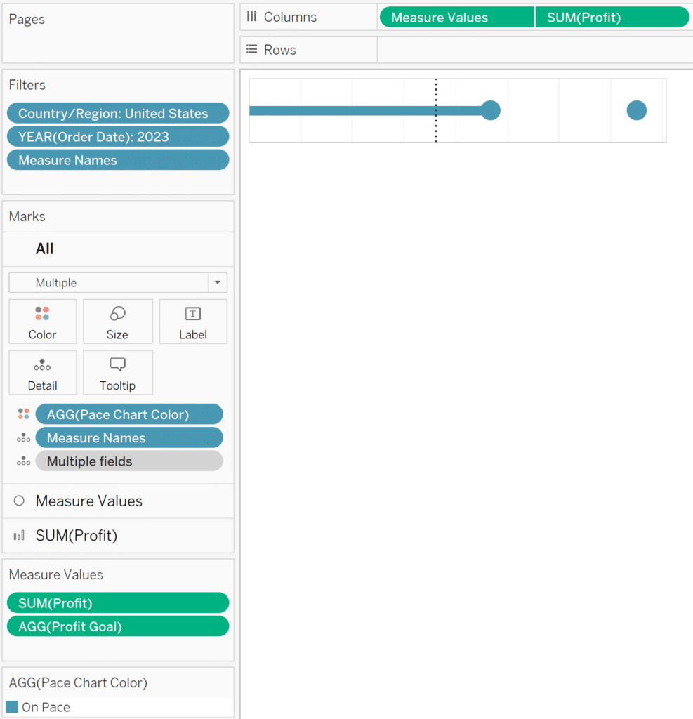
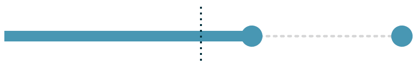
I am writing this about halfway through the 18-month time range to meet the goal, so we see that the reference line indicating where we should be at this point is approximately halfway across the gap chart. Since our actual profit performance is past the pace, the marks were all classified as “On Pace”, and colored blue.
At this point, we essentially have a gap chart, which we have created on a single sheet. To get the nice connecting dotted line, you can simply make this sheet transparent by right-clicking somewhere within the chart, choosing “Format”, navigating to the “Shading” tab of options, and change the first dropdown for “Worksheet” to “None”. You can now float this sheet over an image with a dotted line on a dashboard.
Here is how my final gap chart looks in Tableau after removing all lines / borders, making the background of the sheet transparent, and floating over an image of a dotted line.
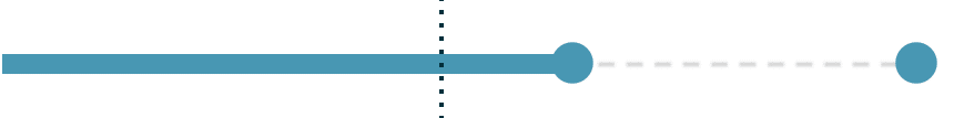
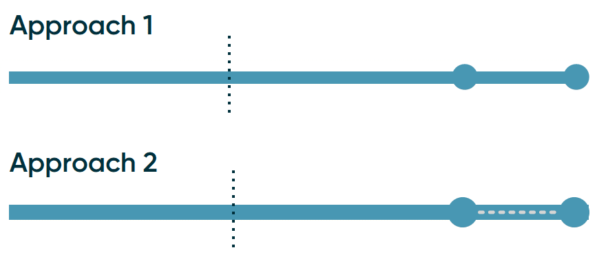
The only drawback to this approach is you must create a background image for the dotted line in a separate tool. For example, I used PowerPoint to create the dotted line, took a screenshot of it, saved it as an image, placed it on a dashboard in Tableau, then floated the gap chart over the top of it. In the next section, you will find a solution for creating every single component of the gap chart directly in Tableau.
How to make a gap chart entirely in Tableau Desktop
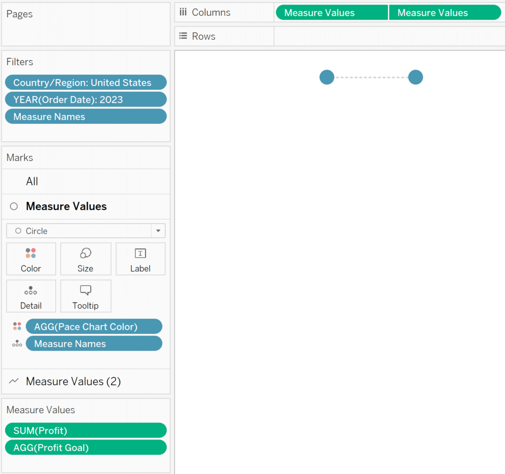
If you followed along to this point, you already have all the calculated fields needed for this second approach, so we can begin constructing the gap chart. To start, on a new sheet, change the mark type to Circle, place the Measure Values field onto the Columns shelf, and remove every measure except for Profit and Profit Goal from the Measure Values shelf.
Next, duplicate the Measure Values pill on the Columns shelf or drag a second occurrence of Measure Values onto the Columns shelf. On the Marks card for the second column, change the mark type to Line. In version 2023.2, Tableau released a feature that allows you to change the “Line Pattern” to dotted by clicking on the Path property of the Marks card and choosing an alternative pattern.

Next, convert this chart into a dual-axis combination chart by right-clicking on the second Measure Values pill on the Columns shelf and choosing “Dual Axis”. You will also want to ensure the axes are synchronized by right-clicking on either axis and choosing “Synchronize Axis”.
How to Make Dual-Axis Combination Charts in Tableau and Some Creative Applications
Since each measure gets its own Marks card, we can format them independently. Here is how my chart looks after placing the Pace Chart Color calculated field on the Color property of the Marks card for my circles, changing the shade of gray on my Marks card for the line, moving the marks of the line to back by right-clicking on the top axis and choosing “Move marks to back”, then hiding all the lines and headers.
We have just created the circles and the dotted line of the gap chart. Now we just need a second sheet to create the bar mark. The easiest way to start the second view is to duplicate the first by right-clicking on its tab name at the bottom of the Authoring interface and choosing “Duplicate”. We are still using the same two measures and still using a dual-axis combination chart, but will no longer need the Measure Values shelf.
A shortcut to getting the desired result is to drag the Profit measure from the Measure Values shelf and drop it right on top of the first occurrence of the Measure Values pill on the Columns shelf. This leaves you with only the two measures we need, still in a dual-axis combination chart with synchronized axes.
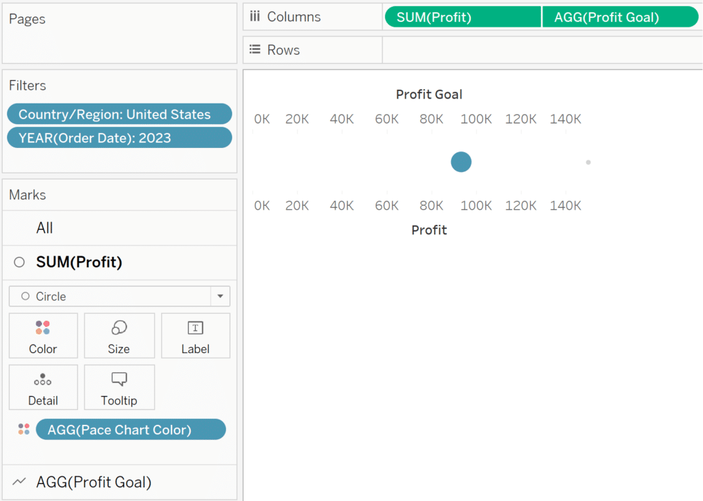
What’s great about this is the goal is still on the view, currently as a faint gray line. This will help us sync the bar mark with the circles and line view in the last step. Also remember that the marks of dual-axis combination charts can be edited independently, so we can make the Line mark for the Profit goal completely invisible by clicking on its Color property and sliding the opacity slider all the way to the left.
We can also change the mark type of the Profit mark to Bar and hide both headers. Lastly, I will add the Pace reference line in the same way I did for the first approach: add Pace to the Detail property of the Marks card, then drag a Reference Line onto the view from the Custom section of the Analytics pane.
Now all that’s left to do is line these up again on a dashboard. Here’s how my second Tableau gap chart looks after making the background of the view containing the circles and dotted line transparent and floating it over the view containing the bar mark on a dashboard.
Finalizing with some Playfair Data polish
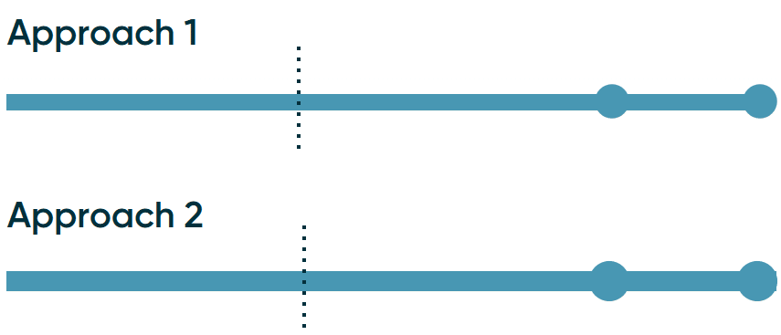
Should the actual performance ever pass the goal, one of the benefits of a bullet graph, pace chart, and gap chart is you can see how far past 100% of goal was achieved. However, the effect is somewhat confusing with a gap chart. To demonstrate, I’ve multiplied the Profit value by two on both approaches we’ve created to this point.
We still see two circles, one for the actual performance and one for the goal, but it is not clear which is which. To me, this is particularly confusing with the dotted line in the second approach and almost looks like a mistake. To alleviate this latter issue, you can simply reorder the layers of the sheets, using the sheet with the circles and dotted line as the base layer, then floating the sheet containing the bar mark over the top; just ensure the sheet containing the bar mark is transparent.
Lastly, you may want to experiment with the mark type of the mark that represents the goal whenever it is passed. At a minimum, you can change the mark type on the Measure Values Marks card from Circle to Shape, place Measure Names on the Shape property, and map a circle for actual performance and a different shape for the goal.

You can take this even further by making reference lines and/or shapes dynamic using calculations like “IIF([Profit] > [Profit Goal],[Do One Thing],[Do Something Else])
How to Color Goal Surpluses / Budget Excesses in Tableau Bar Charts
To see the first Tableau gap chart in action, Lifetime Playfair+ members can access the Google Analytics 4 Swift from their account dashboard.
Thanks for reading,
– Ryan


Written By
Ryan Sleeper
Related Content
Introducing Pace Charts in Tableau
Pace charts are an alternative bullet graph design that normalize progress to goal visualizations across KPIs, even if the KPIs…
Introducing Pilula (aka Dr. Mario) Charts in Tableau


At Playfair Data, our designers, data specialists, and Tableau engineers team up for every client consulting project to curate practical…

Ryan Sleeper
Unlock new design possibilities by layering sheets and graphics You’ll see how to add: (1) a trend line in the…