Introducing Pilula (aka Dr. Mario) Charts in Tableau


At Playfair Data, our designers, data specialists, and Tableau engineers team up for every client consulting project to curate practical and innovative ways to elevate their data insights through dashboard visualizations. Collaboration is a big part of our culture, enabling us to bring diverse perspectives and creativity to data and information design.
Most recently, during our work with the Mobility & Opportunity Trends in the NFL project, we put our heads together and pushed Tableau to create our new chart type, Pilula, which we later found extremely beneficial in our Asana PM Swift by Playfair+.
We are excited to introduce a new way to bring your data to life. And our Pilula chart innovation has proven that our collaboration tactics can generate the best ideas when presented with a problem we all know very well: How can we best visualize the data we have?
In this post, you will learn about Pilula (aka Dr. Mario) charts, the behind-the-scenes making of a new visualization, and how to implement the chart type in your Tableau reports.
Designing for a new chart type
Every creator goes through a process for evaluating the data, understanding the data, and brainstorming new ways to represent the data visually.
Designers and analysts often ask themselves: “How can we best visualize the data we collected?”
The Pilula chart type came to us out of necessity during a brainstorming session for the NFL, where we needed to highlight specific subjects within and across different groups and see a change over time. We explored many chart types and evaluated how well they fit the data. The initial concepts involved unit charts, waffle charts, pace charts, line graphs, etc. But, at every turn, our ideas solved some but not all of the problems.
At last, we explored more intently a Barcode Chart to highlight a data point over time (x-axis), where each bar indicated a period or subject, and color would spotlight a characteristic (anything we wanted to call attention to in the data set). Later, we considered grouping all the bars with the same highlight value, creating wider blocks across the x-axis. And ultimately, we opted to round each bar to achieve a cleaner and more modern look, much like pills.
We devised splitting the pattern and creating rows in table form to achieve a comparison of different groups. This allowed us to find patterns in the data across various metrics using a single chart.
Continue reading with a free account, or login.
Unlock this tutorial and hundreds of other free visual analytics resources from our expert team.
Already have an account? Sign In
By continuing, you agree to our Terms of Use and Privacy Policy.

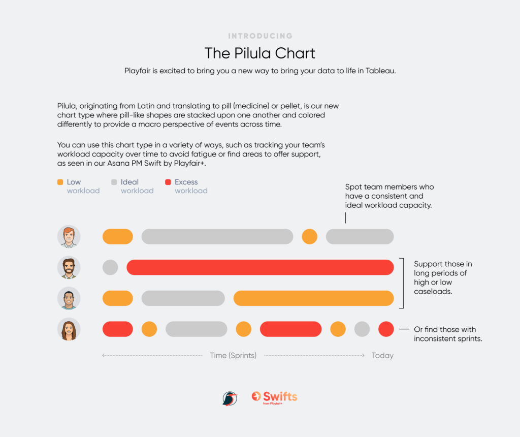
We named it Pilula, from which its Latin origin translates to pill (medicine) or pellet. Since the chart evoked a playful anatomy, where the positioning of pill-like shapes are split and stacked upon one another and colored differently, we reminisced about the visual pattern from the video game for Dr. Mario.
The Pilula chart type enabled the NFL to bring awareness to the diverse hiring processes across different pro football league teams by highlighting those who hired and retained coaches of color over time and their performance correlation.
The same chart is in Playfair Data’s Swift tool for Asana Project Management, where the Pilula highlights the week-over-week workload capacity for each team member and provides a big-picture look at how your team is balancing their projects.
Next, we will go over the steps to creating your own Pilula chart in Tableau.
Visualization engineering in Tableau
Before jumping into building the visualization, it’s important that you first understand the different ingredients that this chart requires.
At its most basic, building the Pilula chart requires a continuous date on the x-axis, a discrete dimension on the y-axis, and a unique id on the Detail property of the Marks card. The date on the x-axis must be continuous so we can draw a line across the years for each row, the discrete dimension on the x-axis creates a row for each dimension, and the unique id is what will break each row’s line into smaller pills along the continuous date, which represents the duration of time. The longer the pill, the longer duration of time.
A unique identifier is required
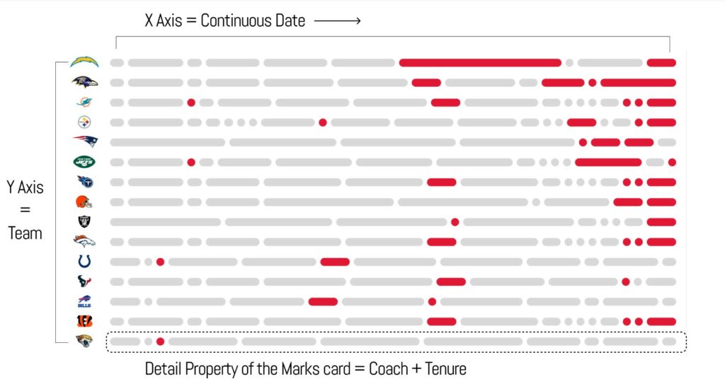
In our Mobility & Opportunity Trends in the NFL project, we needed to build the Pilula chart to visualize all the coaches that each NFL team employed to depict characteristics such as the length of their contract, role retention, and self-identified race. To achieve this, we placed the continuous date field on the Columns shelf, Team on the Rows shelf, and Coach (the unique identifier) on the Detail property of the Marks card. Simple, right?
While this appeared to do the trick, I noticed that when a coach had been with a team at two different points in time, Tableau wanted to connect those two separate tenures with a single line instead of creating two separate pills. For example, John Gruden coached for the (now) Las Vegas Raiders from 1998 through 2001, then again from 2018 through 2019. With Coach on the Detail property of the Marks card, Tableau was drawing a single line across all the years between 1998 – 2019 instead of drawing two separate lines for each of John Gruden’s tenures with Las Vegas (one for 1993 – 2001 and a second for 2018 – 2019).
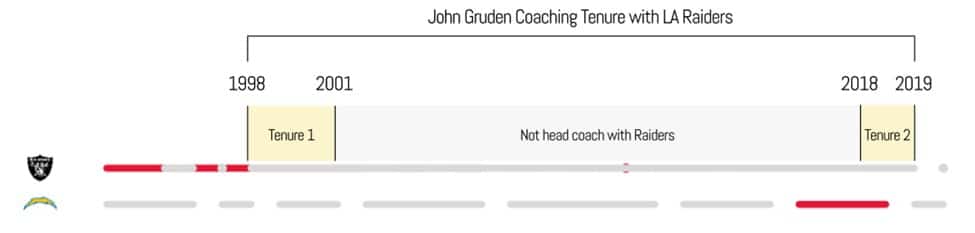
To solve this issue, our Senior Manager of Data Engineering, Ariana Cukier, created a ‘Tenure’ field in Alteryx, creating a unique value for each coach’s time as head coach with a team i.e. Tenure 1 (1998 – 2001), Tenure 2 (2018 – 2019), etc. Using the new Tenure field, I created a combined field of Tenure and Coach, resulting in a unique key. Before, Tableau was trying to connect all of the ‘John Gruden’ data points for the Raiders, but now with the combined field, there are two separate values for John Gruden at the Raiders, ‘John Gruden Tenure 1’ and ‘John Gruden Tenure 2’. Placing this new combined field onto the Detail property of the Marks card achieved exactly what I was looking for; separate lines drawn for each head coach’s coaching period for each team.
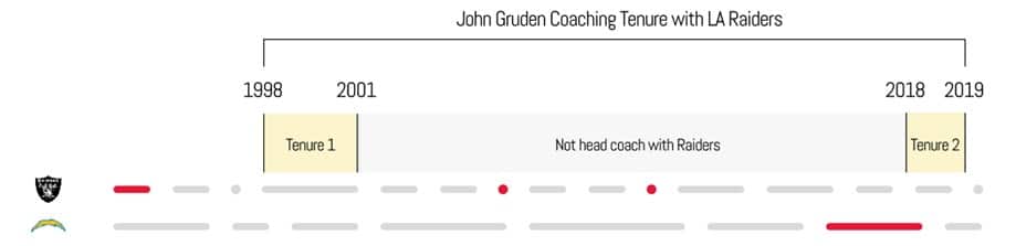
The key takeaway from this experience is that your x-axis must be sliced and diced by a field that represents both the value you are measuring (i.e. ‘Coach’ from the NFL example) but also contains unique values to represent each unique duration of time (i.e. ‘Tenure’ for each coach from the NFL example).
If your data set already contains the required fields needed to build the Pilula chart, then the viz engineering is simple. Place the continuous date on the Columns shelf, the discrete dimension on the Rows shelf, and your unique duration identifier on the Detail property of the Marks card. Then change the Mark type to Line.
There is an alternative method for building the Pilula chart if you don’t meet these basic requirements, where your data set does not contain the unique duration identifier required to accurately split the line into separate pills, or if you do not have access to a data prep tool like Alteryx or Tableau Prep. Our Associate Director of Analytics Solutions, Felicia Styer, helped to conceive another way to build the Pilula chart in Tableau, and this was the method we used to build the Pilula chart for the Asana PM Swift by Playfair+.
![]()
Building the Pilula chart in Tableau
For the sake of this tutorial, I am going to use the same mock data set that we used to build the Asana PM Swift by Playfair+. Asana is an agile project management tool where individual tasks are created for larger projects and assigned to individuals. The workload of these tasks is measured in what are called ‘Story Points’. In this example, we are replicating the use case of the Asana PM Swift, where we want to visualize each team member’s capacity using story points from tasks on a week-to-week basis to identify team members that might be over or under-burdened.
With this method, we’ll be using a combination of Gantt bars sized by Boolean logic that are dual axes with circles to create a line effect. Let’s get into it!
The Easy Way to Make Rounded Gantt Charts in Tableau
If you want to follow along, first view / download / connect to the required data set.
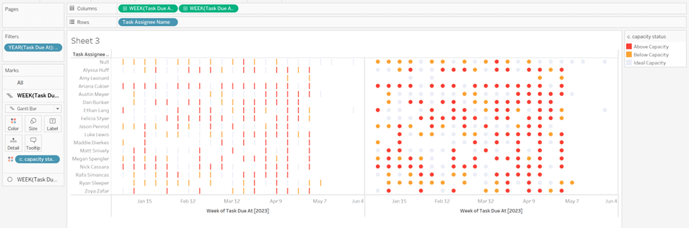
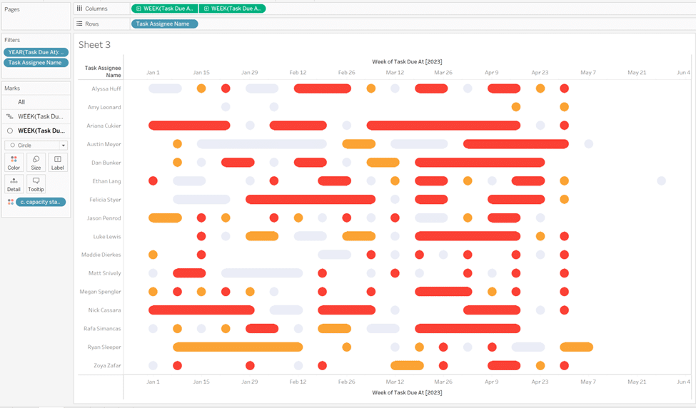
Right-click and drag Task Due At to the Columns shelf and select WEEK(Task Due At) continuous. Drag Task Due At to the Filters shelf and filter to only the year 2023, then place Task Assignee Name on the Detail property of the Marks card. Change the Mark type to Gantt Bar.
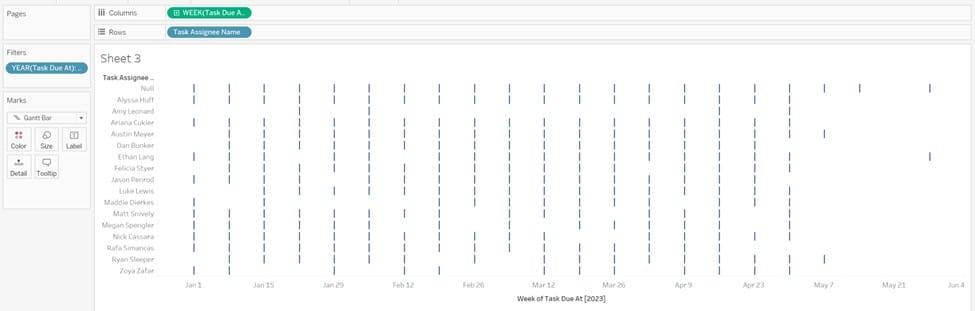
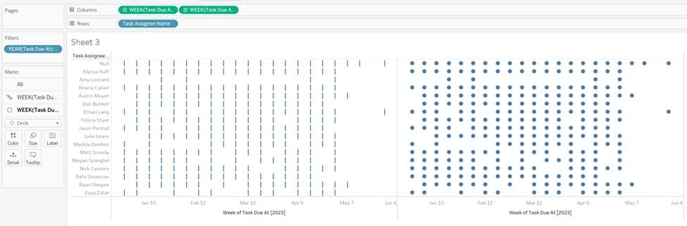
Duplicate the date field on the Columns shelf by right-clicking and dragging WEEK(Task Due At) to the right of the existing pill and release. Change the Mark type of the second date field to Circle and you should be left with a view that replicates the below image.
We next need to calculate whether a team member was above, below, or at an ideal workload capacity for each week. For the simplicity of this tutorial, we will hard code the ideal weekly story point range as 5-10 points. Any team member whose total weekly story points are above 10 points will be over capacity, and any team members whose total weekly story points are below 5 points will be below capacity.
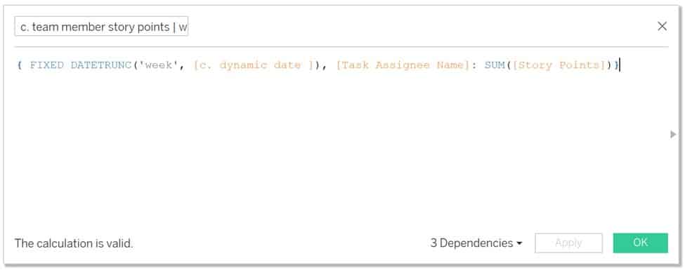
The first calculation we’ll create is called ‘c. team member story points | weekly’, which will calculate an individual team member’s story points for each week. It is important to note that we will later be using this field in a table calculation. Therefore, this calculation cannot result in an aggregation because table calculations cannot be addressed or partitioned by aggregate fields.
The Beginner’s Guide to Tableau Table Calculations
To work around this, we will wrap SUM(Story Points) in a Fixed LOD. Remember that Fixed LOD’s fix the level of granularity at whatever is defined between ‘FIXED’ and the colon. I want to calculate SUM(Sales) for Task Assignee Names at the week level, so I must define that in the Fixed LOD calculation. The logic is as follows:
{ FIXED DATETRUNC(‘week’, [c. dynamic date ]), [Task Assignee Name]: SUM([Story Points])}
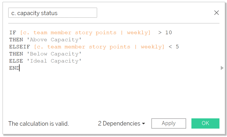
Next, we’ll calculate each team member’s capacity for each week based on the 5-10 story point range. Let’s call this field, ‘c. capacity status’.
The logic is as follows:
IF [c. team member story points | weekly] > 10
THEN ‘Above Capacity’
ELSEIF [c. team member story points | weekly] < 5
THEN ‘Below Capacity’
ELSE ‘Ideal Capacity’
END
Let’s now place our newly-created c. capacity status calculation on the Color property of the Marks cards for both Gantt and Circle to color our viz by the capacity of each team member.
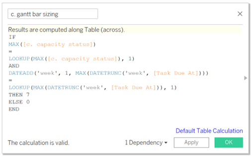
We next need to implement some table calc trickery to carefully size the Gantt bars. We only want the Gantt bars to be sized if each succeeding week contains the same capacity status. For example, the Below Capacity bars for each succeeding week will connect to form a unified bar, the Ideal Capacity bars will connect, etc. To achieve this, we’ll utilize what’s called a Lookup function which will ‘return the value of the specified expression in a target row, specified as a relative offset from the current row’.
![]()
More simply explained, this function will allow us to compare the capacity status of one week to its next succeeding week, and if they are the same status, then the calculation will return 7 (for 7 days in a week). If the current week and the following week aren’t the same status, then the calculation will return 0. We want the calculation to return 7 because we are analyzing this viz at the weekly level, so a value of 7 (1 for each day in a week) will size our Gantt bars to connect weeks that have the same status.
The logic is as follows:
IF MAX([c. capacity status])
=
LOOKUP(MAX([c. capacity status]), 1)
AND
DATEADD(‘week’, 1, MAX(DATETRUNC(‘week’, [Task Due At])))
=
LOOKUP(MAX(DATETRUNC(‘week’, [Task Due At])), 1)
THEN 7
ELSE 0
END
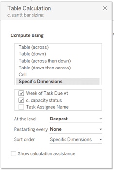
Place c. gantt bar sizing onto the Size property of the Gantt Bar Marks card. Right-click the pill and select Edit Table Calculation. Choose Specific Dimensions, check mark Week of Task Due At and c. capacity status, then lastly, make sure the fields are in top to bottom order of Week of Task Due At, c. capacity status, Task Assignee Name.
Exit the table calculation settings, and your result should resemble the image below.
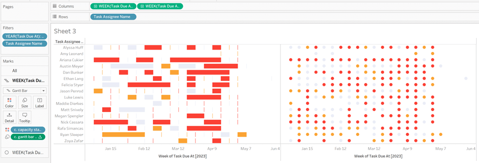
Right-click the second date field on the Columns shelf and select Dual Axis. Right-click the x-axis and select Synchronize Axis. Lastly, you will have to adjust the sizing of the Gantt bars and circles to match up perfectly.
All that is left is to format the lines, borders, font, etc. And that’s it; you now have all the tools you need to create a Pilula (aka Dr. Mario) chart with any data set and wow your stakeholders!
Happy Designing & Vizzing,
Rafael & Dan


Written By
Rafael Simancas

Written By
Dan Bunker

Peer Review
Alyssa Huff
Assoc. Director, Information Design
Related Content
Introducing “Gap” Charts in Tableau
In Practical Tableau, we introduced the concept of a pace chart, an alternative bullet graph that normalizes progress to goal…

Ryan Sleeper
An alternative solution for showing rank and performance Learn how to make ‘leapfrog’ charts, a dot plot variant that uses…
3 Ways to Make Gorgeous Gantt Charts in Tableau
Traditional Tableau Gantt charts display a mark at a start date and size the mark by duration, showing a visual…