How to Color Goal Surpluses / Budget Excesses in Tableau Bar Charts
Great visualizations answer the question – “Compared to what?” – without making users expend much effort uncovering their next actionable insight. This often leads to integrating comparison points such as goals, prior periods, or benchmarks; and/or leveraging the preattentive attribute of length / height to create one of our company namesake’s pride and joys: the bar chart. But what if we could have the best of all worlds and create a bar that colors only the portion of the bar that exceeds a goal a second color in Tableau? Not only does this technique look great, but It also makes processing more efficient with the preattentive attribute of color and clearly shows the difference with the comparison point. This tutorial will show you how to use dual-axis bar charts, along with a tricky calculated field to cap values, to color only a goal surplus or budget excess a second color.
Playfair Data Presents: Preattentive Attributes
Introduction
By the end of this post, you will be able to create a bar chart that colors only the portion of the bar that exceeds a goal, budget, or other comparison point.
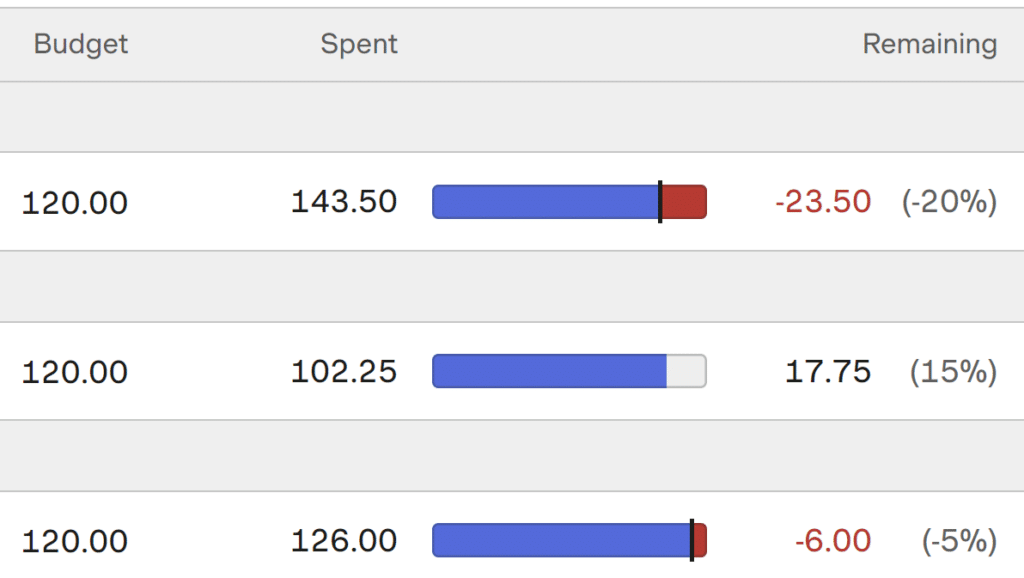
This technique was inspired by a report in Harvest, the time-tracking software that we use on the consulting side of our business. When looking at project budgets, the bar represents the number of hours worked and the bar chart container represents the total budget. When the budget is exceeded, a line is added that represents the budget and the portion of the bar that now exceeds the budget is colored red.
Continue reading with a free account, or login.
Unlock this tutorial and hundreds of other free visual analytics resources from our expert team.
Already have an account? Sign In
By continuing, you agree to our Terms of Use and Privacy Policy.
The chart is similar to a bullet graph in that it shows a comparison point in addition to the bar, but I like the alternative aesthetic of using the color sparingly instead of coloring an entire bar when a comparison point is exceeded. In my opinion, it also makes it more clear what portion of the bar has exceeded the comparison point.
3 Ways to Make Brilliant Bullet Graphs in Tableau
Capped values calculated field
For this tutorial, I will use the Sample – Superstore dataset that comes with every download of Tableau. Just for fun, I’ve renamed the Sales field “Expenses” by right-clicking on it within the Data pane, choosing Rename, and typing “Expenses”.
![]()
The first trick to getting this technique to work is to create a calculated field that limits the maximum value of the bar to match the comparison point. Since I’m using Expenses for this example analysis, we’ll imagine that we are comparing expenses to a quarterly budget of $45,000. You can also parameterize the comparison point or use a lookup table if your budgets change from quarter to quarter.
The formula for my example is:
IIF(SUM([Expenses]) > 45000,SUM(45000),SUM([Expenses]))
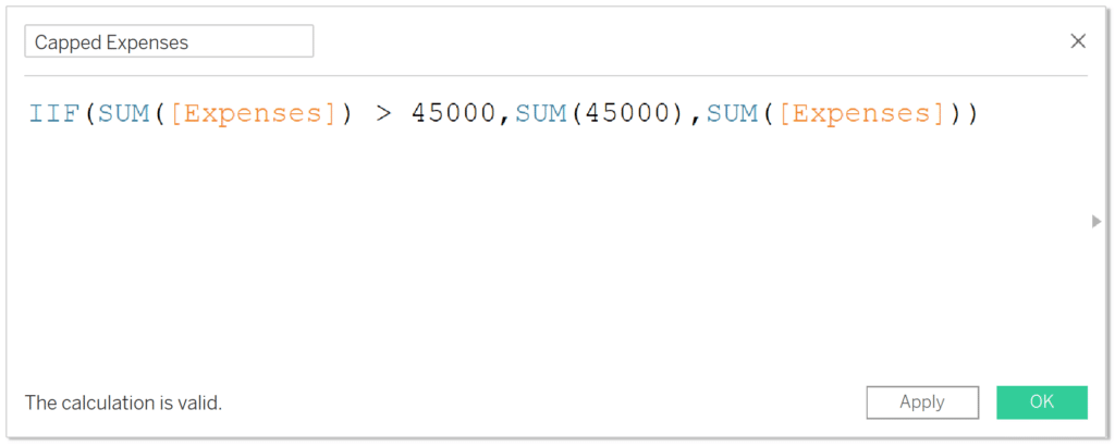
This formula will look at the sum of expenses at the visualization level of detail and if they are over 45000, the value of the bar will be locked in at 45000. When the sum of expenses is less than 45000, the actual value will be displayed.
One drawback with approaches like these is you must create a separate calculated field for each measure you are analyzing. However, you can even get around this now by using Measure Names in calculated fields through parameter actions.
How to Use Measure Names in Tableau Calculated Fields
Creating the dual-axis bar chart to color goals in Tableau
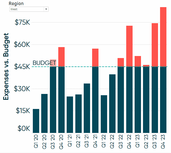
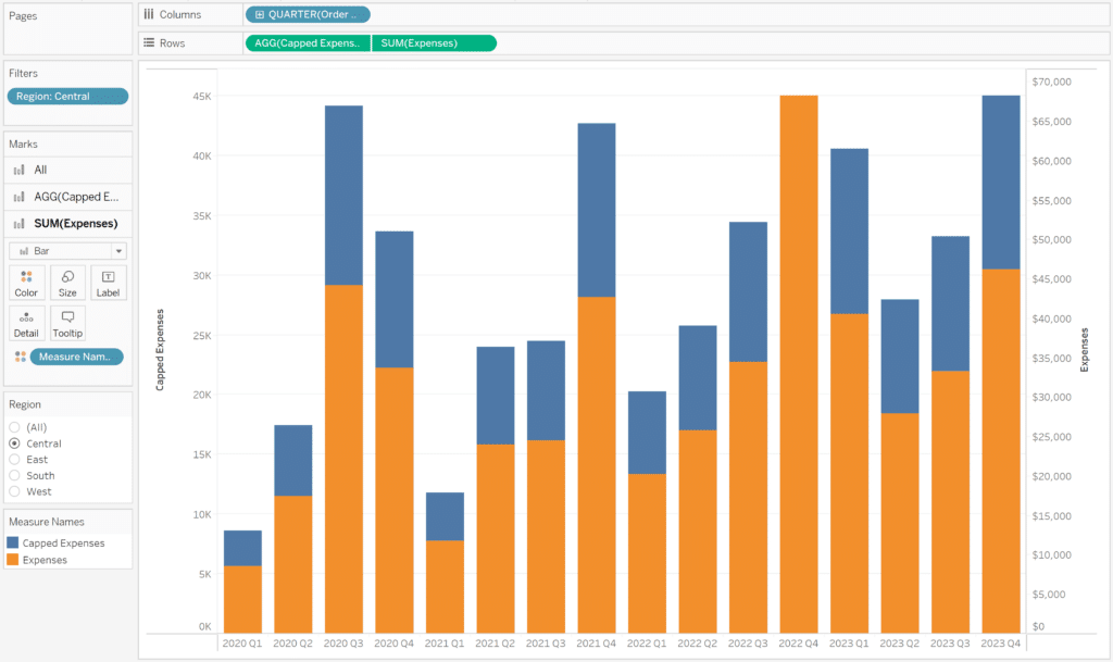
Next, I will use this newly-created Capped Expenses calculated field in a bar chart by Quarter of Order Date. To do so, place Capped Expenses on the Rows shelf, Quarter([Order Date]) on the Columns shelf, and change the mark type to Bar. I will also add a Region filter and filter the view to the Central region by right-clicking the Region field from within the Data pane, choosing Show Filter, and selecting Central.
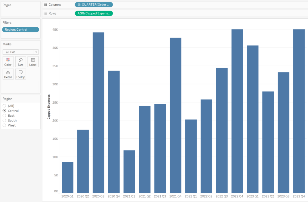
💡 Tip: This technique works whether the date field is being used as discrete or continuous, but I prefer the bar sizing when dates are used as discrete.
Notice that two of the quarters appear to end at exactly 45,000. Those are the two quarters where budget was exceeded in the Central region, but our calculated field is capping the value being shown at exactly the budget amount; every other quarter is displaying the actual expense amount.
![]()
Now place the non-capped version of the measure you are analyzing onto the Rows shelf next to the capped version and convert the view into a dual-axis bar chart. There are several ways to accomplish this, but I will right-click on the Expenses measure on the Rows shelf and choose “Dual Axis”.
Ensure the axes are synchronized by right-clicking on either y-Axis and choosing “Synchronize Axis”. You will also want to move the marks for the uncapped version of the measure to the back by right-clicking on its y-Axis and choosing, “Move marks to back”.
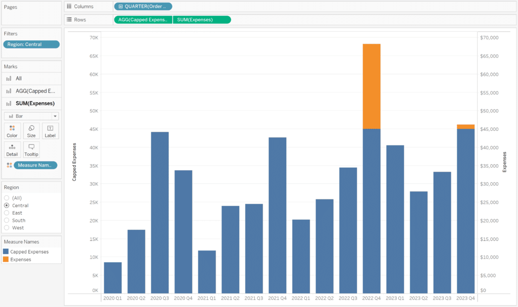
We can now see that sure enough, the two capped marks from earlier that stopped at 45,000 are the two quarters where the budget was exceeded. What’s happening now is there is an orange mark behind every blue mark, but you will only see the orange mark when it goes above 45,000.
How to Make Dual-Axis Combination Charts in Tableau and Some Creative Applications
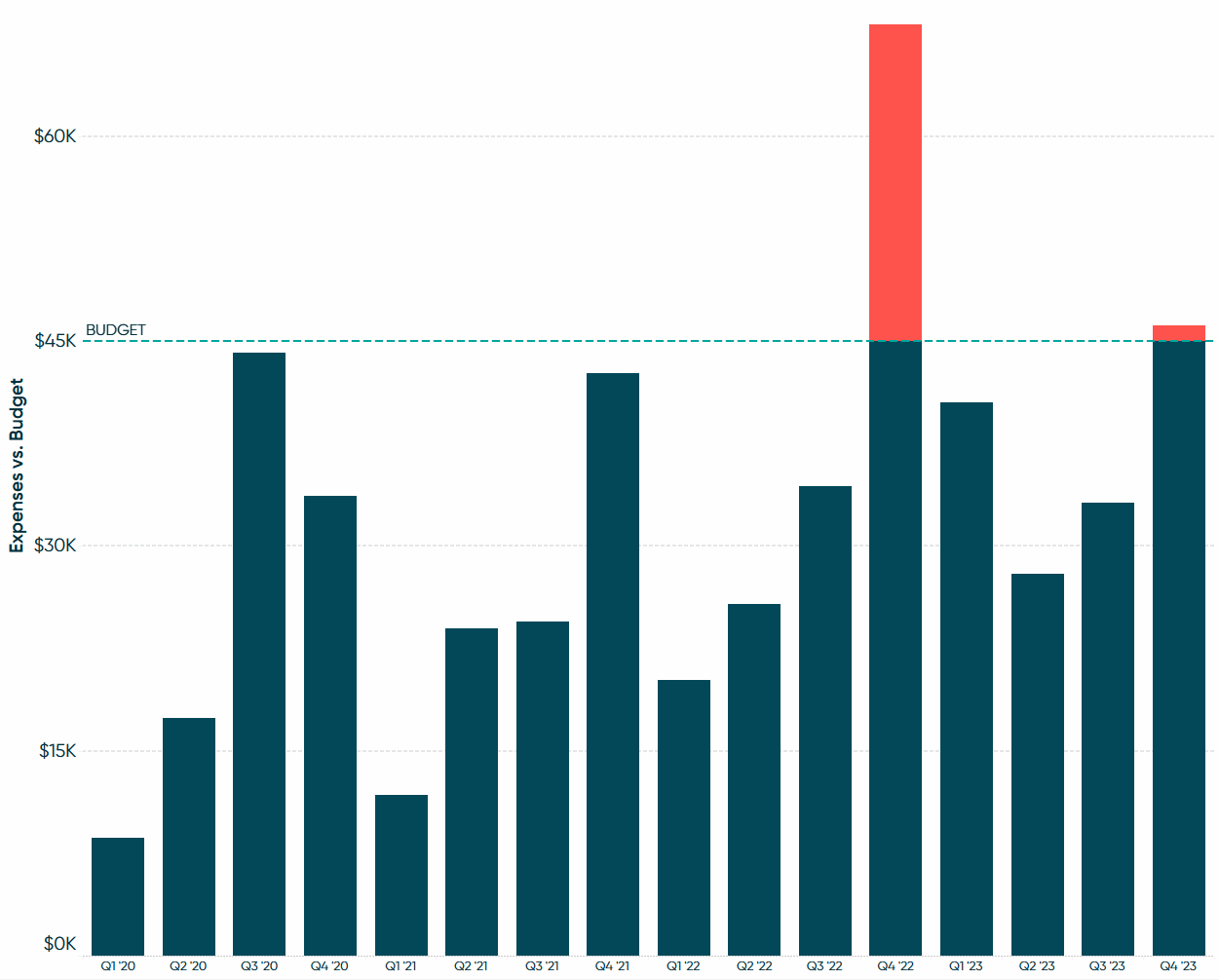
Final formatting options for coloring goals in Tableau
To finalize the view, consider some of these formatting options:
- Hide the right dual axis by right-clicking on it and deselecting “Show Header”
- Rename the remaining axis by right-clicking on it, choosing “Edit Axis”, and renaming the axis title towards the bottom of the dialog that appears
- Update fonts, colors, axis ticks, and number formatting
- Add a reference line for the budget amount by right-clicking on the y-Axis, choosing “Add Reference Line”, setting the aggregation of the value to “Constant”, and typing the value of the comparison point
You now have a dynamic bar chart that colors only the portion of a mark that has exceeded a comparison point such as a goal or budget!
Thanks for reading,
– Ryan


Written By
Ryan Sleeper
Related Content
3 Creative Ways to Visualize Outliers in Tableau

There are many ways to detect outliers in your data, but flagging them for your end users may present some…
3 More Ways to Make Beautiful Bar Charts in Tableau
The humble Tableau bar chart still reigns supreme when it comes to visualizing differences between categorial, or discrete, data –…

Ryan Sleeper
Leverage color to improve your designs and help communicate insights Color tips include reducing the saturation of marks, keeping color…