3 Ways to Normalize Data in Tableau


While performing data analysis, you might find yourself needing to transform your data to further unlock some insight. One way to do that is through data normalization in Tableau, but don’t worry, normalization is just another way of saying standardization. When you’re normalizing data, you’re making an “apples-to-apples” comparison. This can make your data easier to understand, give you more relevant analysis, or sometimes both!
Three common methods of normalization that can help you get the most out of your data visualizations: 1. Setting a zero baseline, 2. calculating a min-max index, and 3. Changing measure aggregation.
How to Turn Normalization On and Off in Tableau
How to calculate a zero-baseline normalization in Tableau
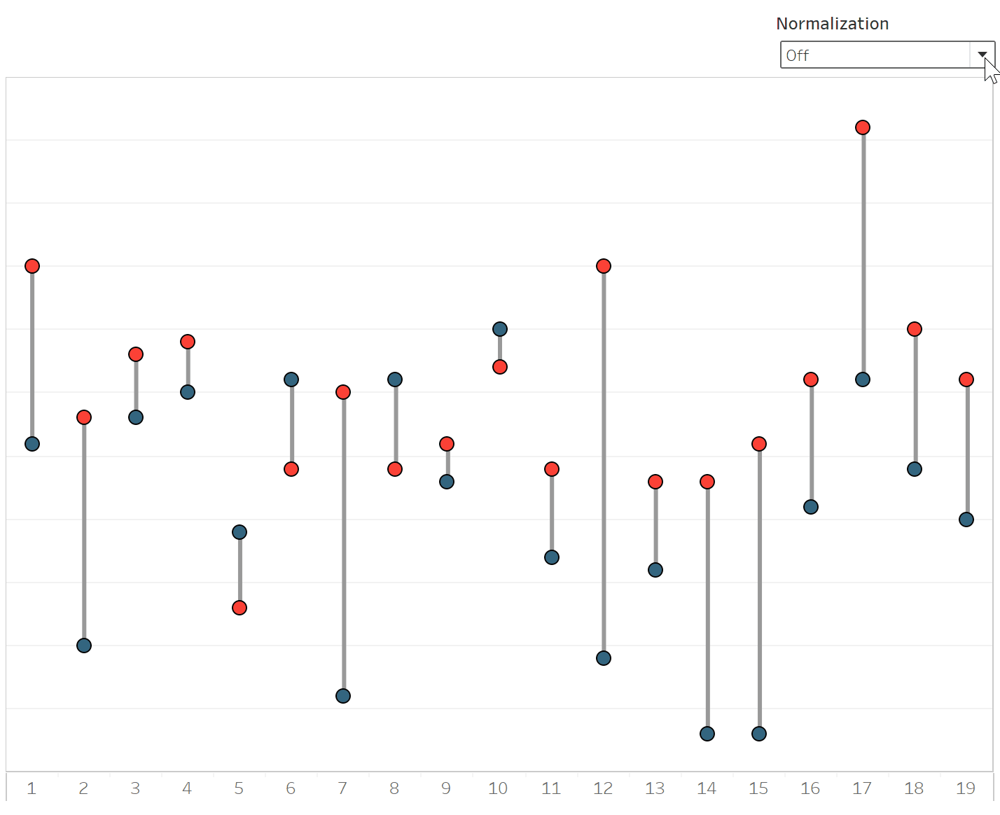
Full disclosure—this is my favorite normalization method because it focuses on the absolute difference between two measures. Maybe you’re measuring the performance enhancements from an optimized website, or you want to quickly see the winning margins for a team’s entire season—setting a zero baseline strips away extraneous information that takes time to process but leaves the relevant measure on the visualization.
Further speaking about favorite things, we’re going to use a small dataset of the game results from the Kansas City Chiefs’ 2019 Super Bowl-winning season for this example. Playfair Data has an office in Kansas City, and needless to say, many of us were excited to watch the Chiefs run that season.
![]()
Each game in the season is a unique event with two measures (the winning and losing scores), but if we wanted to quickly view which games were close and which were blowouts, normalizing the scores on a zero baseline is perfect for that.
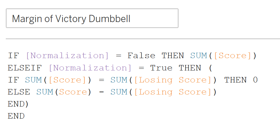
To display the scores for each game and the margin between winning and losing, we’ll set up two quick Calculated Fields; one to show the margin and another that will allow us to flip between the actual scores and the normalized scores using a simple Boolean Parameter.
Continue reading with a free account, or login.
Unlock this tutorial and hundreds of other free visual analytics resources from our expert team.
Already have an account? Sign In
By continuing, you agree to our Terms of Use and Privacy Policy.
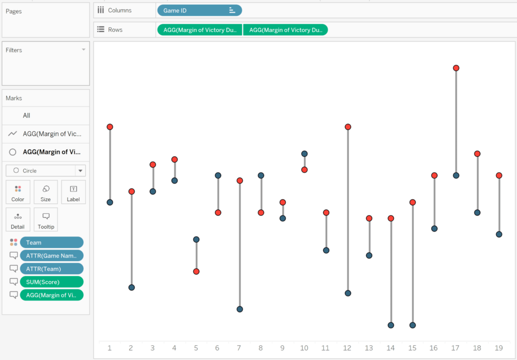
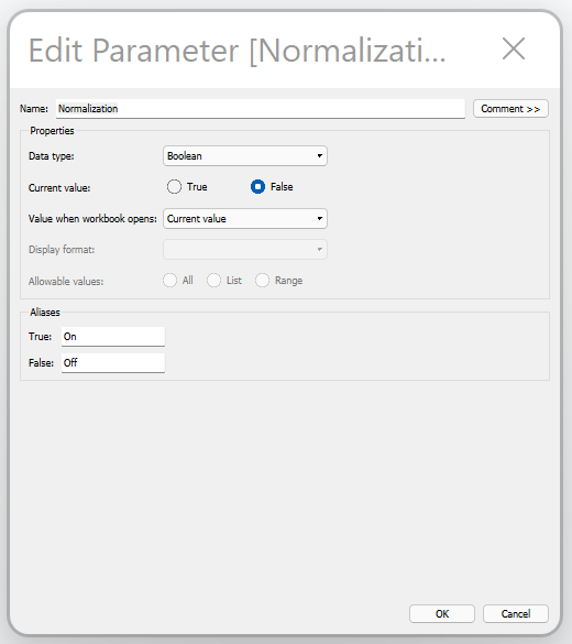
Now, let’s take a look at the parameter control for this visualization. Since we’re only concerned with viewing the data either in its original format or normalized, we can set the data type to Boolean. This gives us two options, and I’ve also set my aliases as “On” and “Off” to make it even easier in a dashboard.

From here, we drop Game ID into the Columns shelf and our Calculated Field onto the Rows shelf twice, then right click the second pill to select “Dual Axis.” After that, make sure one of your measures in the Marks card is listed as a Circle data type, and the other is a Line data type. This gives us the basic formatting, showing each game, the winning and losing scores, and the margin of victory/defeat for the Chiefs.
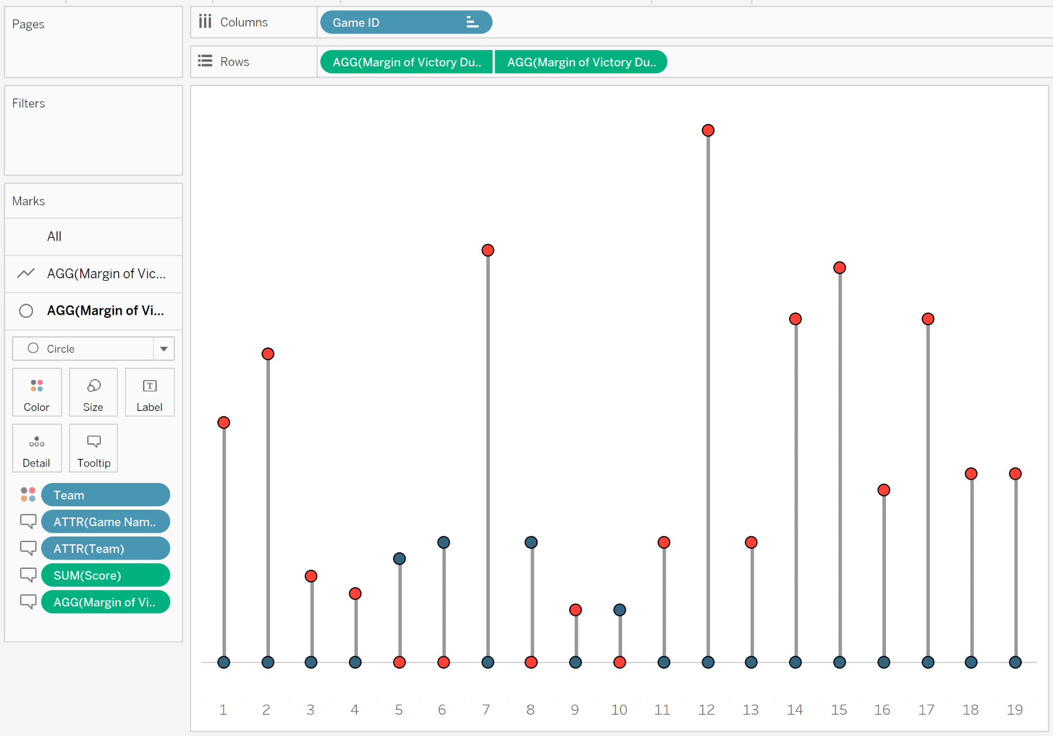
Changing the Normalization parameter to the “On” position gives us the losing score set at zero for each game, making it easy to see which games were close contests!
How to calculate a min-max scaling in Tableau
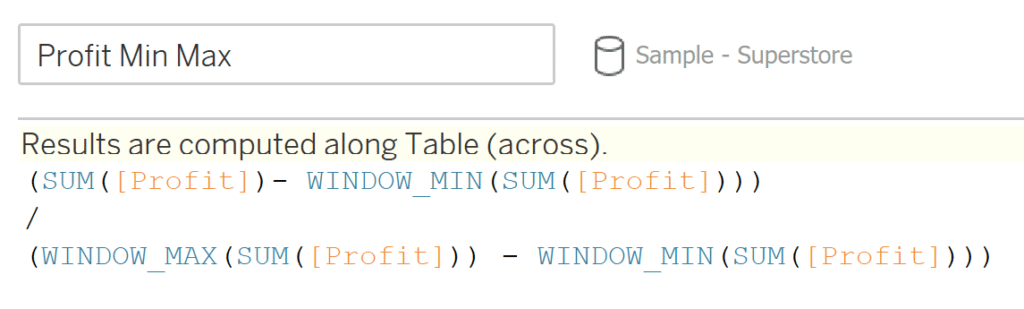
Indexed normalization, or sometimes called “min-max normalization,” is a way to standardize measures that vary widely in scale to a single standard. Perhaps you have sales figures from multiple regions that vary widely in volume and want to bring all the regions into the same scale. In doing so with min-max scaling, you are setting a range for your data of [0,1] where 0 is the minimum and 1 is the maximum.
The formula for this is:

While we used a sports-related dataset for the first normalization method, we’re going to use the built-in Sample–Superstore dataset for the next two methods. Before we visualize, we will need to create our min-max calculation. Using the formula above, our min-maxed Profit formula should look like this:
To best visualize how the min-max normalization changes the scale of our measure, I’m going to create a box-and-whisker chart for each. Start by dragging both our Profit and Min Max Profit measures to the Rows shelf, and add Region to the Columns shelf. Next, add Subcategory to the Detail property of the Marks card to give us the level of detail we want to see in our measure. Then, using the “Show Me” menu in the top right corner of your page, select the box plot icon to generate the view below.
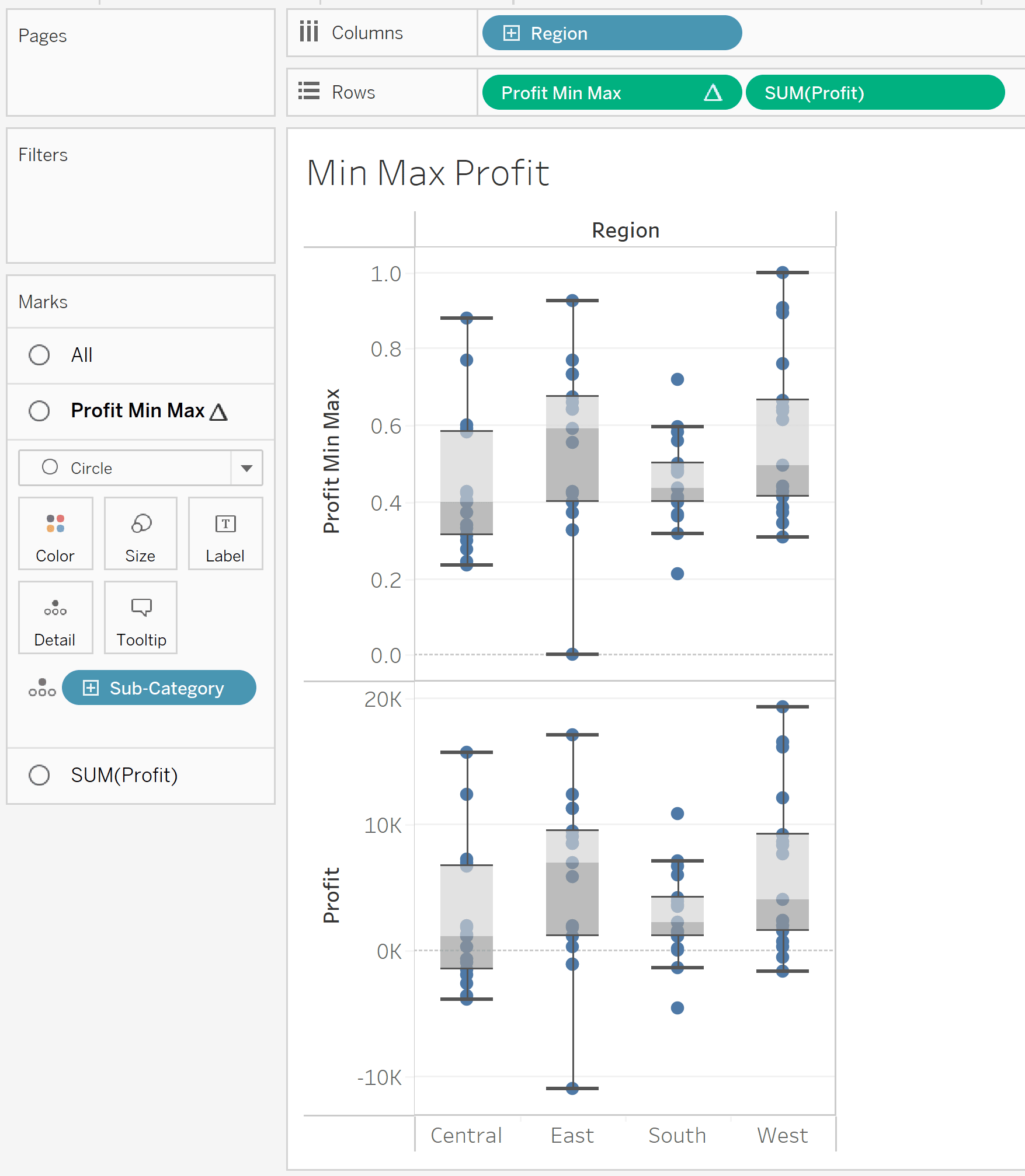
As you can see, both charts look the same, however if you look closely at the y-axis on both charts, the scale has been normalized between 0 and 1 on the Profit Min Max version. Going forward, you could compare other measures like Sales or Orders to Profit, all on the same 0-to-1 scale. Furthermore, if you are building a data model for advanced analysis, normalizing all scales can help you avoid outliers in one measure from distorting the model too heavily.
![]()
Normalizing per capita data in Tableau
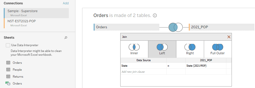
Our third method of adjusting our data to a common scale will be to normalize data by population size. In the Sample-Superstore dataset, you can see that California and New York have the largest amount of profit… but is that because they like the products the most or simply because they have the largest populations? Normalizing per capita is a better way to analyze this dataset, so before we go any further, we need to download and join population information to the Sample-Superstore dataset. I grabbed a simple table from the US Census website and joined it to Sample-Superstore.
For this third example, we’re also going to use the same parameter we created in the first example. This will let us toggle between the raw profit numbers and the profit normalized by state population.
A quick LOD Calculated Field to make sure we’re using the right state population, and then we have a Profit Normalization calculation that should look familiar from example 1 above.
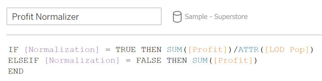
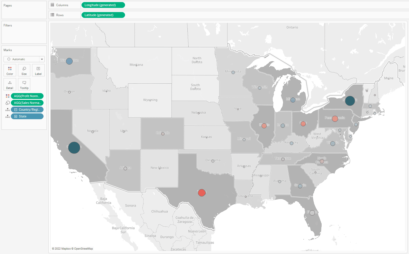
Now, Tableau has a built-in map chart type you can select from the Show Me menu on the top right of your screen. When you add our measures to the Marks card, your map should look like this:
And when you switch the Normalization toggle to the ON position, it should look like this:
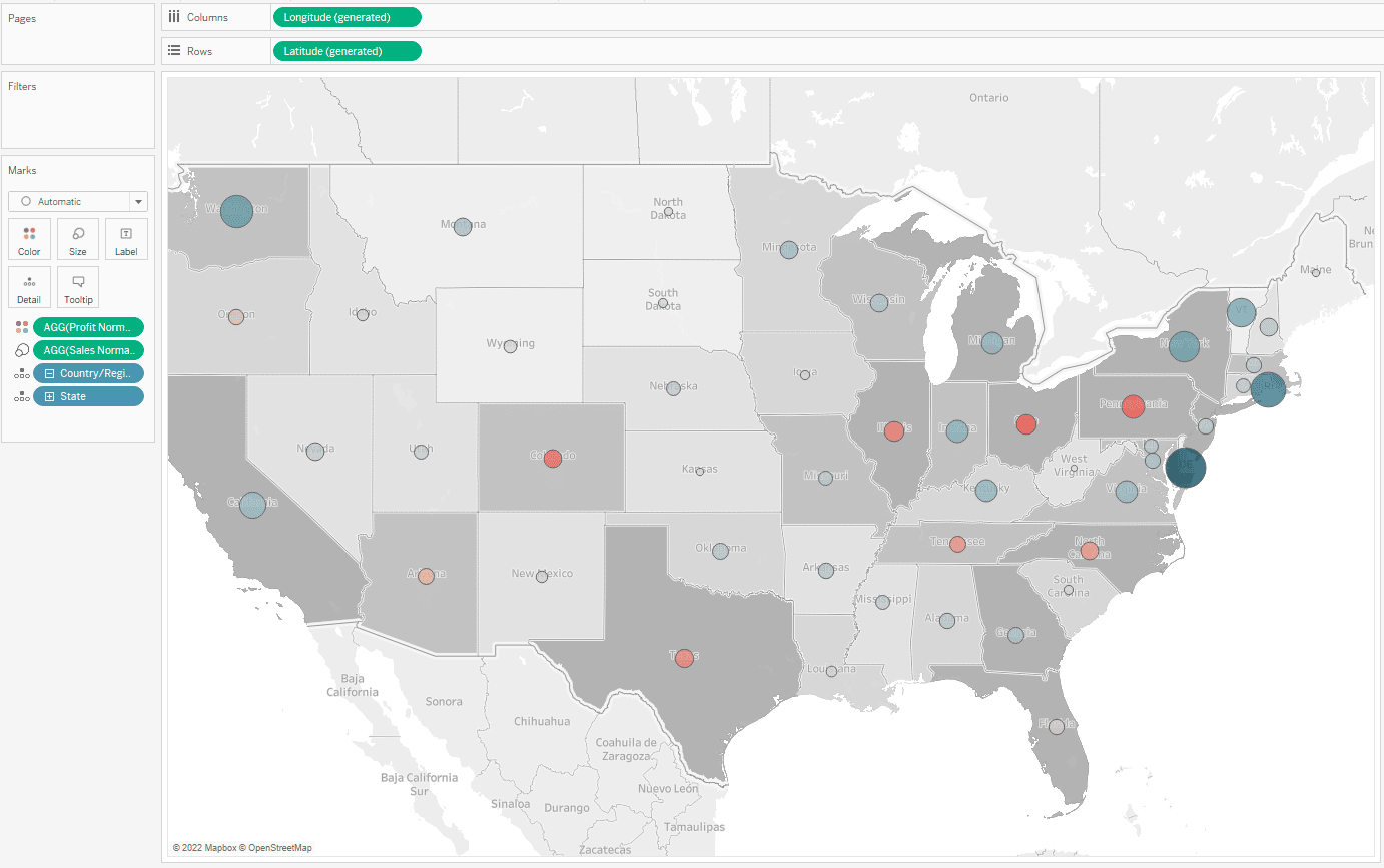
With Sales on the Size mark and Profit on the Color mark, you can quickly see the difference. Look at Delaware’s per capita sales and profit!
How to Deduplicate Joined Rows in Tableau
I hope taking a look at these three ways to normalize your data was helpful to you.
Thanks for your time!
-Matt


Written By
Matt Snively

Written By
Ethan Lang

Peer Review
Maggy Muellner
Sr. Visual Analytics Associate

Peer Review
Maddie Dierkes
Manager, Decision Science

Graphic Design
Dan Bunker
Manager, Decision Engineering
Related Content
The Beginner’s Guide to Tableau Table Calculations
Tableau table calculations, while very powerful, can be both tricky and confusing to work with. There are some great benefits…
A Quick Start Guide to Tableau Prep

In this tutorial, we’ll be covering the Tableau Prep tool and how we can use it to build out data…

Ryan Sleeper
Get more from your line graphs with this advanced tactic for equalizing dates Dates are tricky to work with in…