3 Ways to Use Alt Code Characters (▲,★,■) to Enhance Your Tableau Dashboards

ASCII, or American Standard Code for Information Interchange, is the standard when it comes to computers converting numbers into readable text. In addition to all of the ASCII text characters, Alt codes were introduced to cover all of the characters not available on a computer’s hardware. While the primary purpose of these alternative symbols was to provide characters that required accent marks and foreign-language characters with different styles, there are many other symbols available on your machine when you hold the “Alt” key while entering a numeric code.
Since these codes exist, there are several characters you can use to enhance your data visualizations. This post will show you how to dynamically show increases and decreases with the ▲ and ▼ characters, how to format with the ★ and • symbols, and how to create a Viz in Tooltip with the ■ Alt code.
How to Dynamically Format Numbers in Tableau
Continue reading with a free account, or login.
Unlock this tutorial and hundreds of other free visual analytics resources from our expert team.
Already have an account? Sign In
By continuing, you agree to our Terms of Use and Privacy Policy.
Alt Code 1: Dynamically formatting numbers with triangles to show changes in performance
In my post, How to Dynamically Format Numbers in Tableau, I illustrate how to provide a dynamic number format whether the number is positive or negative, regardless of the data type, and even when the number has a prefix and/or suffix. While that is my favorite approach when dealing with more than two scenarios, if I am only trying to illustrate a positive or negative change, I like to format the numbers with an up (▲) or down (▼) triangle.
To use any of the Alt codes in this post:
1. Ensure the Num Lock key is turned on
2. Hold the ‘Alt’ key while entering the numerical code for the symbol
3. Let go
The Alt code for a triangle pointing up is 30 and the Alt code for a triangle pointing down is 31. If you are on a laptop and don’t have access to the Num Lock key, you can also just copy and paste the characters within this post.
To show you how to put these into practice, we will be recreating one of the triangle indicators from the Super Sample Superstore dashboard.
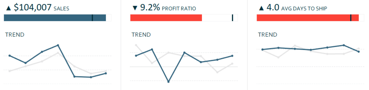
In the dashboard, positive changes are illustrated with the up triangle and negative changes are illustrated with a down triangle. This is a simple way to use psychological schemas to communicate the insight efficiently.
This is achieved by custom formatting a measure in Tableau Desktop. Here’s how my Sales Callout from the previous screenshot looks ‘under the hood’.
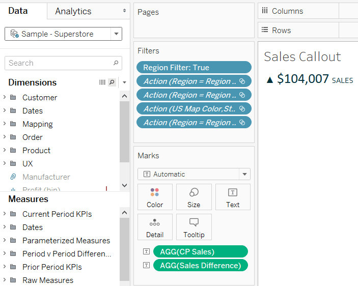
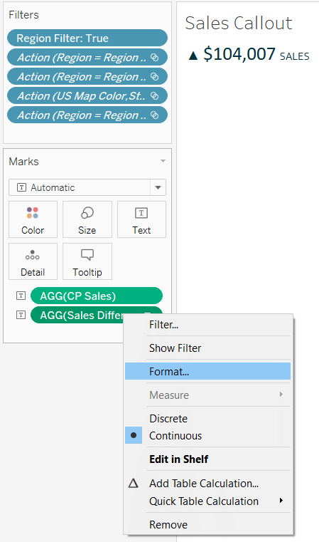
Note that this entire view is generated by just two measures: CP Sales and Sales Difference. The Sales Difference measure is what is being formatted into the up and down triangles. To do this, right-click on the measure you want to format and choose “Format…”.
After clicking, a new formatting pane will appear on the left. Choose “Numbers”, then “Custom”. This is where you can copy and paste the up and down triangles, separating them with a semicolon “;”. Whatever symbol you place before the semicolon will show up when the value is positive; whatever symbol you place after the semicolon will show up when the value is negative.
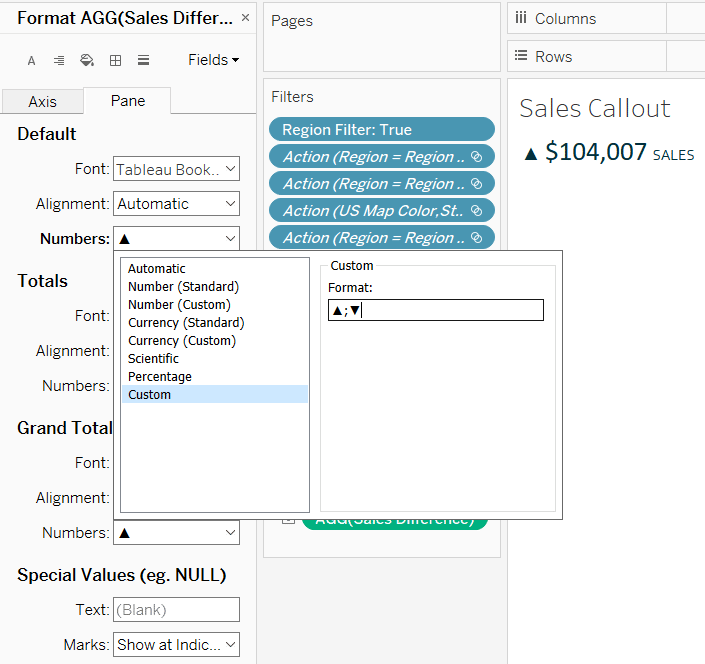
For ease of this illustration, and to provide myself flexibility, I often like to create individual elements that can be combined in larger calculations. That being said, in this case, I could have also simply formatted the CP Sales measure with this “▲$#,#; ▼$#,#” to get the same effect with just one field. One disadvantage to the latter approach is that the sizing will be the same for the entire field (i.e. I can’t have smaller triangles with larger numbers).
![]()
Lastly, you can add a third format by entering a second semicolon followed by the format. For example, sometimes I use a third format to communicate when something is not applicable or available to display as a number. The custom format would look something like this “▲$#,#; ▼$#,#; -”. This custom format would display an up triangle with a dollar sign when there was a positive dollar change; a down triangle with a dollar sign when there was a negative dollar change, and a dash when there was no change or the calculation couldn’t be computed.
Alt Code 2: Formatting your visualizations with the star and bullet symbols
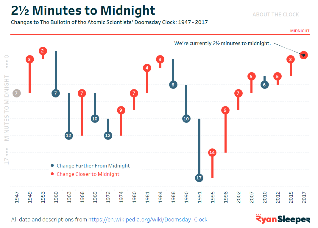
Alt code symbols can also be used as a way to improve the formatting and add a unique style to your dashboards. One of the most common characters I use is the bullet (•), or Alt code 7. This symbol can be used in ordered lists, but also doubles as an alternative approach to color legends. I prefer the circle shape to the default color legend squares in Tableau, particularly when using a circle mark type as you would with a scatter plot.
Here is an example from my visualization, 2½ Minutes to Midnight.
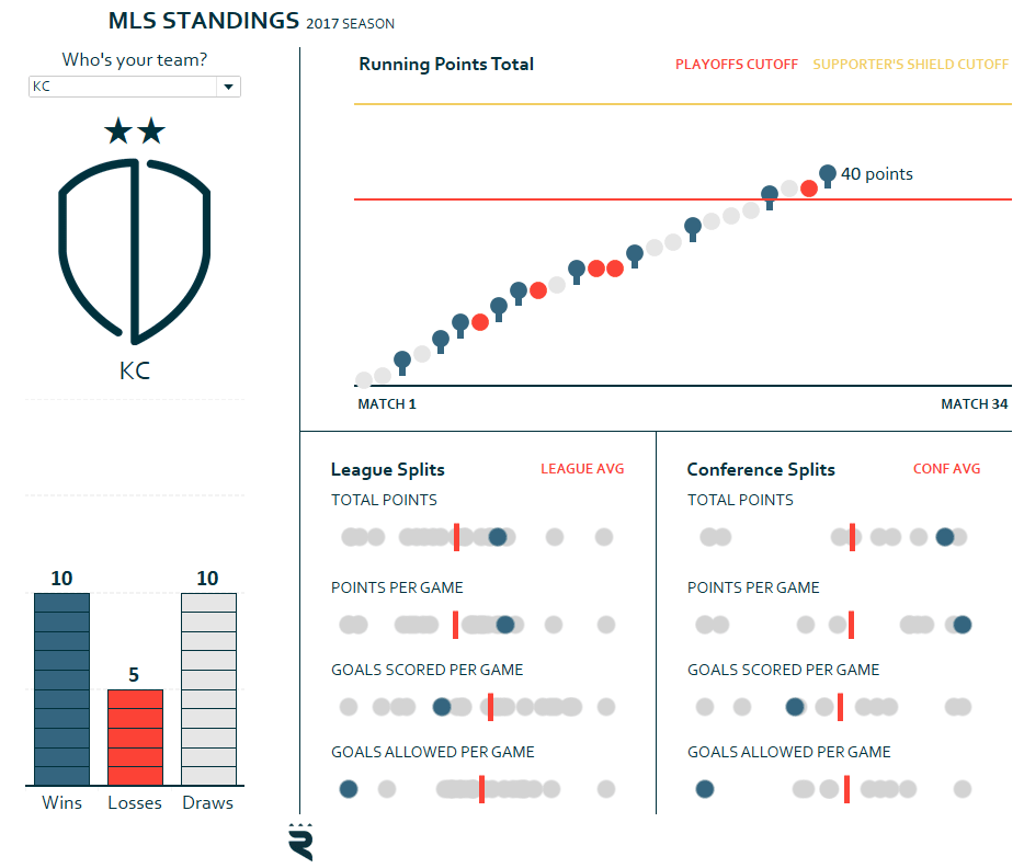
In another example, I took this a step further by integrating the star symbol (★), or Alt code 9733. In soccer (football), it is tradition to display a star over the team’s crest for each championship that they’ve won. So in my viz, 2017 Major League Soccer Standings, there is a field in the underlying data for championships won. Instead of displaying the number of championships, I put one star symbol for one championship, two star symbols for two championships, and so on. That way when a team is selected that has won at least one championship, the stars representing their championship(s) appear in the dashboard.
This same effect could have been achieved with a calculated field that tells Tableau how many stars to display depending on the number of championships won. The formula would look something like this:
IF [Championships Won] = 1 THEN “★”
ELSEIF [Championships Won] = 2 THEN “★★”
ELSEIF [Championships Won] = 3 THEN “★★★”
ELSEIF [Championships Won] = 4 THEN “★★★★”
ELSEIF [Championships Won] = 5 THEN “★★★★★”
END
“A picture tells a thousand words” and these Alt code characters are a way to pack a lot of information into a single symbol. For the Kansas City fans in attendance for the coldest game in MLS history, a championship that went to a 10-round penalty kick shootout (the longest in MLS history), that star reminds them of quite a bit.
![]()
These are just two ideas for using Alt codes to format a visualization, but there is an entire site dedicated to different options.
Alt code 3: How to make a bar chart Viz in Tooltip with squares or rectangles
While we have been excitedly awaiting the ‘Viz in Tooltip’ functionality (now available as of Tableau Desktop 10.5) that Tableau is currently working on, I have been trying to share alternative ways to add value to tooltips. Viz in Tooltip allows you to show a secondary data visualization when you hover over a data point on a primary data visualization on a view.
Believe it or not, Andy Cotgreave (Tableau evangelist and data viz hero), came up with a creative way to do this nearly seven years ago. Seriously… download the workbook in his post and it was made with version 6!
The tip involves combining a parameter with a string of Alt code squares (Alt+9632) or rectangles (Alt+219) with calculated fields that compute how many symbols to display. As Andy has had seven years to optimize his approach, and I do not have anything to add at this time, I’m going to point you his way for this last tutorial.
Thanks for reading,
– Ryan


Written By
Ryan Sleeper
Related Content
3 Innovative Ways to Use Tableau Scaffolding

If you have been working with Tableau for any length of time, you have probably come across tutorials utilizing the…

Ethan Lang
Learn the foundation of logical statements that can be transferred over multiple tools In this tutorial you will learn how…
Fundamentals of Accessibility Design: Making Your Dashboards a Friendlier Place

“What are your accessibility design standards?” It’s a question that can catch us off guard during project discussions. But when…