3 Innovative Ways to Use Tableau Scaffolding

If you have been working with Tableau for any length of time, you have probably come across tutorials utilizing the “MIN(0)” trick to create placeholder Columns or Rows. This approach is so useful and flexible that I personally use it at least once in every dashboard I build. At Playfair, we refer to this technique as ‘Tableau scaffolding’, not to be confused with data scaffolding, because we are creating a scaffold-like structure or framework within Tableau to place fields into.
This method is a way to create a “fake” measure and mark to attach data to, by adding “MIN(0)” pills to the Columns or Rows shelf, depending on your needs. In this tutorial, I will review the basics of Tableau scaffolding and introduce three innovative ways to implement this technique in a dashboard.
What is Tableau scaffolding?
Building crosstabs is one of the most common uses of Tableau scaffolding with the MIN(0) trick. If you are not familiar with this technique, I recommend reviewing 3 Ways to Create Charming Crosstabs in Tableau, which demonstrates how you can get around Tableau’s built-in column limit by using MIN(0) as a column placeholder, along with a few other handy tricks.
![]()
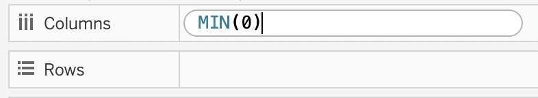
To start, you simply double click the Columns shelf (or Rows shelf), type “MIN(0)”, and hit Enter. You can repeat this to create as many columns or rows you need.
Continue reading with a free account, or login.
Unlock this tutorial and hundreds of other free visual analytics resources from our expert team.
Already have an account? Sign In
By continuing, you agree to our Terms of Use and Privacy Policy.
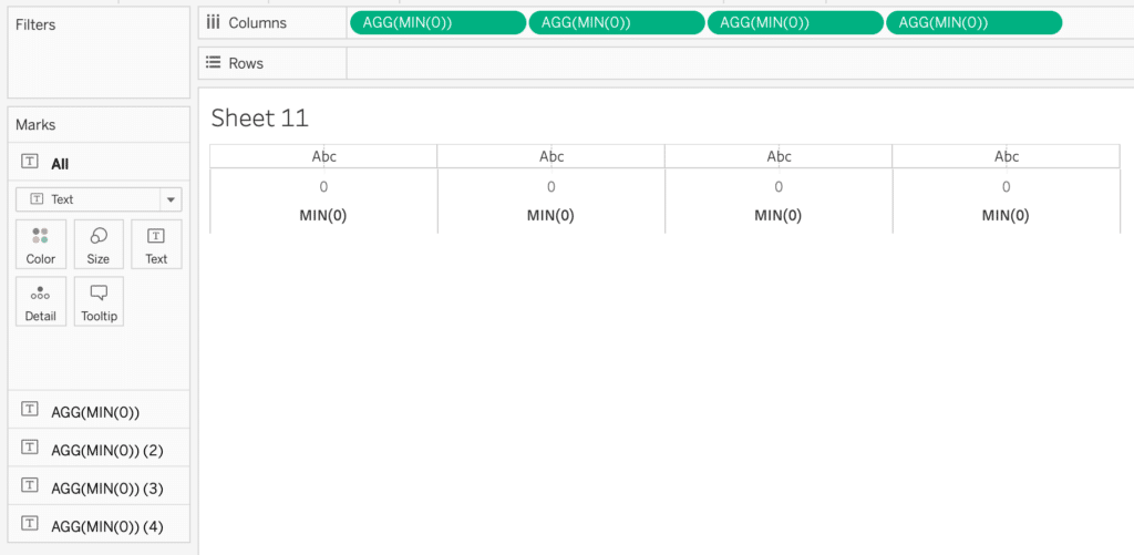
As you can see in the below image, I repeated this four times, which gave me four separate Marks cards that I can customize as I see fit.
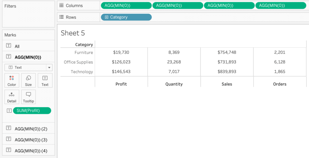
Now I added the Category dimension to Rows, and the Profit, Sales, Quantity, and Order Count measures to the four Text properties of their respective Marks cards. This example is just to demonstrate functionality, so I’m not adding any color or font design. I updated each axis title to reflect the measure being displayed and removed any axis ticks.
While this simple example can also be created using Measure Values and Measure Names, there are many cases when Tableau scaffolding allows more flexibility and customization.
How to Highlight Entire Table Rows in Tableau (Including Headers)
Build a scrollable, selectable list with Tableau scaffolding
The use of Tableau scaffolding and the MIN(0) trick is not restricted to building crosstabs. Take Senior Manager of Information Design, Alyssa Huff’s, complex tutorial on expanding donut charts, which uses MIN(0) as a placeholder center axis for the visualization. I have found this technique extremely useful for enhancing my dashboard user experience, with a scrollable and selectable list that highlights the selected item.
I will first walk you through building a simple list, and next show you two additional ways to make your list more informative and engaging.
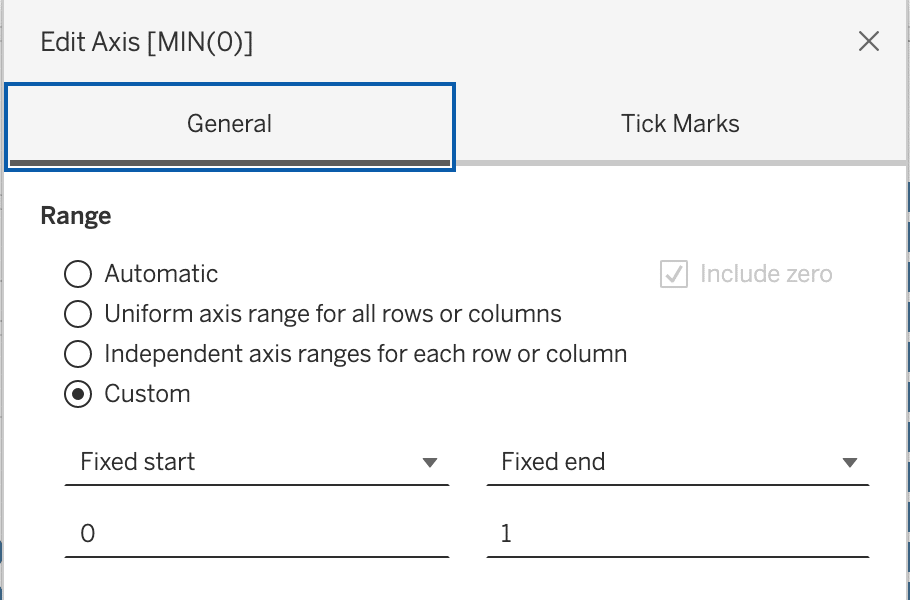
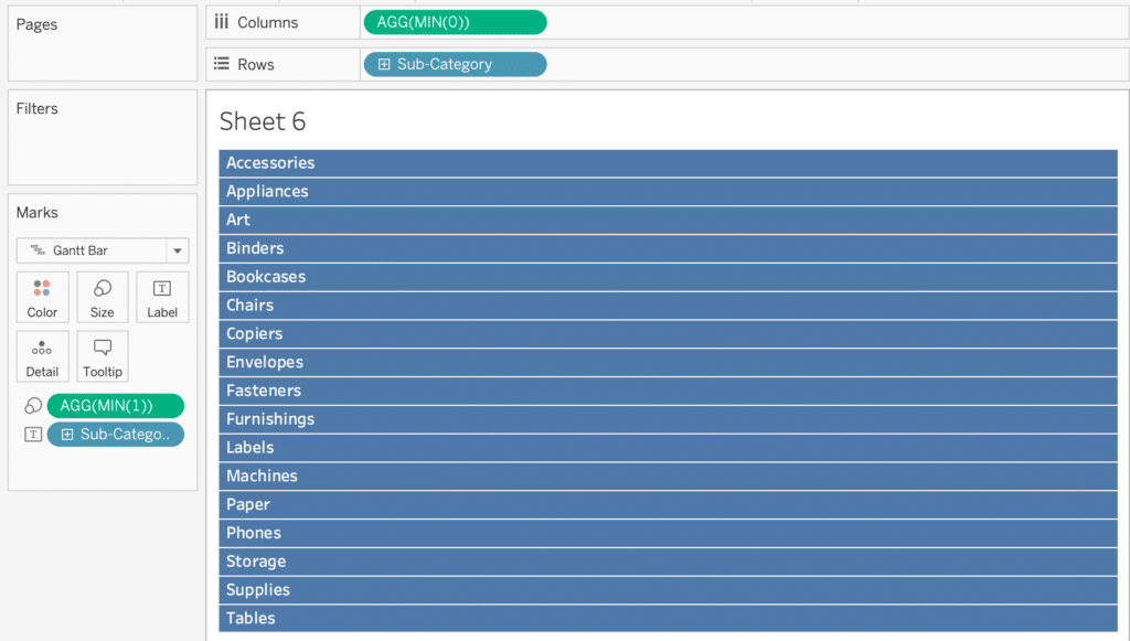
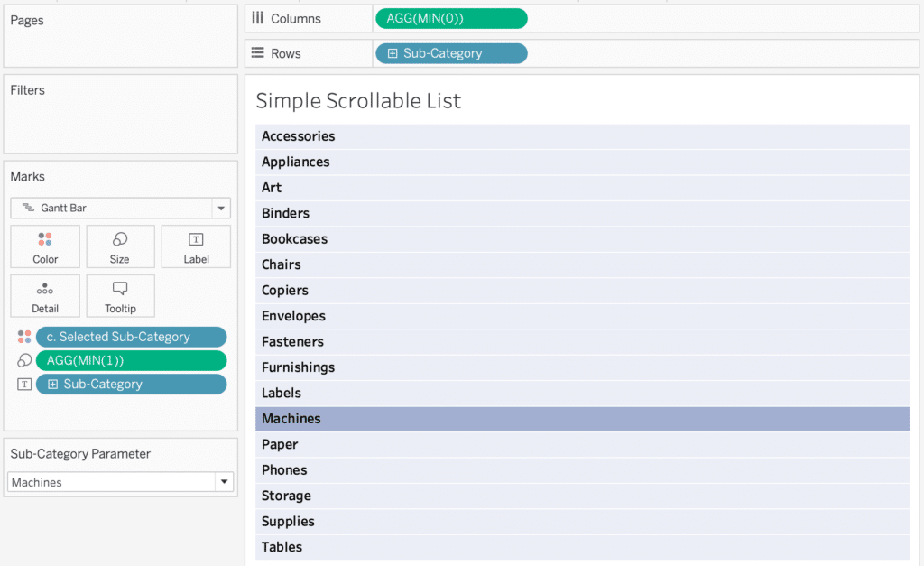
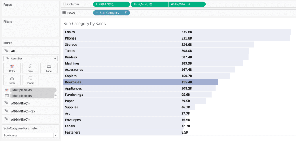
First, you will need to add “MIN(0)” to the Columns shelf, and a dimension to the Rows shelf. In this example, I am using the Sub-Category dimension from the Sample – Superstore dataset. Next, change the mark type to Gantt. Then double-click the empty space on the Marks card, type “MIN(1)”, and drag the “MIN(1)” pill to Size. So far, your view should look like this.
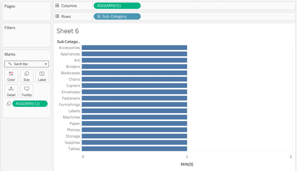
Right click your MIN(0) axis, select “Edit Axis”, and change the axis range to 0 – 1. Since the Gantt mark is sized at one unit, changing the axis range will allow your mark to fill the entire visible area.
Add the Sub-Category dimension to Label on the Marks card, and left align the text.
I also hid all headers, moved the mark size all the way to the right, and added borders to the Gantt marks.
You should have the bones of the visualization complete now, but for interactivity we need to make a Sub-Category parameter and calculated field to color the selected Sub-Category.
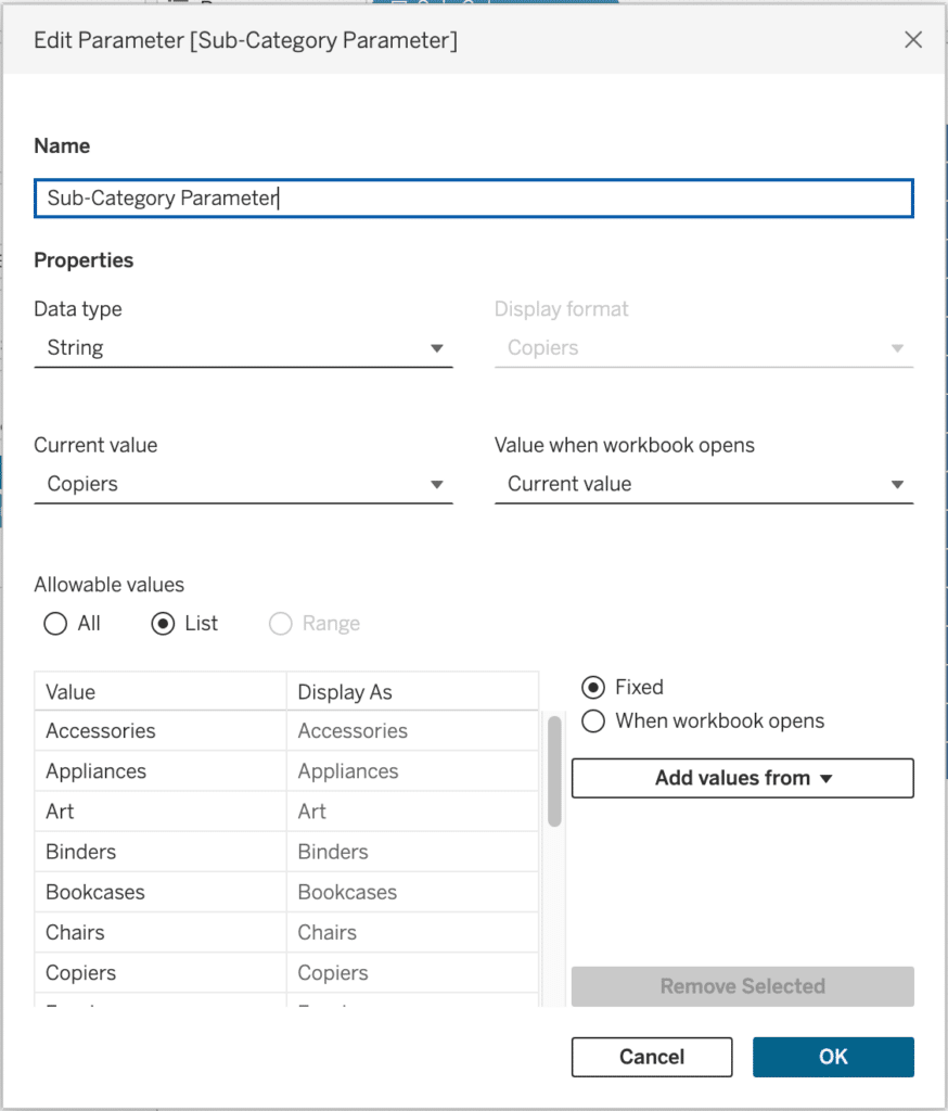
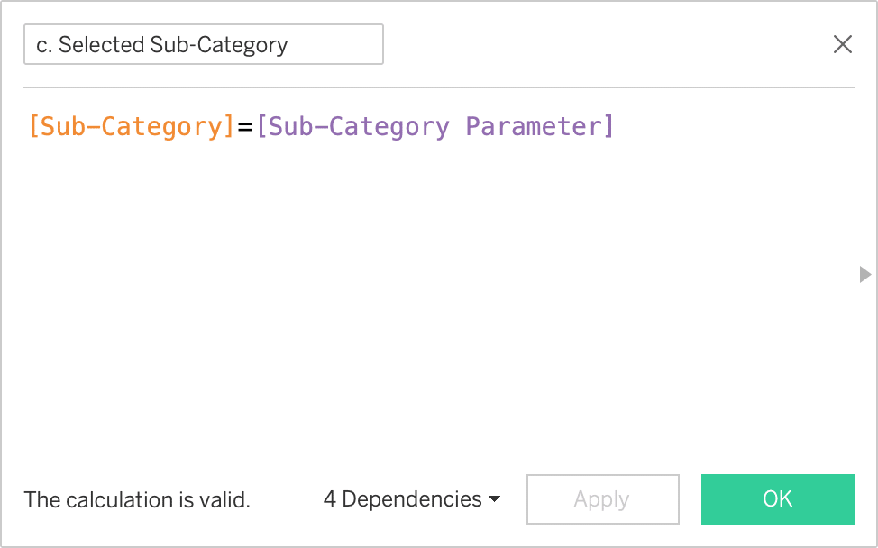
Once you have created the Sub-Category parameter, make a Boolean calculated field to filter to the parameter selection: [Sub-Category]=[Sub-Category Parameter].
Now you add this calculated field to Color on the marks card, and your sheet is complete.
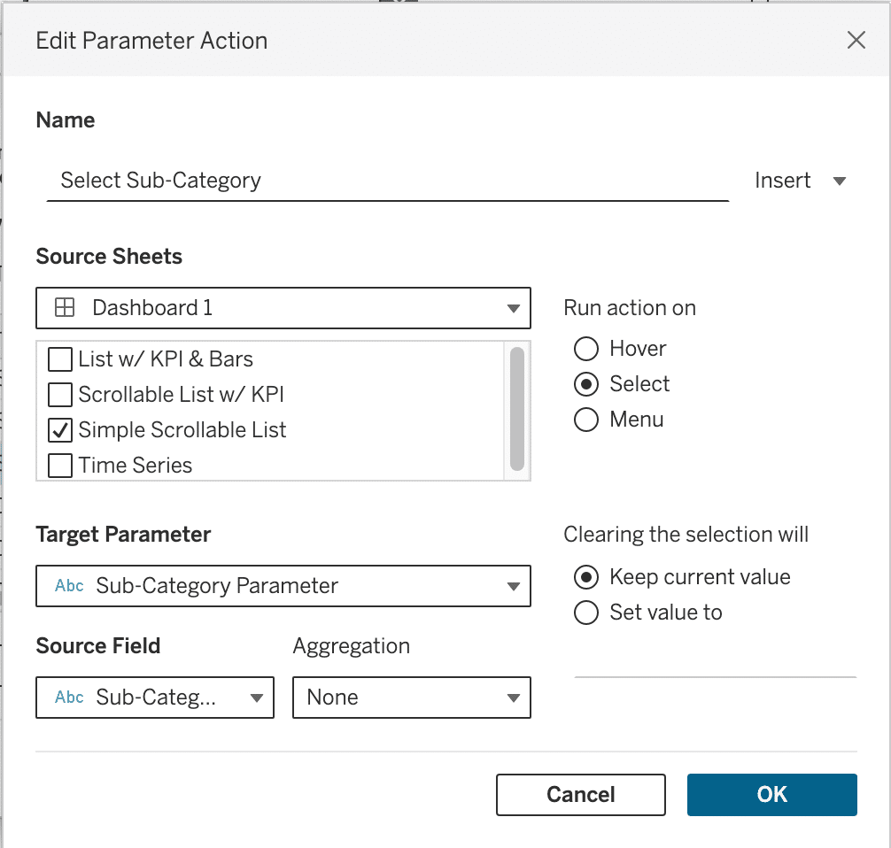
Now you can add this sheet to a dashboard, fit the sheet to width, and add a dashboard parameter action that changes the Sub-Category parameter when a row on the list is selected. I will show a working dashboard example at the end of this tutorial.
How to Highlight a Dimension Member in Tableau
Adding a relevant KPI to your list
When building a dashboard, you typically want to give users a reason to make a selection. The selectable list we just built displays Sub-Category in alphabetical order, which is helpful if a user is looking for a specific category, but what if the user is interested in selecting the most profitable sub-category? Right now, they would have to go through the list, selecting each item, which would take up a lot of time.
With Tableau scaffolding, we can build onto the list we just built and add a KPI for each Sub-Category. First, you need to add a second “MIN(0)” to the Columns shelf, leaving everything else the same. The new Gantt marks card should have the same color, size and text settings as the first, but we want to replace the Sub-Category dimension on Label with the Profit measure. Your view should now look like this.
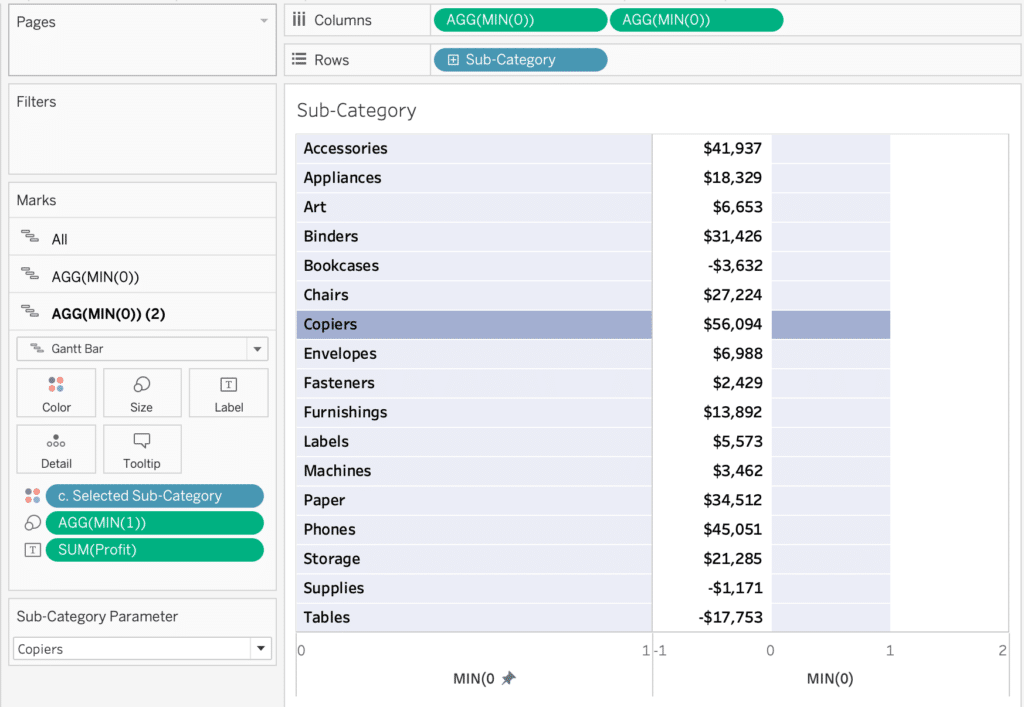
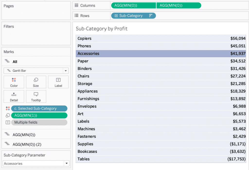
Now we need to adjust the second axis to mirror the first, changing the range to 0-1, and setting the label to right aligned. Finally, right click the new axis to create a dual axis and hide the headers. I also sorted the rows by Profit descending.
Combining multiple visualizations with Tableau scaffolding
The final evolution of this selectable list uses even more scaffolding to transform a selectable list into a data visualization in itself. By adding one more “MIN(0)” pills to the Columns shelf, we can include a bar chart on each row in addition to the KPI label. We will start by adding a third “MIN(0)” pill to the Columns shelf. Make sure the mark type is set to Gantt, and the “Selected Sub-Category” calculated field from the previous section is on Color.
We are going to use the Sales measure for this visualization, so drag “SUM(Sales)” to Size on the third “MIN(0)” column, and switch the label on the second Marks card by replacing “SUM(Profit)” on Text with “SUM(Sales)”.
I have found that playing around with which measures are included in the dual axis can help find your desired label alignment. So in this case, I recommend removing the dual axis from the first two “MIN(0)” columns by right-clicking the middle “MIN(0)” and de-selecting “Dual Axis”. Now, right-click the third “MIN(0)” and select “Dual Axis.” Don’t worry if your view looks a little off so far, we just need to fix the color and axis range.
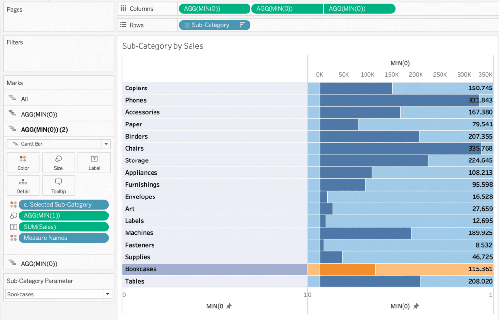
First, select your second Marks card. Remove all fields from Color, change the mark color to white, and left align your label. Next, select your third Marks card. Make sure only the “c. Selected Sub-Category” field is on Color, and check the axis bounds. If the lower bound does not automatically start at zero, make sure to set the lower bound to zero, and leave the upper bound set to automatic. This will ensure you don’t have any color gaps across your rows.
You can clean up your view by removing any borders and headers. I also decided to sort Sub-Category by SUM(Sales) descending.
Tableau Formatting Series: How to Use Lines and Borders
Your final view should look like this.
Putting it all together
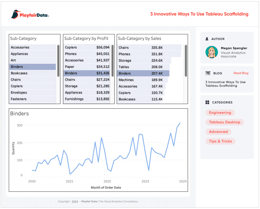
Now that you have built multiple selection lists, it’s time to see them in action! To demonstrate the dashboard actions, I put together a simple time series line chart with the “c. Selected Sub-Category” calculated field on the Filters shelf set to True, and Quantity as the measure. You can add your preferred selection list to the dashboard, create a dashboard parameter action to change the Sub-Category. The source sheet should be your list, the target parameter the Sub-Category Parameter, and the source field the Sub-Category dimension.
The use cases for Tableau Scaffolding are truly unlimited, so I encourage you to experiment on your own and discover new ways to enhance your dashboard.
Thanks for reading!
Megan

Written By
Megan Spengler

Graphic Design
Jason Penrod
Director, Information Design

Peer Review
Maddie Dierkes
Manager, Decision Science
Related Content
The Definitive Guide to Dashboard Objects in Tableau
If you have ever built a Tableau dashboard, even a simple dashboard with a single sheet, you know what a…

Ryan Sleeper
Ever wanted to use Tableau like Excel by modifying individual cells on a spreadsheet? This video explains the difference between…
How to Highlight Entire Table Rows in Tableau (Including Headers)
One of my favorite ways to highlight table rows of interest in a Tableau crosstab is to place a dimension…