How to Make an Expanding Donut Chart in Tableau

Did you know that pie charts have been around for over 220 years?! They first appeared in 1801 in William Playfair’s The Statistical Breviary. (The name Playfair might sound familiar…) While a debate can certainly be had about the merits of pie charts and the donut chart variation, I wanted to share my take on an interactive version of a donut chart. By the end of this blog, you’ll be able to create an interactive expanding donut chart in Tableau to show more detail when a user hovers over one of the slices. Let’s get started.
Learn the history of data visualization with Playfair+
FAQs answered in this post:
How do I create a basic donut chart in Tableau?
Create a donut chart by adding MIN(0) as a placeholder to Columns, changing the mark type to Pie, then placing your dimension on Color and measure on Angle. Duplicate the placeholder field to create a dual-axis, remove all fields from the second Marks card, change it to Circle mark type with white fill, then synchronize the axis. Finally, resize the white circle to fit inside your pie chart, creating the donut hole effect.
What are parameter actions and how do they enable expanding donut charts?
Parameter actions allow user interactions to change parameter values, which control what displays on your dashboard. For expanding donut charts, create a parameter for the focused category, then use Dashboard Actions to set this parameter when users hover over slices. This triggers conditional calculations that reveal sub-category details while hiding others, creating the expansion effect without requiring clicks or manual parameter selection.
How do Boolean calculations control which donut slices display in Tableau?
Create a Boolean calculated field comparing your Focus parameter to the Category field, then concatenate this True/False result with the category name using STR() conversion. Place this concatenated field on Color to map “True” combinations to highlight colors and “False” combinations to your background color. This color mapping technique effectively shows or hides specific slices based on which category the user is hovering over.
Why should I add dynamic labels and tooltips to expanding donut charts?
Dynamic labels using IF statements that check your Boolean filter ensure sub-category text and sales values only appear for the currently highlighted category. This prevents label clutter and cognitive overload by showing relevant details only when users express interest through hover actions. The result is a cleaner, more intuitive user experience that reveals hierarchical data progressively rather than overwhelming viewers with all details simultaneously.
How do I align multiple donut charts perfectly on a Tableau dashboard?
Add your sub-category donut first, then make the category sheet transparent by setting Format > Shading > Worksheet to None before adding it to the dashboard. Size and position both sheets until the category donut fits inside the sub-category donut with even spacing. This layering approach with transparent backgrounds allows precise alignment that creates the seamless expanding effect when users interact with the visualization.
How can Playfair Data help implement advanced Tableau interactivity techniques?
Playfair Data specializes in advanced Tableau engineering including parameter actions, Boolean filtering, and hierarchical drilldowns that transform static dashboards into interactive experiences. Our instructors teach techniques like expanding donut charts that improve user engagement and exploration. Schedule a strategy call to learn how our Flagship Tableau training can help your team master interactive visualization techniques that elevate dashboard quality and stakeholder satisfaction.
Create a basic donut chart
Start with a simple donut chart using Category and Sales from the Sample Superstore dataset. Any dataset you’d like to use with some kind of Category/Sub-Category hierarchy will work. First, we’ll add a placeholder field which will allow us to create the dual axis used to achieve the donut chart look. Use the calculated field MIN(0) by double-clicking on the Columns shelf and typing in the formula. On your sheet, change the Mark type to Pie. Drag Category onto the Color property of the Marks card and drag Sales onto Angle.
![]()
Next, hold Ctrl then click and drag the placeholder field so that it’s duplicated on the Columns shelf. You should have a view that looks like this:
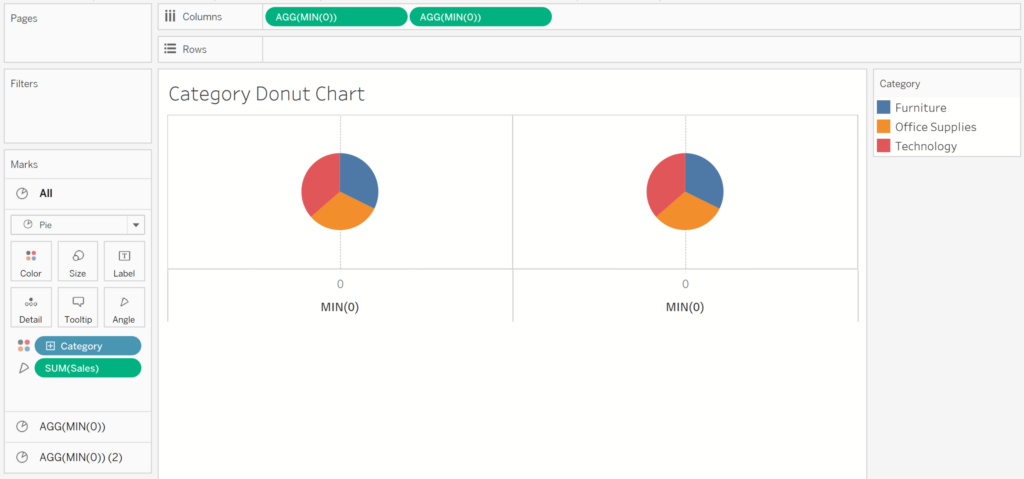
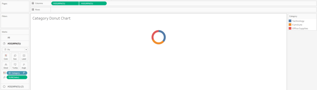
From here, it’s relatively simple to transform our two pie charts into the Tableau donut chart. Click the Marks card for the second placeholder field. Remove Category from the Color property and Sales from the Angle property. Switch the Mark type to Circle, then change the color of the circle to white or whatever color you’re using as your dashboard background. Right-click on the second placeholder field and choose Dual Axis. Finally, resize the white circle so it fits inside your pie chart. Before I move on, I’m going to sort my Category field in descending order by Sales and remove all borders, gridlines, and zero lines.
Our next step is to create a donut chart for the Sub-Category field, which will expand out from our original donut chart. To save some time and clicks, duplicate the Category donut chart sheet. Add Sub-Category to the Detail property of the Marks card, not the Color property. The Color property will come into play in the next few steps. For now, this donut chart will appear unchanged compared to the first one we created.
Create the interactivity with parameter actions
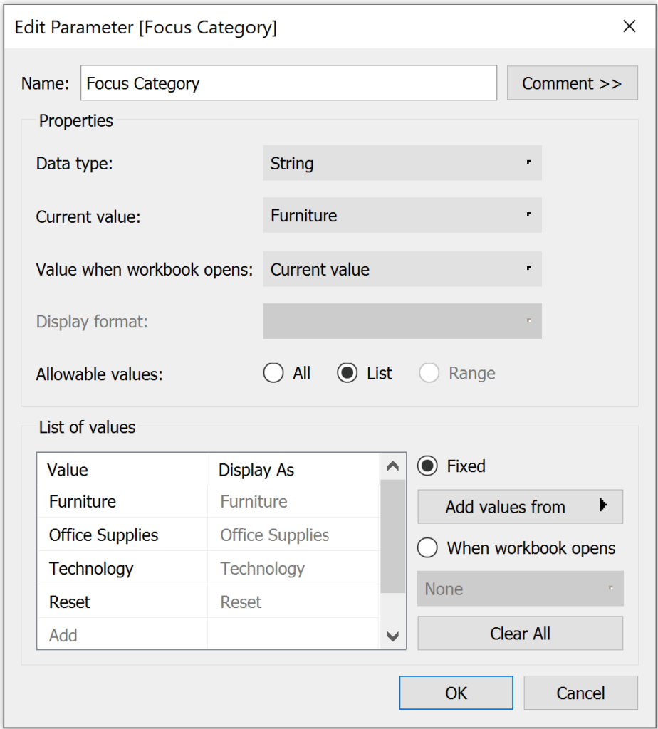
Let’s get into setting up the interactivity of this view. Right-click on the Category pill in the Data pane and go to Create and click Parameter. I renamed my parameter “Focus Category”. Add a value called “Reset”. This will allow us to “reset” the view and hide the Sub-Category expansion.
We need two calculated fields to focus on a specific Category and its Sub-Categories. The first I named “Category Filter”, and it uses the following formula:
[Focus Category]=[Category]
The second I called “Category Filter Color” and is written as follows:
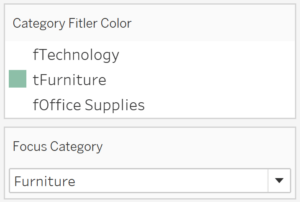
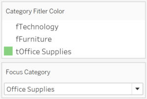
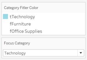
STR([Category Filter])+[Category]
The second calculated field tells Tableau which Category we want to highlight by concatenating either ‘t’ or ‘f’ from the Category Filter calculation (a Boolean value that needs to be converted to a string) and the Category name.
Replace Category on the Color property of the Marks card with Category Filter Color. Sort ascending order by Sales. Show the parameter control for Focus Category. Your color legend should look something like this:
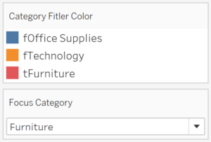
Now we need to map our colors so that every combination of “f+[Category]” is mapped to white (or your dashboard background color), and that every combination of “t+[Category]” is mapped to a highlight color.
Before we add these donut charts to our Tableau dashboard, let’s take a few more formatting steps to polish these views. First, update the colors on the Category donut so that they’re in the same color family as the colors on the Sub-Category donut. I decided to make the Category donut slices a slightly darker version of each color on the Sub-Category donut chart. I used the built-in Green-Orange-Teal color palette from Tableau, but feel free to use any colors you’d like.
Continue reading with a free account, or login.
Unlock this tutorial and hundreds of other free visual analytics resources from our expert team.
Already have an account? Sign In
By continuing, you agree to our Terms of Use and Privacy Policy.
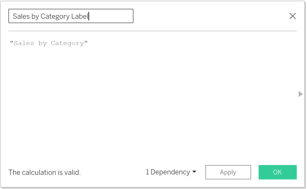
Next, add a label to the Category donut chart that says “Sales by Category”. To achieve this, I created a placeholder calculated field and dragged it onto the Label property of the Marks card, then formatted it to my liking:
Now add a white border to our donut slices by clicking on the Color property of the Marks card, clicking on the Border dropdown, and choosing White. Complete this step for both the Category and Sub-Category donut charts.
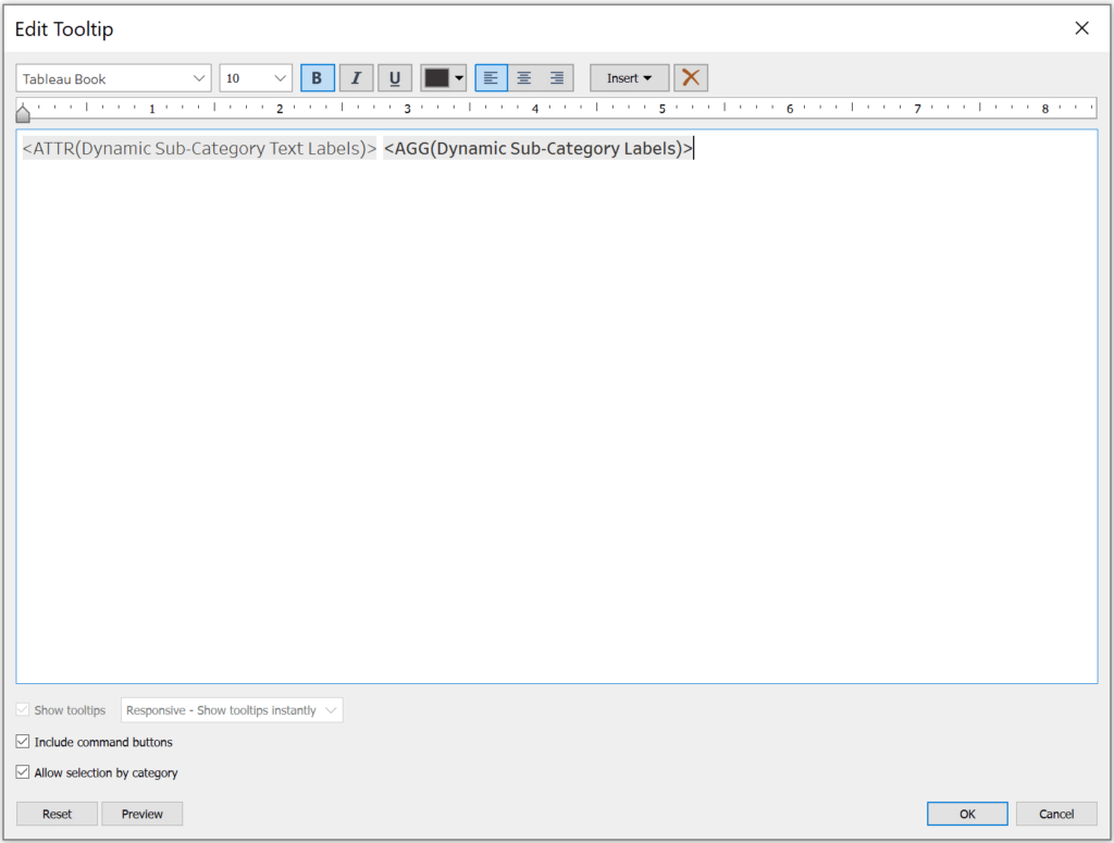
We need two calculated fields to have dynamic Sub-Category labels and tooltips that only show up for the highlighted Category. The formula for the dynamic Category Text labels is as follows:
IF [Category Filter Color]=’tOffice Supplies’
OR [Category Filter Color]=’tFurniture’
OR [Category Filter Color]=’tTechnology’
THEN [Sub-Category] ELSE NULL END
The formula for dynamic Category sales labels is very similar. Once I created the calculated field, I changed the default number formatting to show currency with one decimal place using thousands (K) as the unit.
SUM(IF [Category Filter Color]=’tOffice Supplies’
OR [Category Filter Color]=’tFurniture’
OR [Category Filter Color]=’tTechnology’
THEN [Sales] ELSE NULL END)
Drag these two new calculated fields onto the Label property of the Marks card for your Sub-Category donut chart. Next, update your tooltip so that it only uses the dynamic fields, and voila, labels and tooltips that only show the Category being highlighted!
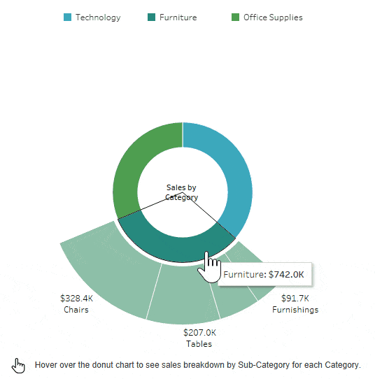
Okay, we’re ready to start our dashboard. Add your Sub-Category sheet to the dashboard first. Make the sheet for the Category donut transparent by clicking on Format > Shading and under Worksheet choosing “None”, and then add it to the dashboard. Size your donuts and sheets until they line up correctly. In other words, make sure your Category donut fits inside your Sub-Category donut with even spacing between each chart. This might take a few tries to get just right.
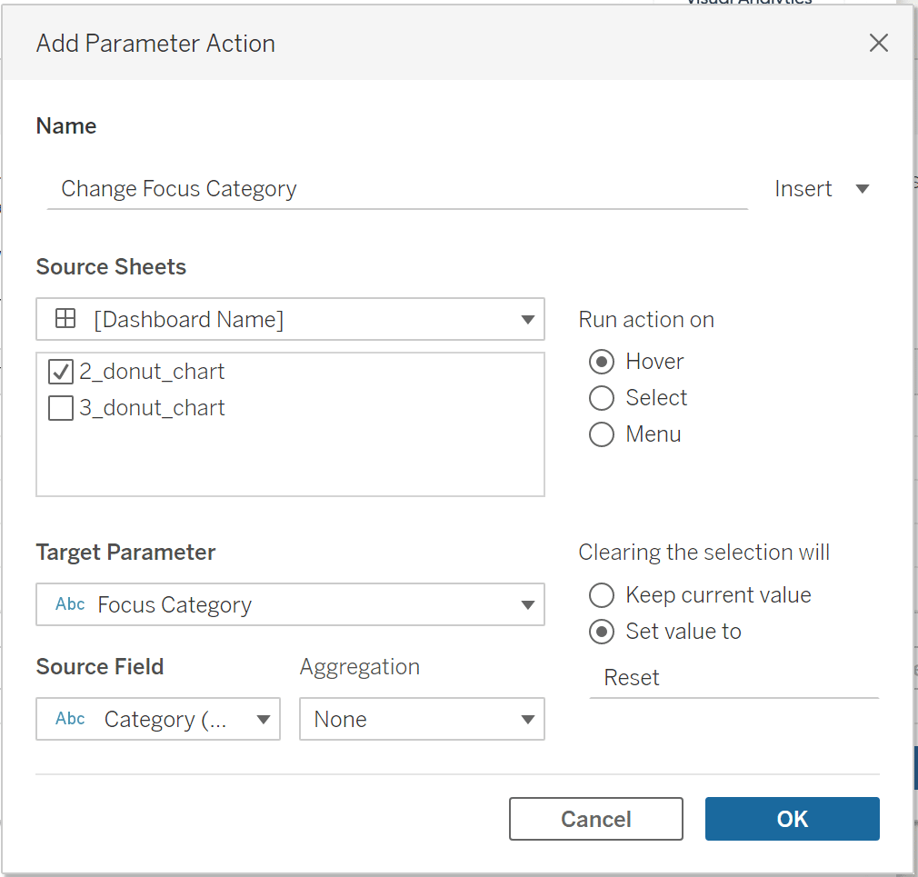
Now we’ll create the magic of the expanding donut chart in Tableau. Select Dashboard > Actions. Click Add Action, then Change Parameter. We’ll use our Category donut chart as the source sheet to change our focus Category, which will show the corresponding Sub-Category donut slices. To hide the Sub-Category expansion when you remove your mouse from the view, under “Clearing the selection will” select “Set value to” and type “Reset” so that it matches your parameter.
How to Use Tableau Parameter Dashboard Actions
On your dashboard, click the dropdown arrow on the Category sheet, select Legends, and make sure Color Legend (Category) is checked. To arrange the categories in a single row like my view, click the dropdown arrow on the color legend, go to Arrange items, and choose Single row.
![]()
Finalize the view with user instructions
Lastly, I added a hand icon with text that tells the user that they can hover over the donut chart to see a breakdown. My final view looks like this:

Happy vizzing,
Alyssa

Written By
Alyssa Huff

Design & Peer Review
Dan Bunker
Manager, Decision Engineering
Related Content
Practical Tableau: Serving Up 3 Better Options Than Pie Charts
Despite being one of the least effective means of communicating data, I often see Tableau pie charts in corporate dashboards…

Ryan Sleeper
Improve hierarchical drilldowns with this 3-step trick Hierarchical drilldowns in Tableau are all or nothing, but in this video, Ryan…
Tableau Tip: Single Row Drilldown “Deluxe”
I’ve shown you before how to drill into a single row of a Tableau crosstab. I find this to be…