Why Dashboard UX is Important

Dashboards are valuable tools that allow us to visualize and analyze the most important data at a glance. The effectiveness of a dashboard can depend on how users experience it. Well-designed dashboard UX can make the difference between a tool that’s engaging and insightful and one that is confusing, overwhelming, or potentially ignored. In this post, we will explore the importance of UX in dashboard design, including what works, what doesn’t, and why.
Dashboard ux that works…
Designing with the user in mind
User-centered design is essential for the dashboard as it is a tool meant for people, and it should cater to the needs of all its users. As you design your dashboard, it’s important to consider who you are creating it for. Asking questions such as: What is the target audience trying to achieve by using this dashboard? What problems are they experiencing? What data will provide the most insight?
Continue reading with a free account, or login.
Unlock this tutorial and hundreds of other free visual analytics resources from our expert team.
Already have an account? Sign In
By continuing, you agree to our Terms of Use and Privacy Policy.
Vital Question 1: Who is the Audience?
Involving the user in the design process typically can take the form of interview sessions to reveal challenges and needs. However, sometimes we are unable to talk directly to end-users. Instead of conducting a 1-1 user interview, this information can sometimes come from the stakeholders who have asked us to create the tool or visualization (who can also be part of our target audience). We can then use their guidance to help us understand the scope and objectives of the problem we are trying to solve. In certain cases, we have the opportunity to engage with a user group. Other ways to involve the users include during testing, after the tool is engineered, and revised with their feedback.
When ideating data visualizations to address users’ queries, it’s important to consider their preferences while pursuing innovation. For instance, we frequently encounter the need to design for users accustomed to working with Excel spreadsheets, who may prefer a tabular format. Even then, relying solely on tables can be overwhelming. That is why our design team aims to create concepts that combine the best of both worlds.
We strive to make it intuitive for users familiar with spreadsheets while incorporating visualizations that offer new insights and enhance engagement. Our goal is to provide visualizations that help users identify patterns and trends that are not immediately apparent in a table alone, making it easier for them to extract meaningful insights from their data.
![]()
Additionally, we take into account the users’ intended use of the dashboard and the platform on which it will be displayed. Sometimes, there are cases where we need to design a dashboard that can be printed as a report. In such instances, we create an interface and visualizations that consider these nuances and are tailored to the user’s requirements.
Creating Clarity
A user-friendly dashboard provides a clear narrative for your data and should be easy to navigate. Clarity is essential for reducing cognitive load. But that doesn’t mean you need to oversimplify content or avoid the display of complex information. The key is to ensure that the tool is easy to interact with and navigate. It is also important to consider which features will be most helpful. We may often get asked to present a significant amount of information in one view; when designing with clarity in mind, it is essential to prevent overwhelming the user. This brings us back to being selective about which data to display, aligning with the user’s goals. This approach results in efficient and effective dashboards.
Clear dashboards are efficient, allowing users to find needed information quickly and without frustration.
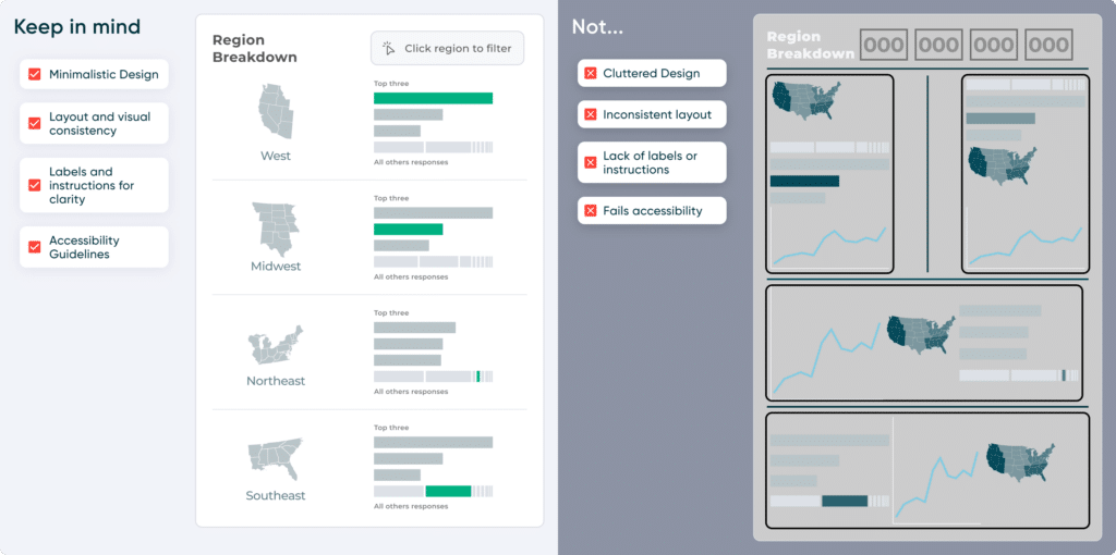
Ways to ensure clarity in your dashboards are:
- Opt for a minimalistic design that avoids clutter or distractions by avoiding unnecessary decorative elements that might distract users.
- Create a cohesive and navigable design by maintaining consistency in layout, hierarchy, color scheme, font style, and chart placement across the dashboard
- Using labels or instructions when certain functionality could potentially be unclear.
- Take accessibility guidelines into account by ensuring there is sufficient color contrast and not relying only on color.
Maintaining consistency
When dealing with interactive products, consistency is a crucial element that should not be overlooked, as it is the foundation of a smooth and seamless user experience. Consistency can mean using familiar-looking icons that the user has seen before in other applications or in the real world. Consistency can also extend to design choices, fonts, and color palettes throughout different pages, making navigation intuitive for users. Following the brand’s style guide is another way to maintain consistency, ensuring the tool’s design aligns with the brand’s image, thereby reinforcing brand identity and cohesiveness.
From a visualization standpoint, consistency in specific visualizations can represent staying on track with the goal of the dashboard. This aids users in finding answers to their questions and better understanding the data being presented. Finally, consistency becomes a predictable outcome for any user interaction with the tool. This predictability helps the user know what to expect so they feel in control and confident while using the tool.
Testing your design
In a fast-paced environment, it can be tempting to overlook user testing when stakeholders are eager to update a tool. However, taking the time to organize and conduct testing or feedback sessions can be incredibly beneficial for any design project. It allows you to see whether your tool is meeting the needs and addressing the pain points of its intended users.
Consider a recent example from our design team: we implemented changes to a tool, including the creation of a brand-new view, even though it wasn’t initially part of the project’s scope. After users had the opportunity to test the tool, a new use case emerged that we hadn’t anticipated and needed to be planned for. This highlights the crucial role of testing in identifying issues and opportunities that might otherwise go unnoticed.
Ultimately, design is all about creating tools and experiences that make people’s lives easier and more enjoyable. Therefore, you should make sure that users are happy with the tool you are creating. Testing is a valuable way to make sure the tool meets users’ needs and expectations.
What doesn’t work…
You can probably infer that what doesn’t work is the opposite of what we covered earlier, but just to highlight key points:
Cluttering your design
I wanted to start here as sometimes we can find ourselves trying to squeeze as much as possible into a dashboard view. It’s important to be selective and prioritize the content we want to share. An increased cognitive load occurs when there’s too much going on with the visual elements in our display.
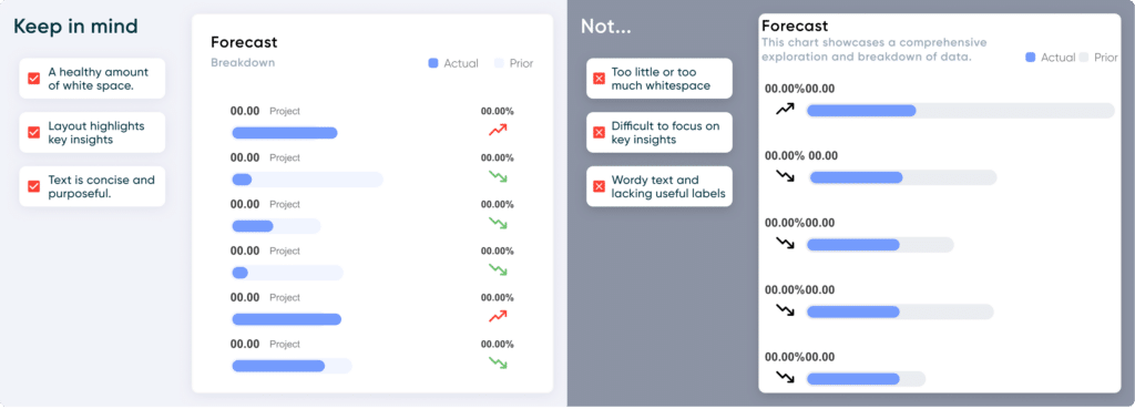
Things to keep in mind:
- Is there a healthy amount of white space? There should be enough white space around all elements. White space helps prevent visual clutter and allows users to focus on the content.
- Does the layout highlight key insights? The layout should be formatted in a way that highlights the most important insights. Use visual hierarchy, larger fonts, or color emphasis to guide users toward key information.
- Is text concise and purposeful? Avoid unnecessary details and provide clear, direct information.
- Example: Instead of: “In this chart, we present a detailed analysis of widget performance across various regions, districts, and stores, taking into account different metrics.”
- Use: “Explore widget performance by region, district, and store.”
Unnecessary Complexity
Dashboards can hold complex information, but the interface should remain simple and user-friendly. The layout should maintain consistent navigation, with standardized design and visual elements throughout. Similar elements of the same context should be grouped together, and there should be a consistent visual hierarchy throughout the dashboard. Navigation should feel intuitive to the user’s flow.
![]()
When organizing your layout, I recommend following the F or Z reading pattern. The F-pattern involves horizontal and vertical scanning, while the Z-pattern is a zigzag scan. These guide for natural reading behaviors.
Neglecting User Feedback
Earlier, we mentioned the importance of user testing in your design process. Depending on the project scope and timing, conducting user testing sessions consistently can be demanding. Nonetheless, it’s still important to make time for feedback. Ultimately, it’ll be worth it when you get insight into what’s working, what’s not, and areas that need improvement. Ensure that users have plenty of time to use the tool and provide feedback. If you receive feedback suggesting that your tool needs improvement, don’t worry; you and your team can return to the drawing board and brainstorm new solutions. It can be challenging when new expectations arise, so it’s important not to neglect this stage when planning your project.
Conclusion
In conclusion, a well-designed user experience can make the difference between an informative and engaging dashboard and one that risks confusion and frustration. Knowing what works, what doesn’t, and why will hopefully give you tools you can walk away with for your next project.

Written By
Zoya Zafar

Peer Review
Rafael Simancas
Sr. Manager, Brand Strategy
Related Content
3 Ways to Wow Stakeholders with Figma
When it comes to demonstrations, it goes without saying that you want your stakeholders to walk away “wowed.” But what…
3 Simple Ways to Improve the UX of Your Dashboards

At Playfair Data, we pride ourselves in improving the UX of dashboards to transform raw data into powerful insights. To…

Ryan Sleeper
Create Stacked Bar Charts Formatted For a Positive User Experience Ryan demonstrates how to make stacked bar charts in Tableau,…