Dashboard Element 5: White Space

One of my favorite dashboard elements is a little less tangible because – well — it’s sort of invisible. I’m talking about white space or negative space; an important design element that should be considered in the context of your data visualization. While there is no ink in white space, its use can make or break how your work is perceived and utilized.
White space provides the benefits of (1) helping you as the dashboard author prioritize content, (2) helping your end user focus their attention during their analysis, and (3) adding some professional design polish which will lend itself to better credibility with your audience. This post will show you three different tactics for improving the white space in your Tableau dashboards.
Making Your First Tableau Dashboard (Part 2)
What is white space?
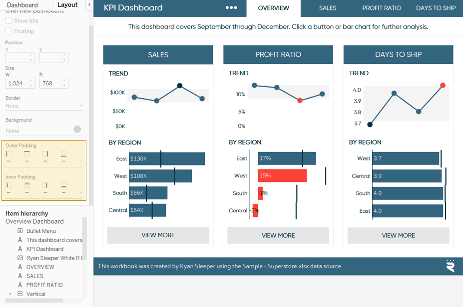
Before I share my three tactics for implementing white space in your Tableau dashboards, look at this example to help understand the difference that this negative space can make. In this first image, I’ve used mostly default spacing, padding, and layout.
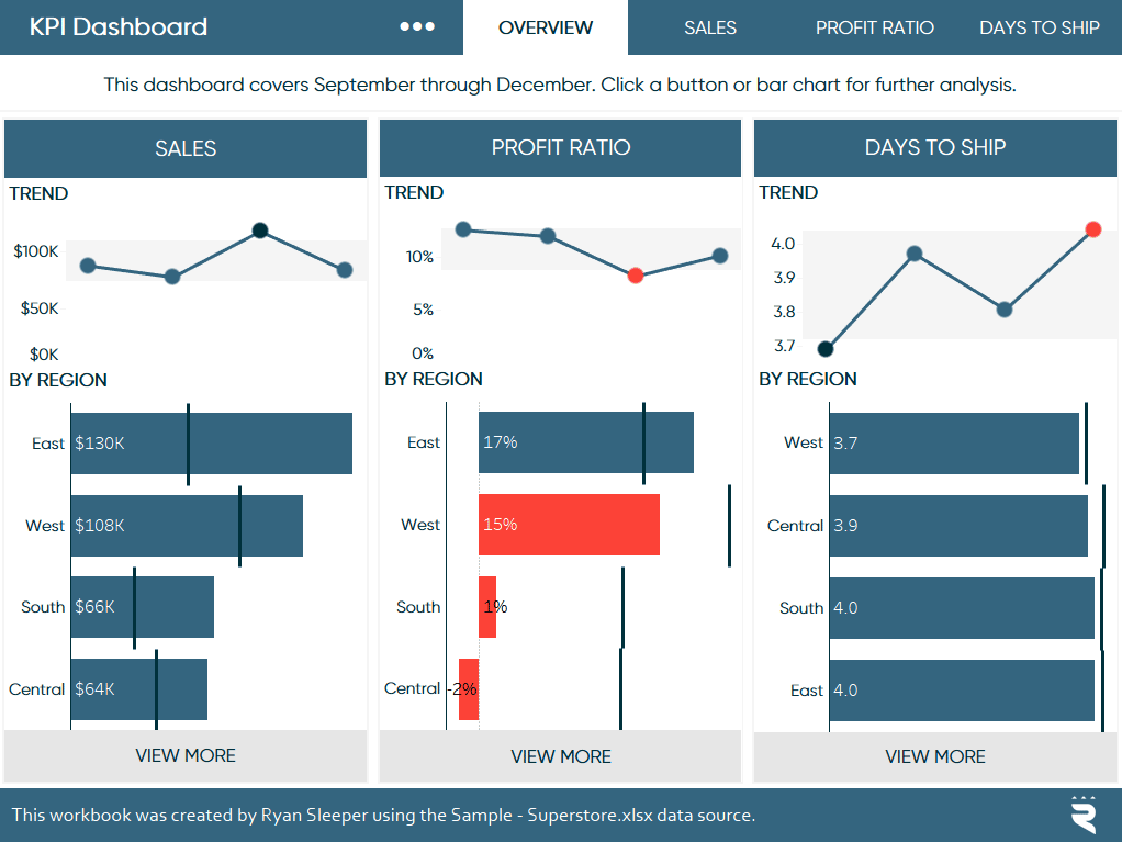
Note that this could be even worse because I left the nicely spaced navigation buttons and centered text in the date caption. Tableau also tries to help you with this very design aspect we’re discussing because, by default, it adds four pixels of padding around the vertical layout containers that are holding the individual sheets related to each KPI.
![]()
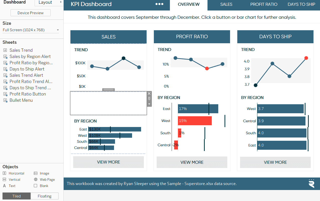
Still, you can see this isn’t ideal. Objects are too close together; it’s not clear if you should be reading left to right or from top to bottom; it’s not easy to see there are buttons to drill into deeper analyses. Generally, this looks like a big block of stuff, and I’m not sure if I trust the dashboard’s author or its underlying data. Here is the same view after implementing the three tactics I’m about to share:
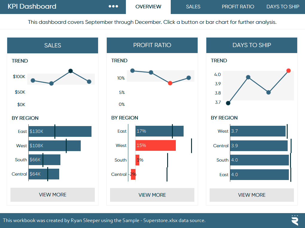
This dashboard has the exact same elements, but the design is much nicer and easier to consume. The only difference between the two is white space.
Continue reading with a free account, or login.
Unlock this tutorial and hundreds of other free visual analytics resources from our expert team.
Already have an account? Sign In
By continuing, you agree to our Terms of Use and Privacy Policy.
Sketch out the dashboard dimensions in advance
In my opinion, the best way to ensure your dashboards have a nice layout that incorporates white space, is to sketch out the dashboard dimensions in advance. For example, if I know that the dashboard pictured above was 1024 pixels wide overall, would contain three layout containers across, and that I would like each object to have 25 pixels between them, I would do the math to figure out how wide each of those three layout containers should be. The layout is:
[25px white space] [Container 1] [ [25px white space] [Container 2] [25px white space] [Container 3] [25px white space]
So I know there is a total of 100 pixels of horizontal white space. I would subtract that amount from the overall dashboard width, which leaves me with 924 pixels for the three containers. I would then divide that number by three, which tells me each layout container should be 308 pixels wide. Here’s a sketch of how all the dashboard elements may look:
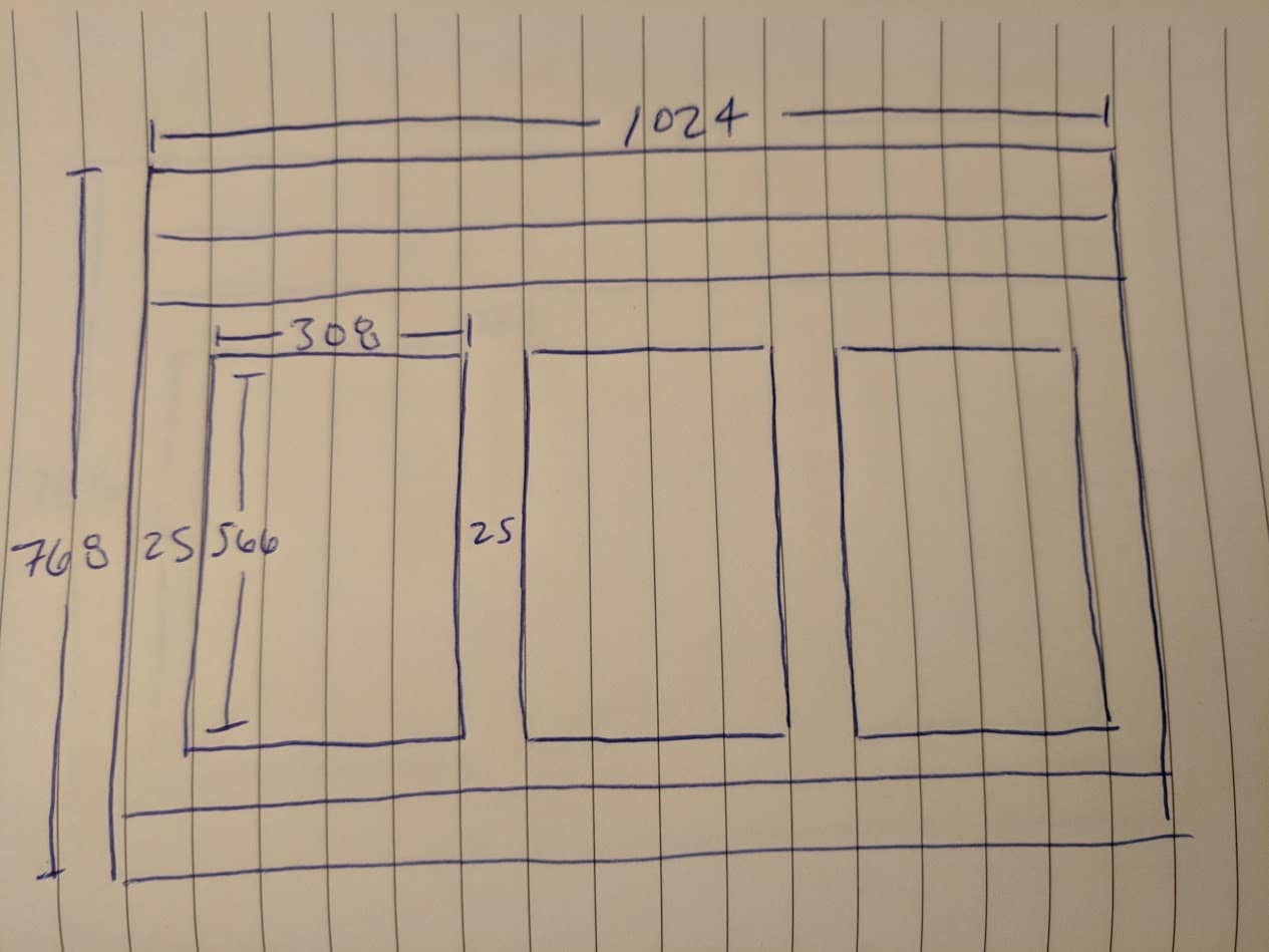
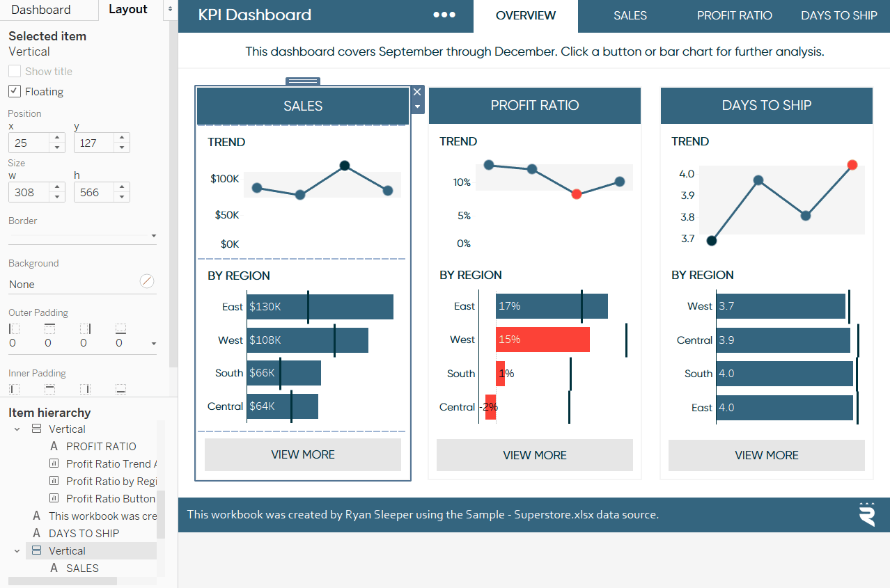
And I really do something like this; either in a notebook or on a white board. Once I have the sketch with the dashboard dimensions, it’s very easy to add objects to the view and change their precise sizing using the Layout pane:
Take advantage of the padding options on the layout pane
I mentioned that Tableau automatically adds four pixels of padding around dashboard objects, but you can adjust this to your liking by clicking on any dashboard object, clicking the Layout tab in the top-left corner of the dashboard interface, and updating the “Outer Padding” and / or “Inner Padding”.
I began sketching out dashboard dimensions with the arrival of Tableau 8.0 which introduced ‘freeform dashboard design’, or the ability to use both tiled and floating objects. At the time, this was the only way to completely customize the white space throughout a dashboard, but that changed with the introduction of object padding in Tableau 10.4.
![]()
Many of the same formatting options I would have to create very manually before are now just a couple of clicks away on the Layout pane. Before this feature was added, I was firmly on “Team Floating”, but lately I have been gravitating toward “Team Hybrid”. I will often make floating layout containers, but the objects within those containers are tiled. I then add padding to create the desired white space.
Use a blank dashboard object
If you are still on “Team Tiled”, I’ll close with the white space object that started it all: Blank. You can add a blank object – which does nothing but add white space between tiled objects – by dragging the Blank object from the Dashboard pane onto a dashboard. See the Sales container below to see what this looks like:
The one drawback with this approach is that you cannot precisely control the size of the Blank object. You can resize it, but you don’t have the same pixel-level precision that you get with floating objects. This is another reason I was on Team Floating and now Team Hybrid.
Whichever approach you take, considering the white space of your Tableau dashboards will help declutter your work and communicate your insights in a professional way.
Thanks for reading,
– Ryan


Written By
Ryan Sleeper
Related Content
How to Create Better Dashboard Layout Designs with Figma


Being able to apply some basics of dashboard layout design to your visual analytics projects in Figma can bring a…
Tableau Formatting Series: How to Use Shading & Backgrounds

There are two approaches to changing surface color in Tableau; shading and background. While they have the same function, the…
3 Ways to Wow Stakeholders with Figma

When it comes to demonstrations, it goes without saying that you want your stakeholders to walk away “wowed.” But what…