The Definitive Guide to Dashboard Objects in Tableau

If you have ever built a Tableau dashboard, even a simple dashboard with a single sheet, you know what a dashboard object is. They live in a box in the bottom left corner of the Dashboard pane, and they help organize and add interactivity to your view. You’ve used containers before, although you might have a complicated relationship with Tiled containers. You know what a text box is, and an Image object is pretty self-explanatory (but can serve so many purposes!). A blank shape is a blank shape… and can be whatever you want it to be. Navigation buttons make your life easier, and the Show/Hide buttons you can add to any element on a dashboard really make your life easier. Web Page objects… you may have tested these out once or twice when you were feeling adventurous, and Download buttons keep clients (and Excel enthusiasts) happy.
But Extensions? They are a little intimidating. Ask Data? Ask Data… what? And we can’t forget Data Story, Workflow, Add Filters, and Einstein Discovery.
Now presenting, The Definitive Guide to Dashboard Objects in Tableau.
This guide will cover each of the options in the Dashboard Objects pane (as of version 2023.3), and introduce a few alternative use cases for dashboard objects as well.
Horizontal & vertical Tableau layout containers
Dashboard layout containers have been around since the dawn of time (or 2009 when Tableau Version 5.1 was released), so I won’t be spending too much time on this object. Containers can hold any dashboard object, including other containers, and are really the backbone of a dashboard. You can control the visibility of containers with Show/Hide buttons, but as of version 2022.3, containers can also be controlled automatically with dynamic zone visibility, allowing for even more flexibility and interactivity. Horizontal containers hold objects side by side and vertical containers stack objects, although the orientation is not locked until a second object is added to the container. Both give you the option to either define the size of an individual object within the container, or distribute all evenly with the same height or width. One thing to remember is that Tableau automatically adds 4px of outer padding to an object when you add it to a container.
How to Do Better Sheet Swapping with Tableau’s Dynamic Zone Visibility
Tableau dashboard Text objects
Another straightforward concept, Text objects are simply text boxes that can be formatted and styled to your preference. Text objects are great for headers, captions, footnotes, or any other need for text that is separate from a sheet. You also can make Text objects dynamic by inserting parameter values. For example, if your dashboard features a custom date range selection, you want to make it clear what date range is currently displayed. The below image shows how you can insert the Start and End Date parameters to your text box for a dynamic label.
Continue reading with a free account, or login.
Unlock this tutorial and hundreds of other free visual analytics resources from our expert team.
Already have an account? Sign In
By continuing, you agree to our Terms of Use and Privacy Policy.
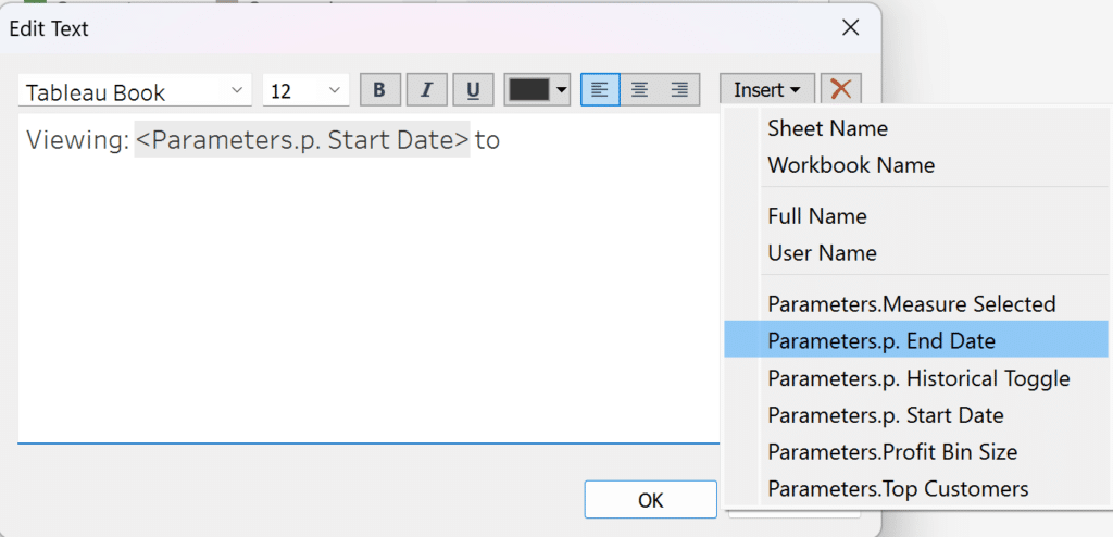
Tableau dashboard Image object
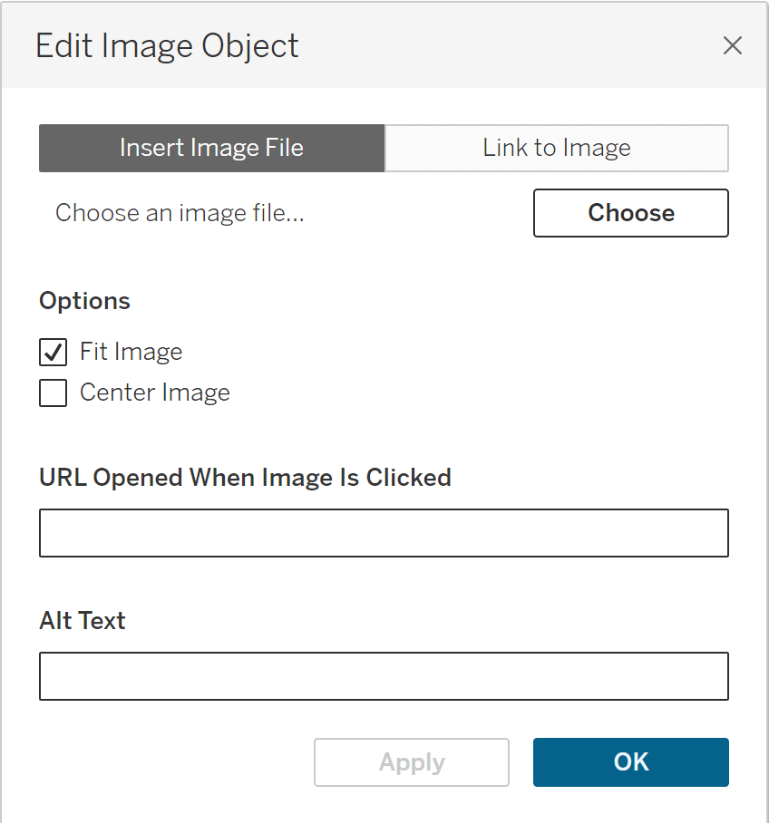
In my opinion, Image objects are arguably the most versatile and widely used dashboard object. At Playfair Data, we use them for background images, buttons, navigation panes, custom alerts and more. You can link your Image object to an image file saved on your computer, or to a URL of an image online.
![]()
One of my favorite hacks is combining Image objects and dynamic zone visibility instead of custom shape marks to get Boolean toggles with crisp image resolution. Building off this how to make a Tableau toggle tutorial, I use a transparent shape for both toggle states, and stack the toggle images as Image objects on my dashboard. Then you can place the sheet with your toggle on top of the Image objects, add dynamic zone visibility controls to the Image objects and a parameter action to the toggle sheet, and voila, you don’t have to worry about the size and resolution of your custom shapes.
The Ultimate Guide to Getting High Resolutions In and Out of Tableau
An often overlooked feature of Image objects is the ability to open a URL in a new tab or browser when the Image object is clicked, transforming the Image object into a navigation button. You can find the text box to enter the URL by clicking the down arrow when your Image object is selected, and choosing “Edit Image.” Editing your Image object also allows you to add alternative text (Alt Text) to your image for accessibility.
The Blank object
Whether you would like to add more white space to your dashboard design, want a thin colored line as a divider, or need a quick fix to hide a dashboard element from users, Blank objects can do it all. Blank dashboard objects are truly just empty objects that can be any color, size or transparency you need.
A quick tip from Felicia Styer, Playfair’s Associate Director of Analytics Solutions: After adding a container to your dashboard, drop a blank object into it. This makes it easier to find and add new objects, especially when you’re working with nested containers.
Tableau Formatting Series: How to Use Shading and Backgrounds
Tableau Extension object
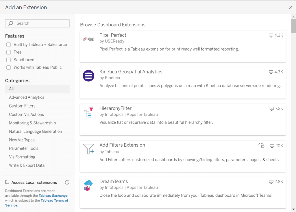
Tableau extensions were introduced in version 2018.2 and allow third-party developers to create independent “plug-in” features that you can add to your dashboard. Some examples include custom CSS styling, additional “Show Me” chart types, or an embedded code editor. You can view the library of available extensions on Tableau Exchange, or if you drag an Extension object onto your dashboard, a window of the available extensions will pop-up.
There are two types of Dashboard extensions: Network-enabled and Sandboxed. Sandboxed extensions are more secure as they are publicly hosted by Tableau in a protected environment, and don’t make any network calls outside of this environment. If you choose to use a Network-enabled extension, make sure you read the documentation and know how your data is being accessed and shared.
If you want to use an extension, you can download it from Tableau Exchange (the file will end in .trex). I recommend saving extension files in your Tableau Repository (Documents > Tableau Repository > Extensions) for easy reference. Then once you drag an Extension object to your dashboard, select “Access Local Extensions,” and you will be able to navigate to your repository and use any saved extensions.
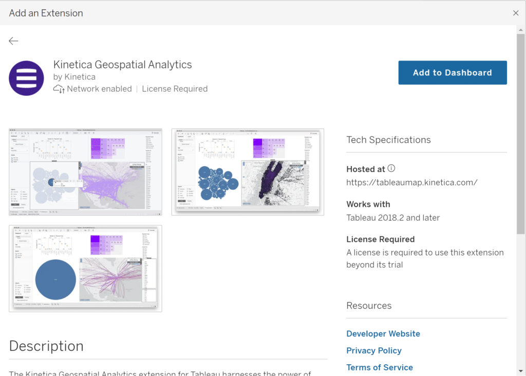
Alternatively, you can download and enable extensions directly from Tableau in the “Add an Extension” window. If you select an Extension, you will get a description of the extension, tech specifications, and links to the documentation.
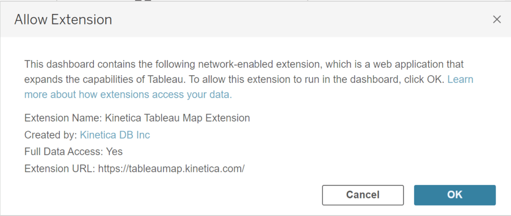
Here you can select “Add to Dashboard” and a pop-up will ask whether or not you want to allow the extension to run on your dashboard. This pop-up also tells you what type of data access you will be giving to the extension.
It is extremely important to pay attention to data access when using extensions, especially when you are working with sensitive stakeholder data. I recommend reviewing Tableau’s best practices for extension security if you are considering using this feature.
Next, I will cover two extensions that Tableau has added as separate dashboard objects: Add Filters and Einstein Discovery.
Add Filters extension
Add Filters is a free, sandboxed extension created by Tableau that allows you to easily customize which filters are visible on a dashboard without fully editing your dashboard. For example, let’s say your dashboard has two end user groups. One is more interested in filtering by date and location, but the other wants to filter on sales and profit values. You could include all of the desired filters on your view, or create two separate versions of your dashboard, but neither solution is ideal. Instead, the Add Filters extension allows each group to choose their desired filters with the click of a button, or you can save the selections as custom views on Tableau Server.
Einstein Discovery for Tableau dashboards
Einstein Discovery is a Network-Enabled extension created by Salesforce that uses AI and machine learning to help you analyze your data and create predictive models without any coding knowledge. Unlike the Add Filters extension, Einstein Discovery requires a paid Salesforce license and Salesforce user account for both the workbook creator and anyone who will be viewing the dashboard online. If interested in this feature, you can read more about the specific license requirements.
Einstein Discovery gives you access to a library of predictive models you can customize to fit your data analysis needs. Once connected to the extension, you can turn your predictions into calculated fields and create visualizations using these predictions and forecasts.
Ask Data Tableau dashboard object
Before we get into Tableau’s “Ask Data” object, please note that this feature will be retired from Tableau Cloud in February 2024 and in Tableau Server version 2024.2, as a new interface involving Tableau GPT and Tableau Pulse is in the works.
Ask Data allows you to directly query a data source you have published on Tableau Server or Tableau Cloud, by first creating a “lens” that focuses on a specific subset of your data. The Ask Data object populates on your dashboard as a search box and pane that will display visuals when prompted. Note, you cannot use this feature with data sources embedded in workbooks, only those published to a Tableau site.
Once you create a “lens,” users can directly query the specified subset through an Ask Data dashboard object. For example, the user can type a custom prompt such as “top 10 Profit by State” and select a supported viz type, which will be displayed once the query is submitted.
Tableau Data Story object
The Data Story object, not to be confused with a Tableau “Story,” uses natural language templates to perform automated analytics based on the data in your dashboard. Data Stories generate written insights, not visualizations, and update automatically when a user interacts with the dashboard. There are a handful of settings you can customize, such as the type of analysis performed and level of detail given in the Data Story output. You need to be signed into Tableau Server or Tableau Cloud to create a Data Story, but you (and your dashboard users) can view the Data Story from anywhere you use Tableau.
Workflow dashboard object
The Workflow object is part of the Tableau External Actions released with version 2022.4, which relies directly on a separate tool, Salesforce Flow. While you do not need to be connected to a Salesforce data source to use the Workflow object, you do need to be able to connect to a Flow built in Salesforce Flow, specifically an autolaunched Flow. Flows are business automation programs, so this feature is not meant for individuals. If you do have access to a Flow, adding a Workflow object to your dashboard will initiate an External Actions workflow, and you will be able to automatically send data, for an example a group of selected marks on a scatter plot or a single category in a bar chart, to your attached Salesforce Flow, creating an efficient automated workflow.
Web Page object
Web Page objects function as mini web browsers within your dashboard, and can be static or dynamic. You can set your Web Page object to display a single default URL, or you can use URL Actions to make your Web Page object update when users interact with your dashboard. I have previously covered how to integrate dynamic URL actions with a Web Page object, and you can also use Web Page objects to add a Google Search to your dashboard.
Navigation (formerly button) object
Previously called Button objects until version 2020.3, Navigation objects allow you to navigate to another dashboard or sheet within your workbook. You can customize your Navigation object as an image or text button, and format with a border and background color. As with all dashboard objects, Navigation buttons can also be controlled with a Show/Hide button or dynamic zone visibility if you want to control when the user has the ability to navigate away from your view.
![]()
Download dashboard object
Having the ability to export or download the data visualized in a dashboard is often a requirement for stakeholders. Once you have built your beautiful and informative dashboard that allows the user to find just the insight they were looking for, it can be extremely helpful to download that specific data snapshot. Fortunately, we have the Download object that can export a dashboard, sheet, or multiple sheets to Crosstab, Image, PDF and PowerPoint formats.
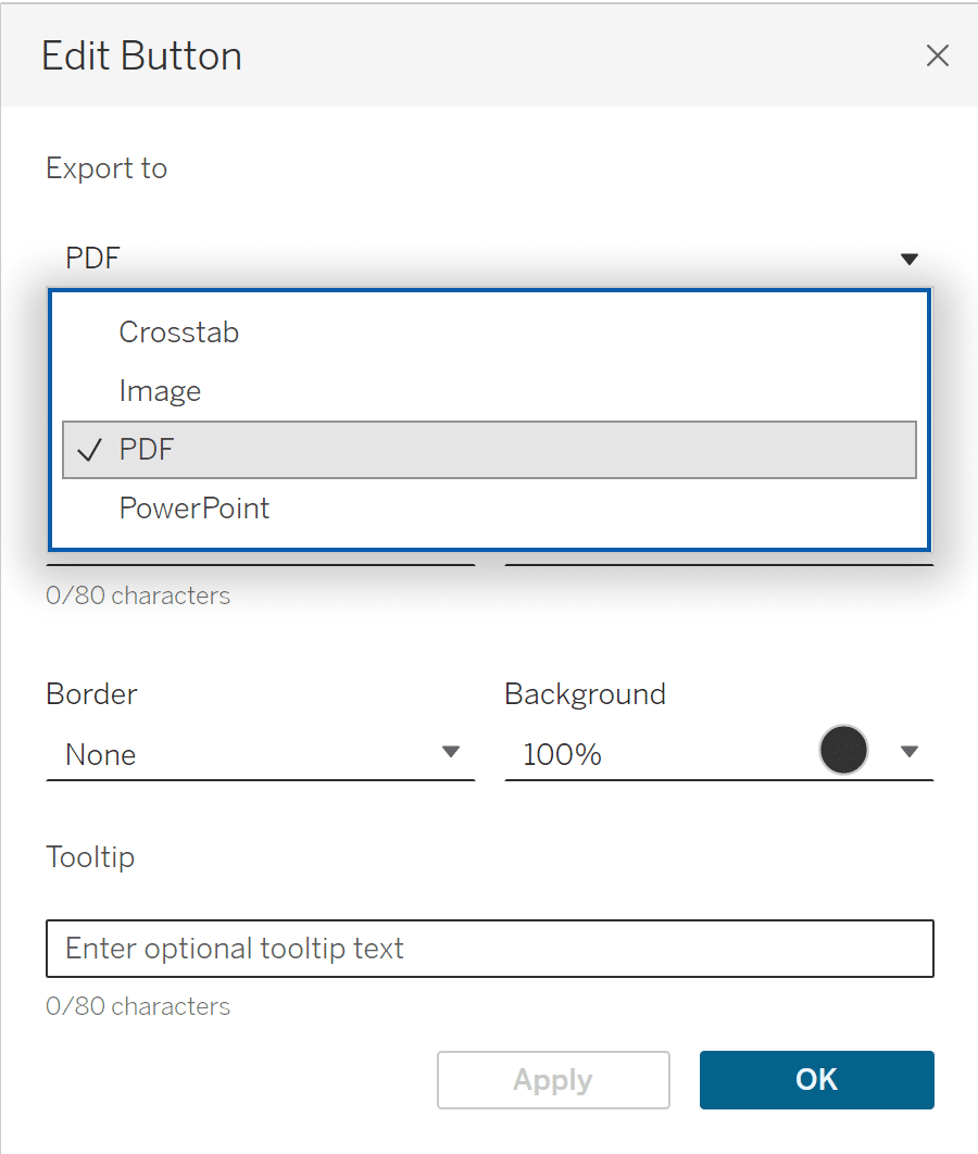
There are some important details to know about each of these export options.
- Crosstab: The ability to export as crosstab is only available on Tableau Server or Tableau Cloud, and the Download button will be grayed out when you are using Tableau Desktop.
- Image: This option is not customizable, and will simply save a .png file of your dashboard as-is.
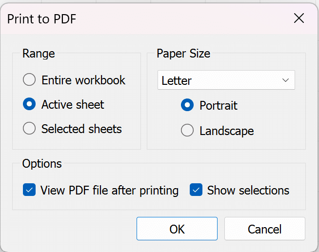
- PDF: When you Print to PDF, you have the option to print the entire workbook, the Active sheet or dashboard, or Selected sheets. You can also choose the PDF size and orientation.
- PowerPoint: When exporting to PowerPoint, selected sheets and dashboards will be exported as static .png images on separate slides, and the dashboard title will be included on a title slide with download time and date.
Conclusion
As you can see, the current Dashboard Object offerings range from a simple blank shape to generative AI connections, providing options for every type of user. The more you explore with your dashboard design and engineering, the more use cases you will find for all of these objects.
Thanks for reading!
Megan


Written By
Megan Spengler

Peer Review
Felicia Styer
Assoc. Director, Analytics Solutions

Graphic Design
Dan Bunker
Manager, Decision Engineering
Related Content
3 Simple Ways to Improve the UX of Your Dashboards

At Playfair Data, we pride ourselves in improving the UX of dashboards to transform raw data into powerful insights. To…
The Definitive Guide to Buttons in Tableau

The Button. Seemingly simple — yet so powerful. As humans, we are well versed in buttons and have been trained…
The Definitive Guide to Filters in Tableau

When designing a dashboard, we often want to give our users the ability to slice and dice the data on…