3 Ways to Create Charming Crosstabs in Tableau
I’ve explained before that a spreadsheet is not a data visualization because it does not take advantage of any pre-attentive attributes that will help you make sense of the data. Alas, many stakeholders continue to ask for Tableau crosstabs (text tables), either so they can do their own manipulation to the data or just because they feel more comfortable seeing the raw numbers. Well, if I have to make crosstabs, I intend to make the best damn crosstabs the world has ever seen!
That’s why for the first time, I’m letting the genie out of the bottle and sharing 3 tips for making your text tables more effective and engaging in Tableau. In this post, we’ll cover how to increase the number of columns in a Tableau crosstab, how to make your text tables as flexible as possible, thoughts on maximizing the data-ink ratio, and how to make custom table headers.
This content is excerpted from my book, Innovative Tableau: 100 More Tips, Tutorials, and Strategies, published by O’Reilly Media Inc., 2020, ISBN: 978-1492075653. Get the book at Amazon.
Tips for Formatting Text Tables in Tableau
How to make flexible Tableau crosstabs with limitless columns
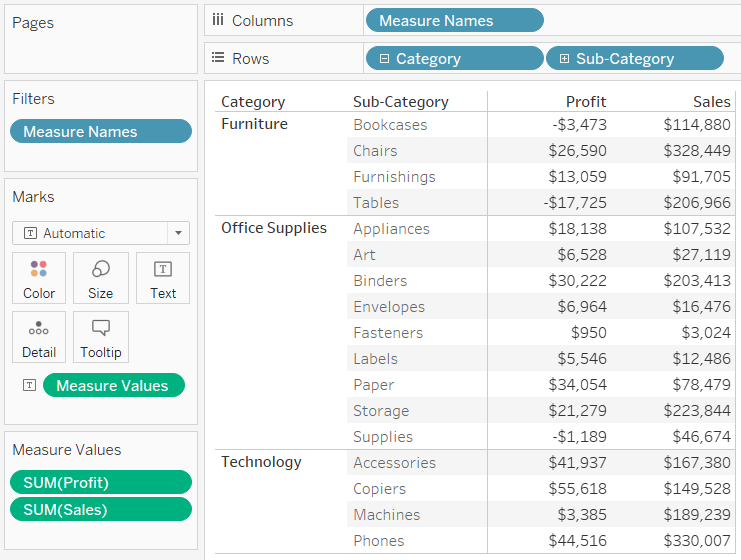
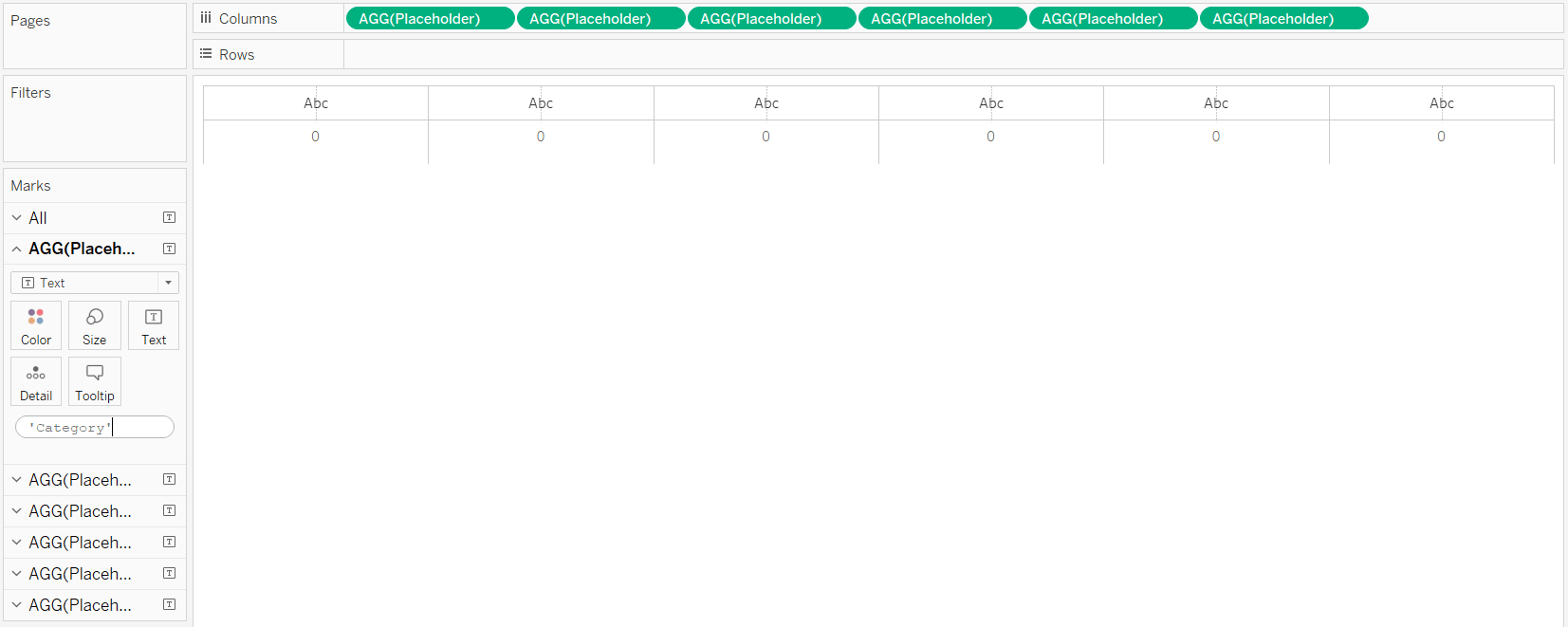
By default, Tableau will allow you to create a text table with six column headers before it begins concatenating dimensions together.
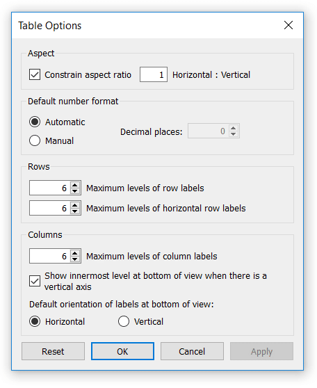
As of version 2018.2, you can easily increase this column limit to 16 by navigating to ‘Analysis > Table Layout > Advanced…’ in the top navigation. A new dialog box will open where you can change the column limits from six up to 16.
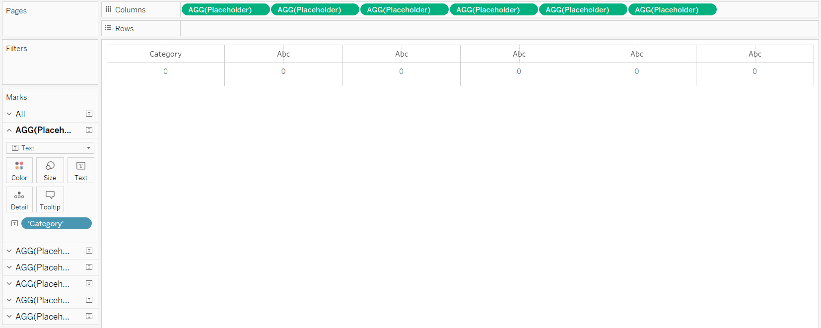
be the best choice for you. In any case, if you want to go beyond 16 columns now, or if you just want to have more flexibility with your table creation, you can use my “Placeholder” hack. To begin, make a calculated field with the formula MIN(0).
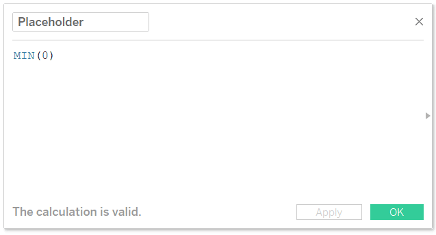
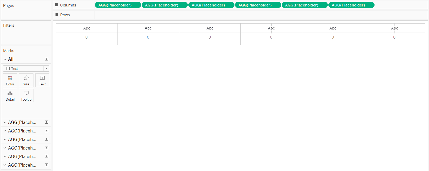
This formula creates a new measure and guarantees that the value of that measure will always be 0. Once you’ve got this calculated field, you can place it on the Columns Shelf or Rows Shelf as many times as you want. The reason this unlocks some unique flexibility is because each measure on the Columns Shelf or Rows Shelf gets its own Marks Shelf, where the Marks Cards can be edited independently. So you can place the Placeholder field on the Rows Shelf 50 times, change the mark type to Text, and place whatever measure you want on each column on the Text Marks Card.
![]()
Continue reading with a free account, or login.
Unlock this tutorial and hundreds of other free visual analytics resources from our expert team.
Already have an account? Sign In
By continuing, you agree to our Terms of Use and Privacy Policy.
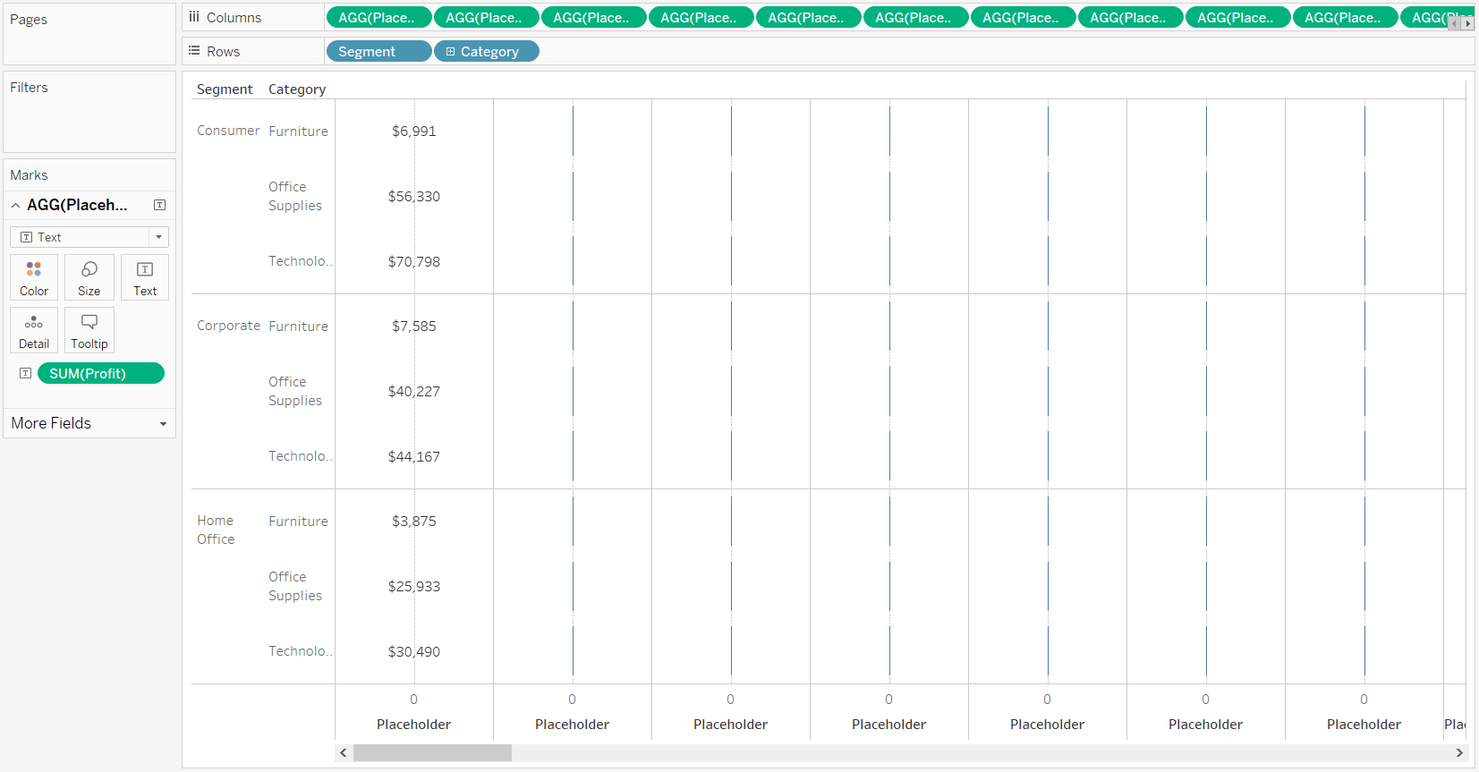
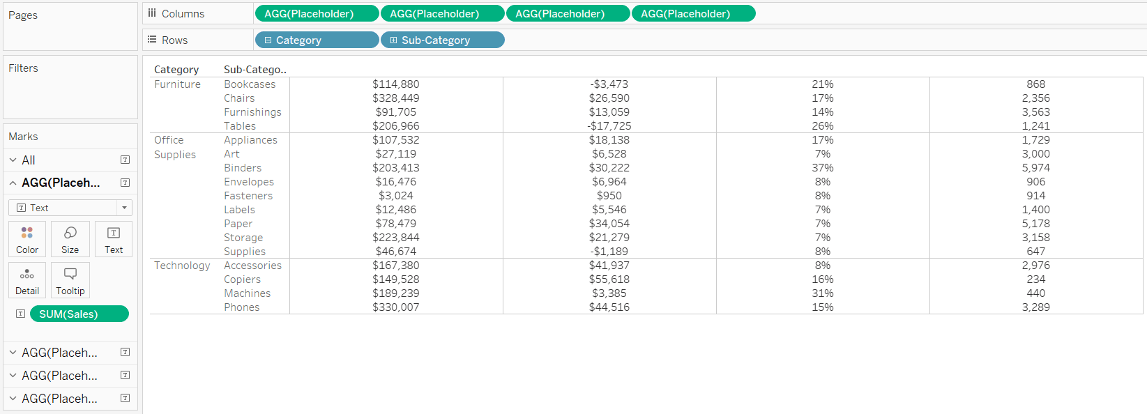
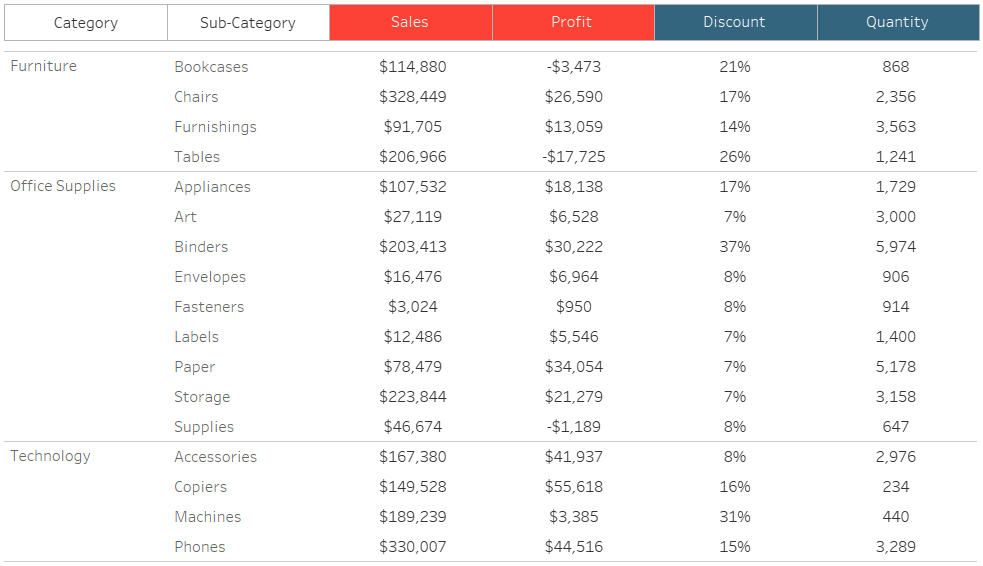
Check it out – here’s the start of a 50-column text table broken down by the Segment and Category dimensions. I’ve placed the Profit measure on the Text Marks Card of the first Placeholder measure.
Of course, this is a very extreme example, but wanted to show that you can already get to 50 (or more) columns. If I ever build text tables, I typically use this approach to make 3 – 5 column tables. What I like more about this Placeholder hack than the ability to use excessive columns is the fact that you can use a combination of mark types. For example, some cells can be text, while other cells can be indicator circles that change color based on performance. This is achieved by changing the mark type on each Marks Shelf.
Maximize the data-ink ratio
I’ve done five other posts related to the design of different chart types including 3 Ways to Make Lovely Line Graphs, 3 Ways to Make Beautiful Bar Charts, 3 Ways to Make Handsome Highlight Tables, 3 Ways to Make Magnificent Maps, and 3 Ways to Make Stunning Scatter Plots – and they all have a common thread: maximizing the data-ink ratio.
The data-ink ratio is a term coined by Edward Tufte that states as much “ink” on a chart as possible should be dedicated to the data.
Text tables or crosstabs are rife with non-data ink including extra lines, redundant headers, and shading. Whether you are building a traditional table in Tableau or using the Placeholder hack to make a flexible crosstab, I recommend you clean up anything that isn’t directly related to the data. For example, take a look at this text table in Tableau with all of the default settings:
One thing I really like about these default settings is Tableau has left-aligned text and right-aligned the numbers. However, there are quite a few improvements to these defaults that I can make by right-clicking anywhere in the view and choosing “Format…”: inconsistent shading, too much shading, excessive lines, inconsistent font formats. Here is how this same table can look after maximizing the data-ink ratio:
Data-Ink Ratio Animation and How to Apply it in Tableau
How to make custom table headers for Tableau crosstabs
One drawback with my Placeholder crosstab above is that you lose the column headers. Fortunately, the same placeholder hack can be used to create the headers themselves. This unlocks some interesting possibilities. For example, you can color some of the headers but not others if want the end user to focus on certain fields. Or you could color the headers based on period-over-period performance.
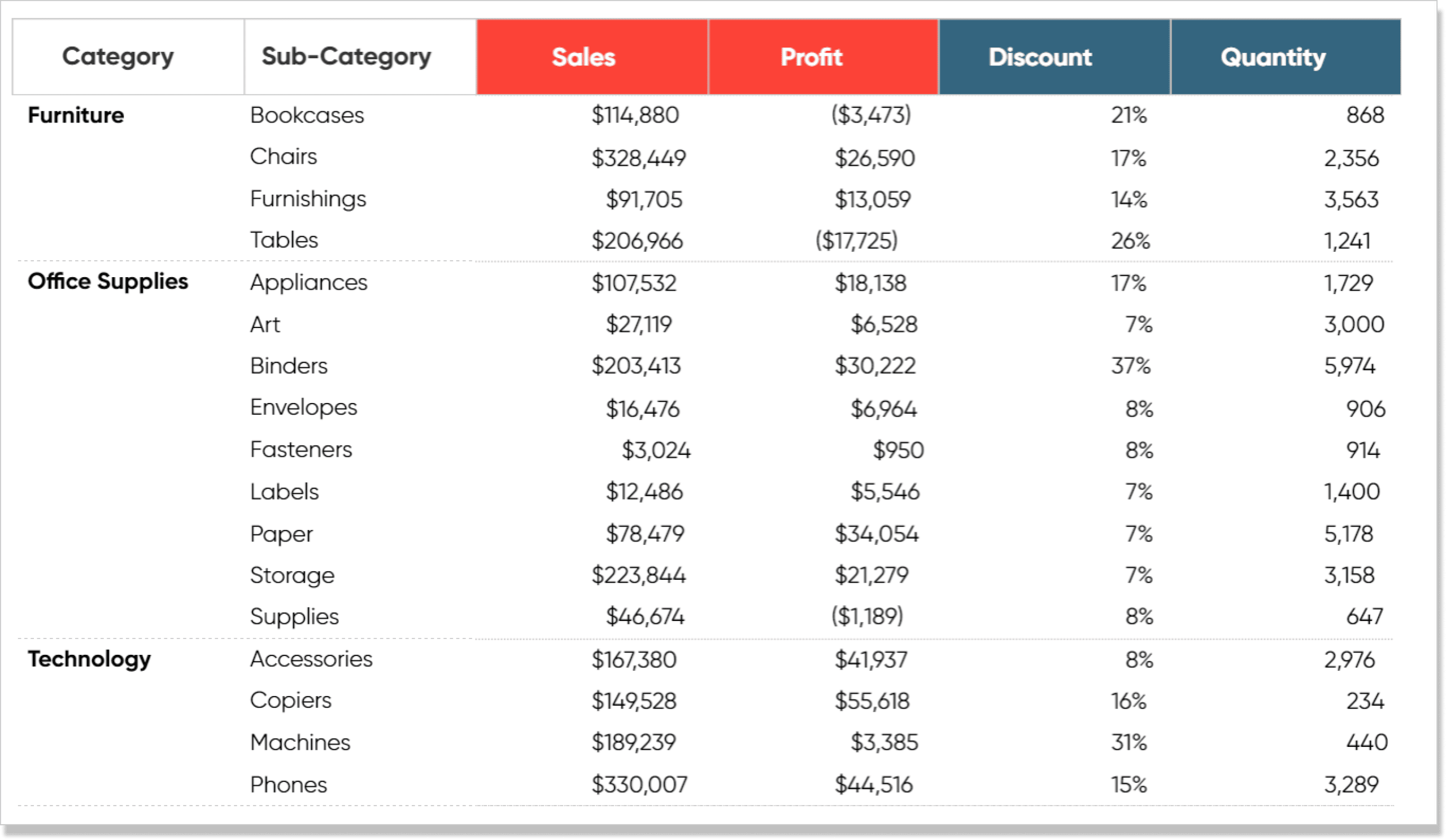
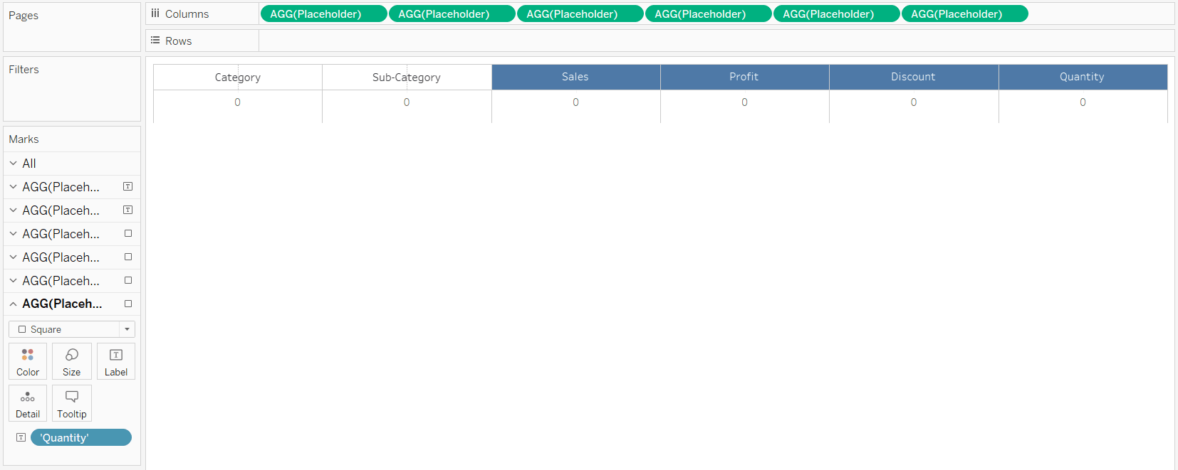
If you want to create custom headers for your text tables, start a new sheet and put the Placeholder measure on the Columns Shelf once for each column in your table. For this example, I’ll pretend we’re looking at Sales, Profit, Discount, and Quantity by Category and Sub-Category with a Placeholder table. Note I’ve hidden the Placeholder headers, zero lines, and gridlines.
See the limitation with this table? No column headers for my measures. On a new sheet, I’ll put the Placeholder measure on the Columns Shelf six times, so that my two dimensions and four measures each get their own Column and respective Marks Shelf that can be edited independently.
For the first two column headers, I’ll leave the mark type as Text and change the column names to “Category” and “Sub-Category”, respectively. One of the ways you can use Tableau in the flow is to double-click on the Marks Shelf below the Marks Cards.
This will open a field where you can type a string. By default, this string will be on the Detail Marks Card, but if you drag it to the Text Marks Card, the name of the column header will populate.
I’ll repeat this step for the Sub-Category header. For the four remaining column headers, I’ll change the mark type from Text to Square. For the squares to fill the entire cell, click on the Size Marks Card and increase the size of the four squares. To add the names of the columns, use the approach from the last paragraph to add the column name in the flow, but drag it to the Label Marks Card instead of the Text Marks Card. Here’s how my foundation looks at this point:
From here, there are some interesting options on deriving value from this custom header. One idea is you can color the column headers (i.e. the squares) to help your end user focus on one or more columns. This is accomplished by navigating to each Marks Shelf, clicking on the Color Marks Card, and choosing different colors. I’ve also updated the formatting to hide the Placeholder header, hide the zero lines, and add borders (column and row dividers) to the headers.
![]()
Another idea is to color the squares based on period-over-period performance for each measure. If you need help on doing this, see How to Make a Current Versus Comparison Index Callout in Tableau. Here’s how my custom header looks with a month over month comparison:
![]()
Once you’ve got either the ‘focus’ or ‘comparison’ customizations built, place the header in line with the table on a dashboard.
How to Create Performance Indicator Titles in Tableau
Bonus tip – How to align text with precision
Notice on the tables that are built with the Placeholder measure above that the default alignment of the text is centered. What’s happening is the text is aligned on a quantitative axis but there is only one number: 0. Instead of using text as the mark type, you can change the mark type to Gantt Bar and show the values as labels. The values will automatically move from the Text Marks Card to the Label Marks Card when you change the mark type from Text to Gantt Bar.
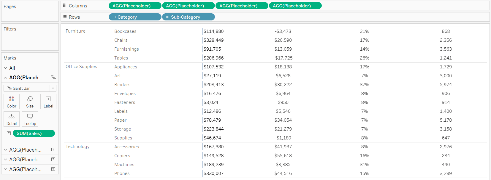
This Gantt mark will always show up at zero, which means you can change the axis range to get the mark to align precisely where you want. I hid the Placeholder header that was showing the axis range of “0”, so first I need to get that back by right-clicking on any of the Placeholder measures on the Columns Shelf and choosing “Show Header”. Now that I can see the axis header, I can right-click on it and choose “Edit Axis…”.
![]()
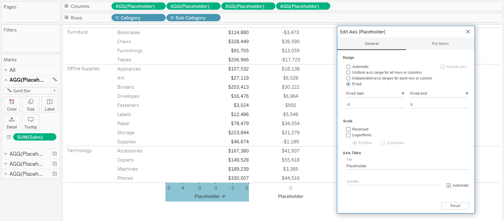
One of the options in this dialog box is to fix the axis range. It’s generally a good idea to right-align numbers, which I can do by setting the axis range from -5 to 0. This will move the Gantt mark to the right-most side of the cell, making the labels appear right-aligned.
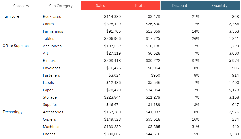
Here’s my final charming crosstab after changing the measure mark types to Gantt Bar, right-aligning all of the measures by customizing the axis ranges, and re-hiding the Placeholder headers.
Thanks for reading,
– Ryan


Written By
Ryan Sleeper
Related Content

Ryan Sleeper
Help your audience evolve from spreadsheets to data visualizations How to convert a text table to a highlight table, leverage…
Ryan Sleeper
Encode Entire Tables Including Headers by Color and Size This video shows you how to highlight entire text table rows…
3 More Ways to Make Charming Crosstabs in Tableau

One of the most challenging aspects of data visualization can be getting stakeholders to buy into using something other than…