How to Highlight Entire Table Rows in Tableau (Including Headers)
One of my favorite ways to highlight table rows of interest in a Tableau crosstab is to place a dimension or calculated field on the Color Marks Card. However, the default behavior is for Tableau to color only the marks – text in this case – but not the headers. This leads to an inconsistent design and poor user experience.
This post shows you how to highlight entire text table rows, including the headers associated with the text marks. We’ll also use a set control to change which rows are being highlighted on the fly, and I’ll share a trick that allows you to not only color entire rows, but size them for extra emphasis.
This is the third and final post in a series on how to get more out of text in Tableau. For other applications, see How to Do Pagination and Single Row Drilldown “Deluxe”.
How to Color and Size Entire Tableau Table Rows
How to highlight marks and headers in Tableau
By the end of this post, you will be able to color and/or size complete rows on a Tableau crosstab and change which rows are being highlighted using a set control.
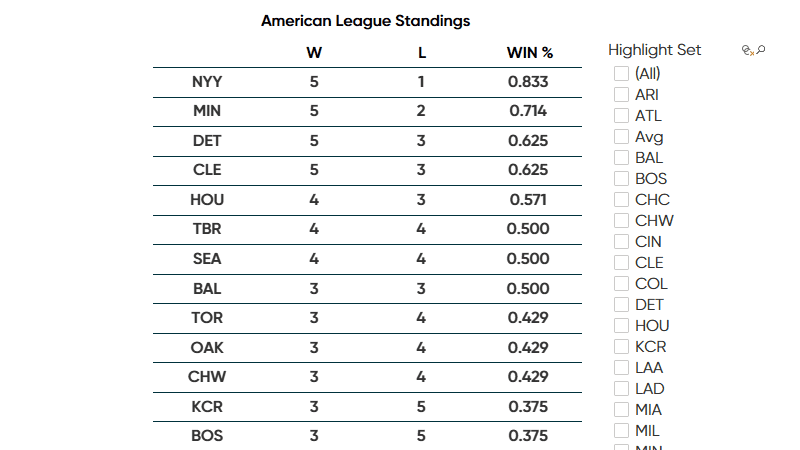
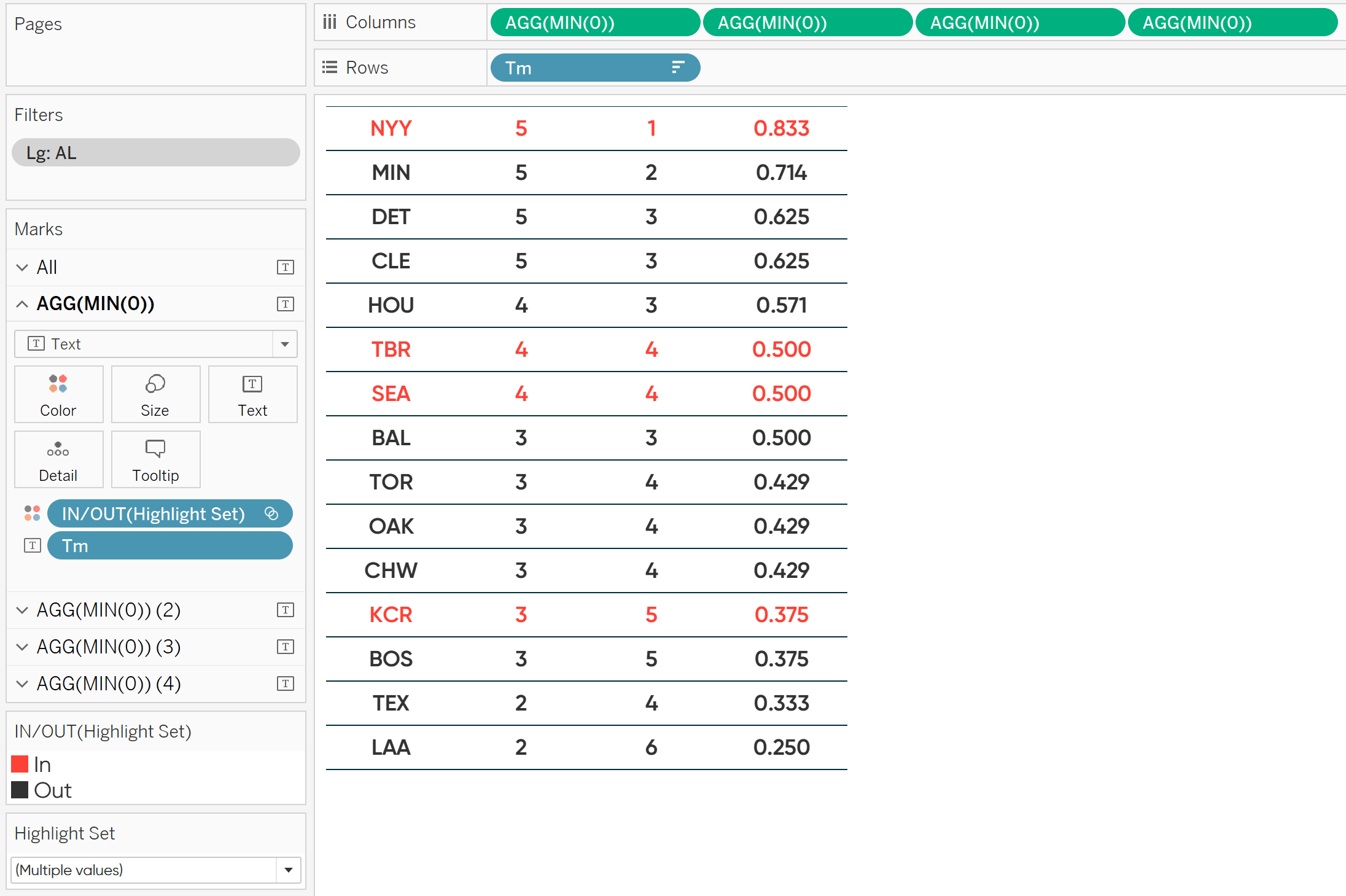
First, let’s take a look at why this tip is needed. You can follow along using any table, including a crosstab built using the Sample – Superstore dataset, but to celebrate the return of baseball, I’ll build a table that looks at Major League Baseball standings (filtered to the American League).
Now, let’s say we want to allow our users to highlight rows of interest. There are two steps required to do so.
![]()
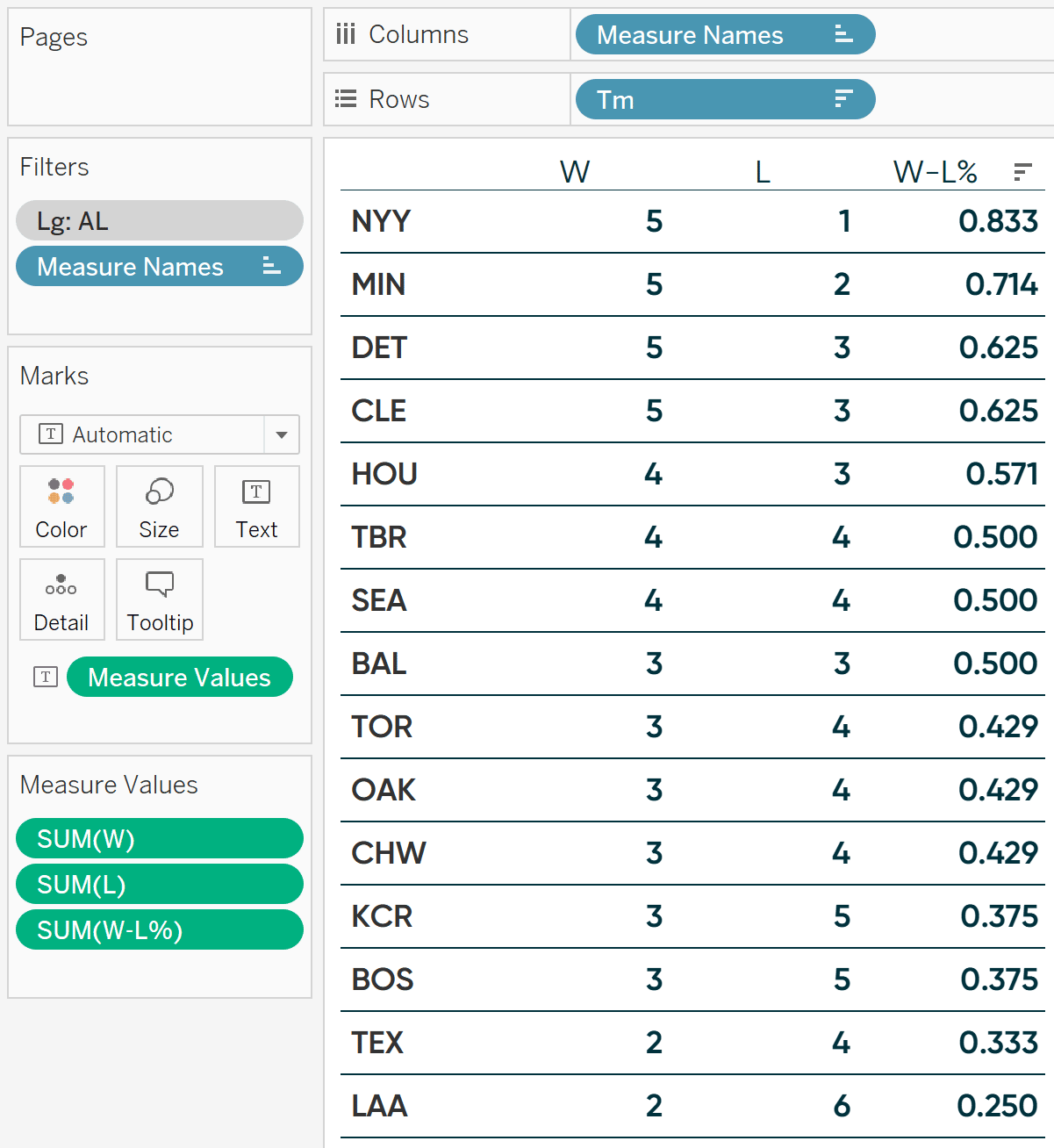
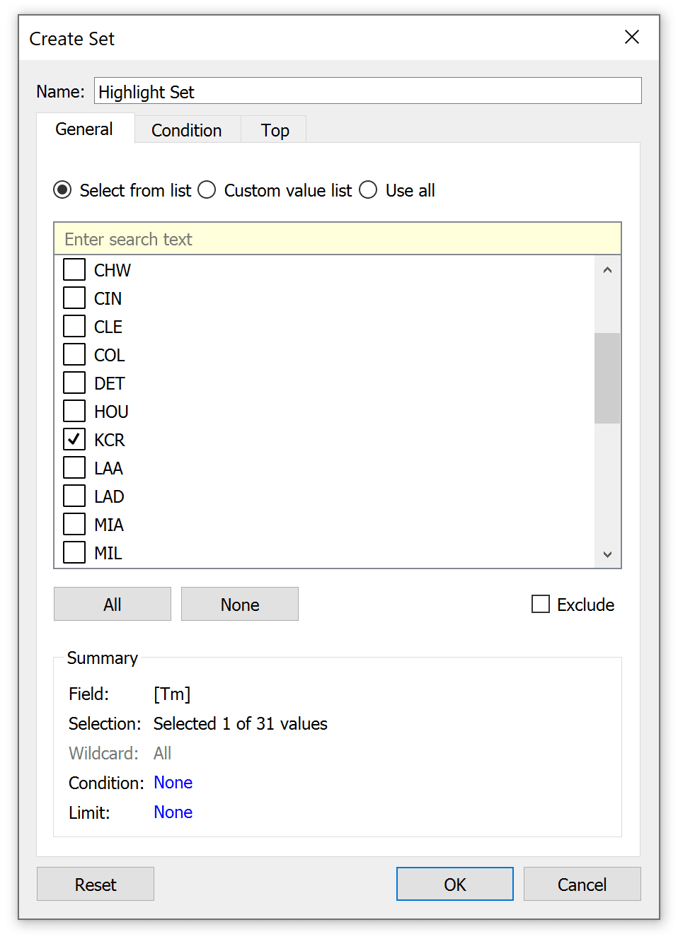
First, create a set out of the dimension on the Rows Shelf. For me, I will right-click on the “Tm” dimension, hover over Create, and choose Set. This will open a dialog where I can give the set a name and choose which dimension members are included in the set.
Continue reading with a free account, or login.
Unlock this tutorial and hundreds of other free visual analytics resources from our expert team.
Already have an account? Sign In
By continuing, you agree to our Terms of Use and Privacy Policy.
Eventually, the dimension members in the set will be controlled by set actions or, if your company has upgraded to Tableau 2020.2 or beyond, a set control. So, I could leave this blank for now, but to ensure my highlight is working right away in the next step, I’ll choose one team, then close this Create Set dialog.
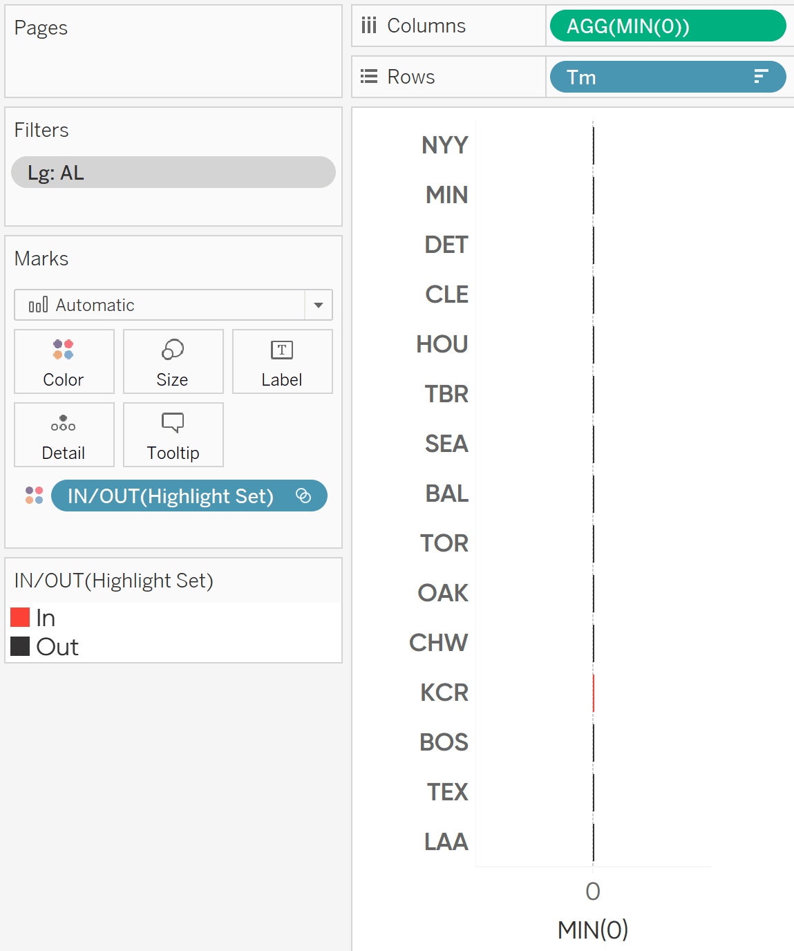
Sets are Boolean, meaning the dimension members are either in the set or they are not. If I drag the newly created Highlight Set to the Color Marks Card, dimension members in the set will be classified as “In” and colored one way; dimension members out of the set will be classified as “Out” and be colored a second way.
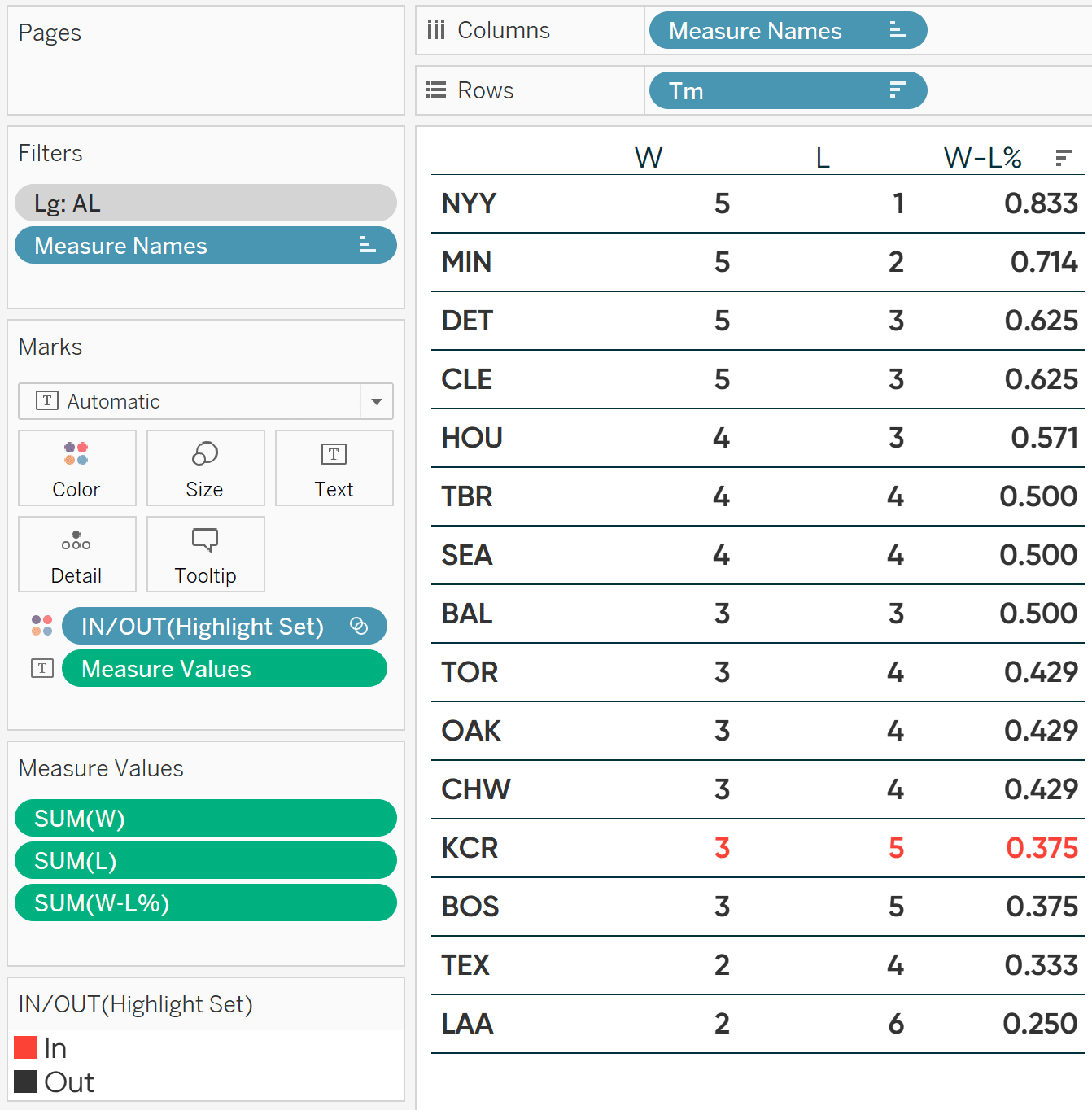
See the issue? The red is drawing my attention to the dimension member I selected in the Highlight Set, but only the marks are highlighted; not the header.
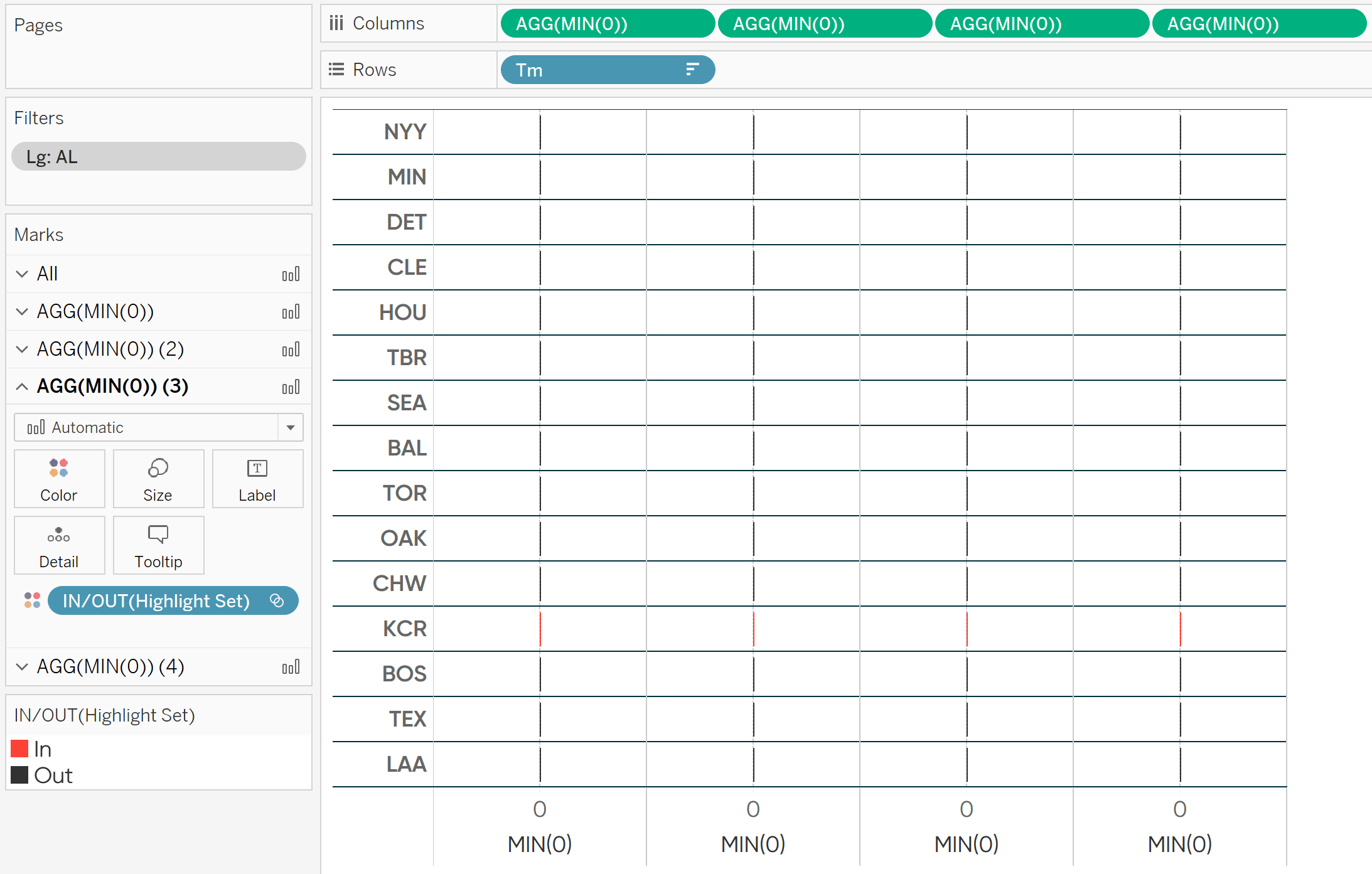
The trick to encoding entire rows including the header is to set up a scaffold using a series of the “placeholder” fields on the Columns Shelf instead of using the Measure Names field.
To start, double-click on the Columns Shelf, type MIN(0), and hit Enter.
Next, duplicate that pill on the Columns Shelf for as many columns needed for your table. You can duplicate pills by holding the Control key while you click on a pill and drag it right next to itself. My table has four columns, so I will duplicate the first MIN(0) field three times.
How to Conditionally Format Individual Rows and Columns in Tableau Like You Can in Excel
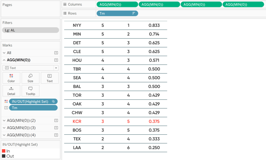
Now that I have four measures on the Columns Shelf, I also have four sets of Marks Cards. If I change the mark type for all four columns to Text and place the Tm dimension on the Text Marks Card of the first Marks Shelf, the team name becomes a mark instead of a header. Since it is a mark, it gets encoded just like the other measures!
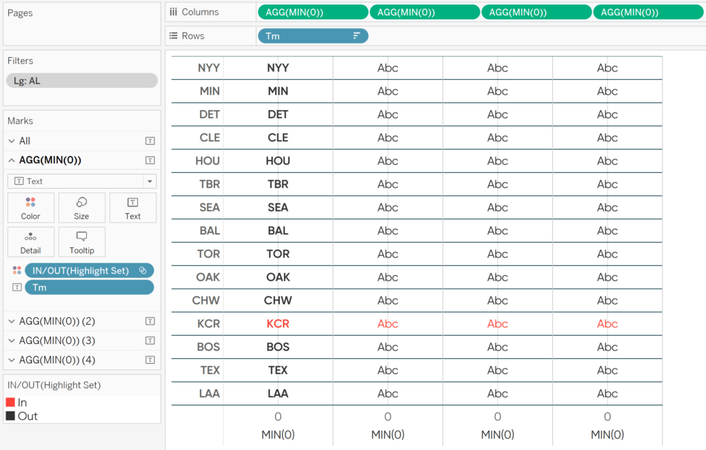
To finalize this table, I will place the Wins measure on the Text Marks Card of the second Marks Shelf, the Losses measure on the Text Marks Card of the third Marks Shelf, and the Win % measure on the Text Marks Card of the fourth Marks Shelf. I’ll also hide the original header and the x-axes by right-clicking each and deselecting “Show Header”. Lastly, I’ll clean up the line formatting by right-clicking anywhere in the table and clicking “Format”.
The only drawback with this “placeholder” scaffolding technique is you lose the column headers. This can easily be fixed by placing this table on a dashboard and adding a series of Text objects that can act as headers.
![]()
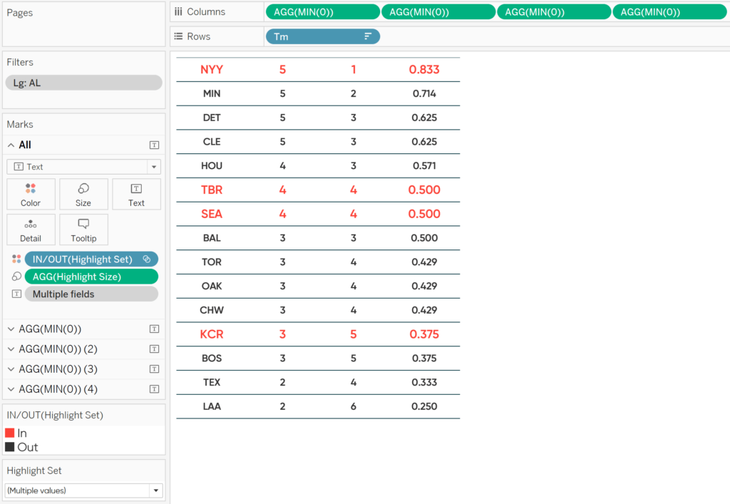
To allow my users to choose which rows are highlighted, I will show the set control by right-clicking on my Highlight Set field from the Dimensions area of the Data pane and clicking “Show Set”. I’ve also gone ahead and added the Yankees, Rays, and Mariners to the set.
How to size marks and headers in Tableau
Here’s a bonus tip for you. To accentuate the rows being highlighted, we can double-encode the marks by color and size. First, create a calculated field with this formula:
MIN(IF [Highlight Set] THEN 2 ELSE 1 END)
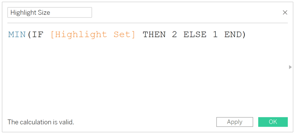
This formula creates a value of 2 for dimension members in the set and a value of 1 for dimension members out of the set. If I place this calculated field on the Size Marks Card for every column, the text on the highlighted rows will be exactly twice as large as the text on non-selected rows!
You can adjust this scaling to your liking by either making the value of 2 larger and/or the value of 1 smaller.
Thanks for reading,
– Ryan


Written By
Ryan Sleeper
Related Content
3 Ways to Create Charming Crosstabs in Tableau
I’ve explained before that a spreadsheet is not a data visualization because it does not take advantage of any pre-attentive…
3 More Ways to Make Charming Crosstabs in Tableau

One of the most challenging aspects of data visualization can be getting stakeholders to buy into using something other than…

Ryan Sleeper
Unlock complete flexibility for Tableau crosstabs Learn how to take Tableau text tables beyond the defaults by (1) creating tables…