5 Tips for Mobile First Tableau Dashboard Design
It’s hard to believe, but I recently completed my very first mobile first Tableau dashboard design. That’s right – 90% of Playfair Data traffic comes through desktop devices and most of our consulting engagements involve creating dashboards for desktop users, so the analytics simply haven’t supported us optimizing for mobile first. Not to say that we don’t create ‘device-specific dashboards’ to provide a better experience for the occasional tablet or phone user, but I had never optimized for them first.
Going through the experience of designing a Tableau dashboard primarily for mobile, I picked up several tricks that I feel need to be shared. This post discusses how to (1) determine if you should consider a mobile first design, (2) scroll multiple sheets at once and eliminate default scroll bars completely, (3) use device-specific dashboards with mobile, and more. Keep reading to see the mobile-first visualization and what I learned creating it!
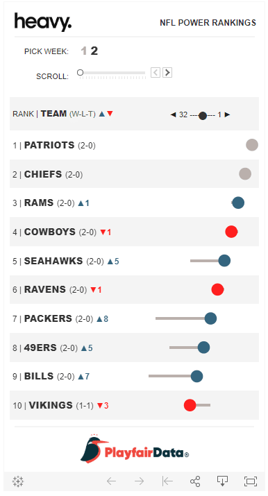
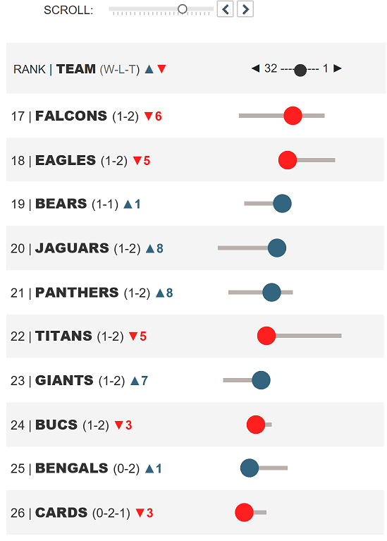
Before I share my suggestions, take a look at the visualization that inspired this post. This dashboard tracks the NFL power rankings for a friend of mine who is a sportswriter – and who happens to get most of his reads through Google search on phones.
Should you optimize for mobile?
Much has been made of optimizing content for mobile. The theory is nearly everyone has a smartphone so it would make sense intuitively that an increasing share of your audience will view your content on those smartphones, right? Right? As with most things in analytics: it depends.
Continue reading with a free account, or login.
Unlock this tutorial and hundreds of other free visual analytics resources from our expert team.
Already have an account? Sign In
By continuing, you agree to our Terms of Use and Privacy Policy.
To determine if you need a mobile first design, I recommend interviewing your stakeholders to determine how they want to consume your reports and/or check your web analytics to see where people are actually viewing your dashboards. We use a free web analytics tool called Google Analytics, with a breakdown of Desktop / Mobile / Tablet users located at Audience > Mobile > Overview. Here’s a snapshot of Playfair Data’s traffic:
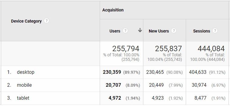
As you can see, mobile and tablet users combined are making up right at 10% of our traffic. Again, not to say we don’t try to provide a good user experience for this type of visitor, but if this is the case, there will likely be other tactics we will prioritize above creating a mobile-friendly experience.
If this ratio is flipped for you, as with my sportswriter friend mentioned above, I suggest digging deeper to find out which mobile devices are most common for your visitors so you can choose the best dashboard dimensions. In Google Analytics, you can add a secondary dimension for “Browser Size” and/or check out the Devices report at Audience > Mobile > Devices.
Consider web safe fonts
Another thing I learned on this project is that fonts I believed to be web safe fonts don’t necessarily render the same between desktop and mobile devices. For example, while Arial, which is the godfather of websafe fonts, may render consistently across devices, its closely related family member, Arial Black, does not.
Here’s how the original design with team names in Arial Black font looks on a desktop device.
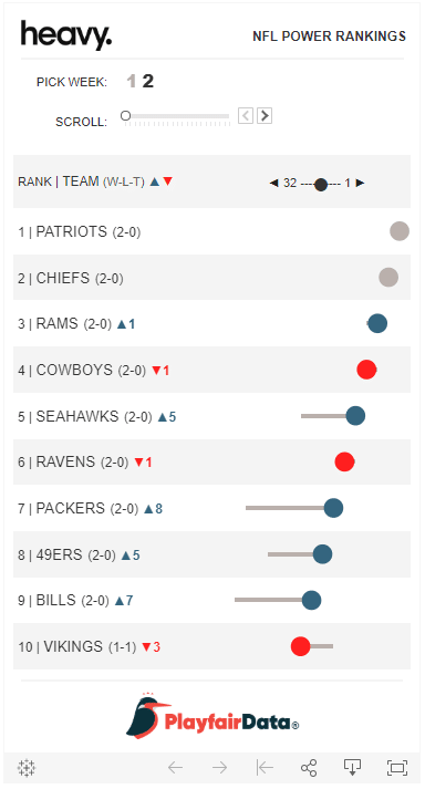
But when this same exact visualization is rendered on my Android phone, Arial Black reverts to Arial without any font formatting.
Fortunately for me, in this case, I had a suitable alternative which was to apply Bold formatting to the Arial Black font while I was authoring. You don’t see anything change when applying Bold formatting to this particular font, but when Arial is rendered in its place, the bold effect can be seen on the team names.
Point being, you will need to quality check your final visualization across devices to ensure you are getting the result you are expecting.
Turn off the automated phone layout
First introduced with Tableau 10, Device-Specific Dashboards have been constantly improving. Device-Specific Dashboards display alternative layouts based on the browser size of your audience. If Tableau Server / Online / Public recognizes the user is on a desktop-sized browser, they render the desktop-sized dashboard; when it recognizes they’re on a phone-sized browser, Tableau can display a dashboard optimized to be viewed on a phone.
In Tableau Desktop 2019.1, Tableau began automatically generating a Phone layout for you. This new default is helpful in theory. I don’t want to ignore one out of ten of our visitors, but I’m also not going to put their experience above nine out of ten of our visitors. So, having Tableau automatically render a more-friendly version of my dashboards was a welcome addition.
However, when I’m already designing for mobile first, the automated Phone version pales in comparison. What’s worse, when my target audience of mobile users does, in fact, view the dashboard on a mobile device, the automated version replaces the version I intended to be shown!
Here’s how the automatically generated Phone version looks, which I accessed by clicking “Phone” at the top of the Dashboard pane.
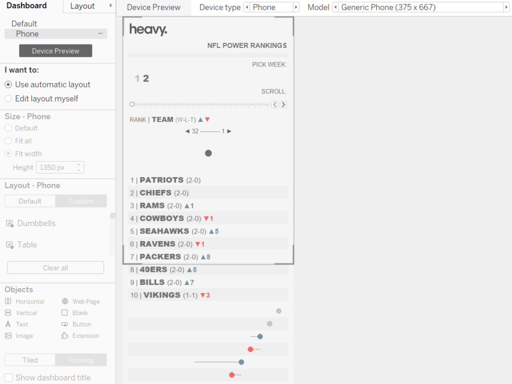
You see a few issues with this version because Tableau placed each object on its own row. Most problematic, it placed my dot plot underneath my table of team names. This caused the viewer to lose the context of which dot plot is associated with which team. This is the main element of the dashboard and the visuals are intended to line up with the team names to appear is if they are one table.
Fortunately, it is easy to remove this version of the dashboard so it doesn’t render when my audience is consuming the dashboard on a phone. Simply click the ellipsis next to Phone at the top of the Dashboard pane and choose “Delete layout”.
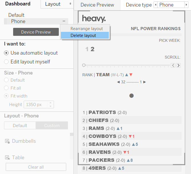
Now when I publish, the audience will always see the version of the dashboard I optimized for mobile.
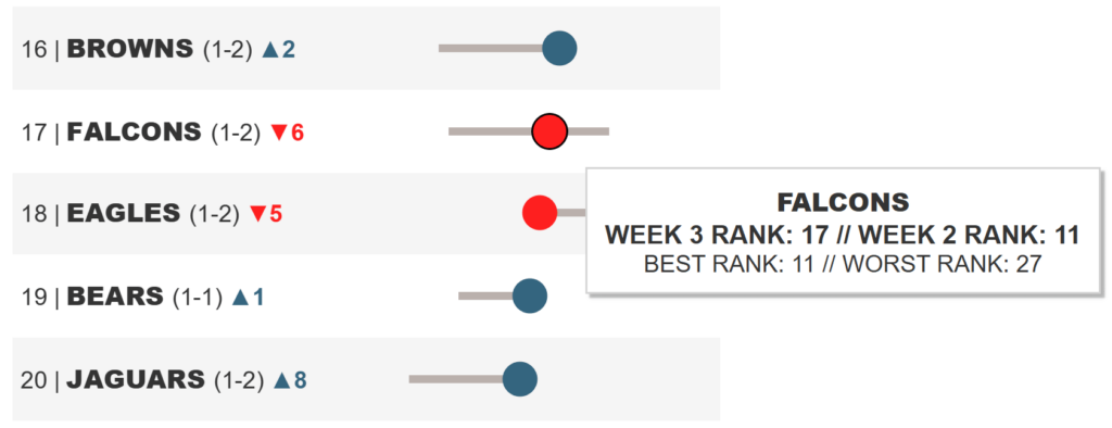
Leverage tooltips
One challenge with the design of my NFL Power Rankings dashboard was coaching the audience on how to read the visuals. This was challenging because I was (1) designing for a mainstream audience that is not necessarily familiar with data visualization, (2) the main component features a novel chart type that tracks the team’s week over week performance as well as their full performance range during the season, and (3) I didn’t have much room to explain things on a 375 by 677 pixel layout.
After considering a few options, I went with tooltips because I thought I could cover the two objectives of providing additional information and explaining how to read the chart without taking away from the clean design.
That may seem like an obvious solution, so I’ve got one more – albeit only slightly-less obvious – tip on using tooltips to get the most from mobile first design in Tableau. One of the things I love about tooltips, as well as Hover dashboard actions, is that the user almost stumbles into the interactivity of a dashboard.
This is ideal when designing for a mainstream audience or any audience that is not as familiar with Tableau because they naturally discover the interactivity. This is a very engaging experience that earns repeat visitors and longer interactions with your work.
Unfortunately, you cannot hover on a mobile device. So, my tip is to coach your audience or provide some visual cue that clicking elements of the dashboard will provide additional context. This can be a call-to-action written on the dashboard somewhere and/or or an icon that implies they should try clicking.
Scroll multiple sheets at once
The table and dot plot you see in my visualization are actually two separate sheets made to appear as one. When this is the case, by default, Tableau adds a scroll bar to each sheet. Not only does this take up space with a clunky gray scroll bar, the two scroll bars do not scroll to the same spot in unison. Needless to say, this results in a horrible user experience and design.
As with most things in Tableau, there is a hack for that. This is an ingenious trick I picked up from Zen Master and 2018 Iron Viz Europe champion, Klaus Schulte.
If you have a unique row identifier, even if you create row IDs using the INDEX() function, you can filter both (or more) sheets to the same rows using a parameter control, creating the illusion they are scrolling in unison. For my use case, this wasn’t quite enough because I didn’t want any scroll bars to appear at all. So, we will taking this trick a step further and limiting the rows to 10 at a time to avoid repetitive vertical scroll bars.
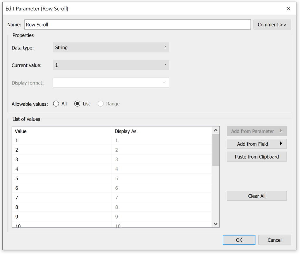
First, create a parameter with your range of row number options. The most technically efficient data type for parameters is Integer. However, parameters with a data type of String have different formatting options for the parameter control, including left and right arrow buttons. For this reason, I’m going to create a parameter with a data type of String, and we will convert the strings to integers in a future step. Here’s how my parameter looks when allowing the user to start the rows between the values 1 and 23.
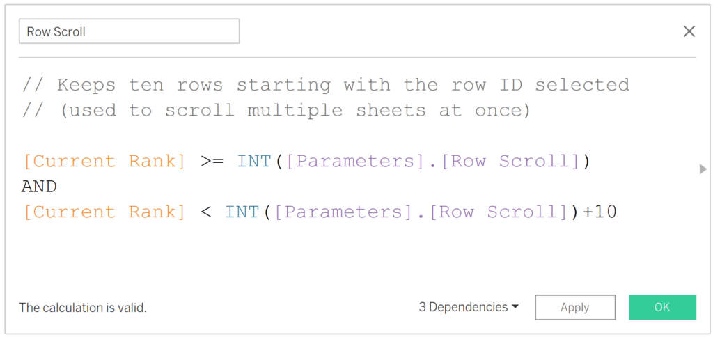
Next, create a calculated field that keeps only the row numbers between the value selected in the parameter and the selected value plus how ever many rows you want on the view. My row numbers, or unique identifiers, were very easy because each team has a unique ranking each week (the Current Rank field). If you do not have a unique row ID in your dataset, you can use the INDEX() function instead, but you will likely have to change the addressing of the table calculation to get the result you are looking for. Here’s how my calculated field looks:
How to Scroll Multiple Sheets at Once in Tableau
Remember, you will replace the [Current Week] field with your own unique row identifier, or INDEX(). Also note the parameter value is preceded by the INT function, which converts the string to an integer.
Now, place this calculated field on the Filters Shelf of every sheet you want to scroll at the same time and keep only the “True” values. In my case, this will keep the 10 rows starting with the value selected in the parameter. If you are using the INDEX() function to create your row identifiers, that field will need to be on the Rows Shelf for a vertical scroll or Columns Shelf for a horizontal scroll.
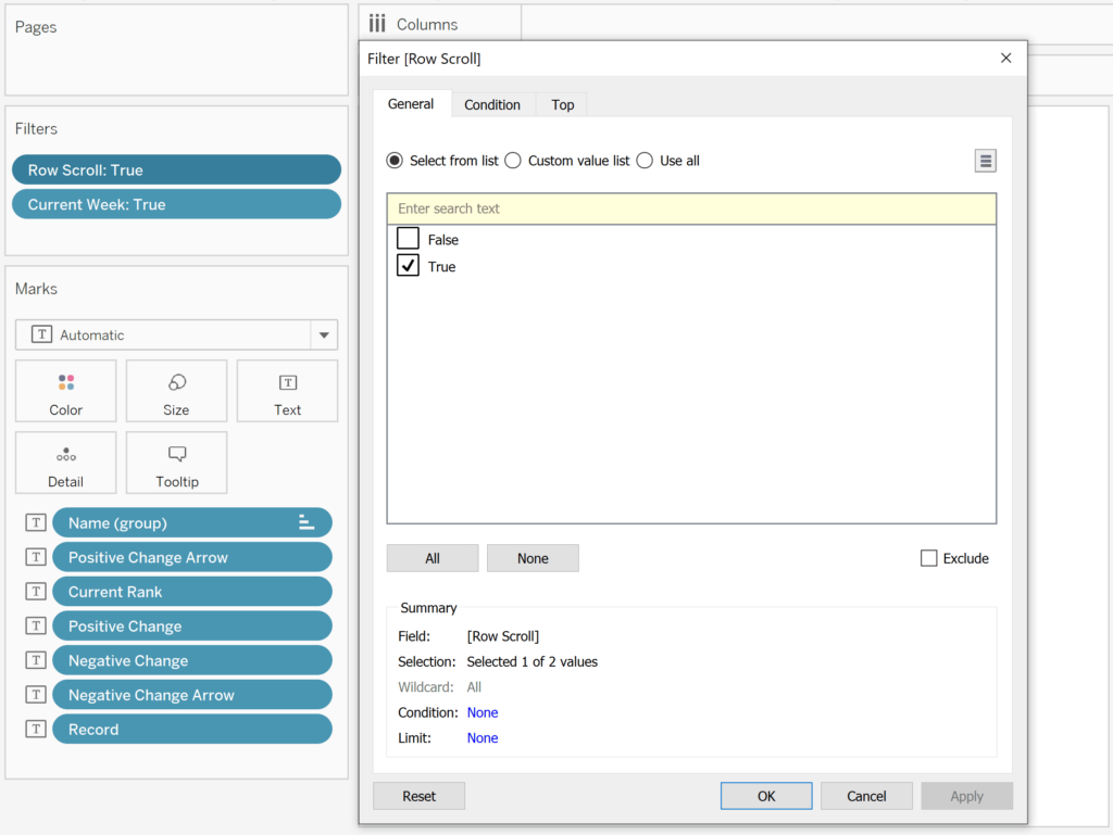
Lastly, show the parameter control by right-clicking on the parameter from the Parameters area of the Data pane and choose “Show Parameter Control”. The value selected in this parameter control creates the starting point for the table by feeding the Row Scroll calculated field. In my case, I capped the number of rows at that starting point plus ten rows.
Now, every sheet that has this calculated field on the Filters Shelf, assuming they are sorted in the same order, will “scroll” to the correct position with a single control!
Thanks for reading,
– Ryan

Written By
Ryan Sleeper
Related Content

Ryan Sleeper
Keep worksheets in sync by scrolling them at the same time! By default, scroll bars in Tableau only control one…
How to Make a Mobile Splash Page in Tableau


As creators, we can use splash pages to inform dashboard users of something that may affect their journey. In the…
Ryan Sleeper
Dashboard dimensions, floating vs. tiled objects, fixed vs. automatic sizing, and more Ryan walks you through the Dashboard pane in…