How to Make a Mobile Splash Page in Tableau


As creators, we can use splash pages to inform dashboard users of something that may affect their journey. In the case that your products are not responsive – meaning that splash pages work well for mobile, tablet, and desktop devices – you risk alienating a significant number of users with the assumption that the tool is broken or poorly implemented.
We can use splash pages to our advantage to alert, control, and enhance the user experience for visitors when a dashboard design is not responsive. For example, some visualizations are best suited for bigger spaces. So, a mobile-size environment is not always optimal for a number of chart types and use-cases.
👀 Want to see a mobile splash page in action? See our recent Mobility and Operations in the NFL project from a mobile device. When a user attempts to view the visualizations on a mobile device, they will receive this message guiding them to come back on a larger screen:

We have no control over how people choose to access our products. The best course of action when adapting to different port sizes that fall outside of the project scope or use-case is to create constraints around our products which discourage people from using them in ways they weren’t designed for.
In this post, you will learn the advantages of designing a mobile splash page for your dashboards, considerations for designing custom splash pages in Figma, and how to implement custom mobile layouts in Tableau.
Continue reading with a free account, or login.
Unlock this tutorial and hundreds of other free visual analytics resources from our expert team.
Already have an account? Sign In
By continuing, you agree to our Terms of Use and Privacy Policy.
Design considerations for custom splash pages in Figma
When creating a splash page, we first need to determine our target audience so we can define the size limitations accordingly. For example, if we build a dashboard that helps track team performance during work meetings, we may decide we don’t require a mobile version for the tool. In this case, project managers and designers still have to cover all their bases and ensure the dashboard is not accessible through mobile. One solution to determine which devices your dashboards are being accessed from is to login to GA4 and navigate to User > Tech > Overview – or – simply ask your users!
5 Tips for Mobile First Tableau Dashboard Design
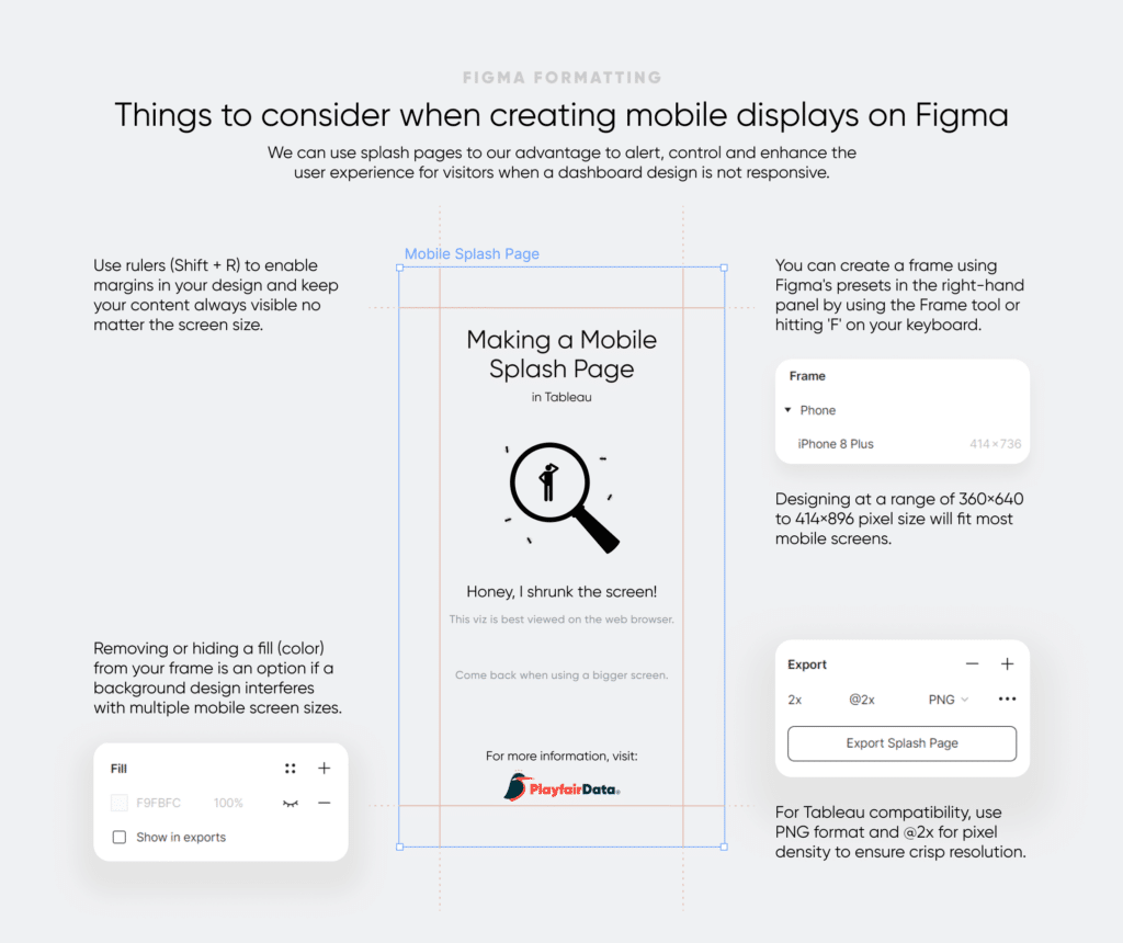
For mobile pages, we recommend designing at a range of 360×640 to 414×896 pixel size. This will ensure your design can scale and fit most mobile screens. Creating a splash page – a simple screen that will automatically appear and halt the use of the tool, allowing us to dictate its usage.
If you are using Figma to design a custom splash page, you can create a canvas by selecting a frame size from Figma’s presets in the right-hand panel by using ‘Frame’ (from the toolbar at the top of your screen) or hitting ‘F’ on your keyboard. For today’s example, we will use the iPhone 8 Plus (414×736) or, if using Tableau as a guide, the Google Pixel Series (411×731).
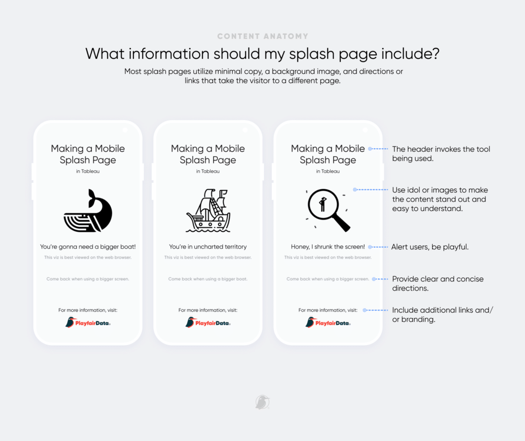
Next, we need to consider the content. Most splash pages utilize minimal copy, a background image, and directions or links that take the visitor to a different page. Here is an opportunity to be playful with the language and incorporate some branding into your design.
Once you’ve created your splash screen on Figma, select the frame (or layer) and navigate to the right-hand panel to find the section labeled Export.
For Tableau compatibility, we recommend choosing a PNG format and adjusting the suffix to @2x. This refers to pixel density, and Tableau will compute high image resolutions when the suffix @2x is part of the file name.
Building a mobile splash page in Tableau
The inspiration to build a mobile splash page came during our most-recent project evaluating hiring trends of racially-diverse coaches in the NFL. As we were nearing the end of the project and closer to the final distribution date, we were extremely proud of what we had built and excited for users of all data literacies to view the project on the NFL Operations website. However, we recognized the possibility that there could be a large amount of mobile traffic to the site and that our tool was not built to be viewed on a mobile layout.
That’s when our team thought of creating a mobile splash page to direct people from their phones to their desktops. It was a simple yet brilliant solution. To view the real-life use-case of the mobile splash page, visit the Mobility and Opportunity Trends dashboard from your mobile device or continue reading to learn how we built this mobile splash page.
Building out the mobile splash page in Tableau is quite simple, requiring only a few steps to implement.
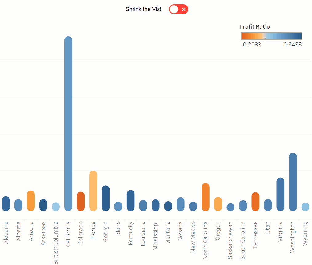
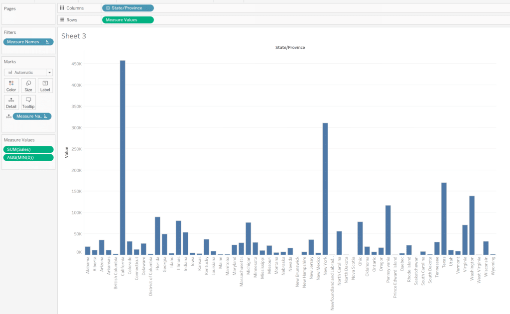
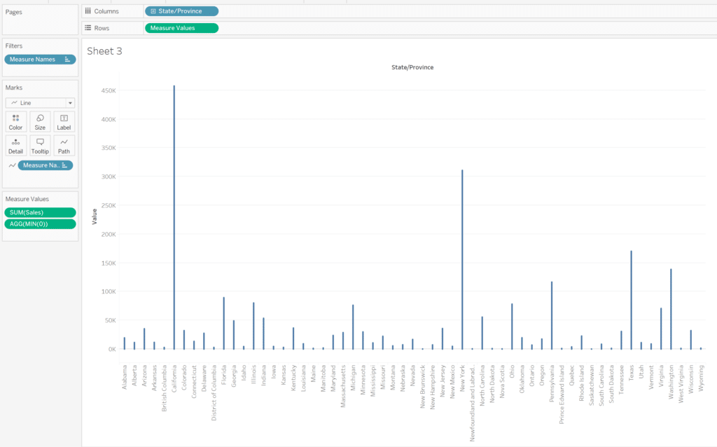
For the purpose of our example, we’ll first build out a simple rounded bar chart visualization using the Sample Superstore data. Place the State/Province dimension onto the Rows shelf, and the Measure Values measure onto the Columns shelf.
The Easy Way to Make Rounded Bar Charts in Tableau
Double-click in the Measure Values shelf, type ‘MIN(0)’, then click enter. Remove all values from the Measure Values shelf except MIN(0) and SUM(Sales).
Change the Mark type from Bar to Line, then drag Measure Names from the Detail property of the Marks card to the Path property.
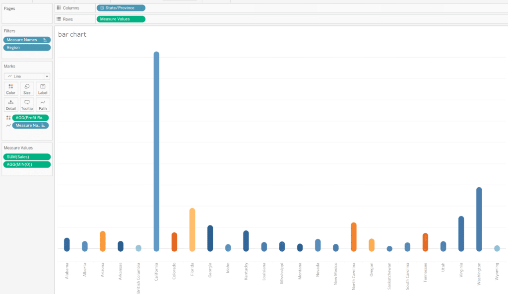
Place the Region dimension on the Filters shelf and select the South and West regions. Place the Profit Ratio measure on the Color property of the Marks card to show which states are most profitable. Lastly, resize the lines appropriately using the Size property of the Marks card.
Create a new dashboard and add the rounded bar chart visualization. Under the Dashboard pane, select ‘Phone’, select ‘Device Preview’, then deselect the lock button next to ‘Phone’ to allow customization of the dashboard.
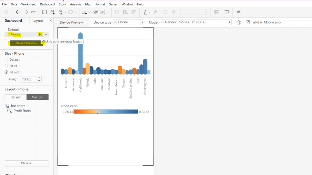
There are several options at the top of the dashboard, including ‘Model’. Select the ‘Model’ drop-down menu, and while you can choose whichever mobile device layout you’d like, I typically choose the largest option available so it has a better chance of compatibility with more phones. In this case, I chose the iPhone XR model.
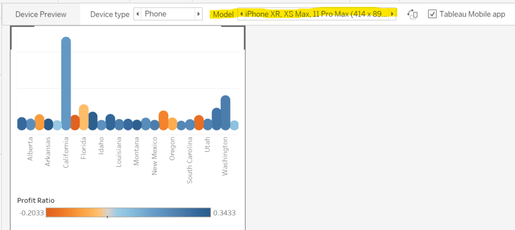
Under ‘Size – Phone’, choose ‘Fit all’, then delete all sheets and containers in the dashboard. Drag an Image object into the dashboard, choose Fit Image and Center Image in the Edit Image Object settings, then select Choose… and choose your own customized splash page image that you have saved to your desktop.
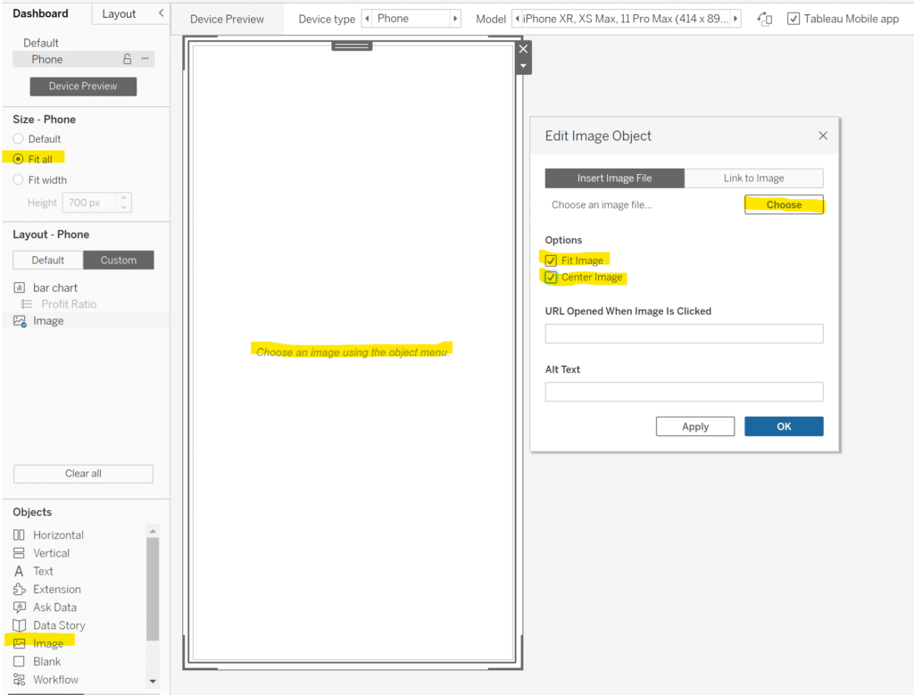
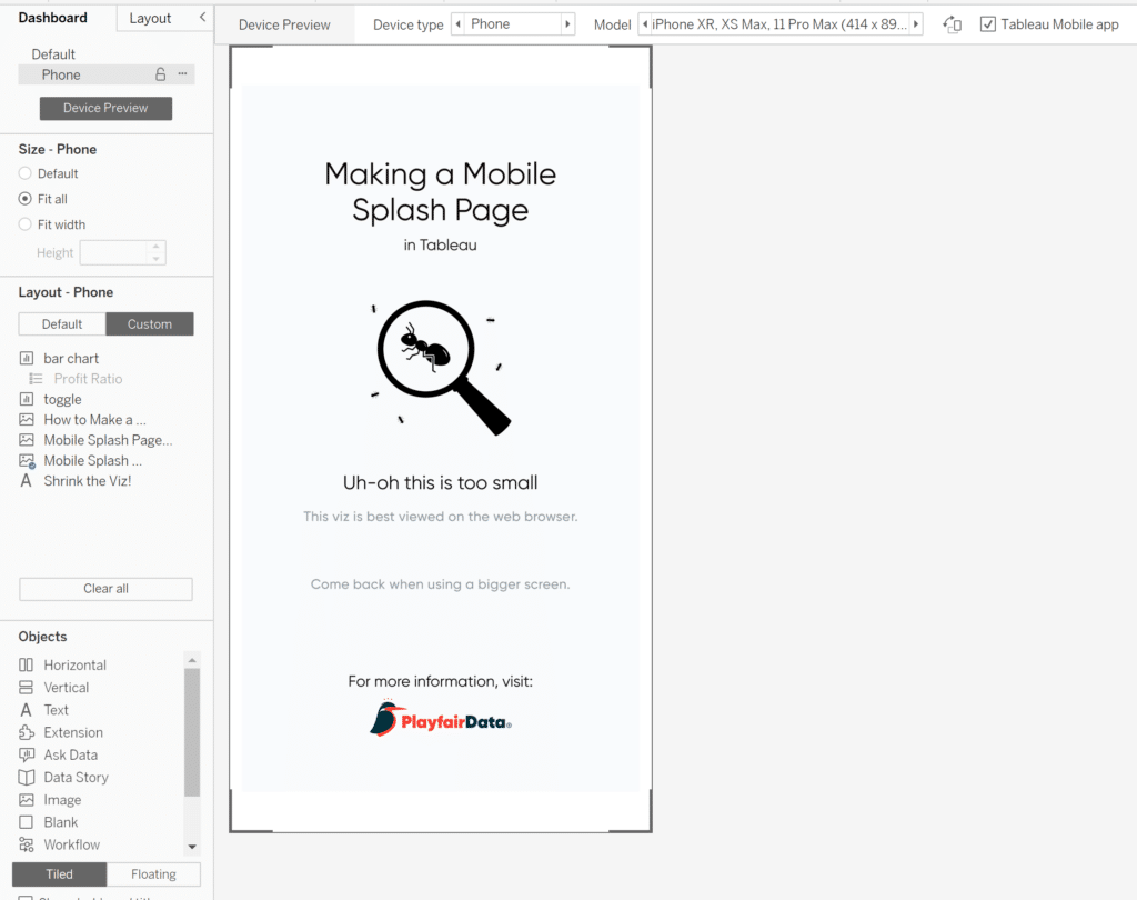
The result should look similar to the screenshot below.
Conclusion
And that is it! To get back to your original dashboard, just select ‘Default’ in the Dashboard pane right above ‘Phone’. You now have a fully functioning dashboard for a desktop layout and a mobile splash page guiding mobile users to their desktops to view the visualization. Tableau Public, Tableau Server, and Tableau Cloud all have built in logic to automatically display the best version of the dashboard depending on the size of the browser the viewer is using. Desktop users will automatically see the full-size version of the dashboard, the way you intended it to be shown, while mobile users will automatically see instructions guiding them to come back when they are on a larger screen!
Happy Vizzing,
Rafael Simancas & Dan Bunker

Written By
Rafael Simancas

Written By
Dan Bunker

Peer Review
Luke Lewis
Information Design Associate

Peer Review
Ethan Lang
Sr. Director, Enterprise Intelligence
Related Content
3 Innovative Ways to Use Figma in Your Visual Analytics Projects

What does design software have to do with visual analytics software like Tableau? At Playfair Data, we approach our visual…
3 Ways to Wow Stakeholders with Figma

When it comes to demonstrations, it goes without saying that you want your stakeholders to walk away “wowed.” But what…
How to Create Better Dashboard Layout Designs with Figma
Being able to apply some basics of dashboard layout design to your visual analytics projects in Figma can bring a…