Data-Ink Ratio Animation and How to Apply it in Tableau
In his 1983 book, The Visual Display of Quantitative Information, Edward Tufte introduced the concept of the data-ink ratio in data visualization. In case you are not familiar with this classic book and concept, the data-ink ratio is the portion of ink (i.e. pixels) that makes up data-information on the view.
Over time, I’ve realized that this single concept is the core of almost all my design tips. As such, we’ve created an animation to educate our stakeholders on the data-ink ratio and how its application can improve almost any chart or graph.
This post shares an animation of the data-ink ratio, addresses the concept’s two fundamental flaws, and shows you how to apply principles of the data-ink ratio within Tableau.
Playfair Data presents: Maximize the data-ink ratio
If you are new to the data-ink ratio, I encourage you to watch this one-minute animation which explains the concept and shows you how it can dramatically improve a bar chart.
Show the Data – Maximize the Data Ink Ratio
How to apply it in Tableau
There are several ways to improve the data-ink ratio in Tableau by changing the default format settings the software provides. To illustrate, we’ll improve the data-ink ratio in the following Orders by Category bar chart built with the Sample – Superstore dataset. Along the way, I’ll point out two fundamental flaws with Tufte’s vision for the concept.
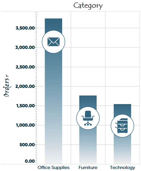
Step 1 – Erase non-data ink
First, we will remove non-data ink, such as graphics. In the same book Tufte introduced the data-ink ratio, he also coined the term “chart junk” for non-data graphics that clutter the view. This happens to be one of the few times my humble opinion diverges from Tufte. I believe that non-data ink, such as icons, can help make a data visualization more engaging, so that more people stop to look at it, adopt it, and hopefully eventually act on it.
For this reason, I use a slightly different definition for chart junk, which is any graphics that distract from the data rather than add value.
In a 2007 study, Inbar found that students preferred small amounts of “chart junk”. Further, a 2009 study by Hockley found that graphics improve memorability.
Continue reading with a free account, or login.
Unlock this tutorial and hundreds of other free visual analytics resources from our expert team.
Already have an account? Sign In
By continuing, you agree to our Terms of Use and Privacy Policy.
The key is using graphics tastefully so they contribute to processing and retention and don’t distract from them. In my Tableau example, the icons may help the user remember which category performed best, but the varying locations of the icons within the bar imply the locations have meaning – when they don’t. This increases the cognitive load on the audience and causes users to slow down to figure out what the location of the graphics on the y-axis indicates.
Here is the view after removing chart junk.
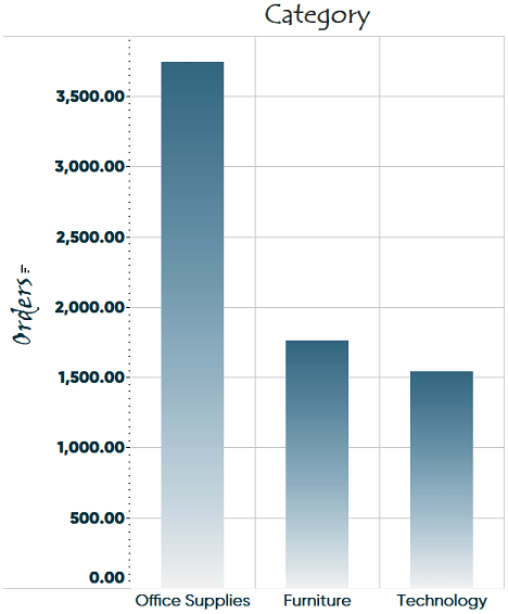
The next tips are to remove effects such as gradients…

Remove varying font styles and formats…
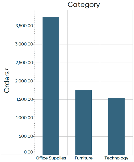
Remove the grid…
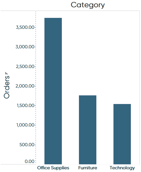
And removing borders.
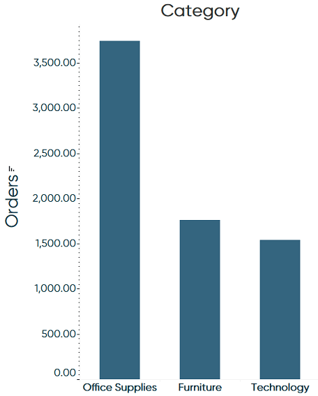
It’s the last two tips that have also caused criticism of the data-ink ratio. Removing grid lines and the top borders make it harder for users to accurately compare performance across categories. I sometimes split the difference in Tableau and add a light, dotted grid that helps the user compare performance, but also provides a nice aesthetic.
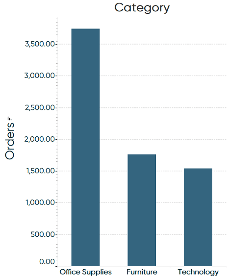
All of these formatting changes can be accessed in Tableau by right-clicking anywhere in the view and choosing “Format…”.
Step 2 – Erase redundant data ink
Just because pixels on a view convey data, it does not mean they are all necessary. You can also have redundant data ink. Some easy opportunities to remove redundant data ink include:
Removing extra labels and/or consolidating them into a title…
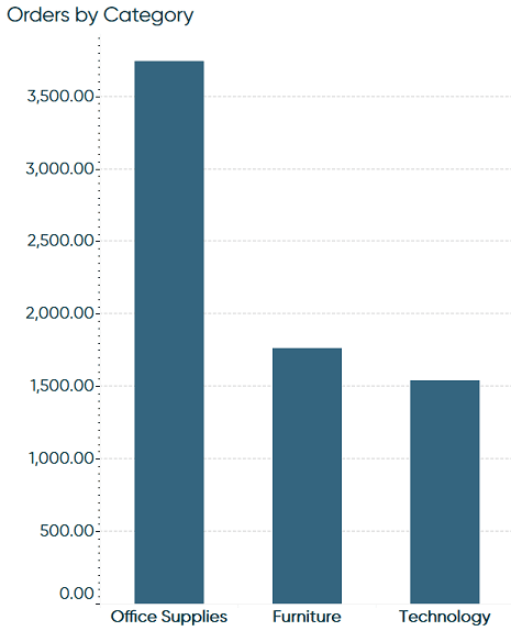
Removing unneeded decimal places and excessive axis tick marks…
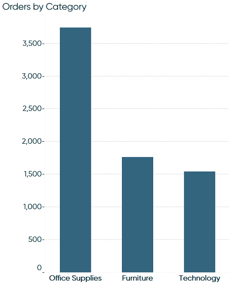
To change decimal places for a specific axis, right-click on the axis and choose “Format…”. Then use the “Numbers” dropdown to format the numbers.
To change the default number of decimal places every time a measure is used, right-click on the measure in the Measures area of the Data Pane, hover over Default Properties, and choose “Number Format…”.
Or better yet, use direct labeling instead of axes. This works particularly well with bar charts with a relatively small number of marks on the view.
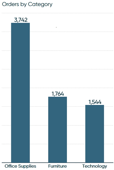
Step 3 – Revise and edit
The last step in maximizing the data-ink ratio is to revise and edit. Here is a comparison of where we started and ended up after applying the techniques listed throughout this post:
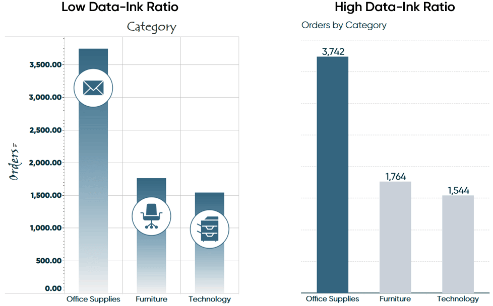
For more bar chart formatting ideas, see 3 Ways to Make Beautiful Bar Charts in Tableau.
Thanks for reading,
– Ryan
Related Content
3 Ways Psychological Schemas Can Improve Your Data Visualization
Whether you are aware of it or not, you are constantly recognizing and processing patterns in your everyday life. Think…
3 Storytelling with Color Tips to Improve Your Data Visualization
Color is one of the easiest ways to control the style of your data visualization. A good use of color…
Ryan Sleeper
Adding love for bar charts by showing you how to make them more engaging in Tableau This video shows how…
