How to Add Custom Integrated Insights to a Tableau Dashboard
When I discuss data visualization strategy, I often talk in terms of descriptive and prescriptive analytics. Descriptive views are the most common and can be thought of as high-level overviews of what happened. Most weekly or monthly reports, particularly if they’re consumed as static documents, are descriptive dashboards. Descriptive dashboards certainly provide value and have a place, but they’re only a starting point for deeper analysis.
Prescriptive views go a step further than descriptive views and attempt to answer why something happened. For example, a descriptive view might show that sales spiked 25% last month, and a prescriptive view would add value by showing it was the 15% off email campaign that caused the spike. Ideally, prescriptive views also ‘prescribe’ what should be done about the insight. For example, “we saw the email campaign worked; next, we should test the discount amount to maximize our profit ratio.”
While descriptive insights can be easily ascertained by most audiences, prescriptive insights and recommendations are much harder to come by. I know some really smart people are working on ways to replace analysts with robots, but in the meantime, I found a simple way to allow you and your end users to add their own prescriptive insights to a Tableau dashboard.
How to add custom integrated insights to a Tableau dashboard
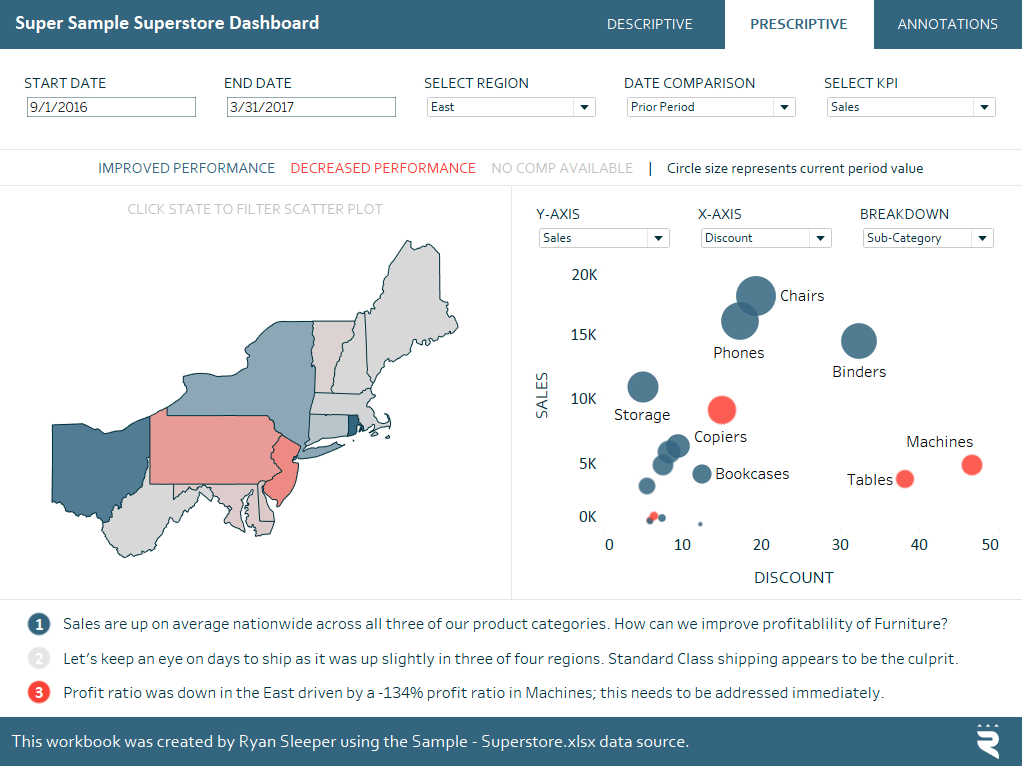
To help illustrate, we will be using the Super Sample Superstore dashboard. As you can see, there are three different insights at the bottom of the Prescriptive view.
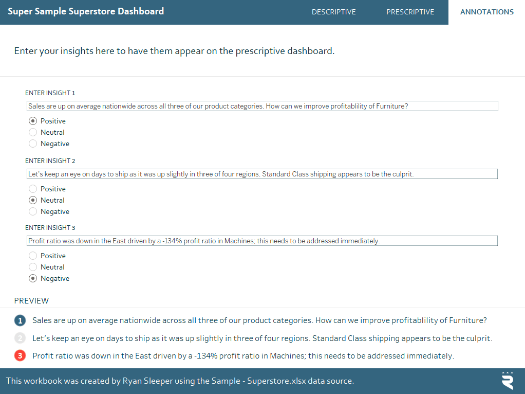
These three insights were entered on the “Annotations” tab.
The end user has the ability to type their insight into a freeform text box and choose whether the insight is positive, neutral, or negative. The rating is mapped to a color-coded indicator and both the indicator and insight show up on the prescriptive view!
Continue reading with a free account, or login.
Unlock this tutorial and hundreds of other free visual analytics resources from our expert team.
Already have an account? Sign In
By continuing, you agree to our Terms of Use and Privacy Policy.
To accomplish this, I first started by creating a parameter with a data type of String. Here are the settings for the first parameter.
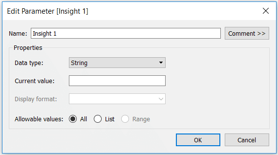
Note that the allowable values were set to ‘All’ to allow the end user to type any string.
Parameters do not do anything on their own, so to get the end user’s input onto a view, I also created a calculated field that shows whatever is typed into the parameter’s freeform box.
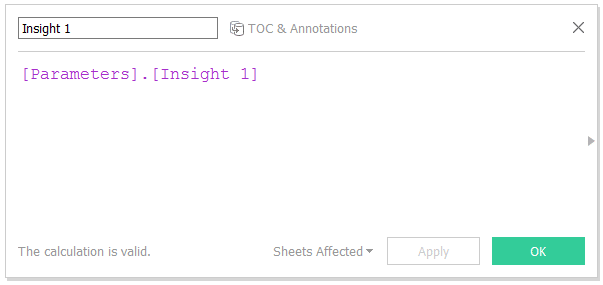
Now this calculation can be placed on the Text Marks Card of a sheet and formatted to your liking. Be sure to show the parameter control by right-clicking on the parameter and choosing “Show Parameter Control”. Now whatever is typed into the parameter control will show up on the sheet.
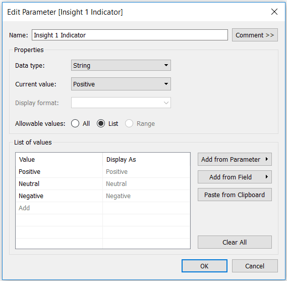
For the colored circles, I set up another string parameter with the options of Positive, Neutral, or Negative.
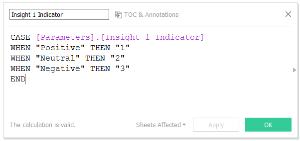
Much like the parameter in the first step for the text, I also need to set up a calculated field to give Tableau instructions for what to do with this parameter. This time, I’m mapping a number for each selection.
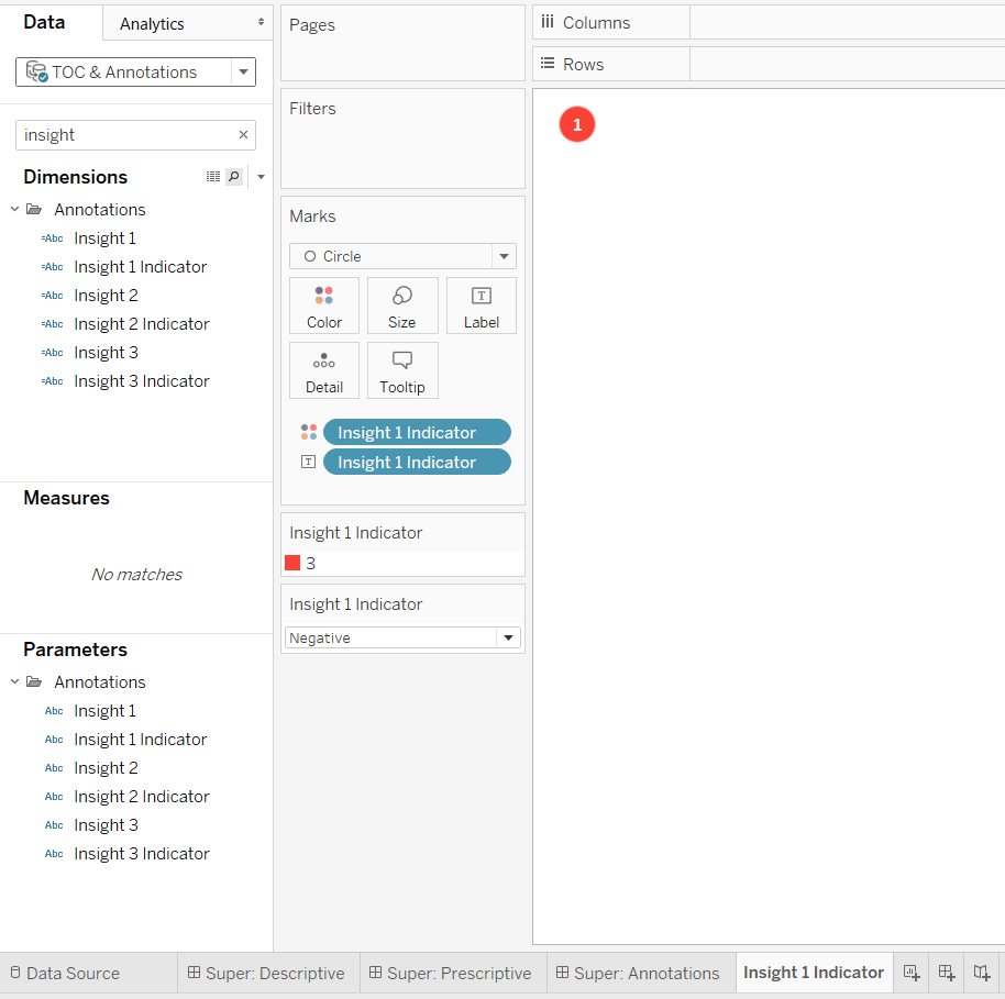
Lastly, I set up a simple sheet that has a mark type of circle, with the indicator calculated field on both the Label Marks Card and Color Marks Card. With the parameter control shown, you can click through each of the three options and map the colors of your choice.
After creating a parameter, calculated field, and sheet for the text and (optionally) the circle indicators, add them to a dashboard with their respective parameter controls. Repeat these steps for the number of insights you want you and your end users to enter. The Super Sample Superstore dashboard allows up to three customized insights.
Now that you have provided the ability to seamlessly enter customized insights, users can save their own views, including their own insights on Tableau Server. For example, you can open a weekly report, add your insights, then save and send it out. This approach even works on Tableau Public, and the insights persist when you use the share link!
Thanks for reading,
– Ryan
Related Content
How to Make Your New Favorite Commenting System in Tableau
I’ve shown you in the past how to add custom integrated insights to a Tableau dashboard. This tactic allows you…
3 Creative Ways to Use Tableau Parameter Actions
I have always described Tableau parameters as a Swiss Army knife due to their infinite applications. In case you are…
Ryan Sleeper
Let your audience control a visualization through user-generated values This video will show you how to set up a parameter…
