How to Connect to Data in Power BI Desktop

Microsoft’s Power BI is one of the top data visualization platforms on the market. The Power BI platform has products to suit many of your data visualization needs through Power BI Desktop, Power BI service, and Power BI mobile apps. This tutorial is designed for beginners who are just getting used to the Power BI platform. In this tutorial, we’ll cover how to connect to data in Power BI Desktop, the basics of Power Query Editor, and the basics of managing/creating relationships between data tables in the same data source.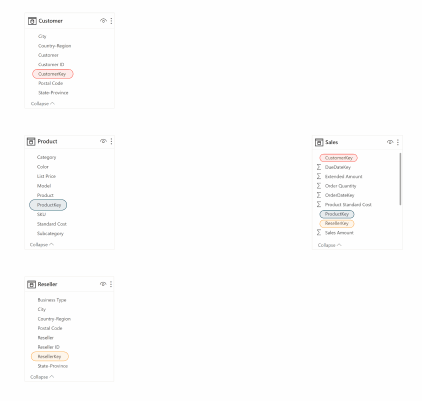
Connect to data in Power BI
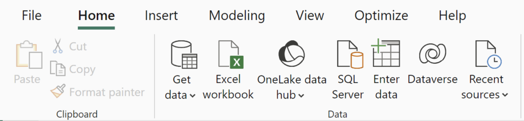
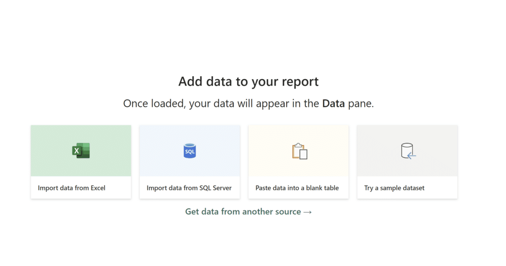
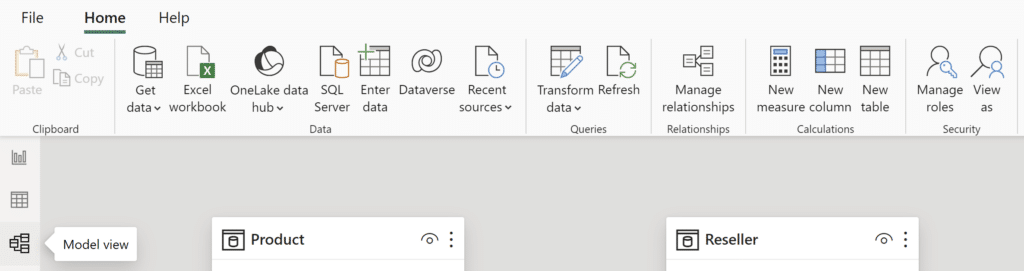
Once you open the Power BI Desktop application you are prompted with the option to start with some sample tutorials. If this is your first time using Power BI these might be helpful for you. If not, close it to start fresh with a blank canvas/work environment. Usually, the next step is to select the “Get Data” tab on the Home ribbon. Since this tutorial is starting fresh, select the “Try a sample dataset” tile on your blank canvas.
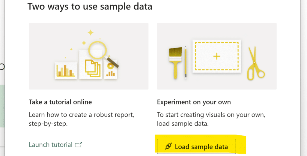
Now click “Load sample data” to continue.
Continue reading with a free account, or login.
Unlock this tutorial and hundreds of other free visual analytics resources from our expert team.
Already have an account? Sign In
By continuing, you agree to our Terms of Use and Privacy Policy.
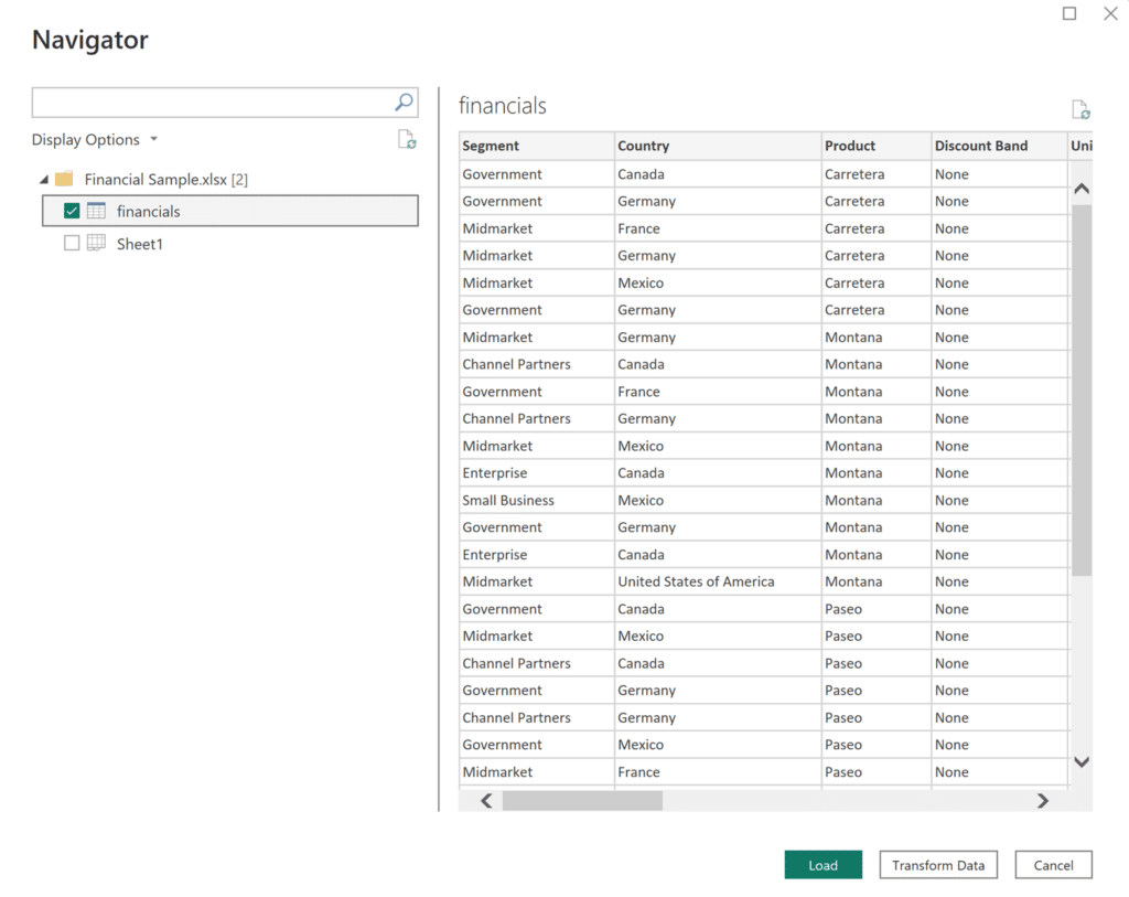
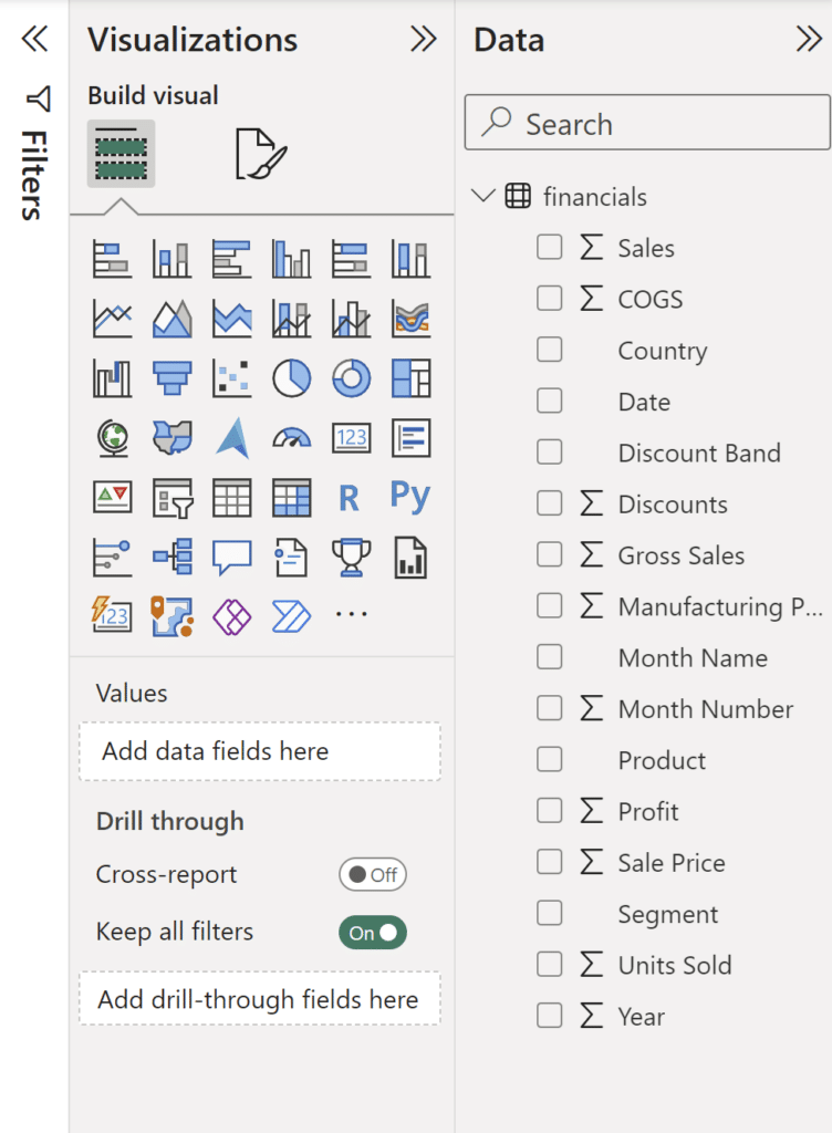
If you check any of the boxes next to the data table names, Power BI Desktop shows you a preview of your sample data. At this step, you can load your data or transform it before loading by clicking “Load” or “Transform Data.”
Using Power Query Editor to prepare a data source
Selecting “Transform Data” data opens up the Power Query Editor. Here you have access to a multitude of data transformation options such as changing data types, adding/removing columns and rows, creating and pivoting columns.

It is usually a good idea to select “Transform Data” before loading to double check that you have a clean dataset that is structured appropriately for your use. Unfortunately, messy or unorganized data is extremely common but the Power Query Editor offers many easy solutions.
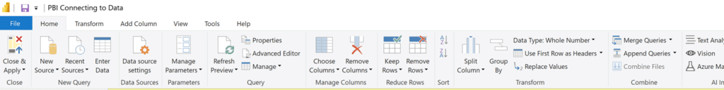
You can exit the Power Query Editor by clicking the Close & Apply button on the left side of the Home Ribbon.
Since we are loading in Power BI sample data, we can skip this step. Select the checkbox next to the table name and click “Load” to continue. Now that we have our data loaded, Power BI Desktop presents us with a blank view on the default Report View window.
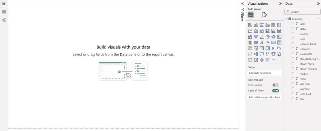
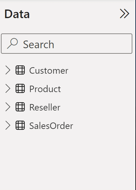
Make note of the Data pane on the right side of the screen. Here you can select each table and expand by clicking on the side arrow by each table name.
This covers the basics of connecting to data in Power BI Desktop. To learn how to connect multiple data tables in Power BI Desktop, read on!
Power BI data modeling to connect to multiple data tables
Before we proceed, let’s connect to a data source with multiple different tables. We will use the Adventure Works dataset. This GitHub repository provided by Microsoft has plenty of other sample datasets if you want to try another. Select the download file button on the right side of the page.  Open up a new Power BI report and connect to data in the same way as before. Select Get Data, Excel Workbook, and then select the Adventure Works file in your downloads.
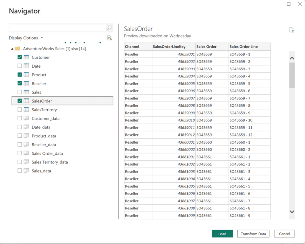
For this exercise, we will be using the Customer, Product, Reseller, and SalesOrder tables. Select the check box next to these tables and click Load.
Now select any visual you want and try to use fields from multiple tables. For example, try to create a Filled map visualization that answers the question, “How do different types of products vary by state?”
For this visual, we’ll use the “State-Province” field from the ”Customer” table and the “Category” field from the ”Product” table. What happens to your visual?
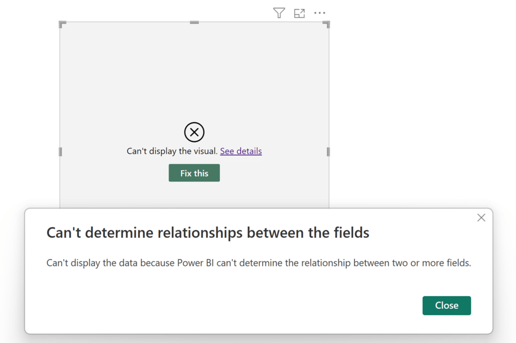
Why does this happen? All of the data tables have been successfully loaded in my report, but there is no relationship between them, meaning that the tables are unable to interact with each other. You won’t be able to create a visual using fields from multiple tables.
If this doesn’t really make sense, another good way to look at this is to think about an Excel workbook. A single workbook can have multiple different sheets inside of it. Just like an Excel workbook, we can have many different data tables in the same report.
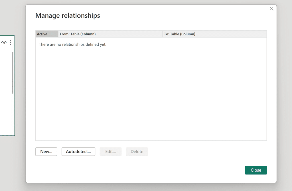
To create visuals with data from multiple tables, we need to create a relationship between the two data sources using a common field. First, switch your view from “Report View” to “Model View” using the navigation bar on the left hand side of your screen from earlier. Now in the “Model View” look for the “Manage Relationships” tile located on the home ribbon, between the “Queries” and “Calculations” tiles.
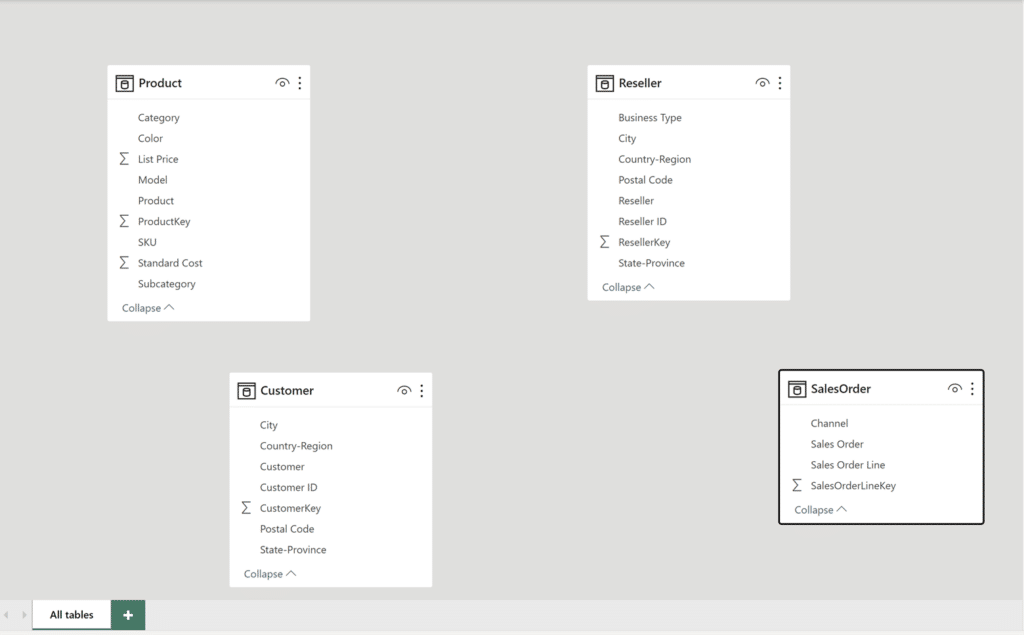
The ”Model View” provides a visual of what we discussed previously. All four tables exist in the same report but are not connected. Luckily, the Adventure Works sample file makes this easy because it has a common table to join all of these data tables.
Since we already have a common table, select Get Data and Excel Workbook again (or just click the Excel Workbook tile) and select the Adventure Works sample file again. Now we will only click on the Sales table, since we’re already connected to the rest of our tables. Hit Load to add this table into your report.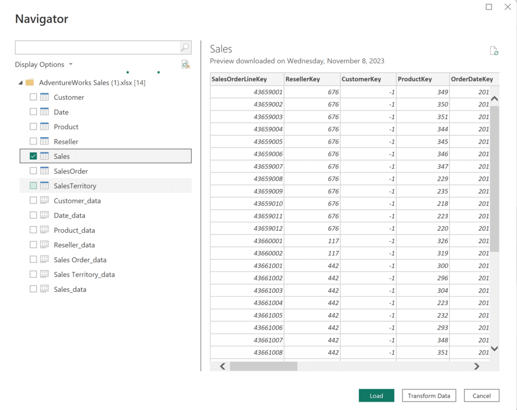
If you changed your view recently, click back on the “Model View” tab. Now you’ll notice a few lines all relating the Sales table to the Product, Customer, Reseller, and SalesOrder tables.
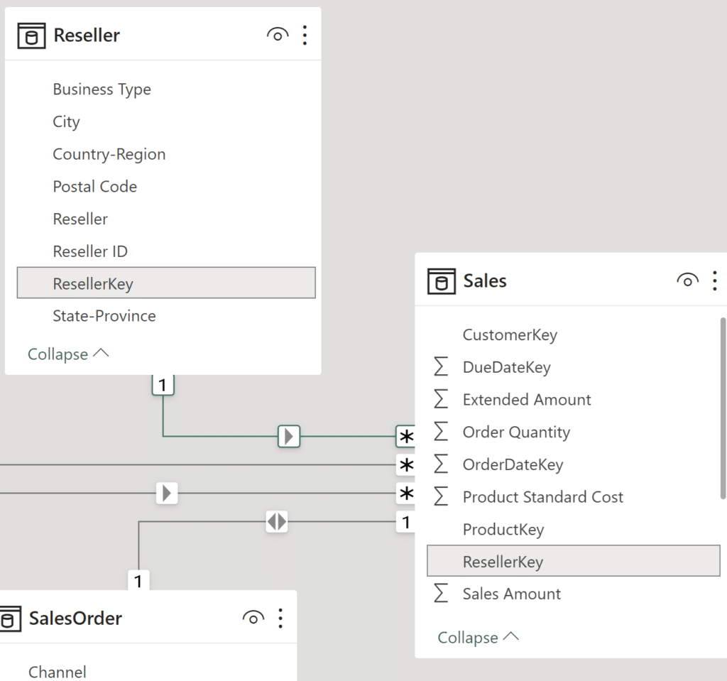
These lines represent the relationships between the tables. Hovering over any one of the lines will highlight the fields used in the relationship.
The icons at the ends of each line represent the different types of relationships. The different types of relationships define how the data tables are joined together. As you can see, the Product, Reseller, and Customer tables all have a one-to-many relationship with the Sales table, indicated by a “1” on each table connection, and the “*” at the Sales table. The SalesOrder table has a one-to-one relationship with the Sales table, indicated by the “1’s” on each table connection. In short, the “1” means that the column has unique values and the “*” means that the column can have duplicate values.
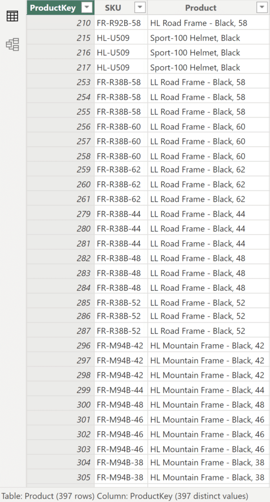
To help this make more sense, let’s discuss this in terms of the one-to-many relationship the Product table has with the Sales table. Their common field is the “Product Key” column. Open up the “Table View” and select the Product table. At the bottom, we’ll see the number of rows and distinct values in the Product table. We can see that there are 397 rows and 397 distinct values in the ProductKey column.
Now select the Sales table in the “Table View” window. Since this table is the common connector for the rest of the tables in the Adventure Works file, it is significantly larger.
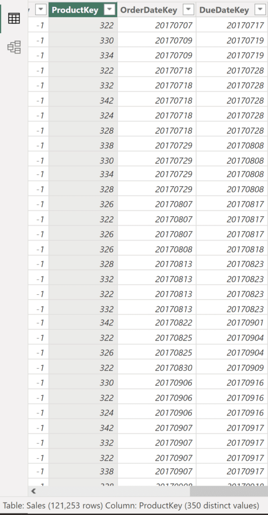
Scan the first few rows of the ProductKey column. Do you see any duplicate values? The same ProductKey will appear every time a product is sold. This example broadly summarizes how a one-to-many relationship works. For an example of a one-to-one relationship, open up the SalesOrder table and compare the number of rows to the Sales table. They should have the same number of rows, since each SalesOrderLineKey is unique.
Before we move on, an important thing to note is that Power BI automatically detected and created these relationships since they shared the same column names. Since our sample report is relatively small and there was a common table that connected all of our tables, Power BI’s automatic relationship detection and creation worked perfectly. In larger reports with a large number of tables, automatic detection likely won’t perform as well. To disable automatic detection and creation of relationships, click on File at the top left of your screen, click on Options and Settings, and select Options. Once the Options popup window appears, click on Data Load under the Current File options. In the Relationships section, deselect the third option, “Autodetect new relationships after data is loaded.”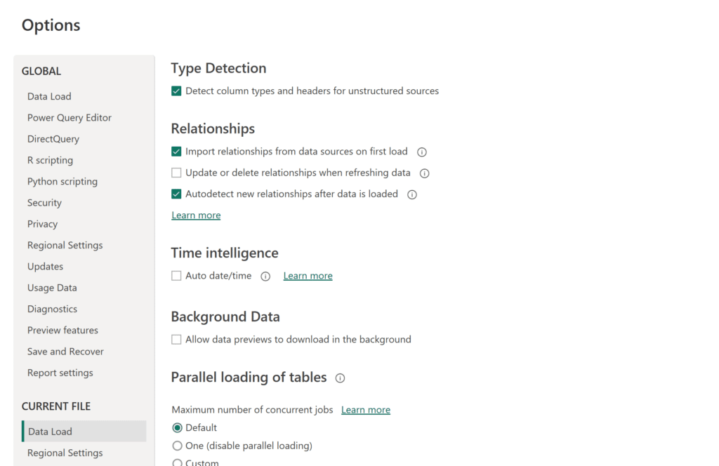
Before showing our completed visual, let’s quickly run through the steps to create a relationship between tables in Power BI Desktop.
Now in the “Model View” to establish a relationship, either click the “Manage relationships” tile, or click the three dots on the upper-righthand side of either table to expand your options and select “Manage relationships” from there. Once the “Manage relationships” window appears, click on New.
After clicking on New, the “Create Relationship” window automatically pops up.
In the “Create relationship” window, we will select the two tables that we want to relate. Use the scroll bar to select the two common fields and the Cardinality and Cross filter direction will populate automatically. Then hit OK to create this relationship. You can always edit this relationship after creating it by selecting on your created relationship and using the properties pane on the “Model View” page. While not necessary for this tutorial, it is important to know for future cases.
Now that we’ve established a relationship between our tables and covered some of the basics of creating relationships, you are free to build out visuals with fields from multiple tables as long as the tables are related!
To wrap up, let’s rebuild our example Filled map visual from earlier. After formatting/filtering and adding a Category Slider visual for some quick and useful functionality, here’s what we see: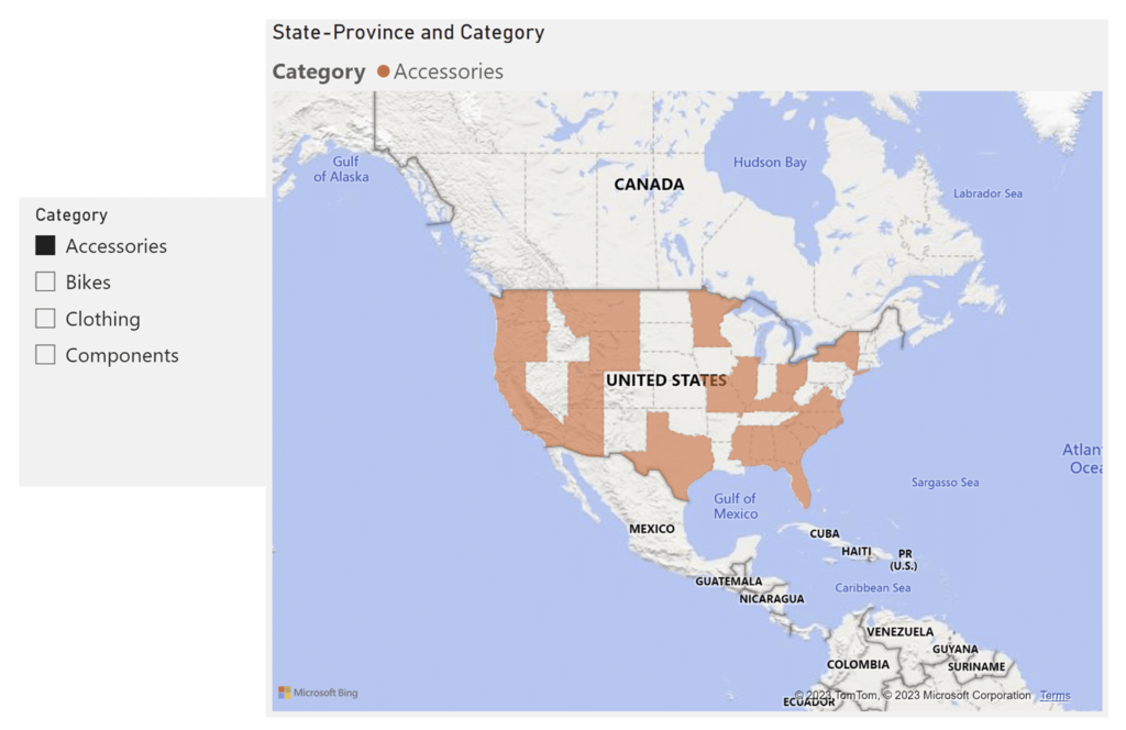
As always, thanks for reading!
Juan Carlos Guzman


Written By
Juan Carlos Guzman

Peer Review
Maddie Dierkes
Manager, Decision Science

Peer Review
Matt Snively
Sr. Manager, Analytics Engineering
Related Content
Beginner’s Guide to DAX in Power BI: Creating a Date Table
In the same way that you can’t bake a cake without flour, you can’t use Power BI Desktop without Data…
Matt Snively
Connect to an Excel workbook data source in Power BI Desktop In this video, you’ll learn how to connect to…
3 Ways to Make Magnificent Maps in Tableau

Maps are one of the most effective chart types in Tableau and are also among the easiest chart types to…