How to Make a Pareto Chart in Tableau 2.0

Pareto Charts are powerful, eye-catching visualizations that help illustrate your most significant dimension members. The 80/20 Pareto Principle states that roughly 20% of causes are responsible for 80% of outcomes. For a tutorial on the basics of Pareto Charts and visualizing the 80/20 Rule, check out the tutorial, 3 Ways to Make Powerful Pareto Charts in Tableau, from Playfair Data’s founder, Ryan Sleeper. When your data follows the 80/20 Rule closely, you can easily determine the 20% of causes responsible for 80% of outcomes. In an ideal world, this is always the case. But what if your data doesn’t follow the 80/20 Rule?
In this tutorial, I will show you how to create precise Pareto Charts when your data deviates from the 80/20 Rule. As a bonus, we’ll also cover an application of the 80/20 Rule, the 64/4 Rule, to further enhance the insights you can gain from a Pareto Chart. For this tutorial, we will be using the Sample – Superstore Dataset readily available in Tableau.
How to visualize the 80/20 rule in Tableau
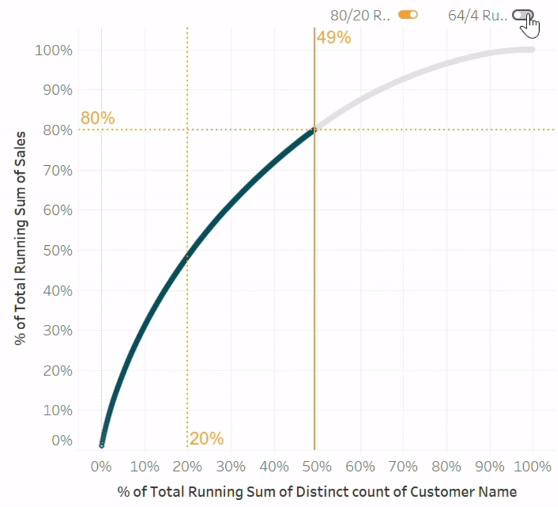
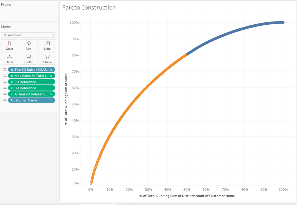
Different from a traditional Pareto chart, this version shows the percent of total running sum of outcomes on the y-axis, and the percent of total running sum of causes on the x-axis. In this example, we will analyze the Sales measure by the distinct count of Customer Name CNTD([Customer Name]) to determine what percent of our customers are responsible for 80% of sales.
![]()
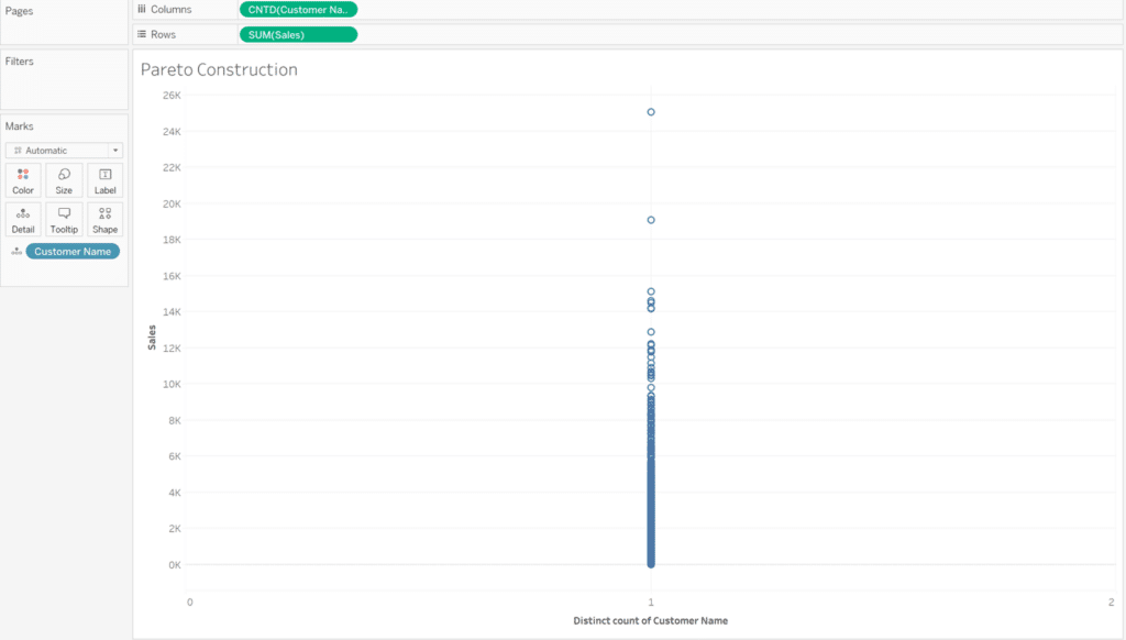
Begin by placing the measure you want to analyze the results for on the Rows Shelf (sum of Sales) and the measure that produces the results (count distinct of Customer Name) on the Columns Shelf. Convert the Customer Name dimension to the count distinct measure CNTD([Customer Name]) by right-clicking the Customer Name dimension as you drag it to the Columns Shelf, and choosing CNTD on the menu that pops up. As you will notice, CNTD([Customer Name]) combines every Customer Name into one single value. To show every individual Customer Name, drag Customer Name to the Detail property of the Marks card.
Continue reading with a free account, or login.
Unlock this tutorial and hundreds of other free visual analytics resources from our expert team.
Already have an account? Sign In
By continuing, you agree to our Terms of Use and Privacy Policy.
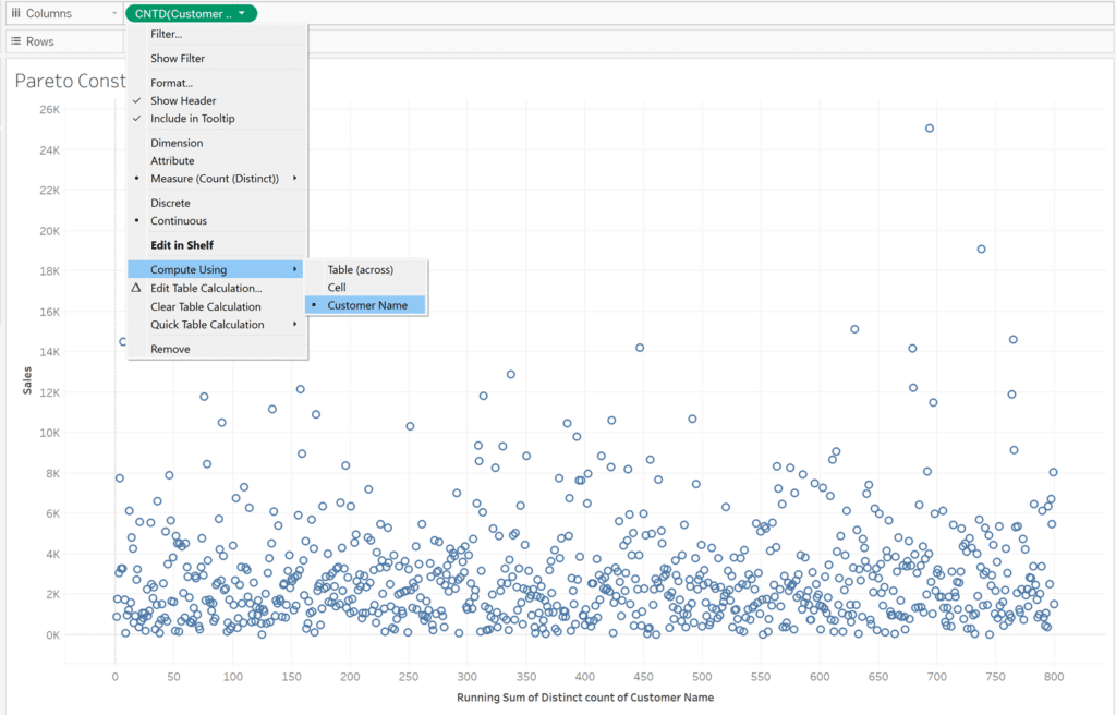
Next, we will add a Running Total table calculation to both measures in the view. To do so, right click the measure on the Columns shelf, hover over “Quick Table Calculation”, and select “Running Total”. To actually show a change, we have to change the addressing of the table calculation from the default addressing, Table (across), to Customer Name. To do this, right click on the pill in the Columns shelf containing the table calculation, hover over “Compute Using”, and choose the dimension being used.
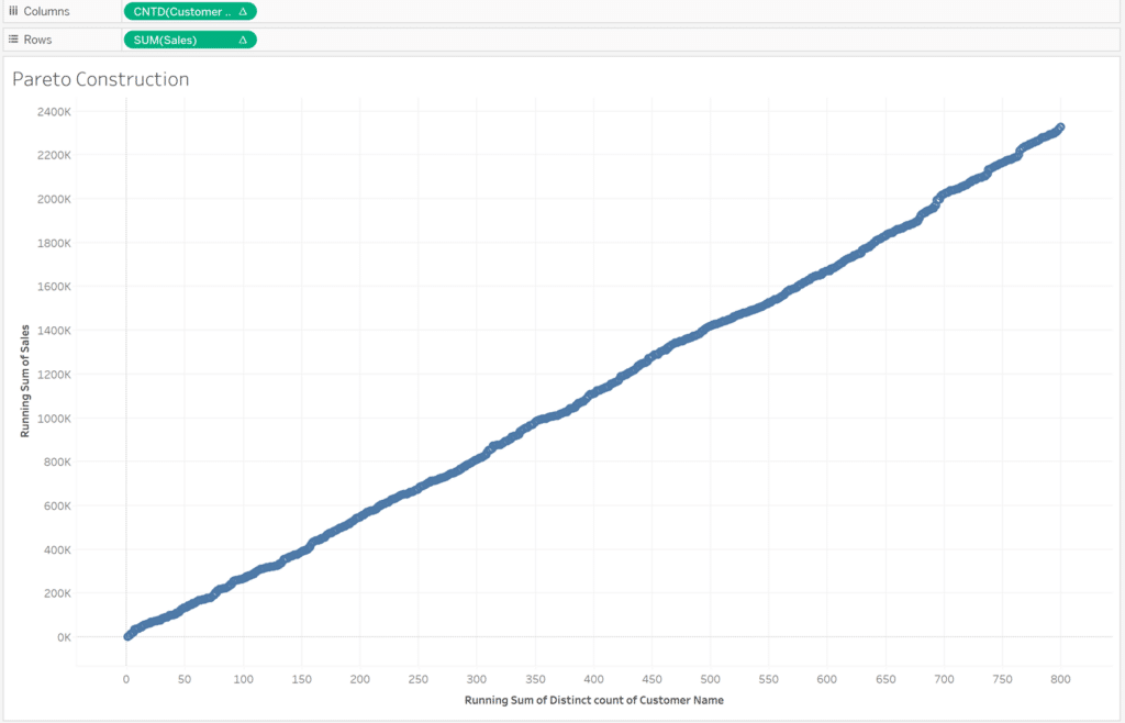
Repeat the same steps for the measure you placed on the Rows shelf. You should see something similar to this:
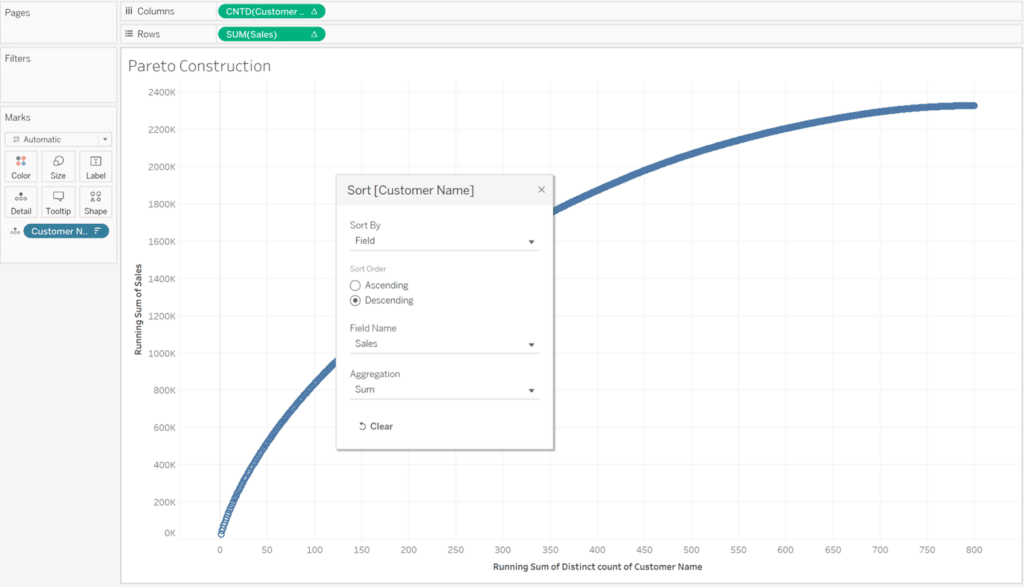
The current shape represents the running total of the dimension in the Columns shelf but it is not sorted. To give this chart the smooth curve we expect, right-click the dimension on the Detail property of the Marks card and select “Sort”. In the Sort By dropdown, select “Field”. Under the Field Name dialog that appears, select the dimension being evaluated in the Rows shelf, and change the Sort Order to Descending.
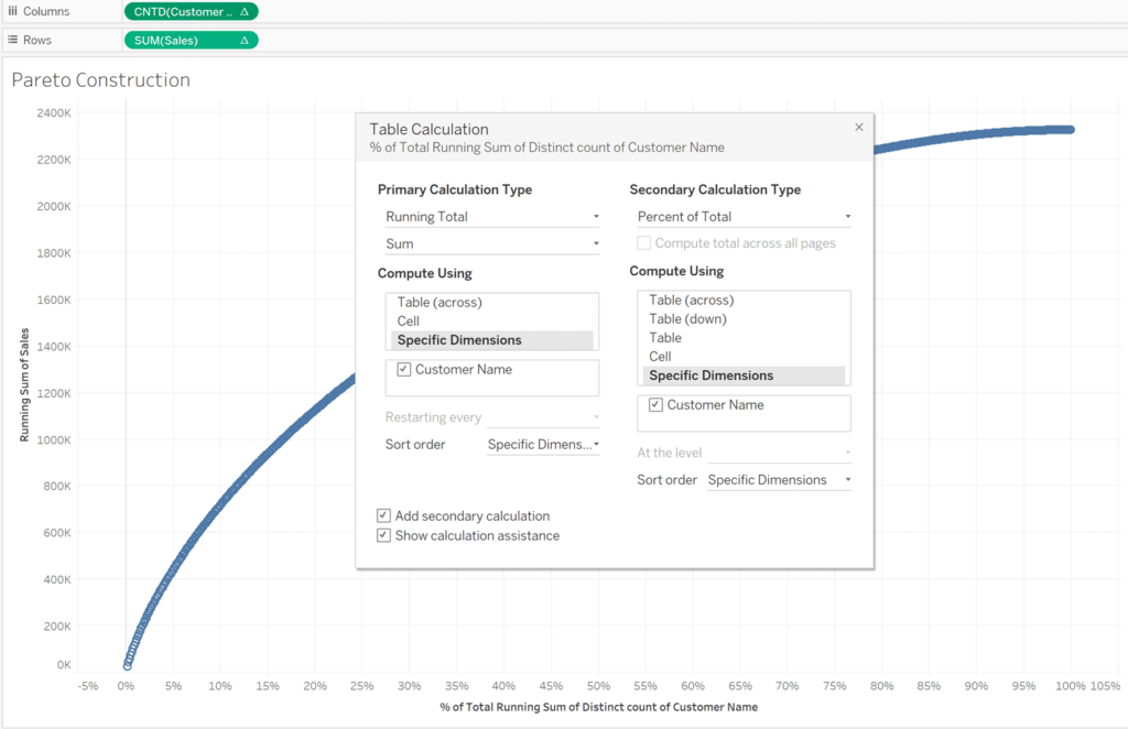
So far, our Pareto looks great! Since Running Total is our primary table calculation, we need to add “Percent of Total” as a secondary calculation to compute the percent of running total to change our axes from integers to running percentages of totals. Like before, right-click the measure in the Columns shelf, select “Edit Table Calculation”, check the “Add secondary calculation” box, and change the secondary calculation to “Percent of Total.” Make sure the “Compute Using” section in the secondary calculation matches the primary calculation. Repeat this step for the measures in the Columns shelf and Rows shelf. Now our axes display percentages of running totals.
This covers the basics of building a smooth Pareto curve in Tableau.
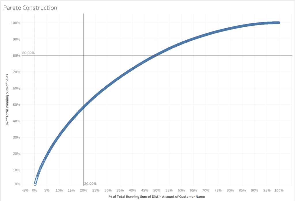
Next, we’ll add reference lines to start visualizing the 80/20 rule. Using the Analytics tab, drag Constant Line onto the view. When the “Add a Reference Line” prompt appears, drop one Constant Line onto CNTD(Customer Name) and set the value to 0.2, then drop a second Constant Line onto SUM(Sales) and set the value to 0.8. Now you have the 80/20 reference lines to test your data against the 80/20 Rule.
As you can see, our data does not model closely to the intersection of the two constant lines.
How can we determine the actual percentage of our customers/customer names that are responsible for 80% of our sales?
Before we continue, remove the two constant lines because we will be recreating them using a different method in the next section.
How to Make Pareto Charts in Tableau
Fitting the 80/20 Pareto principle to our data
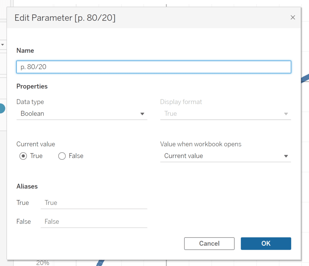
First, we want to create a Boolean parameter and set of calculated fields for the 80/20 Rule. This method will help us create reference lines that apply the Pareto Principle with more precision since our data doesn’t follow the 80/20 rule.
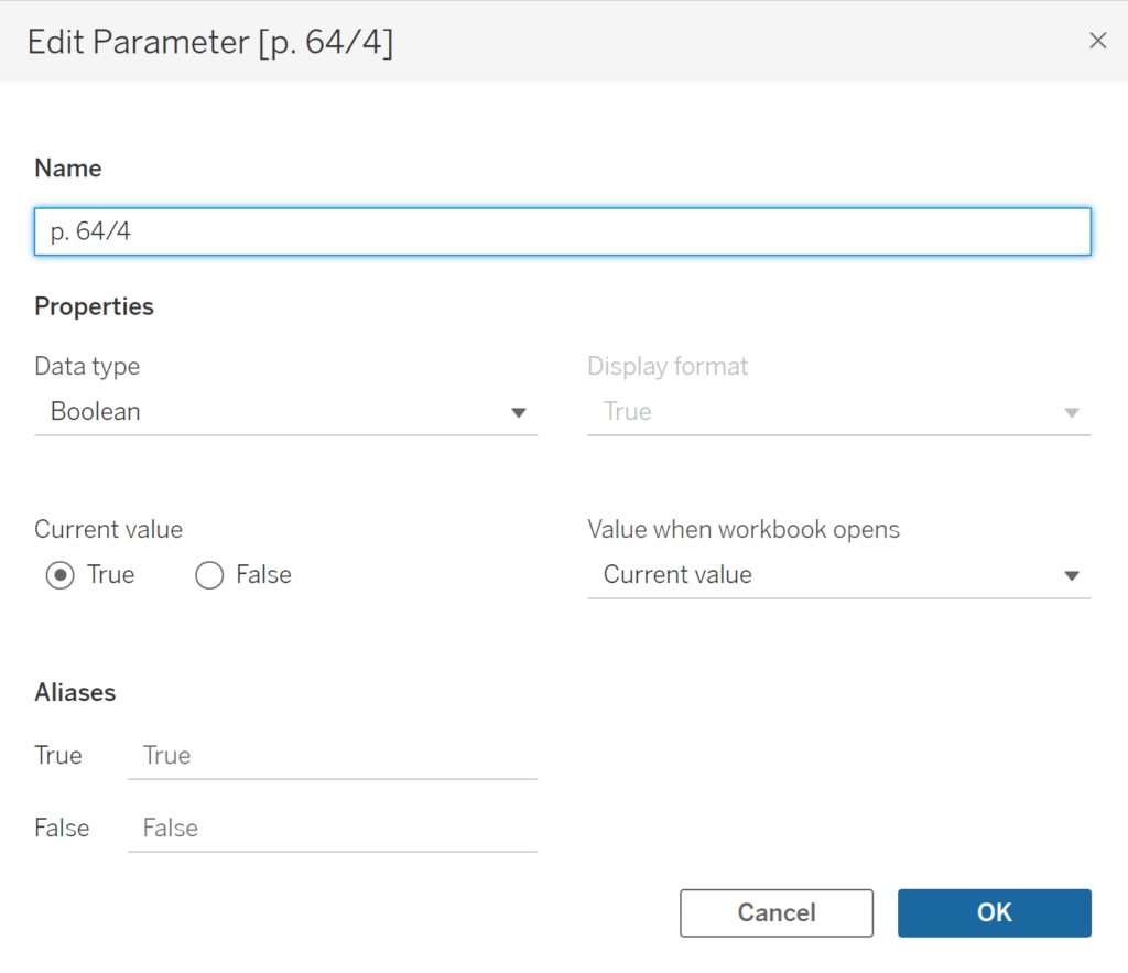
To create a parameter, click on the dropdown arrow by the search bar in the Data pane and select “Create Parameter”. Give it a name and change the Data type to Boolean.
Next, we’ll need two calculated fields with Immediate If statements (IIF) that reference our new Boolean parameter. These will become our 80% and 20% reference lines.
Create the two calculated fields by clicking the dropdown arrow and selecting, “Create Calculated Field”. IIF statements check whether a condition is met (in this case, the condition is the parameter, “p. 80/20” being selected), and return one value (0.8) if true, another value if false (NULL), and an optional third value or NULL if unknown. Use the following formula (replace “Condition” with your parameter and “Value 1” with 0.8):
IIF([condition], Value 1, NULL)
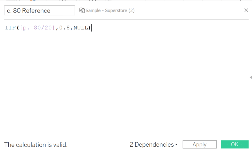
Repeat the same process for your second calculated field that represents the 20% reference line, replacing “Value 1” with “0.2”.
Before adding our reference lines, we need to create a few more calculated fields in order to successfully determine the actual percentage of Customers that represent 80% of our sales.
3 Ways to Make Powerful Pareto Charts in Tableau
For these next calculated fields, make sure to click “Default Table Calculation” in blue in the calculated field, and change the “Compute Using” dropdown to the dimension in the Columns shelf. This is a good habit to form to better understand how your table calculations work.
First, we’ll begin with a calc called “c. Top 80 Sales (80/20)”. Use the following formula replacing your key performance indicator, “KPI”, with your field of interest:
RUNNING_SUM(SUM([KPI])) <= SUM({FIXED: SUM([KPI])})*.8
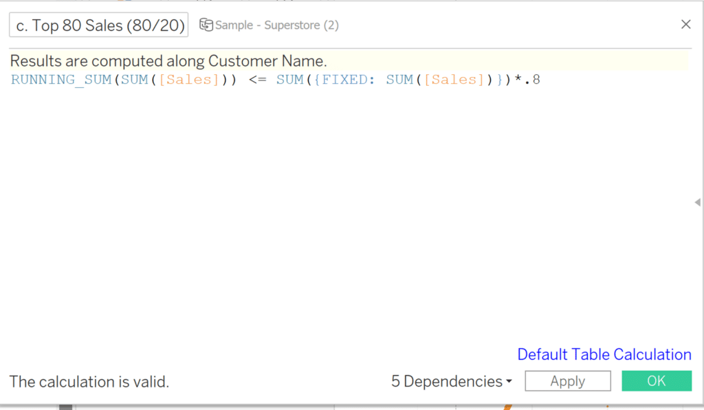
Place this calculated field on the Color property of the Marks card. This calculation returns true if the running sum of the sales per customer is less than or equal to 80% of the total sales. Now, right-click on the calculated field on Color, hover over “Compute Using”, and choose the dimension you are evaluating.
Next, we’ll create a field to count all of the sales where our previous calculation, “c. Top 80 Sales (80/20)” returned true, and divide that by the total number of Customer Name/Customers. Replace “KPI” with the calculated field from the previous step, and replace “Dimension” with the dimension you wish to divide the previous calc by. This calculated field follows the formula below:
RUNNING_SUM(IIF([KPI], 1, 0)) / SUM({FIXED: COUNTD([Dimension])})
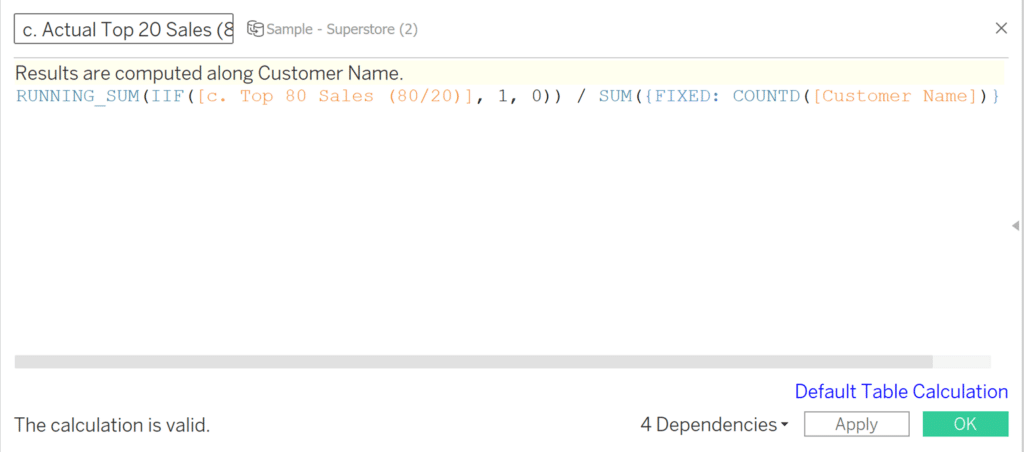
The calculation we just created, “c. Actual Top 20 Sales (80/20)” will stay on the sidelines, but we will need it for our next calculation which will be added into the view. Our next calculation is a window calculation on the previous calculation, c. Actual Top 20 Sales (80/20). Replace “KPI” with the calculated field we created in the previous step. It follows the formula:
WINDOW_MAX([KPI])
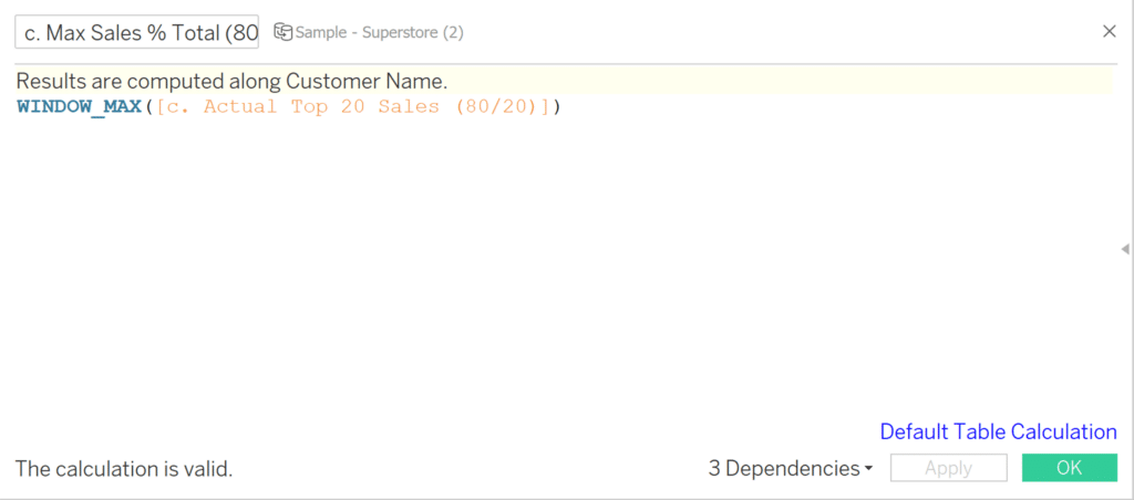
Add this calculation, “c. Max Sales % Total (80/20)” to the Detail property of the Marks card.
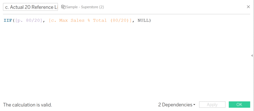
Our final calculation will be the actual percentage of customers that are responsible for 80% of sales. Replace “Condition” with the parameter we created in the first step, and replace “KPI” with the calculated field we created above. The formula is:
IIF([condition], [KPI], NULL)
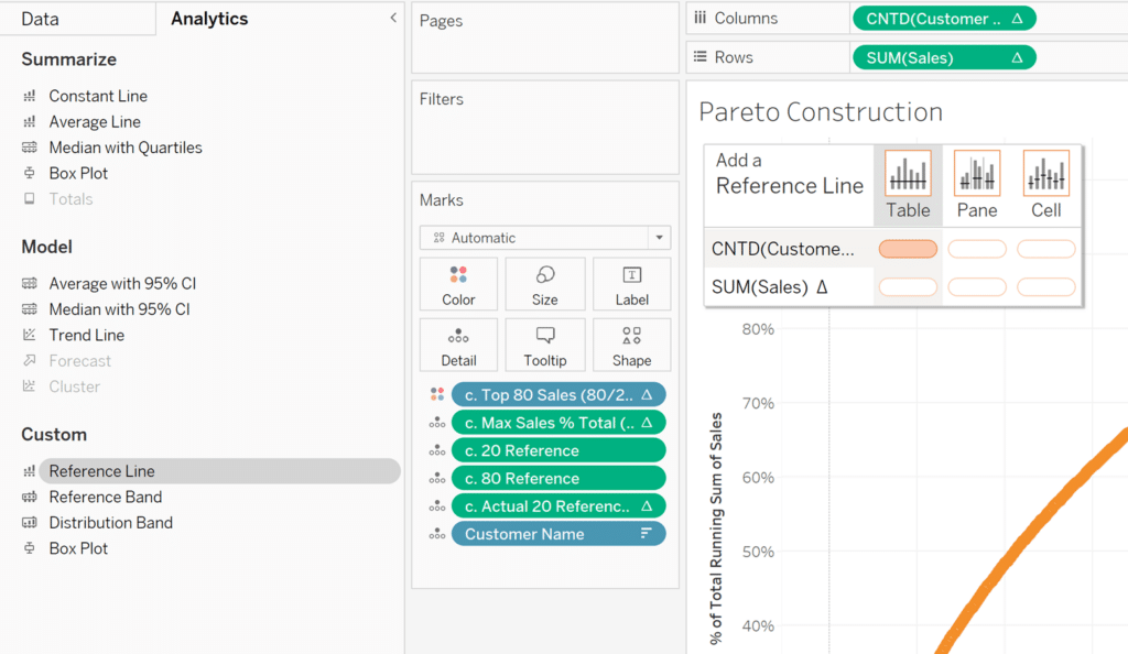
Before we open up the Analytics pane, move the reference lines for 20% and 80% into the Detail property of the Marks card, converting them from a measure to a dimension by right-clicking and selecting “Dimension”. We will also drag the “Actual 20 Reference Line (80/20)” calculation into the Detail property of the Marks card. The “Max Sales % Total (80/20)” calculation should already be on the Detail property, so now you should see something similar to this:
Analytics pane: Applying our actual 80/20 reference lines
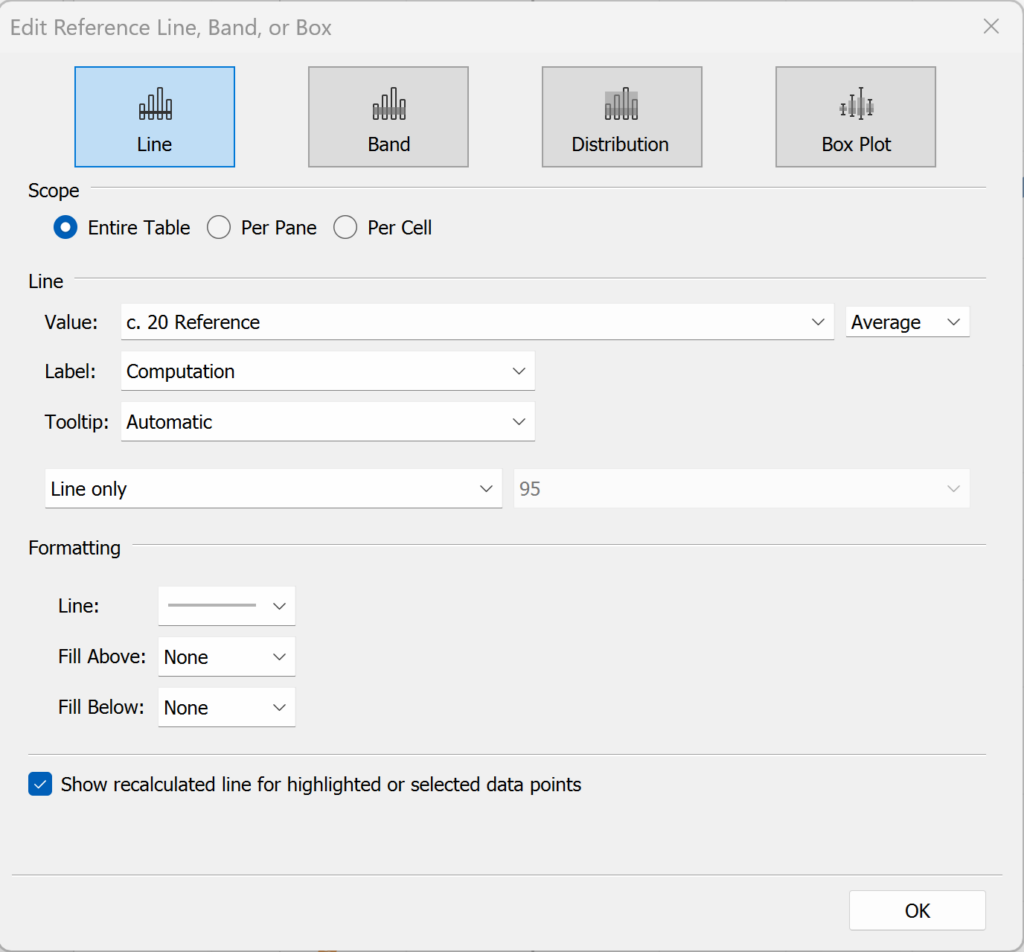
Navigate to the Analytics pane and click on “Reference Line”. Drag the Reference Line onto the sheet, where a dialog will pop up allowing you to select an axis for the Reference Line.
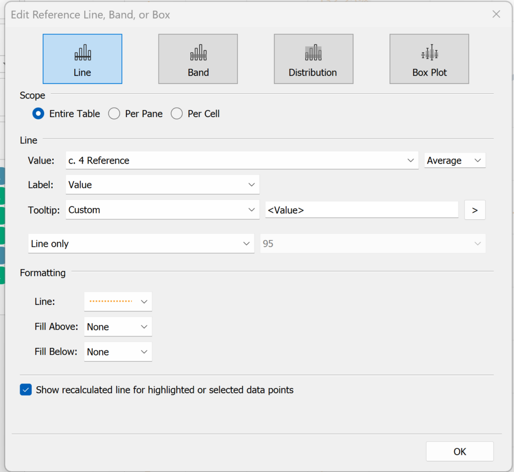
Once you drop it here, the Reference Line window will pop up, allowing you to edit. In the “Line” section, change the “Value” dropdown to the first Reference Line calculated field (c. 20 Reference).
Repeat this process for the y-axis Reference Line, dropping “c. 80 Reference” on SUM(Sales). We have replicated the same process from earlier using Reference Lines instead of Constant Lines. To add our Actual 20 reference line, we will repeat the same process.
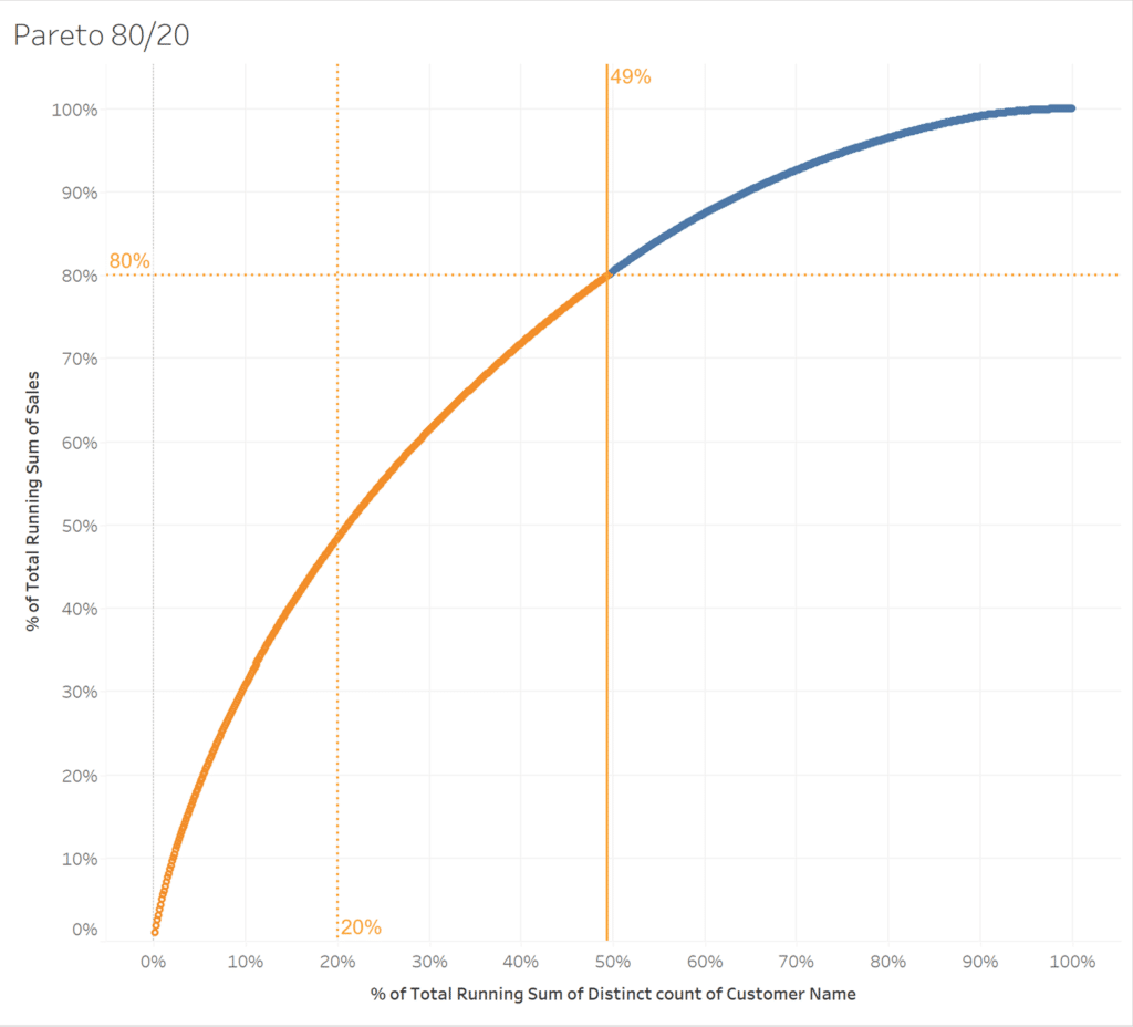
This shows us that our data follows closely to an 80/50 rule instead of the 80/20 rule. In other words, 80% of our sales came from just under 50% of our Customers/dimension members.
Pareto chart principle in Tableau: 64/4 rule
Applying the 80/20 Rule to itself results in the “64/4 Rule”, which tells us that roughly 4% (20% x 20%) of our causes are responsible for 64% (80% x 80%) of our outcomes. The 64/4 Rule helps you learn that an even smaller percentage of your causes can be responsible for a majority of your outcomes.
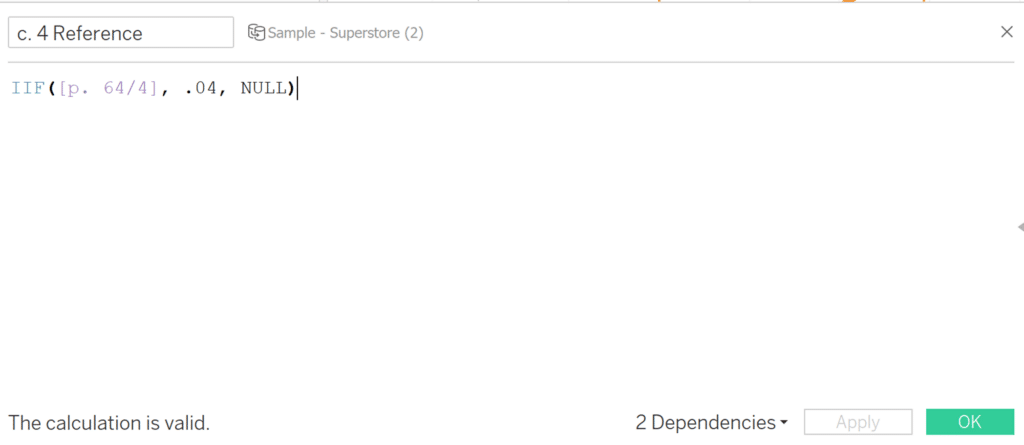
To use the 64/4 Rule, repeat the above steps and calculations starting at the “Fitting Pareto Principle to our Data section”, replacing 80 and 20 with 64 and 4, respectively. Below are screenshots of the parameter and calculated fields created.
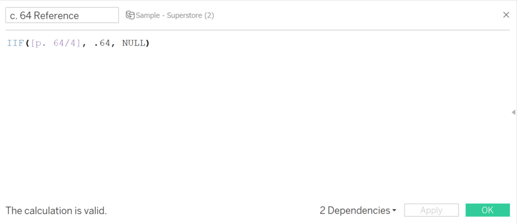
Remember, when creating the 4% reference line, use a value of 0.04 instead of 0.4, which would give you 40%.
Now that our reference lines are created, we will create our calculated fields, beginning with a calculation called “Top 64 Sales (64/4)”. Use the following formula to replace your key performance indicator, “KPI”, with your field of interest:
RUNNING_SUM(SUM([KPI])) <= SUM({FIXED: SUM([KPI])})*.64
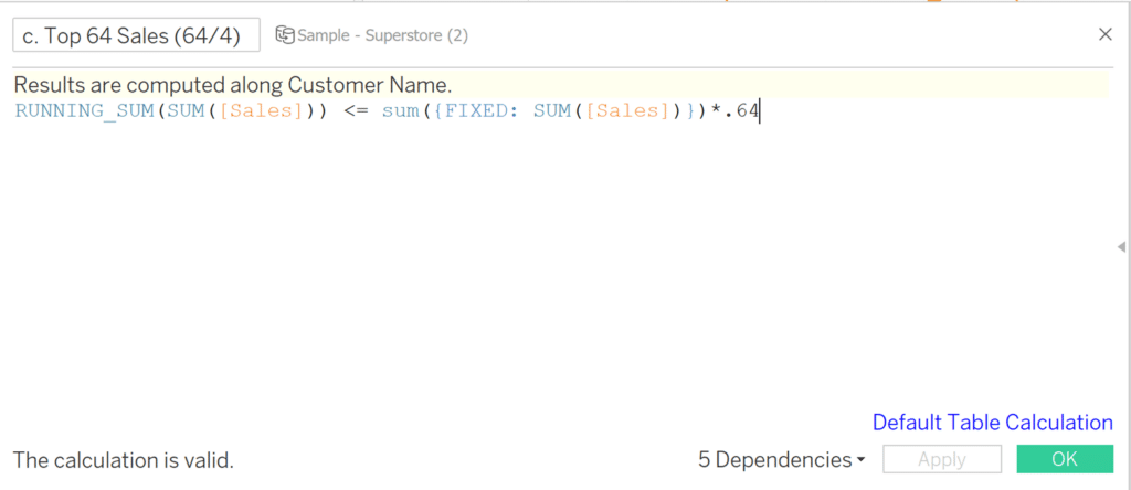
Place this calculated field on the Color property of the Marks card. Now, right-click on the calculated field on Color, hover over “Compute Using”, and choose the dimension you are evaluating.
![]()
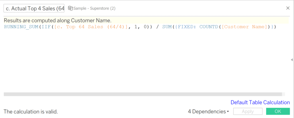
Next, we’ll create a field to count all of the sales where our previous calculation, “c. Top 64 Sales (64/4)” returned true, and divide that by the total number of Customer Name/Customers. Replace “KPI” with the calculated field from the previous step, and replace “Dimension” with the dimension you wish to divide the previous calc by. This calculated field follows the formula below:
RUNNING_SUM(IIF([KPI], 1, 0)) / SUM({FIXED: COUNTD([Dimension])})
The next calculation is a window calculation on the previous calculation, c. Actual Top 4 Sales (64/4). Replace “KPI” with the calculated field we created in the previous step. It follows the formula:
WINDOW_MAX([KPI])

Now add the “c. Max Sales % Total (64/4)” calculation to the Detail property of the Marks card.
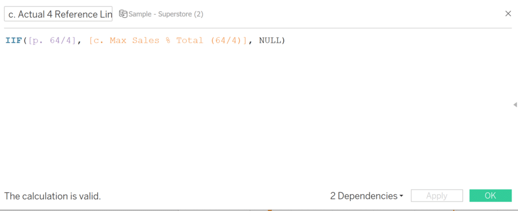
Our last calculated field will tell us the actual percentage of customers that make up 64% of our sales. Replace “Condition” with the parameter we created in the first step, and replace “KPI” with the calculated field we created above. The formula is:
IIF([condition], [KPI], NULL)
Just like the steps from the 80/20 Principle, move the reference lines for 4% and 64% into the Detail property of the Marks card, converting them from a measure to a dimension by right-clicking and selecting “Dimension”. We will also drag the “Max Sales % Total (64/4)” and the “Actual 4 Reference Line (64/4)” calculations into the Detail property of the Marks card. You should see something similar to this:
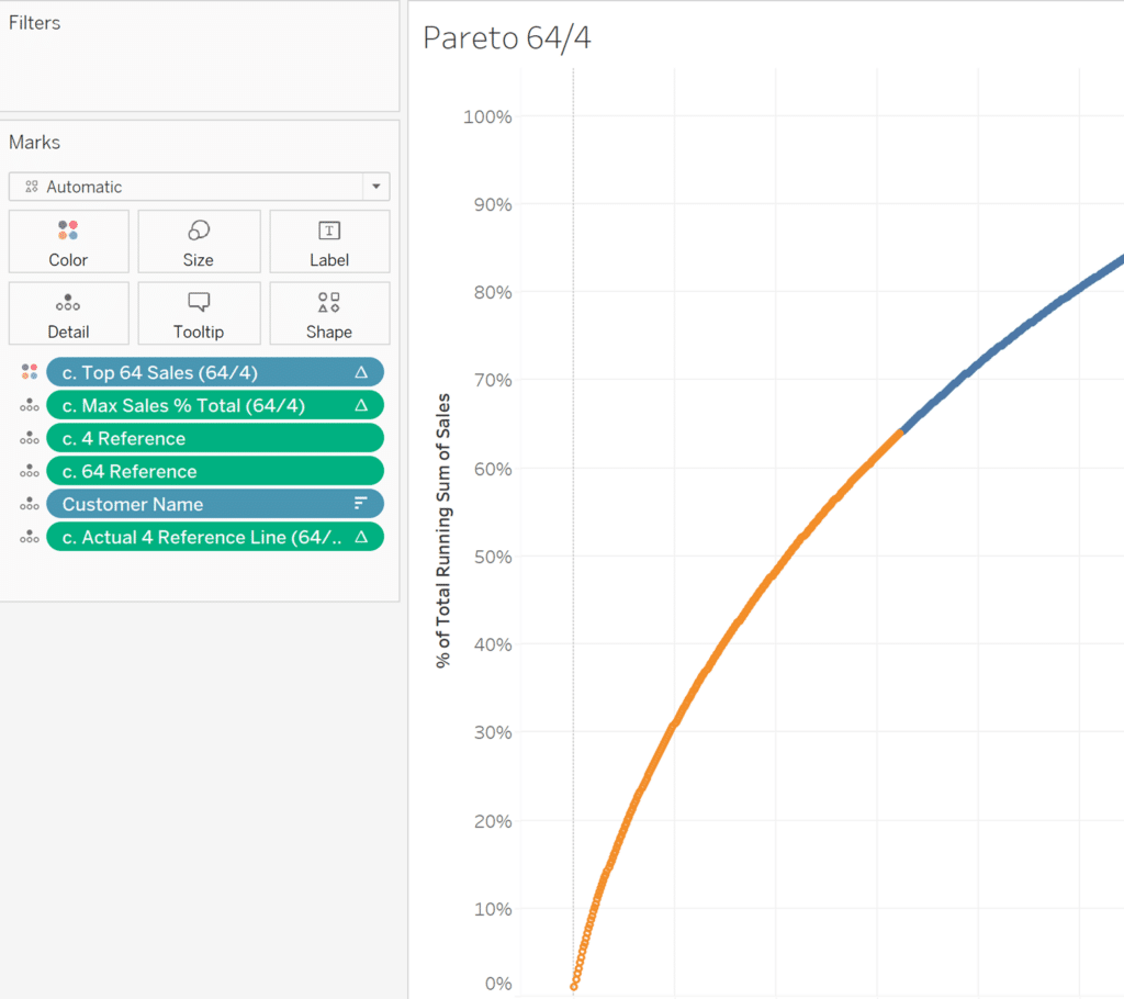
Applying our actual 64/4 reference lines
Following the same process as applying our 80/20 reference lines, navigate to the Analytics pane and click on “Reference Line”. Drag the Reference Line onto the sheet, where a dialog will pop up allowing you to select an axis for the Reference Line.
Once you drop it here, the Reference Line window will pop up, allowing you to edit. In the “Line” section, change the “Value” dropdown to the first Reference Line calculated field (c. 4 Reference).
Repeat this process for the y-axis Reference Line and our Actual 64 reference line.
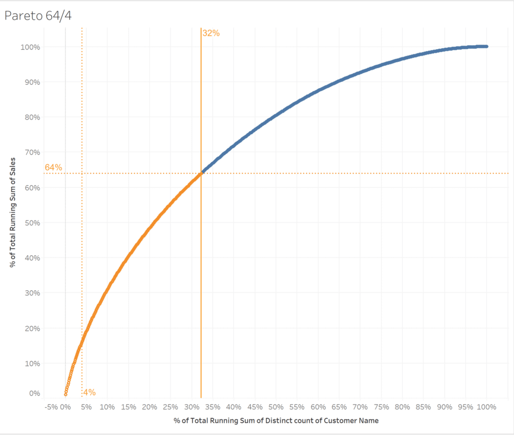
This shows us that our data follows closely to a 64/33 rule instead of the 64/4 rule. In other words, 64% of our sales came from just under 33% of our Customers/dimension members.
Conclusion of Pareto charts in Tableau
With this ability to create visualizations by customizing Pareto Principles, we can take a closer look at our data and discover key causes and outcomes that will help us make more educated business decisions!
Thanks for reading,
Juan Carlos Guzman


Written By
Juan Carlos Guzman

Peer Review
Ethan Lang
Director, Analytics Engineering

Peer Review
Megan Spengler
Manager, Decision Intelligence
Related Content
The Beginner’s Guide to Tableau Table Calculations

Tableau table calculations, while very powerful, can be both tricky and confusing to work with. There are some great benefits…
Ethan Lang
Benchmarking, Modeling, Forecasting, and More In this live webinar on the Analytics pane in Tableau, join Ethan as he does…
3 Ways to Make Powerful Pareto Charts in Tableau

Pareto charts in Tableau – named for the Pareto principle inspired by Italian economist, Vilfredo Pareto – help visualize the…