3 Ways to Make Powerful Pareto Charts in Tableau

Pareto charts in Tableau – named for the Pareto principle inspired by Italian economist, Vilfredo Pareto – help visualize the dimension members causing the biggest impact. What better way to move the needle than to focus your efforts on the 20% of your business causing 80% of the results?
This tutorial will show you how to make a traditional Pareto chart in Tableau and three ways to make them even more impactful. We’ll cover how to: (1) visualize the 80/20 rule by converting axes into percent of total calculations, (2) isolate the best-performing segment for further analysis, and (3) export the best-performing segment for use in real-world applications.
Watch the related video with Playfair+
By the end of this post, you will be able to make the following:
How to make a traditional Pareto chart in Tableau
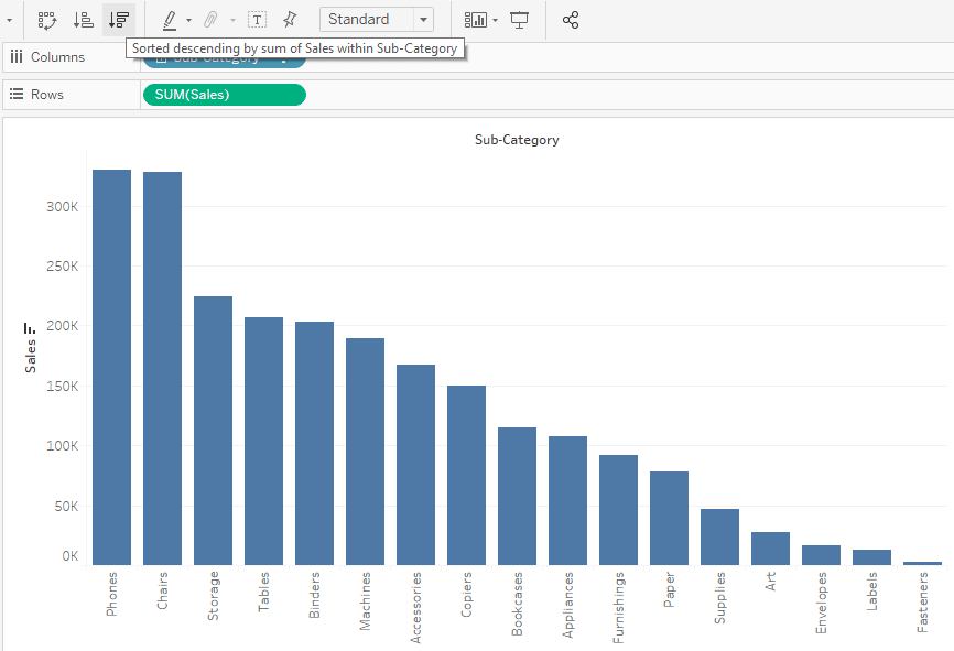
Traditional Pareto charts in Tableau use a combination of sorted bars and a dual axis displaying the percent of running total for the measure being analyzed. For the first example, we’ll evaluate the Sales measure by the Sub-Category dimension in the Sample – Superstore dataset that comes with every download of Tableau Desktop.
![]()
To start, place the Sales measure on the Rows Shelf, the Sub-Category dimension on the Columns Shelf, and click the Sort Descending button in the top tool ribbon.
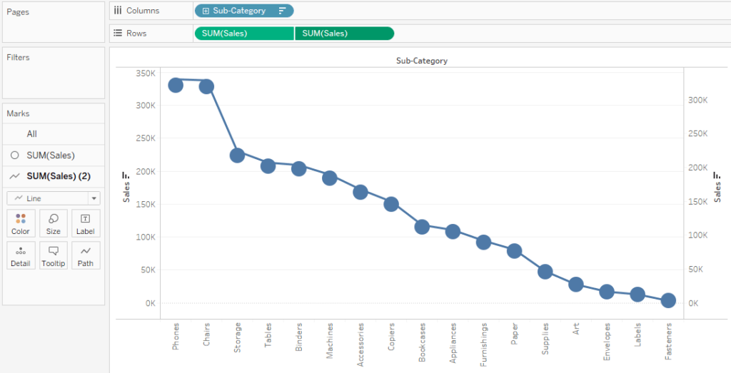
Next, place the measure being evaluated (sum of Sales, in this case) onto the Rows Shelf a second time, change the mark type to Line by changing the mark type dropdown on the third Marks Shelf, and convert the chart into a dual-axis combination chart by clicking the second SUM(Sales) pill on the Rows Shelf and selecting “Dual Axis”.
Continue reading with a free account, or login.
Unlock this tutorial and hundreds of other free visual analytics resources from our expert team.
Already have an account? Sign In
By continuing, you agree to our Terms of Use and Privacy Policy.
Tableau has automatically changed the mark type of the marks on the first axis to Circle. To create a traditional Pareto chart in Tableau with a combination of bars and lines, we need to click the second Marks Shelf (the one controlling the marks on the first axis) and change the mark type dropdown back to Bar.
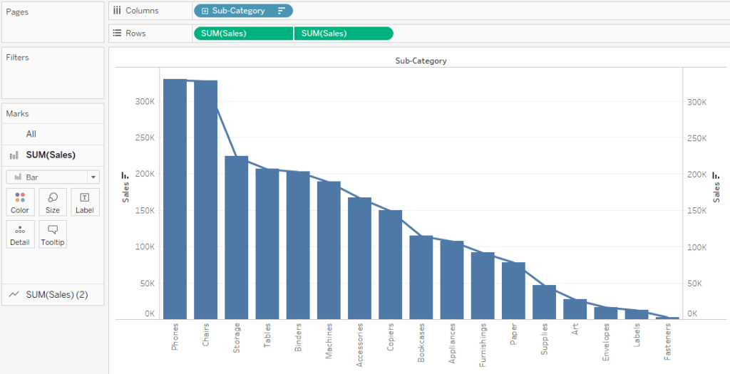
Next, add a quick table calculation to the second axis by right-clicking on the second pill on the Rows Shelf, hover over “Quick Table Calculation”, and choose “Running Total”.
The Beginner’s Guide to Tableau Table Calculations
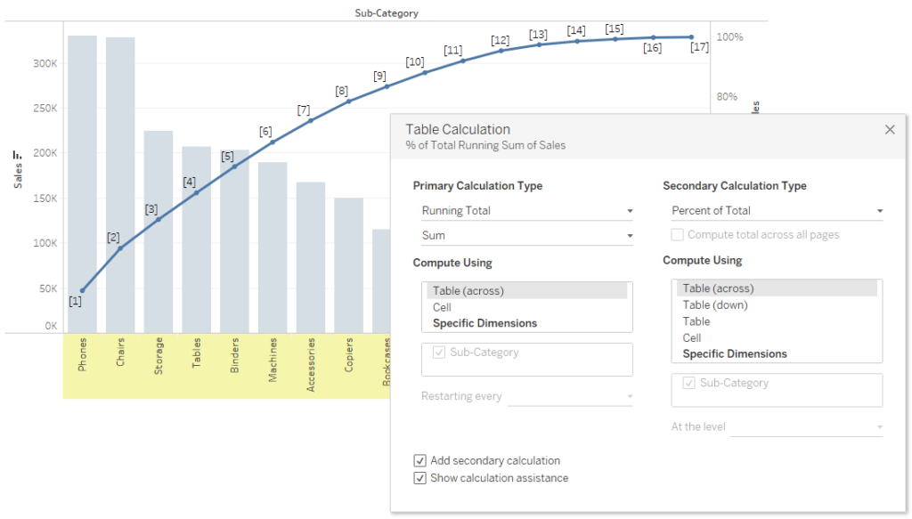
Running Total and Moving Average table calculations are unique in Tableau in that you can add a secondary table calculation – or a table calculation of a table calculation, if you will. To convert the right axis, which is currently showing us a running sum of sales in dollars, to a percent of running total, right-click on the second pill on the Rows Shelf (the one with the table calculation being applied) and choose “Edit Table Calculation”.
This will open a dialog where you can choose to add a secondary table calculation by checking the box next to “Add secondary calculation”. Here are the settings after following these steps and choosing Running Total as the secondary table calculation.
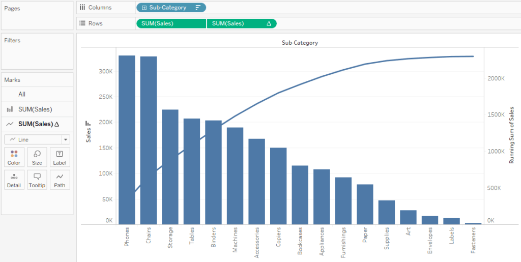
After clicking the “X” button in the top-right corner of the dialog, you are left with a traditional Pareto chart in Tableau showing you sales on the left axis with bars sorted in descending order and running percent of total sales on the right axis with a mark type of Line. Here is how my final example looks after some formatting updates including colors.
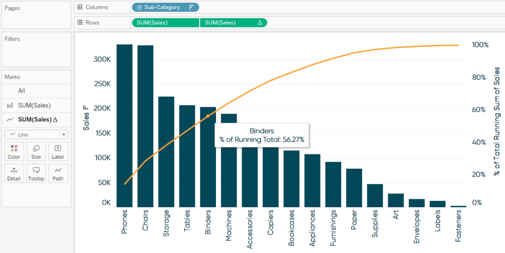
By hovering over Binders, this visualization is telling me that the top five sub-categories in the Sample – Superstore business are providing 56.27% of all gross sales.
How to visualize the 80/20 rule in Tableau
In the first example, we did not reach the 80% of sales mark until somewhere between the Copiers and Bookcases sub-categories, which were the eighth and ninth out of seventeen sub-categories, respectively. In other words, this turned out to be more like the 80/50 rule instead of the 80/20 rule, where 80% of our sales came from 50% of our dimension members.
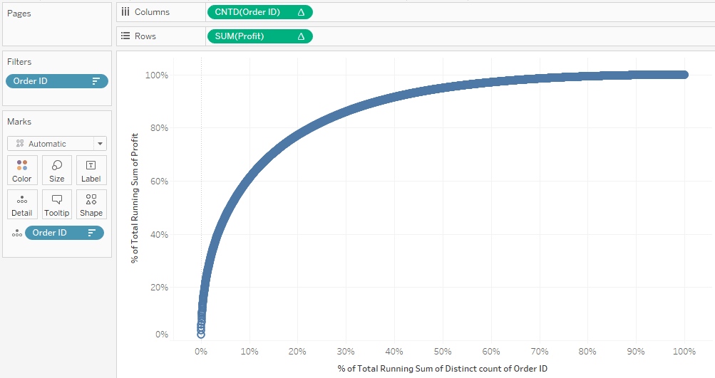
For a more powerful and precise Tableau Pareto chart, we will build a version that tracks the percent of running total of results on the y-axis by the percent of running total of causes on the x-axis. For this example, I will analyze the Profit measure by COUNTD([Order ID]) to find out what percent of my orders are generating 80% of the profit.
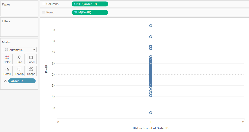
To begin, place the measure you want to analyze the results for (sum of Profit, in this case) on the Rows Shelf and the measure that is generating the results (count distinct of Order ID, in this case) on the Columns Shelf. The easiest way to convert the dimension of Order ID to the measure of COUNTD([Order ID]) is to right-click while you drag the Order ID dimension to the Columns Shelf, then choose “CNTD” on the dialog that appears.
Since we need all causes accounted for in the analysis, we will also need to add every dimension member we want to analyze to the view somehow. Right now, CNTD([Order ID]) is consolidating every Order ID into a single value of 5,009 on the x-axis. To ensure each individual Order ID is on the view and can be computed, drag the Order ID dimension to the Detail Marks Card. Here is the foundation of my “80/20 Pareto” chart.
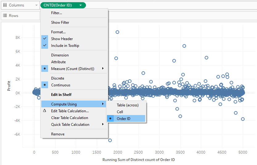
As with the traditional Tableau Pareto chart, the next step is to add a Running Total table calculation, but this time we will add the table calculation to both measures being used on the view. For the first, right-click on the measure on the Columns Shelf, hover over “Quick Table Calculation”, and choose “Running Total”. At first, you will not see anything other than the axis title change. That is because we must change the addressing of the table calculation from the default, Table (across), to Order ID. To change the addressing, right-click on the pill containing the table calculation, hover over “Compute Using”, and choose the dimension being used (Order ID, in this case).
Follow these same steps for the measure on the Rows Shelf – add a quick table calculation of Running Total and ensure the addressing is changed to Order ID. After doing so, you should see the following coming together:
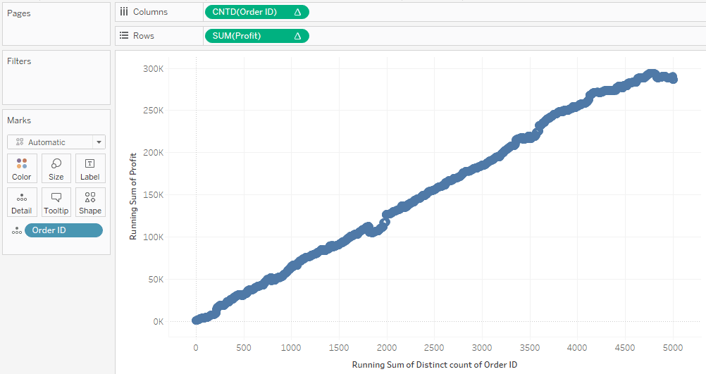
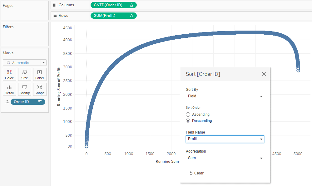
This is headed in the right direction, but we don’t see the nice smooth curve we would expect to see with a Tableau Pareto chart. This is because while every Order ID is accounted for in the view and we are seeing their collective running total from left to right, they are not sorted from the best-performing orders to the worst-performing orders. To re-sort the dimension members, right-click on the dimension on the Detail Marks Card and choose “Sort”. After updating the settings in the dialog to sort the IDs by the measure we are evaluating in descending order, we see the smooth curve come into shape.
At this point, both axes are showing us integers, but we want them to display running percent of totals. Again, because we have used Running Total as our primary table calculation, we can add a secondary table calculation of “Percent of Total” to compute a percent of running total. As with our first example, this can be accomplished by right-clicking a measure with a table calculation being applied to it, choosing “Edit Table Calculation”, checking the “Add secondary calculation” box at the bottom of the dialog, and changing the secondary calculation to “Percent of Total”.
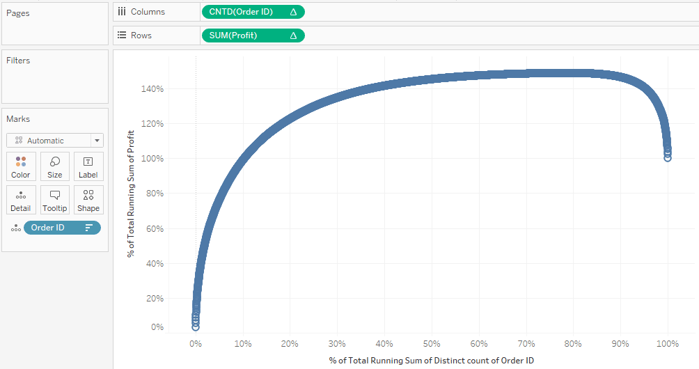
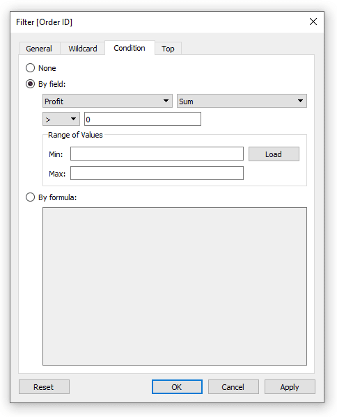
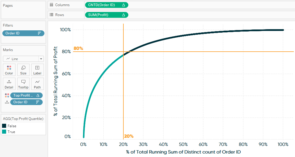
We now see percentages of running totals for our results on the y-axis and percentages of running totals for our causes on the x-axis. Note on the x-axis, we end up at 100% from left to right, but our scale goes from 0 to 140% on our y-axis. Since some orders have negative profits, our running total first pushes above 100% before the negative results bring the curve back to end up at 100%. To focus on profitable orders only, I will drag the Order ID field to the Filters Shelf, click the Condition tab, and set the following rule:
After adding this filter, we see both percent of running total scales going from zero to 100%.
Lastly, to show the audience the intersection of 20% of causes and 80% of results, I will add a constant reference line to each axis. The easiest way to do this is to click the Analytics tab on the left side of the Authoring interface and drag Constant Line onto the view.
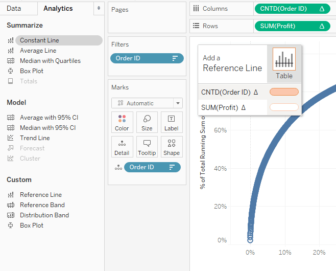
After dropping the Constant Line onto one of the two axis options, a dialog will appear where you can enter a value. For the x-axis, enter a value of .2, which is the same thing as 20%. Repeat this step for the y-axis and enter .8, which is the same thing as 80%. Here is my final 80-20 Pareto in Tableau after adding these reference lines and making format updates.
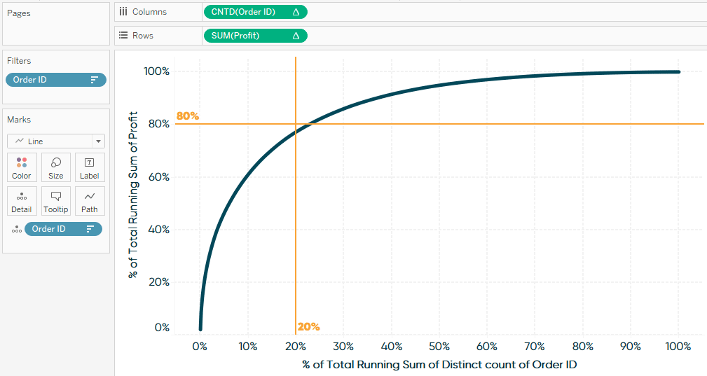
This visualization is showing us that the orders in the Sample – Superstore dataset are indeed following very close to the 80/20 rule, where just over 20% of orders provided 80% of total profit!
How to isolate the top performing quantile in a Tableau Pareto chart
If I can impact roughly 80% of my business’ performance by focusing on just 20% of the causes, the next thing I want to do is isolate that top-performing segment for further analysis. What are they buying? Where do they live? How did they hear about us so we can create more customers like them?
To classify dimension members as being in the top quantile (20%) for your key performance indicator, create a calculated field and use the following formula (replace “KPI” with your own field):
SUM([KPI]) >= WINDOW_PERCENTILE(SUM([KPI]),.8)
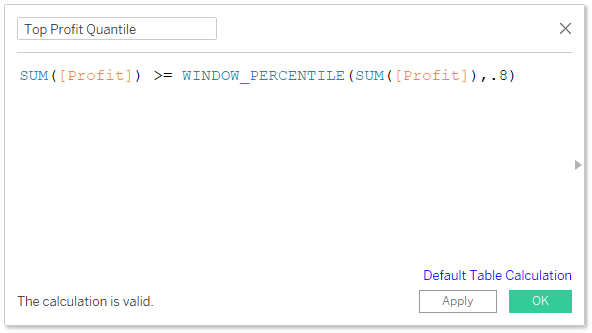
Next, place this field onto the Color Marks Card. This calculation contains a table calculation of WINOW_PERCENTILE so, by default, it will compute from left to right and classify every dimension member as “True”. To get the desired effect, right-click on the calculated field just added to the Color Marks Card, hover over “Compute Using”, and choose the dimension you are evaluating (Order ID, in my case).
To precisely isolate our top 20% of orders, we can filter the view to only Order IDs classified as True by right-clicking True in the color legend, then choosing “Keep Only” on the dialog that appears. Then, click CTRL + A to select all the marks on the view, hover over any of the marks, and click the Venn diagram icon to create a set.
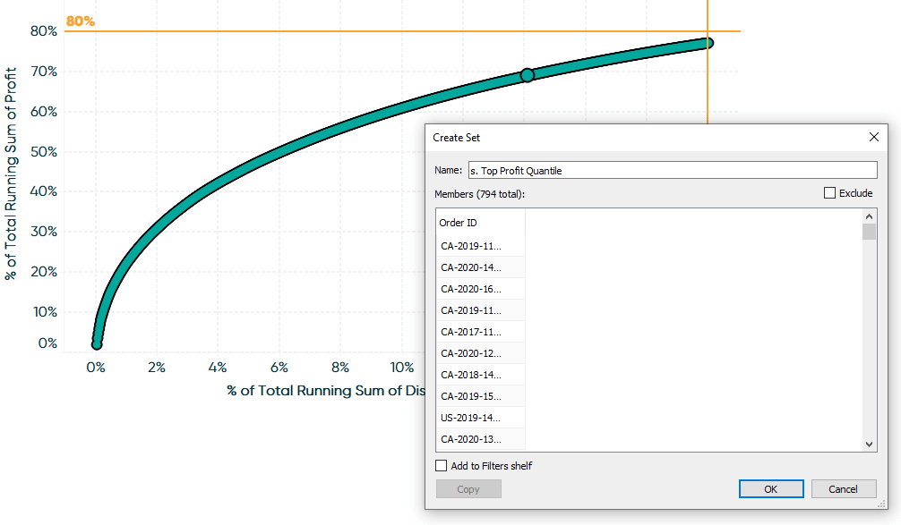
We have just captured our top 20% of orders as a set and can use this set in other views to analyze customer behavior! See our video on Playfair+ for several ideas on using Tableau sets to analyze segments.
How to export the top performing segment for further action
One of the many ways to utilize the set created in the previous section is to create a data table with information about your top-performing segment, add the newly created top quantile set to the Filters Shelf to keep only the dimension members in the set, and then export the table as an Excel file that can be used in other applications.
![]()
Here is an example where I have created a crosstab containing Order ID, Customer Name, and their location. I have also added their sum of profit performance, a measure that calculates their rank with the formula RANK(SUM([Profit])), and sorted the table in descending order. Don’t forget to add the Top Quantile set to the Filters Shelf!
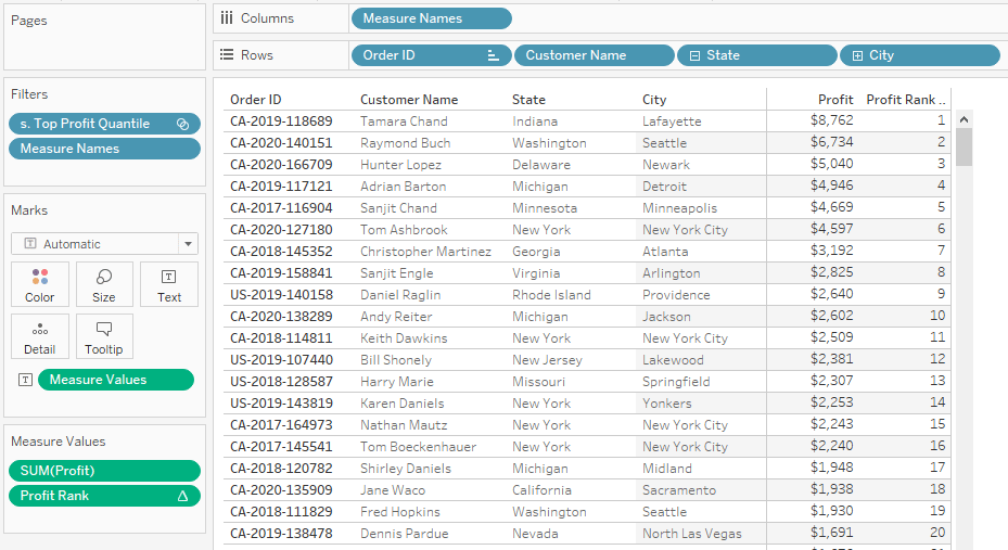
With this table created, one of the ways you can export it straight to Excel is to click Worksheet in the top menu, hover over Export, and choose “Crosstab to Excel”. Of course, this table can be customized with data from your real-world use cases including phone numbers, addresses, or demographics. With this list in hand, we can create tailored marketing campaigns, conduct focus groups, or implement sales initiatives – all straight to our best customers!
Thanks for reading,
– Ryan


Written By
Ryan Sleeper
Related Content
How to Make a Pareto Chart in Tableau 2.0

Pareto Charts are powerful, eye-catching visualizations that help illustrate your most significant dimension members. The 80/20 Pareto Principle states that…
The Beginner’s Guide to Tableau Table Calculations

Tableau table calculations, while very powerful, can be both tricky and confusing to work with. There are some great benefits…
3 Ways to Make Wonderful Waterfall Charts in Tableau
Waterfall charts visualize the individual categorical or time period contributions to a running total and are one of my favorite…