How to Make a Radar Chart in Tableau

Radar charts are great for catching attention! However, keep in mind that they are difficult to interpret. So combining a radar chart with a more simple chart type can strike a nice balance between clarity and design. These charts are also referred to as spider or web charts.
Learn More Advanced Charts with Playfair+
This blog will walk you through the steps to create a radar chart that dynamically adjusts for any number of points. We’ll also discuss some optional variations on the chart, including the starting angle, the direction of rotation, and additional layers.
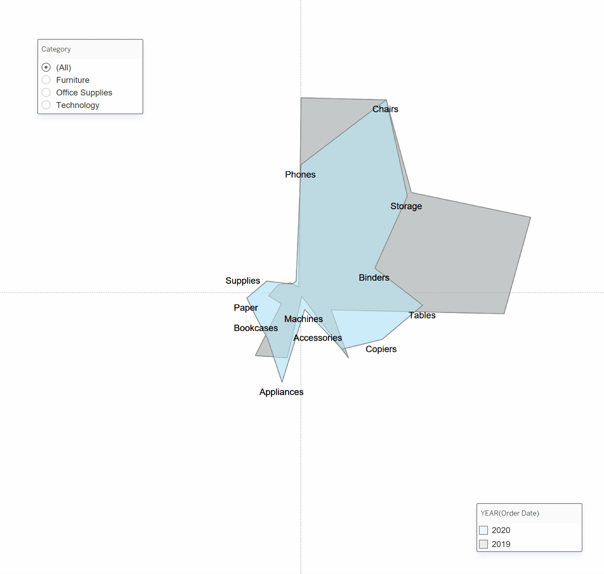
This works by using Sales and Index to calculate X and Y coordinates for each mark. Then, the coordinates are plotted using the Polygon Mark type.
![]()
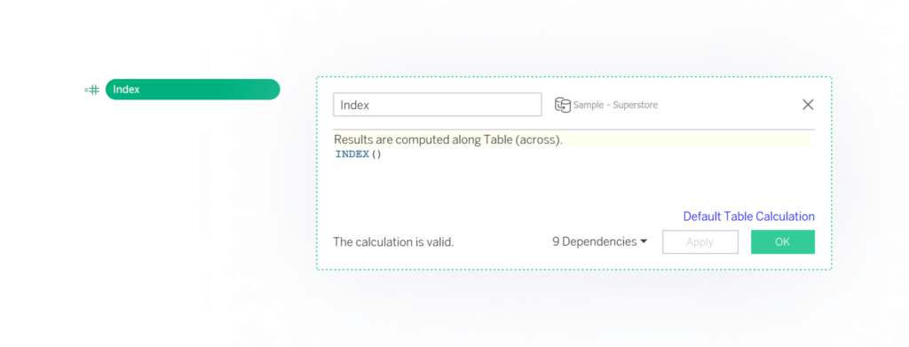
Creating INDEX() calculations
To start, first, create your Index calculation.
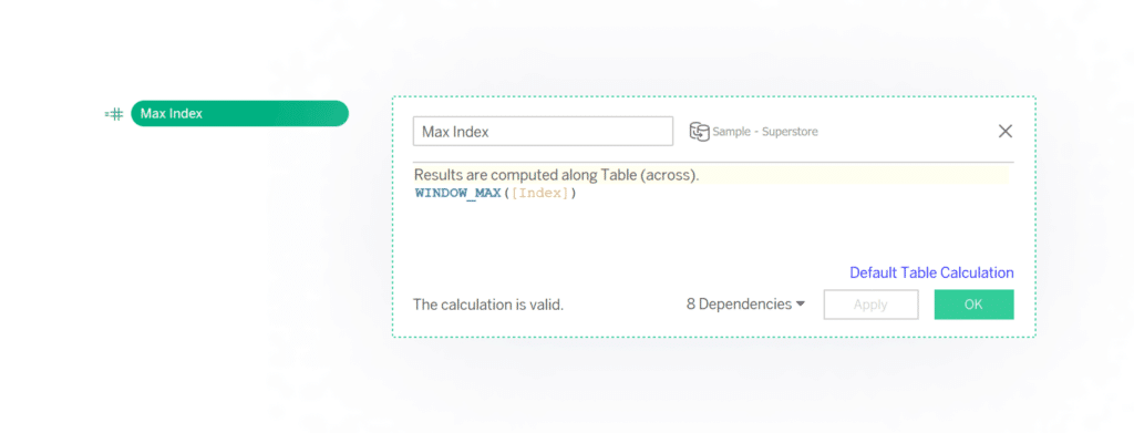
The second calculation is Max Index. This will be used to determine how many points the radar chart has.
Continue reading with a free account, or login.
Unlock this tutorial and hundreds of other free visual analytics resources from our expert team.
Already have an account? Sign In
By continuing, you agree to our Terms of Use and Privacy Policy.
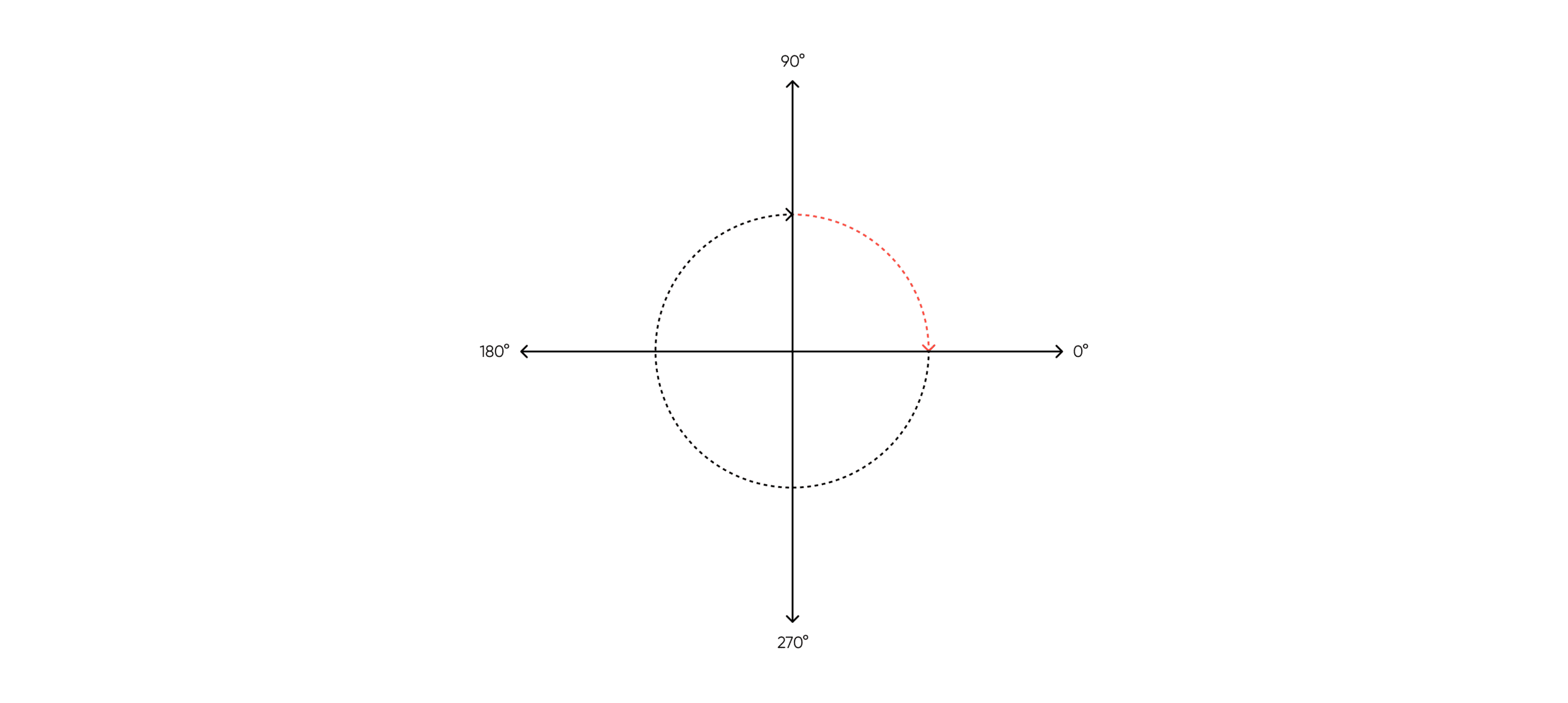
Next, we calculate the angle of each point. Our goal is to have the first index at the top of the circle. The subsequent marks should be distributed evenly, moving clockwise around the circle.
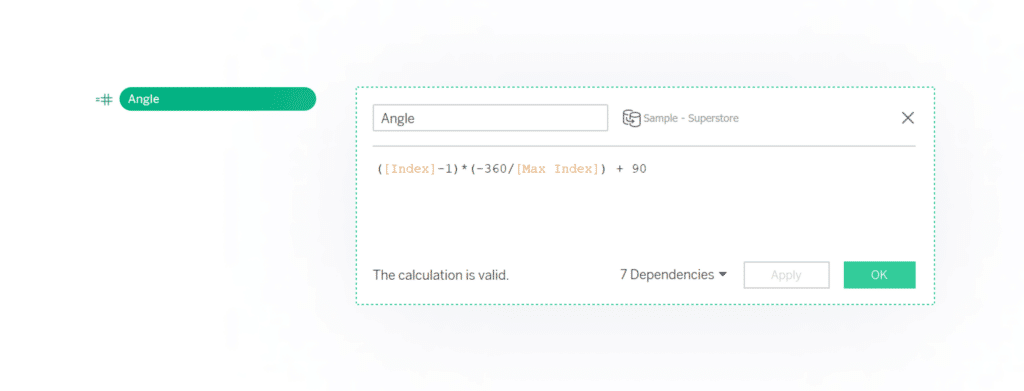
Computing the angles
This next paragraph walks you through the calculation, and is totally optional!
First, subtract 1 from the index because Tableau indexes start at 1. While this adjustment could be done in the offset instead, this approach is more clear. Next, multiply the adjusted index by the rate of change (-360°/[Max Index]). Each point will be equally distributed, so divide 360° by Max Index to find the angle between each point on the radar. Multiply by -1 to switch the orientation from counterclockwise to clockwise. Finally, add a 90° offset to move the starting point from 0° to 90°. If you want the marks to appear between these angles instead of on them, add (-360/(2*[Max Index])) to the offset. Now, in combination with our key metric, we have the radial coordinates to plot the marks. The next step will convert them into cartesian coordinates.
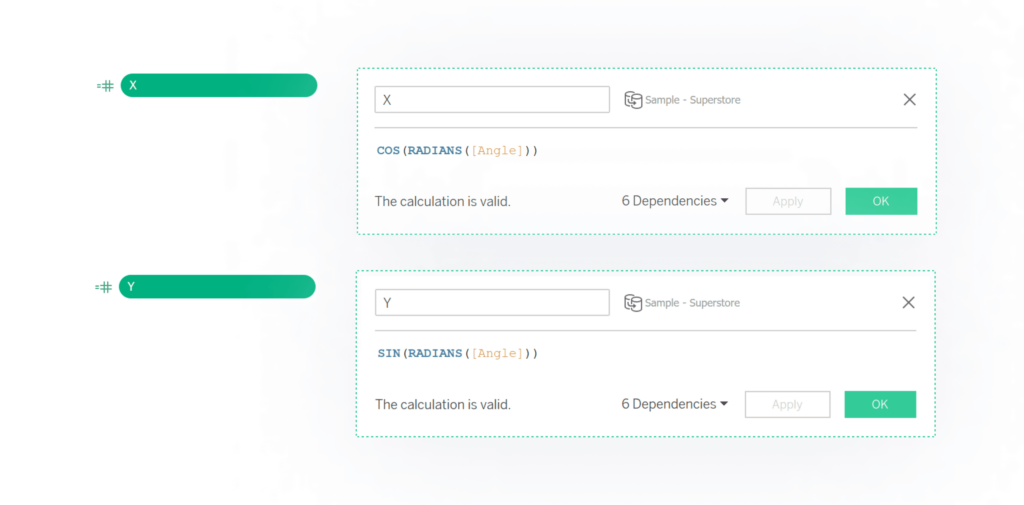
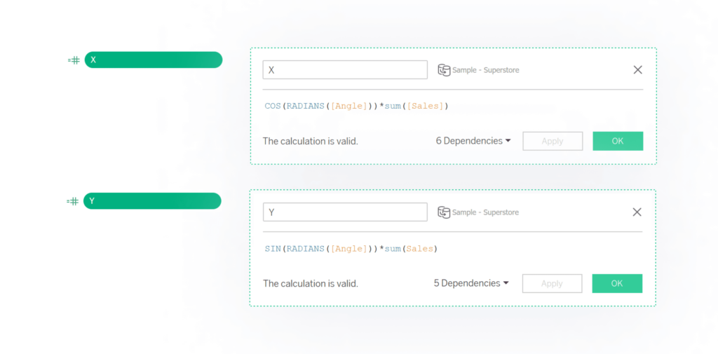
Now that we have the angles, our next step is to translate this into X and Y coordinates. To do this requires basic Trigonometry! (Who said there was no good use for a math degree?!)
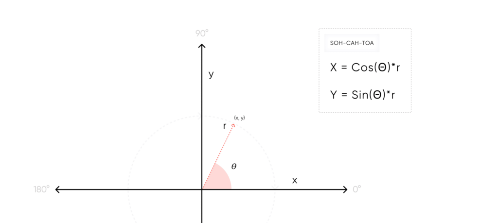
Our angle calculation is based on degrees, so we need to convert our degrees to radians before using Sin and Cos. For now, we’re using a radius of 1, which will allow us to check the calculations by plotting the marks. After checking our angles, we’ll add the dynamic radius to the calculation.
Once plotted you should see a symmetrical shape with even sides and angles.
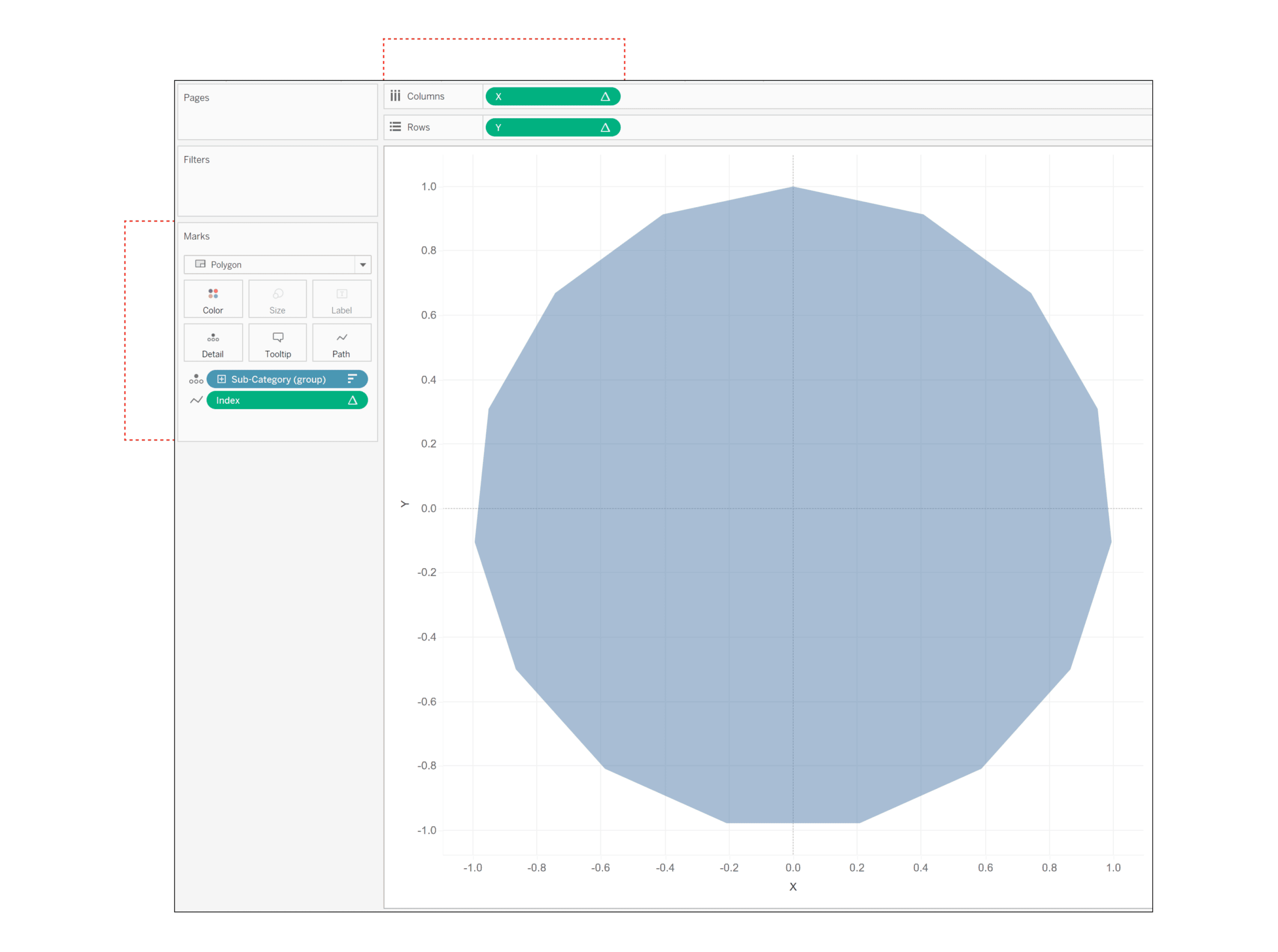
Plotting the X and Y coordinates
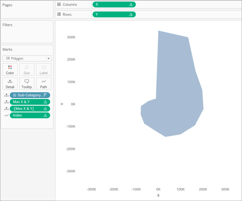
Plot the X and Y coordinates by adding a dimension (I’m using [Sub-Category]) to the Detail property of the Marks card, X to the Columns shelf, and Y on the Rows shelf. Make sure that you specify ‘Calculate Using’ your selected dimension for X and Y. This controls how the marks are indexed. Change the mark type to Polygon. Add Index to the Path property. If you don’t see a regular shape, adjust your table calculation settings as needed.
Once the angles are set, we can update the magnitude. To do this, multiply the existing X and Y calculations by your measure of interest. (I’m using SUM([Sales])).
This gets you the core of the chart! From here on out we’re adding formatting. Hide your gridlines and axis rulers – the vertical and horizontal gridlines aren’t useful on a radial plot.
Create multiple overlapping radars by adding a dimension to the Detail or Color property of the Marks card.
Labels can be added by creating a dual axis chart. Duplicate the X or Y pill by holding Ctrl while dragging the pill to the side. On the new Marks card, change the Mark type to Circle. This enables the Label property. You can set the opacity of the circles to zero to hide them on the view while still showing the labels.
![]()
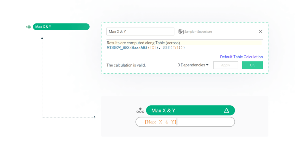
If you’d like to add radial gridlines, you can add a background image to the sheet. First, you’ll need to center the shape using 4 reference lines. Each axis will need one of these calculations.
Finalizing the radar chart
Now that the radar chart is centered, you can either use a transparent background and overlay the chart over an image of radial gridlines or add it as a background image to the sheet.
Thanks for reading!
- Felicia

Written By
Felicia Styer

Graphic Design
Rafael Simancas
Sr. Manager, Brand Strategy
Related Content
How to Create a Dynamic Spider Web Background for Radar Charts

Radar charts can be a good option to make comparisons with your data, but one of the problems with this…
Tableau Formatting Series: How to Use Shading & Backgrounds
There are two approaches to changing surface color in Tableau; shading and background. While they have the same function, the…
The Ultimate Guide to Getting High Resolutions In and Out of Tableau
What makes dashboards attractive, engaging, and thought-provoking? While data can craft a compelling narrative, the human eye is naturally drawn…