How to Make a Tableau Navigation that Doubles as a Color Legend
Okay – I thought I was done with the Tableau user interface tips series, but I’ve got a bonus tip for you. As is often the case, new client requirements inspire new approaches that are made possible through Tableau’s flexibility. While I was writing the five posts in the UI series, a need came up to create a navigation that doubles as a color legend. You can set up color legends to highlight dimension members, but this navigation needed to filter. A filter alone wouldn’t work because filters don’t include color encoding.
So let’s combine the two using a highlight table and dashboard actions! This approach provides several benefits including (1) formatting flexibility (2) improved dashboard processing time and (3) a better user experience.
If you are familiar with this technique, you likely know that the Square mark type can limit your ability to make nice, evenly-sized squares that fill all the available space in each cell of the highlight table. This tutorial shows you a trick for getting around that too – producing perfect rectangles every time!
How to Make a Custom Color Picker in Tableau
Introduction to Tableau navigation
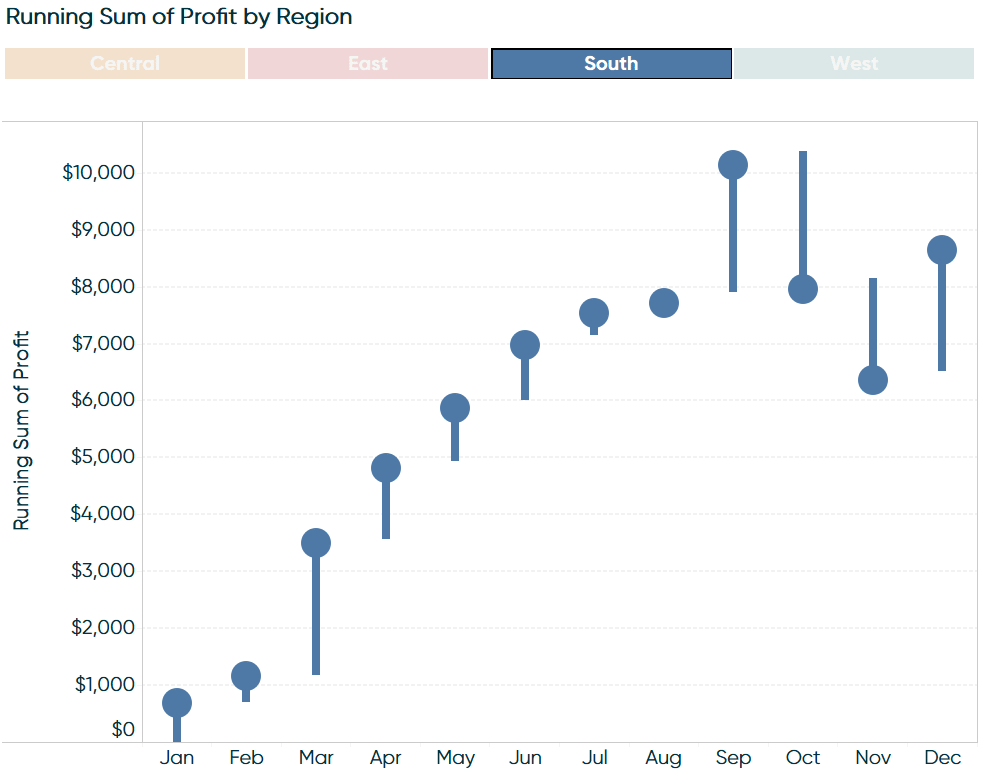
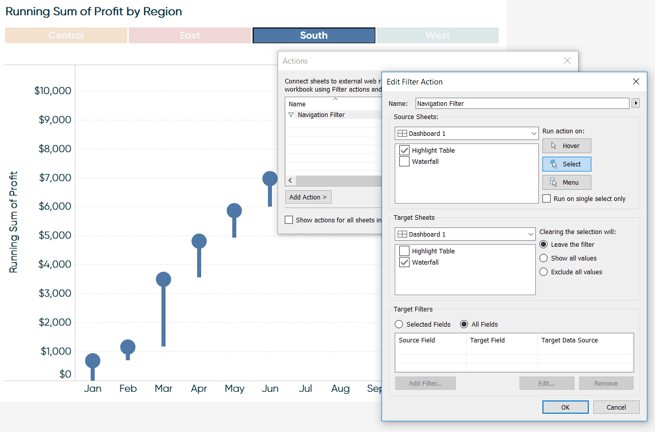
To illustrate how to combine a navigation and color legend using a highlight table with dashboard actions, we will recreate this small dashboard. This dashboard uses a Tableau dual-axis waterfall chart to show how profit is trending in the Sample – Superstore dataset.
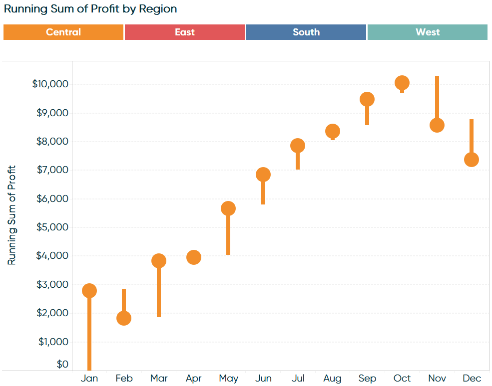
Clicking on the highlight table at the top filters the chart.
Continue reading with a free account, or login.
Unlock this tutorial and hundreds of other free visual analytics resources from our expert team.
Already have an account? Sign In
By continuing, you agree to our Terms of Use and Privacy Policy.
Creating a navigation control sheet
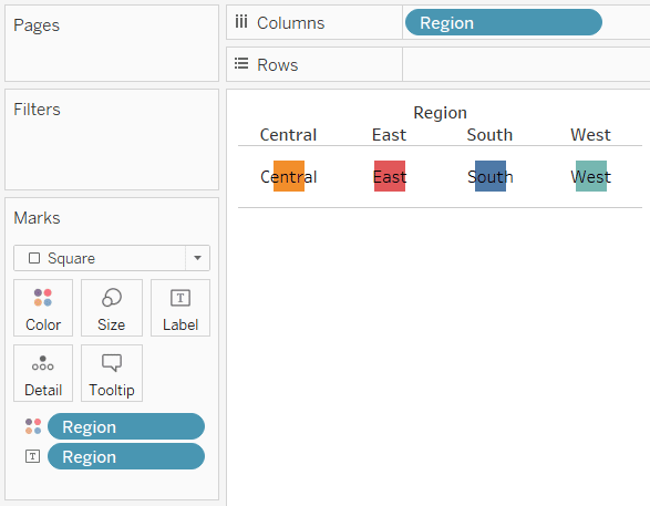
The navigation at the top is created by setting up a control sheet that includes the dimension members you want to include in the navigation.
![]()
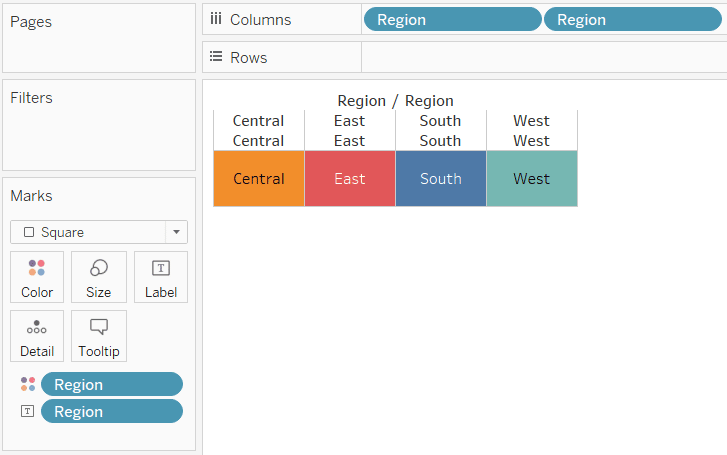
To set up the view, start by creating a new worksheet, placing the dimension of interest on the Columns Shelf, changing the mark type to Square, and placing the dimension of interest on the Color Marks Card as well as the Label Marks Card.
This is a good start, but obviously we need to make the squares larger; ideally filling all of the white space between each button. Here’s where most run into some formatting issues. Here’s how the view looks after clicking on the Size Marks Card to increase the size of the square marks and dragging the slider all the way to the right (making the marks as large as possible).
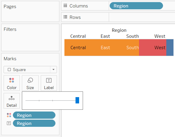
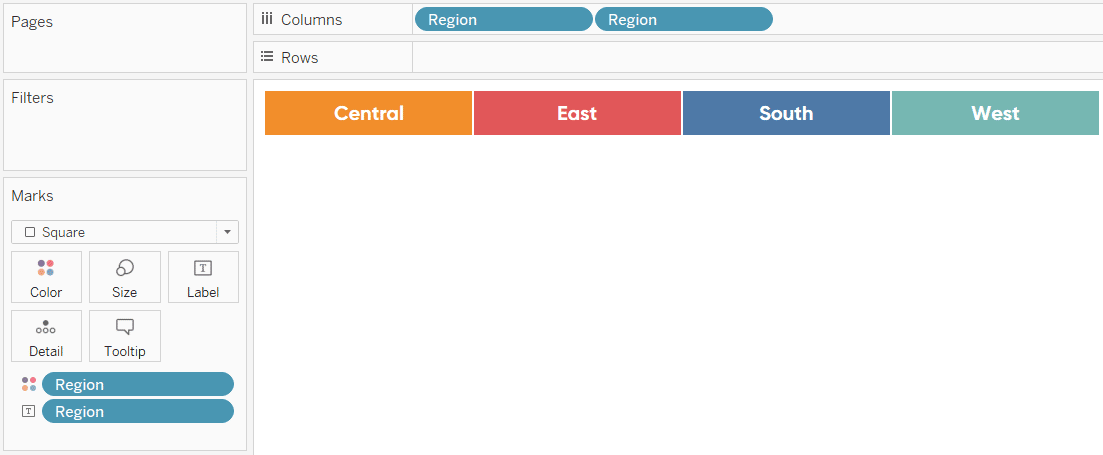
Yikes – not very effective! The orange square that represents the Central region is laying on top of the others so we do not see as much of the red and blue squares; or any of the turquoise square. Luckily, there is a simple solution: Drag the dimension of interest to the Columns Shelf a second time.
There are a few more things I like to do to a view like this before adding it to a dashboard:
– Hide the headers by right-clicking on them and deselecting “Show Header”.
– Format the column and row separators for the table by right-clicking anywhere on the table and choosing “Format…”
– Ensure the labels are always a consistent color by clicking on the Label Marks Card and changing the font format
Adding the filter dashboard action
The color legend / navigation is now ready to be added to a dashboard. The user experience of having the dashboard filter to the dimension member clicked from the table is accomplished through dashboard actions.
![]()
Simply add a dashboard action that suits your needs; here is a look at the dashboard action for the use case illustrated in this post.
Thanks for reading,
– Ryan

Written By
Ryan Sleeper
Related Content
3 Ways to Make Handsome Highlight Tables in Tableau
To draw a highlight table in Tableau, you need one or more dimensions and exactly one measure. This is the…

Ryan Sleeper
A Trick for Getting Around Tableau’s Default Highlight Formatting By default, Tableau highlights dashboard action selections by graying out non-selected…
Ryan Sleeper
Link Tableau dashboards with a seamless navigation menu This video shows you how to create a user-friendly navigation experience by…