How to Make Better Drop-Down Menus in Tableau

A Tableau drop-down menu is nothing new. Tableau has this capability built in for filters, set controls, and parameters which work great, except if you want to format them to look a particular way. Sure, you can change a few of the colors and adjust the font and text attributes, but formatting is limited.
At Playfair Data, we often design dashboards that adhere to the brand guidelines of our clients which means our product can look more like a branded website than a Tableau dashboard. This can be a subtle but powerful aspect in terms of user adoption, user trust, and user training.
Watch the related video with Playfair+
While Tableau drop-down menus are functional — no matter how they’re formatted, they always look like Tableau drop-down menus. In this post, you will learn how to create drop-down menus that have infinite formatting options and can take on the look of any interface out there!
The drop-down menu will require two graphics that will get swapped out depending on which “state” it is in. User interface design “states” represent the different ways a single element can look (i.e. selected, not selected, hover etc.). In this example the menu has two states, one that shows the drop-down list and one where the list is hidden.
Integrating the custom button shapes
Below are the buttons for the tutorial but with some design software you can dream up your own versions and get endless formatting options. The button graphics provided are identical except for the small triangle indicating the list is hidden (triangle pointing right) or the list is shown (triangle pointing down).


To begin, download the files provided for the buttons and add them to your Shapes folder in your Tableau repository which can be found in your Documents folder. Then open Tableau Desktop and start a new project using the Sample – Superstore dataset.
Creating the Tableau drop down menu parameter control
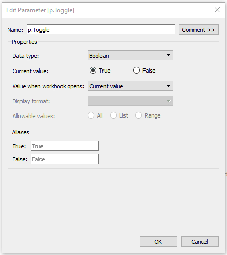
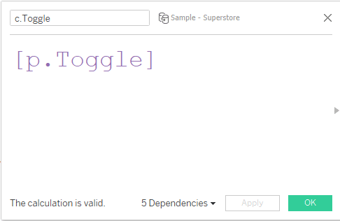
Name your first sheet “Drop-Down Button”. Create a new parameter called “p.Toggle” with a data type of Boolean. After creating the parameter, right click on it in the parameter list and select “Show Parameter”. Next, create a new calculated field called “c.Toggle”. The formula is [p.Toggle].
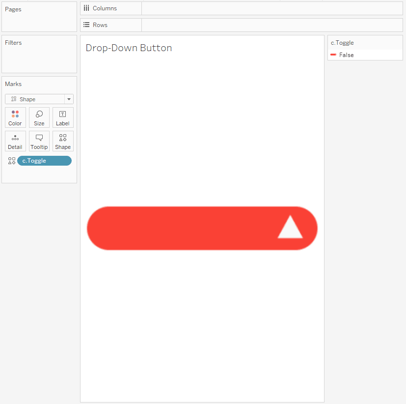
Change your mark type to Shape and add c.Toggle to Shape. Click on the Shape property and add the new button graphic we added to your Shapes folder to the current value. If you don’t see the shape graphics you added you may have to use the “Reload Shapes” button found inside the Shape property of the Marks card. Once you have found the button graphic click “OK”.
How to Create a Boolean Toggle Switch in Tableau
Continue reading with a free account, or login.
Unlock this tutorial and hundreds of other free visual analytics resources from our expert team.
Already have an account? Sign In
By continuing, you agree to our Terms of Use and Privacy Policy.
This is a good time to set your view to “Entire View” and size the mark so it is filling the sheet. Then change the parameter to False and set the shape as the other custom graphic. Now when you change the value of the parameter you should see the two states of the button.
Next, create a new sheet and rename it “Drop-Down List”.
Creating Tableau drop down menu options
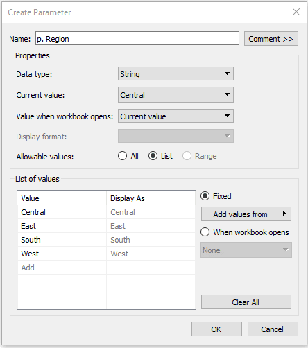
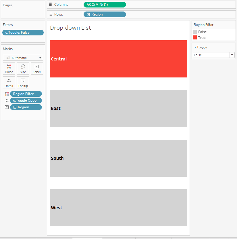
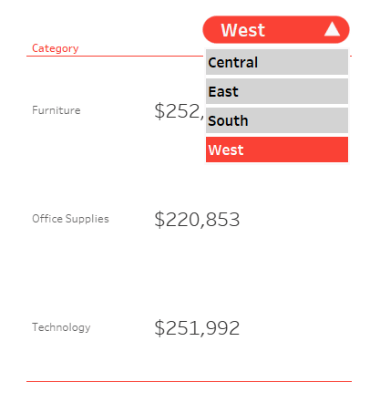
For this example, we will use the Region dimension for our list. First create a parameter for the Region dimension and call it p. Region. Right click on the Region dimension and select Create > Parameter. By default, the current value of the parameter will be the first Region.
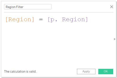
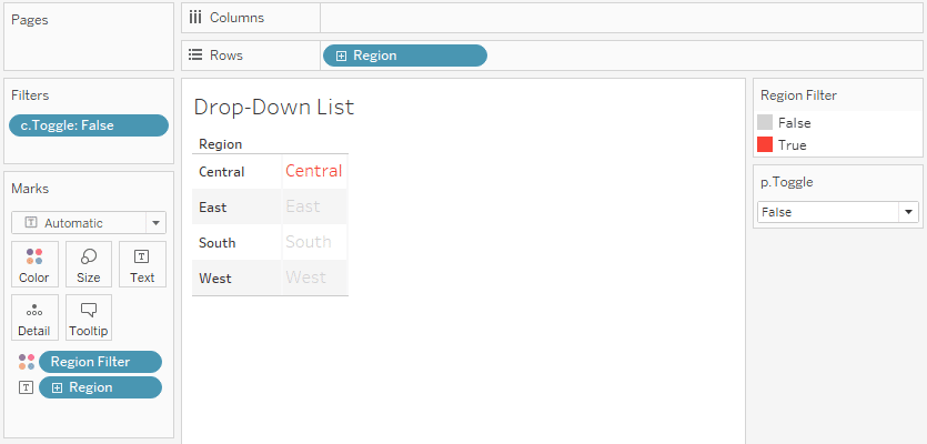
Create a Calculated Field called Region Filter with the formula Region = p. Region. Place the newly created Calculated Field on the Color property of the Marks card and change the color to reflect your color palette, or if you are following my example, True = #FA4135 and False = #DEDEDE. Then place Region on the Rows Shelf. In addition, place Region on the Text property of the Marks card.
Add a Placeholder calculation to the Columns shelf by double clicking in the Columns shelf and adding MIN(1). Use the Label property of the Marks card to left justify the text labels and increase the size of the font to 12 bold. Turn off tooltips and set your View to Entire View.
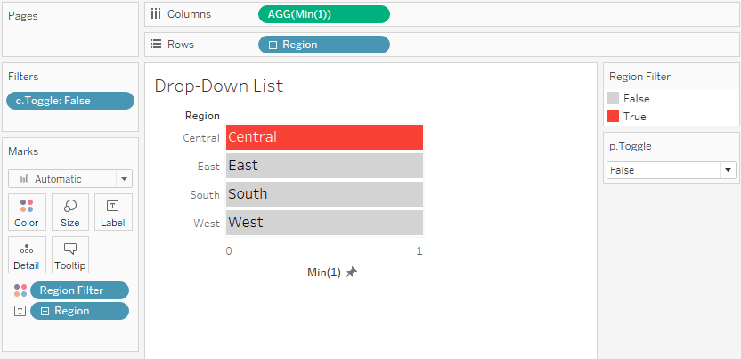
You will need to edit the axis on Columns to a fixed start and end of 0 and 1. Hide the axis by right clicking on the axis and unchecking “Show Header”. Set the alignment in the Label marks card to left align.
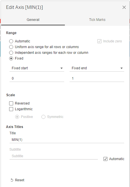
Next, right click on both of the axes and uncheck “Show Header”. You can also right click in the chart and select formatting, choose the Line attribute in the Formatting pane and turn off “Axis Rulers” and “Zero Lines”.
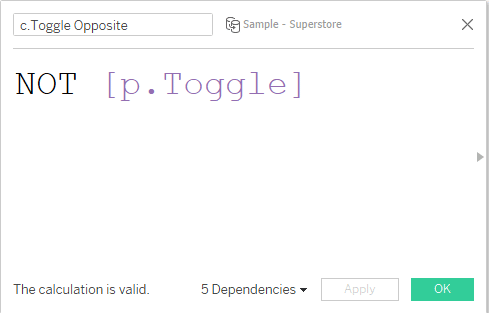
Right click on p.Toggle and choose Show Parameter. Add c.Toggle to the Filters shelf and select False. Now the list should disappear when the parameter is set to True. Create one more calculation named c.Toggle Opposite. This calculation will be True when c.Toggle is False and vice versa. The calculation is NOT p.Toggle.
Add the calculation to the Detail property of the Marks card. This calculation will be used with a parameter action to switch the Toggle parameter between TRUE and FALSE in our dashboard.
Create a sheet called “Drop-Down Blank”.
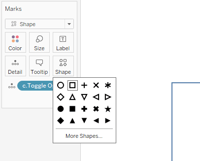
Place c.Toggle Opposite on the Detail property of the Marks card. Change the mark type to Shape, and select the open square. You will also need to change the slider on the Size property by pushing it all the way to the right. Turn off tooltips.
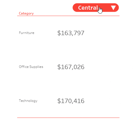
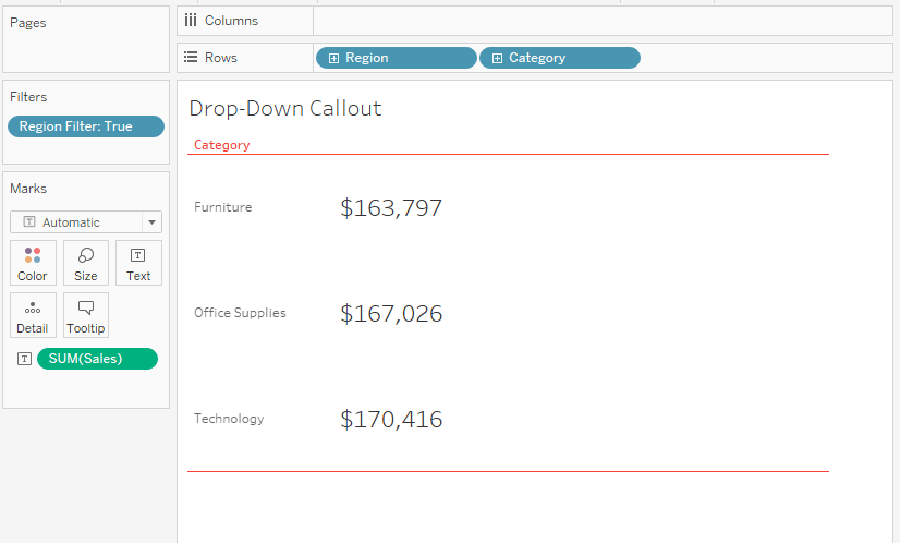
Create a final sheet called “Drop-Down Callout”.
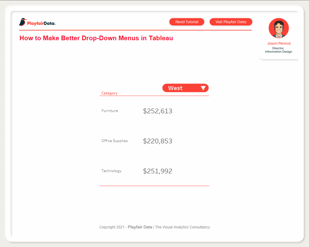
This final sheet will prove that our drop-down filter is working. We will need a simple chart that uses the Region dimension, so I am going with a simple text callout. Place Region and Category on the Rows shelf and Sales on the Text property of the Marks card. Add your Region Filter Calculated Field to the Filters shelf. Format your chart so it’s easy to read. You can also right click on Region and uncheck Show Header because in our final design the button will serve as our label for the chart.
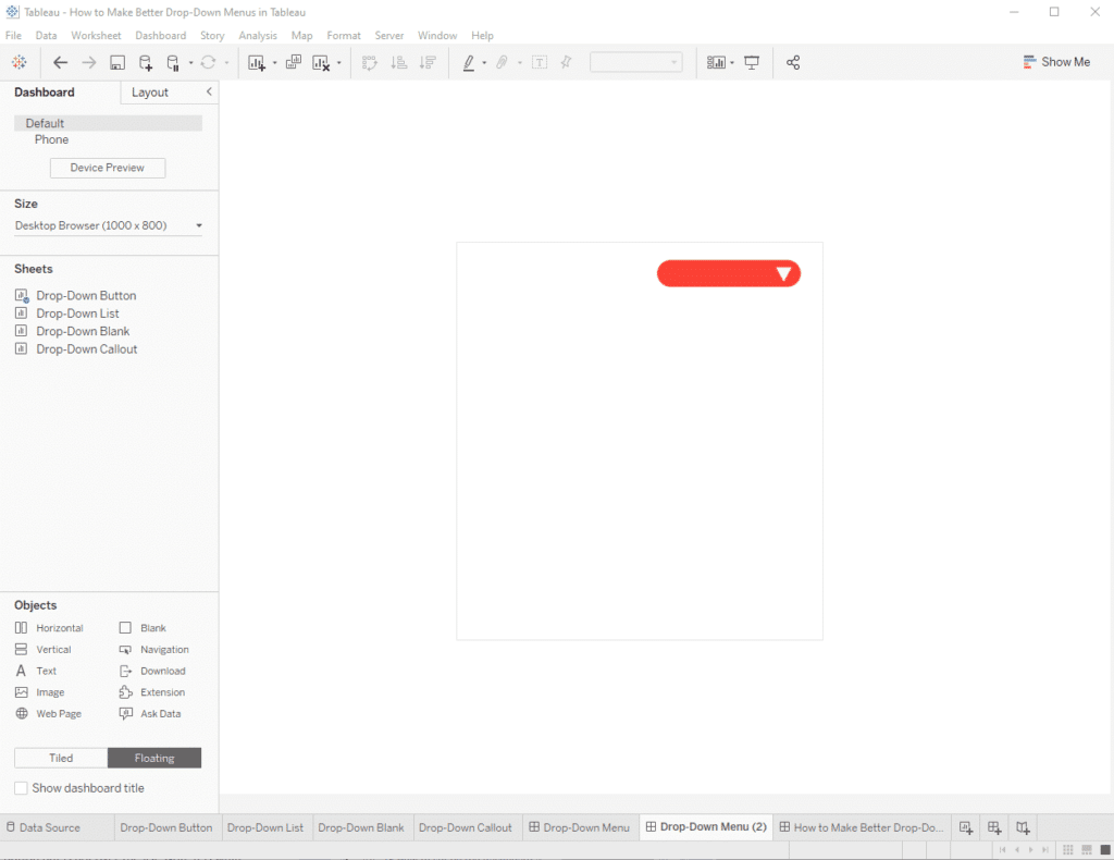
Tying it all together on a dashboard
Now create a Dashboard and name it “Drop-Down Menu” and change it to a “Floating” layout. We are using layers here so the order is important. Also, as a designer working in Tableau, I prefer to use floating layouts as it give me control over where objects are placed. I also like the ability to use layers to add functionality or visual effects not available in tiled designs. I also like to plan out where elements will go before I start adding sheets to the dashboard. Here you can see I am using a Blank Object to approximate where my callout and drop-down will be placed.
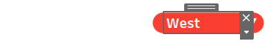
First, add “Drop-Down Button” to the dashboard. You can remove any parameters and legends that are added to the view automatically. Hide the title. Make sure the sheet is set to “Entire View” on the dashboard. Use the object dimensions and/or adjust the mark size on the Drop-Down Button sheet to make the button fill the object.

Next add a text box on top of the Drop-Down Button sheet. Drag a text object into the view, click the Insert button in the top right corner of the interface that appears and choose p. Region. Position the text over the drop-down menu as desired and then update the font color to white.
Now add the “Drop Down Callout” sheet below the button and fill any space you have planned for the interface elements. Hide the title and set size.
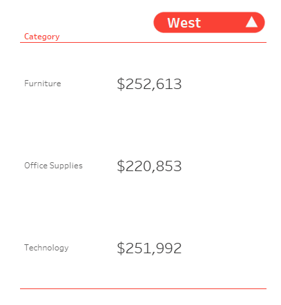
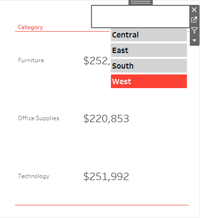
Now we need to add the “Drop Down List” sheet aligned directly below the button and over a part of the call out in my case. Hide the title and remove the legend and parameter. Arrange the list so it fits under the button, set the view of the sheet to “Fit Width”.
Finally, add the “Drop Down Blank” sheet to the view and hide its title. Use “Entire View” and adjust the placement and dimensions so that it entirely covers the button but is not over the list. Note it is white right now because we have not removed the background color, but this can be handy to place it. Once you’re happy with the placement, right click on it and use the formatting options to remove the background color.
Now we are ready to bring it to life with dashboard actions.
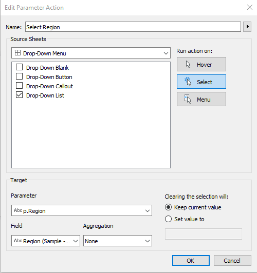
We need a parameter action to pass the selected value into the p.Region Parameter. Create a parameter action and name it “Select Region”. The action should run on Select, Source sheet will be Drop-Down List, and the target parameter will be p.Region and the Field is Region. Make sure the “Keep current value” option is checked.
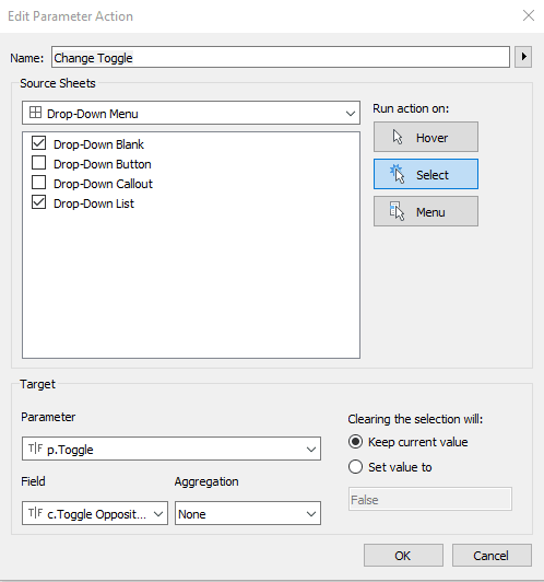
Next, we will create a parameter action to flip the Toggle parameter. Name the action “Change Toggle”. The action should run on Select, with source sheets Drop-Down Blank and Drop-Down List, target parameter p.Toggle, and field c.Toggle Opposite.
After you have saved all the actions and clean up any formatting it’s time to test things out. Clicking on the list should pass the selection to the Region Parameter and change the button text to the Region selected and the list should disappear. Clicking on the button should toggle the button to show a down arrow and reveal the list of regions!
Thank You,
— Jason


Written By
Jason Penrod

Peer Review
Felicia Styer
Assoc. Director, Analytics Solutions
Related Content
How to Completely Customize Multi-Select Filters in Tableau
Filters play a crucial role in allowing users the flexibility to manipulate dashboards to their liking. Multi-select filters can be…

Dan Bunker
Enhance Dashboard UX with Dynamic Zone Visibility In this tutorial, Dan explains Tableau’s dynamic zone visibility feature and how it…
How to Create Multiselect Parameters in Tableau

Binary Parameters are a new technique that allows you to store multiple Boolean selections in one parameter, essentially creating a…