How to Make Connected Scatter Plots in Tableau
As I mentioned in the post, 3 Ways to Make Stunning Scatter Plots, this chart type is already my third favorite for its innate ability to visualize many records at once, reveal correlations and outliers, and create a natural four-quadrant segmentation. One weakness of scatter plots, however, is that they don’t clearly show how a dimension member’s position is changing over time. Fortunately, Tableau’s flexibility allows us to go way beyond the defaults and Show Me options, and this in case, will help us literally connect the dots on a scatter plot.
By creating connected scatter plots, it is much easier to compare the paths of dimension members as their respective intersections on the x and y-axes change from period to period. This post will show you how to make connected scatter plots in Tableau and how to leverage a dual-axis to (1) make the visualization more engaging and (2) display the point order of each mark.
Watch the Related Video with Playfair+
Lay the foundation with a traditional scatter plot
By the end of this post, you will be able to make a scatter plot that connects marks by year and is colored by any dimension of your choosing. You will also be able to communicate the order of the marks by using a table calculation on the Label Marks Card.
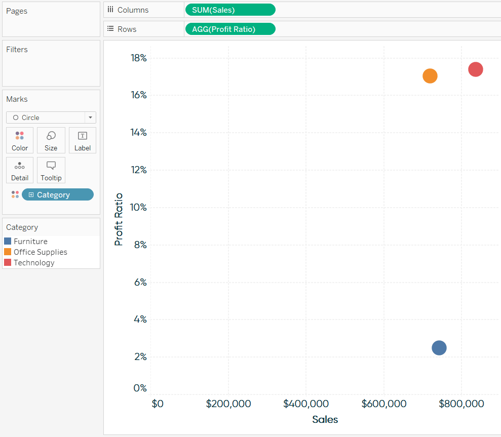
You can use the following technique with any fields, but for this tutorial, we will lay the foundation of a scatter plot using the Sample – Superstore dataset with Sales on the Columns Shelf, Profit Ratio on the Rows Shelf, and Category on the Color Marks Card.
Continue reading with a free account, or login.
Unlock this tutorial and hundreds of other free visual analytics resources from our expert team.
Already have an account? Sign In
By continuing, you agree to our Terms of Use and Privacy Policy.
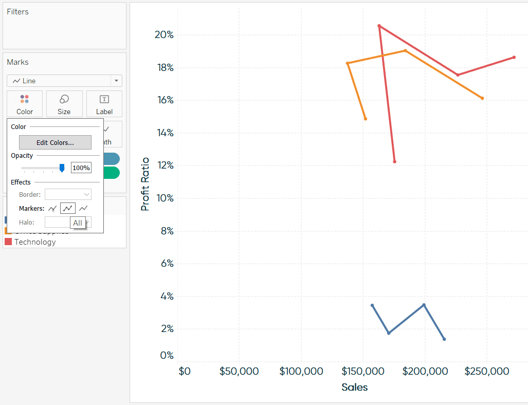
To connect the dots, change the mark type to Line.
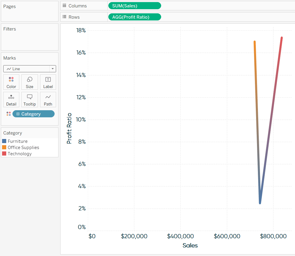
Next comes the most important step for creating connected scatter plots in Tableau. By default, Tableau is connecting these dots between the dimension members in the dimension on the Color Marks Card, but we can change how Tableau connects the dots by placing a dimension on the Path Marks Card.
Connect the dots of a scatter plot over time
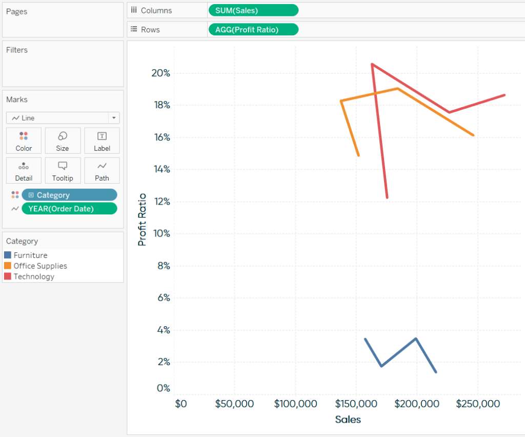
If we want to connect the dots by Year([Order Date]) to visualize how each Category changed position from year to year, place the Year([Order Date]) dimension on the Path Marks Card. By default, the Year date part is displayed in chronological order, but just in case, note that I used the Year([Order Date]) field as continuous.
Tableau Classification – Discrete vs. Continuous
At this point, we have a connected scatter plot, and you have the option to stop here. I may at least suggest turning the markers on, which is an effect you can find by clicking on the Color Marks Card.
Displaying the point order on a connected scatter plot
But let’s keep going and make this even better by providing a visual cue that communicates to our audience what order the marks should be read. First, I’m going to duplicate the Profit Ratio pill on the Rows Shelf.
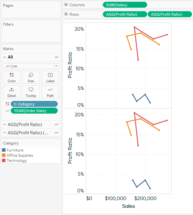
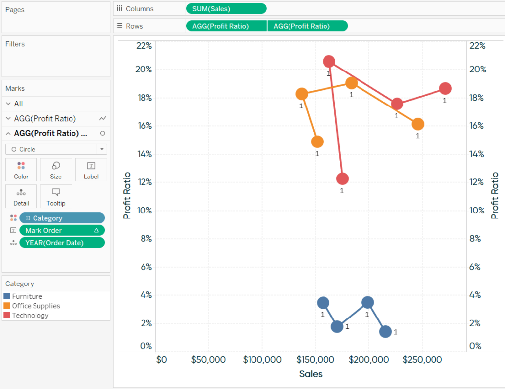
Now that there are two measures on the Rows Shelf, they each get their own Marks Shelf, which can be edited independently of the other. I’ll change the mark type for the second row to Circle so we get a nice big mark that we can add a label to.
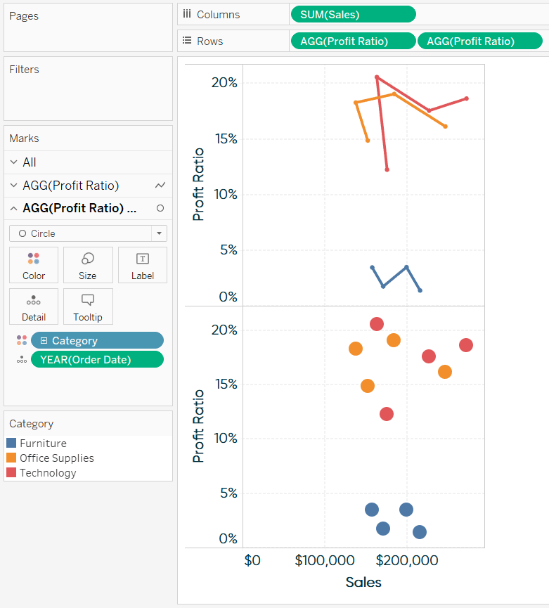
Next, convert these separate rows into a dual-axis combination chart by clicking into the second pill on the Rows Shelf and choosing “Dual Axis”. The connected and unconnected version of the scatter plot should be sharing the exact same scale, so once they’re on a dual-axis, ensure the scales are lined up by right-clicking on either axis and choosing “Synchronize Axis”.
![]()
After following these steps, we’re left with this dual-axis combination chart:
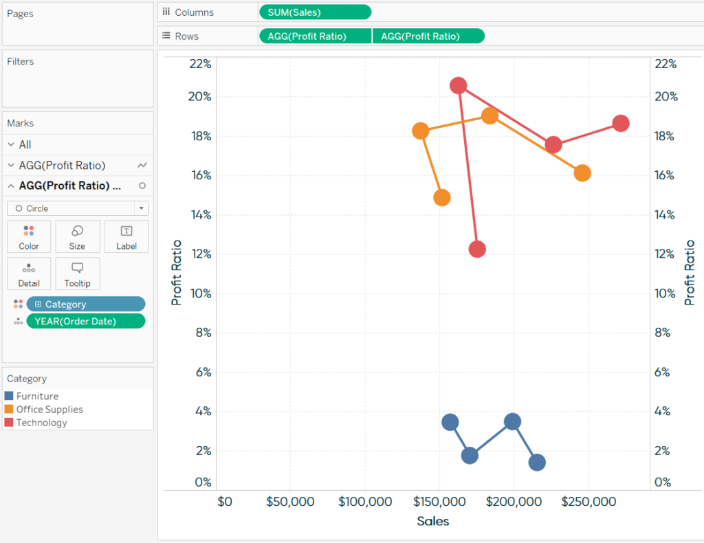
We can still modify the marks independently of each other, so we can add a mark order label to the Label Marks Card of the circles only. For Tableau to display the proper mark order, start by creating a calculated field containing only the INDEX() function.
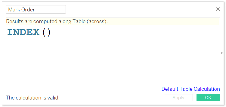
INDEX() is a table calculation and I think of it as being synonymous with row number. If we can get the addressing and partitioning correct, we can display the proper order in which our audience should read the connected marks in our scatter plot.
An Introduction to Tableau Table Calculations
The first thing we see after placing this newly created Mark Order calculated field on the Label Marks Card is the number 1 on each mark because we haven’t yet changed the addressing.
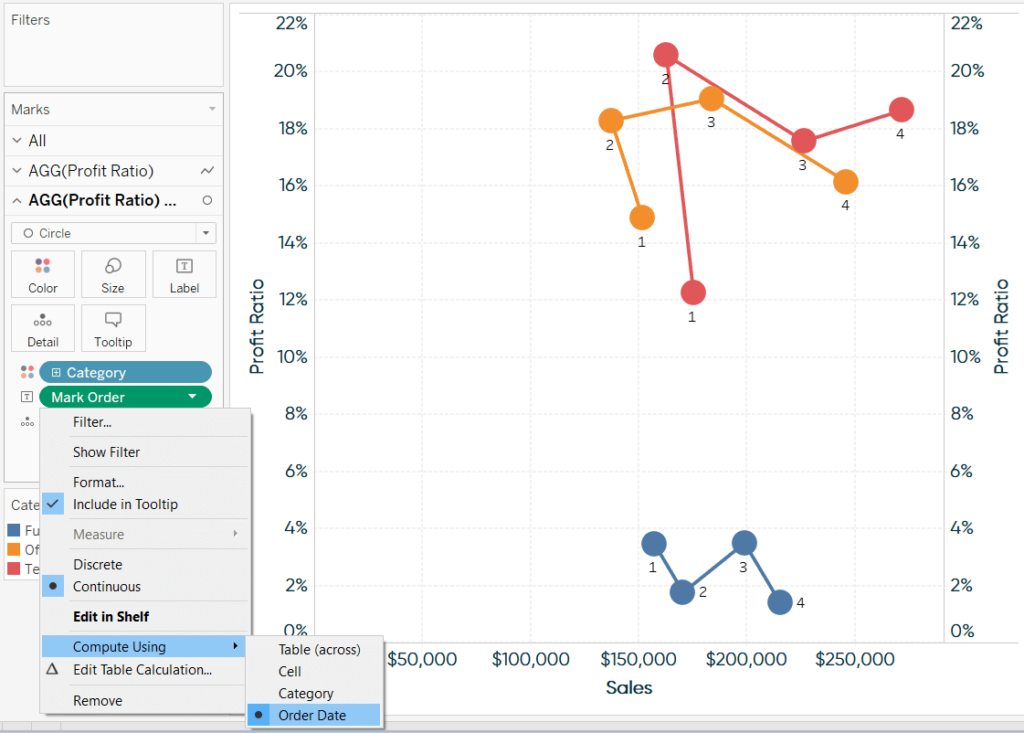
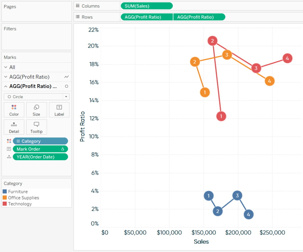
To change the addressing, click into the pill with a delta symbol on it (indicating there’s a table calculation taking place) and hover over Compute Using. We want to display the proper index, or in this case, mark order, for the Order Date dimension.
Finalizing the view
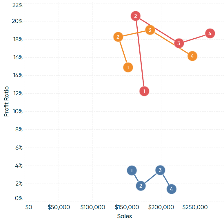
From here, all that’s left is formatting! Here’s how my connected scatter plot looks after hiding the right axis, centering the labels, and polishing up some of the lines and borders.
Thanks for reading,
– Ryan


Written By
Ryan Sleeper
Related Content
3 Ways to Make Stunning Scatter Plots in Tableau
When it comes to my favorite chart types, scatter plots are a close third behind bar charts and line graphs.…
The Beginner’s Guide to Tableau Table Calculations

Tableau table calculations, while very powerful, can be both tricky and confusing to work with. There are some great benefits…

Ryan Sleeper
Drill In and Out of Segments with a Single Click We’ve shown you before how scatter plots create a natural…