How to Make Dynamic Tooltips in Tableau
Tooltips, the box that appears with information about an item when you hover over it, are an effective way to save valuable real estate on a data visualization while providing context. Whenever I know that my data visualizations will be consumed via an interactive version of Tableau (i.e. Tableau Public, Tableau Online, Tableau Server, Tableau Reader), I move as much secondary information as possible to the tooltips. This is easily done by moving the fields you want displayed in the tooltips to the Tooltip Marks Card and formatting as desired.
However, there is one big drawback with tooltips. Any field that is placed on the Tooltip Marks Card will be shown for every mark on the view, and in the same format. There are times when this doesn’t make sense, resulting in some strange results such as descriptive words in the tooltip that don’t have corresponding values (which happens if the value is null). This post shares how to make dynamic tooltips in Tableau, allowing you to show different information for each mark.
This content is excerpted from my book, Innovative Tableau: 100 More Tips, Tutorials, and Strategies, published by O’Reilly Media Inc., 2020, ISBN: 978-1492075653. Get the book at Amazon.
How to Make Dynamic Tooltips in Tableau
How to make dynamic tooltips in Tableau
To illustrate how to make dynamic tooltips in Tableau, we’ll be looking at my recent visualization, A Tale of 50 Cities. This visualization shows the census over census population change of the 50 largest cities in the US since 1790. Notice there are no labels on the highlight table so the information was communicated through the tooltips which can be seen if you hover over the interactive version (click the image if you want to see the experience).
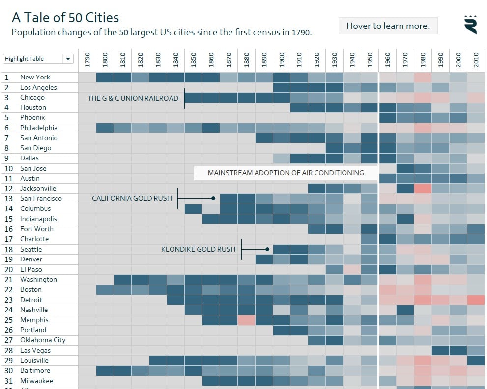
While creating the visualization, I realized there were two issues with my tooltips. First, I wanted to display the population for each city during each census, but my data source only had the population for cities that were in the top 100 at the time of each census.
Continue reading with a free account, or login.
Unlock this tutorial and hundreds of other free visual analytics resources from our expert team.
Already have an account? Sign In
By continuing, you agree to our Terms of Use and Privacy Policy.
This prevented me from making a generic tooltip that said something like “[Year of Census] Population” because if the city was not in the top 100, this descriptive text would be followed by a null value / blank space:
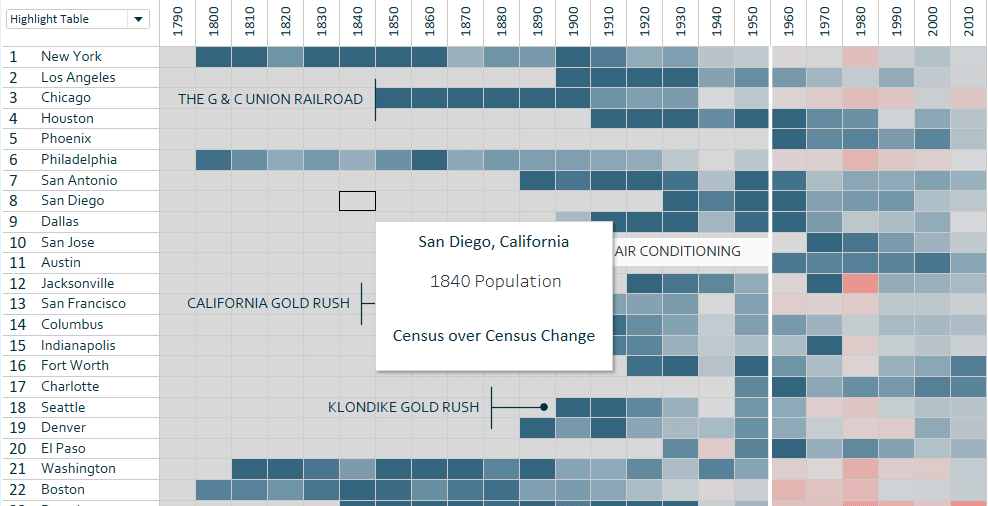
In the screenshot, you can also see the second issue. If there is not data for Tableau to compute the census over census change, the “Census over Census Change” label is also followed by a null value / blank space. This is a potentially confusing user experience that I wanted to avoid.
The trick to creating dynamic tooltips is to create a calculated field that provides logic for what descriptive text to display for each mark. In my first case, if a city did not have a population measure because it wasn’t in the top 100, I would prefer my end users see “(Not in Top 100 Cities)” instead of the standard text for the other marks followed by a null value. The formula for this calculated field is:
IF ISNULL(SUM([Population])) THEN “(Not in Top 100 Cities)”
ELSE STR(MIN([Census]))+” Population”
END
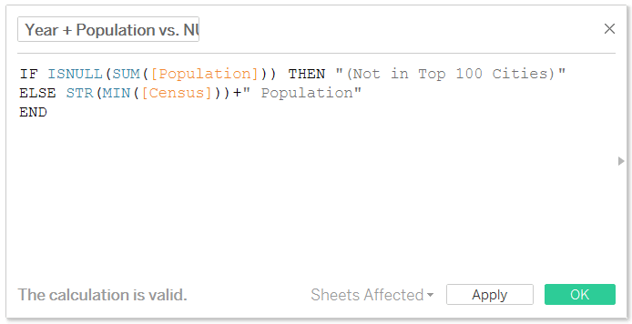
This calculation looks at the population measure for each mark. If it is null, it displays “(Not in Top 100 Cities)”; otherwise it strings together the year of the census and the word “Population”.
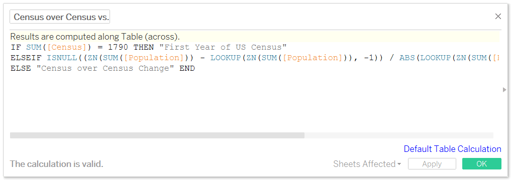
This approach also works with table calculations. Here’s how I created a dynamic tooltip for the census over census change. Note that this descriptive text for the tooltip has three outcomes: (1) the first year of the census (2) census over census change is not available (as is the case when there aren’t values for Tableau to do the math and (3) the original standard “Census over Census Change”.
IF SUM([Census]) = 1790 THEN “First Year of US Census”
ELSEIF ISNULL((ZN(SUM([Population])) – LOOKUP(ZN(SUM([Population])), -1)) / ABS(LOOKUP(ZN(SUM([Population])), -1))) THEN “Census over Census Change N/A”
ELSE “Census over Census Change”
END
After creating these calculated fields to dynamically compute the descriptive text that will be displayed in the tooltip, I simply replaced my hard-coded text in the tooltip with these fields:
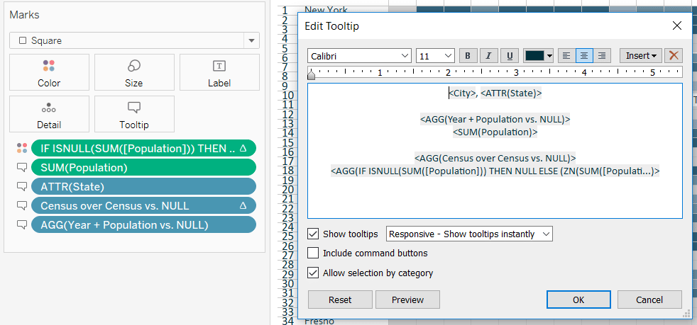
And now when I hover over a city that was not in the top 100 at the time of the census and/or a city where the data were not available to compute the census over census change, the end user sees a description that makes much more sense:
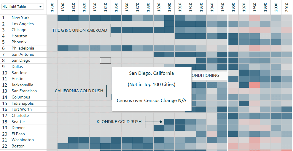
This is just one of countless examples, but the main point of the article is that you can leverage calculated fields with strings, the ISNULL function, and/or table calculations (plus more we didn’t cover) to improve the user experience with your tooltips!
Thanks for reading,
– Ryan
Related Content
Ryan Sleeper
Blurring the line between explanatory and actionable analytics Ryan shares one of his favorite tactics for helping users evolve from…
How to Add a Tooltip to a Dimension in Tableau
Tableau tooltips are one of the best tactics for providing context to a data visualization without taking up valuable real…
How to Add an Image to a Tableau Tooltip
This year marked the introduction of a long-awaited Tableau feature: Viz in Tooltip. I believe this will be a game-changer…

