How to Add a Tooltip to a Dimension in Tableau
Tableau tooltips are one of the best tactics for providing context to a data visualization without taking up valuable real estate on the visualization itself. While we anxiously await the new ‘Viz in Tooltip’ functionality, I’ve been writing about some other ways to get value from tooltips. Last week, I showed you how to create dynamic tooltips to improve your user experience. This post will show you how to add a tooltip to a dimension.
By default, Tableau tooltips can only be added to measures, but what if you want to provide additional information about text on a row or column header? For example, the following trick will allow you to display the definition of the dimension members on your view when they are hovered over. This has several practical benefits including (1) it helps your end users understand the dimensions in the flow of the analysis (2) it’s more intuitive to display information about the dimension on the dimensions themselves (3) it improves focus by saving real estate in the measure tooltips.
This content is excerpted from my book, Innovative Tableau: 100 More Tips, Tutorials, and Strategies, published by O’Reilly Media Inc., 2020, ISBN: 978-1492075653. Get the book at Amazon.
How to Add a Tooltip to a Dimension in Tableau
How to add a tooltip to a dimension in Tableau
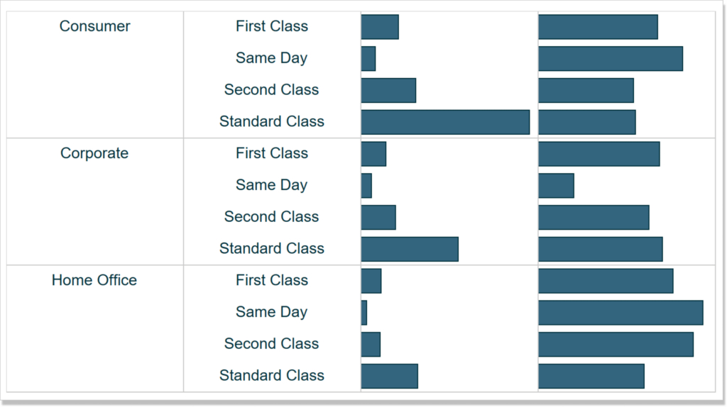
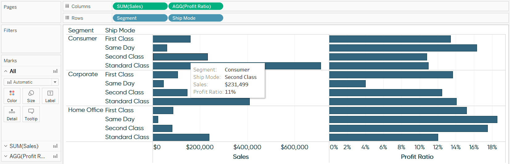
For this tutorial, let’s imagine that our business use case is to make the following bar chart showing the Sales and Profit Ratio measures by the Segment and Ship Mode dimensions.
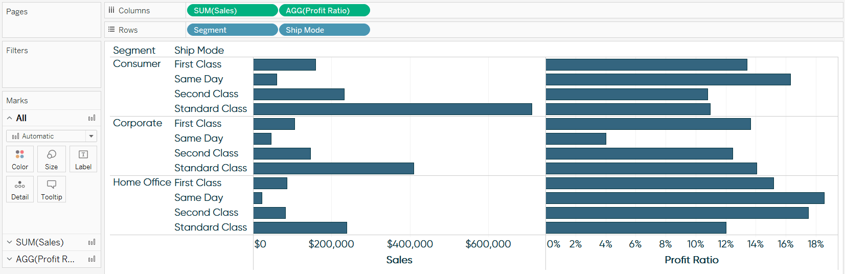
By default, if I hover over any of the bars, I see a tooltip:
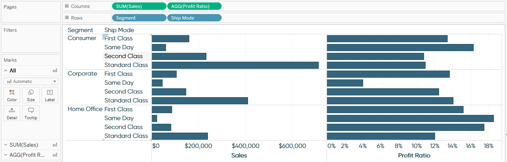
However, if I hover over a dimension member on one of the row headers, I see nothing:
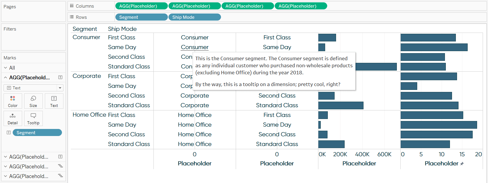
But what if we want to provide some information about our row headers? Where did they come from? How are they defined? Information about dimensions can be just as important to an analysis as information about measures.
![]()
Continue reading with a free account, or login.
Unlock this tutorial and hundreds of other free visual analytics resources from our expert team.
Already have an account? Sign In
By continuing, you agree to our Terms of Use and Privacy Policy.
Yes – I understand that you can add information about the dimensions to the tooltip for the measures, but the approach I’m about to show you has at least two big advantages: (1) information about dimensions can be placed in better relation to the dimensions themselves and (2) information about dimensions is typically more static than information about measures, so this approach allows you to save real estate on the more-dynamic measure tooltips by moving information to the more-static dimension tooltips.
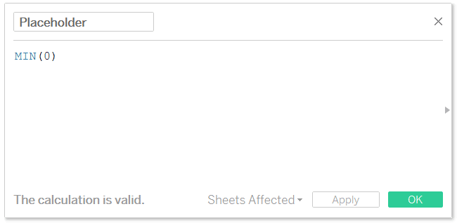
To add a tooltip to a dimension, we will use the same placeholder hack that we can use to conditionally format in Tableau like Excel.
To begin, create a calculated field where the entire formula is MIN(0).
We will now rebuild the bar chart from above, but instead of placing the Sales and Profit Ratio measures on the Columns Shelf, we will place this newly created Placeholder field on the Columns Shelf. Note that the dimensions on the Rows Shelf will stay the same, but the Placeholder field will be placed on the Columns Shelf four times; the first two will eventually be the dimensions that we are adding a tooltip to, and the second two will eventually be the Sales and Profit Ratio measures.
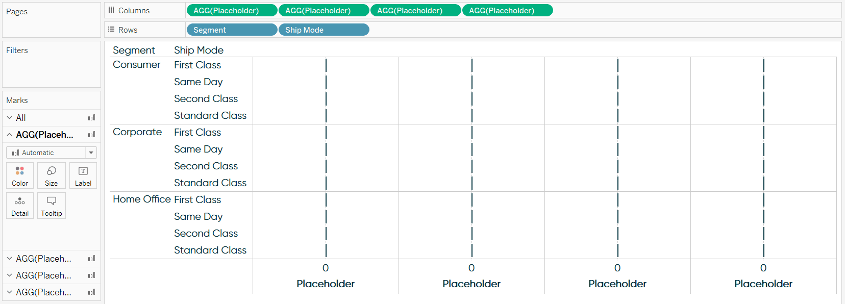
At this point we have the framework for our bar chart. What’s powerful about this second approach to creating the bar chart, and will provide the flexibility to add a tooltip to a dimension, is that each column now has its own set of Marks Cards. This means that they can be edited independently of each other.
I’ll start recreating the bar chart above by navigating to the third and fourth Marks Shelves, changing the mark type to Gantt Bar, and placing the Sales and Profit Ratio on the Size Marks Card for each respective Marks Shelf.
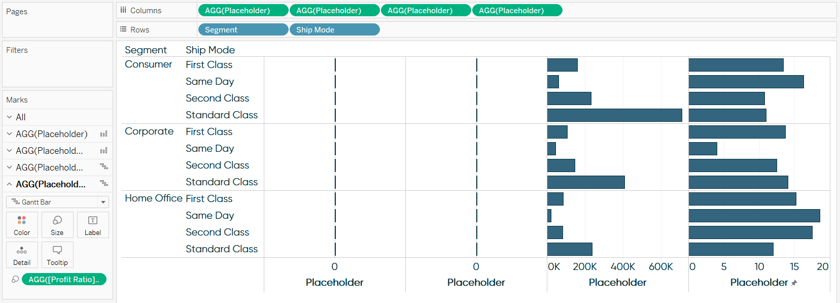
Here’s where the trick for adding a tooltip to a dimension comes in. For the first two Marks Shelves, I’ll change the Mark Type to Text and place the Segment and Ship Mode Dimensions on the Text Marks Card for each respective Marks Shelf.
Now that the dimensions are on the view as measures (because they are technically the text being displayed for the Placeholder measure), they have a complete set of Marks Cards. That means you can now add a tooltip to a dimension by modifying the Tooltip Marks Card! The tooltip can be used to show the definition of the measure, what data source it comes from, whether the data source is verified, additional context about the visualization, or whatever other purpose you can think of.
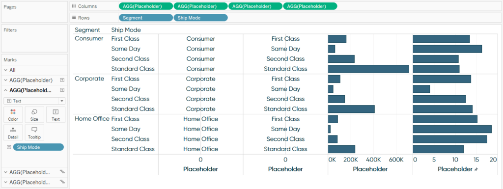
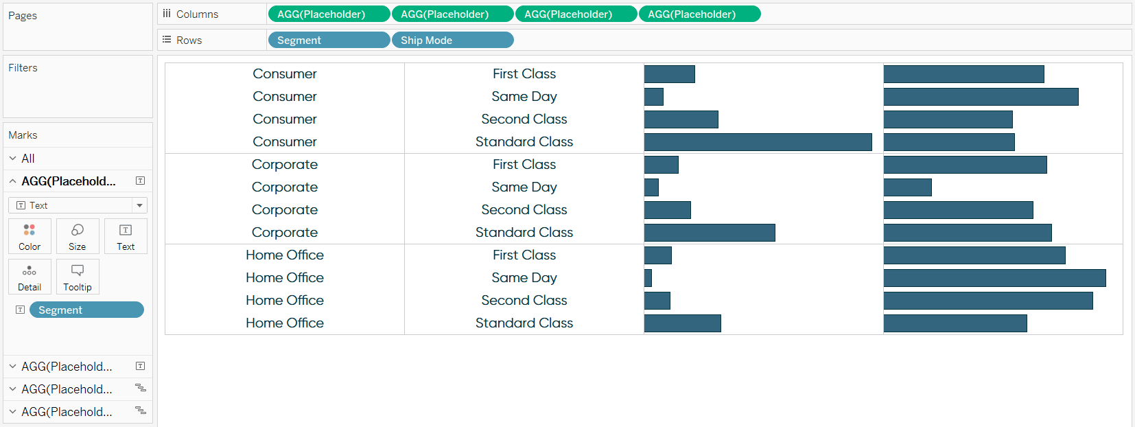
I’ll finish the view by cleaning up the formatting including:
– Hiding the first two columns (the original dimensions on the Rows Shelf) by right-clicking on them and deselecting “Show Header”.
– Getting rid of the zero lines and gridlines on the text columns by right-clicking on either column, choosing “Format…”, navigating to the Lines tab, and turning the zero lines and gridlines to none.
– Hide the Placeholder axes by right-clicking on any of the axes and deselecting “Show Header”. Note that this is one drawback to the Placeholder approach; you have to float the column headers and/or axes on a dashboard if you want them.
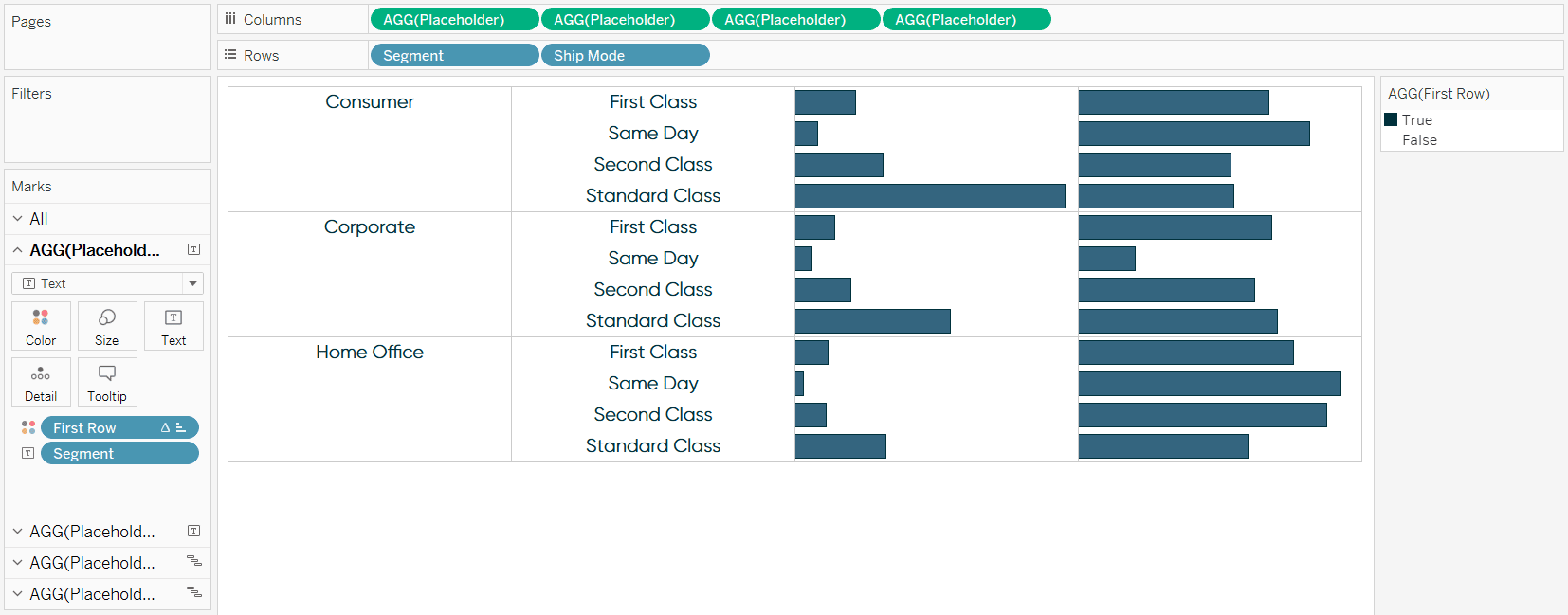
Lastly, if you’re losing sleep because the segment names are repeated for each row in the first column, there’s a hack for that too. You can color the text on the first row and color the remaining rows white using a simple table calculation.
![]()
First, make a calculated field with the formula “INDEX() = 1”. Next, put the newly created First Row calculation on the Color Marks Card for the first column. Change the direction and scope of the table calculation for the First Row calculated field to Pane (down). Give the first row color and change the color for the other rows to white.
Thanks for reading,
– Ryan


Written By
Ryan Sleeper
Related Content
How to Add an Image to a Tableau Tooltip
This year marked the introduction of a long-awaited Tableau feature: Viz in Tooltip. I believe this will be a game-changer…
3 More Ways to Overcome the Excel Barrier to Tableau Adoption
Yikes – I’m getting old in Tableau years. This week I clicked on a Tableau Public post I thought sounded…

Ryan Sleeper
Display different messages based on the underlying data Tooltips are not all or nothing per visualization. Learn how to use…