How to Make Marginal Histograms and Bar Charts in Tableau
As I often discuss, one of my main objectives as a data visualization practitioner is to avoid the question, “So what?”. I never want to have an analytics partner put their trust in me and spend my time building out a dashboard, only to have them not know why my findings are important or what to do about them. Three of the best ways to make your data visualization deliverables useful are to (1) build in comparisons, (2) add context, and (3) visualize the same fields in different ways.
In the case of scatter plots, adding marginal histograms accomplishes all three of these techniques. Marginal histograms are histograms added to the margin of each axis of a scatter plot for analyzing the distribution of each measure. And as my friend, Steve Wexler, points out, they’re not just for scatter plots. This post shows you how to make marginal histograms for scatter plots, marginal bar charts for highlight tables, and explains the difference between the two.
How to make marginal histograms in Tableau
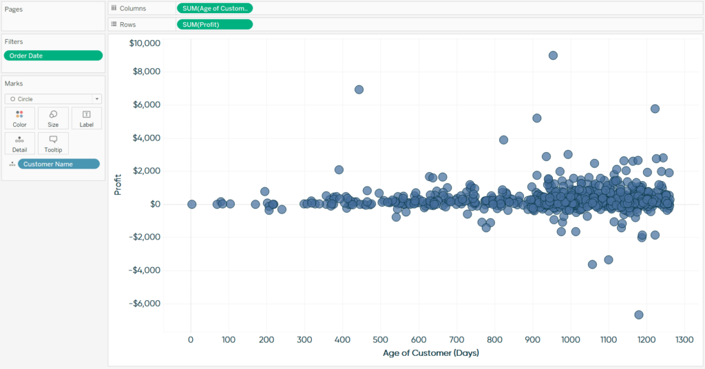
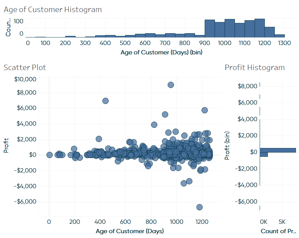
The traditional use of marginal histograms involves adding a histogram of each measure used in a scatter plot to the top and right margin. To begin, consider the following scatter plot looking at the Profit and Age of Customer (in days they’ve been a customer) measures by the Customer Name dimension:
How to Analyze Data Distributions Using Histograms in Tableau
If you want to follow along using the Sample – Superstore dataset, Age of Customer is a calculated field using this formula:
DATE(TODAY())-{FIXED [Customer Name]: MIN([Order Date])}
This formula takes today’s date minus the lowest date (i.e. the date they became a customer) for each customer name. I also added a filter so all dates would have to be less than today (the sample dataset has some dates into the future).
![]()
Continue reading with a free account, or login.
Unlock this tutorial and hundreds of other free visual analytics resources from our expert team.
Already have an account? Sign In
By continuing, you agree to our Terms of Use and Privacy Policy.
There are quite a few insights provided by this scatter plot. It seems like there is a correlation between the age of the customer and their lifetime value, which makes sense. As a customer has been retained longer, they’ve had more opportunities to buy something else and add to their running total of profit. It also looks like most of our customers are bunched between 900 and 1200 days old, and that most of our outlier customers (i.e. extra high or low profit) are at least two years old.
All of this is great, but it would be easier to see the distributions of our two measures if we added marginal histograms to this scatter plot. To start a marginal histogram, create a histogram for each measure on a separate worksheet. Histograms, which are made with just one measure, are one of the few chart types I prefer to make using Show Me. To make a histogram, simply create a new sheet, click on the measure you want to create the histogram from, click Show Me in the top right corner of the authoring interface, and choose Histogram.
Here’s my default histogram for the Profit measure:
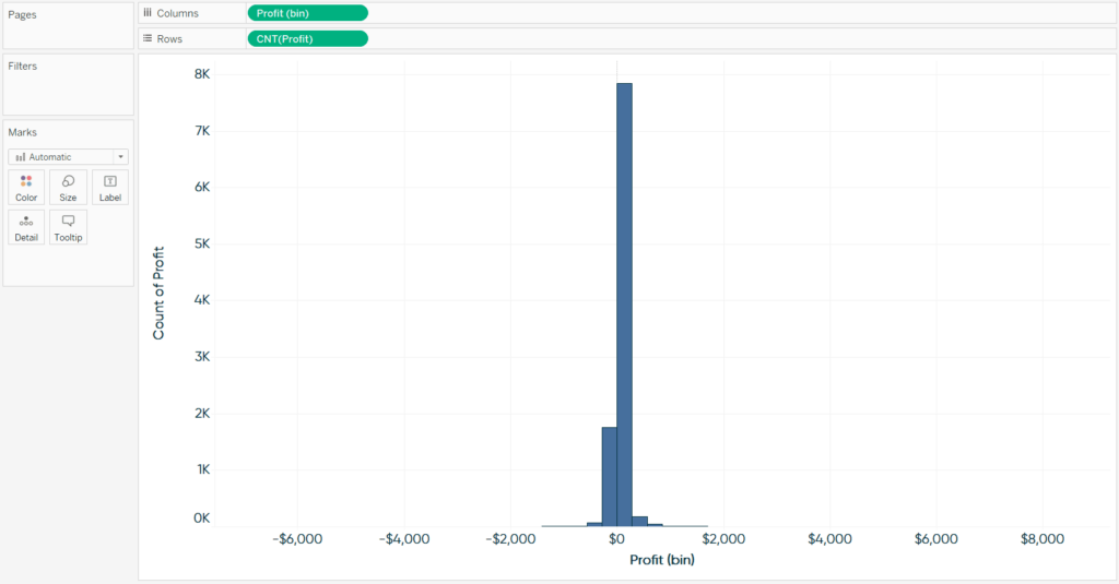
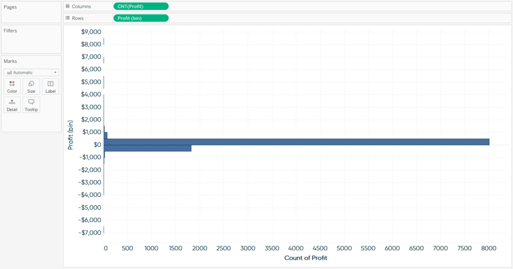
There are two changes I want to make to this histogram before combining it with the scatter plot. First, as this histogram will eventually reside in the right margin of the view, I want to swap the measures on the Rows Shelf and Columns Shelf, which will give the histogram a vertical orientation. Second, by default, Tableau is generating a “bin” size of 283. I normally like to change this to a more round, human-friendly number, such as 500. To edit the bin size, right-click on the Profit (bin) dimension in the Dimensions area of the Data pane, click “Edit…”, and enter a number next to where it says “Size of bins:”. Here’s how my Profit histogram looks at this point.
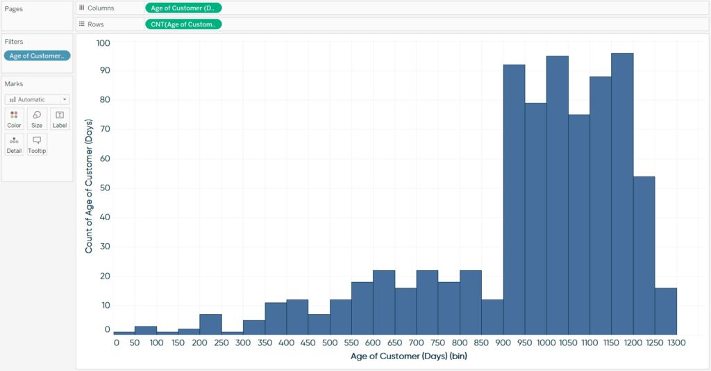
Next, create a horizontal histogram for your second measure. Here’s how my histogram looks for Age of Customer (Days) with a bin size of 50.
The trick to converting these three separate worksheets into a marginal histograms view is to line them up on a dashboard. This is easily accomplished in Tableau by using tiled dashboard sheets and the blank object. First, I’ll add all three elements to the dashboard.
The next step is optional, but I like to clean up the marginal histograms by removing sheet titles and axis headers. Instead of providing the values via the axes, you can add labels directly to the marks.
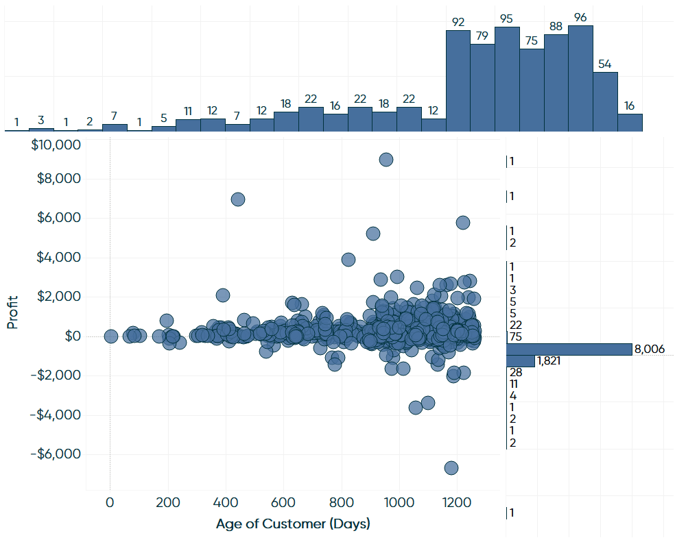
Lastly, I’ll add blank dashboard objects to the left and right of the top marginal histogram and below the right marginal histogram to get them to line up perfectly with the axes of the scatter plot.
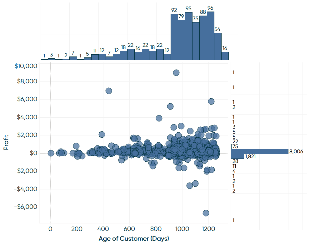
As suspected by looking at the scatter plot view alone, most of our customers are between 900 and 1200 days old, but now we can see the precise distribution. On the y-axis, we’re now able to see that the vast majority of profit values are between 0 and 500, but that our second biggest distribution is actually negative; an insight that would very challenging to discover with the scatter plot alone.
How to make marginal bar charts in Tableau
The concept of marginal histograms works well any time you’ve got a breakdown on both the y-axis and x-axis, and you want to visualize a higher aggregation than the view’s level of detail. To give you an alternate example, consider this highlight table looking at sales by region and segment.
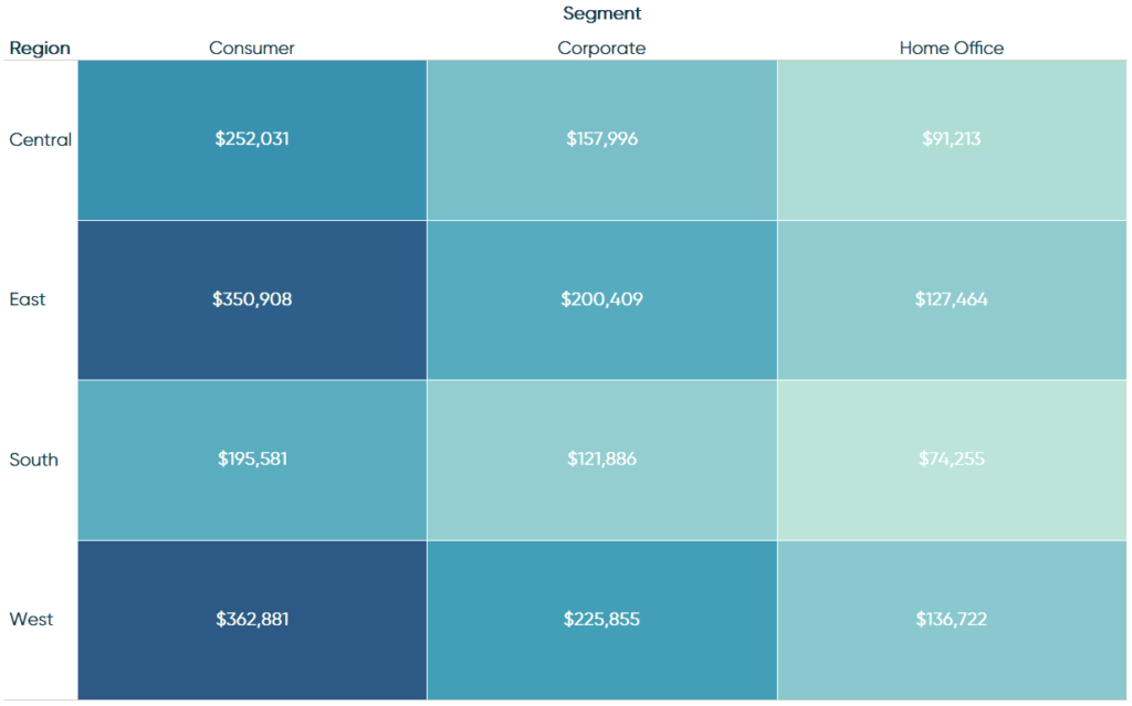
This view does a great job of showing our highest selling combinations of region and segment, but there is also value in knowing the sales across regions and segments individually (i.e. not combined). To get this ladder piece of context, we can create a view similar to the marginal histograms example with the scatter plot above.
![]()
The difference is that the charts in the margins this time will technically be bar charts (sales by region and sales by segment). They’re not histograms because histograms are made with exactly one measure; that one measure is then broken into counts of the values across equally sized bins. Our bar charts will use one measure (Sales), but also one dimension in each case (Region in the first; Segment in the second). Here is how a marginal bar chart view looks when added to the preceding highlight table. For best results, sort both bar charts in descending order and ensure the dimension members of the highlight tables line up properly with the dimension members within the bar charts.
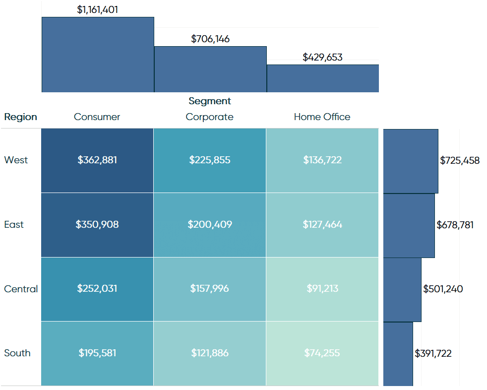
Now in addition to seeing the highest selling combination of region and segment, we can view the sales at the region level individually (without a breakdown by segment) and at the segment level individually (without a breakdown by region). This is a more visual alternative to adding subtotals to a highlight table!
For more ideas on formatting your highlight tables, see 3 Ways to Make Handsome Highlight Tables in Tableau.
For more ideas on formatting your scatter plots, see 3 Ways to Make Stunning Scatter Plots in Tableau.
Thanks for reading,
– Ryan

Written By
Ryan Sleeper
Related Content
3 Ways to Make Handsome Highlight Tables in Tableau
To draw a highlight table in Tableau, you need one or more dimensions and exactly one measure. This is the…
3 Ways to Make Stunning Scatter Plots in Tableau
When it comes to my favorite chart types, scatter plots are a close third behind bar charts and line graphs.…

Ryan Sleeper
Finally View Value Distributions Even When Measures are Ratios By default, Tableau histograms cannot be used with calculated fields such…