How to Make Small Multiples in Tableau
Small multiples are a group of charts or graphs that share the same axes and scales, which allows the user to compare trends across dimensions in a single view. They have been praised for their ability to provide a great deal of context, reducing the need for end users to ask the dreaded, “….So what?”. The term small multiples was popularized by Edward Tufte, who puts it best in his book, Envisioning Information:
“At the heart of quantitative reasoning is a single question: Compared to what?”
While smaller series of small multiples can work well on an executive summary dashboard, I typically like to use them as a second layer in an analysis. My executive level view, or ‘first layer’, may provide higher level information about a particular measure, such as the overall sales trend and progress towards goal. This is a ‘descriptive’ view of the data answering the question, “What is happening with sales?” From here, I may provide an option to view sales across different dimensions and sub-categories as a series of small multiples in a second layer of the dashboard (often located away from the first view). While small multiples are still a ‘descriptive’ view, it helps answer the question, “Compared to what?”
How to make small multiples in Tableau
Small multiples can come in several different forms, but for the purposes of this tutorial, I am going to show you how to compare a single measure across two different dimensions. I am using the Superstore sample data that comes packaged with every version of Tableau Desktop. To get started, select two dimensions and a measure. I have chosen the dimensions of Segment and Region and the measure of Sales for the view to follow.
Continue reading with a free account, or login.
Unlock this tutorial and hundreds of other free visual analytics resources from our expert team.
Already have an account? Sign In
By continuing, you agree to our Terms of Use and Privacy Policy.
Step 1 – Place one dimension on the Columns Shelf and the other dimension and your measure on the Rows Shelf.
By default, Tableau has created a bar chart for you. By placing Segment on the Rows Shelf, performance for each segment is read left to right, in rows. By placing Region on the Columns Shelf, each region is represented vertically, in columns.
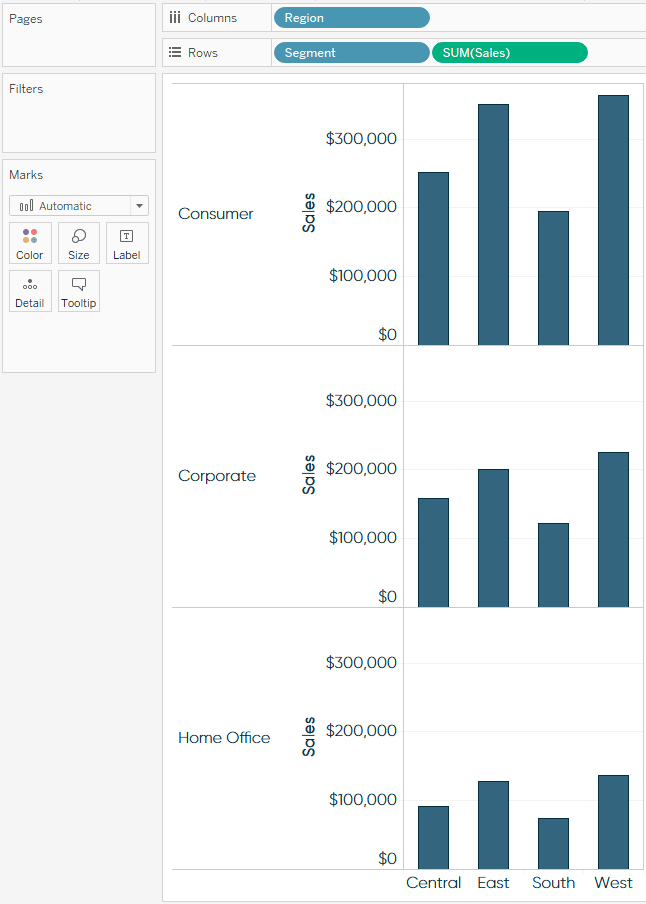
Small multiples may be a series of bar charts, but we still need to add an element of time to trend the Sales measure.
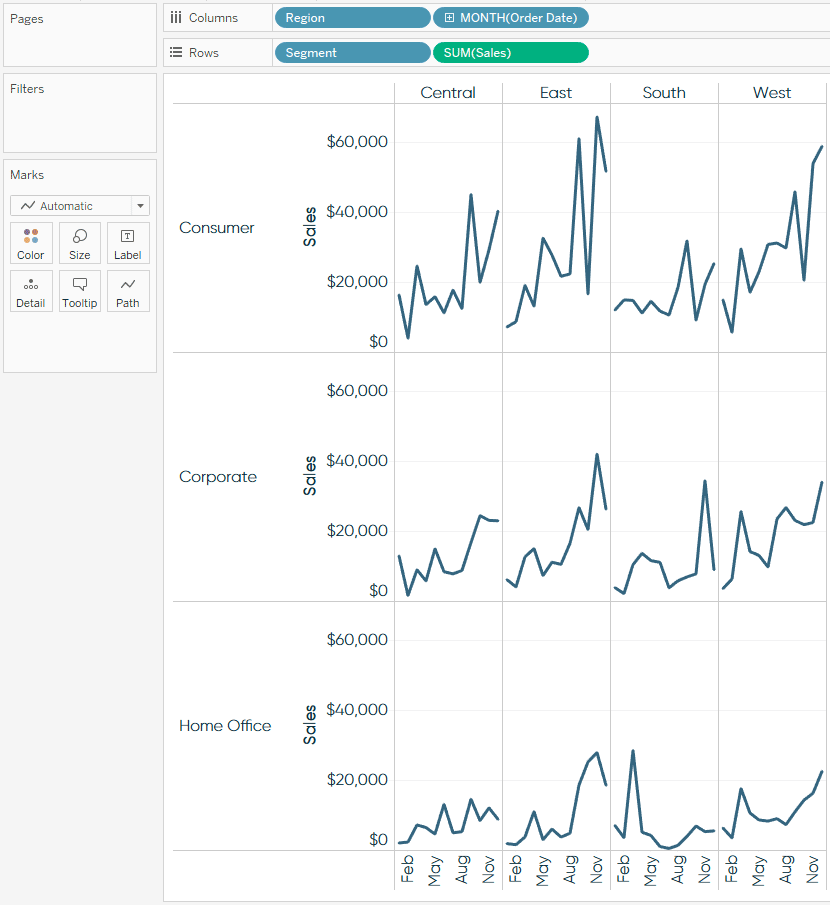
Step 2 – Place a date field on the Columns Shelf.
Let’s pretend that we would like to evaluate the seasonality of sales to answer a question such as, “Is there a certain month that I can expect a spike in sales?” For this type of analysis, we will use a discrete date field with a monthly aggregation, which will always show us the performance per distinct calendar month. By using discrete months rolled up to the datepart of month, I know that I will always have twelve data points per small multiple, or one for each calendar month (January, February, March, and so on). The Superstore sample dataset contains four years of data, so if we used a continuous date field with a monthly aggregation, we would have up to 48 data points per small multiple (four years x 12 months = 48 points).
![]()
By right-clicking and dragging the Order Date field onto the Columns Shelf, I was given an extra option to select the date aggregation (i.e. Year, Month, Week). To get the view to look as it does below, I chose the MONTH option that was colored blue. Month is the datepart and the blue indicates that the date will be discrete.
Step 3 – Format the small multiples to your preference.
From here, all that is left to do is format the view to your liking.
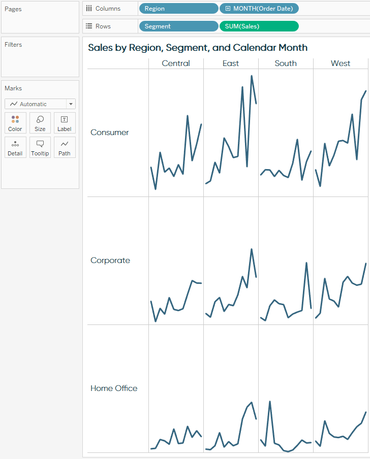
Formatting changes I made to finalize this view include:
– Hid the field labels for columns by right-clicking on Region / Order Date and deselecting “Show Header”.
– Hid the field labels for rows by right-clicking on Segment and deselecting “Show Header”.
– Hid both the X and Y axes by right-clicking on them and deselecting “Show Header”. This is a personal preference of mine. You may choose to keep the axes in the view for additional context. To keep the view as clean as possible, I opted to provide this context in the form of a title, and would typically provide additional information in the tooltips that appear when an end user hovers over different data points.
– Increased the font size in the headers.
![]()
Final considerations
In this tutorial, we have laid a strong foundation for using small multiples, but Tableau makes it easy to build on this view by customizing it in many different ways. For example, instead of using lines, you can change the mark type to bars, which are particularly useful for measures that can be positive or negative, or areas – which provide a beautiful design alternative. I have also seen small multiple views that display year over year data nicely and here is how to make small multiple maps in Tableau. So get creative, and build small multiples that help provide the answer to “Compared to what?”.
Thanks for reading,
– Ryan

Written By
Ryan Sleeper
Related Content
How to Make Trellis / Tile / Small Multiple Maps in Tableau
A chart type with many names… trellis maps, Tableau tile maps, or small multiple maps can help you compare measures…

Ryan Sleeper
When we know the outcome vs. making our user part of the story Did you know there are two types…
3 Ways to Make Spectacular Sparklines in Tableau

Minimalist chart types like Tableau sparklines are a great addition to most dashboards because they can add value without overcrowding…