How Your Brain Sees Data: Bars, Lines, and Pie Charts

Whenever I’m designing a dashboard, I ask myself the question: could someone spot the insight before they start reading?
When we are shown data, in those first split seconds, our visual system is already scanning, filtering, and prioritising what matters without our awareness. By the time you read the chart labels, legends, and footnotes, your brain has already made a few decisions.
In this tutorial, we’ll unpack what’s happening inside our brains during those initial moments when we start digging into a dashboard. We’ll explore how information is taken in, how it’s filtered, and how all of this connects to three of the most common chart types analysts use every day: bar charts, line charts, and pie charts.
By the end, you’ll understand why some charts and layouts work better than others. But more importantly, you’ll learn how to design dashboards that work with the brain and not against it.
Let’s get started!
The brain sees first, then thinks
One of the first things we need to understand is that what our eyes take in isn’t the same as what our brain actually perceives. Our eyes are constantly scanning for information (in the form of light), but the process of interpreting, analysing, and making sense of that stream is what we call visual perception.
Visual input never really switches off as long as we’re awake; information keeps pouring in. But perception is selective; our brains mechanically decide what’s worth paying attention to and what gets ignored.
In “Thinking, Fast and Slow,” Daniel Kahneman describes the brain as operating through two systems, each with a very different job:
- System 1 is the quick, instinctive one and is often known as the “reptilian brain.” It is fast, mostly subconscious, and makes snap judgments based on what it sees.
- System 2 is the slower and more deliberate part of the brain. This is where we stop, think, and put the real effort into analysis.
When someone opens a dashboard for the first time, System 1 takes the lead. The brain instinctively scans for colour, shape, size, and position, forming impressions in a matter of milliseconds. Only after that initial sweep does System 2 step in for the heavier thinking.
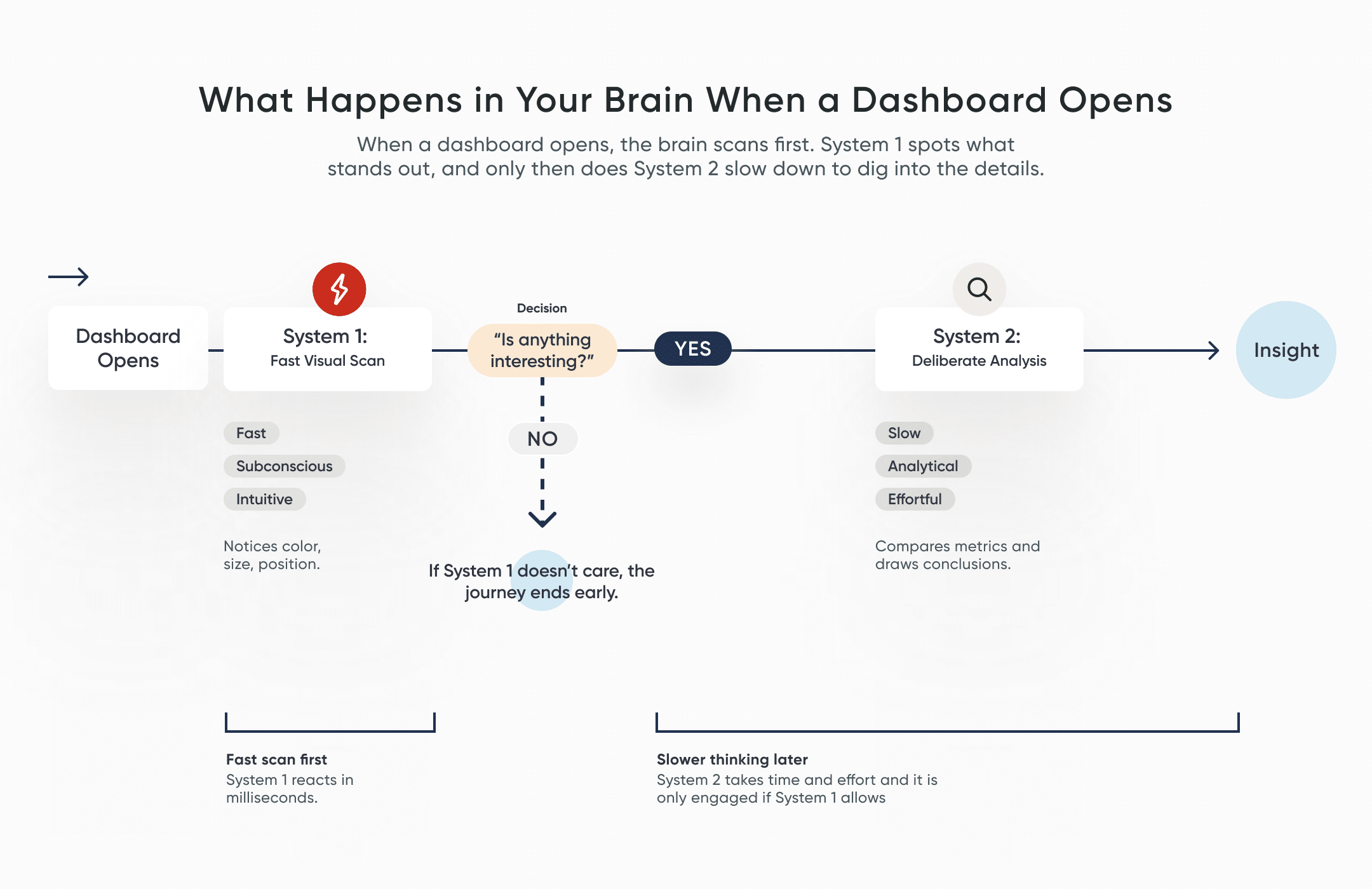
This explains why some dashboards resonate better than others. Many reporting tools are unintentionally built for System 2 first, designed with dense tables, heavy visuals, complex layouts, and lots to read. But if System 1 doesn’t spot anything that feels important or interesting, System 2 won’t get involved. This results in audiences losing interest before they even realise it.
Create a free account, or login.
Unlock this tutorial and hundreds of other free visual analytics resources from our expert team.
Already have an account? Sign In
So, the most effective way to design successful dashboards is to design for System 1 first. Focus on capturing attention early, and only then layer in the detail that System 2 needs to dig deeper.
How the brain decides what to notice
Many analysts assume that packing more information onto a page leads to a higher understanding of the data. However, that’s not really how the brain works.
The brain is a highly selective filtering system. It constantly screens incoming sensory input, allowing only a small portion to reach conscious awareness. This filtering behavior is essential to our survival. Without it, we’d be completely overwhelmed by our surroundings.
![]()
So, when a dashboard feels cluttered, the brain struggles deciding what actually matters and what it should pay attention to. This is true when everything is highlighted with the same color, the charts use too many labels, or are heavily stylized and decorated. The more visual noise you introduce, the harder the brain will need to work.
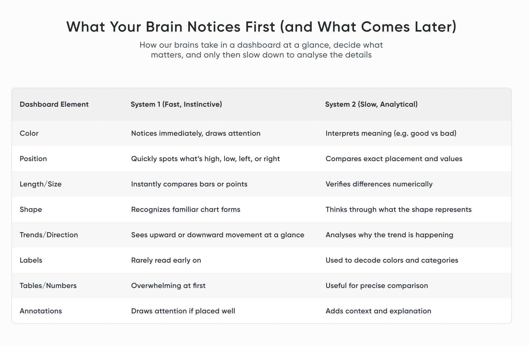
This is where the brain relies on pre-attentive attributes to make sense of things. These are visual cues that our brains process almost instantly, before our conscious minds do, such as color, length, position, orientation, size, and shape. These attributes are closely tied to System 1. They are what allow someone to spot a spike, a gap, or an outlier at a glance. That’s why pre-attentive attributes matter so much in dashboard design: they give us a way to guide attention in those initial seconds and help the brain spot the insights before any real analysis begins.
If you’d like to dive deeper into pre-attentive attributes, Megan Spengler’s Preattentive Attributes Comparison tutorial and Ryan Sleeper’s Playfair Data Presents: Preattentive Attributes video are both excellent tutorials.
How we make sense of charts at a glance
When we look at a chart, we don’t experience it as a collection of individual marks, axes, or encodings. We see things. Shapes. Patterns. Objects that may feel familiar or not.
In psychology, this is known as object recognition. This is how our brains make sense of what we’re seeing by matching it to a memory or past experience.
Building Blocks of Dashboards: A Beginner’s Guide to Visual Elements
The process of object recognition functions in two directions at once: There’s the bottom-up side, where the brain picks up raw visual details such as lines, angles, and shapes. And there’s the top-down side, where expectations and experience step in to interpret what those shapes must be. In everyday life, this is what helps us differentiate a friend from a stranger, or know instinctively how to pick up a hammer. In dashboards, it’s what helps us spot patterns and extract insight.
I bring this up because it has real consequences for how we design charts. Object recognition is shaped by experience. If someone hasn’t seen a chart like yours before or if the design hints at the wrong kind of “object,” their brain may confidently recognize a pattern that isn’t actually there.
That’s why picking high data literacy chart types or unconventional visualizations can be risky. The brain likes to fill in the gaps, make assumptions, and jump to conclusions before System 2 has had a chance to slow down and check the logic. In the same way, if a user doesn’t understand a chart, they may miss an important insight.
This doesn’t mean that creativity should be limited or that new chart types should be avoided. It’s those familiar elements that reduce mental effort and lower the risk of misunderstanding. So that when you do decide to push beyond the familiar and think outside the box, it helps to be aware of how people are likely to perceive what you’re putting in front of them.
Understanding human perception, cognition, and psychology is important when it comes to creating successful visual analytics tools. A psychological element we often unknowingly use, called a heuristic, is a rule-of-thumb or mental shortcut that we can use to make a decision or solve a problem. Humans have heuristics for many things, but they can be especially useful for dashboard interface design. Alyssa Huff wrote a fantastic blog that walks you through what these are: How Nielsen’s Usability Heuristics Apply to Visual Analytics
How the brain reads bars, lines, and pie charts
Now that we get a sense of how visual perception works, let’s dive into how the brain actually experiences some of the most common chart types.
Bar charts
Our brains are especially good at comparing length and position. We do it quickly and with very little effort, which is why bar charts are such a reliable choice.
They work well because:
- Comparing lengths is fast and accurate.
- Rankings are obvious almost immediately.
- Patterns and outliers can stand out easily.
- They are familiar and take low data literacy efforts to understand.
Bar charts are a solid go-to for categorical comparisons and rankings, and are easily scanned and understood quickly, leaving little room for misleading insights or erroneous conclusions.
Line charts
Line charts are a simple and reliable way to show how data changes over time. Our brains naturally follow connected points and notice changes in direction, making patterns and shifts easy to spot.
Also, because we read left to right, we perceive time linearly, which helps System 1 process the chart quickly and accurately, leaving little room for misinterpreting the data.
They work well because:
- Trends and patterns are immediately clear.
- Any sudden jumps or dips will stand out.
- Can compare multiple categories at once.
Line charts are used to illustrate how something changes over time. They make it easy to see direction, momentum, and turning points – where things start to climb, level off, or drop. When used correctly, a line chart helps viewers understand the trend quickly and focus on what’s changing, before System 2 gets involved.
Pie charts
Pie charts are familiar and approachable, which is why people like them. But our brains aren’t great at comparing angles or areas, so pie charts often slow us down and require System 2 to step in and do more work. They can still be useful, but only in limited situations.
They tend to work best when:
- The message is simple.
- There are very few slices (ideally two to four).
- One slice clearly matters more than the rest.
Most often, a simple bar chart will work far better at telling the same story. But if a pie chart is preferred, I do recommend keeping the following in mind.
When designing:
- Include legends for all slices close to the chart.
- Limit to 2-4 slices.
- Limit color usage and highlight the most important slice.
- Consider donut charts to reduce center clutter.
Final thoughts
Designing data isn’t just about making things look nice. It’s about understanding how people actually see things. Every chart is a little conversation between your data and someone else’s brain. System 1 always talks first, where System 2 only joins if it’s invited.
When we design with perception in mind, instead of expecting people to patiently figure everything out, our insights actually stand a chance of influencing decisions.
Thanks for reading, and happy charting!

Written By
Rafael Simancas

Peer Review
Alyssa Huff
Sr. Manager, Information Design

Cross-Functional Peer Review
Dan Bunker
Manager, Decision Engineering
Related Content
Building Blocks of Dashboards: A Beginner’s Guide to Visual Elements
Lines, shapes, colors, and space are all around us, including in the tools we use every day. On their own…
How Nielsen’s Usability Heuristics Apply to Visual Analytics
Understanding human perception, cognition, and psychology is indispensable when it comes to creating successful visual analytics tools. A psychological element…
Winning the Oracle Analytics Cloud Data Visualization Challenge
What better way to start the year than for the Playfair Data team to have won yet another award! Our…