Year in Review / Top Playfair+ Tutorials of 2025
What a year 2025 has been! With 29 new written tutorials, 18 new video tutorials, and many public and private training events held throughout the year, the Playfair Data team further expanded into valuable topics such as Decision Science, Tableau innovations, Oracle Analytics Cloud, Power BI, Figma, and Design principles for data analytics. As tradition holds, we will be sharing our top written and video tutorials of the past year, along with some observations to provide insight into what the data analytics community found valuable and where current trends might be heading.

Continue reading with a free account, or login.
Unlock this tutorial and hundreds of other free visual analytics resources from our expert team.
Already have an account? Sign In
By continuing, you agree to our Terms of Use and Privacy Policy.
Top 3 written tutorials of 2025
#1 – Introducing Balance Scale Charts in Tableau by Dan Bunker
The most popular written tutorial of 2025 is a Tableau engineering innovation, Introducing Balance Scale Charts in Tableau by Dan Bunker. This is a chart innovation from the Financial Analysis Swift, which visualizes the weighting of two variables. In the case of the Financial Analysis Swift, it visualizes the balance between assets and liabilities on a balance sheet. The beauty of this chart is its “balance” of simplicity, originality, and directness. Utilizing the preattentive attribute of size, this chart innovates on a simple bar chart where a user can immediately understand what’s being visualized and its comparative value.
When we noticed we had an instant hit with a new chart type that served an important financial analysis use case, we also adapted the approach to other popular software, including the tutorial, How to Create Balance Scale Charts in Power BI.
#2 – Enhancing UX with Interactive User Guides in Tableau by Alyssa Huff
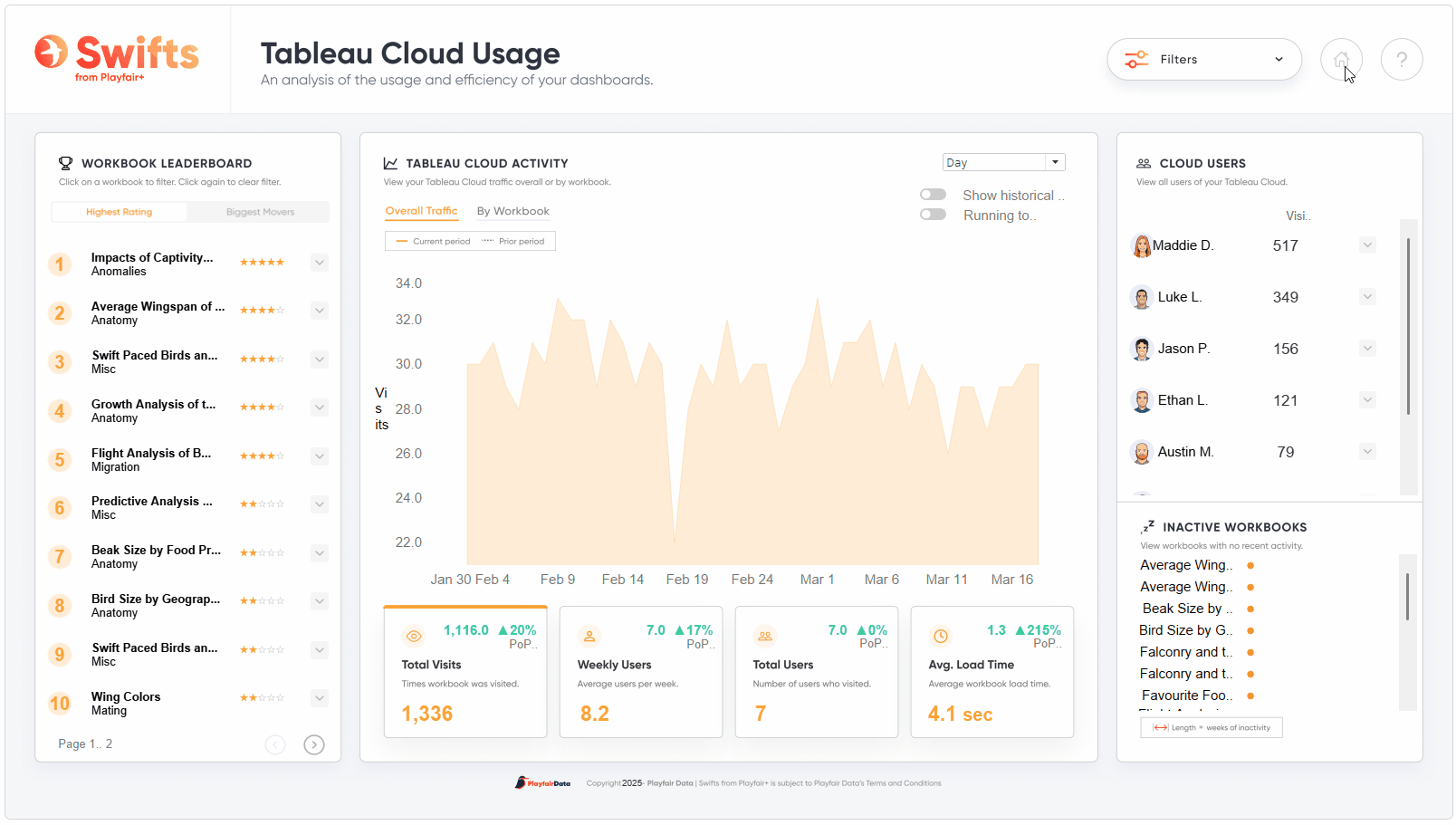
The second most popular written tutorial of 2025 is a user experience and design tutorial written by Alyssa Huff, Enhancing UX with Interactive User Guides in Tableau. Alyssa explains that a guide can help users get the most out of the tools you build for them. But what makes a user guide effective? It needs to be accessible, logically organized, and easy to understand. In this tutorial, Alyssa shares a technique for an interactive user guide in Tableau that not only fits these criteria but also engages the audience. As a use case, Alyssa walks you through how she created a user guide for one of our Playfair+ template dashboards, the Tableau Cloud Usage Swift. And she equips you with the tools to map out a logical and concise user guide, build the creative assets, and implement the guide in Tableau.
Creating a great executive dashboard for finance takes careful attention to design principles and a solid understanding of user needs. In this tutorial, Rafael and Dan walk you through the key lessons they learned while building our own executive dashboard, the Financial Analysis Swift, for analyzing a company’s financial health. These are the insights that guided them through the process, and they hope they’ll be helpful as you work on your own executive dashboards.
Reflection of the top three written tutorials
- At Playfair Data, we utilize a team approach to every visual analytics project, with skills that overlap in key areas. Those key skill areas are reflected in how we categorize all our tutorials, namely Strategy, Engineering, Data Prep, and Design. It is serendipitous that the top three tutorials of 2025 spanned three of the categories: #1 Engineering, #2 Design, and #3 Strategy. Our Playfair+ members clearly agree that excellence in visual analytics requires a multidisciplinary approach.
- In 2025, we have seen a trending interest among the data community in Figma and design principles. Figma tutorials received the most views of any tool, with Alyssa’s Design/Figma tutorial, Enhancing UX with Interactive User Guides in Tableau, coming in as the second-most popular tutorial, and Rafael’s design training drawing a large and interested crowd. We have heard your demand for additional design content, and we are excited to continue sharing our expertise in this area of visual analytics in 2026, including a new Design Thinking for Data People training.
- In 2024, one of the top three written tutorials was an innovation: How to Create Multi Select Parameters in Tableau. In 2025, two of the top three tutorials were innovations. Because it is clear that our Playfair+ members value new engineering and design techniques, we will strive to continue innovating on your behalf in 2026 to bring new, interesting ways to visualize data in your preferred visual analytics tool.
- All of the top three written tutorials were inspired by building Swifts, which are expertly crafted “plug and play” dashboards. The Balance Scale Chart and Lessons Learned Designing Executive Dashboards tutorials were inspired by the Financial Analysis Swift, and Alyssa’s Enhancing UX with Interactive User Guides tutorial was inspired by the Tableau Cloud Usage Swift. Building these Swifts has not only benefited our Playfair+ Premium members but has also inspired the wider community through the innovations and tutorials that have followed.
Top 3 video tutorials of 2025
Video tutorials are available to Core and Premium Playfair+ members. Learn more about Playfair+.
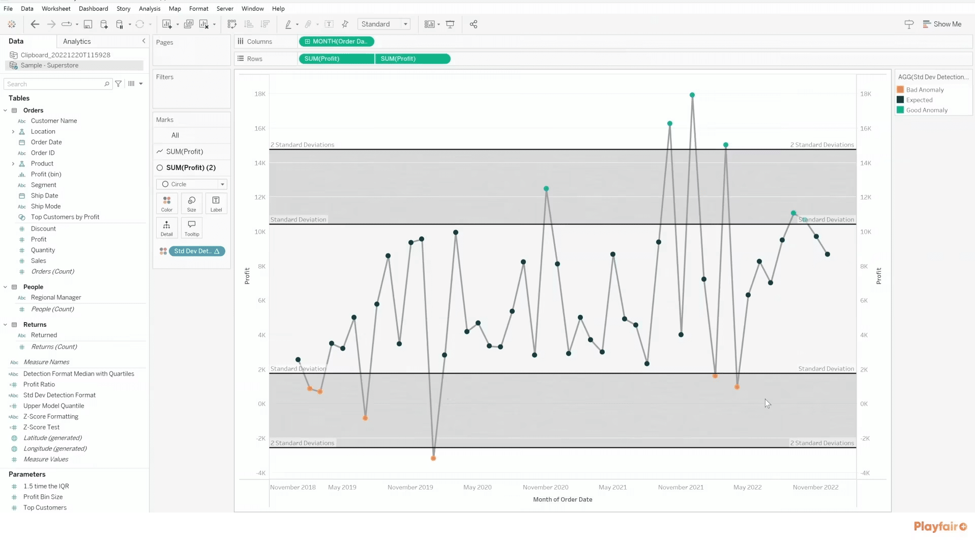
#1 – 3 Ways to Visualize Outliers in Tableau by Ethan Lang
Ethan’s tutorial, 3 Ways to Visualize Outliers in Tableau, shows how to immediately unlock value in your visual analytics project by finding and fixing negative outliers. In this video, learn how to automate the process of detecting anomalies in your data and three different models for ensuring your findings are statistically significant.
#2 – Getting Started with the Oracle Analytics Cloud Authoring Interface by Dan Bunker
With Oracle Analytics recently making a splash on the scene in data analytics, 2025 Oracle Analytics Ambassador and winner of the 2025 Oracle Analytics Data Visualization Challenge, Dan Bunker, provides a tour of the Oracle Analytics Cloud interface, introduces key terms and definitions, and teaches you how to begin visual analytics engineering in this tool.
#3 – The Importance of Cohesive Design in Your Power BI Reports and Dashboards by Matt Snively
In this video, Matt Snively teaches how to create well-designed Power BI reports and dashboards by applying cohesive design across all elements on a page. You’ll also learn tips to match visual formatting and how to use background elements and shapes to make your Power BI products pop.
Reflection on the top three video tutorials of 2025
- In 2025, the Playfair Data team made a conscious effort to deliver value to our Playfair+ members using what we have dubbed the big three visual analytics tools: Tableau, Power BI, and Oracle Analytics Cloud. It is with great pleasure that my annual analysis proved that our Playfair+ members found this diversification valuable, as the top three videos spanned all three of these tools! Given this outcome, we will continue to deliver useful video content across these three visual analytics tools in 2026.
- An exciting trend emerged in 2025 on the topic of Decision Science, with Ethan’s 3 Ways to Visualize Outliers in Tableau coming in at the most popular video tutorial. It’s no surprise that this result follows Ethan’s popular session, presented multiple times at this year’s Tableau Conference in San Diego. In addition, Ethan’s private and public training event, “Statistical Tableau,” drew large, engaged crowds throughout the year. Our Decision Science team is taking this to heart and will be making an effort to bring new, innovative decision science approaches not only to Tableau, but the other visual analytics tools as well.
- With its sleek, intuitive user experience and robust ecosystem, Oracle Analytics Cloud is a newer tool gaining momentum in the analytics marketplace. This momentum was certainly reflected in the viewership of Getting Started with the Oracle Analytics Cloud Authoring Interface. Reflecting this trend and new demand, our team will continue adding value for our Playfair+ members by producing new, innovative Oracle Analytics Cloud tutorials in 2026.
- 2025 was a big year for Power BI, with 16 newly published video tutorials and Matt Snively hosting our first public Power BI training for Playfair+ members. With the design trend we have been observing, it is no surprise that Matt’s tutorial, The Importance of Cohesive Design in Your Power BI Reports and Dashboards, was the most popular Power BI video tutorial. With nearly all Power BI videos in 2025 being fundamental tutorials, our team will make an effort to expand into more intermediate and advanced topics in 2026.
Analysis of AI’s influence on organic traffic
Given that the majority of our viewers are analysts, some of whom may be in marketing analytics, I thought our readers might find this insight interesting in the age of artificial intelligence and its influence on Google rankings, marketing, and SEO. Despite organically ranking in the top positions for most of our tutorial topics, we have noticed that organic traffic steadily decreased year-over-year since AI made a splash on the scene and AI overviews were implemented into Google Search. This is a trend that has a lot of marketers concerned, but keep up hope – with any change comes opportunity!
Though overall Organic Search Traffic declined, the traffic from AI increased 290% from 2024 to 2025, with ChatGPT (63% total AI traffic), Perplexity (20% total AI traffic), Gemini (13% total AI traffic) accounting for the majority of the AI traffic. In total, AI traffic increased from 0.17% of total traffic in 2024 to 1.10% of total traffic in 2025. We will be closely watching the unfolding of this trend in 2026 to identify opportunities for ranking within the AI overviews.
Conclusion
In 2025, we saw that Tableau Desktop innovations still reign supreme; there is continued interest in learning about Figma and design principles for data analytics; Oracle Analytics Cloud is continuing to gain momentum and popularity; and Decision Science is becoming a trending topic. Going into 2026, we will do our best to continue serving our Playfair+ community by delivering the most relevant and highest-quality training and tutorials. I hope you have a happy new year and that 2026 brings you clean data, meaningful analytics projects, and satisfied stakeholders.
Thanks for reading,
Dan

Written By
Dan Bunker

Editorial Review
Juan Carlos Guzman
Visual Analytics Associate
Related Content

Ethan Lang
3 Ways to Visualize Outliers in Tableau Finding and fixing negative outliers is one of the fastest paths to value…

Dan Bunker
Learn about the Oracle Analytics Cloud authoring interface This video will help orient you with the Oracle Analytics Cloud authoring…

Matt Snively
Include custom designs in your Power BI reports and dashboards In this video, you’ll learn to create well-designed Power BI…