5 Lessons Learned from Designing Executive Dashboards: the Financial Analysis Swift

Creating a great executive dashboard for finance takes careful attention to design principles and a solid understanding of user needs. In this tutorial, we’ll walk you through the key lessons we learned while building our own executive dashboard, the Financial Analysis Swift, for analyzing a company’s financial health. These are the insights that guided us through the process, and we hope they’ll be helpful as you work on your own executive dashboards.
This tutorial uses an example from our portfolio of downloadable dashboard templates, Swifts, which are available to Playfair+ Premium members.
Know your audience
One of the first steps in designing a dashboard is to know who your users are. Understanding your audience helps you solve their specific problems and create something they find helpful. In the end, it’s the users who decide if the dashboard really works for them.
For our Financial Analysis Swift executive dashboards, we followed our usual process to get a good understanding of the audience. Here are three key areas we focused on:
1. Understanding users’ familiarity with the data
A big part of designing well is being able to see things from the user’s point of view. We need to understand their goals, expectations, frustrations, and behaviors. So, we started by asking questions like, “Who are our users?”, “Where are they coming from?”, and “Who will be using this tool?”
We quickly learned that most of our potential Financial Analysis Swift users would already be somewhat familiar with other tools for financial analysis. Since they weren’t new to this information, we had room to make the visualizations more detailed. Our main focus became how to show complex data in a way these knowledgeable users would find useful.
Continue reading with a free account, or login.
Unlock this tutorial and hundreds of other free visual analytics resources from our expert team.
Already have an account? Sign In
By continuing, you agree to our Terms of Use and Privacy Policy.
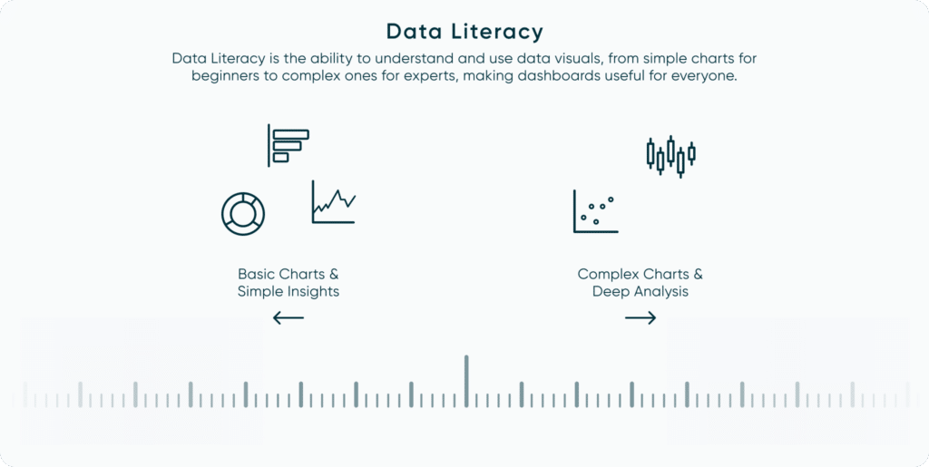
2. Understanding their level of data literacy
Knowing how comfortable users are looking at data reports is key to making a dashboard that’s easy for them to use. If users aren’t working with data reports every day, they need simple navigation, basic charts (like bar, line, or donut charts), and some instructions to help them understand what they’re looking at.
For users who have more experience with reading data visualizations, though, we can include more complex charts, like scatter plots, box-and-whisker plots, or Pareto charts. These provide deeper insights but need a bit more understanding.
For the Financial Analysis Swift, we knew our audience would include both less experienced users and expert analysts. To serve both groups, we used straightforward visuals—like trend graphs—that everyone could understand, but we also added some charts with more detail for advanced users. For example, we included a spider chart to help compare metrics and created our very own “Balance Scale” chart to show the relationship between assets and liabilities, giving users a clear view of financial balance. Both of which we’ll walk you through further down this tutorial.
3. Defining use cases and user types
After understanding our users and their data literacy, we focused on defining use cases and user types (personas) to make sure we covered all the needs of our audience. We identified three main personas for financial statements:
- Managers, who need to monitor the company’s performance and overall financial health.
- Lenders, who look at financial statements to check the company’s creditworthiness.
- Stockholders and analysts, who use the statements to judge the company’s value, predict future performance, and decide if it’s a good investment.
By defining these groups, we could better understand the tool’s requirement for each persona. This helped us know what kind of analysis to include, which data points were essential, and what features would make the tool valuable for each user.
![]()
Design within constraints
What is a constraint? In design, a constraint is a limit or restriction that keeps users from taking certain actions or helps them avoid mistakes. Constraints reduce the number of choices a user can make, guiding them toward the intended experience. Good design almost always includes constraints to keep things user-friendly. There are also practical constraints outside of design that need to be considered, like budget, time, and resources.
Let’s look at some we considered for the Financial Analysis Swift:
1. Constraining your scope
When we started creating the Financial Analysis Swift, we knew this was just the first version of the tool. Having a big-picture vision is great, but it’s also important to be realistic about what can be done in the first round. That’s where the idea of a Minimum Viable Product, or MVP, comes in—it’s a version with just enough features to attract early users and show the tool’s value.
For this project, we had to focus on what mattered most. With finance data, there are so many ways we could go, but we narrowed it down to only utilize four companies and asked ourselves, “What’s the main story we want to tell with this data?” Trying to do everything would have made the tool too complicated.
By keeping the scope clear, we stuck to a manageable set of data fields, stayed on track, and told a simple, meaningful story through the data.
2. Managing cognitive load
When it comes to dashboards, one of the main design challenges is managing cognitive load, or how much information users can handle at once without feeling overwhelmed. If users say a dashboard is “too much,” they may not even give it a chance. Managing cognitive load is essential in creating executive dashboards. Once we narrowed down the data, we could focus on how much information to show at once on each screen.
For the Financial Analysis Swift, we followed a simple rule: each view should answer about 3-4 key questions. This kept the layout straightforward and kept users focused. For example, we focused on questions like, “What’s the business’s profitability?”, “Are we meeting our debt obligations?”, and “What caused the balance to go up or down?” Keeping it to these main points allows users to get the answers they need without feeling lost in the details.
Data-Ink Ratio Animation and How to Apply it in Tableau
3. The ‘Elevator Pitch’
Executives typically don’t have much time, so we approached the executive dashboard like an “elevator pitch”—giving just enough detail for a quick, clear takeaway. If your dashboard includes an Overview page, like ours did for Financial Analysis Swift, it’s crucial to present information in a way that’s easy to digest and actionable – a key feature of many executive dashboards.
In as little as 30 seconds, we wanted users to start answering the essential questions right away. For Financial Analysis Swift, our goal was to make sure they could instantly see whether the company’s financial health was trending up or down. This clear, quick-access approach means users get the insights they need without digging or analyzing every detail.
Optimize for executive dashboards for performance
Tool adoption can be one of the greatest barriers to successful analytics in any organization. You can have the most insightful report that would influence important decisions, but when no one uses the report, then it is as good as nonexistent. When building dashboards, it is important to get into the mindset of your end user, therefore when building executive dashboards, we must put ourselves in the mind of an executive.
Storytelling Tip: Know Your Audience
When it comes to executive dashboards, speed is of utmost importance. The stereotypical executive wants to quickly know high-level information to ask the right questions and draw conclusions. Unlike the analyst persona, the executive does not want to take the time to tediously look through the granular data. Therefore, it is imperative that the executive dashboard has been optimized for speed.
If an executive dashboard takes over 10 seconds for every click then the stakeholder will get frustrated and lose interest. Due to the complexity of the Financial Analysis Swift, the load time became a major issue. The original load time for each selection was averaging 25 seconds, but by following the basic rules below, I was able to reduce that load time to under 10 seconds.
Tips for efficient workbook processing:
- Optimize rows and columns by removing unused fields and metadata: The Beginner’s Guide to Basic Tableau Calculated Fields (playfairdata.com)
- Roll up the data granularity to the highest level possible: Why It’s Important to Understand the Granularity of Data (playfairdata.com)
- Export the most efficient data source file types for your software: 3 Ways to Optimize Tableau Workbook File Size (playfairdata.com)
- Use data extracts instead of a live connection: How to Run and Interpret the Tableau Workbook Optimizer (playfairdata.com)
- Reduce the use of level of detail calculations and replace them wherever possible with table calculations. The Beginner’s Guide to Tableau Level of Detail (LOD) Calculations (playfairdata.com) The Beginner’s Guide to Tableau Table Calculations (playfairdata.com)
While there are other techniques for reducing the load time of a workbook, these five tips should provide the best results across most use cases.
Useful tips for working with new data
In all circumstances, working with new data for the first time is a challenging task. Often, multiple layers of proficiency are required of the analyst/engineer to successfully complete the project. Those areas of proficiency usually include a basic understanding of the business strategy, what the business questions are and how the new data can be used to address them, an understanding of how the specific department (if relevant) currently gathers and uses the data, and an understanding of the data and data structure.
Get familiar with the data
When working with new data, you must take it upon yourself to extensively research it. Some starting points for research can include answering simple questions such as what are the definitions of the different data fields (i.e. what do they mean?), mapping out the data structure (or required data structure), researching and studying the different terminologies that are new to you, what chart types are best suited for the data and audience, how is the data currently being used/visualized, what is the stakeholder hoping to gain from the data?
These are just a few of the many questions that could be addressed during research but the most important point is that you have a good understanding of what you are working with before engineering the project.
Lean on a subject matter expert
It is very helpful to surround yourself with a team of experts who have more knowledge and experience with the data. Identify who the subject matter experts are and then don’t be shy about asking questions because not all answers can be found through your own individual research. These people will help you to gain confidence in the data you are working with and help guide you to an in-depth understanding of general trends, what’s normal, what’s not normal, etc.
Establish a single source of truth for efficiency and confidence
When creating or recreating calculations with new data, having a verified source of truth that you can compare the results of your calculations to is incredibly valuable. It will decrease the time you spend building calculations, decrease the likelihood of an incorrect calculation, and will provide you with confidence that all your calculations are accurate. A source of truth provides efficiency and peace of mind.
Drive innovation in data visualization
In our experience, data visualization innovations almost always occur when there is an intersection of two or more people with different skill sets working together to solve a problem. Rafael as the designer drafts up ideas in Figma and then Dan as the engineer will take those ideas and figure out what’s feasible to build. From there we’ll iterate between what’s creative and what’s constrained to achieve a solution that is both original and practical.
There were several new innovations that came out of this project including a ‘balance scale’ chart and a new technique for creating dynamic radar charts.
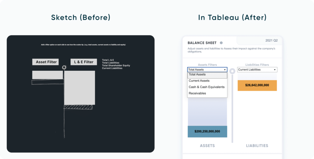
The ‘Balance Scale’ chart
On the Overview page, we introduced what we called our “Balance Scale Chart.” This chart came to life during a team brainstorming session as we discussed different chart types that could best represent the balance sheet data and how users would want to view it.
The concept is simple: a balance sheet is a financial statement that measures a company’s ‘balance’ between its assets and liabilities + equity. There are different insights that an investor can draw from the company’s ratio of assets to liabilities, assets to shareholder’s equity, liabilities to equity, etc. that provide clues to the health of the business, thereby qualifying or disqualifying it as an investment opportunity based on the analysts parameters.
So, with our understanding of this data relationship, we thought about how to represent it visually. We kept coming back to the image of a scale, where one side tips based on the weight of assets, liabilities, or equity. This visual made sense, so we set out to bring it to life in Tableau.
As the designer, I started by sketching a few ideas for a simple balance scale. Given the constraints of Tableau, I asked myself, “What elements make a scale feel like a scale?” I realized it needed two sides that could move independently, going up or down depending on the data, with a central pillar to anchor them. From there, I considered which parts could be part of Tableau’s dynamic elements and which could stay in the background. Since the pillar was static, it made sense to keep that in the background, while the scale’s two sides needed to be dynamic to respond to live data.
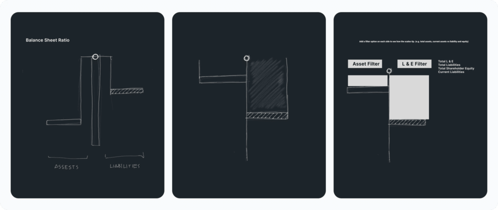
Next, we thought about other data fields we could link to the scale, allowing users to select from various fields related to assets and liabilities. This flexibility would make the chart more interactive and valuable for users.
![]()
Finally, it was up to our engineer to bring it all together in Tableau and see if the concept worked with real data. And it did! We created a unique, interactive chart that gives users a clear view of the company’s financial balance.
The Spider chart
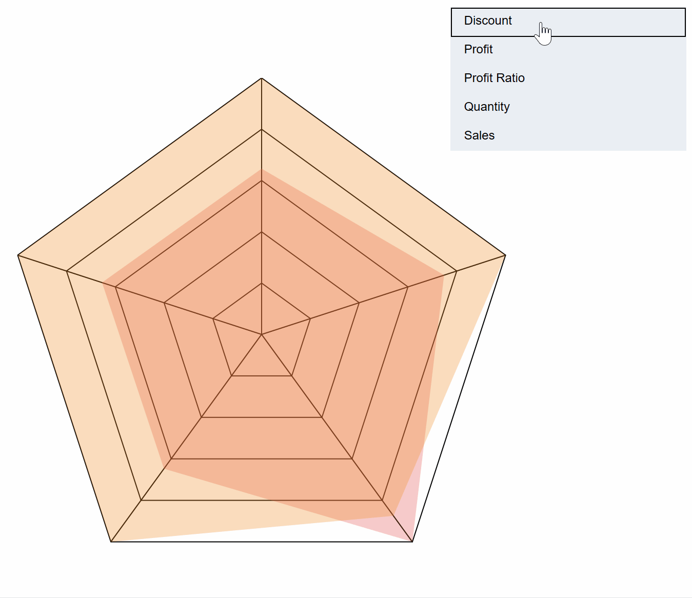
New innovation takes a team who will push the boundaries of creativity as well as an engineer who has a problem solving mindset. During the Financial Analysis Swift wireframing phase, our stakeholder Ryan Sleeper requested that the analysis dashboard have an engaging chart type to compare measures of the financial statements.
Rafael took this request and drafted up a radar chart that would compare multiple measures of Company A and Company B that have been selected from a menu – meaning the radar chart could have 3+ points depending on how many measures had been selected from the menu. Anyone who has built a radar chart in Tableau understands the engineering challenge of this request.
The first challenge was figuring out how to structure the data that would allow the points of the radar to be represented by measures in the most efficient way possible. The solution was found by researching what other people have already done, experimenting with those different methods, then adapting the best methods to suit our specific needs.
The second challenge was to figure out the best way to scale the measures on the radar chart so the user can quickly compare and contrast the two companies. You can imagine the difficulty a user would have when one point on the radar compares total revenue expressed in millions while a different point on the radar compares profit margin expressed in decimals. The solution to this problem was to normalize all of the measures on the radar with a 0 – 1 index using table calculations.
The third challenge was to then figure out how to make both the spider chart and spider web background dynamic to only display the measures that had been selected from a custom menu. The solution came with a lot of experimentation but I eventually figured out how to bend the points of the spider chart to the will of the customized multiselect menu.
How to Make Sensational Spider Charts in Tableau
Conclusion
While new innovation in the data visualization space can be fun and exciting, it’s also important to remember that innovation for its own end isn’t always best practice. Creativity and originality should be used as a means to solve problems, add value to the stakeholder, reduce time to insights, and increase accuracy of the insights.
We hope these lessons learned from the Financial Analysis Swift will help you become a better designer, engineer, and analyst.
Thanks for reading,
Rafael and Dan

Written By
Rafael Simancas

Written By
Dan Bunker

Peer Review
Felicia Styer
Assoc. Director, Analytics Solutions
Related Content
Fundamentals of Accessibility Design: Making Your Dashboards a Friendlier Place
“What are your accessibility design standards?” It’s a question that can catch us off guard during project discussions. But when…

Dan Bunker
Enhance Dashboard UX with Dynamic Zone Visibility In this tutorial, Dan explains Tableau’s dynamic zone visibility feature and how it…
How to Completely Customize Multi-Select Filters in Tableau
Filters play a crucial role in allowing users the flexibility to manipulate dashboards to their liking. Multi-select filters can be…