How to Make Automatic Insights in Tableau
I’ve illustrated before how to add custom integrated insights to a Tableau dashboard; a feature that does not come out-of-the-box in the software. This is an important prescriptive tactic that helps explain your insights and actionable recommendations. But what if you could automate those insights? Well, just about any calculation can be computed in Tableau. The results of these calculations can then be combined with text to provide automatic insights to you and your audience in Tableau.
In this post, we will reverse engineer a Tableau Public visualization to show how automatic insights are created, I’ll share how to concatenate text and computed string results to automatically spell out full sentences in Tableau, and we’ll use level of detail expressions to create an automatic insight that compares the performance of a specific dimension member to a benchmark.
This is the second in a five-part series on getting the most out of text in Tableau. For future updates, subscribe to our mailing list.
An example of automatic insights in Tableau
I haven’t shared this before, but my favorite visualization I’ve ever personally created is Your Salary vs. a MLB Player’s Salary – and it even has donut charts on it!
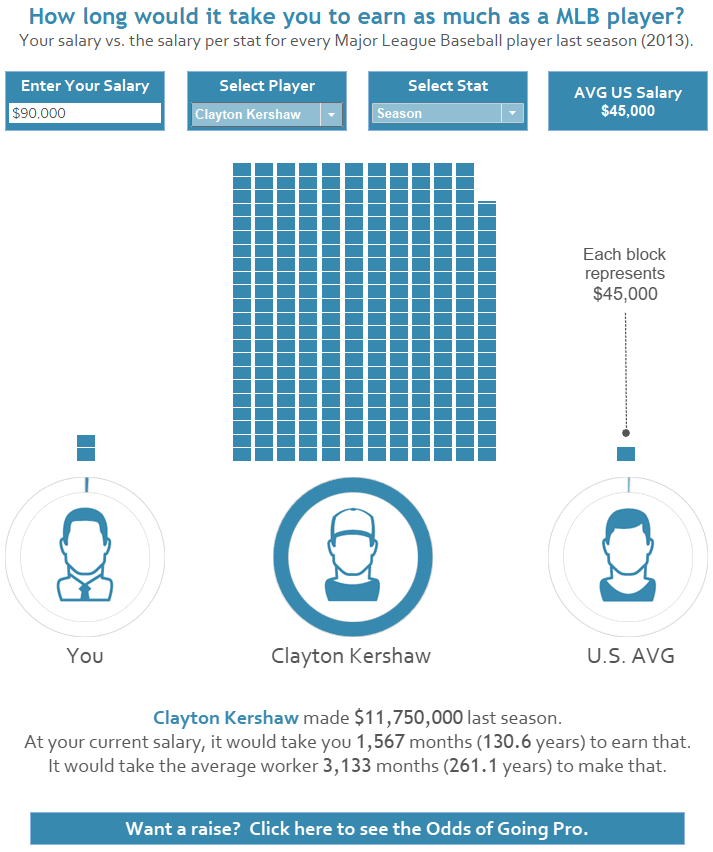
Questionable practices aside, there are several elements I like about this one: the user becomes part of the story by inputting their own salary, the bars appear to animate (an illusion created by ordering the bars so they would render sequentially), simple design, cross-branding and linking, and even an easter egg appears if you type in a salary greater than a million dollars.
![]()
Create a free account, or login.
Unlock this tutorial and hundreds of other free visual analytics resources from our expert team.
Already have an account? Sign In
Picking your favorite visualization can be like picking your favorite child, but what puts this one over the top for me are the automatically-generated insights at the bottom. Not only does the end user become part of visual representation of the salary comparison, but they get reaffirmed as part of the story with a caption that becomes customized to their personal salary.
We almost become desensitized to hearing the gigantic salaries of professional athletes these days, but when you see the visual and read the unique caption, it has an almost visceral effect. What’s great about these features is that I only had to set them up one time; from then on, Tableau does the rest of the work for me to generate the captions automatically.
Remember, any of my Tableau Public visualizations can be downloaded so you can reverse engineer them to see exactly how they were created. Here’s a look at the automated insight:
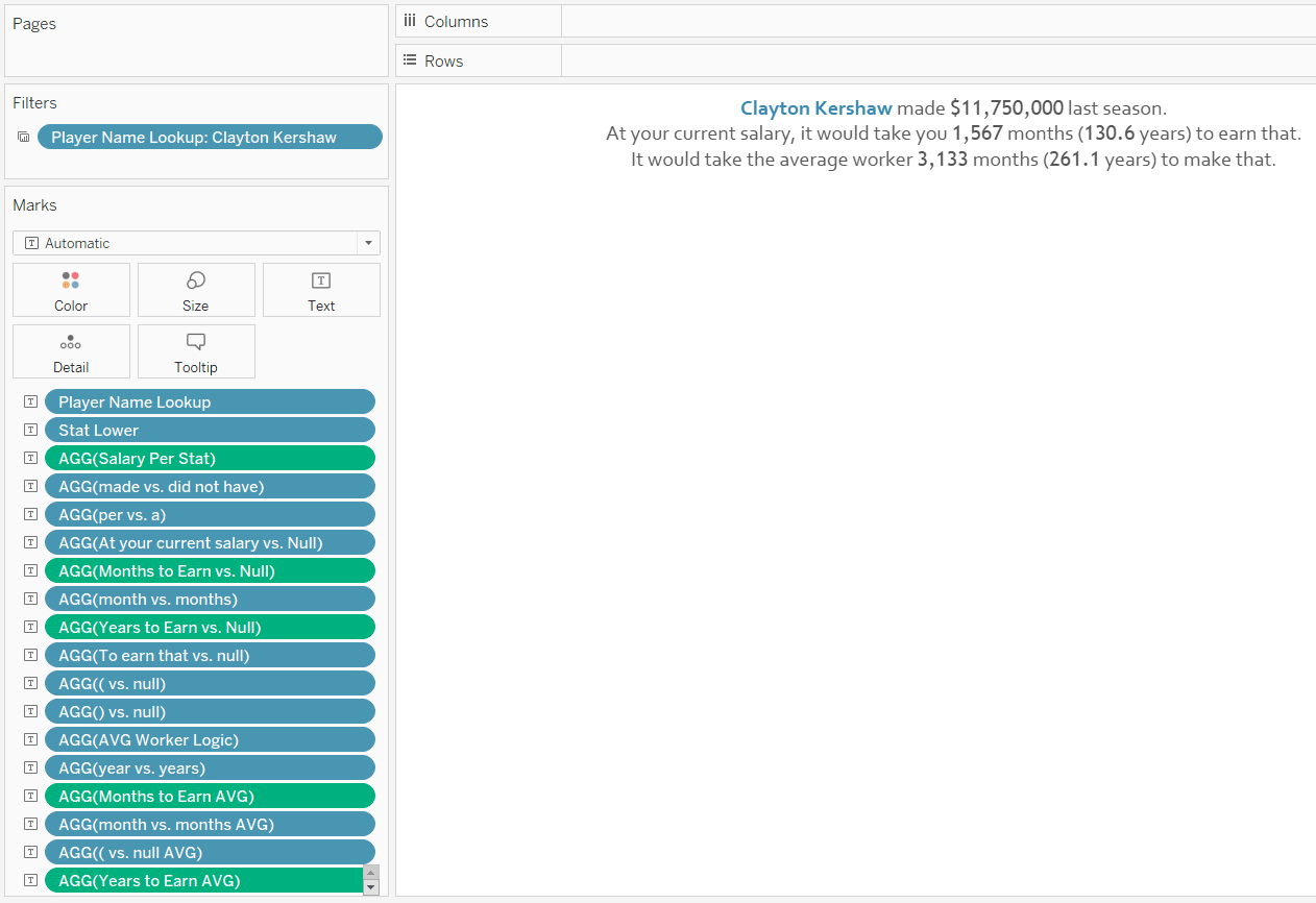
As you can see, there are quite a few fields on the Text Marks Card. In fact, here’s a closer look that can be accessed by clicking on the Text Marks Card and clicking the “…” icon next to the “Text:” box.
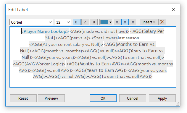
Note there are only two words in this entire word processor that are hard-coded (which I know because hard-coded words don’t have gray shading behind them): “last season.” Everything else is computed dynamically to spell out the appropriate sentence based on the user’s salary, player, and statistic selections.
Admittedly, depending on the complexity of your insights, this can become quite a rabbit hole. In my use case, I discovered all kinds of scenarios that had to be accounted for in the underlying calculated field for each element of the sentences. For example, American League pitchers would not have hitting statistics; sometimes the result would be months instead of years; sometimes fields needed to be singular instead of plural…
I recommend breaking each element of your insight into a separate calculated field for easier management. If you would like some examples of how mine were created, simply download the workbook from Tableau Public, right-click on any field that starts with an equal sign (=), and click “Edit…”
The goal is to combine these individual elements that spell out full sentences with proper spelling, punctuation, and grammar.
How to concatenate strings or text fields in Tableau
The most flexible way to concatenate fields in Tableau to form full sentences is to put the fields on the Text Marks Card and then reorder the fields so the sentences make sense. This approach allows you to alter the format of individual fields and use a combination of text and numbers. The one drawback to this approach is that it can be a lot to manage. The one paragraph of text in the visualization above has 21 different fields on the Text Marks Card.
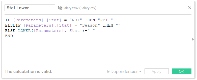
If you would prefer to consolidate some of these fields so they’re easier to keep track of, you can also concatenate strings by creating a calculated field. The trick to concatenating strings in Tableau is to simply “add” the strings together within a calculated field. Here’s a calculation that writes the first sentence in the caption above.
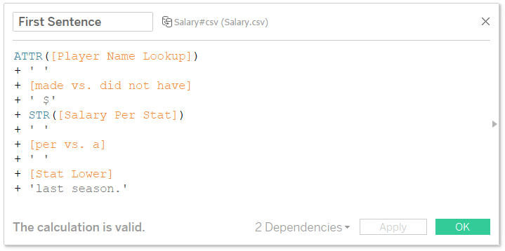
There are a few nuances to this calculation that I would like to point out:
– You cannot mix aggregates and non-aggregates in a Tableau calculated field so I had to add “ATTR” before the Player Name Lookup field (the only field that wasn’t an aggregate).
– The lines that have ‘ ‘ are adding spaces between the elements in the sentence.
– You cannot add string and float data types so I had to convert the one number in this calculation (Salary Per Stat) to a string by wrapping it in the STR function.
– When you convert a float to a string, you lose the number formatting; this is why I added a dollar sign before the Salary Per Stat field.
– As I explained in An Introduction to String Calculations, it doesn’t matter whether you use single tick marks or double quotation marks.
You would then place this calculated field on the Text Marks Card just as I did above with the individual elements. The difference in this case is we’ve consolidated five fields into one to create the first sentence!
Using LODs to create an automatic insight to compare against a benchmark
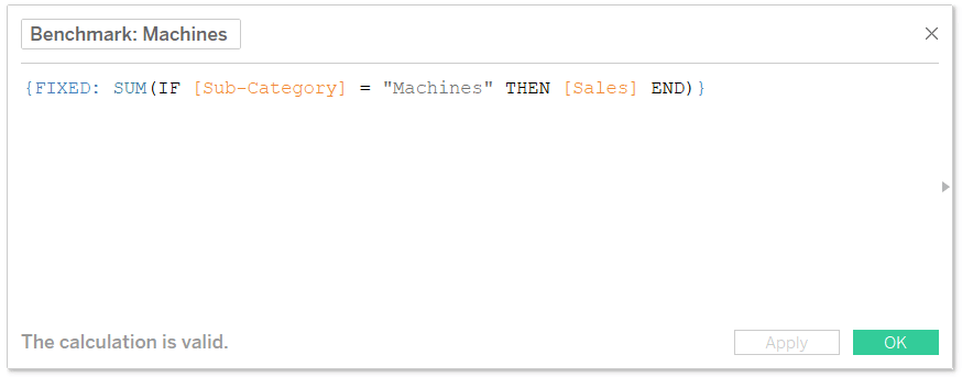
So let’s put some of these ideas to work to create a new use case. One of my favorite applications of Tableau level of detail expressions is to create benchmarks. For illustration, let’s say that our benchmark is the Machines sub-category in the Sample – Superstore dataset and we want to create an automatic insight to compare the performance of each sub-category to Machines. First, I’ll set up a calculation that isolates the performance of the Machines sub-category. The formula is:
{FIXED: SUM(IF [Sub-Category] = “Machines” THEN [Sales] END)}
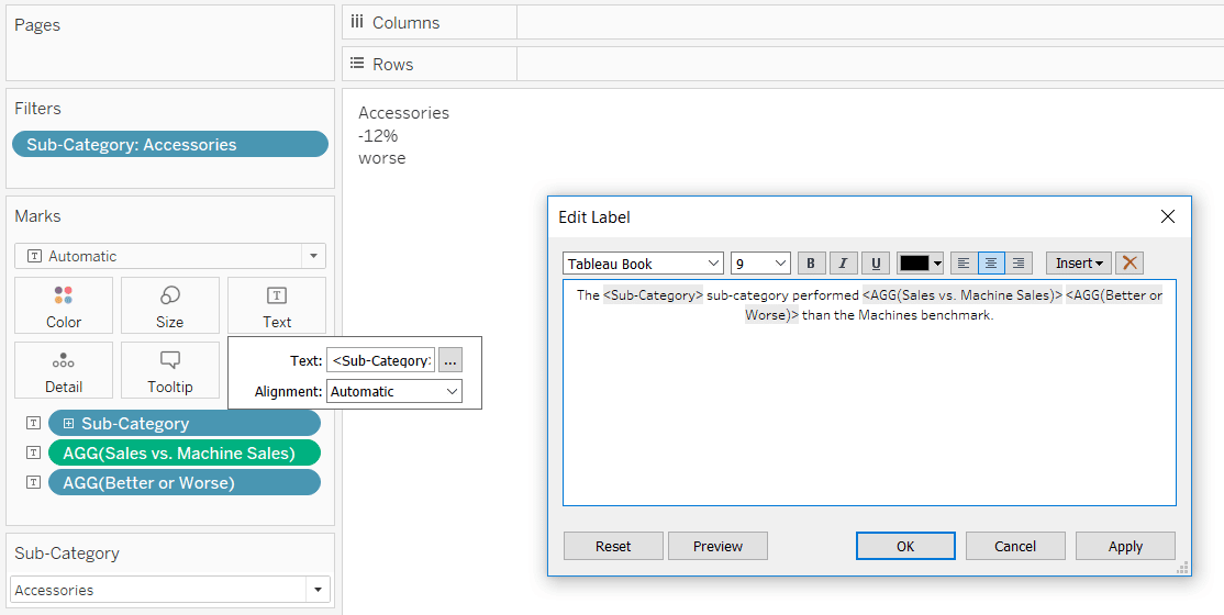
We’ll imagine that we want our automatic insight to say “The [Sub-Category Selected] sub-category performed X% [Better or Worse] than the Machines benchmark.”
There are four elements in this insight: hard-coded text, the sub-category selected, the percent compared to the benchmark, and the word “better / worse”. Two of these four elements need to be computed: the percent change and the word “better / worse”.
The first formula is SUM([Sales]) / SUM([Benchmark: Machines]) – 1
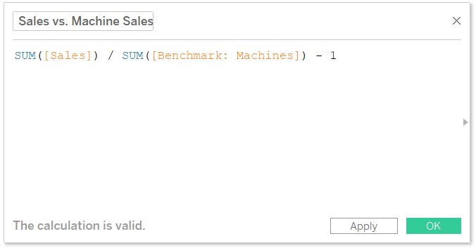
For best results, I’ll change the default formatting of this calculated field to percentage with no decimal places by right-clicking on it in the Measures area of the Data Pane, hovering over Default Properties, and choosing “Number Format…”.
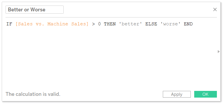
The second formula is IF [Sales vs. Machine Sales] (from the first formula) > 0 THEN ‘better’ ELSE ‘worse’ END
Now that we have all the components, I will add each to the Text Marks Card of a new sheet.
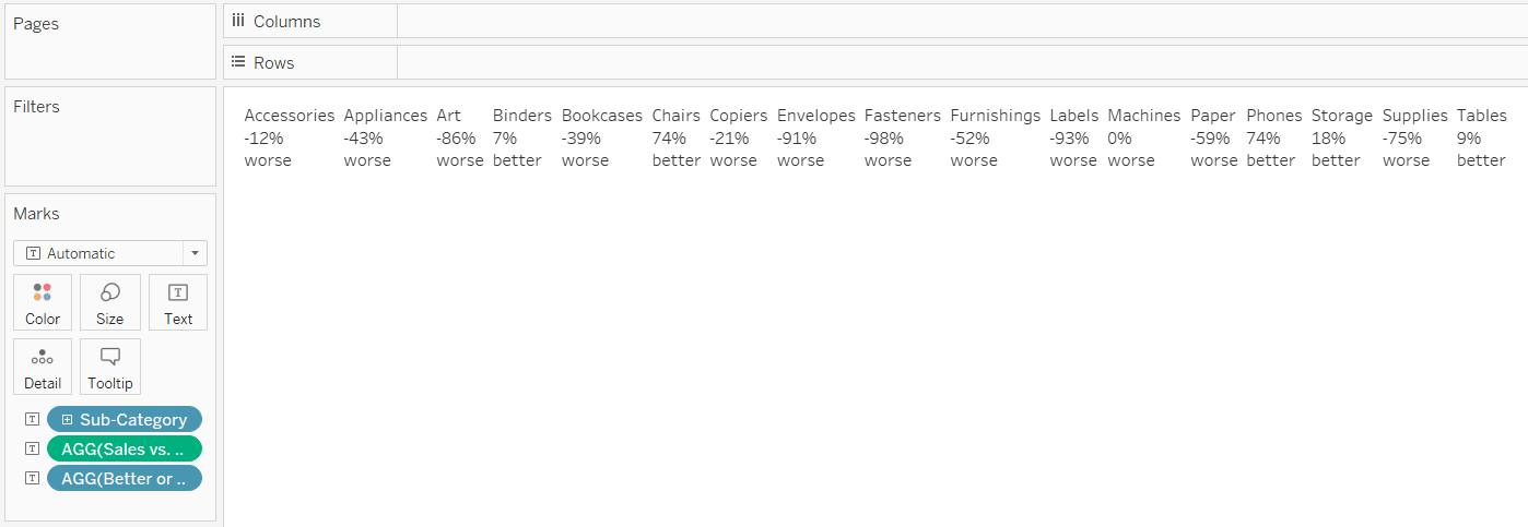
Just glancing across the table, I can see that the negative percentages have the word “worse” and the positive percentages have the word “better”, so it’s passing the eye test so far. To do a full quality check, you could simply add the Sales measure to the Text Marks Card as well and make sure the percentage calculations are checking out.
![]()
This insight is only meant to compare one sub-category to Machines at a time, so I will add a single value dropdown filter and filter the view to the Accessories sub-category.
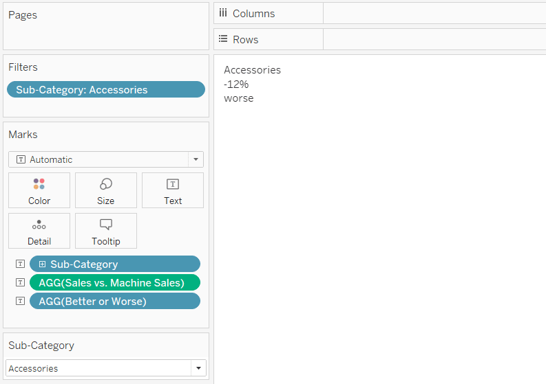
Lastly, I will click on the Text Marks Card to add my hard-coded text and put the dynamic elements in the appropriate place within my automatic insight.
Now when I choose a different sub-category dimension member to focus on, the insight updates to automatically reflect the performance of that specific dimension member to our benchmark!
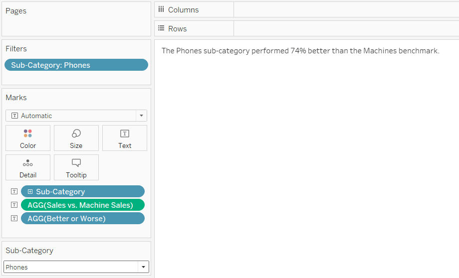
I can now put this sheet on a dashboard and Tableau does the rest of the work for me regardless of the sub-category the end user selects. This approach can be used to automatically compare against a competitor, goal, and/or performance last year.
Thanks for reading,
– Ryan

Written By
Ryan Sleeper
Related Content
How to Make Your New Favorite Commenting System in Tableau
I’ve shown you in the past how to add custom integrated insights to a Tableau dashboard. This tactic allows you…
How to Do Pagination in Tableau
To celebrate the release of Innovative Tableau: 100 More Tips, Tutorials, and Strategies, I’m releasing some bonus content to show…

Ryan Sleeper
Harness the power of level of detail calculations to create comparisons Learn how to use the FIXED and EXCLUDE level…