3 Meaningful Ways to Visualize Margin of Error in Tableau
When creating a new dashboard, it is important to add context to our data. While Tableau provides a few good tools in the Analytics pane, such as Trend Line or Box Plot, these out-of-box solutions are limited and hard to scale. Therefore, to expand on what Tableau has given us, I have implemented different techniques that provide more context while also allowing us to scale the solution. One of these techniques is visualizing the margin of error. Margin of error is a statistic that shows the possible error of a sample from the true value. For example, if we wanted to be 95% confident and our margin of error was five percentage points, then we could conclude that 95% of the time we would observe a result within five percentage points of the real population value. I will get more in-depth throughout the blog, but that is the basic premise.
Learn more advanced analytics with Playfair+
Visualizing the margin of error reminds the reader that our measurements are not an exact representation of reality and contextualizes the statistics listed. So, in this tutorial, I will show you three ways of visualizing the margin of error and how to implement it in a scalable way within Tableau.
What is the margin of error?
As I mentioned in the introduction, the margin of error is a statistic that shows the error of a sample from the true value. It takes several variables into account, which influences how much margin of error you will have. Here is the formula we will be using:
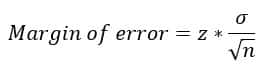
n – Represents the sample size. If we think about this intuitively, we realize the relationship sample size has with margin of error. The more samples we take from a population, the closer we are to the true population value and the lower our margin of error. The smaller the sample taken from the population, the larger our margin of error. For example, if we surveyed an IT Department of 100 people and they all responded, we wouldn’t need to talk about the error because we would know the exact average response of that population. But if we surveyed the same IT Department and it was 1 of 10, then we would have a large margin of error because we have sampled 10% of the total population.
σ – This Greek symbol is called the sigma and represents the standard deviation. The easiest way to describe it is a measure of dispersion. Meaning it’s how spread out the values of a measure are from its average value.
Z-Score – This value is found by deciding on your confidence interval. Once you know your confidence interval, there is a table called a Z-Table that you can look up specific values on, and it will tell you what your Z–Score is. For this exercise and to keep things relatively simple, I have calculated them for you.
How to create margin of error calculations in Tableau
Now that we have the basics of the formula, let’s start translating these into Tableau calculations.
![]()
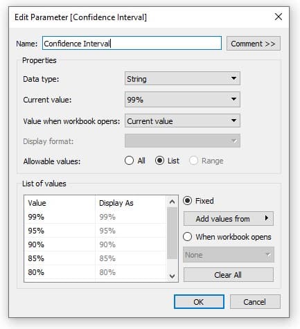
To begin, I am going to connect to the Sample-Superstore dataset. I want to create a calculation for the margin of error for Discounts by Sub-Category. To start, I will create a new parameter called Confidence Interval. I am going to assign it a data type of String and select the List radio button. I will then type the following values in my list and click OK.
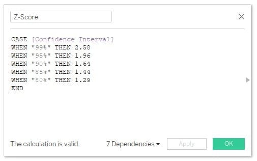
Next, I will create a calculated field that will represent my Z-Score. To do this, I will create a new calculated field and enter a case statement connected to my Confidence Interval parameter. The idea is to pass the correct Z-Score when a different confidence interval is selected. The formula is as follows.
CASE [Confidence Interval]
WHEN “99%” THEN 2.58
WHEN “95%” THEN 1.96
WHEN “90%” THEN 1.64
WHEN “85%” THEN 1.44
WHEN “80%” THEN 1.29
END
Continue reading with a free account, or login.
Unlock this tutorial and hundreds of other free visual analytics resources from our expert team.
Already have an account? Sign In
By continuing, you agree to our Terms of Use and Privacy Policy.
Now I will create another calculated field and label it Margin of Error, then enter the following calculation.
MIN([Z-Score])*(STDEV([Discount])/SQRT(COUNT([Orders])))
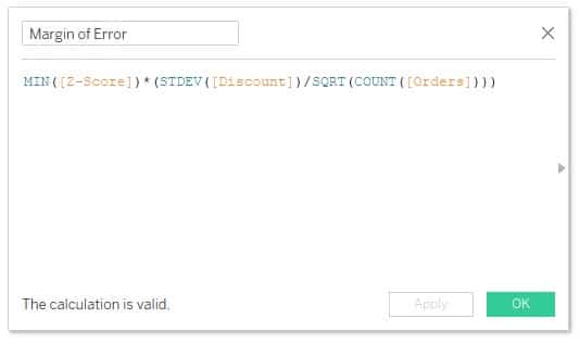
This calculation will give us the margin of error if you want to display it as a single KPI. But to truly visualize it, I want the margin of error to the left and right of the Average Discount. To do this, I am going to create two more calculated fields.
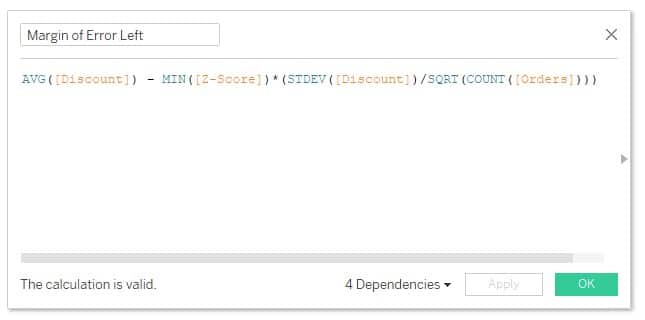
Margin of Error Left: AVG([Discount]) – MIN([Z-Score])*(STDEV([Discount])/SQRT(COUNT([Orders])))
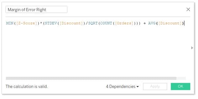
Margin of Error Right: MIN([Z-Score])*(STDEV([Discount])/SQRT(COUNT([Orders]))) + AVG([Discount])
With our calculated fields done, we are ready to start creating our visualizations.
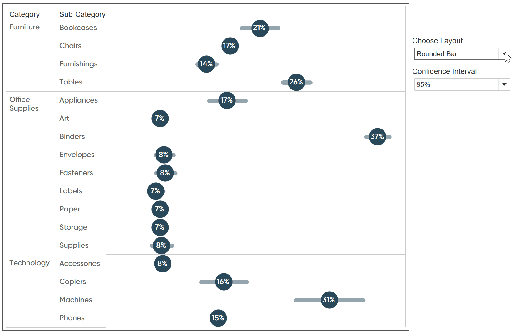
How to use a rounded bar to visualize margin of error
To start, I will add AVG Discount and Measure Values to the Columns shelf, then Category and Sub-Category to the Rows shelf. When Measure Values are added to the view, you will notice that it brings in practically all of the measures into the view.
We want to filter that list down by dragging Measure Names to the Filters shelf and then select Discount, Margin of Error Left, and Margin of Error Right then click OK.
Now I will select the AVG(Discount) Marks card and change the Mark type to Circle.
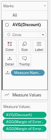
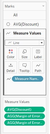
Then select the Measure Values Marks card and change the Mark type to Line and move Measure Name to the Path property of the Marks card.
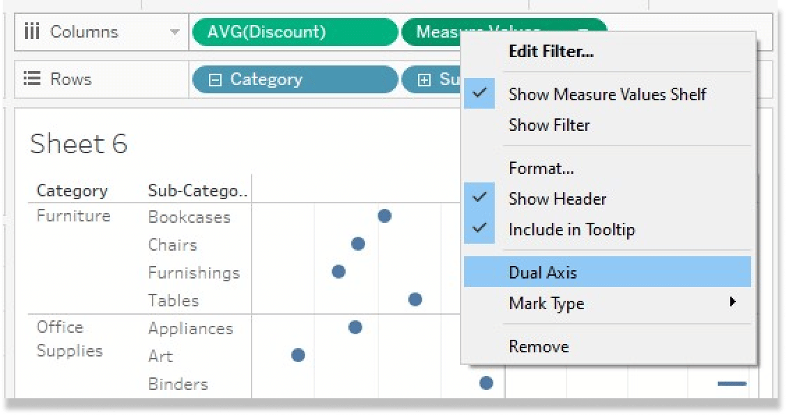
Next, I will right-click Measure Values and choose Dual Axis.
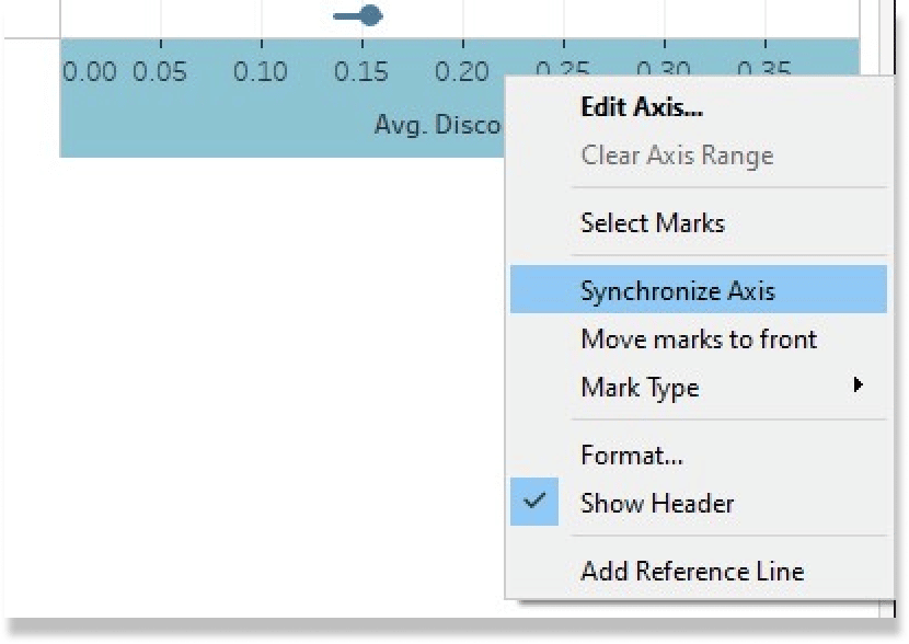
Then I will right-click on the lower axis and choose Synchronize Axis.
The visual we are left with is Margin of Error represented by the line and AVG Discount represented by the circles in the middle.
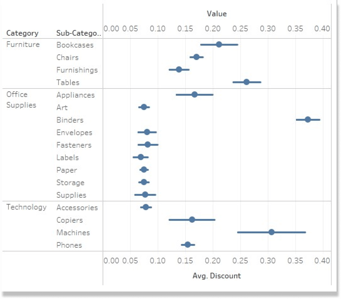
I am going to clean this up a bit now by changing the Color and Size elements of the view. I will also add the AVG Discount measure to the Label property of the AVG Discount Marks card.
The Easy Way to Make Rounded Bars in Tableau
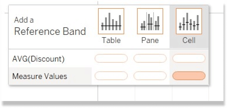
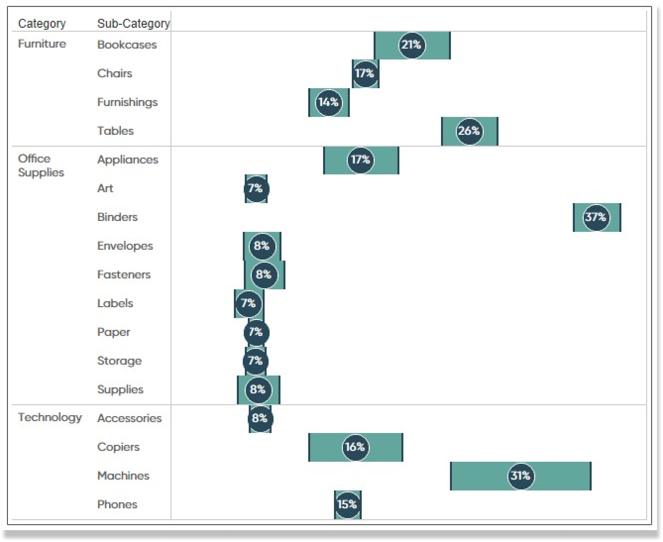
How to use reference banding
For the next visualization, I will be using a Reference Band. To start, I am going to right-click on the sheet we just made and choose Duplicate. This will carry over the formatting we just made and save us steps in the long run.
Now I will click on the Analytics pane and drag Reference Band to the view. In the top left corner of the view, we will see a box appear with different options. We want to drag Reference Band to the Cell option on the far right, then drop it in the Measure Values Cell.
You will see some bandings appear over the rounded bar charts. To clean the view up, I am going to select the Color property from the Measure Values Marks card and change the Opacity down to zero. This will make it appear as if the rounded bars disappeared and we are left with just the bands. I will adjust the colors of the bands and call it good.
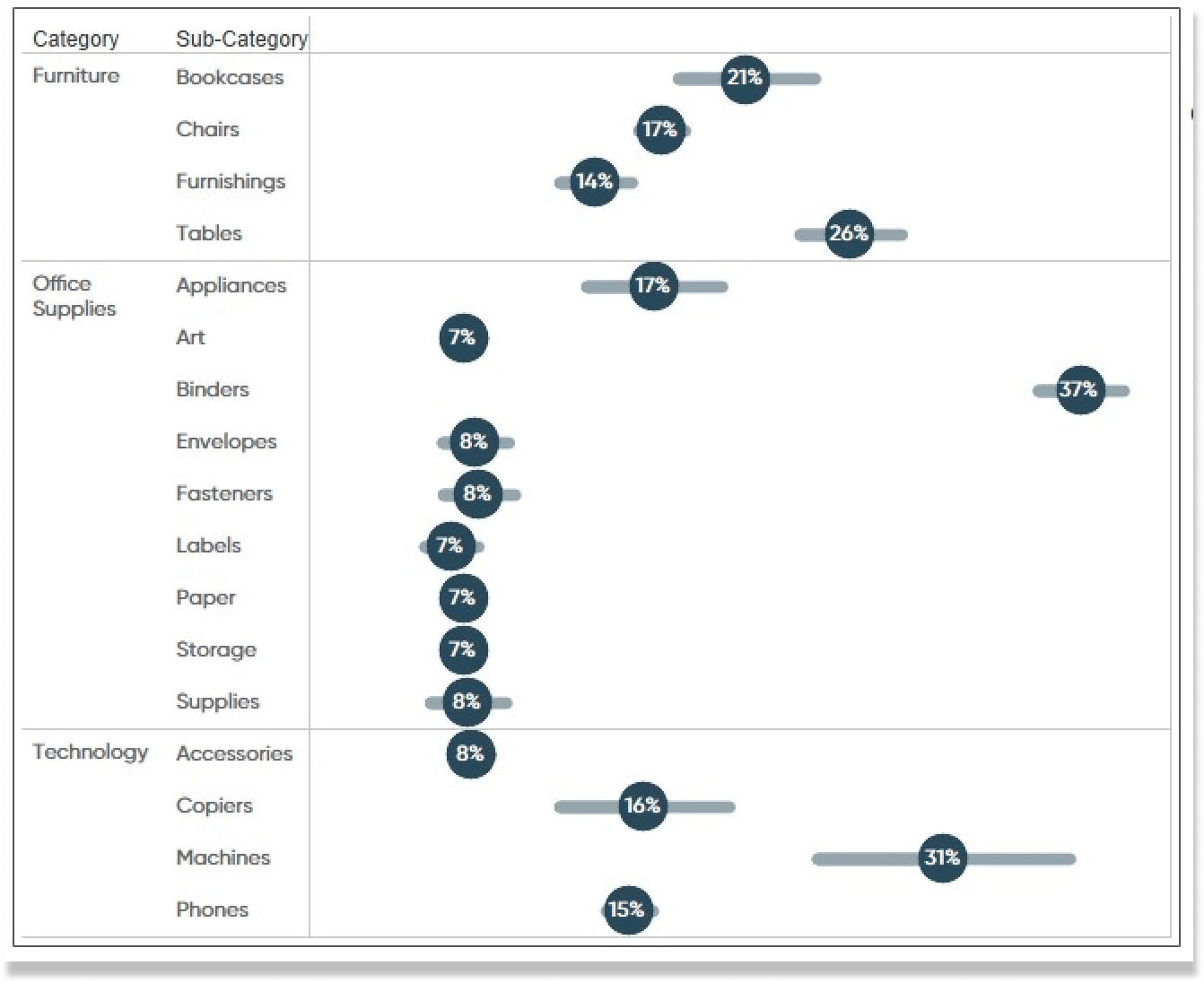
How to use box plots
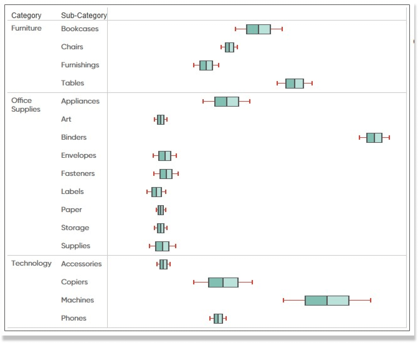
Lastly, I will show you how to visualize margin of error using box plots. This approach is very similar to the last. I will duplicate the Rounded Bar sheet and then select the Analytics tab at the top of the pane. I will drag in Box Plot and drop it on the Measure Values Cell.
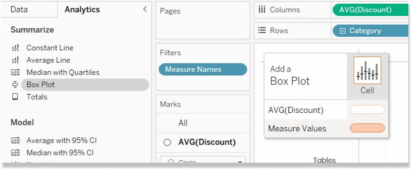
To clean these box plots up, I will first remove AVG Discount from the Label property of the AVG Discount Marks card. I will also decrease the size of the circle and change the color to 0% opacity. Then I will click on the Measure Values Marks card and change the line color to 0% opacity. This will leave us with just the box plots in our view. The last thing I will do is clean up the color and give it my own personal spin.
Adding context to the analysis
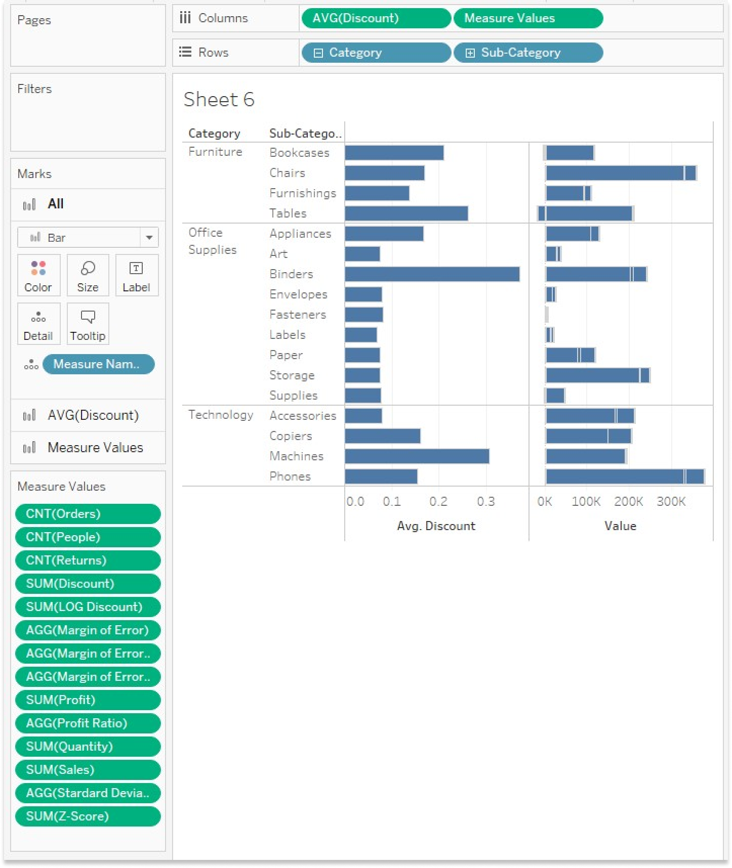
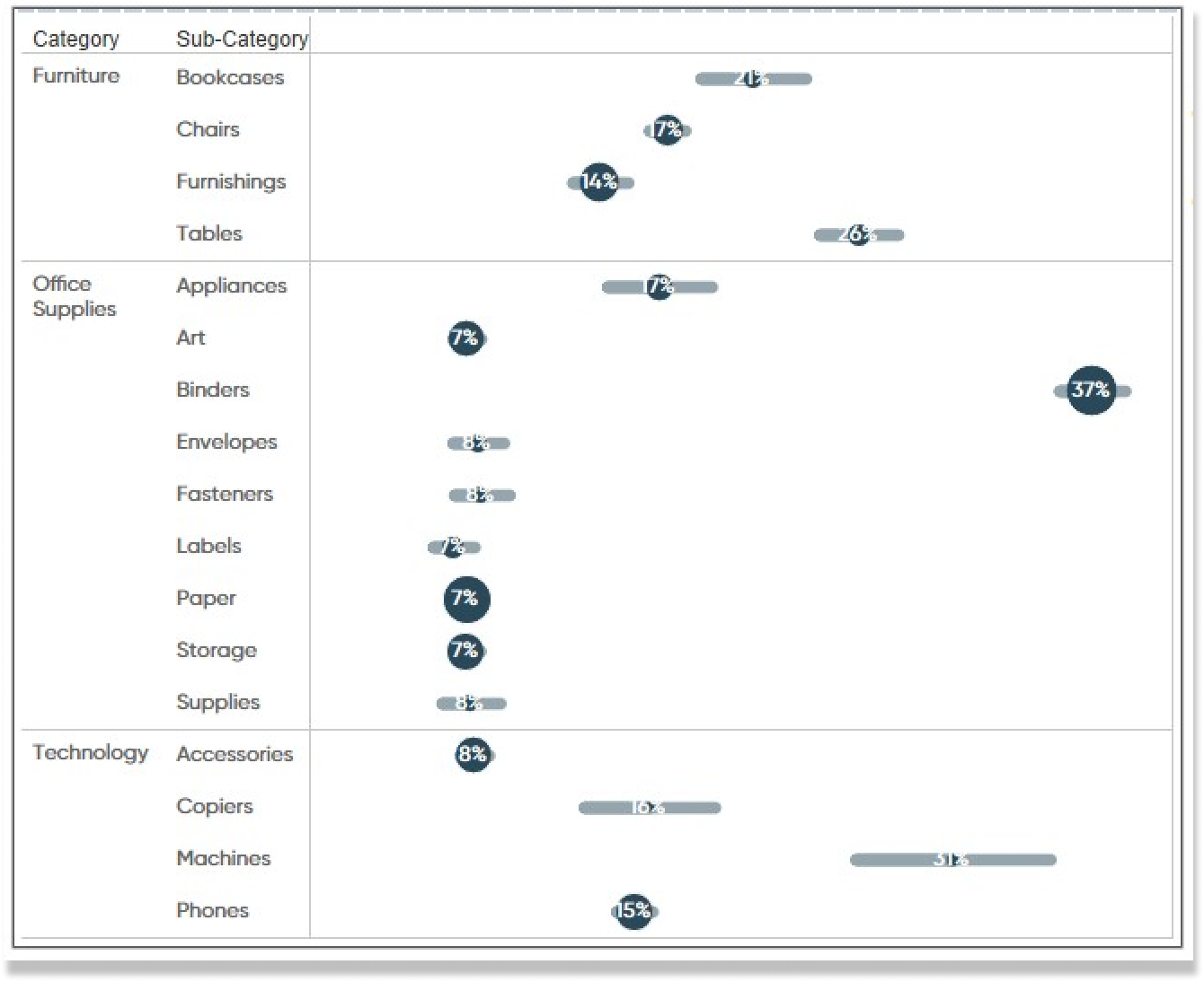
We can see that some Sub-Categories have a wider margin of error than others. This is most likely due to the number of orders or sample size. For example, if we look at the Machines Sub-Category and compare that to the Paper Sub-Category; we can see that the Machine Sub-Category has a very wide margin of error compared to the much smaller margin of error for the Paper Sub-Category. If we think about this intuitively, it makes sense because we can imagine that we sell more paper than machines, so the sample size is higher for Paper. We can also imagine that machines cost more than paper products and therefore may have a wider range of discounts applied to them.
![]()
To confirm my assumptions, let’s go back to the rounded bar chart view and add Count of Orders to the Size property of the AVG Discount Marks card and remove AVG(Discount) from the Label property. Now we can easily see that Paper has a higher order count than Machines by just looking at the size of the circle.
I hope this tutorial helps you add more context to your dashboards and drive them to insight.
Until Next Time,
Ethan Lang
Director, Analytics Engineering
[email protected]


Written By
Ethan Lang

Graphic Design
Dan Bunker
Manager, Decision Engineering
Related Content
The Definitive Guide to the Analytics Pane in Tableau
Adding statistics to visual analytics can be an extremely powerful way to give our audience more insight into the data…

Ethan Lang
Benchmarking, Modeling, Forecasting, and More In this live webinar on the Analytics pane in Tableau, join Ethan as he does…
Statistical Tableau: Using MAD to Detect Outliers in Non-Normalized Data
I recently wrote a tutorial on 3 ways to visualize outliers in Tableau. This tutorial assumes a normal distribution of…