3 Reasons the Analytics Maturity Framework Is Broken (and What’s Better!)

During our Decision-Ready Data strategy workshops, one focus area is ensuring practitioners and stakeholders align on the type of analytics being delivered. We’ve shared before how you should know if decision makers are expecting data, analytics, or visual analytics, but within each of those, there is nuance that creates the difference between data that goes nowhere (except maybe the question, “So what?”) and visual analytics you can actually use and act upon.
The most common framework for aligning on the type of analytics being conducted is the Analytics Maturity Model, sometimes called the Data Analytics Continuum, and often credited to Gartner’s Analytic Ascendency Model. You’ve likely heard of its stages: Descriptive, Diagnostic, Predictive, and Prescriptive.
In the age of exponential data growth, a hyper pace of innovation, and AI being used for analytics and data visualization, the common analytics maturity model is broken in a lot of ways. This post discusses the most popular data analytics continuum, observes some pitfalls in its current application, and provides a solution that has worked better for Playfair Data and our clients.
Schedule a complimentary data strategy call with our experts to explore creating a customized roadmap for your organization.

The commonly accepted analytics maturity model
Before we can get into my arguments about a better way of thinking of the data analytics continuum, we need to understand the version that is most widely used. I also want to preface this by saying I, too, started with this framework. It is powerful for capturing many analytic use cases, and it is absolutely a better solution than nothing at all. The steps and definitions are as follows:
Descriptive | Includes observations of past data and comparisons, then describes that state to the user. I’ve always said even this basic type of analytics is better than a spreadsheet, but it falls short of guaranteeing a positive impact because it doesn’t explain why something happened or how to act upon the insights it’s uncovering.
Diagnostic | Stemming from the Greek, diagnostikos, meaning “skilled at discerning”, this type of analytics helps discern the signal in the data from the noise. It gets into the why factors may be causing certain observations in the descriptive analytics.
Predictive | Based on the data and findings of causation in the diagnostic step, this type of analytics predicts future outcomes. To tease one of my recommendations below, it is important to know that – news alert – it’s impossible to precisely predict the future. It’s extremely challenging; sports bettors would only need to correctly pick the future 52.5% of the time to be successful. I like Seth Partnow’s way of explaining analytics is the art of being less wrong.
Prescriptive | Like a doctor prescribing medications to alleviate symptoms in a patient, prescriptive analytics considers the predictions and prescribes actions based on those possible outcomes.
This model leaves out at least one critical type of analytics, is mostly linear in a non-linear world, and requires expert statisticians – just for a chance of being less wrong. Let’s explore a few gaps and an updated model that has been successfully applied to hundreds of automated data products for Playfair’s clients.
Don’t neglect Exploratory Data Analysis
The first potential pitfall of relying exclusively on the Analytic Ascendency Model is that it doesn’t formally account for exploratory data analysis. This type of analysis has been done for centuries, but John Tukey formally coined the term and introduced the technique in his 1977 book of the same name, Exploratory Data Analysis. In this type of analytics, the analyst explores the data using statistics and data visualizations without a specific objective.
![]()
While we always challenge our clients to either test a specific hypothesis or have the vital question, what is the measure of success, inform what a dashboard should look like, there are huge wins to be gained by simply exploring a dataset with no end goal in mind:
- Helps the analyst get acquainted with the data.
- Acts as a quality assurance check to ensure the data is ready for deeper analysis.
- Identifies outliers that may be used to inform other hypotheses / routes worth exploring.
Having an objective going into an analytics project and tying everything to answering specific questions is extremely powerful, but once instigated, it tends to blind you to factors outside of the analysis that could be impacting the business. I’ve seen cases firsthand of exploratory data analysis finding millions of dollars in revenue and being the first line of defense in alerting teams that data was missing prior to tools being built.
Don’t forget to make a habit of exploring your data before formalizing it into a more structured type of analytics.
No mnemonic device to assist recall
While it may seem like a novelty or unnecessary branding, mnemonic devices add value by helping stakeholders remember and align on a strategic approach. I’ve jokingly apologized when teaching analytics strategy that seemingly every strategic framework is required to be an acronym. The fact is, the “analytics maturity model”, nor descriptive / diagnostic / predictive / prescriptive, nor its abbreviated DDPP, have a nice ring to them or will help you remember them when it’s time to apply. Here are just a few studies and statistics that explain how mnemonic devices can support recall of analytics frameworks:
- Students using mnemonic devices performed 77% better compared to students who did not (Miller, 1967)
- Teaching individuals structural memory techniques resulted in a 138% improvement after just 20 minutes of instruction (published in Neuron, 2017)
- Structural mnemonic devices drastically outperformed control strategies regarding the sequence of words in a 20-word list (Roediger, 1980)
- Medical students reported that localized memory tricks had an efficacy rate of 92% for recalling complex anatomical and physiological facts (published in Advances in Physiology Education, 2014)
Utilizing an analytics maturity framework that can be read as an acronym or other mnemonic device (i.e. rhyming, chunking) will help you and your stakeholders remember, apply, and align on analytics work being done.
You can prescribe solutions without predicting the future
These observations aren’t necessarily in a ranked order, but I must admit I am partial to this third: you don’t have to wait until predictive analytics have been applied to find insights that lead to valid decisions that will move the business forward. To illustrate, let’s take a look at our Super Sample Superstore dashboard, which was used to demonstrate several innovations in my book, Innovative Tableau (2020). While this dashboard feels dated to me today, it’s also an example of a sustainable solution delivering insights over five years later, which is similar to what we create for our clients every day.
The overview page can be described as the traditional descriptive type of analytics, showing how our various regions are performing period over period across three KPIs: Sales, Profit Ratio, and Average Days to Ship.
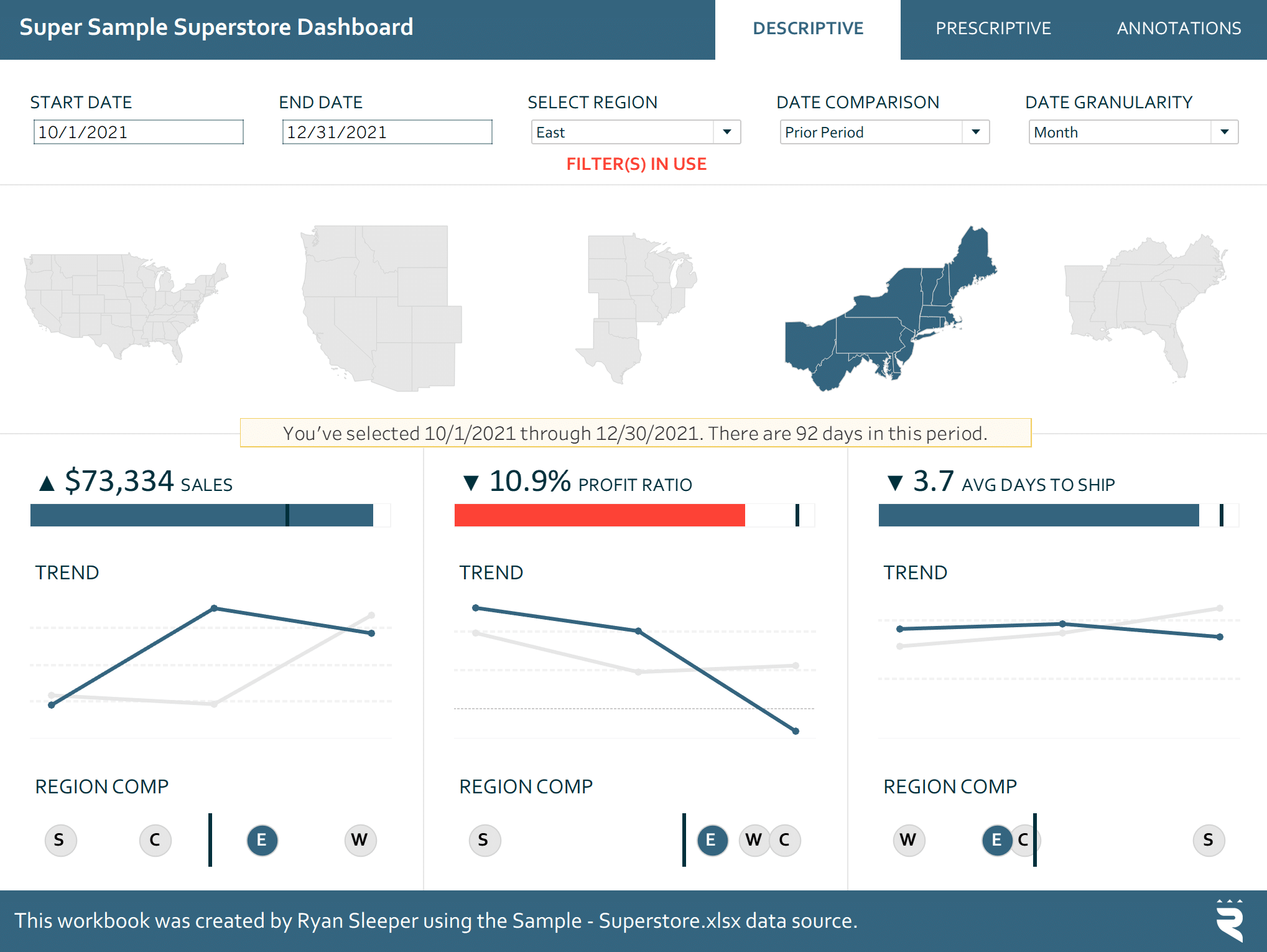
Your eye is likely drawn to the red bullet graph showing that the East region is down two percentage points in profit ratio period over period. Fortunately, the workbook contains a Prescriptive view where I can analyze what is causing that poor performance and hopefully prescribe a remedy to improve the profit ratio. After changing a filter to focus on the Profit Ratio KPI and then clicking the state of Ohio, which appears to be the biggest culprit, I am left with this view:
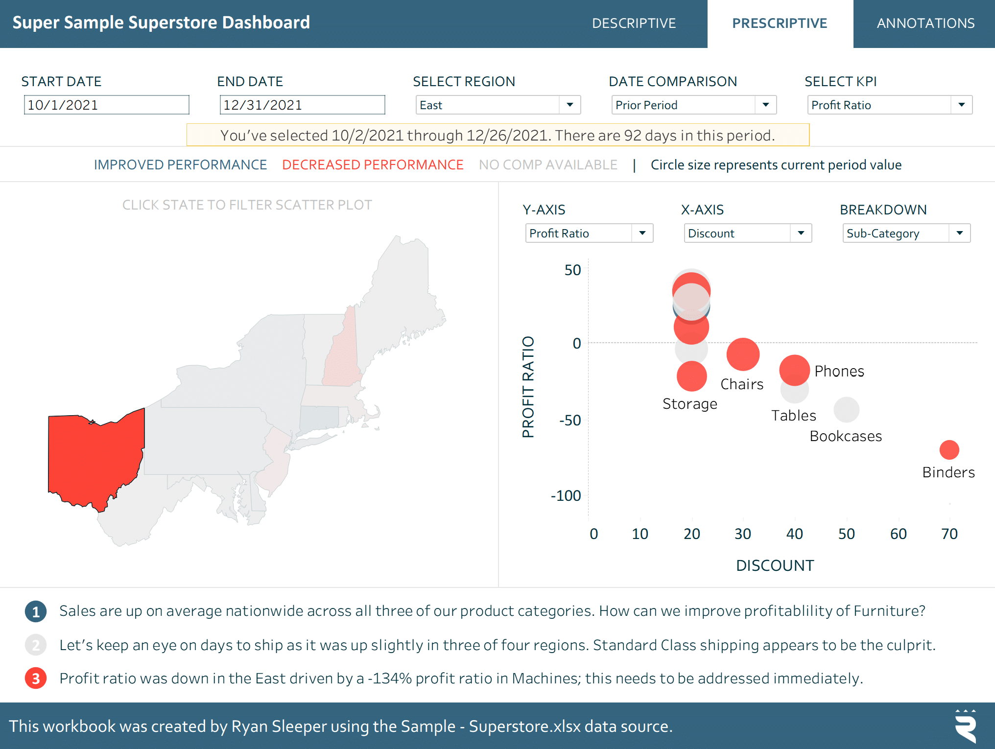
What you can clearly see if you’re familiar with reading a scatter plot is that the Binders sub-category is the worst performer at minus 70 percent. I also see on the x-axis that Binders is our most discounted product sub-category with a strangely strong correlation of 70 percent. We are giving away our profit ratio for binders in the form of discounts.
Unlock this tutorial and hundreds of other free visual analytics resources from our expert team. Already have an account? Sign In By continuing, you agree to our Terms of Use and Privacy Policy. It’s possible the business is simply trying to offload our inventory of binders, and this was expected. However, if this was not intentional, the prescription is clear: reach out to the manager in Ohio and reduce or eliminate the discount on binders. You can even add custom insights like this directly to the bottom of the view or create automated insights that detect and communicate outliers like these. In any case, notice we jumped directly from the first step in the analytics maturity framework, Descriptive, to the last, Prescriptive, without needing to predict the outcome. The nature of a continuum is that it is continuous, implying it goes in a linear order. Sometimes your stakeholders aren’t looking to follow a progression, but just need different types of analytics altogether. In a metaphorical sea of data that has the potential to help us make faster, better decisions, the SEA(D) framework is what we use at Playfair to help us realize data’s potential. This framework overcomes all three pitfalls of the Analytics Ascendency Model I’ve outlined above, including exploratory data analysis being represented, a metaphor and acronym to support recall, and categorizing different types of analytics (instead of requiring them to be executed sequentially).
The acronym is as follows: Search & Discovery | Synonymous with EDA, this type of analytics can be applied before a formal hypothesis is evaluated, used as a quick quality assurance check, or simply to understand the data fields being analyzed. Explanatory | Similar to descriptive or comparative analytics, this type of analytics derives its name from explaining something that happened in the business. Actionable | In my opinion, this is the most valuable type of analytics. Actionable analytics go beyond explaining what happened to helping you connect the dots to why it happened, in turn creating potential actions. Analytics are only as valuable as a business’s ability to act on findings to create a positive impact. Decision Science | The D in the SEA(D) framework stands for Decision Science and is purposely in parentheses because when the first three types of analytics are done properly, you are not always required to apply advanced analytics before making a decision. This framework emerged naturally after working with dozens of clients across hundreds of analytics and data visualization projects when I realized not only were clients at different stages of analytics maturity, but they also needed to be aligned on what type of analytics were being applied. Need a tool to help you conduct ad hoc analysis or find your own insights that are relevant to you? Let’s create a Search & Discovery deliverable like the GA4 Swift. Need a tabular view with a simple breakdown of static, historical numbers? Sounds like you’re just looking for an explanation of the current state of the business? In a position to make decisions and act on the insights that the analytics products are delivering? Let’s aim for actionable analytics. In future posts, we’ll cover how this framework can be applied in more detail and how I believe it helps explain why some are saying dashboards are dead. If that’s relevant to your team, please share this post or recommend they become a Playfair+ free member. If you are interested in collaborating with our expert team to create any tools with the SEA(D) framework, I encourage you to schedule a complimentary data strategy call. Thanks for reading,Continue reading with a free account, or login.
The SEA(D) Framework for analytics and data visualization
![]()
– Ryan
![]()

Written By
Ryan Sleeper
Related Content
Data vs. Analytics vs. Visual Analytics: What’s the Difference?
As tradition holds, Playfair Data shares our analytics trends and predictions going into each new year and recaps it by…
Introducing the Triple Crown Framework for Data Visualization
This is the first in a series of four posts about my newest strategic framework for data visualization. Subscribe here…
Vital Question 2: What is the Measurement of Success?
My second of two “vital questions” is more practical than understanding your audience, but I’m surprised how often it is…