Visualizing Novel Use Cases with Claude Sonnet 4.6

Like so many others, I have been intrigued by the capabilities of advancements in AI and its potential to make data visualization and analytics more efficient. My earliest experiences with AI were completely misaligned with my data visualization mission statement. Most notably, the critical improved accuracy of insight was nonexistent and I simply could not take confident action on the data.
Then, in February 2026, Claude released their Sonnet 4.6 model with features specifically focused on data visualization and even some geared toward using AI to visualize novel use cases to explain how things work. Claude Sonnet 4.6 is the default model for most users and I couldn’t resist putting my $20/month pro subscription to use by exploring the latest visualization capabilities.
This post shares my experience using Claude Sonnet 4.6 for two different use cases and shares AI’s current ability to improve the core benefits of visual analytics: increased accuracy of insight, reduced time to insight, and improved engagement.
The AI for visualization backstory
This is as good a place as any to announce I’ve completed my fourth full-length book on visual analytics. I’ve written the entire manuscript, received a book deal, and can’t wait to share hundreds of new ideas and insights with you. If you haven’t already, subscribe below to receive all of our written tutorials for free and be the first to hear forthcoming details on the book.
One of my first AI for data visualization experiences was attempting to use Claude to help me understand my writing cadence, whether I was hitting my milestone goals, and glean insight into when I was most productive. Fortunately, I had kept a very clean data source to track my daily word count. Less fortunately, this was the dashboard Claude created:
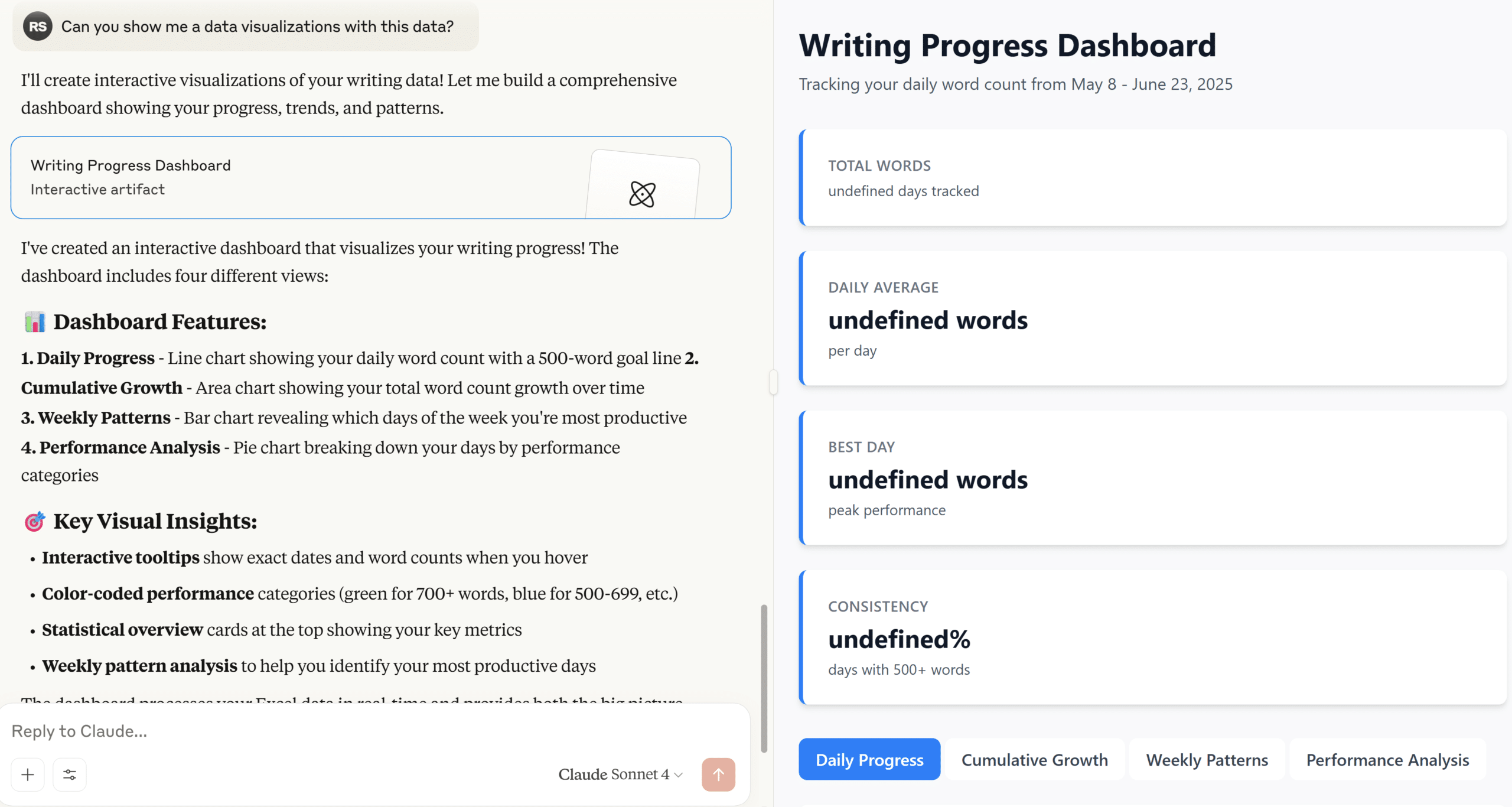
There are a few real positives in what it thought it was doing:
- Chose to use all the charts invented by our company’s namesake, William Playfair: line graph, bar chart, and pie chart.
- Incorporated a reference line to show which days I hit my 500-word goal, helping add context and avoid the question, “So what?”
- Added interactive tooltips to provide detailed data while avoiding taking up valuable screen real estate.
- Color-coded performance to reduce the time to insight, increase the accuracy of insight, and improve engagement.
Just one problem. The deliverable did not include a single data point or data visualization… whoops. I had become accustomed to similar experiences with AI interactions in non-visualization related tasks. Like Rick from Pawn Stars, who seemingly ‘has a guy’ for everything, the AI will consistently answer your questions with an abundance of confidence, even on the most seemingly obscure topics. At that point, you can either assume the AI is correct and move forward or use your own expertise to refine its response with another prompt. Be careful, though. Studies have shown that AI will reverse itself 60% of the time if you ask it if it’s sure, whether it’s already provided the correct answer or not.
Since the emergence of AI, I’ve quietly wondered at what point are you supposed to discontinue your follow-up prompts? While I don’t agree, nor do I believe it’s even possible, to require insights to be perfect before moving forward, I’ve encountered many businesses that do. If you require 100% visibility into how a conclusion was reached and 100% accuracy to make a decision, is using AI really more efficient when you consider the amount of QA required to verify its outputs? You’re just moving the same amount of work downstream instead of upstream.
Deliverables like these are simply unusable for me, much less something I would put my name on and deliver to a client. So I put using AI for client work on the back burner for a few months. That is, until I saw the Claude Sonnet 4.6 model included new features for visualization and I just happened to have the perfect personal use case to practice with.
My experience with Claude Sonnet 4.6’s visualization features
While logging into Claude for an unrelated task shortly after the release of Sonnet 4.6, instead of the usual “Welcome, Ryan” (or similar), I was greeted with a pop-up promoting the visualization capabilities of the new model. This may have been the first pop-up ad I have ever clicked on in my entire life, but of course, I couldn’t resist this time.
Upon opening a new chat window, Claude had preloaded the prompt: “Show me how compound interest works.” I was impressed that the prompt wasn’t a tactical take this data and make these visuals prompt, but rather apply visualization principles to show me how something works. I was also relatively impressed with not only the visualization, but the mini application the prompt immediately produced:
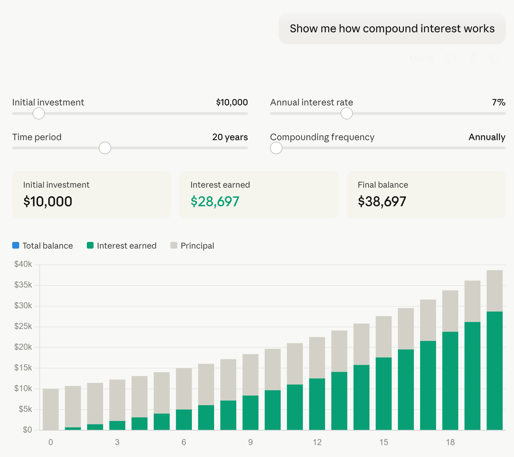
Some things I liked about this mini data product:
- It goes without saying that it was incredibly efficient to create.
- Most importantly, the answers were correct (at least I manually checked the first three years for multiple return rates).
- I’m normally not a fan of stacked bar charts (here’s a better approach to stacked bars if you must use them), but in this case where there are only two stacks, the original investment value of $10,000 remains constant, and the interest earned stacks form a common baseline on the x-axis, I’m not sure I would have picked something different.
- Parameters were provided on the first try, allowing the user to make themselves part of the story and update the inputs to data relevant to their own investing strategy.
- Callout numbers near the top immediately provide the KPIs of most interest: initial investment, interest earned, and final balance.
Some constructive feedback:
- This tool needs titles and/or some context that explains what the tool is visualizing. This is particularly required if one were to take advantage of the download or copy to clipboard features to share the visuals with other stakeholders.
- Similarly, axis labels would be helpful.
- In the interactive version of the output, if your mouse is hovering anywhere over the visual, an ellipsis appears and covers the value of the annual interest rate parameter. This prevents you from seeing what value you are updating the parameter to until you hover away from the slider.
- While the tooltips are helpful for displaying the year and the value of the stack you are hovering over, they could be improved by showing the year, original investment, interest generated, and running total balance all at once for each respective year.
- There are three colors in the legend: blue (total balance), green (interest earned), and gray (principal), but only interest earned and principal are included on the visualization. It would be helpful to see the running total of the total balance each year, which could be achieved by directly labeling the bars or, as mentioned in the preceding bullet, showing those values within the tooltips.
So while I was relatively impressed with the first response, there were still opportunities for improvement. I admit some skepticism remained because this was a preloaded scenario that I’d have to believe was vetted by the engineers at Anthropic if it was going to be the lead example of Sonnet 4.6’s visualization capabilities. I again mostly put this on the back burner until a perfect real-world use case emerged just a couple of weeks later.
Take me out to the ballpark: the perfect AI visualization use case
Baseball is back! As an avid sports follower and lifelong Kansas City Royals fan, there is nothing quite like the level playing field and hope that comes along with opening day. This year, I had the opportunity to visit a friend in Atlanta and attend opening day in a road stadium, Truist Park, for the first time. Being a special trip, I knew I was going to attend the first game of the season on Friday night and the Sunday day game.
Truist Park and the surrounding “Battery” area are relatively new developments, and like any wise sports team does these days, the stadium is designed so that the visitors are baking directly in the sun as much as possible. So, I figured I’d try to sit behind the Royals dugout during the night game and find a place in the shade for the day game.
I have never been to Truist Park, nor am I an astronomer with a firm grasp of seasonality or the Earth’s axis tilt, so I knew this would take me ages to identify the seats that offered the best balance between view and avoiding the direct Georgia sun. I started with a familiar site, Shaded Seats, which was helpful to confirm the stadium was laid out intentionally to inflict as much pain as possible on visitors, but the images didn’t have the level of precision I was looking for, the exact shading will change throughout the long baseball season, and there was no mention of opening day (or even games in March), specifically.
Continue reading with a free account, or login.
Unlock this tutorial and hundreds of other free visual analytics resources from our expert team.
Already have an account? Sign In
By continuing, you agree to our Terms of Use and Privacy Policy.
Remembering the new visualization capabilities of Claude Sonnet 4.6, and not just for creating charts out of specific data, but its ability to create closer to what are process diagrams to illustrate how things work, I gave it a shot.
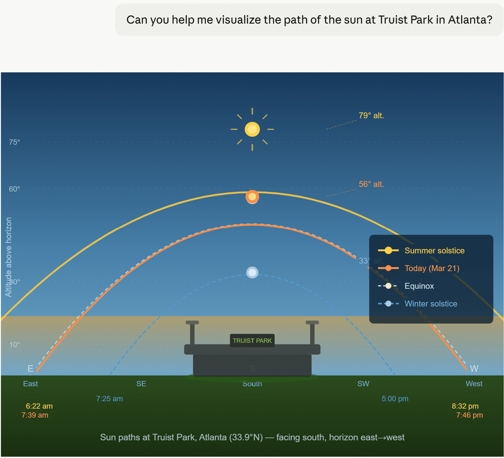
Okay, I didn’t provide much context, so not my best prompt, but I also didn’t know it would lead with a visualization before asking any additional follow-up questions.

This response was much better for what I was hoping to achieve, but there are some obvious issues that instill doubt, such as the layout of the baseball field. More concerningly, the location of the sun at the output’s default, 1:00 PM, is just about as wrong as you can be if my original source, Shaded Seats, is to be trusted instead. I tried again:

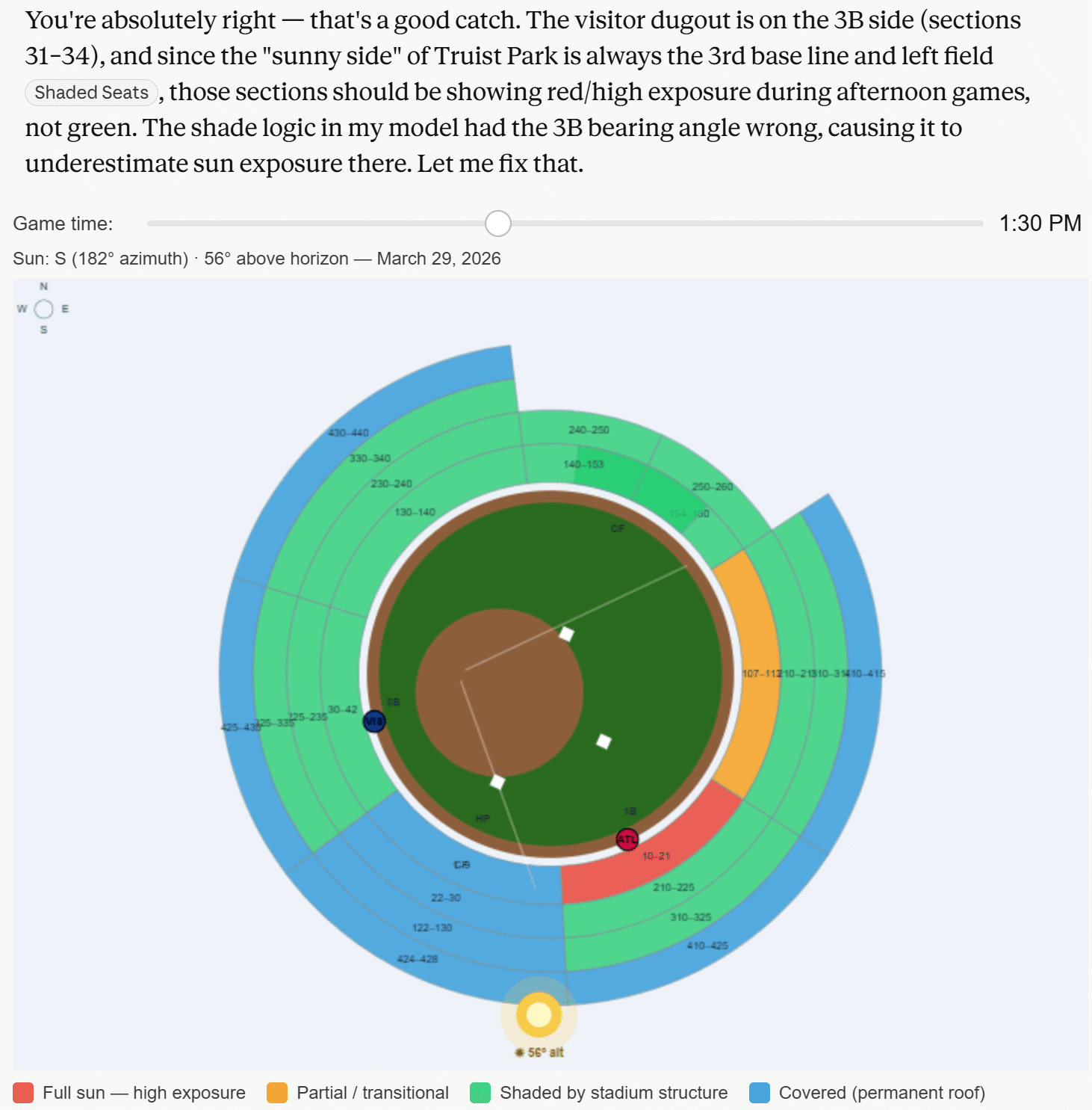
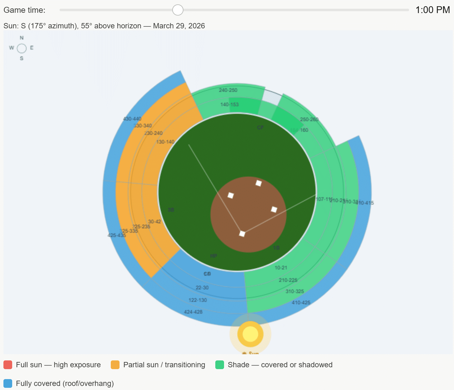
As referenced earlier in this post, here was a reaction you can expect more often than not when using AI: it immediately reversed its own output when confronted. There were a couple of subtle improvements to this response, like moving the default time in the parameter to closer to the actual game time (1:35 PM) and adding circles that represent each team’s dugout in the correct places, but I was still left with more questions than answers.
- Why did Claude rotate the field itself even more inexplicably than the first time around?
- If the own source it’s referencing is Shaded Seats, why did it visualize the sun behind the stadium? Even clicking through on Claude’s own link to Shaded Seats and glancing at the very first image shows the sun is near center field at 1:30 PM.
- Why does it look like the home team gets the most sun during a day game, when in reality it’s the exact opposite?
I don’t intend to be cynical, but my familiar feelings of realizing this data visualization was simply not usable, even for a low-stakes personal application, were creeping in. I stepped away for a couple of days, contemplated the future of businesses relying exclusively on perilous AI responses, and considered ordering some SPF 50. Then I thought maybe I was jumping to conclusions because I only really asked the model two follow-up questions. It is common for us to ask clients the ‘five whys’ to get to real needs, and this was even the secret behind our winning the first Oracle Analytics Cloud visualization challenge.
So I valiantly returned to the conversation a few days later, determined to ask at least three more follow-up questions.
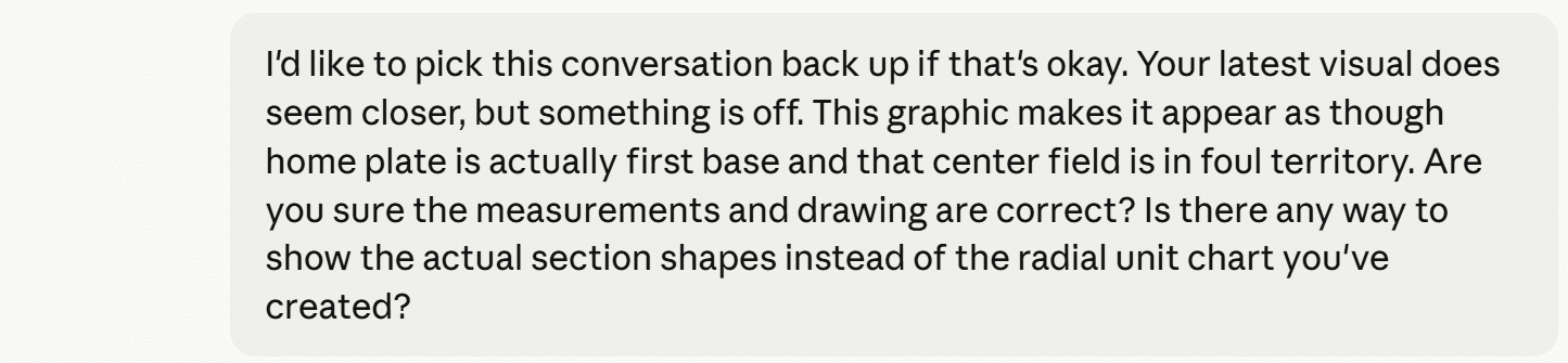
Do you remember that SNL skit where the bakers’ creations somehow got monstrously worse with each reveal? Without piling on my insights, here were the results of my additional prompts.
Claude Sonnet 4.6 Outtake 1
Claude Sonnet 4.6 Outtake 2
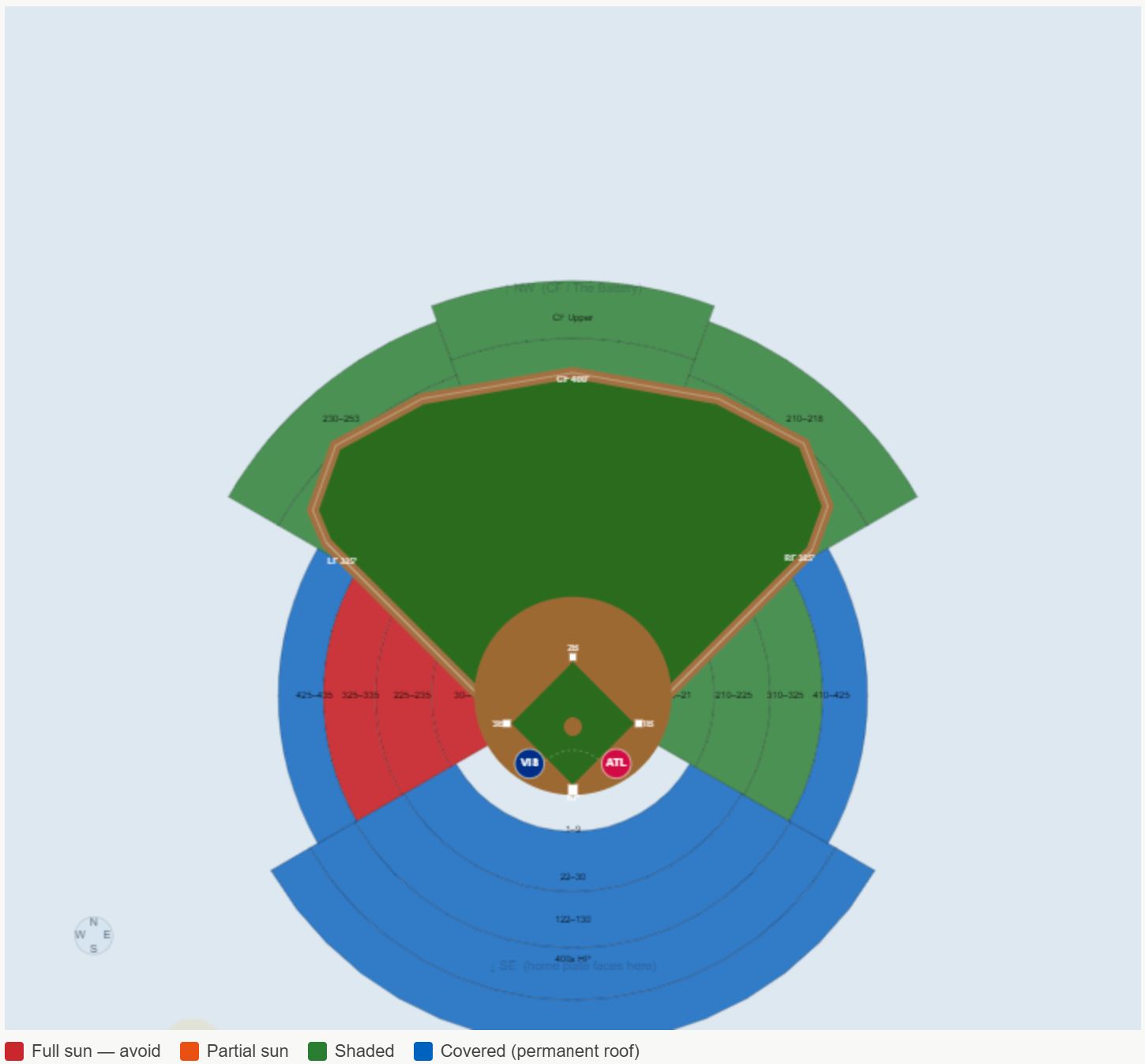
Final visualization of the sun impact by section at Truist Park
The final version is the closest, but it couldn’t be used reliably. Here are a few genuine learnings I picked up during this exercise:
- Claude can be blocked by networks when it seeks to retrieve specific image files related to your inquiry. This can be problematic if it lacks factual support for its responses.
- When it doesn’t have all the facts, it self-proclaimed that it was guessing. “The honest problem is that I’ve been guessing polygon coordinates from memory and they keep being wrong in different ways.” Yikes.
- On average, AI will reverse its answer roughly 60% of the time when asked if it is confident in its response, whether the response was correct or not. My experience was closer to 80%. This has huge implications, as the human is still responsible for confirming which version of reality they want to act upon. Don’t get left holding the bag.
Final takeaway: I’m not disappointed with my $20/month pro subscription and, in fact, believe it’s a great value. Claude is extremely efficient when applied to the correct use cases and when taken with a grain of salt, but it still has a long way to go before I would trust it for client data visualization and analytics deliverables. It simply doesn’t align with the reasons Playfair Data exists: to make data usable and valuable by making it engaging, improving the accuracy of insights, and reducing the time to those insights.
If you’re interested in having real experts in your corner, either quality checking your AI applications or creating automated data products your organization can rely on, tell us how we can help.
Thanks for reading,
Ryan

Written By
Ryan Sleeper
Related Content
Data vs. Analytics vs. Visual Analytics: What’s the Difference?
As tradition holds, Playfair Data shares our analytics trends and predictions going into each new year and recaps it by…
Data democratization is dead. Long live data democratization.
This year, I had the opportunity to attend my first Gartner Data & Analytics Summit, one of the leading community…
3 Ways to Avoid Data Visualization Desire Paths
Desire paths are unplanned trails that form when users circumvent the carefully constructed paths before them in favor of routes…